Showing posts with label risk. Show all posts

Sunday, November 20, 2016

Post-Election Risk Trending Up in Treasuries and the Euro, Down in U.S. Stocks

You can always tell when the crowd gets long the VIX and ends up on the wrong side of the trade.  “The VIX is broken!” becomes an oft-repeated refrain, as does “The markets are rigged!” and the usual list of exhortations from those who are in denial.  The current line of thinking is that the world must be much more dangerous, risky and uncertain as a result of a Trump victory, yet the VIX is actually down 31.4% since the election – ipso facto the VIX is broken.

While I have more than a small soft spot in my heart for the VIX, I will be the first to point that taking an Americentric, equity-centric view of the investment landscape is dangerous and naïve.  More often than not, the issues that end up having a strong influence on the VIX are born on foreign soil and/or in other asset classes.  Just look at the recent history in China, Greece, Italy, currencies and commodities to name a few.

When it comes to looking at implied volatility indices as a risk proxy, I prefer to survey the landscape across asset classes, geographies and sectors, which is why I have developed tools such as a proprietary Macro Risk Index (more on this shortly) that look at risk across asset classes, geographies and sectors.

In the graphic below, I have isolated a handful of volatility indices that cut across asset classes and geographies to show how these have moved in the eight days following the election.  Note that Treasuries (TYVIX) and the euro (EVZ) have been trending steadily higher since the election as uncertainty related to the future of inflation and interest rates in the U.S. has risen, while the relationship that the Trump Administration will have with our NATO allies and the European Union is also somewhat murkier. 

Gold implied volatility (GVZ) initially moved sharply higher following the election, but has since receded, as gold prices fell swiftly after the election, but have since stabilized.  Meanwhile, emerging markets saw dramatic selling immediately following the election, but have bounced during the course of the past week as fears and implied volatility (VXEEM) have subsided.  Last but not least, the moves in crude oil and crude oil implied volatility (OVX) have been the least remarkable of the group


[source(s):  CBOE, VIX and More]

In aggregate, the picture is a mixed one in terms of implied volatility, risk and uncertainty.  As is often the case, risk has become elevated in certain asset classes, such as Treasuries and the euro.  In other areas, such as U.S. equities – and their VIXian barometer – there are winners and losers, with the result that a net bullish outlook has moved equity implied volatility lower.  This is not to say that a Trump Administration – whose cabinet members and policy priorities are largely unknown at this juncture – will not increase risk in some areas.  More risk is certainly on the horizon and if history is any guide, an Americentric, equity-centric view of the investment world is likely to be slow in identifying those risks.

Related posts:


For those who may be interested, you can always follow me on Twitter at @VIXandMore


Disclosure(s): the CBOE is an advertiser on VIX and More

Tuesday, July 16, 2013

Guest Columnist at The Striking Price for Barron’s: How to Spot Risk Early

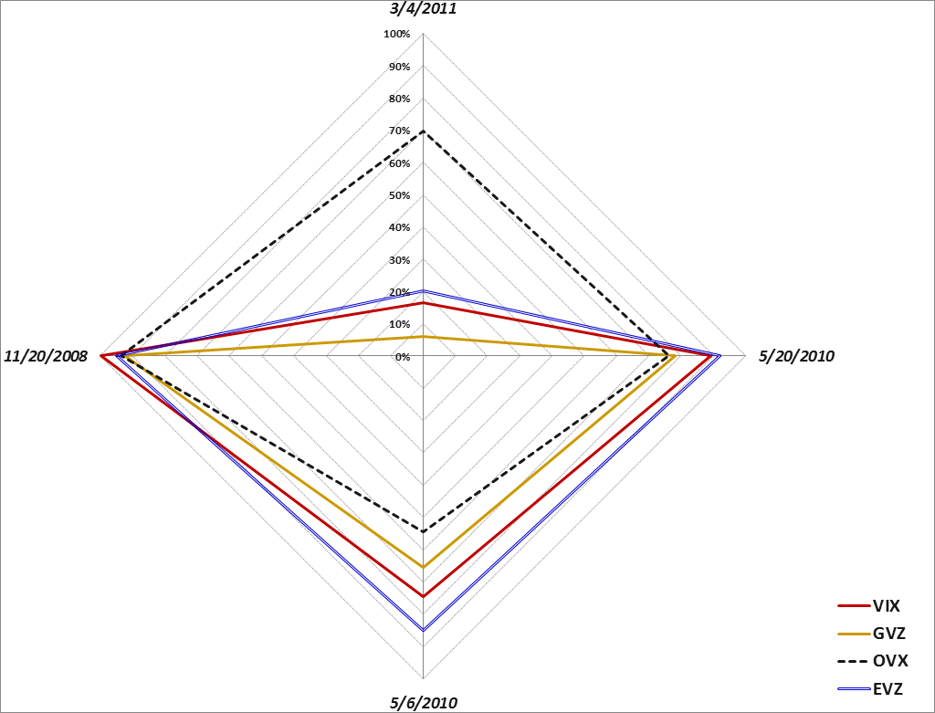
Today’s guest column, How to Spot Risk Early, at The Striking Price on behalf of Steven Sears at Barron’s, is the eleventh time I have had the opportunity to write a column for Barron’s. Today’s column picks up on a theme I addressed in a March 2011 article in Expiring Monthly which was titled, Evaluating Volatility Across Asset Classes. In that 2011 article, I introduce the concept of a volatility compass as a framework for evaluating the different types of volatility spikes that were seen in the 2008 financial crisis, the euro zone crisis as of May 2010, the Arab Spring in March 2011, and the May 6, 2010 flash crash.

[Volatility compass showing different levels of volatility across asset classes during four recent spikes in volatility. Source(s):VIX and More]

In the 2011 article I provide an overview of my thinking as follows:

“It is my belief that a better understanding of the volatility picture across asset classes will yield a better grasp of volatility events and help to identify a number of favorable trading setups.”

Later on I conclude the article with the following thoughts:

“For those who have studied sector rotation strategies and methods for trading geography-based ETFs, some of the analytical techniques used in those two disciplines can be carried over to an analysis of cross asset class volatility.

Ultimately, the study of volatility has both a science and art component to it, but a cross asset class approach provides a more broad-based holistic view of the volatility landscape and adds a little more science to the mix.

At some point, volatility becomes the study largely of contagion and falling dominoes. I can say without hesitation that a multi-disciplinary approach is essential to understanding contagion and dominoes and that a cross asset class analytical framework supplemented by tools such as the volatility compass is an effective way to approach that subject.”

In today’s Barron’s article, I expand upon the idea of four types of volatility indices and address volatility indices that provide a snapshot of geographical uncertainty and risk as well as broader measures of uncertainty and risk across asset classes such as U.S. Treasury Notes and currencies.

I will have more on this subject in the future, but for those interested in researching some of these subjects, I have highlighted some previous posts on different ways of thinking about uncertainty, risk and volatility below.

Related posts:

A full list of my Barron’s contributions:

Disclosure(s): none

Monday, July 1, 2013

Top Posts of 2013 (Through First Half of Year)

Every year I tabulate the most-read posts in this space as I find this exercise to be an excellent way to identify the issues that are resonating with readers and also to see how these issues evolve over time. These most-read posts also serve as easily accessible repositories of high-quality material for the benefit of new readers and long-term readers alike.

A number of themes seem to be top of mind for 2103 so far. Clearly the VIX ETPs and their construction and valuation quirks continue to be a huge issue, as is their performance during various volatility regimes. On a related note, low volatility ETPs generated considerable press and interest toward the beginning of the year and as volatility picked up in the second quarter, readers gravitated toward information on VIX spikes and various ways to measure and evaluate risk.

The posts below represent those that have been read by the highest number of unique readers during the first half of 2013. Farther down there are links to similar lists going back to 2008, along with several other “best of” type posts that I have flagged for archival purposes.

For the record, each year I also attach the hall of fame label to a handful of posts that I believe have particularly compelling and/or original content, regardless of readership.

Related posts:

Disclosure(s): none

Monday, June 17, 2013

The VIX and the Pre-FOMC + Post-FOMC Trades

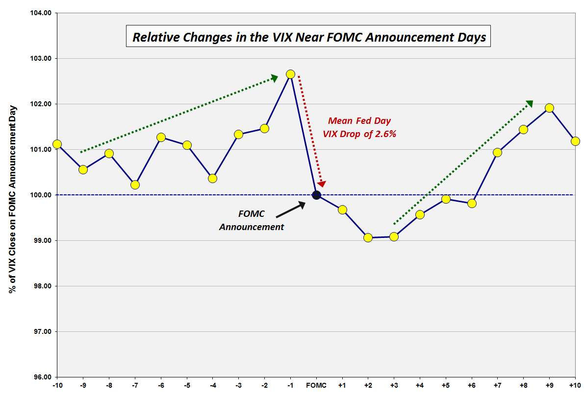
Back in December 2008, in VIX Trends Around FOMC Announcement Days, I posted a chart of the average movements in the VIX in the ten trading day leading up to and following “Fed Days,” otherwise known as days in which the Federal Open Market Committee (FOMC) makes its policy statement announcement. Several long-time readers who recall that chart – and an earlier incarnation from VIX Price Movement Around FOMC Meetings – have recently asked for an updated version. With all eyes on the Fed’s statement and Ben Bernanke’s press conference on Wednesday, this seems like a good time to revisit how the VIX moves in the days leading up to and following FOMC announcements.

In the chart below, I have normalized VIX data going back to 1990 to make it easy to compare the mean daily changes in the VIX in the ten trading days preceding FOMC policy statement announcements as well as ten trading days following those announcements. The quick takeaway is that the data from the last five years has been consistent with the data as of 2008. There are still three dominant features in this chart:

  1. a pre-FOMC VIX ramp in which the VIX tends to move up sharply in the three days leading up to the FOMC announcement and trend up more gradually 1-2 weeks in advance of the announcement
  2. a sharp decline in the VIX averaging about 2.6% on the day of the FOMC announcement, with a gradual decline in the VIX of another 1.0% or so in the two days following the announcement
  3. a sharp rebound in the VIX that starts three days after the FOMC announcement and persists until nine trading days after the announcement

Over the course of the past five years, the pre-announcement ramp in the VIX has been steeper during the three days prior to the announcement and more gradual in the week or so prior to that period. Also, recent history has seen the post-announcement decline in the VIX extending two additional days to now span four days following the announcement.

Of course there is no reason to expect that patterns which have persisted for the past 33 years to magically reappear for each FOMC announcement going forward, but I do believe that the historical pattern does say something about human nature, uncertainty and perceptions of risk.

It is worth noting that the biggest one-day jump in the VIX on a Fed day dates from February 4, 1994, when Federal Reserve Chairman Alan Greenspan surprised the markets by announcing a 0.25% increase in the federal funds rate, helping to lift the VIX 41.9% on that day. For comparison purposes, the next largest Fed day VIX increase was a 15.1% gain on March 15, 2011. While another VIX pop may be in the cards, history says there is a 72% chance the VIX will decline on Wednesday and that the decline should average about 2.6% or about 0.44 based on the current level of the VIX.

What is the trade here? While many will undoubtedly try to guess the direction of Wednesday’s move, the three other trades with a historical bias include:

  1. an increase in the VIX in advance of Wednesday’s announcement
  2. a continuation of any decline in the VIX from Thursday to Monday
  3. a new uptrend in the VIX beginning on Monday or Tuesday and running through the beginning of July.

[source(s): CBOE, Yahoo, VIX and More]

Related posts:

Disclosure(s): none

Tuesday, June 11, 2013

The Currency Carry Trade, DBV and Risk

Anyone who has been active in the financial markets during the past five years knows that there are many types of risk, many ways to think about and measure risk, and invariably some risks lurking around the next corner that many of us have never bothered to contemplate. Most investors tend to focus their attention on equities and therefore have a tendency to think in terms of the CBOE Volatility Index (VIX) and use that number to evaluate the relative level of risk, uncertainty or perhaps fear in the markets. That being said, during the past few years, almost everyone has become conversant in such topics as credit default swaps, the TED spread, the LIBOR-OIS spread, bank capital ratios and a whole host of concepts and statistics which were not on their radar in 2007.

For a more holistic approach to evaluating risk, there is always the St. Louis Fed’s Financial Stress Index, which is one example of an attempt to aggregate a variety of risk factors (18 in all) related to economic and financial matters into a single risk index.

One aspect of market risk that many investors continue to struggle with is the currency carry trade. If the daily movements of the dollar are relatively unimportant for those interested in buying and selling stocks that are primarily based in the U.S., then it is relatively easy for most investors to conclude that the gyrations of the Japanese yen (FXY) or Australian dollar (FXA) can be dismissed as much less important than those of the dollar. Unfortunately, this is not always the case. It turns out that many investors, particularly large institutional ones, have an appetite for the currency carry trade, in which one borrows in a currency where interest rates are low and uses the proceeds to buy assets in a currency where interest rates are higher. With Japan’s central bank targeting interest rates of 0.1% and the Reserve Bank of Australia recently cutting its base rate to 2.75%, the carry trade is structured as an interest rate differential trade in which an investor can borrow in yen and then buy Australian bonds, with profitability determined by the net interest rate differential plus or minus any fluctuation in the exchange rate.

Naturally some more aggressive investors prefer to use the yen as a funding currency for the purchase of assets other than bonds, including U.S. stocks. The problem for investors in U.S. stocks is that when the yen appreciates sharply – as it did on Monday and Thursday of last week, as well as during today’s session – traders with short yen positions who are victimized by a short squeeze will be subject to margin calls and/or forced liquidations, which means that not only are they covering their short yen positions, but they are also selling any long positions in U.S. equities as both legs are unwound. For this reason, when the yen carry trade is in favor, U.S. equities tend to move in the opposite direction of the yen. Traders can monitor the strength of the yen by following the USD/JPY currency cross or the Japanese yen ETF, FXY.

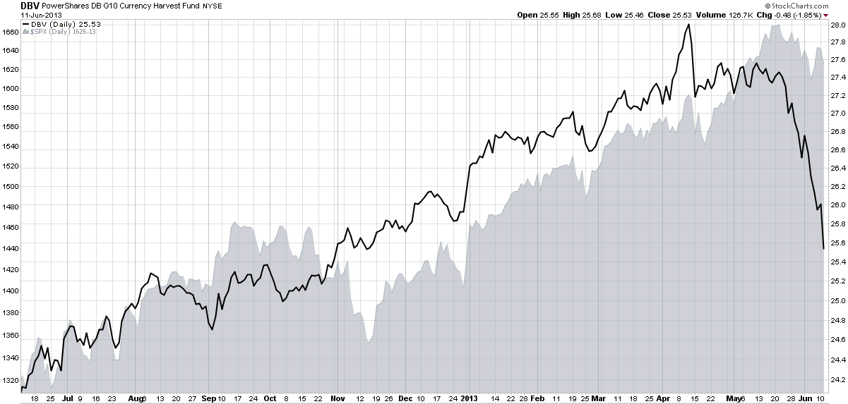
An alternative to focusing entirely on the yen is to monitor the PowerShares DB G10 Currency Harvest Fund (DBV), which, as PowerShares indicates, “is composed of currency futures contracts on certain G10 currencies and is designed to exploit the trend that currencies associated with relatively high interest rates, on average, tend to rise in value relative to currencies associated with relatively low interest rates. The G10 currency universe from which the Index selects currently includes U.S. dollars, euros, Japanese yen, Canadian dollars, Swiss francs, British pounds, Australian dollars, New Zealand dollars, Norwegian krone and Swedish krona.”

In other words, DBV is a carry trade ETF that is short three currencies and long three currencies at all times, updating these holdings on a quarterly basis. The ETF is currently short the Swiss franc, the euro and the yen, with long positions in the Australian dollar, the Norwegian krone and the New Zealand dollar.

As the chart below shows, DBV has been tracking the S&P 500 index quite closely for most of the past year, but that relationship has recently broken down as DBV has plummeted while the SPX has experienced only a mild pullback. Going forward, investors should strongly consider keeping an eye on the USD/JPY cross, the FXY ETF (which is optionable) and also DBV, which provides a much broader picture of the overall carry trade – and can also serve as a proxy for the risk this trade can pose to stocks.

[In addition to the products referenced above, note that there is a currency carry trade ETF that is similar to DBV, the iPath Optimized Currency Carry ETN (ICI), but this product has considerably less liquidity.]

[source(s): StockCharts.com]

Related posts:

Disclosure(s): none

Friday, January 4, 2013

VIX ETP Performance in 2012

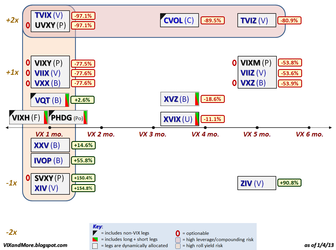
For anyone who pays attention to the VIX exchange-traded products space, 2012 was the year of the inverse (short) VIX futures ETP. The graphic below recaps the performance of the VIX ETPs that were trading as of the end of 2012 and it is easy to see that if you were long the inverse products (XIV, SVXY, ZIV, etc.) and were able to hold on to these positions during volatility storms such as the Greek elections, yield spikes on the sovereign debt of Italy and Spain, the fiscal cliff, etc. (all of which required nerves of steel and a creative risk management approach), then 2012 was a very good year for you. If not, then let the performance ups and downs be a reminder that most of the VIX ETPs are not well-suited for mainstream investors.

Instead of going into too much detail about the performance and reiterating much of what I have already said in the past, I encourage readers to investigate the links below, which include some predictions about future price moves and risk-reward ratios that have been borne out by the events of 2012.

If your new to this product space, perhaps the first place you should begin your research is with posts tagged with labels such as contango, roll yield and term structure – subjects that I have been writing about since the first VIX ETPs were launched, three years ago this month.

[Note that there are no performance numbers for VIXH or PHDG, as these products were launched during the year and have not yet accumulated full-year performance data.]

Related posts:

Disclosure(s): long XIV, SVXY and ZIV at time of writing

Sunday, June 10, 2012

Chart of the Week: The St. Louis Fed’s Financial Stress Index and Market Risk

Determining the risk in the financial markets should get easier with more data, more measures and more experience navigating crisis environments, right? Not so fast.

Right now, for instance, the CBOE Volatility Index (yes, the VIX does have a formal name) is just a shade above its lifetime average, yet the yield on the 10-Year U.S. Treasury Note is just a week away from its all-time low. Granted the Fed has been distorting interest rates with Operation Twist and other policy initiatives, but it has only been in the last month or so that yields have dipped below 1.7%.

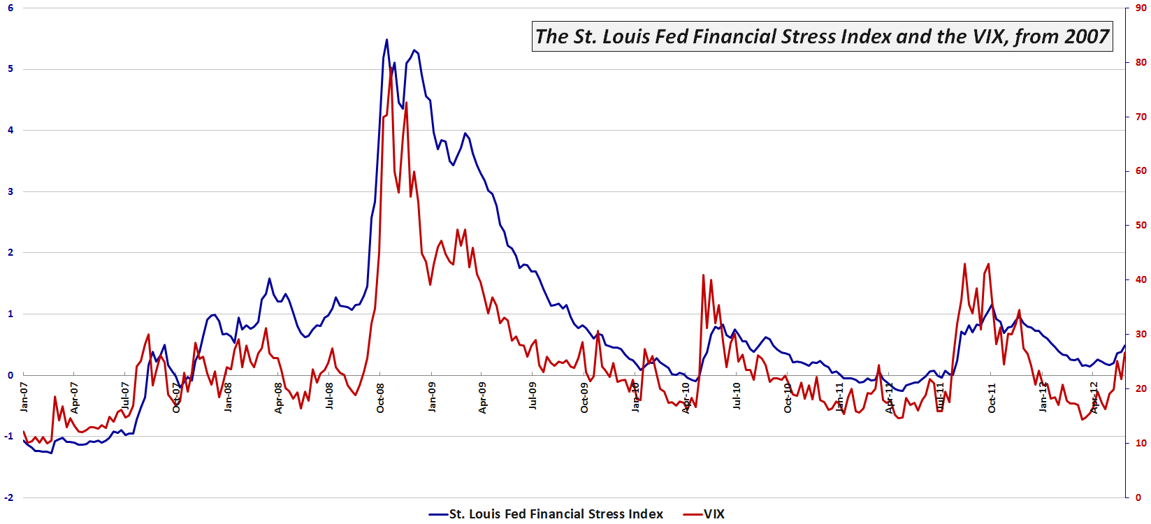
One broad-based tool for measuring risk in the financial markets and related institutions is the St. Louis Fed’s Financial Stress Index (which I refer to as the STLFSI), which has 18 component measures that include a variety of interest rate and yield spread data, as well as the VIX, measures of bond volatility and other data that are correlated with market stress.

This week’s chart of the week below shows the movements in the STLFSI and the VIX since the beginning of 2007. Note that for most of 2012 the VIX has been indicating much less risk and uncertainty than the STLFSI. Only since the middle of May have I observed the VIX rise to a relative level that is consistent with the STLFSI. As of last week, for instance the STLFSI was at the 79th percentile of its lifetime range, while the VIX was in its 82nd percentile. For the record, the divergence was widest in the middle of March, when the STLFSI had a 68th percentile reading, yet the VIX was mired in the 23rd percentile. Financial historians might also be interested to know that the mid-March divergence was the largest since August 2008…

For more information on the components of the STLFSI and the index’s long-term performance, check out an earlier post, St. Louis Fed’s Financial Stress Index, as well as some of the other posts linked below.

Related posts:

[source(s): Federal Reserve Bank of St. Louis]

Disclosure(s): none

Thursday, April 12, 2012

Buying SVXY Calls when the VIX Spikes

Based upon some of the emails I have received this week, it appears that a number of readers have been focused on buying some of the inverse VIX ETPs, notably XIV and SVXY, when they saw the VIX spike. Some have preferred shorting VXX, TVIX and UVXY, based partly on availability, while others have preferred to trade VXX options, generally by buying puts or limiting risk with the likes of a bear call spread.

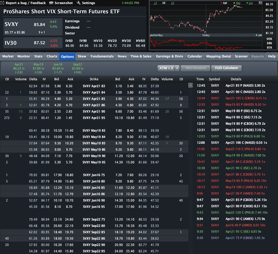
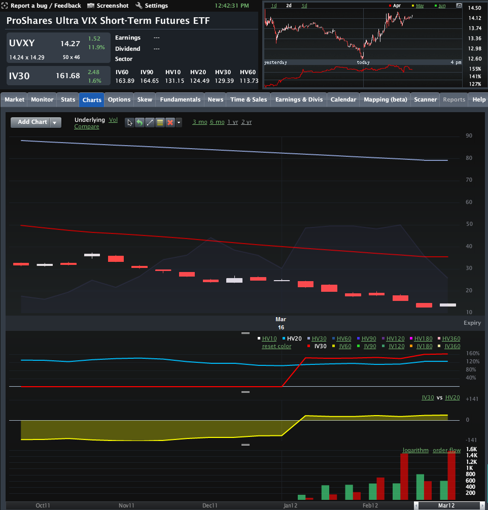
I had thought that my recent Options on UVXY and SVXY Open Up New VIX ETP Trading Approaches might nudge some traders into considering strategies involving the +2x leveraged long VIX short-term futures ETF (UVXY) and perhaps utilize the -1x short VIX short-term futures ETF (SVXY) as well, but based on the volumes, these issues are still in the process of gaining a broader audience. In fact, UVXY did see record call volume of 7300 contracts on Tuesday, but SVXY has been the laggard so far, as the graphic below illustrates.

So here is a thought: the next time the VIX has a significant spike, one of the first trades you should investigate is fading that spike by buying SVXY out-of-the-money calls. This is a simple trade and has the potential to be quite profitable. The SVXY April 90 calls, for instance, have jumped 40% from Tuesday’s close.

The exciting news about options on SVXY and UVXY is that traders can now easily structure a broad variety of trades that involve defined risk and substantial upside. While VXX (and VIX) options are still the gold standard in terms of liquidity, SVXY and UVXY options also deserve some love – even if the spreads are still wider than those of VXX.

Related posts:

[source(s): LivevolPro.com]

Disclosure(s): long XIV and SVXY, short VXX, TVIX and UVXY at time of writing; Livevol is an advertiser on VIX and More

Tuesday, March 27, 2012

Options on UVXY and SVXY Open Up New VIX ETP Trading Approaches

Whether or not I find it useful to flog the wounded horse otherwise known as the VelocityShares Daily 2x VIX Short-Term ETN (TVIX), it seems as if investors and the media insist that the wild and crazy story of this +2x VIX futures ETN remain on the front page for now.

While the TVIX story is indeed a fascinating one (see links below for more details), I fear it has crowded out a potentially more useful development from last week that has been criminally overlooked, the launch of options on two important VIX ETFs:

  • ProShares Ultra VIX Short-Term Futures ETF (UVXY)
  • ProShares Short VIX Short-Term Futures ETF (SVXY)

First off, note that the fact that these two products are exchange-traded funds instead of exchanged-traded notes means that it was much easier for options to be approved. While their more famous ETN counterparts, TVIX and XIV, grab most of the headlines, the addition of options means that traders now have much more flexibility in terms of strategy and tactics with UVXY and SVXY. 

In the past when I have mentioned how options on VIX ETPs were critical to their long-term success, I was met with a few (electronic) blank stares. Part of this reflects that fact that many have been drawn to the VIX ETPs for the potential to reap huge profits in a short period of time (more on this in The Trader Development Stage Model and the Jump from Stocks to Options) with leveraged trades. Talk to most professional options traders, however, and leverage is rarely a factor they mention as a reason for their focus on options trading. In fact, pros are more likely to cite the two key advantages of options as their flexibility and ability to structure defined risk (or limited risk) trades.

This brings me back to options on UVXY and SVXY. With UVXY down 83% for the quarter as of yesterday’s close, one would think that defined risk positions – on the long or short side – would be a critical factor in structuring future trades. With the huge contango and negative roll yield currently in the VIX futures, a directional bet in either direction entails huge risk. For shorts, this means that a short position can have its risk capped by buying UVXY calls. For longs this means that a long position can also limit risk by buying puts.

There are other ways to implement defined risk trades, notably with vertical credit spreads and vertical debit spreads, where gains and losses are limited to the distance between strikes. Traders can also just simply buy puts and calls to put a directional idea to work, knowing that their maximum loss will be limited to the purchase price.

In hard to borrow situations – which are common with some VIX ETPs – traders can also use options to create a synthetic position. For instance, a long put plus a short call is the equivalent of a synthetic short, so if no shares are available to borrow, a synthetic position might be an excellent proxy, with the same profit and loss potential as a standard short position, yet typically tying up a lot less trading capital.

Note that the markets for options in UVXY and SVXY are only one week old and not particularly liquid at this stage. On the other hand, volumes are ramping up quickly (see graphic of UVXY options volume, etc. below) and the flexibility and risk control inherent in options products makes these attractive, particularly so when applied to highly volatile products like UVXY and SVXY.

Related posts:

[source(s): LivevolPro.com]

Disclosure(s): long XIV and SVXY, short TVIX and UVXY at time of writing; Livevol is an advertiser on VIX and More

Friday, February 3, 2012

Suppressing Volatility and The Black Swan of Cairo

First published in the May/June 2011 issue of Foreign Affairs, The Black Swan of Cairo: How Suppressing Volatility Makes the World Less Predictable and More Dangerous is a thought-provoking effort by co-authors Nassim Nicholas Taleb and Mark Blyth to advance the idea the efforts of policy-makers to smooth out the peaks and troughs of volatility actually has the unintended consequence of making the world a more volatile place.

I was reminded of the Taleb and Blyth article when I recently read Suppressing Volatility Makes the World More Dangerous, by Kurt Cobb of Resource Insights. Here Cobb extends the thinking of Taleb and Blyth and argues that not only do efforts to suppress volatility backfire in the economic and political realms, but also in areas such as agriculture and public health.

Of course, I could probably argue that Jeff Goldblum’s ranting against the instability of complex systems in Jurassic Park some two decades ago outflanked Taleb, Blyth and Cobb, but on a week when a low VIX seems to have many vexed, ruminating on the ideas of Taleb, Blyth and Cobb may help readers flesh out some insights into what may lie ahead. Along the same lines, I believe the links below might also contain some provocative and related thought starters.

Related posts:

Disclosure(s): none

Monday, January 30, 2012

A Monthly Comparison of VXX and VXZ

Three years after their launch, VXX has about four times as many assets as its mid-term sibling, VXZ. When it comes to public relations and media column inches, I imagine the ratio is more like 50-1 in the favor of VXX. In many ways VXZ is the unloved stepchild of the duo.

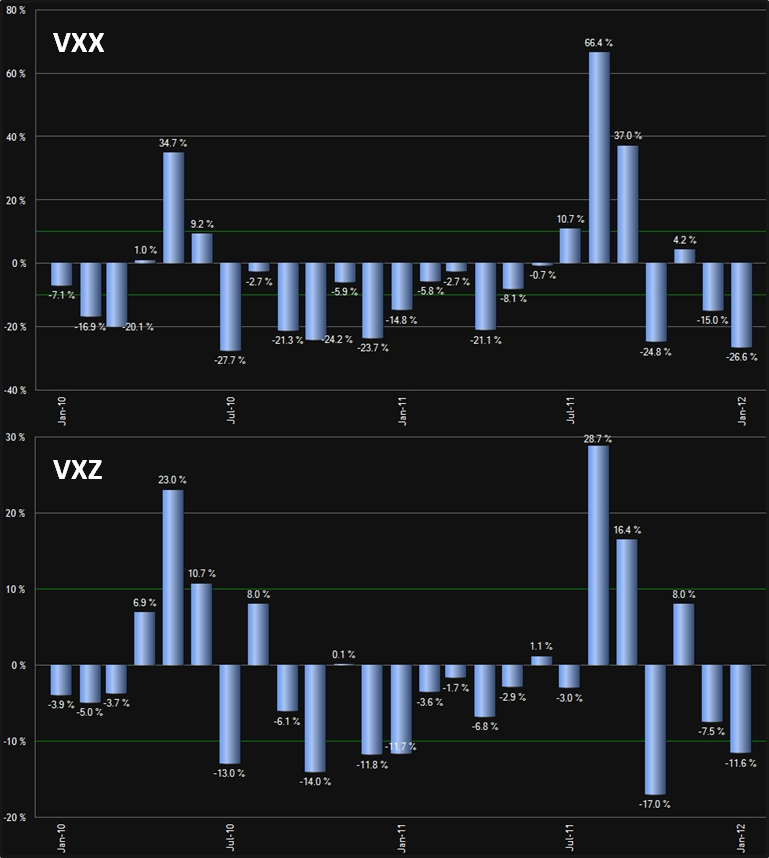
I recently opined that when it comes to the inverse variants of these two ETPs, ZIV is Undeservedly Neglected. I believe the same case holds for VXZ. One of the great difficulties in trading VIX-based ETPs is that while the potential returns are enormous, when things move in the wrong direction, a bad trade can spiral out of control and trigger an extremely painful loss with surprising speed. This is a large part of what makes VXZ more attractive than VXX. Even though VXZ is relatively volatile, with a current 30-day historical volatility of 39.5, it pales in comparison to the 70.1 30-day HV of its rocket-fueled short-term brother, VXX. In this case, the slower the train wreck, the more easily it can be avoided and position risk becomes much more manageable.

In addition to the lower volatility, VXZ is also much less susceptible to the contango and roll yield issues that plague VXX. In fact, on average VXZ is only subjected to about 1/3 of the negative roll yield that impacts VXX, which is a large part of the reason why the long-term performance of VXZ is much superior to the numbers put up by VXX. To illustrate this point, the chart below shows the month-by-month performance data for VXX and VXZ going back two years.

In summary, if you are impatient and you like action, VXX is the better bet, but if you have some patience and want better odds, VXZ is often a better long volatility play.

Related posts:

[source(s): ETFreplay.com]

Disclosure(s): long ZIV and short VXX at time of writing

Friday, January 13, 2012

Comparing SPLV and VQT

Based on some of the questions and comments that came out of Wednesday’s Three New Risk Control ETFs from Direxion, there appears to be a significant portion of the investment community that is uncertain about just how some ETPs are attempting to dampen volatility and control risk.

Today I am going to differentiate between three types of risk control approaches and compare two ETPs that have a little performance history. The approaches and an example ETPs are as follows:

  1. Using low beta stocks to minimize portfolio volatility (SPLV)
  2. Using a market timing mechanism that dynamically allocates between stocks and bonds according to measures of market volatility (VSPY)
  3. Using a market timing mechanism that dynamically allocates between stocks and VIX futures according to measures of market volatility (VQT)
While it may be partly semantics, I would not call SPLV a hedge in the sense that it does not attempt to hold securities that are negatively correlated with stocks. Instead, this approach is heavy on defensive stocks, with the current top sector allocations in utilities, consumer staples and health care stocks (see SPLV’s top holdings here.)

On the other hand, the approaches employed by VSPY and VQT are hedges in the traditional sense in that they switch into asset classes (bonds and volatility) that are generally negatively correlated with stocks when measures of volatility such as implied volatility and historical volatility signal an environment that poses greater risk to long equity positions.

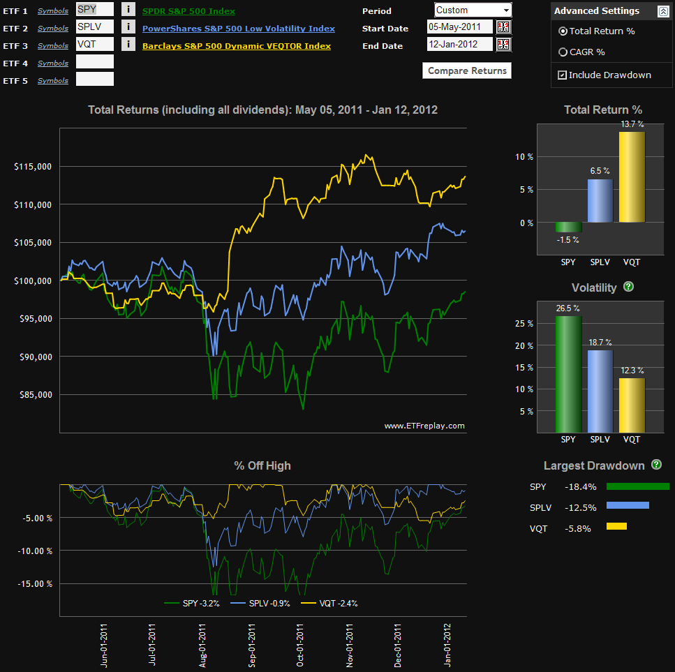
As VSPY was just launched this week, it is too early to talk about the performance of this approach, but the chart below captures the performance of both SPLV and VQT since the launch of the former on May 5, 2011.

Note that both SPLV and VQT are less volatile than SPY, had a lower drawdown, had a smaller peak to trough drawdown during the August-October selloff, and dramatically outperformed SPY during the period covered by the chart. Once VSPY establishes some meaningful historical data, I will return to this subject and offer a more detailed comparison of all three approaches to controlling risk.

For those interested in pursuing some of these subjects further, there is a good deal of information in the links below.

Related posts:
 
[source(s): ETFreplay.com]


Disclosure(s): none

Wednesday, January 11, 2012

Three New Risk Control ETFs from Direxion

Today Direxion announced they have launched three ETFs whose intent is to match their exposure to an underlying equity index based upon current levels of market volatility. The new ETFs are as follows:

  • Direxion S&P 500 RC Volatility Response Shares (VSPY)
  • Direxion S&P 1500 RC Volatility Response Shares (VSPR)
  • Direxion S&P Latin America 40 RC Volatility Response Shares (VLAT)

The launch of these ETFs expands Direxion’s stable of what they call “rules-based index ETFs,” which began with two ETFs that are based on insider trading data: INSD and KNOW. The three new ETFs also arrive just five days after S&P announced a new S&P Dynamic Rebalancing Risk Control Index Series, which provides the basis for evaluating volatility and matching equity exposure to anticipated risk.

The intent of these ETFs is spelled out by Direxion:

“The Funds embody a rules-based investment approach that uses volatility as a gauge to determine equity exposure. They operate according to the principle that exposure to equities should be reduced during periods of higher overall market volatility, and increased during periods of a more stable (lower volatility) market environment. Each Fund has a target volatility level for its corresponding index. When volatility moves above those levels, the Funds will increase their exposure to U.S. Treasuries and decrease their exposure to equities. The Funds will proportionately increase exposure to equities during periods of low market volatility.”

Readers with sharp memories may recall that back in July 2010, Direxion was the first ETF provider to announce that they would be launching a product based on the S&P 500 Dynamic VEQTOR Index, which was an effort to mitigate risk with a dynamic allocation of VIX short-term futures, essentially the equivalent of sizing a VXX hedge based on observed levels of implied volatility and historical volatility. I am not sure why Direxion’s VEQTOR product never saw the light of day, but Barclays ended up with one of the few successful VIX ETPs in 2011 (see VIX Exchange-Traded Products: The Year in Review, 2011) with its Barclays ETN+ S&P VEQTOR ETN (VQT) product, which I made a strong case for back in October 2010 in The Case for VQT.

One of the interesting aspects of the approach taken by VSPY, VSPR and VLAT is that these products will tend to have minimum exposure when the VIX is at its highest – and as anyone who has ever looked a chart of the VIX and SPX/SPY knows, this is typically when stocks bottom and begin a sharp bullish move.

With impeccable timing, EconomPic Data just happened to publish a study yesterday, VIX as a Predictor of Equity Returns, which concluded that for the most part, SPY daily returns were much higher with an elevated VIX than with a historically low VIX.

All this raises the question of how to play increased volatility and risk. In the land of ETPs, there are quite a few alternatives, including:

  • Barclays ETN+ S&P VEQTOR ETN (VQT) – dynamically hedge with a long VIX futures position
  • Direxion’s VSPY and VSPR to dynamically adjust exposure to equities
  • PowerShares low volatility (SPLV) and high beta (SPHB) approaches for manual market timing
  • ETRACS Fisher-Gartman Risk On ETN (ONN) and ETRACS Fisher-Gartman Risk Off ETN (OFF) – for those who wish to manually time the multi-asset class risk on/risk off trade

Investors who believe they are more adept at timing the market may prefer to avoid the rules-based products that dynamically adjust exposure based on a static risk measurement mechanism. For those who prefer not to watch their portfolio closely or are not convinced that they can do a better job than the likes of VQT, VSPY and perhaps SPLV, the new category of dynamic risk exposure products should provide some excellent tools for portfolio augmentation and in some cases, portfolio replacement.

Related posts:

Disclosure(s): short VXX at time of writing

Tuesday, March 29, 2011

The VIX Summit, a.k.a. the CBOE Risk Management Conference

About a month ago I had an opportunity to attend the CBOE Risk Management Conference, which could easily had been called the VIX Summit. This was the first time I attended this conference and in retrospect, I have little doubt that if VIXophiles were only to attend one conference per year, this would be the one.

Where else can you find several hundred like-minded souls who obsess about the VIX and volatility on a daily basis? Where else could you holler out “Hey, Mr. VIX?” in a crowded room and expect at least a dozen heads to turn?

This year’s agenda tells part of the story. Some of the sessions I had the pleasure of attending included:

  • VIX Option Strategies
  • Tail Risk Protection: A Panel Discussion on Why and How Investors Might Hedge Downside Risk
  • Volatility ETNs and ETFs: A Panel Discussion on the Construction and Usage of Volatility-Based Investment Products
  • Equity Correlation and Macro  Investment Decisions, Crash Risk and Correlation Trading Paradigms
  • What the Derivatives Markets Tells us About the Macro Economy
In addition to the sessions above, there were also sessions on cross-asset class volatility strategies; short and relative value volatility strategies; long-dated equity index volatility, etc. Of course, the real value in this type of event is getting an opportunity to meet people in the business and cross-pollinate not just ideas but also relationships.

I went to the RMC hoping that some of the ideas that I would be exposed to might change how I viewed my trading and give me some thoughts about how I might tweak some of my existing strategies or branch out into new strategic soil. The conference certainly accomplished that objective and in a most enjoyable setting, at Dana Point, California.

So, when it comes to planning out next year’s itinerary, give some strong consideration to attending the 28th annual Risk Management Conference, which I believe is scheduled to return to Florida (it alternates between the East Coast in even years and the West Coast in odd years) for 2012.

Finally, note that some of the presentations from prior years have been archived, so that those who believe good ideas have a meaningful half-life can access them at their leisure.

Disclosure(s): the CBOE is an advertiser on VIX and More
Friday, January 14, 2011

Managing Risk with a Short VXX Position

Since I am not sure how many readers review the comments section, I thought I should pass along a recent reader Q&A in post format in order to capture the attention of a broader audience. By the way, if you would like to see more Q&A in this space or have a specific question you are longing for an answer to, just hit up the comments section below.

Reader Mike submits:

With less $$ going into the VXX EFT due to other options to shoppers, in theory VXX should continue dropping in price value as well, correct?
I lost a good amount of money longing VXX over the summer, but recouped all losses and made money towards the end of the year shorting VXX. Now, I've loaded up on shorting it with even more capital and have a very comfortable % gain so far this year. I want to protect that gain, but my belief is that VXX will continue much lower allowing for even more reward.
I'm thinking you have the same thoughts, is that right?

Hi Mike,

Good questions. VXX is more of a function of the price of the underlying VIX futures than the demand for the ETP, so unlike some neglected stocks, it will not drop just because demand slacks off.

I'm glad to hear you have done well shorting VXX. In terms of protecting your gains, you might want to consider buying some VXX calls to hedge your risk in the event of a VIX spike. Another thought is to convert your short VXX position into a long XIV position. While these positions look almost equivalent on the surface, when VIX spikes, the size of your VXX short will increase, while the size of your XIV long will decrease. This has implications for position concentration and potential margin issues, etc. It also means that instead of having losses compound if the VIX continues to rise, there will be a diminution of incremental losses.

For example, assume a net position of $100,000. If VXX jumps 10% three days in a row a short VXX position will lose $10,000, then $11,000, then $12,100. On the other hand a long XIV position would lose $10,000, then $9,000, then $8,100. In only a few days, the daily losses become 50% higher in short VXX than in long XIV. The longer the increase in volatility persists and the bigger the daily moves are, the larger the difference becomes. Recall that in April-May 2010, the VIX tripled in a month and VXX doubled. You might want to walk through how you can protect yourself should something like that happen again.

It's something to think about, anyway.

Good trading,

-Bill

Related posts:
Disclosure(s): short VXX and long XIV at time of writing

Sunday, July 11, 2010

Chart of the Week: The Risk Trade

Lately I have been talking about the flight-to-safety trade in posts such as Revisiting the Flight-to-Safety Trade. In thinking about various flight-to-safety low risk havens I tend to focus on U.S. Treasuries, the dollar (UUP) and gold (GLD).

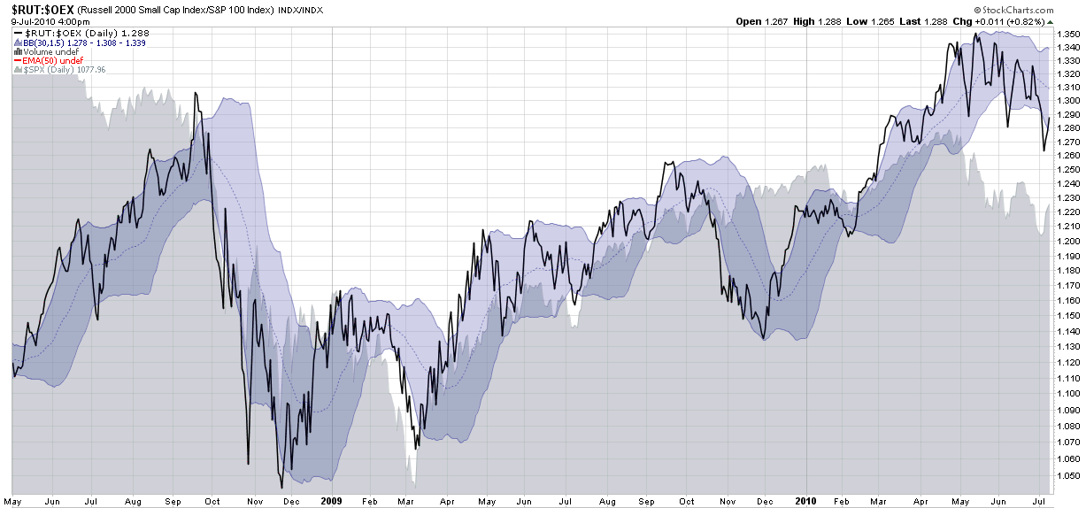
Turn the flight-to-safety trade upside down and essentially what we are looking at is the risk trade. There are many ways to think about the risk trade (growth vs. value, emerging markets vs. developed markets, consumer discretionary vs. consumer staples, etc.) but for a broad and simplified perspective on the risk trade I like to focus on market capitalization. Specifically, I like to follow the ratio of the small cap Russell 2000 index (RUT) to the mega cap S&P 100 index (OEX).

This week’s chart of the week below shows the RUT relative to the OEX (black line) since May 2008, with a gray area chart of the S&P 500 index added for context. Also included in the chart are Bollinger Bands that use customized settings of 30 days and 1.5 standard deviations (for more information on using something other than the default 20 days and 2.0 standard deviations, see the links below.) The result is a chart that tells me when the RUT:OEX ratio is high in absolute terms or relative to recent values.

If stocks are in the process of moving into an trading range (i.e., as suggested in The Elusive Trading Range), then investors should be thinking about transitioning from indicators that measure trend strength to indicators such as oscillators that measure how much various asset classes are overbought oversold.

When it comes to stocks, an important part of understanding momentum and reversal opportunities in either trending or trendless markets it to look at various proxies for the risk trade. For me at least, a good place to start is the RUT:OEX ratio and lately that ratio has done a solid job of identifying overbought and oversold conditions in stocks.

For more on related subjects, readers are encouraged to check out:

[source: StockCharts.com]
 

Disclosure(s): none

Tuesday, June 29, 2010

Revisiting the Flight-to-Safety Trade

Once again the S&P 500 index approached the precipice at 1040 and for now at least has backed away and found a little breathing room.

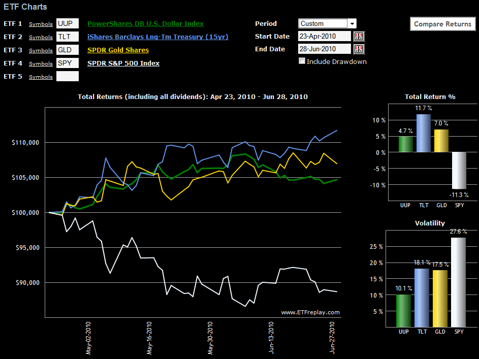
With anxiety running high, investors have embraced the flight-to-safety trade once again. The current preference is for U.S. Treasuries, the dollar (UUP), and to a lesser extent, gold (GLD).

While the most conservative plays are necessarily on the short end of the U.S. Treasury yield curve (represented by ETFs such as SHV and BIL), note that in the chart below I have included the long bond ETF (TLT) to provide a higher volatility bond for comparison purposes. The trend is fairly well established at this stage. Of the flight-to-safety vehicles, U.S. Treasuries are attracting the most interest (perhaps due to deflationary concerns), followed by gold, with the dollar the least enticing alternative, today’s 0.8% rally notwithstanding.

Not shown in the chart below is VXX (iPath S&P 500 VIX Short-Term Futures ETN), which is more of a speculative bear market play or a hedge than a flight-to-safety alternative. During the period from the April 23rd high through yesterday (June 28th) VXX is up 53.4%, with a volatility level of 94.5.

For more on related subjects, readers are encouraged to check out:


[source: ETFreplay.com]

Disclosure(s): short VXX at time of writing

Sunday, May 23, 2010

Chart of the Week: The Flight-to-Safety Trade

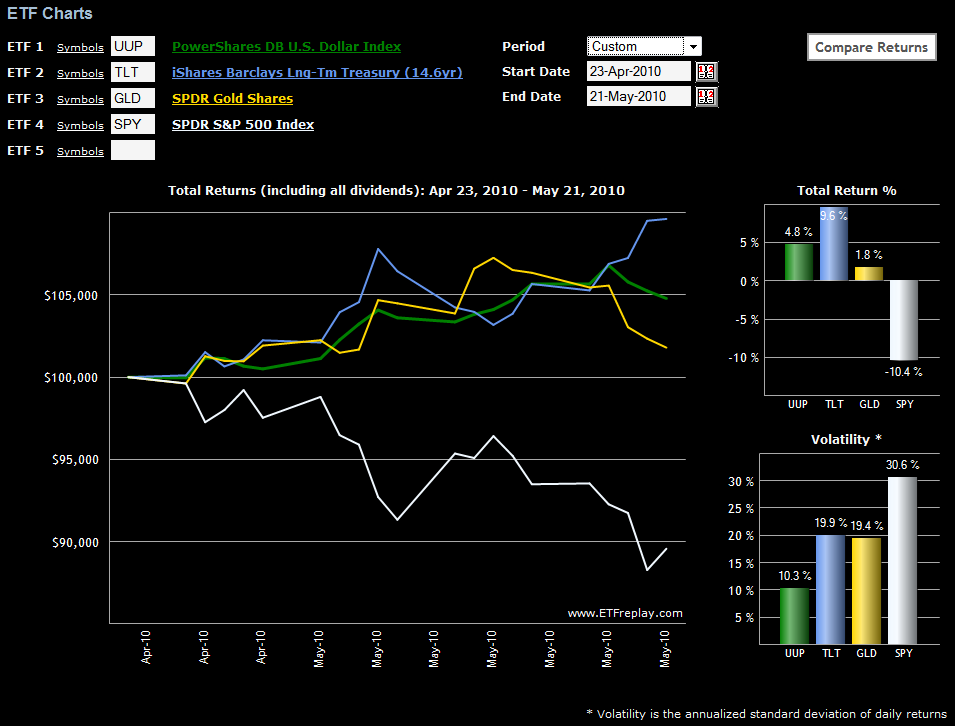
This week’s chart of the week looks at some of the various flight-to-safety trades that investors have been taking advantage of since the recent closing high of 1217 in the S&P 500 index from April 23rd.

In the chart below, note that first gold (GLD) and then the dollar (UUP) peaked as hedges against stock declines. More recently, U.S. Treasuries have been the favored flight-to-safety vehicle, with the long bond ETF (TLT) outperforming the other two alternatives and shorter-term Treasury ETFs such as IEF, not shown, attracting quite a few buyers.

Also not shown in the chart below is VXX (iPath S&P 500 VIX Short-Term Futures ETN), which is more of a hedge than a flight-to-safety alternative. During the last month VXX is up 81.3%, with a volatility level of 113.6.


[source: ETFreplay.com]

Disclosure(s): short VXX at time of writing

Friday, December 4, 2009

New Dr. Brett Series on Lessons for Developing Traders

If there is one blog on the web where I never seem to find the appropriate amount of time required to digest all the nuggets of wisdom it contains, that site is undoubtedly Brett Steenbarger’s TraderFeed. Filled with insights that range from quantitative analysis and system development to what is arguably the best collection of content on the web in the realm of trader psychology, TraderFeed continues to be – at least in my opinion – the top all-purpose investment blog on the web.

For this reason, when Brett mentioned in Lessons for Developing Traders: What Moves Markets that he is “going to write about topics that no one told me about when I was learning the ropes,” I thought that instead of waiting until the series is finished to highlight it I would flag it now for anyone who is not already on the Steenbarger bandwagon.

This new series also got me thinking to about the three things I wish I had been told (assuming I was smart enough to follow that advice) at the beginning of my trading career. The answers are personal ones, but I believe they capture insights that led to quantum advances in my trading:

  1. Standardize on one time horizon…and make it consistent with your trading approach and personality

  2. Make research and analysis of risk management at least as important as R&D on stocks, indicators and strategies

  3. Focus more time on developing expertise in managing (and exiting) existing positions than on discovering new high potential entries

For the record, a close fourth in this exercise was understanding the tenets of behavioral finance and the associated decision-making pitfalls that investors should learn to avoid. Those who wish to get a better sense of how I see the learning process for developing traders may wish to investigate my trader development stage model.

Readers, feel free to use the comments section to spell out the 3-4 things you wished someone had told you when you first started trading.

For more on these subjects, readers are encouraged to check out:

Disclosure: none

Wednesday, September 30, 2009

The Trader Development Stage Model and the Jump from Stocks to Options

First, thanks to all who commented or wrote to me about the trader development stage model, I was quite surprised and heartened by the response.

When I was in the process of assembling my initial draft of the trader stage development model, I had in mind a novice trader that was focusing primarily on stocks, but perhaps occasionally trading ETFs. With respect to options, my sense is that for the most part, novice traders avoid options entirely or take an occasional gamble on a potential big winner by buying out of the money calls or puts.

Looking at the model, however, it quickly dawned on me why so many traders have trouble making the transition from trading stocks to trading options. I asked myself two questions:

    1. What is the motivation for a stock trader for jumping into trading options?
    2. How far has the trader progressed in terms of the stage development model at the time he or she decides to trade options?
I suspect quite a few beginning traders get frustrated with some of the stage one issues associated with entries, leverage and position sizing and before coming to terms with these issues, they decide that stocks just aren’t the right trading vehicle for getting rich in a hurry. Attracted by the leverage potential of options, these traders make the jump from stocks to options and in so doing, simply magnify the cost of their mistakes. Of course, this is absolutely the worst way to approach options. Almost without exception, traders who follow this course of action succeed only in accelerating the time it takes to blow out their account.

The situation is only marginally better for traders who make the jump to options after advancing to stage two and are grappling with how to cut losses while letting winners run. With options positions much more volatile than stocks and spreads much wider, many of the exit strategies that work well for stocks do not work as well with options. Further, some traders become confused about whether to use the options, the underlying or both as their cues for when to exit. On a personal level, while I think mastering the art of exiting positions is a critical success factor for anyone who trades stocks, I found that porting the lessons I learned about stock exit strategies to options was nowhere near as easy as I had hoped.

Even for those traders who have reached stage three of the development model, options will be difficult to trade profitably, but these traders should understand most of the hurdles to success and what it takes to overcome them. Still, edges that work for stocks don’t necessarily work for options and risk management becomes much more complicated and difficult.

The bottom line is that for those stage three stock traders who are interested in augmenting their trading with options, their time and effort will likely be rewarded. On the other hand, for those traders who are still mired in stage one and stage two of their development process, options are almost certain to be a disaster and result in large losses.

If you are thinking about making the jump to options, make sure you undertake an honest self-assessment before diving in and be sure to make risk management your number one priority.

For some related posts, readers should check out:

DISCLAIMER: "VIX®" is a trademark of Chicago Board Options Exchange, Incorporated. Chicago Board Options Exchange, Incorporated is not affiliated with this website or this website's owner's or operators. CBOE assumes no responsibility for the accuracy or completeness or any other aspect of any content posted on this website by its operator or any third party. All content on this site is provided for informational and entertainment purposes only and is not intended as advice to buy or sell any securities. Stocks are difficult to trade; options are even harder. When it comes to VIX derivatives, don't fall into the trap of thinking that just because you can ride a horse, you can ride an alligator. Please do your own homework and accept full responsibility for any investment decisions you make. No content on this site can be used for commercial purposes without the prior written permission of the author. Copyright © 2007-2023 Bill Luby. All rights reserved.
 
Web Analytics