Saturday, May 31, 2008

Portfolio A1 Performance Update: 5/31/08

Since I continue to receive inquiries about Portfolio A1 as well as my new subscriber newsletter model portfolios, I thought I would provide a snapshot of the portfolios at the end of each month.

The chart below shows the equity curve and some summary statistics for Portfolio A1 since the portfolio (which is equities only, long only) was created on February 16, 2007. During the 15 ½ months since inception, Portfolio A1 has posted a cumulative return (exclusive of dividends) of 19.8%, while the benchmark S&P 500 index has declined 3.8%.


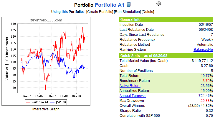
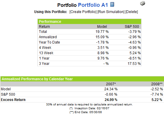
The graphic to the right provides some additional performance details for Portfolio A1 vs. the S&P 500 index over a variety of time frames.

For the record, Portfolio A1’s current holdings include: Mosaic (MOS); TBS International (TBSI); PetroQuest (PQ); World Acceptance (WRLD); and Brasil Telecom Participacoes (BRP). Portfolio A1 also shares some common ancestry and has a stock ranking system that is similar to the VIX and More Focus Aggressive Trader model portfolio – one of the four model portfolios that I update transaction by transaction for newsletter subscribers. At some point later this weekend, I will provide some details about the performance of the subscriber newsletter portfolios.

Finally, I would be remiss in not reiterating that Portfolio A1 was created with tools developed by Portfolio123.com and is managed via Portfolio123.com’s tool set. For more information on Portfolio123.com, please refer to an earlier post on the subject, Portfolio123.com: The Engine Behind Portfolio A1. [For the record, I have no affiliation with Portfolio123.com]

Friday, May 30, 2008

Agricultural Commodities vs. Base Metals

I’ll be the first to admit that I am sometimes guilty of oversimplifying the commodities world by lumping all commodities together for the purpose of making broad comparisons between equities and commodities. When I break out a particular commodity, it is usually crude oil or gold.

In fact, the recent action in agricultural commodities and base metals has been at least as interesting as the action in the energy and precious metals baskets. Many of the same factors – supply and demand, inflation, geopolitics, etc. – are at work across the full spectrum of commodities. Sometimes the geopolitics of agricultural commodities and precious metals are on par with that of oil politics. Just ask the Chinese…

The chart below compares the ETFs associated with the PowerShares Deutsche Bank Liquid Commodity Index – Agriculture (DBA) with the comparable ETF for base metals (DBB) over the course of the 17 month life of the ETFs. The chart shows three distinct internal trends within the broad commodity sector: the strong metals performance for the first four months of 2007; the sharp rally in agricultural commodities relative to metals during the remainder of 2007; and the more recent (albeit less dramatic) tilting of the pendulum back in the direction of base metals.

At the moment, both agricultural commodities and base metals are struggling to hold on to gains made over the past six months. There are a myriad of ways in which to invest in commodities over the long-term or to take short-term speculative positions. When thinking about the latter alternative, do not overlook a pairs trading approach.

Thursday, May 29, 2008

It’s the Oil, Stupid

When it comes to volatility, there are few catalysts that can spook the market like the prospect of an oil shortage. With today’s announcement that crude oil inventories fell 8.8 million barrels when analysts were expecting a slight increase in inventory levels, the markets reacted sharply, with crude futures immediately spiking almost $4 per barrel to over $133. In spite of today’s jump, crude is still trading below the all-time high of $135.09 and has pulled back toward 130. Still, 135 will be an important resistance level to watch going forward. If 135 holds, volatility should be contained; if it is breached, expect equities to face and volatility to surge with crude prices.

One more thing: tomorrow is the last trading day before the official beginning of the Atlantic hurricane season…

Wednesday, May 28, 2008

Comparative Volatility Indices

I am a strong believer in simplifying life – and one’s approach to investing – as much as possible. Less is more.

With that thought in mind, I pulled up a six month chart of the five major US volatility indices: VIX, VXO, VXN, RVX, and VXD. The chart, which comes courtesy of BigCharts, shows that over the past six months, the difference between the volatility indices are no more than subtle nuances. Keep in mind that during this period, the financial sector was extremely hard hit. Moreover, financials are overrepresented in the VIX and VXO, underrepresented in the RVX, and absent from the VXN. The sector distinction is all but lost in the charts (except perhaps from mid-February to mid-March) and if there were ever a time for the indices to diverge in a meaningful way, this was it.

The bottom line is that for most market observers, it makes sense to follow only the VIX. Volatility aficionados may also choose to follow the VXN, but after adding a second volatility index to one’s radar, the incremental return on effort and complexity diminishes rapidly.

When there are important divergences between these indices, I will be quick to point these out, but for the most part, expect my comments about the VIX to apply to the entire volatility index family tree as a whole.

Tuesday, May 27, 2008

Whither COF?

Ever since the onset of the credit crisis, it seemed like only a matter of time before problems in the area of home mortgages and HELOCs inevitably spread to credit cards. Given that Capital One Financial (COF) has dipped heavily into the subprime borrower market, it seems to reason that COF will be a large part of the collateral damage.

So far, COF has been able to keep charge offs at a manageable rate, one that was stable at 6.1% in March and April. This leveling off of the charge-offs in the most recent month prompted Goldman Sachs analyst Brian Foran to offer optimistically, “any sign that credit deterioration in U.S. card could be taking a breather is positive.”

COF’s stock is currently 30% above the January low and has traded in an ascending triangle, as the chart below shows. While the stock is up this morning, it is testing the bottom of the triangle pattern. Ominously, on balance volume shows a significant divergence from the price pattern, with at least three significant distribution days (down on above average volume) over the past four weeks.

While XLF, XBD, C and LEH are all important indicators of the health of the financial sector, keep an eye on COF to see how the credit crisis is affecting subprime credit card holders.

Friday, May 23, 2008

VIX Implied Volatility Surges

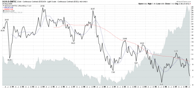
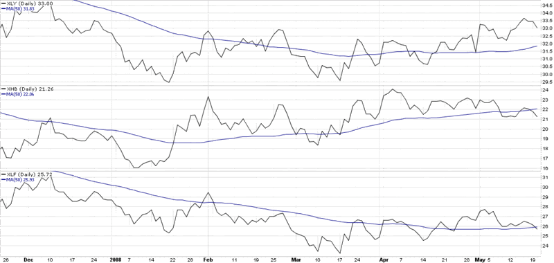
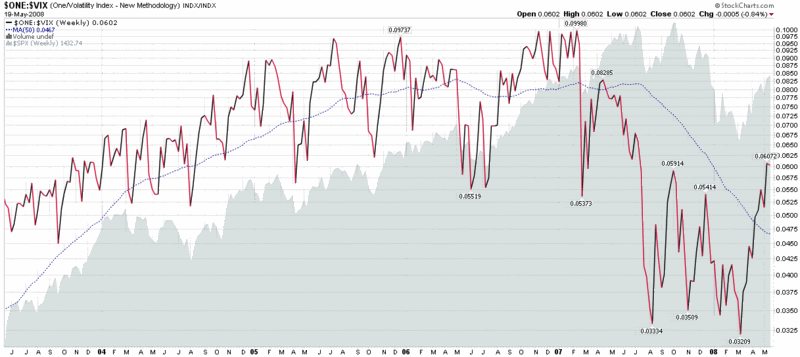
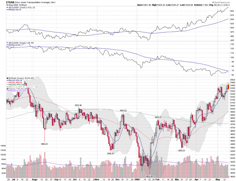
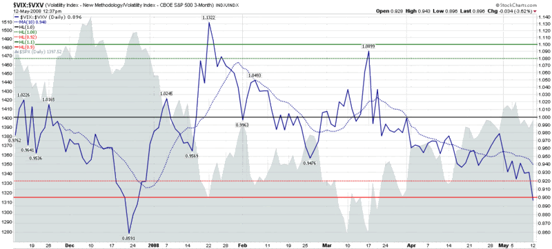
This is where things get fun. The VIX is a measure of implied volatility of SPX options, yet the VIX also has its own implied volatility, derived from VIX options, which I am simply going to call VIX IV. Since we are on the verge of a long weekend (for some), just think of the VIX IV as the implied volatility of the implied volatility of the S&P 500 index. If you prefer, call it meta volatility.

The reason I bring up these mental gymnastics is that the implied volatility of VIX options has been increasing dramatically over the course of the past two weeks. Given that there are different methods for calculating an aggregate implied volatility number across a range of strikes, it is not surprising that different sources can arrive at a different aggregate IV value. In the case of the VIX, the three month implied volatility charts from optionsXpress (above right) and iVolatility.com (below) seem to arrive at very similar numbers, with the VIX IV jumping from about 50 to 115 or so over the past two weeks. In the case of the ISE (very bottom), their methodology shows VIX IV hitting a new 52 week high of 230 on yesterday and hovering around 198 today.

I am not sure why there is such a large discrepancy between the ISE and the other two sources – and I will be back to clarify this when I get a good explanation – but the key takeaway is that while implied volatility in the SPX is starting to edge back up slowly, volatility in the VIX is surging. There are several possible explanations for this phenomenon, but in all cases, the surge in VIX IV suggests that options traders are pricing in much higher uncertainty associated with near-term VIX values. One possible translation: traders believe that the probability of a significant spike in the VIX is increasing.


Thursday, May 22, 2008

The Big Question for the VIX

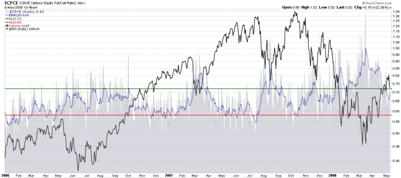
There are a lot of important questions about the markets that are being hotly debated as I write this. These include:

  • Are we in a recession?
  • Will crude oil break 150 soon?
  • How long will it be until the housing market finally hits bottom?
  • Can the indices take out their 200 day SMAs?
  • Why is the VIX still under 20?

OK, so I was kidding about the last one. Judging by the number of visitors this blog gets, there is a fair amount of interest (about five times as much as there was a year ago) in the nanosubject known as the VIX.

Condor Options, a site that is part of my regular reading, wonders if the VIX phenomenon has jumped the shark. Drawing upon the latest from Steven Sears, Don’t Read too Much Into a Rising VIX, my avian friends opine (in Has the VIX Jumped the Shark) that “the VIX has definitely received too much attention of late, and is being asked to perform too many roles - market timer, sentiment indicator, and even trading vehicle.”

The gist of the Condor Options argument comes a little later:

“…it’s getting harder and harder to find a source whose daily market commentary doesn’t feature at least a casual nod to VIX action, and more importantly, those passing references almost always describe it one-dimensionally as ‘the fear index.’”

I was debating whether to weigh in on some of the particulars of the Condor Options article when another prominent blogger who bears more than a passing resemblance to Henry Winkler picked up on the VIX theme and added:

“The VIX is just one tool in the shed, and a very imperfect one. It is an estimate, and as such, there is a boatful of noise in the number any time you look at it. At the end of the day, it tends to confirm something you already knew. Back in January and March the VIX spiked as the market got plowed and peaked on those big down gap days. Guess what, emotions got extreme.”

Adam (of Daily Options Report fame) also offered some good advice to VIX watchers. “Going forward, we should forget about the blips, myself included…[a]nd we should concentrate on looking for divergences.”

Condor Options and Adam certainly make some excellent points. Regarding the larger question of whether or not the VIX has jumped the shark, my answer is that when I started a blog about the VIX with a tongue-in-cheek tagline of “Your One Stop VIX-Centric View of the Universe…” some seventeen months ago, the water skis were already passing over the dorsal fin.

With respect to the ‘fear index’ label, divergence analysis, and several other specific points about the VIX, I will save these subjects for more detailed treatment at a later date.

Wednesday, May 21, 2008

Gold vs. Oil

Peak Oil or not, crude has had an incredible run as of late. If you have any doubt about how sharp the move has been, check out Tim Knight’s Elliott wave count and chart at The Slope of Hope.

As the chart below shows, gold has had quite a run too (see the area chart), but lately oil has been outperforming gold. One way to interpret this ratio chart is to think of what an ounce of gold would cost if it were priced in barrels of oil. As anyone who has been to Dubai lately can tell you, it is taking less and less oil to buy an equivalent amount of gold these days.

There was a time when a house was considered to be one of the best hedges against inflation. Clearly that is not the case at the moment – at least in the US. Gold has historically been an even better inflationary hedge, but lately oil has outpaced gold in that area. The oil trade is very crowded at the moment and when oil turns down, there will still be many who are seeking alternative hedges against inflation. Don’t be surprised if a lot of that oil money flows into gold and sends the gold to oil ratio back toward historical norms.

Tuesday, May 20, 2008

Three Pivotal Sectors: Financials; Homebuilders; and Consumer Discretionary

Throughout the recent market turmoil, there have been three sectors that I have watched most closely in order to help determine the extent of the challenges the US economy is currently facing and will face in the near future. There should be no surprises here, but for the record, those sectors are financials (XLF), homebuilders (XHB), and consumer discretionary (XLY).

The financials are the foundation of these three sectors and provide a sense of the strength of the institutions involved in credit markets and other related financial businesses. The homebuilders offer some insight into changes in value of existing real estate assets, as well as consumer confidence and willingness to undertake large financial commitments in the coming months. Finally, consumer discretionary firms reflect the size of the pool of disposable income and the level of comfort consumers have in letting go of or holding on to that money.

The chart below shows all three sectors over the past six months. Financials and homebuilders are clearly struggling and have both fallen below their 50 day simple moving averages as of late. The consumer discretionary sector has been the strongest of the three over the past month, but may have peaked last week after getting extended.

Ultimately, my belief is that a healthy economy and a healthy stock market require a strong performance in all three of these pivotal sectors, which is why I call them my 'indicator species' sectors. That may still happen down the road, but at the moment, at least two of the three pivotal sectors are showing a fair amount of weakness.

Monday, May 19, 2008

Inverted VIX: The US Tour

I have mentioned the inverted VIX on two previous occasions, most recently about 5 ½ months ago in Inverted VIX Still Bullish.

In the chart below, I continue my practice of displaying the inverted VIX in a weekly chart and looking at longer term patterns. A lot has changed on the volatility front in 5 ½ months, as evidenced by the fact that the current inverted VIX is farther above its 50 week moving average than it has been at any time since the record 64% one day spike in the VIX on February 27, 2007.

Perhaps even more interesting is that in this five year lookback period covered by the chart, current VIX levels look positively middling and unremarkable on an absolute basis, even though the VIX has come a long way in a short time on a relative basis. A new VIX floor in the 15-16 range is not unreasonable. It is higher than the new VIX floor of 13-15 I was calling for on August 1, 2007, but given all that has transpired in the markets over the past ten months, the fact that these numbers are even in the same ballpark is something to ponder.

[For more on why it is sometimes useful to turn charts upside down while analyzing them, readers may wish to check out A Different Way to Look at the VIX: 1999-2007.]

Friday, May 16, 2008

The Shift from Roads to Rails

The Dow Jones Transportation Average (DJTA) has a long and storied history, but has been frequently overlooked in recent years. Despite this secondary billing, the index is up over 30% since bottoming in January and is close to challenging last summer’s all-time high.

The transports are often thought of as a barometer of the cyclical economy, frequently rising as an economy transitions from recession to recovery. As such, the rise in this index has been noted by many observers as a sign of better economic times ahead.

The reality is that the transportation index aggregates several related industries, including commercial airlines, shipping companies, railroads, truckers, and air freight firms. These firms have had widely varying fortunes lately and the outlook is different from segment to segment. One important distinction between these companies is their exposure to rising fuel costs. Not surprisingly, airlines and truckers have been hit hard by rising energy prices. Shippers and railroads, however, have suffered less of an impact. The distinction is dramatic when drawn between railroads and airlines. In the chart below, I have included not only the DJTA, but the Dow Jones US Railroad Index ($DJUSRR) and the Dow Jones US Airlines Index ($DJUSAR). The chart shows what most of us already know: the rails are booming and the airlines are struggling.

Energy costs are tilting the balance of power away from airlines and truckers back toward the traditional bulk carriers: railroads and shipping companies. In an era of rapidly expanding global trade, not only will the winners be the ones with a significant cost advantage, but their growing market share and growing markets should make for some enticing investment opportunities.

Thursday, May 15, 2008

One Reason Why Volatility May Have Bottomed

The graphic below says it all – and the official beginning of hurricane season is two weeks from Sunday.

Given the supply issues with oil and natural gas, even the threat of a hurricane in the Gulf of Mexico is sure to cause considerable consternation. Of course, with all the global warming, this year’s prediction from the folks at Colorado State University is not particularly soothing:

"Based on our latest forecast, the probability of a major hurricane making landfall along the U.S. coastline is 69 percent compared with the last-century average of 52 percent," said Phil Klotzbach of the Colorado State hurricane forecast team. "We are calling for a very active hurricane season this year, but not as active as the 2004 and 2005 seasons."

I’ll have more to say on weather and volatility as we get deeper into the hurricane season.

Wednesday, May 14, 2008

VIX Options in Current Declining Volatility Environment

Kudos to Adam at Daily Options Report for today’s A Quick Trading VIX Primer, which provides a succinct explanation of the basis for VIX options prices – some of which have left casual options traders scratching their heads in recent days.

In Adam’s words:

“The VIX estimates volatility on the SPX itself for the next 30 days.

VIX futures are a bet on where that estimate will be on the day the future expires. In other words, it is a snapshot of what the market expects for volatility 30 days AFTER the future expires. If it is a September future for example, you are guessing how the market prices volatility 30 days forward from September expiration. You are not betting on SPX volatility between now and September; that is a common misconception.”

Two graphics might help to illustrate this point. The first graphic initially appeared on VIX and More one year ago in VIX Futures: The One Picture to Remember and shows what happened to the VIX futures on the day before and the day of the record 64% spike on the VIX on February 27th 2007. The bottom line is that the long-term outlook for volatility did not change appreciably, but the VIX futures moved from contango (upward sloping over time) to backwardation (downward sloping over time). So the future still looked the same, but the VIX was expected to take a different path to arrive at essentially the same place.


The second graphic is a snapshot of the VIX options as of this morning. Note that with the (cash/spot) VIX at 17.24, the bid on the May 17.00 puts (0.15) is almost the same as the bid on the May 22.50 calls (0.10). The reason? Mean reversion is priced into the VIX futures – and the options reflect the consensus opinion that a 5 point VIX spike is just about as likely as a 0.25 point drop in the VIX over the next week (recall that VIX options expire on Wednesdays; this month it is one week from today.)

Tuesday, May 13, 2008

Revert to What?

If there is one thing that most VIX-watchers can agree upon, it is that the VIX is ultimately a mean reverting animal. If you accept that postulate, then the next set of questions that spring to mind generally concern which mean the VIX reverts to and over what time period mean reversion takes place.

Since much of the discussion of the VIX centers around 10 day moving averages, I thought I would zoom out a bit, pull up a VIX weekly chart, and look at some long-term numbers: the 40 and 200 week simple moving averages.

Logically, one might assume that most of the activity in the VIX would fall neatly in between the 40 and 200 week SMAs. Interestingly enough, that has rarely been the case historically. During the past five years, for instance, the VIX has traded in the range between the 40 and 200 week SMA less than 20% of the time, as the VIX has trended down, then back up.

At current levels, the VIX is near the halfway point between the 40 and 200 week SMA, perhaps partly due to some of the gravitational effect of mean reversion. While current levels of volatility appear to resonate as too low for some, a continuation of the bullish bounce off of the March lows should send the VIX back to the 200 week SMA – or even lower.

In sum, while long-term VIX mean reversion does have some analytical use, it is less reliable than the short-term mean reversion patterns that are more commonly utilized for trading.

Monday, May 12, 2008

Strong Bear Signal from VIX:VXV Ratio

I consider the VIX:VXV ratio to be an indicator in the making. Since the VXV is only six months old it is still too early to give it the robust indicator seal of approval, but that doesn’t mean you shouldn’t pay attention to it.

Looking at the chart below, the only previous time the VIX:VXV ratio gave a bearish signal comparable to the current one was just as the markets were about to move down in dramatic fashion from late December to late January.

At the very least, the bulls should consider some downside protection in the current market environment. I suspect the bears are preparing to pounce very soon…

Sunday, May 11, 2008

Subscriber Newsletter Update

I have received a number of questions about the subscriber newsletter and I thought this might be a good time to address them.

First, thanks to all who have subscribed. I have been extremely pleased by the response to date. I appreciate all the support and am particularly encouraged by the fact that so far the renewal rate has been 100%.

In terms of content, the Sunday format has already been standardized. The typical Sunday issue is six pages long and has the following sections:

  • The Week in Review – my thoughts on what constituted the important macroeconomic, fundamental, and technical news for the past week
  • The Week Ahead: What to Look For – includes suggestions on earnings to watch, important government data releases, critical technical support/resistance levels, etc.
  • Market Sentiment Update – a discussion of the readings and related implications from two of my proprietary sentiment indicators, the Options Sentiment Indicator (OSI) and the Aggregate Market Sentiment Indicator (AMSI). In some respects these two indicators are descendants of the VIX Weekly Sentiment Indicator (VWSI)
  • Asset Class Outlook – where I update my outlook over the short-term (1-3 weeks), intermediate-term (1-3 months), and long-term (6-12 months) time frames for ten important asset classes that cover US equities, foreign equities, bonds, currencies, and commodities
  • Current Investment Thesis – my take on what is driving the markets, in which direction, and why
  • VIX and More Focus Model Portfolios – three different model portfolios (Aggressive Trader, Growth, and Foreign Growth) consisting of 5-7 stocks each that have returns of +18.0%, -2.7%, and +2.1% since the March 30, 2008 inception
  • Stock of the Week – a single weekly stock selection that has a cumulative return of +48.5% since the initial March 30th selection

The Wednesday issue is much more like the blog, but with a more detailed analysis and a place where I offer more in terms of conclusions and takeaways. It generally runs 4-6 pages and has three standard sections:

  • Market Commentary – updates my thinking as laid out on Sunday
  • Market Sentiment Update – similar to the Sunday section, but may drill down more on specific issues, such as volatility, put to call data, market breadth, volume, etc.
  • Volatility-Based Sector Rotation Model – one of my current research interests is using volatility to time trades on a variety of ETFs, including sectors, geographies, commodities, and currencies. This is not a model portfolio, per se, but I have been providing commentary on what the model is suggesting in terms of sector rotation strategies, what geographies to be long or short in, as well as plays in commodities and currencies

In addition to the three standard sections, Wednesday usually includes several feature sections where the subject matter varies from week to week. Some of the features from the past three issues include:

  • The VIX:VXV Ratio Continues to Perform Well
  • NYSE Total Volume Suggests Rally May Have Run Out of Steam
  • ‘Stock of the Week’ Averages Up 5% in One Day
  • CBOE Equity Put to Call Ratio Remains Bullish (a shorter, updated version of this post went up on the blog a week later)
  • A Long-Term Look at the VIX and the VXN
  • Yield Curve DĂ©jĂ  Vu and Other Musings (a much shorter version of this post went up on the blog later)
  • Is the Fed Done Cutting Rates?
  • Market Breadth and Sustaining a Rally
  • Highs and Lows in the S&P 500 Index

If anyone has any additional questions or comments about the subscriber newsletter, please feel free to email me at bill.luby@gmail.com or check out the subscriber newsletter blog.

Friday, May 9, 2008

The Return of the Links

There was a time where the most popular feature on the blog was my (mostly) weekly set of links to posts on other blogs that had given me something important to chew on. I never intended for that feature to die – and starting today I will do my best to resurrect it.

So without further ado, here is some of what I have been reading and thinking about in the past few days:

Thursday, May 8, 2008

CBOE Equity Put to Call Ratio No Longer Bullish

The CBOE equity put to call ratio, which Stockcharts.com and I refer to as CPCE, has been generating consistently bullish readings since the beginning of 2008. Those bullish readings came to an end about a week or so ago, as the chart below reflects. That does not necessarily mean that options sentiment is turning bearish, only that the ‘free lunch’ portion of the bounce off of the March low is over. Now the likelihood of getting whipsawed – either on the long side or the short side – increases considerably. I suspect that a couple more days like yesterday will push options sentiment back into the bullish contrarian camp, but that remains to be seen. Until the market generates a stronger directional signal, priority should be given to conservative strategies.

Wednesday, May 7, 2008

VIX Surfing Down the Moving Average Channel

I have seen a number of typing heads out there proclaiming that the VIX is “too low” and therefore the recent rally is about to run out of steam. I have my own reasons (yesterday’s VIX:VXV ratio warning sign, for instance) for thinking that the current move is overextended, but labeling the VIX as “too low” is not one of those reasons.

As best as I can determine, most people who use the VIX to time the market focus on the distance between the current VIX value and 10 day simple moving average, with the expectation that the greater the distance between the two, the more likely that the VIX will snap back in the direction of the SMA. With that in mind, consider the chart below, which shows the VIX in the context of the 10 day SMA and two moving average envelopes that show the 10% (dotted green) and 20% (solid green) distance from the SMA. For the last 6 ½ weeks or so, the VIX has been dropping steadily, but in such a fashion that its movements have largely been constrained to a channel between the 10 day SMA and the -10% moving average envelope. At current levels, the VIX is barely 3% below the very same 10 day SMA, hardly what most would consider to be in the “too low” category.

Tuesday, May 6, 2008

The Commodities vs. Equities Battle Continues…

If the markets seem a more than little indecisive at the moment, one of the reasons is that ongoing sector rotation has muddied the waters with respect to what is hot and what is not. A lot of the sector rotation churning, on the other hand, is merely asset class trickle down, as investors try to decide at a much higher level whether they want to make a substantial commitment to equities and the possibility of a resumption in the recent bull market – or whether the hard assets of commodities are a more attractive option in light of natural resource shortages and concerns about inflation.

The commodities vs. equities battle has been tilting in the direction of commodities in recent months, but since the March lows the consensus has unraveled. In the chart below, the ratio is of the Rogers International Commodity Total Return Index (RJI) to the SPX. [RJI is an ETF linked to the Rogers International Commodities Index that has a broad weighting, with less emphasis on energy than most commodity indices] The ratio chart shows indecision over the past six weeks, with the symmetrical triangle pattern awaiting resolution. I am not sure which side will win the commodities vs. equities skirmish, but when we can declare a victor in this battle, we should know a great deal about the future of the markets over the next few months.

For a longer term perspective on this subject, see my Equities or Commodities? post of a month ago.

Monday, May 5, 2008

Relative Highs and Lows in the SPX

There are a wide variety of ways to measure market breadth, a number of which I have blogged about in the past in some detail. I have not, however, spent much time discussing new highs versus new lows in the S&P 500 index – and given that this blog spends an inordinate amount of time talking about the VIX, it makes sense that much of the analysis here eventually gets tied back in to the SPX.

Of course there is a chart for this – and in this case I have elected to go back through six months of bearish market movement to make my points. The relative high and low chart is best used for two purposes: to identify oversold levels; and to help flag a change in trend. In the chart below, the 20 day EMA dips below the 20 level in both January and February of 2008 for the first time since October 2002, signaling an oversold condition. The change in trend is harder to spot on this chart, but historically a bullish leg is usually underway once the high low index is back over the 65-70 level. Note that the chart ends with Friday end of day data; this week will bring a better sense of the strength of the current rally.

Friday, May 2, 2008

Limited Upside for Consumer Discretionary Sector?

As Corey at Afraid to Trade pointed out in Some Surprising Trend Day Action, one of the more interesting sub-plots in yesterday’s breakout was the strength in the consumer discretionary sector, which rallied 5.8%.

I am firmly of the opinion that the current stock market rally cannot be sustained unless consumer confidence, consumer purchasing power and consumer activity all rally in concert with the markets.

My concern with the consumer discretionary sector extends to a chart of the sector ETF, XLY. In the weekly chart below, the current level of the XLY (33.55 as I type this) is now back to the 32-34 area bounded by the symmetrical triangle formation of 2005-2006 and is also rapidly approaching the 34.08 50% Fibonacci retracement level. Both of these indicators suggest that the XLY should find considerable resistance in the 34-35 area; if this is the case, the market will have to rely on other sectors to continue the current bull rally.

Thursday, May 1, 2008

Time for Biotech to Turn Around?

I have been experimenting with a new volatility-centric sector rotation model that I may start talking about in more detail in this space in the coming weeks.

I mention this because the system generated a buy signal in BBH, the HOLDRS biotechnology ETF. While the system does not require a confirmation signal from today’s trading, BBH is trading up with the broader markets today, albeit with a smaller percentage rise. The chart below shows that biotech actually bottomed in January and has not participated in the rally off of the March lows. Generally a healthy biotech sector is an indication of bullish speculative activity. As such, this is one of my ‘indicator species’ charts to watch.

[Note to readers: I have heretofore avoided any disclosure statements when writing about stocks and ETFs. As my content is currently being picked up by Seeking Alpha and other aggregator sites, I will now make it a practice of disclosing positions in any securities mentioned in my posts. If there is no disclosure, this means I do not have a position in any of the securities I reference, as is the case with BBH today.]

DISCLAIMER: "VIX®" is a trademark of Chicago Board Options Exchange, Incorporated. Chicago Board Options Exchange, Incorporated is not affiliated with this website or this website's owner's or operators. CBOE assumes no responsibility for the accuracy or completeness or any other aspect of any content posted on this website by its operator or any third party. All content on this site is provided for informational and entertainment purposes only and is not intended as advice to buy or sell any securities. Stocks are difficult to trade; options are even harder. When it comes to VIX derivatives, don't fall into the trap of thinking that just because you can ride a horse, you can ride an alligator. Please do your own homework and accept full responsibility for any investment decisions you make. No content on this site can be used for commercial purposes without the prior written permission of the author. Copyright © 2007-2023 Bill Luby. All rights reserved.
 
Web Analytics