Showing posts with label XLF. Show all posts

Sunday, April 29, 2012

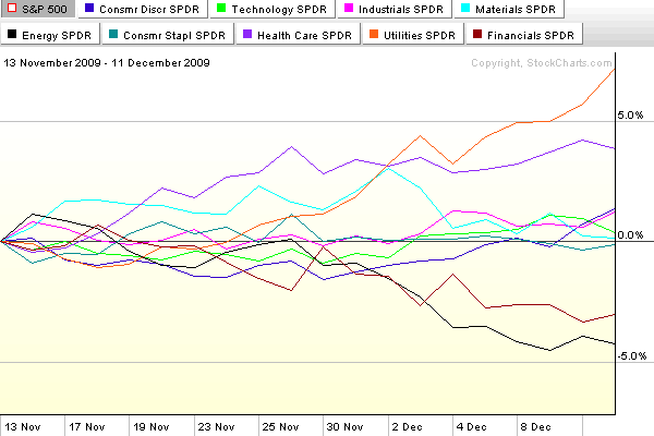
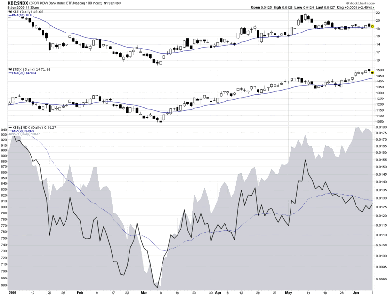
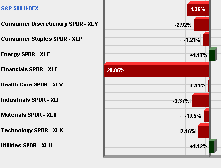
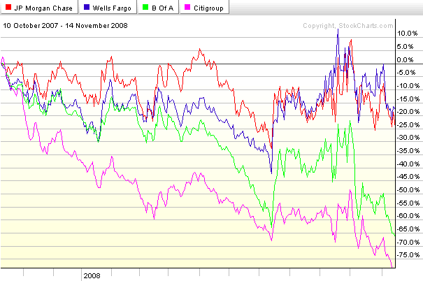
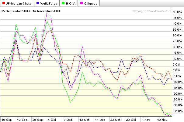
Chart of the Week: Sector Winners and Losers

While there was a lot going on in the sector space during the rally from October to April and the pullback earlier in the month, I have yet to see any sort of detailed explanation of what happened during these two periods.

This week’s chart of the week below attempts to bridge this gap, with a four-chart comparison of the bull move from October 4, 2011 to April 2, 2012 as well as the bear pullback from April 2 to April 10, 2012. The top two charts cover the bull move, with the left chart capturing absolute sector performance and the right chart capturing sector performance relative to the changes in the S&P 500 index as a whole. The bottom two charts also have absolute sector performance on the left and relative sector performance on the right, but this time during the April 2-10 pullback.

The absolute data show that all sectors moved up during the bull move and fell during the bear move. The relative data allow for a more nuanced analysis that shows financials (XLF) were the main engine behind the bull move and also the largest contributor to the pullback. While financials shared some of the credit with consumer discretionary stocks (XLY), industrials (XLI) and technology (XLK) on the way up, it was materials (XLB), energy (XLE) and industrials that helped to pull the broader index down. Only two sectors have outperformed the S&P 500 index on the way up and on the way down: technology and consumer discretionary stocks. Conversely, energy has been the only laggard in both directions.

While not reflected in these charts, in the three weeks since the April 10th bottom, consumer discretionary, materials and industrials have been the biggest contributors to bullish moves. Interestingly, technology has now flipped to being the biggest drag on performance.

One could make a fairly good case that the ability of the S&P 500 index to make a run at 1500 (take a bow, James Altucher) will in large part be a function of the degree to which technology returns to a leadership role.

Related posts:

[source(s): StockCharts.com]

Disclosure(s): long XLY at time of writing

Sunday, December 13, 2009

Chart of the Week: A Month of New Sector Leadership

During the course of the past month or two, stocks have drifted sideways, lacking buying conviction and strong leadership.

In this week’s chart of the week below, I have tracked the performance of the nine AMEX sector SPDRs over the course of the past month. Note that former leaders financials (XLF) and energy (XLE) are now lagging, while defensive sectors such as utilities (XLU) and health care (XLV) are leading the way. Now I have nothing against utilities and health care, but the next time these two sectors lead a significant bull rally will be the first time in my memory. One or more of technology (XLK), consumer discretionary (XLY), materials (XLB) or perhaps financials needs to take a leadership role to give the next bullish leg the type of strength that portfolio managers can believe in.

A good defense may win championship, but it will not light a fire under potential buyers.

For more on related subjects, readers are encouraged to check out:

[source: StockCharts]

Disclosure: none

Monday, October 12, 2009

Implied Volatility Flat Ahead of Bank Earnings

With some very important earnings in the financial sector coming up this week (JPM on Wednesday; C and GS on Thursday; BAC and GE on Friday), I have been watching implied volatility (IV) in the sector very closely. Much to my surprise, implied volatility has not increased ahead of earnings, as is typically the case.

The chart below, courtesy of Livevol, shows six months of price and volatility activity in JPMorgan Chase (JPM), with the upper portion chart highlighting the last two earnings releases with the blue “E” icon. The bottom half of the chart plots 30-day implied volatility (red line) against 30-day historical volatility (light blue line) during the same period.

Note that just prior to the last two earnings reports, implied volatility rose due to the uncertainty and potential for higher volatility associated with an earnings surprise. This time around, however, the lack of movement in implied volatility – as well as the proximity of the IV level to historical volatility – suggests that investors are not expecting any surprises at all. In fact, this situation is not specific to JPMorgan, but is also mirrored at Citigroup, Bank of America, Goldman Sachs and even quasi-financial General Electric. Not surprisingly, the bank ETFs, such as KBE, and the financial sector ETF, XLF, show a similar pattern.

No matter how the current earnings season unfolds, it is difficult to imagine that there will not be any surprises. Investors who think implied volatility is underestimating the surprise potential for the banks may look to initiate long straddles or long strangles to take advantage of a potential increase in implied volatility – and hence options prices.

For some related posts on implied volatility in financials, readers are encouraged to check out:

[source: Livevol Pro]

Sunday, October 11, 2009

Chart of the Week: Two Bull Legs and Counting…

In the seven months since stocks bottomed and rallied some 61% (in the SPX) to current levels, there have been two distinct bull legs. The first leg began with the low close on March 9th (or intraday low on March 6th) and lasted just a little more than three months until the high close on June 11th. After a one month downturn, the second bull leg was launched on July 10th and persisted almost two and one half months until September 23rd. This time the pullback appears to have been more short-lived and has a provisional end date of October 2nd.

The three charts below – which collectively form this week's chart of the week – capture the sector performance relative to the SPX (the numbers are not in absolute terms) for the first two bull legs and also throws in the first week of what may turn out to be a third bull leg.

Note that in the first two bull legs, financials (XLF) were easily the top performing sector in both instances. Also, on both occasions it was the materials (XLB) and industrial (XLI) sectors that had clear separation from the rest of the sectors and were almost neck and neck for second and third. These three sectors clearly represent a top tier in terms of performance during the most pronounced 2009 bull moves. A second tier of consumer discretionary (XLY), technology (XLK) and energy stocks (XLE) has generally performed slightly above the baseline SPX. The bottom tier consists of three defensive sectors that typically only outperform the SPX in market downturns. In fact, these three sectors, health care (XLV), consumer staples (XLP) and utilities (XLU), were the top three performers during the June 11th to July 10th pullback.

Just for fun, I have added the last week of performance in the bottom chart. It is too early to draw conclusions for one week of upward movement, but so far the leading sector for October is energy. If the markets are to continue to set new highs for 2009, a big question will be whether the same sectors continue to lead or whether new leadership emerges. Personally, I do not expect that the same performance hierarchy that has characterized the last two bull legs to continue during the next month or two of upward moves. In fact, I would expect leadership to shift to the second tier in the form of technology, energy or consumer discretionary stocks. No matter what happens, it will be interesting to see how the broader market performs if financials start to lag the other sectors.

[source: StockCharts]

Wednesday, August 5, 2009

Money Center Banks Surge as Regional Banks Lag

While the S&P 500 index is down about 0.8% as I type this, banks are faring considerably better than the index today, continuing a recent trend. Buying interest across the bank universe is splintered, however, with strong demand for money center banks and less interest in regional banks.

The chart below compares the performance of two popular banking ETFs, KBE, which is based on a broad-based bank index, and KRE, which is based on a regional banking index. The contrast is stark. Not only is KBE up 2.2% today while KRE is down a fractional amount, but this has been a recurring theme since the end of April, when regional banks became a laggard. Note that both banking ETFs have trailed the performance of the full financial sector, as represented by seemingly ubiquitous XLF.

During the last two days, sellers have been unable to put a dent in either real estate or financials. Until this pattern reverses, stocks are not going to be able to correct.

[source: StockCharts]

Tuesday, June 30, 2009

FAS Is Now XLF

For someone who gets a kick out of volatility, the arrival of triple ETFs has been a little bit like manna from heaven. Of course the launch of the Direxion triple ETFs back in early November just happened to coincide with the highest VIX readings in history. There is nothing like record volatility, except perhaps record volatility times three.

But a lot has changed since November. The VIX traded in the 80s the month it was launched; today it was as low as 25.02. At the moment the VIX is exactly 1/3 as high as it was when it peaked in November at 81.38. For those who have been selling options, the ride down the volatility slide has been an unusually profitable one. In fact, it is likely that some of the premiums harvested in the last nine months or so will turn out to be the most bloated we will see in our trading lifetimes.

My personal interest in the triple ETFs notwithstanding, these vehicles have received mixed reviews, largely because their suitability as buy and hold investments degrades rapidly after just one trading session – with the problems exacerbated by increases in volatility. On the flip side, the recent decrease in volatility has muted some of the tracking and compounding errors inherent in leveraged ETFs. In fact, in the current environment, the 3x and -3x ETFs are starting to look somewhat tame relative to their history. The two charts below show the (30 day) historical volatility (purple line) and implied volatility (gold line) of the most popular financial sector ETF, XLF, and the 3x financial sector ETF that has taken the trading world by storm, FAS. While there are a number of interesting conclusions to be drawn from these charts, the point I wish to make is that current historical and implied volatility for FAS (top chart) is hovering around the 100 mark, which is about where HV and IV were for XLF (bottom chart) in February, March and April. In other words, the 3x ETF FAS is no more volatile or has more uncertainty in its stock price now than XLF did during the period from October through April. Tracking error aside, FAS is now effectively the ghost of XLF.

[source: iVolatility]

Monday, June 8, 2009

Banks, Large Cap Tech and Leadership

One month ago today in The Banks vs. Technology, I mentioned the divergence between technology and financials and noted, “so far the financials (XLF) have done a better job of leading the market up than technology stocks (XLK) have done of inspiring the bears.”

Fast forward one month and the divergence has turned upside down. In the chart below, I focus on financials in the form of the KBE banking ETF and large cap technology as exemplified by the NASDAQ-100 or NDX.

As it turns out, May 8th, the day of the original post, was the top in the banking ETF. Since that date, banks have slowly trended lower (top graphic), even while large cap technology (middle graphic) and the S&P 500 index (gray area chart at bottom) have been making new highs. The change in leadership is perhaps best illustrated by the solid black line in the bottom portion of the chart, which tracks a ratio of KBE to the NDX. In March, April and the early part of May, the ratio quite accurately mirrored the movement in the SPX.

During the course of the past four weeks, however, leadership flipped from banks to large cap technology and the ratio began to decline – all while the SPX continued to make new highs.

I find it particularly interesting that it is not just the relative performance of banks that has declined, but it is also becoming increasingly common for banks and technology to move in different directions on the same day. This has been the case today and has been true for five of the past six days.

I am not surprised to see leadership being passed from financials to large cap technology, but as I said a month ago, I do not expect the market to make any significant additional gains unless the two sectors are able to move up in unison.

[source: StockCharts]

Friday, May 22, 2009

Big Intraday Surge in VIX While SPX Treads Water

While I tend to shy away from talking too much about intraday moves in the VIX, today has been an unusual day in the VIX.

First, for most Fridays and particularly before long weekends, you should expect the VIX to be (a little more than 1.0%) lower than usual due to what I refer to as calendar reversion, when options are repriced with the assumption of lower volatility in advance of several non-trading days.

As I type this the VIX is almost flat, while all the major indices are in the green.

What is particularly interesting, however, is how the VIX has surged since about 1:00 p.m. ET. In the one minute intraday chart below, note the steady rise in the VIX over the course of the last hour or so, while the SPX has essentially moved sideways.

The action in the VIX could portend a rocky last hour or two or perhaps indicate that traders are becoming more concerned about holding long positions over the holiday weekend. Keep an eye on the VIX – and the weakness in real estate (IYR) and financials (XLF).

[source: BigCharts]

Disclosure: Short XLF, IYR and long VIX at time of writing.

Friday, May 8, 2009

The Banks vs. Technology

I was going to put up a post about the recent negative divergence in technology, particularly the large cap technology companies that dominate the NASDAQ-100 (NDX), but I noticed that Cam Hui at Humble Student of the Markets already beat me to the punch yesterday morning in an excellent Weak Leadership Imperils Market Advance.

Interestingly, since Cam’s post, the divergence between financials and technology has accelerated as the banks have continued to rise in advance of and in response to the release of the stress test results, while large cap technology has been trending down since Monday.

So far the financials (XLF) have done a better job of leading the market up than technology stocks (XLK) have done of inspiring the bears. Until these two sectors start to move in unison, though, I suspect we will have a stalemate.

[source: BigCharts]

Tuesday, March 31, 2009

Introducing the Parabolic Stop and Reverse (SAR)

Yesterday, a reader asked about the usefulness of the parabolic stop and reverse indicator, sometimes called the PSAR or SAR. Since this is one of my favorite not-quite-mainstream indicators, I thought I would take a moment and mention some of the reasons why I am a fan of the SAR. One thing led to another and before I knew it, my simple response had grown to Tolstoyan proportions. For that reason, I am going to address the SAR over the course of several posts.

The SAR was unveiled by Welles Wilder as part of the groundbreaking 1978 classic, New Concepts in Technical Trading Systems. Even after more than three decades, the achievements in this book still boggle the mind. In one fell swoop, Wilder launched the RSI (relative strength index), ATR (average true range), ADX (average directional indicator) and SAR, along with several lesser known indicators (e.g., commodity selection index, swing index, etc.) that probably deserve much more attention.

When it comes to adding more indicators to one’s TA toolbox, I am always a little hesitant to do so, as I prefer to keep things simple rather than make them too complex. This bias for “less is more” when it comes to indicators is partly due to the fact that so many of the indicators share some computational ancestry that the value added is often a lot less than meets the eye.

With those caveats in mind, I consider the SAR to be an exception. Specifically, the SAR is a unique combination of price and time. It works particularly well in trending markets and perhaps best suited to being implemented as a trailing stop mechanism.

This time around, I will not delve into the details of the calculations of the SAR; instead, I will provide a quick overview of how the SAR works. In the chart below, I have captured data in XLF, the financial ETF, going back one year. The SAR values are represented by the purple dots that are overlays on the price chart. When the purple dots are below the candlesticks, this indicates rising prices; when the purple dots are above the candlesticks, this indicates falling prices. Each time a change in trend is signaled, the purple dots flip from the bottom to the top or the top to the bottom. To make these reversal signals easier to identify, I have added green and red arrows to indicate trend reversals.

The SAR assumes traders are always in the market. Very simply, when the trend reverses, the SAR signals a new position should be initiated. To get a sense of how the SAR values move, review the new short signal from the second week in December. Note that the SAR is a good distance above the initial short entry signal, but as time passes, the SAR continues in the direction of the original signal, regardless of whether the market follows the trend or not. This brings the SAR close to the price at the beginning of the year. Take note also that as XLF begins to move sharply down in the beginning of January, the SAR accelerates down with it and stays close to the price action. When XLF finally reverses in the last week in January, the trailing stop is so tight that one bullish gap up day triggers an exit. This is the essence of the SAR: it gives gradual trends some time to gather momentum, hugs sharp trends closely, and acts as a tight stop should the trend begin to change direction.

Now study the balance of the chart. Notice that when XLF was in a persistent trend (May, June, October, etc.), the SAR performed quite well. When XLF traded sideways, however, as it did in August, the SAR was responsible for quite a few whipsaws.

In the next article in this series, I will delve deeper into the calculations behind the SAR and discuss some of the preferred approaches for applying this indicator.

[source: StockCharts]

Wednesday, March 18, 2009

XLF Bias Depends on Time Frame

Lately it seems as if the financial sector is the market. For this reason, I now watch the financial sector SPDR (XLF) and the KBW Bank Index (BKX) tick by tick, in addition to a handful of financial stocks that seem to be in the most peril on a particular day.

In my opinion, however, XLF is the best way to capture the full extent of goings on in the financial sector, from banks and brokerage houses to insurers and consumer finance companies, XLF pretty much covers the waterfront.

The chart below captures the last six months of action in XLF and highlights the problem facing XLF and the broader markets at the moment. Stocks are overbought in the short-term and oversold in the long-term.

Rather than use oscillators to show how overbought and oversold stocks are, I generally prefer to rely on a combination of moving averages and trend strength indicators, with volatility as an important secondary indicator. Looking at the moving averages, XLF is now well above the 10 day MA and running up against resistance in the form of the 50 day MA. In terms of trend, utilizing the Aroon indicator to measure trend and breakout strength, XLF is bullish in the 10 day calculations, but bearish from a 30 day perspective. In this chart there is not much to see in terms of volatility, but by tracking in the upper half of the Bollinger Bands, XLF generally has positive short-term momentum, while proximity to the upper band suggests a reversal is likely soon.

So there you have it: bullish momentum triggering buying on the part of the trend following crowd, while overbought indicators have the swing trading crowd ready to get short. Such is the current state of the market. The direction in which you lean is more likely to be a function of the time horizon of your analysis than any other technical factor.

[source: StockCharts]

Disclosure: Short XLF at time of writing.

Thursday, February 19, 2009

VIX Sluggish as Market Probes Lows

A reader asked why the VIX was down almost 5% with the SPX basically flat.

In addition the possibility of statistical white noise, there are several factors which may be affecting today’s VIX readings relative to the SPX. In no particular order, they include:

  • Much of the news cycle uncertainty is gone (earnings season is essentially over, Geithner made his speech about TARP 2.0, the FOMC minutes are out, almost all of the key economic data for February has been released, etc.)

  • Most of the recent volatility has been in the banks (KBE) and banks are an increasingly smaller portion of the S&P 500 index (two years ago financials (XLF) were 22% of the SPX, now they are only 10%)

  • VIX futures indicate expectations are for a VIX in the low 40s during the second half of the year

  • Low volatility leading into options expiration – while the SPX was down 4.6% on Tuesday, in four of the past five days the daily closing change has been no more than +/-1%

  • The VIX is significantly higher than the 10, 20, 30 and 50 day historical volatility in the SPX – all of which is currently under 40 (see below)

[source: VIXandMore]

Tuesday, February 10, 2009

Pre-Geithner Financial Butterflies

At this stage of the game, it is difficult to predict whether the markets will sell on the news following Geithner’s speech or rally on the possibility of progress.

One thing is much more likely: uncertainty and volatility associated with financial stocks is likely to drop significantly.

There are a number of ways to play the financial volatility game. A basic one is with a long butterfly spread, such as the one shown below, in which XLF is profitable if it stays in a 9.28 – 10.72 range in the next 1 ½ weeks.

[source: optionsXpress]

Saturday, January 24, 2009

Chart of the Week: Change of Trend in Cash Holdings?

Tempting though it may be to slap up yet another chart of the financials (XLF), bank index (BKX) or one of the individual bank that seems to be floundering even more than its peers, this is what I did with Bank of America (BAC) in last week’s chart of the week. The story has not changed much this week, except that the picture has become even uglier.

There may be a story developing, however, in terms of cash on the sidelines. According to data from the Investment Company Institute, cash in money market mutual funds jumped over 45% from August 2007 through last week, when it reached an all-time high. The chart below shows how cash on the sidelines has increased dramatically since last October, leaving less fuel to keep the S&P 500 index aloft. During the past week the ICI reported the first meaningful drop in money market mutual fund cash levels since September and also only the second time in 16 weeks that cash levels have dropped for institutional investors.

If the change in money market mutual fund levels from the past week is the first signs of a change in trend, then this will almost certainly have significant bullish implications for equities.

[source: Investment Company Institute, VIX and More]

Tuesday, January 20, 2009

Financials Account for Half of Loss in S&P 500 Index in Past Month

While this should come as no surprise to anyone holding bank stocks, I find it interesting to note half of the losses in the S&P 500 index over the course of the past month can be attributed to the financial sector (XLF).

The chart below shows that while financials have fallen almost 21% during the last month, the other major industry sectors have come close to breaking even. Remove financials from the equation and only industrials (XLI) have lost 3% during this period.

The market is not healthy right now, but the collateral damage inflicted by financials on other sectors may have already peaked. This is not to say the market can rally without financials, but it is becoming increasingly difficult for the financial sector to drag the entire market down.

[source: AMEX, VIX and More]

Tuesday, January 6, 2009

Market Rewind on Risk

Since Joe Nocera, Michael Lewis and David Einhorn all had a chance to talk about risk in yesterday’s Required Reading segment, I thought it was timely of Jeff Pietsch at Market Rewind to pick this morning to offer up some of his thoughts on the subject of risk.

In ETF Risk in Review, Pietsch draws on data from his ETF Rewind tool to tackle the subject of risk-adjusted performance and ranks the 2008 performance of various ETFs within their grouping according to a Sortino Ratio (similar to the more familiar Sharpe Ratio, but the Sortino Ratio not penalize performance for upside volatility.) Not surprisingly, consumer staples (XLP) and health care (XLV) turn in the some of the best risk-adjusted performance numbers for 2008, while financials (XLF), emerging markets (EEM) and real estate (IYR) are notable laggards.

One key take away from the analysis is the value of thinking of ETFs in terms of miniature portfolios whose performance can be evaluated on a risk-adjusted basis. We witnessed history in 2008 and as painful as some of that history may have been to live through, hopefully we all enter 2009 with the benefit of a healthier and more sophisticated perspective on volatility and risk.

Thursday, December 11, 2008

Where Is the Leadership in this Rally?

For the last three weeks, I have been impressed by the confidence and resolve shown by the bulls as they have consistently used pullbacks to flood the market with new long positions. Perhaps algorithms have no fear

More recently, however, as the bull leg has stalled around the SPX 900 mark, I have found myself thinking about the lack of ‘proper’ leadership. Yesterday and today, the rallies have been led by commodities, with gold and energy equities the top performers.

At the same time, the three sectors I think are most critical to the recovery, my so-called ‘indicator species’ sectors (financials, homebuilders and consumer discretionary stocks), have been unable to get out of the red today.

I am not sure where the leadership will come from that will eventually push the SPX back over 1000. Today large cap technology names First Solar (FSLR), Apple (AAPL), Dell (DELL), Research in Motion (RIMM), eBay (EBAY) and Intel (INTC) are all strong performers. Frankly, I would expect technology to play a strong role in the next big leg up, but leadership may come from a number of other sectors.

There are few guarantees in the stock market, but I can guarantee that gold and energy are not going to pull the SPX up over the 1000 mark and leave financials (XLF), homebuilders (XHB), and consumer discretionary stocks (XLY) behind.

[source: StockCharts]

Friday, December 5, 2008

Breaking Down the Financial Sector Post-Lehman

For most of 2008, the three sectors I have been watching most closely to gauge the health of the economy are financials (XLF), homebuilders (XHB), and consumer discretionary stocks (XLY). I have even referred to these sectors as my ‘indicator species’ sectors, as I am of the opinion that unless all three of these sectors are healthy, the health of the broader economy cannot be assured.

In the past two weeks, relative strength all three of the above sectors has helped the broader market indices put in what is no less than a provisional bottom. Financials have been the most consistently strong sector, with the XLF financial ETF now 35% above its November 21st low.

In the chart below, I have attempted to break out the relative performance of various financial sectors over the past three months, using four ETF from the financial sector specialist Keefe, Bruyette & Woods (KBW). The chart dates back to September 5th, ten days before the Lehman Brothers bankruptcy. The baseline ETF (black line) is KBE, which tracks the KBW bank index. The top performer among the other three ETFs is KRE, the KBW regional banking index. The two laggards are KIE (KBW insurance index) and bottom-dweller KCE (KBW capital markets index.)

In relative terms, insurance and capital markets seem to have enjoyed the more impressive bounce off of the November low. Regional banks, which actually showed small gains in September, have been acting more sluggish as of late. More dominoes are certain to topple as the ripple of the financial crisis continues to broaden its reach, but the recent relative strength in insurers and investment banks bodes well for the financial sector, which just might provide leadership when the next bull leg commences.

[source: BigCharts]

Wednesday, November 19, 2008

The Concrete Shoes of XLF

Lately there have been quite a few days when it looks as if the market is wearing ‘concrete shoes’ and will never be able to keep its head above water. Time and time again the financials look like those concrete shoes: financials plunge; the market follows.

In fact the performance of financials relative to the broader market has been weakening steadily since early October 2006, when the ratio of financials (XLF) to the S&P 500 index (SPX) peaked. The chart below tracks this ratio since the beginning of 2006 and shows how financials have pulled the broader market down. Additionally, the chart reveals that almost every temporary improvement in the ratio has been an excellent shorting opportunity.

The chart also demonstrates that temporary bottoms in the ratio have presented some tradeable though short-loved opportunities on the long side. This morning the XLF and the XLF:SPX ratio are once again making new lows. Eventually the ratio will find a bottom. If the patterns in this chart hold true to form, the bottom in the ratio will precede a bottom in the SPX.

[source: StockCharts]

Monday, November 17, 2008

The Big Four U.S. Banks

The events of 2008 have completely reshaped the landscape of the U.S. commercial banking industry. At this point it looks as if four major banks will emerge as the dominant players: two relatively strong ones; and two that face a more challenging competitive environment. Here the charts identify the players nicely. From the peak of October 2007, Wells Fargo (WFC) and JPMorgan Chase (JPM) have each fallen about 20%, less than one half of the drop in the financial sector ETF, XLF. At the other end of the spectrum are Bank of America (BAC) and Citigroup (C), each of which has seen their stock drop at least 65% during this period. See the top chart for details. Refocus to the period since the failure of Bear Stearns (bottom chart) and the pattern is even more dramatic, with WFC and JPM each down a little more than 5% while BAC and C are down over 35%.

XLF made a new low of 11.70 on Thursday and is trading at about 12.00 as I type this. If XLF and the large commercial banks are not able to scrape out a bottom, then this market will not be able to sustain any rally. Better yet, add XHB (homebuilders) and XLY (consumer discretionary sector) to that list. A sustainable rally will require the participation of XLF, XHB, and XLY.

[source: StockCharts]

DISCLAIMER: "VIX®" is a trademark of Chicago Board Options Exchange, Incorporated. Chicago Board Options Exchange, Incorporated is not affiliated with this website or this website's owner's or operators. CBOE assumes no responsibility for the accuracy or completeness or any other aspect of any content posted on this website by its operator or any third party. All content on this site is provided for informational and entertainment purposes only and is not intended as advice to buy or sell any securities. Stocks are difficult to trade; options are even harder. When it comes to VIX derivatives, don't fall into the trap of thinking that just because you can ride a horse, you can ride an alligator. Please do your own homework and accept full responsibility for any investment decisions you make. No content on this site can be used for commercial purposes without the prior written permission of the author. Copyright © 2007-2023 Bill Luby. All rights reserved.
 
Web Analytics