Showing posts with label KBE. Show all posts

Monday, December 13, 2010

Chart of the Week: Banks on a Tear

There were many cross-currents in the financial markets during the last week, but one of the dominant themes was the spike in Treasury yields. As expectations for interest rates move higher, the banks are also catching a bid. Long able to borrow at Bernanke-induced artificially low rates, now banks are finding better prospects on the lending side – and have the added bonus of a larger yield spread on their loans as interest rates start to climb.

These factors make banks the focal point of this week’s chart of the week. In the graphic below, note that the upper study shows banks have been consistently underperforming the S&P 500 index for the past seven months. In the last week, however, banks have shown a dramatic turnaround that has lifted KBE, the popular bank ETF, above resistance (dotted blue line) and also reversed the trend of outperforming the broader market.

As was the case in 2010, the performance of the banks will be a critical factor in the performance of the broader market in 2011. Said another way, banks will continue to be a critical barometer not just of global growth, but of the ability of various economies to deal with threats to growth, such as sovereign debt and other issues.

Related posts:


[source: StockCharts.com]

Disclosure(s): long KBE at time of writing

Sunday, January 10, 2010

Chart of the Week: Regional Banks Rising?

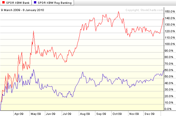
In 2010 I have a bunch of indicators I will be looking at in order to get a sense of how the economy and the stock market are performing. One of the ones I am choosing to profile in this week’s chart of the week is the relative performance of regional banks (KRE) to the broader banking sector (KBE).

The rationale is fairly simple. While the money center banks have benefited disproportionately from various crisis-related government programs and policies over the course of the past year or so, for the most part regional banks have been left to their own devices. The investment hypothesis is that ultimately the fate of regional banks will be a better barometer of the breadth of the economic recovery, the health of the commercial real estate market and the ability of small businesses and local economies to regenerate and grow.

The chart below shows that from the March lows through early October, regional banks were lagging the banking sector significantly, but in the last two months or so, regional banks have rallied impressively relative to a sluggish banking sector and are currently much closer to their 52 week highs than the broader banking index. Regional banks still face considerable obstacles, but their performance relative to money center banks and the broader banking sector should continue to provide an accurate picture of the health of local economies across the country – and one that is less likely to be distorted by policies and legislation coming out of Washington.

For more on related subjects, readers are encouraged to check out:

[source: StockCharts]

Disclosure: Long KBE at time of writing

Sunday, November 15, 2009

Chart of the Week: Four Key Sectors Struggle

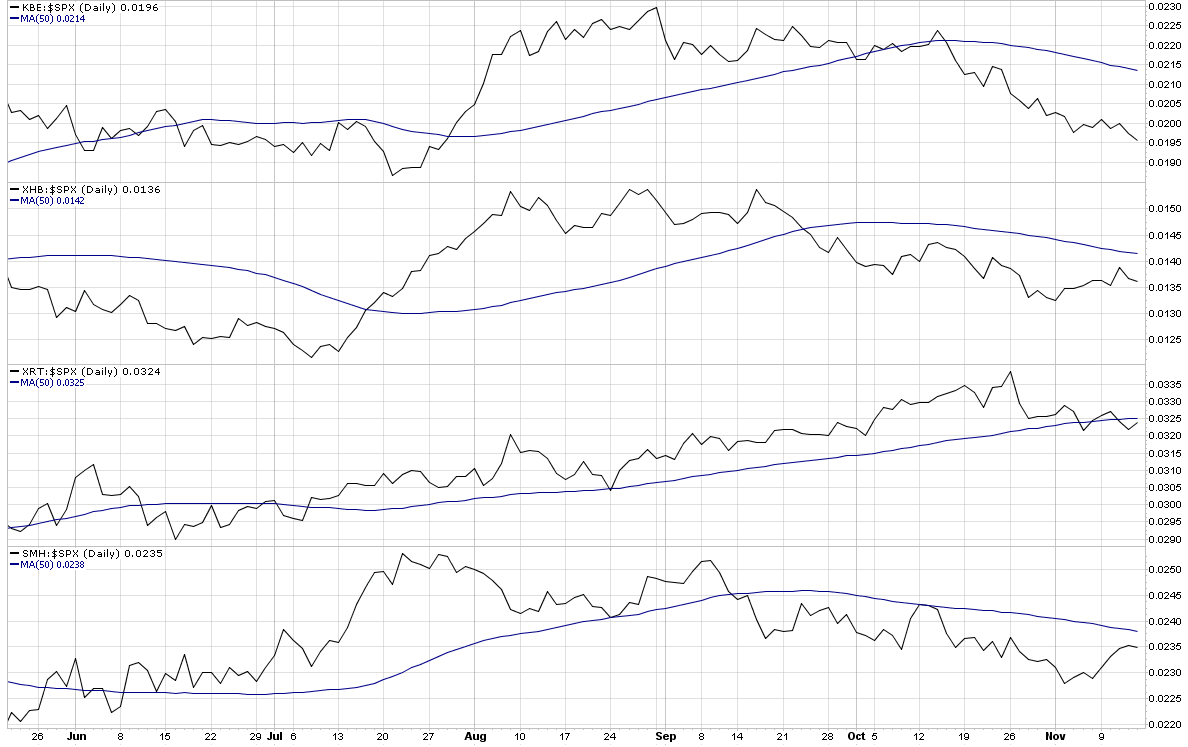
While I still have at least one and a half feet placed firmly in the bull camp, I am increasingly concerned with a number of signs from some key technical indicators. Near the top of my list of concerns is market breadth, as measured by the McClellan Summation Index and other similar market breadth indicators. The bottom line is that if the indices continue to advance on the strength of a narrow base of rising stocks while the majority of issues move sideways or decline, then the rally will have trouble sustaining itself.

During the last few weeks, several key sectors have been underperforming the S&P 500 index, notably banks (KBE); homebuilders (XHB); retailers (XRT); and semiconductors (SMH). This week’s chart of the week shows the performance of the four sectors relative to the S&P 500 index over the course of the last six months. In all four instances, these critical sectors are below the 50 day average of their ratio to the SPX and in the case of the banks, the relative performance gap is increasing almost on a daily basis.

Going forward, I would expect that the major market indices such as the SPX will have difficulty making new highs if all four of these sectors continue to underperform on a relative basis. For this reason, I will keep an eye generally on market breadth and specifically on these four key sectors.

For additional posts on related subjects, readers are encouraged to check out:

[source: StockCharts]

Monday, October 12, 2009

Implied Volatility Flat Ahead of Bank Earnings

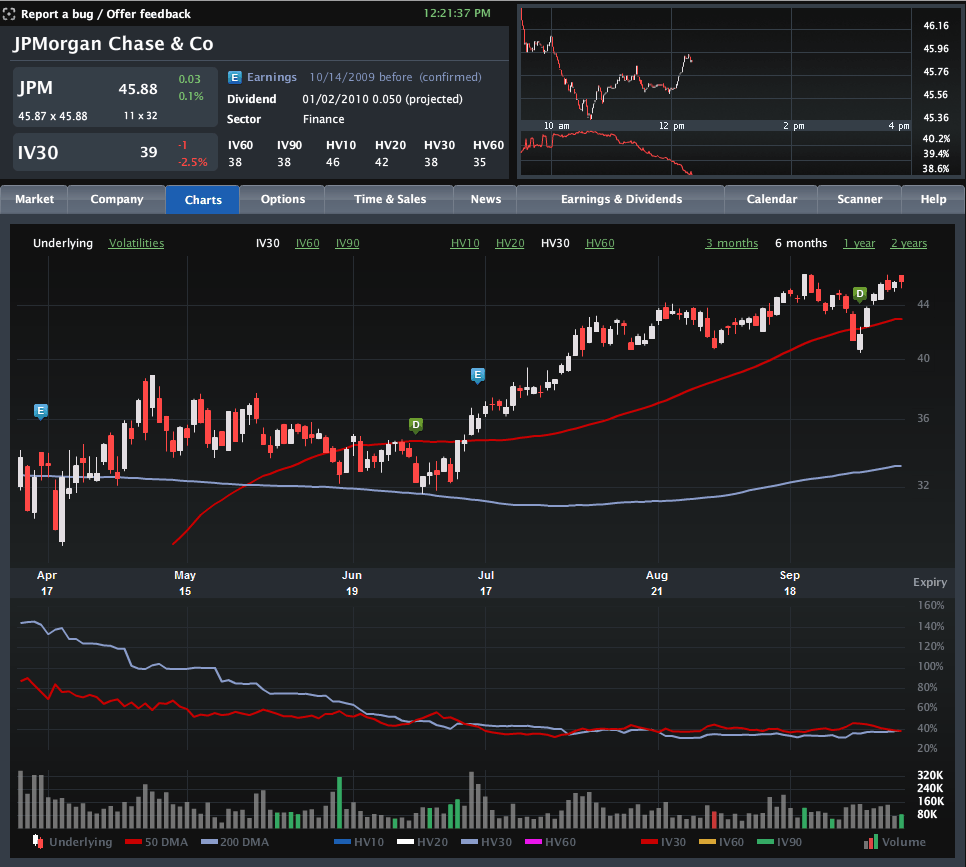
With some very important earnings in the financial sector coming up this week (JPM on Wednesday; C and GS on Thursday; BAC and GE on Friday), I have been watching implied volatility (IV) in the sector very closely. Much to my surprise, implied volatility has not increased ahead of earnings, as is typically the case.

The chart below, courtesy of Livevol, shows six months of price and volatility activity in JPMorgan Chase (JPM), with the upper portion chart highlighting the last two earnings releases with the blue “E” icon. The bottom half of the chart plots 30-day implied volatility (red line) against 30-day historical volatility (light blue line) during the same period.

Note that just prior to the last two earnings reports, implied volatility rose due to the uncertainty and potential for higher volatility associated with an earnings surprise. This time around, however, the lack of movement in implied volatility – as well as the proximity of the IV level to historical volatility – suggests that investors are not expecting any surprises at all. In fact, this situation is not specific to JPMorgan, but is also mirrored at Citigroup, Bank of America, Goldman Sachs and even quasi-financial General Electric. Not surprisingly, the bank ETFs, such as KBE, and the financial sector ETF, XLF, show a similar pattern.

No matter how the current earnings season unfolds, it is difficult to imagine that there will not be any surprises. Investors who think implied volatility is underestimating the surprise potential for the banks may look to initiate long straddles or long strangles to take advantage of a potential increase in implied volatility – and hence options prices.

For some related posts on implied volatility in financials, readers are encouraged to check out:

[source: Livevol Pro]

Wednesday, August 5, 2009

Money Center Banks Surge as Regional Banks Lag

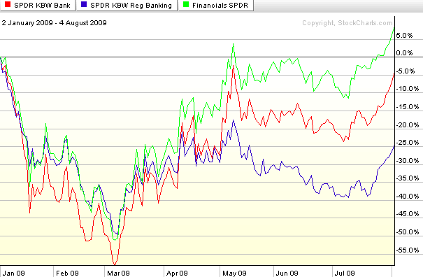
While the S&P 500 index is down about 0.8% as I type this, banks are faring considerably better than the index today, continuing a recent trend. Buying interest across the bank universe is splintered, however, with strong demand for money center banks and less interest in regional banks.

The chart below compares the performance of two popular banking ETFs, KBE, which is based on a broad-based bank index, and KRE, which is based on a regional banking index. The contrast is stark. Not only is KBE up 2.2% today while KRE is down a fractional amount, but this has been a recurring theme since the end of April, when regional banks became a laggard. Note that both banking ETFs have trailed the performance of the full financial sector, as represented by seemingly ubiquitous XLF.

During the last two days, sellers have been unable to put a dent in either real estate or financials. Until this pattern reverses, stocks are not going to be able to correct.

[source: StockCharts]

Monday, June 8, 2009

Banks, Large Cap Tech and Leadership

One month ago today in The Banks vs. Technology, I mentioned the divergence between technology and financials and noted, “so far the financials (XLF) have done a better job of leading the market up than technology stocks (XLK) have done of inspiring the bears.”

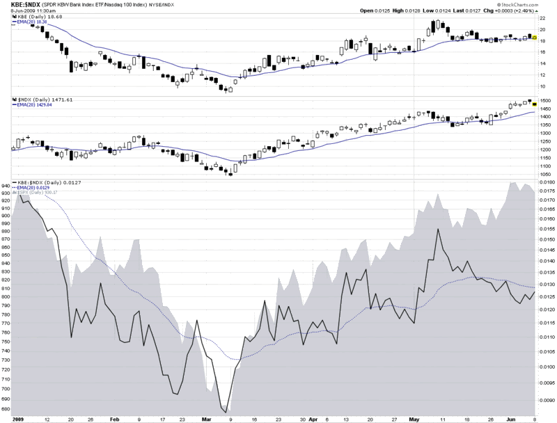
Fast forward one month and the divergence has turned upside down. In the chart below, I focus on financials in the form of the KBE banking ETF and large cap technology as exemplified by the NASDAQ-100 or NDX.

As it turns out, May 8th, the day of the original post, was the top in the banking ETF. Since that date, banks have slowly trended lower (top graphic), even while large cap technology (middle graphic) and the S&P 500 index (gray area chart at bottom) have been making new highs. The change in leadership is perhaps best illustrated by the solid black line in the bottom portion of the chart, which tracks a ratio of KBE to the NDX. In March, April and the early part of May, the ratio quite accurately mirrored the movement in the SPX.

During the course of the past four weeks, however, leadership flipped from banks to large cap technology and the ratio began to decline – all while the SPX continued to make new highs.

I find it particularly interesting that it is not just the relative performance of banks that has declined, but it is also becoming increasingly common for banks and technology to move in different directions on the same day. This has been the case today and has been true for five of the past six days.

I am not surprised to see leadership being passed from financials to large cap technology, but as I said a month ago, I do not expect the market to make any significant additional gains unless the two sectors are able to move up in unison.

[source: StockCharts]

Monday, March 30, 2009

Recent Financial Sector Component Performance

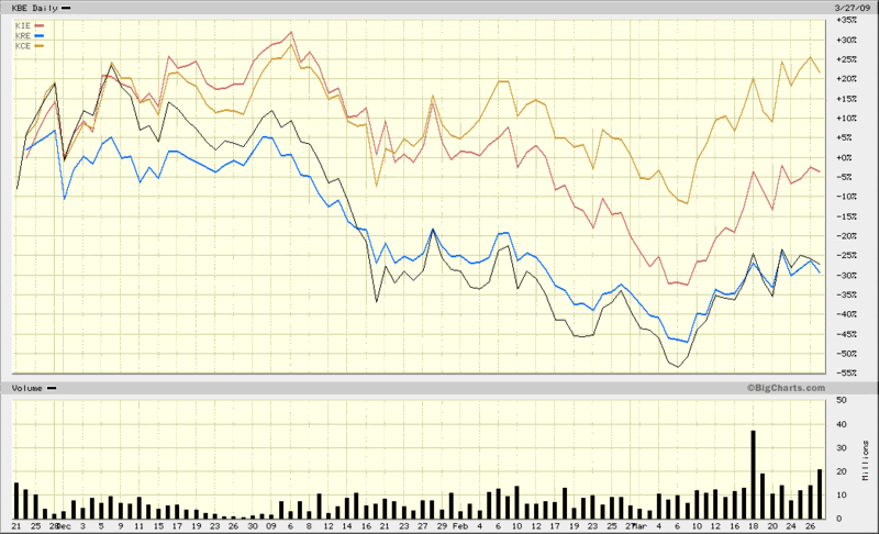
Back in early December, in Breaking Down the Financial Sector Post-Lehman, I contrasted the broad-based KBW Bank Index ETF (KBE) with several other KBW financial sector ETFs, notably KRE (KBW regional banking index), KCE (KBW capital markets index) and KIE (KBW insurance index.) At that time, the regional banking index was holding up better than its siblings, but had begun to show some weakness.

Fast forward almost four months and in the chart below I contrast the performance of the same quartet of ETFs since the November 21st bottom (SPX 741), when things probably looked darkest for the financial sector.

Notice that now the capital markets group (with top holdings of GS, MS, CME, SCHW and STT) is sporting gains of over 20% since this period, while insurance stocks are almost back to breaking even and both banking ETFs, the regional and money center variants, have been bring up the rear, moving almost in lockstep as of late and showing losses in excess of 25% for the period in question. All four groups have bounced impressively off of the March lows, but once again, it is the capital markets group that has showed the most strength, with State Street (STT) leading the way.

[source: BigCharts]

Thursday, February 19, 2009

VIX Sluggish as Market Probes Lows

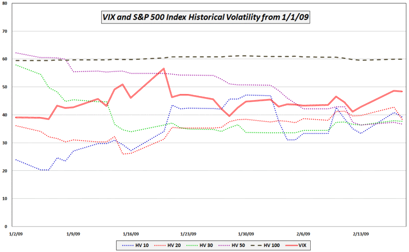
A reader asked why the VIX was down almost 5% with the SPX basically flat.

In addition the possibility of statistical white noise, there are several factors which may be affecting today’s VIX readings relative to the SPX. In no particular order, they include:

  • Much of the news cycle uncertainty is gone (earnings season is essentially over, Geithner made his speech about TARP 2.0, the FOMC minutes are out, almost all of the key economic data for February has been released, etc.)

  • Most of the recent volatility has been in the banks (KBE) and banks are an increasingly smaller portion of the S&P 500 index (two years ago financials (XLF) were 22% of the SPX, now they are only 10%)

  • VIX futures indicate expectations are for a VIX in the low 40s during the second half of the year

  • Low volatility leading into options expiration – while the SPX was down 4.6% on Tuesday, in four of the past five days the daily closing change has been no more than +/-1%

  • The VIX is significantly higher than the 10, 20, 30 and 50 day historical volatility in the SPX – all of which is currently under 40 (see below)

[source: VIXandMore]

Friday, December 5, 2008

Breaking Down the Financial Sector Post-Lehman

For most of 2008, the three sectors I have been watching most closely to gauge the health of the economy are financials (XLF), homebuilders (XHB), and consumer discretionary stocks (XLY). I have even referred to these sectors as my ‘indicator species’ sectors, as I am of the opinion that unless all three of these sectors are healthy, the health of the broader economy cannot be assured.

In the past two weeks, relative strength all three of the above sectors has helped the broader market indices put in what is no less than a provisional bottom. Financials have been the most consistently strong sector, with the XLF financial ETF now 35% above its November 21st low.

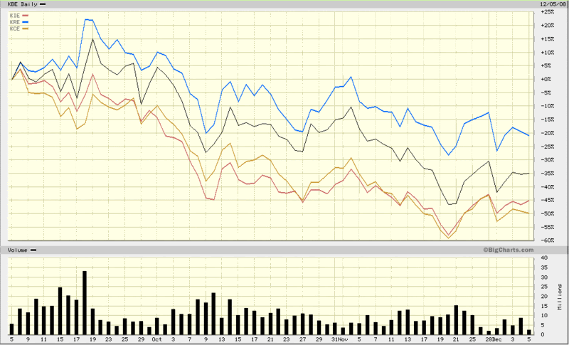
In the chart below, I have attempted to break out the relative performance of various financial sectors over the past three months, using four ETF from the financial sector specialist Keefe, Bruyette & Woods (KBW). The chart dates back to September 5th, ten days before the Lehman Brothers bankruptcy. The baseline ETF (black line) is KBE, which tracks the KBW bank index. The top performer among the other three ETFs is KRE, the KBW regional banking index. The two laggards are KIE (KBW insurance index) and bottom-dweller KCE (KBW capital markets index.)

In relative terms, insurance and capital markets seem to have enjoyed the more impressive bounce off of the November low. Regional banks, which actually showed small gains in September, have been acting more sluggish as of late. More dominoes are certain to topple as the ripple of the financial crisis continues to broaden its reach, but the recent relative strength in insurers and investment banks bodes well for the financial sector, which just might provide leadership when the next bull leg commences.

[source: BigCharts]

DISCLAIMER: "VIX®" is a trademark of Chicago Board Options Exchange, Incorporated. Chicago Board Options Exchange, Incorporated is not affiliated with this website or this website's owner's or operators. CBOE assumes no responsibility for the accuracy or completeness or any other aspect of any content posted on this website by its operator or any third party. All content on this site is provided for informational and entertainment purposes only and is not intended as advice to buy or sell any securities. Stocks are difficult to trade; options are even harder. When it comes to VIX derivatives, don't fall into the trap of thinking that just because you can ride a horse, you can ride an alligator. Please do your own homework and accept full responsibility for any investment decisions you make. No content on this site can be used for commercial purposes without the prior written permission of the author. Copyright © 2007-2023 Bill Luby. All rights reserved.
 
Web Analytics