Relative Movements of the SPX and VIX


Posted by
Bill Luby
at
10:56 AM
2
comments
![]()
Labels: SPX:VIX
Not so much recommendations as strategies to think about. I guarantee pricing on these and other strategies will change a great deal during the day, but looking at yesterday’s close and not taking into consideration this morning’s futures:
Note that the suggested action targets March because reversion to the mean is a much better bet for the next 10-20 trading days than for April and beyond.
This presumes you have read my caveats from earlier. If you haven’t, I highly recommend that you do. If the caveats haven’t sufficiently dampened your enthusiasm for VIX options, then before making any trades I suggest you think about how Brian Overby at TradeKing compares VIX options to predicting the weather four months in advance based on current weather patterns.
Good trading!
Posted by
Bill Luby
at
6:19 AM
0
comments
![]()
Labels: February 27, mean reversion, VIX options
It looks like I am going to opt for some sleep over a long night of research, but before I head off to bed, I thought I would offer up some VIX-related bullet points for you to keep in mind as you watch trading unfold tomorrow and beyond:
Posted by
Bill Luby
at
11:59 PM
6
comments
![]()
Labels: February 27, implied volatility, mean reversion, VIX futures, VIX options, VIX spikes
I mentioned datawink once previously as a chart pattern recognition engine that looks at current chart patterns, finds similar patterns from the past, and uses past outcomes from those similar charts to generate a range of likely future outcomes from the current situation.
By some stroke of luck, datawink just added ^VIX to their database and concludes that based on those historical patterns, there is a 69% probability that the VIX will be below the current price level one month from now. Even more interesting, however, is the list of similar charts from the past and the list of associated outcomes you get when you toggle the mode function from Similarity to Predictability. Try it. I guarantee you will have fun with this site.
Posted by
Bill Luby
at
10:49 PM
0
comments
![]()
Labels: chart pattern recognition, datawink
As we all know, the markets have a talent for making big U-turns at the most inconvenient times. For some, this means a 4% sell off just when you decided to margin some high flying internet stocks. For me, this means having a birthday and attempting a birthday celebration on the day when the subject of your blog makes an unprecedented 64% move. Yesterday someone asked me what I wanted for my birthday and I almost blurted out “A 20% spike in the VIX, of course,” but I bit my tongue and said something much less memorable. There’s a lesson in there somewhere.
Oh well, I guess it could have been worse. I could have been the guy who bought 63,000 April 11 VIX puts. Heck, here in
Back to the real world…I’ve been away from my computer for the nine hours or so since the markets have closed. I will do my best in the next hour or two to make some sense out of the debris left behind from today's seismic shock and post some thoughts here later. In the interim, readers looking to get a sense of my thought process might want to check out some of the following archived but relevant posts (as an aside, I too am not a fan of bands that make a live album or greatest hits collection after only one record or two, but that won’t stop me from doing essentially the same thing):
Posted by
Bill Luby
at
10:20 PM
1 comments
![]()
Labels: greatest hits
Percentage-wise, this is uncharted territory, in case anyone is wondering.
I'm buying VIX puts...
Posted by
Bill Luby
at
11:52 AM
7
comments
![]()
Labels: VIX puts
Nobody has asked yet, but I might as well save those who are contemplating the question a few keystrokes.
Since the VIX was officially rolled out in 1993, there have been only 4 days in which it spiked up 30% or more. Turn the clock back to 1990 and you find a total of 8 days.
For those who might be interested, the mean reversion expectations following a +30% move are very similar to that of +20% days, which I weighed in on this morning. The data sample size is small enough to not be statistically significant, but still, in the 3, 5 and 10 days following the VIX spikes, 6/8, 7/8 and 5/8 of the VIX moves had reversed. The mean retracements were 9% and 11% over the 3 and 5 day period, but 10 days out, the mean move had continued upward 4%, owing largely to the strength of one subsequent 52% spike in the VIX.
The VIX has not made a 40% move to the up side since February 2, 1994, when the Fed’s decision to raise interest rates sent shock waves through the markets.
Posted by
Bill Luby
at
11:26 AM
1 comments
![]()
Labels: 1994, 30%, mean reversion, VIX spikes
Kudos to David Merkel at The Aleph Blog for pointing out that with the VIX up 21% and the SPX down 1.5%, the ratio of the two moves is -14, well above the typical -8 to -10 range.
This obviously supports the thinking that today’s moves are out of proportion to the fundamental events that are driving them and should serve as a reminder that the current environment is in no way as dire as some of the past crises that have caused the VIX to spike 20%. In fact, the magnitude of today’s move may be as much a result of the coiled spring effect (number of days without a 2% correction, etc.) or the volume of the recent bear drumbeat as any fundamental changes in the Chinese economy, geopolitical issues, US durable goods and the like.
Posted by
Bill Luby
at
10:02 AM
3
comments
![]()
There have been 20 VIX spikes of 20% or more in one day since 1990. Today makes 21, with the VIX currently up 21% on the day at 13.52.
Looking at that group of 20 VIX spikes, you can see the footprint of 9/11, the dot com bubble bursting, the Asian financial crisis and similar difficult periods. It is worth pointing out that in 17 of those 20 instances, the VIX was lower 3 days later, 5 days later and 10 days later (interestingly enough, it was a different grouping of VIX spikes that defied the trend in each time period.)
If history is any guide, the VIX should subside about 10% over the course of the next three days and another 2% or so by a week from now. This is the mean reversion tendency of the VIX at work.
While the SPX is ‘only’ down 1.5% at the moment, it is also worth recalling previous research posted here that when the SPX drops 3%, the VIX’s mean reversion tendency over the next five trading days paints a telling picture.
Posted by
Bill Luby
at
9:32 AM
1 comments
![]()
Labels: 20%, mean reversion, VIX spikes
Some things to consider while you watch the red on your screen and contemplate what your next move should be:
In thinking what to expect for the magnitude and duration of the VIX move (and corresponding moves in the broader markets in the other direction) see an earlier post “What to Expect from a VIX Spike.” My comments were not specific to last month, but more to the general case and are still valid in the current market environment. Since the VIX had already moved up 10% over the course of the past two days, we should know a fair amount about the resilience of the current move by early next week.
If the past three months have been “The Shape of Capitulation in the VIX,” then seeing the VIX trade above 13 should change the emotional landscape dramatically.
In other words, even if this VIX spike subsides and the market correction reverses itself, the environment will be different going forward. This is exactly “What My Dog Can Tell Us About Volatility.”
Finally, I was not putting much credence in the observation made by quite a few commentators that the markets could not continue their strong bull move unless the VIX dropped below 10. I still do not believe this is the case, but the recent action may harden the beliefs of those who think that 10 is some kind of a magic number in the VIX.
Posted by
Bill Luby
at
7:47 AM
2
comments
![]()
Labels: VIX spikes
 About a month ago, I remarked on some comments from Doug Kass about how the markets looked a lot like 1994, which was a decidedly down year for equities. Now Bernie Schaeffer tells us that the WABAC machine (not to be confused with the highly entertaining internet archives ‘wayback machine’) should actually be set to 1995, not 1994.
The difference, of course, is substantial. In 1995, we saw the beginning of a glorious bull run that lasted through until early 2000. Those who loaded up on long positions in 1994 probably had a substantial hole to dig out of before they could enjoy the fruits of the 1995 bull – if they didn’t give up entirely in the interim.
In “Market Parallels with 1995,” Schaeffer makes the case for parallels with the beginning of the 1995 bull as follows:
“Joseph Keating, chief investment strategist at First American Asset Management, recently pointed out in an article that the SPX's price-to-earnings (P/E) ratio fell to 17 as of the third quarter of 2006 - lowest since mid-1995. Meanwhile, the SPX has now gone 221 days without a two-percent correction. This compares to the 223-day streak experienced in 1995.
Furthermore, we find the market in another in a low-volatility environment, as the CBOE Market Volatility Index (VXO) currently hovers around levels similar to those we saw in 1995. “
Personally, I think it looks more like 2017 than anything else. If forced to choose to match my outlook with one year over the other, I’d pick 1994 over 1995, but what do I know, I’m just living in my own little VIX-centric universe…
Posted by
Bill Luby
at
9:48 AM
0
comments
![]()
Labels: 1994, 1995, 2% correction, Schaeffer, WABAC, wayback machine
Last week I introduced Portfolio A1, a live mechanical portfolio that I developed and am maintaining at Portfolio123.com.
For those that may be interested in watching the progress of this portfolio in the coming weeks and beyond, it is only appropriate that I talk a little about two predecessor portfolios that I modeled this portfolio after, as I believe the two ancestral relations may provide some clues about the offspring I am babysitting.
The first predecessor portfolio went live on 12/31/04 and uses a very similar stock ranking system and buying setups as Portfolio A1; the largest difference is in the selling rules, which are less restrictive in this portfolio than comparted to Portfolio A1. In the intervening 26 months, this portfolio has returned 94.63% vs. 19.74% in the S&P500. It has also had a maximum drawdown of 20.61% from peak levels during this period. One statistic that is important to note is that the annual turnover in this portfolio is 802%; in other words, the typical stock in this portfolio turns over 9 times ever year or once every 5.8 weeks.
The second predecessor portfolio, which only went live on 8/11/06, is almost identical to the first portfolio in terms of a stock ranking system, but has a slightly tighter set of buying and selling rules -- much more in keeping with Portfolio A1. In its 6 ½ month life span, this portfolio has returned 58.37% vs. 14.58% in the S&P500, with a maximum drawdown of only 7.60%. Because of the tighter buying and selling criteria, this portfolio has posted an annual turnover of 3098% to date, meaning that the typical stock has an average holding period of only 1.6 weeks.
This would be a good place to keep in mind the typical past performance caveats, but I think it is most important to acknowledge that Portfolio A1 is more likely to have annual turnover in the 3000% range, which means substantial transaction costs. As a result, I have dispensed with the $10 commissions for the predecessor portfolios and am using $5 commissions, comparable to those that are available from TradeKing.com (which happens to also have an excellent blog, for those who are interested.)
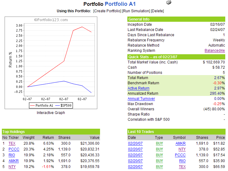
As luck would have it, Portfolio A1 has no buying or selling transactions this week, as the graph below indicates. Though it is not particularly meaningful at this early date, it is interesting to note that while the S&P500 has been down a small amount since the portfolio went live, Portfolio A1 is already up 2.67% to date and has a 3% cushion on the benchmark. Starting next week, I will provide some commentary on the holdings and on any transactions that may be triggered.
Posted by
Bill Luby
at
10:22 PM
0
comments
![]()
Labels: Portfolio A1, Portfolio123
Last week I introduced the VIX Weekly Sentiment Indicator (VWSI) as a gauge of likely VIX activity over the coming 1-4 weeks. Following my initial post on this subject, several readers asked for additional details about the inputs into the VWSI and how the VWSI readings are calculated. This seems like a good time to set some expectations.
First, my intent is to update the VWSI each weekend with some pithy remarks about some reasons for the current reading as well as thoughts around how one might employ various VIX option strategies when the readings reach extreme levels. I would consider ‘extreme’ readings to be >+5 or <-5, but believe that readings in the +3 to +5 and -3 to -5 ranges to be such that they can be also be traded profitably. When we see readings of this magnitude, I will go into more detail.
As far as the calculations are concerned, I have no intention of publishing the exact formula, but suffice it to say that the most heavily weighted inputs are several simple moving averages. Typically, if you see readings of >+3 or <-3, it is usually a function of extreme divergences between the current price and the SMAs – and with it an expectation that the VIX will move back in the direction of the SMA reading over the course of the next 5-10 days. I actually provided considerable detail about this last week.
I should also note that I have wrestled with the idea of how much the content in this blog should be presented as an informational resource and how much, if any, it should be geared toward specific trading strategies and setups. My strong preference is for an informational approach; while I may discuss trading approaches or even specific positions I may be taking in the VIX or in other securities, this will definitely be the exception rather than the rule. I am primarily a discretionary trader and do not have any desire to disclose the rationale for my entries and exits, except on an occasional basis, generally to illustrate a point.
Those interested in an example of one of the mechanical systems I use for trading are encouraged to look at my Portfolio123 live portfolio, which I will update every Sunday.
Finally, to address the title in this post: the VWSI temperature gauge reading for the week ending 2/23/07 is 0, down from the +1 level of the previous week. While some averages (e.g., the 20, 50 and 100 day SMAs) are at all-time lows on an absolute basis, the relative numbers keep the VWSI in the middle of the neutral zone at the present time.
 (Note that in the above temperature gauge, the "bullish" and "bearish" labels apply to the VIX, not to the broader markets, which are usually negatively correlated with the VIX.)
Posted by
Bill Luby
at
8:56 PM
0
comments
![]()
Labels: Informational resource, trading approaches, VIX Weekly Sentiment Indicator, VWSI
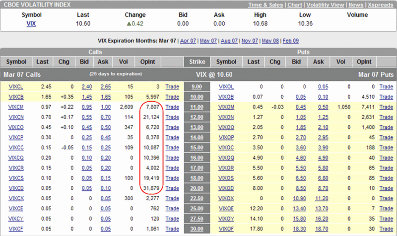
Jim Kingsland of The Kingsland Report claims he’s on vacation, but he continues to ponder the significance of the large open interest March VIX calls all the way up to the 20 strike.
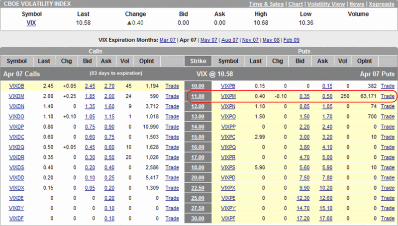
From looking at the open interest patterns out through February 2009, I can only find one other area where it looks like a snake swallowed a cow: the open interest of 63,171 in April 11 puts. My (highly inexpert) guess is that someone has taken a significant long position in April 11 puts and hedged some of this in March with long calls across the 15-20 strike range. If this is the case, it is an interesting way to play the current volatility environment and suggests that a lot of money is going on the fat tails and betting against the type of orderly rise in volatility that would be associated with a mild correction in the SPX.
Posted by
Bill Luby
at
9:07 AM
58
comments
![]()
So here I am patting myself on the back about how Dali’s “The Persistence of Memory” is the perfect accompaniment to my nearly finished post on ever shrinking VIX numbers and the warping of our collective sense of time decay…when I decide to visit one of my favorite options blogs. I pause for a second, then do a double take. Oops, that must be my draft post I pulled up by mistake. No, it turns out I am having a surrealist moment of my own. Dali’s melting clocks appeared on the other blog just minutes before they were scheduled to appear on mine.
It felt almost like the CFO of my largest long position had just resigned abruptly, so I have decided to go in another direction today. Make that another continent…
So, today I am introducing the VDAX! Actually, like the VIX and the old VXO, the Deutsche Börse has a new VDAX (aka VDAX-NEW) and an old VDAX. The biggest distinction between the two is that VDAX-NEW is calculated from the implied volatility in the DAX (German counterpart to the DJIA) options looking out 30 days while the original VDAX looks ahead 45 days.
We will discuss the VDAX and other international volatility indices in greater depth at a later date, but for today I want to pose and address two questions:
In order to answer these questions, I have relied on data for the original VDAX only because I have a better data set. The VDAX and the VDAX-NEW are very highly correlated; in the two graphs below I used data for the original VDAX:
Note the strong correlation between the weekly VDAX and the weekly VIX. In the second chart, the red dotted line and solid ‘best fit’ line for that data series represent the difference between the VDAX and the VIX as a percentage of the VDAX. This difference between the VDAX and the VIX shows that at least over the past year or so, volatility has been dissipating in US markets faster than in the German markets.
As is the case for most comparisons of the
So, from the same continent that brought you Salvador Dali, we have the VDAX – and we also have a date with Dali to discuss volatility in the not too distant future. In the meantime, I will leave you with one of his quotes:
“Have no fear of perfection - you'll never reach it.” ~
Posted by
Bill Luby
at
10:47 AM
150
comments
![]()
The VIX is a strange animal; and since I just started playing zoologist in this space, I don’t have answers to many of the very basic questions about this beast. Not the least of these questions is whether a chartist approach to the VIX is a valid one. I use charts for everything else, but I have yet to develop a set of charts that I feel has much in the way of predictive value for the volatility indices. I will not, however, let that small detail stop me…
In watching the VIX charts, I have been particularly curious about the mid-December lows and the spike in implied volatility to over 160 that soon followed. As the graphic below shows, when the VIX has dropped and spiked IV, the successive IV spikes have been weaker and weaker.
In fact, both the VIX and the VIX IV seem to have succumbed to some invisible down sloping ceiling over the past two months. If this is true, then the chart wants us to believe that the VIX won’t be going up and it won’t be going down either. For all practical purposes, volatility looks ready to settle in the 10-11 range and it is time for me to change the name of this blog. Of course, at least one VIX watcher was saying essentially the same thing three years ago.
 My take is that what we are seeing is likely the shape of capitulation in the VIX. Of course, the VIX is not just a contrary indicator, it is a contrary animal, so much so that capitulation in this case does not print wild swings and large volumes like it does in so many other indicators. No, the capitulation in the VIX is like a glassy pond where this wind has ceased to blow. For now, at least. I wouldn’t furl those sails just yet.
Posted by
Bill Luby
at
9:19 AM
0
comments
![]()
Labels: capitulation, implied volatility, The Coming Storm, Winslow Homer
After giving it fairly prominent play over the past few months at Technically Speaking, Ron Sen asks whether the SPX:VIX ratio chart works effectively as a risk metric.
Many people seem to be giving up on the VIX lately, but the SPX:VIX ratio is a special case. Part of the problem with this ratio is that it compares one trending number with another one that oscillates. Using Ibbotson data as a guide, we can assume -- over the long term at least -- that the SPX should return about 10% per year, while the VIX should oscillate around a stable mean. Interestingly, if you add a 10% trend line to the SPX:VIX ratio chart going back to 1991 in order to compensate for this, you will discover that 15 ½ years later, the trend line almost perfectly bisects the current Bollinger bands.
If you study the chart for a little longer, some interesting conclusions emerge:
I think the SPX:VIX ratio is indeed a useful risk metric, but I recommend using it in a manner that compensates for the long-term bullish bias in stocks and/or that focuses largely on the relative peaks and valleys.
At the moment, I think the SPX:VIX ratio is flashing a mild warning sign, but ultimately where you come down on the ratio is probably more dependent upon what you think about reasons for the historically low VIX than the historically high SPX.
Posted by
Bill Luby
at
11:55 AM
123
comments
![]()
Labels: Asian financial crisis, SPX:VIX
If he keeps it up, Bernie Schaeffer is in danger of garnering honorary VIX pundit status, due to his tendency to talk about the VIX almost as much as Adam Warner and I do. Today, Schaeffer discusses the monthly VIX cycle and ties it in with the recent low VIX readings as follows:
“…the relatively low VIX could entice a number of options players to snatch up put options when trading starts today in an effort to lock in some ‘cheap’ protection. This would put downside pressure on the market.
As we have seen in the past, while expiration week tends to be strong for the market, the week following option expiration is often marred by a pullback in the major indices. Frequently, traders will jump back into put positions now that their previous positions have expired. This swelling in bearish bets is accompanied by hedging among the traders who take the other side of that trade and sell the puts, another factor that creates downside pressure.
Turning to a chart of the VIX, I found that over the past year, VIX peaks have been in the first half of the month, with the very notable exception of May 2006 and also November 2006 (July 2006 is on the bubble).
Another way of framing this could be that in the post-expiration period each month (always in the second half), market performance is ‘challenged’ by the fact low VIX periods attract put buyers and stock sellers. A better explanation might be that the rise in the VIX from the second half of a typical month into a peak in the first half of the next month is the result of the accumulation of index puts in the new front month, with the VIX peaking (and selling pressure lifting) once all the put demand is satisfied.”
I made a similar observation on VIX price movements during the options expiration cycle, which was also supported by an examination of VIX prices during the quarterly earnings cycle.
Could cheap portfolio insurance and the options expiration cycle be part of a vicious circle for the VIX? If so, what happens when portfolio insurance gets more expensive and this circle is broken?
I will kick this one around a little and update my thinking here as it evolves.
Posted by
Bill Luby
at
7:51 AM
0
comments
![]()
Labels: monthly cycle, options expiration, quarterly cycle, Schaeffer
Mike at HEDGEFolios.com is one of many out there who are wondering whether the VIX has outlived its usefulness, as the recent spate of single digit readings have sent many back to look for a better indicator. His suggestion: why not look at the volatility associated with the 10 Year Treasury Note instead of stocks?
Never one to let any untested idea stray too far from a spreadsheet, I examined the volatility of the 10 Year Note from 1990-2006 and learned that 2006 was the least volatile on record, with 2007 off to an even less volatile start. The correlation between the VIX and the 10 Year Note was .24 for the 17 year period, but jumped to .43 for the past decade and an impressive .99 for the last three years, as the chart below (with normalized values) demonstrates.
The current volatility of the 10 Year Note is still a fair distance from the historical lows of the summer of 1998, but as the VIX edges ever lower it is always a good idea to keep at least one eye on the long bonds.
Posted by
Bill Luby
at
10:48 PM
1 comments
![]()
Labels: Treasury Note
Despite the “Your One Stop VIX-Centric View of the Universe…” tagline, I hope it will come as no surprise to anyone that I have an investing life outside of the VIX. Frankly, I am of the opinion that where the markets are concerned, it is important to utilize a broad-brush approach, if not a multidisciplinary perspective, as is advocated so eloquently by Michael Mauboussin of Legg Mason Capital Management.
Instead of jumping right in and philosophizing about some broader market subjects, I thought I would set up a real-time example and use that opportunity to shine a little light on Portfolio123. My relationship to Portfolio123 is this: after paying a lifetime membership to Silicon Investor in 1998, it wasn’t until 2004 that I ponied up another subscription fee, this time for Portfolio123.com. I have been a satisfied customer ever since. (For those who may be interested in kicking Portfolio123’s tires a little – and I recommend that you do – Harry Domash reviewed Portfolio123 in 2004 when it was still in beta and again later that year when some additional features and pricing had been rolled out. You can get a good current overview of P123 from their site and dive into the product tours if you want more comprehensive information. Also, Brian at Trade4Cash is one blogger who is already using P123 technology as the engine for some of his trading systems development and presentation.)
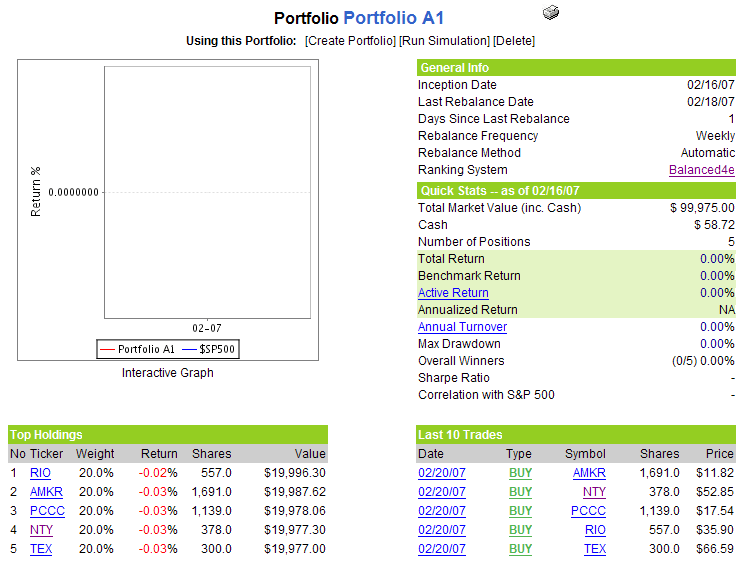
Today I am rolling out a live portfolio which I have just developed at P123 and will briefly update and also use as a thought starter of sorts each weekend. The stock selection portion of the portfolio shares some common ancestry with P123’s stalwart Balanced4 stock ranking system. I will provide additional details about the mechanics of this portfolio and system in subsequent weeks. For now, suffice it to say that this is a five stock portfolio that is rebalanced each weekend; the stocks selected below for initial purchases are required to be priced at $10.00 or more at the time of purchase, trade an average of 300,000 shares per day, and have a minimum market capitalization of $250 million.
Posted by
Bill Luby
at
10:21 PM
0
comments
![]()
Labels: Portfolio A1, Portfolio123

Posted by
Bill Luby
at
11:10 AM
7
comments
![]()
Labels: VIX Weekly Sentiment Indicator, VWSI, Williams %R
Martin Goldberg has a comprehensive review of the VIX on Financial Sense in which he uses a variety of charts to support his claim that the VIX looks like a coiled spring that is ready to jump. He argues that the markets will have difficulty going higher if the VIX does not continue lower, suggests that volatility is bottoming, and reminds us that “fear cannot go bankrupt.”
Brett Steenbarger at TraderFeed has an interesting look at absolute and relative option volatility, with links back to much of his previous VIX research. He also concludes that a market pullback is likely and bases this assessment on the current lows in both absolute and relative option volatility.
Ron Sen at Technically Speaking points to the high SPX/VIX ratio as a warning sign of “enhanced risk” in the markets.
Glenn at the Wednesday Update blog suggests buying VIX calls in the current environment.
Of course, this may just be more linking of arms and minds in that human wall of worry. So says Zen’s Market Insights, Mark Hulbert and many others.
Posted by
Bill Luby
at
7:19 AM
4
comments
![]()
The Lauriston Letter (which can be counted on not just for high quality market commentary, but also for an unmatched sense of complementary images) pointed out an interesting tidbit on Tuesday:
“How often do you see volatility indexes move from the upper Bollinger band to the lower Bollinger band in one day?”
The answer, of course, is almost never, but I decided to dredge my archives anyway in search of a reversal that best resembled the two day swing from above the upper band to below the lower band during February 12-14.
I tried to do for Excel what datawink does for charts and caught very few fish – 11 over the past 17 years and only two during that past decade – that resembled the Valentine’s Day swing. The combination of trying to locate CCI and %R reversals of such large proportions in just 48 hours proved too daunting of a hurdle to come up with anything close to an exact match.
Ironically, the two closest matches turned out to be the ones from the last decade: the three days ending on 11/3/04 and the three days ending on 7/11/05. So I pulled up a bunch of charts to see if the VIX or SPX did anything of interest in the days or weeks that followed these two dates and came up empty. If anything, the markets were considerably more quiet than usual in and around this period, and for the other nine VIX swing periods as well, which is consistent with observations made by Brett Steenbarger about the predictive ability of low volatility readings. Perhaps these were just two random trees felled in a distant forest.
Undaunted, I decided to check the archives of some of the blogs that have archives going back to 2004 and made a stop at Random Roger’s Big Picture. This is where it starts to get interesting…
On Sunday, 10/31/04, Random Roger was posting about how Barron’s was “fixated on how low the VIX is.” In fact, the VIX was at about 15 at the time and Roger was quick to point out that the then current 15-16 range was not low by historical standards. The very next day, the VIX started an unprecedented high to low swing, moving from 16.76 to 13.79 in two days.
Eight months later, on July 6, 2005, Roger dusted off his old post and repeated his point that the VIX was still low by historical standards. What happened next? Even more dramatic fireworks, as the VIX pulled a stunning high-low swing from 13.92 to 10.53 in two days, resulting in the largest CCI (20) reversal since the inception of the VIX and confounding even John Bollinger himself.
So those are the two precedents. Is it merely a coincidence that not-so-Random Roger happened to warn about the VIX not being particularly low just before the largest VIX swings to the downside ever seen? And where was Roger before the Valentine’s Day Massacre of 2007? I have seen nothing on his blog that could lay blame at his feet, but would the VIX really have the temerity to make a move of this magnitude without his public approval beforehand?
I will watch this story closely and bring you any further developments…
Posted by
Bill Luby
at
9:49 AM
3
comments
![]()
Labels: Bollinger bands, Brett Steenbarbger, datawink, lighter side, Random Roger
A number of theories have been kicked around recently to explain why the VIX is at historical lows.
Justin Lahart re-ignited this debate with his comments in the WSJ yesterday in which he offered the explanation that:
“The VIX and other measures of implied volatility are low, in part, because investors are selling put and call options — ’selling volatility’ in Wall Street parlance. That helps to drive option prices — and implied volatility — even lower.”
Bernie Schaeffer takes issue with Lahart’s analysis this morning in www.SchaeffersResearch.com, arguing against both the low VIX theory and the likelihood that selling volatility is the cause. Schaeffer cites the recent extremely tight trading range of the OEX as proof that the VIX can go much lower. He also maintains that a large majority of the option activity in question has been initiated by buyers, not sellers.
Striking a similar note, Adam at the Daily Options Report draws comparisons between the current VIX and the range-bound VIX of the early to mid-1990, suggesting that the 10-15 range may be the natural long-term range of the VIX.
As mentioned previously in this space, Jason Goepfert of www.sentimentrader.com has attempted to reconstruct the VIX going back all the way to 1900 and believes that the current VIX readings are not particularly low by the historical standards of the past century.
Finally, in my first entry in this blog, I proposed that the VIX had moved in four macro cycles in the 14 years since it first appeared, with a typical length of 3-5 years per cycle. According to my analysis, the current cycle of decreasing volatility began in April 2002, so the five years will be up in another two months or so.
I have no prediction for what will happen to volatility two months from now and beyond, but I will do my best to use this blog to present the various theories of why the VIX is low and refine my own thinking as I go along. In the meantime, I will continue to fade any large spikes and continue to work the bear call spread angle.
Posted by
Bill Luby
at
7:27 AM
13
comments
![]()
Labels: bear call spread, Goepfert, Lahart, Schaeffer, VIX macro cycles
Someone has to be wondering about this, even if I haven’t been asked yet.
Here is the reasonably concise answer:
In December 2006, I began wondering when we were going to have a correction from the July rally (I’m still wondering) and set about to look at a bunch of sentiment and other contrary indicators that might support my case. One that particularly caught my attention was the VIX, not just because of the obvious negative correlation to the SPX (see graph below), but also because options are actively traded in the VIX and could provide a more leveraged play than say the QID in a nasty downturn. I did some Googling and concluded that if there are any VIX ‘experts’ out there, they are certainly not a publicity-seeking bunch.
So I download the VIX price history data to Excel and started playing around with it. I posted some observations on an InvestorVillage forum and decided that a blog would be a much more convenient way to archive my thoughts.
That’s about it.
I find it ironic that I now have a VIX blog and am now thinking regularly about implied volatility issues, as I am not an “options guy” per se, having traded almost exclusively equities for the past 20 years, with the exception of an occasional outright purchase of a call or a put, and a rare covered call play. Only in the past month have I made my first foray into (bear call) spreads.
So that is why I call this a “learning laboratory of sorts.”
Initially, I thought I might tackle a wide variety of sentiment-related issues, but since Zen’s Market Insights, HeadlineCharts, and others do such a good job of covering the waterfront there, is not a high priority for me at this stage.
I will, however, experiment with the “and More” portion of this blog soon enough. Hell, espn has never figured out what to do with the “e” at the beginning of their name, so I am not worried about how long it takes me to sort it out.
Thanks to all who have contributed here in one way or another.
As always, comments and suggestions are welcome.
Posted by
Bill Luby
at
12:22 PM
11
comments
![]()
Labels: and More, contrary indicators, QID
It probably comes as no surprise to anyone who takes options seriously that the VIX is most likely to make a big move up or down on either Monday or Friday, but did you realize that the Friday moves are mostly up and the Monday moves are mostly down?
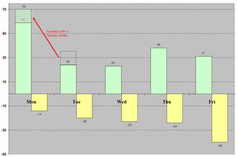 Today’s Excel cut and paste shows all the one day moves in the VIX of 10% or more since 1990. For starters, 61% of these have been up, while 39% have been to the down side. Monday sees by far the most VIX spikes up. If you add the 11 moves of 10% or more that happened on Tuesdays when the markets were closed for a Monday holiday (i.e., those indicated by the red arrow and dashed box), the pattern of a large plunge on the first trading day of the week becomes even more predominant, with 70 sessions of a 10% or greater VIX move up (shown in green) versus only 14 sessions with a 10% move down. On balance, Tuesdays and Wednesdays are relatively light in terms of large VIX moves to the upside, with activity picking up somewhat on Thursdays and Fridays.
Looking at 10% VIX moves down, the trend rides a slow and steady weekday crest, starting from a Monday low and moving up a little each day, with Friday the big winner in the spike down sweepstakes.
I am not yet ready to speculate on the causes of the Friday volatility drops and the Monday and post-holiday Tuesday VIX surges, other than to point out that even following 9/11, when the country appeared to hold its collective breath over the weekend, this pattern seemed to hold.
I will note that in the past couple of years, some of the patterns in the weekday trends may have weakened a little, but for the most part, they have held up in periods when the VIX has been at historically high levels as well as historically low levels.
There are many potential implications to be drawn from this data. Specific to the current rise in the level of the VIX, keep in mind that VIX spikes on a Tuesday or a Wednesday may have more significance than those that straddle the weekends.
For now I am bearish on the VIX and expect that the current VIX uptrend will run its course by Wednesday. If it does not, however, I would think that 15 and perhaps 20 are in play before the month is over.
Posted by
Bill Luby
at
10:03 PM
4
comments
![]()
So the VIX jumped 7% on Friday. Considering that the VIX also managed to set a new low for the 100 day SMA for the 34th consecutive day, it is a little early to declare the recent period of low volatility to be over. Still, Friday’s move warrants closer inspection.
Looking at how the VIX has bounced back from sub-10 closes, the current 11.10 reading is right in the lower middle of the range for where we “should be,” based on historical precedent 13 days removed from the 9.89 close on January 24th.
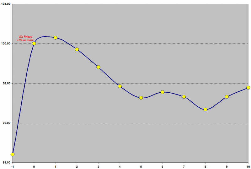 Is a 7% spike in the VIX unusual? Not really. It happens about once every two weeks, on average. Interestingly, a 7% jump occurs just 5.2% of the time on Fridays, but 10.2% of the time on any other day of the week. Monday sees the most volatility, a subject I will tackle in this space in the near future.
Getting back to the 7% rise on Fridays, as the adjacent composite graphic shows, there is typically a small (0.6%) follow-through on the day after the +7% Friday, with a gradual lessening of volatility over the course of the next 1 ½ weeks. The data for the high closes over the two weeks following these 45 Friday 7% spikes also supports the idea of the Friday spike and Monday follow-through as being the high point in this sequence is: fully 27% of the time, the Friday closed held up as the high close over the next two weeks; another 20% of the time, the Monday close turned out to be the high close during this period.
Going forward, keep in mind that many VIX spikes run out of steam 2-4 days after the initial move, so if Wednesday’s retails sales numbers or Bernanke's testimony does not put a scare into the markets and keep them on edge, the VIX spike will likely already have been trampled by the next bull leg.
For now I am slightly bearish on the VIX, with a close eye ready for the Tuesday-Wednesday action.
Posted by
Bill Luby
at
8:00 PM
0
comments
![]()
As I wait for volatility to return to the markets, I have an almost Waiting for Godot feeling about what lies ahead. At the moment, call me partly resigned and partly hopeful.
Fortunately, this is exactly where a bear call spread and call backspread can satisfy those two apparently conflicting views of volatility. You have to ask yourself two main questions before considering which strategy is the better fit for your view of the market:
· What do you think is the likelihood of a significant increase in volatility?
· If a volatility spike happens, how severe will it be?
If you are of the opinion that a volatility spike is unlikely and/or will not be severe, then you should harvest some of the implied volatility in the VIX with a bear call spread. This is a strategy that has been quite successful over the past 7 or so months, as Adam Warner at the Daily Options Report has pointed out on several occasions.
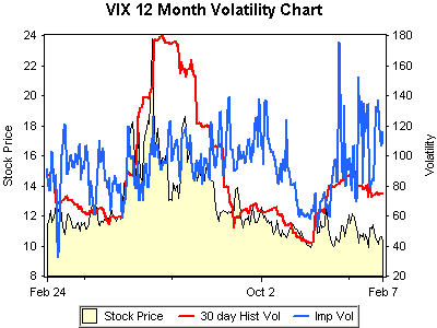 On the other hand, if you think Godot might eventually show up carrying a large volatility spike, you are willing to forego some of the premium to position yourself to cash in on that spike, then the call backspread is a better way to play the VIX. Of course, you can always buy the calls outright, but with VIX implied volatility currently at a very high level, you will have to paddle hard against the time decay current to make any progress.
For more information, optionsXpress (which generated the graphic on the left) has excellent discussions of the bear call spread and the call backspread. OptionPundit takes a deeper dive on both the bear call spread (aka vertical credit spread) and on call back spreads. These are both excellent resources for those whose options experience consists largely of buying calls and puts outright and selling covered calls – and who are open to more advanced options strategies.
Posted by
Bill Luby
at
9:06 AM
0
comments
![]()
Labels: bear call spread, call backspread, vertical credit spread
Tim Knight pays homage to Anna Nicole Smith by pointing out an inverse head and shoulders on the VIX. Of course, all the usual H&S pointers apply: keep your eye below the neckline, watch for the bounce, make sure there is enough support, etc.
Posted by
Bill Luby
at
7:35 AM
0
comments
![]()
Confirmation of bird flu at a
Is this why the VIX has now made 33 consecutive new lows for the 100 day SMA? Perhaps it is not so much complacency that has set in as mass desensitization.
Back to bird flu stocks. Their price movement has a strong fear component in them and as such, they are part of the VIX taxonomy of fear (which I will someday formalize as the VIXdex.) It should come as no surprise, then, that bird flu stocks have characteristics that are similar to that of the VIX. Specifically, they tend to spike up sharply, then subside over time, with patterns of 1 and 3-5 day spikes being relatively common. Some of this can be seen in the BCRX daily chart, where the Williams %R and CCI are showing that four days into the move up, we have a good shorting opportunity:

NVAX, AVII and GNBT are among my favorite of the pure play bird flu vaccine makers. If you have tested systems for trading the VIX, consider that the same tactics may work as well or better with bird flu stocks, with an opportunity to trade the underlying and with lower implied volatility for the options:
Posted by
Bill Luby
at
11:26 AM
1 comments
![]()
Labels: AVII, BCRX, bird flu, GNBT, NVAX, taxonomy of fear, VIXdex, Williams %R
Yesterday we examined the ungainly rainbow Hydra that comprise the nine bounces from a sub-10 VIX close over the past 17 years. Today our intent is to bring order from that chaos in the form of a composite view of those bounces, where the aggregate picture tells a more concise story than the individual ones: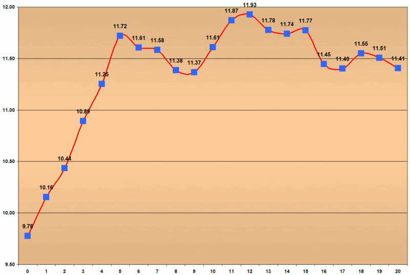
In brief, the composite picture is that of a five day ascent immediately following the sub-10 close, with some sideways meandering thereafter, an aggregate high 12 days out, and finally a slow return to lower levels.
Today’s close of 10.65 on day nine is the lowest day nine close to date. If the current pattern follows form, we will have a three day rise of a little more than half a point, followed by a gradual return to the current level over the next ten day period. As a reminder, it should be noted that the current ‘bounce’ has produced the lowest low for days 5-9 so far, with the distinct possibility that the day 3 peak of 11.46 will hold up as the high value for the 20 days following the sub-10 close.
Just to throw a monkey wrench into this thinking and get away from discussing a sub-10 close for a moment, today was the only the third time in the past 13 years that the VIX’s 20 day SMA made a new low. The last time this happened, on 11/22/06, the VIX jumped 15% in three days and 25% in 10 days. Prior to that, that last new 20 day SMA low was on 1/10/94, when the VIX moved up 13% in three days and 30% in 20 days.
Generally, I favor paying closer attention to the relative VIX values than the absolute values. I suspect the balance of the week will tell us which script to follow.
Posted by
Bill Luby
at
12:51 AM
3
comments
![]()
Several readers have asked about the significance of yet another sub-10 VIX close on 1/24/07. Many seem to be convinced that the markets have entered into an extended period of low volatility where a single digit VIX reading is no longer necessarily an automatic signal to buy some VIX calls. The grumbling is along the lines of “it’s different this time,” but the real concern is that things are going to be different in the volatility world for a long time to come. Not only will the old rules not apply, but it may be awhile before the new rules are apparent.
In the last couple of days, both the New York Times and The Economist have weighed in with warnings about the calm before the storm. Not surprisingly, these publications are not alone. Felix Zalauf has predicted that the VIX will be back over 20 this year. My decaying VIX calls notwithstanding, I am still looking for a significant bump in the road sometime during the next two options cycles. If I turn out to be wrong, it will be no consolation to have learned company on my side; in the markets, one always does.
Back to the sub-10 VIX.
A graph of the VIX for the twenty days following each of the nine instances in which the VIX closed below 10 looks like this:
It is probably important to repeat some earlier caveats to the effect that building a trading strategy around 9 data points in 17 years is probably not a great use of one’s time. I should also reiterate that of those 9 instances, 4 fall on consecutive trading days in 1993 and another 2 are from consecutive trading days in 2006, so it is easy to argue that the history of sub-10 VIX closes includes a mere 5 data points. Recognizing this, if you study at the chart above, you can see that almost half of the lines are the same data, with the time phase shifted one or more days.
Regarding the current bounce from a sub-10 VIX, as of 2/5/07 this is the weakest bounce among the group yet, currently sitting below the previous weakest bounce, which just happens to be the last sub-10 close in December 2006. Two data points don’t necessarily make a trend, but they do provide some food for thought. Note that in all instances of a sub-10 close to date, most of the bounce over the next 20 trading days had already been completed in five trading days.
Posted by
Bill Luby
at
6:59 AM
0
comments
![]()
Labels: sub-10
Last week I looked at what happens to the VIX leading up to and following a 3% drop in the SPX. Turning to the VIX in the five days before and after a 3% rise in the SPX, the composite visual of these 26 data points is much less compelling: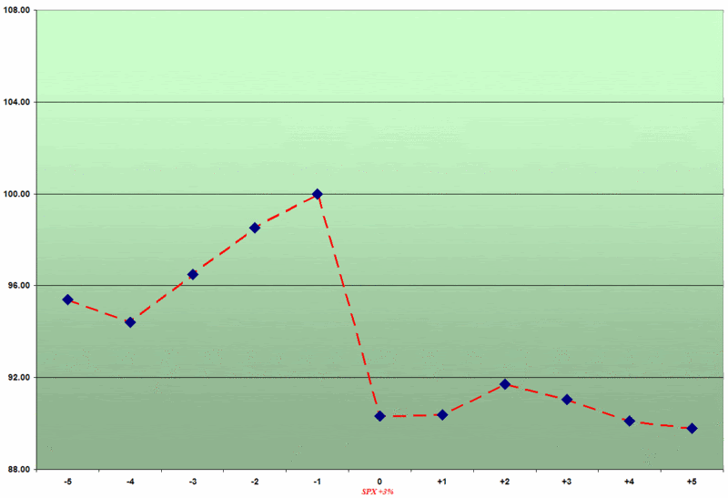
I previously noted that while the VIX surging an average of 10% in the four days prior to the SPX drop might have put some on notice that fireworks could be on the horizon, given the VIX's beta of -7 to -8, there were enough 'false alarm' 10% moves in four days to make this a weak predictive signal. Looking the VIX in the five days before and after a 3% rise in the SPX, any predictive value in a VIX move is much weaker, on the order of 5% on average during the three days prior to the 3% VIX jump.
Two other comparative points are worth noting here:
Posted by
Bill Luby
at
6:35 AM
0
comments
![]()
What happens to the VIX when the SPX drops 3% in one day? Does the VIX provide any advance warning of a selloff or merely serve as a contrary indicator after the fact?
Since 1990, there have been 25 instances in which the SPX has fallen 3% or more in one day. In analyzing those movements, it is important to remember that volatility has a strong tendency to cluster; as a result, a majority of the data points I looked at happened to fall within the same month and many were during the same week as another 3% drop. This should not be surprising, as almost all of the SPX plunges from the last decade have been triggered by the Asian financial crisis (including the spillover into Russia and Brazil) and the unwinding of the dot com bubble.
The following graphic depicts a composite view of changes in the closing price of the VIX on the 25 occasions from 1990 to the present in which the SPX has dropped 3%: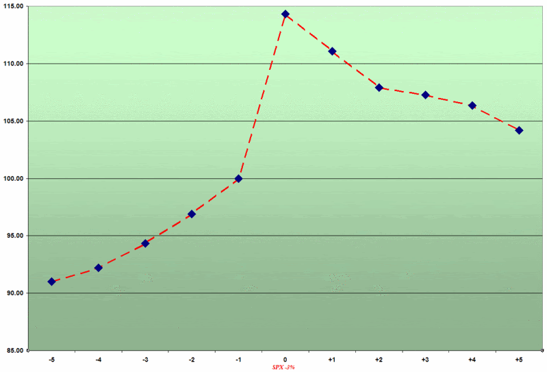
Note that the scales fixes the close on the day before the 3% drop at 100, so that percentage moves to and from that point are easier to calculate. It is worth highlighting that while the actual values of the VIX are not included here, only twice during this period did the SPX drop 3% with VIX values already below 20. In fact, the median value for the VIX prior to the SPX drop is 31.21, again partly reflecting the clustering of volatility that results in multiple sharp drops in the SPX.
On average, a drop in the SPX of 3% or more translates to a 14.3% spike in the VIX. More than half of the time, the day of the SPX 3% drop turned out to be the high in the VIX over this 11 day period. On average, half of that spike is retraced within two trading days and over 70% of that move is retraced in five days.
In future posts, I will discuss in greater detail the issue of the VIX providing advance warning of a selloff in the broader market. Suffice it to say that while the graph above shows that the VIX does jump approximately 10% in the four days before a 3% SPX move, there is not the obvious telltale movement in the day or two before the selloff that might get the attention of the casual observer.
Posted by
Bill Luby
at
11:44 AM
0
comments
![]()
Labels: Asian financial crisis, Brazil, composite, mean reversion, Russia, SPX, volatility clusters
I feel a little like a Ginsu knife, having sliced and diced the VIX: around options expiration; around Fed Days; and even from a monthly seasonal perspective.
When I looked at the earnings season movement in the VIX, I hypothesized that proximity to peak earnings season mattered much more than any influences of the options expiration cycle. I thought a relatively simple test of that theory might be to break down each quarterly cycle into 13 weeks and look at volatility over that 13 week period, keeping in mind that earnings reports for S&P 500 companies generally peak in the fourth and fifth week of each quarterly cycle, with the largest concentration of smaller caps reporting in the fifth week as well.
It turns out that a normalized chart of the 13 week quarterly cycle does not show much of a spike in the VIX leading up to earnings, nor does it show volatility subsiding in the back end of the quarter:
For now, we will leave it to the reader to draw their own conclusions, while we pick up the Ginsu and ponder other ways in which we might wish to julienne the VIX through space and time...
Posted by
Bill Luby
at
12:30 PM
0
comments
![]()
Labels: earnings season, Fed Days, Ginsu, quarterly cycle, seasonality
