Showing posts with label hall of fame. Show all posts

Thursday, December 29, 2016

Average VIX and Volatility for Last Fourteen Presidents

What kind of VIX is appropriate for the Trump Administration? 

For investors in general and volatility traders in particular, this is one of the more interesting questions going into 2017.  Should the VIX be higher or lower in the context of a Trump Administration relative to the Obama Administration?  How much economic policy uncertainty is there in Trumponomics?  How will various geopolitical issues wax and wane in the context of a Trump-Tillerson foreign policy agenda?

While these questions are difficult ones, what is not difficult is looking in the rear-view mirror for some historical context, so that is exactly what I did, calculating the historical volatility for each presidency going back to the Hoover Administration.  In order to take advantage of stock data prior to the 1950s, one has to make use of the DJIA rather than S&P averages.  While VIX data is even more interesting, the VIX was not launched until Bill Clinton’s inauguration and historically reconstructed data from the CBOE only extends back to George H. W. Bush’s presidential term.

The results of the number crunching are included in the chart below and show Herbert Hoover’s historical volatility of 42.87 more than double that of the runner-up, Franklin Delano Roosevelt who posted a historical volatility of 20.88.  The only other president to top the 20 level in terms of historical volatility was George W. Bush at 20.28.  At the other end of the spectrum, the least volatile presidency was that of Lyndon B. Johnson, where HV averaged an amazingly low 9.12.  Following LBJ on the low end are Dwight Eisenhower at 10.70 and Harry Truman at 12.20.


[source(s):  CBOE, Yahoo, VIX and More]

Among recent presidents, three of the last four presidencies (George W. Bush is the exception) have seen middling volatility, with Barack Obama 6th of 14 as of today’s data, while Bill Clinton is 7th and George H. W. Bush in 8th place.

Since the eye canot help but see trends and patterns whether they exist in real life or not, I am obliged to observe that since the LBJ presidency there is a pattern of higher highs and higher lows.  Could volatility by presidential term be trending up?  I am certainly not ready to go that far.

In terms of key takeaways, it is worth noting that the median historical volatility (combining data from Bill Clinton and George H. W. Bush) indicates that a middle-of-the-road presidency can expect historical volatility of 14.65 and a VIX of 18.91.  As far as the VIX is concerned, the 18.91 number aligns nicely with current VIX futures quotes for May and June 2017.

Related posts:


For those who may be interested, you can always follow me on Twitter at @VIXandMore


Disclosure(s): the CBOE is an advertiser on VIX and More

Sunday, January 25, 2015

Top Posts of 2014

Since I launched VIX and More some eight plus years ago, I have devoted one post to highlighting the top 25 most-read posts of each year. I do this in part for archival purposes: to see what is important to readers and how their interest in various issues changes over time. I also hope that these aggregations of most-read posts will serve as relatively easily accessible repositories of high-quality material for the benefit of new readers and long-term readers alike.

During 2014, the blog saw an extended hiatus for the first time in its history, largely due to events arising from the passing of my father. For this reason, I am limiting the number of top posts for the year to thirteen, largely because Song for My Father* ended the year in the #13 slot.

Looking ahead, volatility is back and so am I. I miss writing and I miss the interaction with readers. In the coming year I will significantly ramp up my activity on the blog and also in the comments section. I will also continue to write a weekly newsletter specializing in volatility (which just so happens to have a 14-day free trial), pen periodic guest columns for Barron’s and perhaps contribute to some other publications as well.  All this will be in addition to my primary role, which is that of an investment manager.

In 2014, some of the top stories were Ebola, Ukraine vs. Russia, crude oil, ISIS/ISIL, the Fed and the European Central Bank.  The posts below represent those that have been read by the highest number of unique readers during 2014. Farther down there are links to similar lists going back to 2008, along with several other “best of” type posts that I have flagged for archival purposes.

For the record, each year I also attach the hall of fame label to a handful of posts that I believe have particularly compelling and/or original content, regardless of readership. I was a tough grader last year, as I only added one new post to the HoF in 2014, but I already have an addition for 2015 and my goal is to continue to crank out Hall-of-Fame-worthy posts on a regular basis in 2015 – and even manage to do it without assistance provided by performance-enhancing drugs…

With an increase in posting on the blog, I also foresee a substantial uptick in my activity on Twitter, where @VIXandMore gives me a platform to contribute more in terms of time-sensitive news, short-term insights and other related subjects.

The thirteen most-read posts on VIX and More in 2014 were:

Related posts:

Disclosure(s): none

Tuesday, January 6, 2015

2014 Had Third Highest Number of 20% VIX Spikes

By most measures, one would think that 2014 was a relatively quiet year for the VIX and equity volatility in general. In fact, the average VIX of 14.19 was the lowest for the full year since 2006 and the third lowest going back to 1995. Of course, averages can be misleading and just as you can drown in a river with an average depth of one inch, anyone who was short the VIX when it spiked all the way up to 31.06 in October knows that minimum and maximum readings are important.

With this in mind, the chart below shows the number of 20% one-day VIX spikes per year, going back to 1990. Note that when looked through the lens of those 20% spikes, 2014 was the third most volatile year for the VIX since 1990, with the same number of 20% VIX spikes as 2008! Additionally, if one were to round up a near miss from December 8th, last year would move into a tie for the #2 slot, just behind the euro zone carnage from 2011.

VIXspikesbyyearthru010515_zpse2baffc9[1]

[source(s): CBOE, VIX and More]

Perhaps the most interesting thing about the 20% VIX spikes is that two of them came during the last month of the year and with a little rounding, the December 8th spike could have been number three. Toss in yesterday’s 28.1% VIX spike and that is four VIX spikes of at least 19.5% in one month. Uncharted territory? Not quite, with August 2011 having already marched down that path, but something not achieved in any other year, including 2008 or at any time during the bursting of the dotcom bubble.

The have been a number of important changes in the volatility space during the past year or so and going forward I will address quite a few of them, with additional analysis and commentary.

Related posts:

Disclosure(s): short VIX at time of writing

Tuesday, April 15, 2014

The Correction As Seen in the ETP Landscape

Since stocks bottomed in March 2009, I have periodically been publishing an SPX pullback table and occasionally a plot of all those pullbacks and their duration. The recent selloff in stocks, however, has been anything but an SPX pullback. I toyed with the idea of presenting comparable data for the NASDAQ Composite or NASDAQ-100 Index (NDX), but here again, the selling has been disproportionate in some areas of the NASDAQ universe, even though it has been hit harder than the SPX.

This time around I have opted instead for a chart that shows the peak-to-trough drawdown across the equity ETP universe, focusing on sector groups that I believe are among the most important to watch.

ETP Landscape 2014 DDs 041514

[source(s): Yahoo, VIX and More]

The data above cover only 2014 and indicate the maximum drawdown since the 2014 peak. While many of these maximum drawdowns are from earlier today, there are quite a few instances in which the maximum drawdown was established earlier in the year.

Note that while the NASDAQ gets most of the attention, it is the small caps (IWM) that have suffered the most among the major market index ETPs.

Not surprisingly, biotechnology (IBB), social media (SOCL) and Russia (RSX) have seen the largest declines, but among cyclicals, defensive stocks and European country ETPs, there is very little to choose from.

Finally, just for fun I have added four alternative ETPs with an equity flavor (SPLV, PBP, CWB and PFF) to show how low volatility, covered call, convertible bond and preferred stock ETPs have fared.

Related posts:

Disclosure(s): none

Sunday, January 26, 2014

Top Posts of 2013

Every year I tabulate the most-read posts in this space as a way to monitor the issues that are resonating with readers and also to see how these issues evolve over time. These most-read posts also serve as easily accessible repositories of high-quality material for the benefit of new readers and long-term readers alike.

The top themes from 2013 echo some top themes that resonated with readers from previous years, including continued interest in VIX spikes and SPX pullbacks, as well as the VIX ETPs, low volatility ETPs, the Fed, interest rates and various global flash points, such as emerging markets.

The posts below represent those that have been read by the highest number of unique readers during 2013. Farther down there are links to similar lists going back to 2008, along with several other “best of” type posts that I have flagged for archival purposes.

For the record, each year I also attach the hall of fame label to a handful of posts that I believe have particularly compelling and/or original content, regardless of readership. I find it interesting that ten posts from 2013 made it into the hall of fame – a record for any single year. Part of the reason for this is that while my total number of posts for 2013 was low, I favored quality and more in-depth analysis than pithy commentary, most of which I have migrated to my Twitter handle feed, @VIXandMore

The most-read posts on VIX and More in 2013 were:

Related posts:

Disclosure(s): none

Sunday, November 3, 2013

The Evolution of the Holiday Effect in VIX Futures

[The following originally appeared in the November 2012 edition of Expiring Monthly: The Option Traders Journal. I thought the contents might be timely in light of the upcoming holiday season.]

With fewer trading days and a historical record that favors an uptick in stocks and a downtick in volatility, the end of the year never fails to present an intriguing set of trading opportunities.

One phenomenon related to the above is something I have labeled the “holiday effect,” which is the tendency of the CBOE Volatility Index (VIX) December futures to trade at a discount to the midpoint of the VIX November and January futures.

This article provides some historical analysis of the holiday effect and analyzes how the holiday effect has been manifest and evolved over the course of the past few years.

Background and Context on the Holiday Effect on the VIX Index

Part of the explanation for the holiday effect is embedded in the historical record. For instance, in eight of the last twenty years, the VIX index has made its annual low during the month of December. In fact, the VIX has demonstrated a marked tendency to decline steadily for the first 17 trading days of the month, as shown below in Figure 1, which uses normalized VIX December data to compare all VIX values for each trading day dating back to 1990. Not surprisingly, those 17 trading days neatly coincide with the typical number of December trading days in advance of the Christmas holiday.

{Figure 1: The Composite December VIX Index, 1990-2011 (source: CBOE Futures Exchange, VIX and More)}

Readers should also note that, on average, the steepest decline in the VIX usually occurs from the middle of the month right up to the Christmas holiday.

The December VIX Futures Angle

Most VIX traders are aware of the tendency of implied volatility in general and the VIX in particular to decline in December. As a result, since the launch of VIX futures in 2004, there has usually been a noticeable dip in the VIX futures term structure curve for the month of December. Figure 2 below is a snapshot of the VIX futures curve from September 12, 2012. Here I have added a dotted black line to show what a linear interpolation of the December VIX futures would look like, with the green line showing the 0.50 point differential between the actual December VIX futures settlement value of 20.40 on that date and the 20.90 interpolated value, which is derived from the November and January VIX futures contracts. (Apart from the distortions present in the December VIX futures, a linear interpolation utilizing the first and third month VIX futures normally provides an excellent estimate of the value of the second month VIX futures.)

{Figure 2: VIX Futures Curve from September 12, 2012 Showing Holiday Effect (source: CBOE Futures Exchange, VIX and More)}

Looking at the full record of historical data, the mean holiday effect for all days in which the November, December and January futures traded is 1.87%, which means that the December VIX futures have been, on average, 1.87% lower than the value predicted by a linear interpolation of the November and January VIX futures. Further analysis reveals that on 91% of all trading days, the December VIX futures are lower than their November-January interpolated value. The holiday effect, therefore, is persistent and substantial.

The History of the Holiday Effect in the December VIX Futures

Determining whether the holiday effect is statistically significant is a more daunting task, as there are only six holiday seasons from which one can derive meaningful VIX futures data. Figure 3 shows the monthly average VIX December futures (solid blue line) as well as the midpoint of the November and the January VIX futures (dotted red line) for each month since the VIX futures consecutive contracts were launched in October 2006. Here the green bars represent the magnitude of the holiday effect expressed in percentage terms, with the sign inverted (i.e., a +2% holiday effect means that the VIX December futures would be 2% below the interpolated value derived from November and January futures.)

{Figure 3: VIX December Futures Holiday Effect, 2006-2012 (source: CBOE Futures Exchange, VIX and More)}

Conclusions

With limited data from which to draw conclusions, it is tempting to eyeball the data and look for emerging patterns which may repeat in the future. Clearly one pattern is that an elevated or rising VIX appears to coincide with a larger magnitude holiday effect, whereas a depressed or falling VIX is consistent with a smaller holiday effect. The data is much less compelling when one tries to determine whether the time remaining until the holiday season has an influence on the magnitude of the holiday effect. While one might expect the holiday effect to become magnified later in the season, the evidence to support this hypothesis is scant at this stage.

To sum up, investors have readily accepted that a lower VIX is warranted for December and the downward blip in December for the VIX futures term structure reflects this thinking. As far as whether this seasonal anomaly is tradable, there is still a limited amount of data – not to mention some highly unusual volatility years – from which to develop and back test a robust VIX futures strategy designed to capture the holiday effect.

In terms of trading the holiday effect for the remainder of the year, the coming holiday season is also complicated by matters such as the fiscal cliff deadline and various euro zone milestones that are set for early 2013. In fact, there may not be a reasonable equivalent since the Y2K fears in late 1999 that turned out to be a volatility non-event when the calendar flipped to 2000.

While the opportunities to capitalize on the 2012 holiday effect may be difficult to pinpoint and fleeting, all investors should be attuned to seasonal volatility cycles as 2013 unfolds and volatility expectations ebb and flow with the news cycle as well as the calendar.

Related posts:

Other articles republished from Expiring Monthly:

Disclosure(s): none

Tuesday, October 8, 2013

A History of the VIX During Recent Debt Ceiling and Sequestration Battles

Democrats and Republicans have been fighting over budgets and related matters since before any of us were born and while the debate has been heated at times, only recently has the credit of U.S. debt been called into question as a result.

During the impasse that led to the government shutdowns of November 14 – 19, 1995 and December 16, 1995 – January 6, 1996, for instance, there was nary a whiff of panic in the air, as the VIX never made it above 15 and spent a good portion of the shutdown in the 10s.

The last three instances of party budget squabbling have been much different than the Clinton-era budgetary battles and one only has to watch the trajectory of the VIX during these battles to get a sense of the uncertainty, anxiety and risk that was priced into SPX options during the period. Granted, none of these budget and debt ceiling battles has unfolded in a vacuum and the August 2011 debt ceiling battle played out against the backdrop of a dramatic worsening of the situation in Greece and euro zone sovereign debt in general, but the relative moves in the VIX during these three crises can still be instructive.

The chart below captures the month leading up to as well as data following the following three budget battles, all of which had specific deadlines, which are identified in the chart by the vertical black line running through day zero:

  • the August 2011 debt ceiling crisis
  • the December 2012 sequestration crisis (fiscal cliff)
  • the current debt ceiling crisis

Note that the August 2011 debt ceiling crisis is a classic example of risks that turned out to be much greater than almost everyone had predicted, whereas the fears related to the December 2012 sequestration crisis quickly disappeared. Historically there have been many more false alarms than crises which have escalated out of control, which is part of the reason why investors tend to underestimate and/or discount the full potential of each threat and why the VIX has a tendency to spike and then mean revert fairly quickly.

With a little over a week before the October 17 debt ceiling deadline hits, the VIX is higher now than it was at a similar stage in July 2011 or December 2012. Certainly the political landscape has changed since the last two budget battles and both the Democrats and Republicans have had an opportunity to refine their strategies and tactics in the interim. How it all plays out this week and next is anyone’s guess. I still find it hard to believe that there will be a default, but that still leaves plenty of room for the type of “resolution” that drags out the current anxieties and leads to additional pitched battles – some of which may be even more costly – down the road.

So by all means root for a replay of December 2012, but prepare for August 2011 just in case…

[source(s): CBOE, VIX and More]

Related posts:

Disclosure(s): none

Friday, October 4, 2013

Event Risk, Event Theta and the Next Week

Weekends pose an interesting set of problems for the investor/trader, particularly when there is an ongoing crisis or a reasonable risk that a new crisis lurks around the corner. Today we have a perplexing situation in which there is both an old crisis (government shutdown) and a new crisis just around the corner (debt ceiling limit), as well as the increasing likelihood that the two of these are going to merge into one bigger crisis.

How should an investor think about this situation? First, they need to form some opinions about event risk, including a range of scenarios from a quick and comprehensive resolution of the government shutdown and the debt ceiling to prolonged gridlock that results in the U.S. defaulting on its obligations. The fun part is assigning probabilities to these scenarios, coming up with a probability weighted view of the future and making (semi-)rational decisions about portfolio protection and speculative opportunities after considering risk and potential reward. Sounds like a snap, doesn’t it?

Some investors may not fully appreciate that event risk or event volatility is a two-sided sword. Sure, there is risk that many of us have once again overestimated a bunch of elected lemmings officials and their ability to act in the best interests of their country and in so doing reprise those wonderful memories from August 2011, but there is also the risk that some progress – or even a small sign that the tide is turning – could unfold over the weekend and cause stocks to soar on Monday as short-sellers absorb the brunt of the damage. Attaching a meaningful probability to these scenarios may seem futile, but running through the scenarios in one’s head to see what the implications are is certainly worth a little bit of spare brainpower.

Just a few months before the 2011 debt ceiling crisis, there was the three-pronged crisis that hit Japan, combining an earthquake, tsunami and nuclear meltdown. I talked about this crisis in Fukushima Daiichi and Event Theta and even invented a new term, “event theta,” to describe whether the passage of time was a positive or negative development for those with positions in volatility or other instruments.

“As these events unfolded, seemingly like a slow-motion train wreck, I kept asking myself whether time was in favor of or working against the efforts of those who were trying to limit the damage to the nuclear facility and surrounding areas. In other words, was this a positive theta event (time in our favor) or a negative theta event (a fight against the clock.) Not being an expert in the field of nuclear energy and knowing that certain factors could spiral out of control quickly, but also knowing that efforts were underway to stabilize some of the processes in the plant, I was left to guessing whether current efforts were more likely to fall short and result in a vicious cycle or were expected to stem the problem and turn the tide in favor of the rescue team.

Knowing whether this was a positive or negative theta event also has substantial implications for investment strategies. From a hedging perspective, event theta could influence the selection of hedging vehicles, the anticipated timing for those hedges, how the hedges might be structured and what sort of prices might be appropriate. For the speculative investor, event theta can also help to determine the risk-reward payoff structure and how it varies over time. Anyone who trades in VIX futures and deals with the VIX term structure on a daily basis should have some insights into potential mismatches between event theta and term structure.”

I suspect that for most of this week, event theta has been negative, meaning that the passage of time without meaningful progress toward an agreement was bearish for equities and bullish for holders of long volatility positions. With the weekend coming up and another two plus days of the news cycle, polling data and behind-the-scenes strategizing, it may be that event theta is closer to neutral and perhaps even positive. This is not to say that shorts should cover their positions before today’s close or anyone with a long volatility position should close out their positions and take profits, only to point out that at least until markets open again on Monday, risk for longs and shorts is becoming more balanced and determining the risk-reward payoff for a variety of positions is a much more difficult proposition.

Before the weekend is upon us, investors may wish to give some thought to the 2011 debt ceiling crisis, the 2012 sequestration battle and the timeline for how the 2013 deadlock might play out. In the meantime the, graphic below [an excerpt from The Year in VIX and Volatility (2011)] and the links below that should provide some food for thought about these and a number of related issues.

[source(s): StockCharts.com, VIX and More]

Related posts:

Disclosure(s): none

Tuesday, July 16, 2013

Guest Columnist at The Striking Price for Barron’s: How to Spot Risk Early

Today’s guest column, How to Spot Risk Early, at The Striking Price on behalf of Steven Sears at Barron’s, is the eleventh time I have had the opportunity to write a column for Barron’s. Today’s column picks up on a theme I addressed in a March 2011 article in Expiring Monthly which was titled, Evaluating Volatility Across Asset Classes. In that 2011 article, I introduce the concept of a volatility compass as a framework for evaluating the different types of volatility spikes that were seen in the 2008 financial crisis, the euro zone crisis as of May 2010, the Arab Spring in March 2011, and the May 6, 2010 flash crash.

[Volatility compass showing different levels of volatility across asset classes during four recent spikes in volatility. Source(s):VIX and More]

In the 2011 article I provide an overview of my thinking as follows:

“It is my belief that a better understanding of the volatility picture across asset classes will yield a better grasp of volatility events and help to identify a number of favorable trading setups.”

Later on I conclude the article with the following thoughts:

“For those who have studied sector rotation strategies and methods for trading geography-based ETFs, some of the analytical techniques used in those two disciplines can be carried over to an analysis of cross asset class volatility.

Ultimately, the study of volatility has both a science and art component to it, but a cross asset class approach provides a more broad-based holistic view of the volatility landscape and adds a little more science to the mix.

At some point, volatility becomes the study largely of contagion and falling dominoes. I can say without hesitation that a multi-disciplinary approach is essential to understanding contagion and dominoes and that a cross asset class analytical framework supplemented by tools such as the volatility compass is an effective way to approach that subject.”

In today’s Barron’s article, I expand upon the idea of four types of volatility indices and address volatility indices that provide a snapshot of geographical uncertainty and risk as well as broader measures of uncertainty and risk across asset classes such as U.S. Treasury Notes and currencies.

I will have more on this subject in the future, but for those interested in researching some of these subjects, I have highlighted some previous posts on different ways of thinking about uncertainty, risk and volatility below.

Related posts:

A full list of my Barron’s contributions:

Disclosure(s): none

Tuesday, June 25, 2013

VXTYN Measures Volatility in U.S. Treasuries and Potential Spillover Effect

Recently I have been highlighting some non-traditional measures of volatility and risk in the financial markets, including VXEEM (CBOE Emerging Markets ETF Volatility Index); DXJ (WisdomTree Japan Hedged Equity Fund); and DBV (PowerShares DB G10 Currency Harvest Fund). Part of my intent in focusing some attention on these largely under-the-radar indices and ETPs is to get more investors to think about risk more broadly across geographies and asset classes.

One asset class that should absolutely be watched closely by even those stubbornly equity-centric investors (and I know you are out there in larger numbers than you care to admit) is U.S. Treasuries. Of course U.S. Treasuries come in quite a few flavors, but the most important is probably the U.S. 10-Year Treasury Note. In a display of impeccable timing, last month the CBOE and the CFE teamed up to launch a new volatility index based on this security: CBOE/CBOT 10-year U.S. Treasury Note Volatility Index (VXTYN).

In the chart below, I show the path of VXTYN and the SPX going back to January 10, 2013, which is the beginning of the historical data for VXTYN provided by the CBOE. Note that VXTYN only began rising in May and when hit has made a substantial move up, that has preceded a decline in stocks.

[source(s): CBOE, Yahoo, VIX and More]

Just for fun, I am also including a chart that shows a 21-day rolling average of the correlation between VXTYN and the SPX. Here the relationship between the swings in correlation and subsequent moves in stocks may be easier to visualize. With less than months of historical data to draw on, I would caution against jumping to conclusions regarding correlation and causation, but at the very least I thought this graphic might provide some food for thought.

[source(s): CBOE, Yahoo, VIX and More]

Last but not least: did you know there are ETPs for placing bets on whether the Treasury yield curve will get steeper or flatter? I highlighted these products back in 2010 in Treasury Yield Curve ETNs and Volatility; they are known formally as the iPath US Treasury Steepener ETN (STPP) and the iPath US Treasury Flattener ETN (FLAT).

Related posts:

Disclosure(s): long DXJ at time of writing; the CBOE is an advertiser on VIX and More

Tuesday, June 18, 2013

VIX and SPX During the 1994 Interest Rate Hike Cycle

With yesterday’s The VIX and the Pre-FOMC + Post-FOMC Trades post in the books, it occurred to me that my reference to the series of interest rate hikes in 1994 probably stretches back before the memory banks of the current generation of investors. So with all the anxiety about Fed tapering and ultimately ending quantitative easing, I thought this might be a good time to review what happened to stocks and volatility when the Fed embarked upon a series of interest rate hikes that took the financial community by surprise.

To set the context, the 1990s started out with a recession that coincided with the first Gulf War and a corresponding sharp rise in oil prices. The Fed had been gradually lowering interest rates from 1989 – 1992 and this helped to create an environment that favored a recovery, but this recovery took some time to gain traction and did not get going until 1991. The stock market fared better than the economy during this period; after a down year in 1990, stocks rallied to post gains in 1991, 1992 and 1993. After a strong January for stocks, 1994 appeared to be on a similar path to success.

It was at this point that Federal Reserve Chairman Alan Greenspan decided to remove the proverbial punch bowl before the party got out of hand and on February 4, 1994, the Fed surprised the markets by announcing a 0.25% increase in the federal funds rate. By the time 1994 was over, the Fed had raised interest rates on six different occasions. As the chart below shows, the first three raises were 0.25% increases in the federal funds rate, but the incremental size of the raises increased to 0.50% and eventually 0.75% later in the year and were supplemented by increases in the federal discount rate, which also grew from 0.50% to 0.75%. By the time 1994 was in the books, the federal funds rate had jumped from 3.00% to 5.50% and the federal discount rate had risen from 3.00% to 4.75%. (The rate hike cycle finally ended on February 1, 1995, when the Fed raised the federal funds rate to 6.00% and the federal discount rate to 5.25%.)

Keep in mind that Alan Greenspan did not believe in signaling the Fed’s intentions in those days; on the contrary, he was a master of obfuscation and his cryptic and often ambiguous language typically kept investors in the dark about his intentions. For this reason, it was difficult for the markets to anticipate the Fed’s next move and investors we not necessarily prepared for subsequent interest rate hikes.

How did the financial markets respond to what amounted to almost a doubling of the federal funds rate and an increase of more than 50% in the federal discount rate? With a lot less volatility than one might imagine. The average closing value of the VIX was 13.93 in 1994, little different than the 13.90 average for the VIX in 2013. While the VIX did spike all the way up to 28.30 on April 4th, the VIX only closed above 20.00 on two days during the entire year! The S&P 500 index ended the year with a small loss (a small gain if dividends were to be included in the calculations), but roared back with gains of 34%, 20%, 31%, 27% and 20% in the subsequent five years.

[source(s): StockCharts.com, Federal Reserve Bank of New York, VIX and More]

The series of rate hikes did dramatically change the yield curve, as the chart below illustrates. The more dramatic moves were at the front end of the terms structure, with the curve essentially flat from two years through thirty years by the end of 1994.

[source(s): Wall Street Journal / SmartMoney]

So while Robin Harding’s Fed Likely to Signal Tapering Move is Close article in the Financial Times yesterday (and his subsequent tweet, “The Fed does not leak anything to any journalist to steer markets - especially during blackout”) may have given investors an opportunity for a dress rehearsal for the ultimate tapering, the historical record from 1994 suggests that tapering fears may be exaggerating how the QE end game will ultimately play out.

Related posts:

Disclosure(s): none

Monday, June 17, 2013

The VIX and the Pre-FOMC + Post-FOMC Trades

Back in December 2008, in VIX Trends Around FOMC Announcement Days, I posted a chart of the average movements in the VIX in the ten trading day leading up to and following “Fed Days,” otherwise known as days in which the Federal Open Market Committee (FOMC) makes its policy statement announcement. Several long-time readers who recall that chart – and an earlier incarnation from VIX Price Movement Around FOMC Meetings – have recently asked for an updated version. With all eyes on the Fed’s statement and Ben Bernanke’s press conference on Wednesday, this seems like a good time to revisit how the VIX moves in the days leading up to and following FOMC announcements.

In the chart below, I have normalized VIX data going back to 1990 to make it easy to compare the mean daily changes in the VIX in the ten trading days preceding FOMC policy statement announcements as well as ten trading days following those announcements. The quick takeaway is that the data from the last five years has been consistent with the data as of 2008. There are still three dominant features in this chart:

  1. a pre-FOMC VIX ramp in which the VIX tends to move up sharply in the three days leading up to the FOMC announcement and trend up more gradually 1-2 weeks in advance of the announcement
  2. a sharp decline in the VIX averaging about 2.6% on the day of the FOMC announcement, with a gradual decline in the VIX of another 1.0% or so in the two days following the announcement
  3. a sharp rebound in the VIX that starts three days after the FOMC announcement and persists until nine trading days after the announcement

Over the course of the past five years, the pre-announcement ramp in the VIX has been steeper during the three days prior to the announcement and more gradual in the week or so prior to that period. Also, recent history has seen the post-announcement decline in the VIX extending two additional days to now span four days following the announcement.

Of course there is no reason to expect that patterns which have persisted for the past 33 years to magically reappear for each FOMC announcement going forward, but I do believe that the historical pattern does say something about human nature, uncertainty and perceptions of risk.

It is worth noting that the biggest one-day jump in the VIX on a Fed day dates from February 4, 1994, when Federal Reserve Chairman Alan Greenspan surprised the markets by announcing a 0.25% increase in the federal funds rate, helping to lift the VIX 41.9% on that day. For comparison purposes, the next largest Fed day VIX increase was a 15.1% gain on March 15, 2011. While another VIX pop may be in the cards, history says there is a 72% chance the VIX will decline on Wednesday and that the decline should average about 2.6% or about 0.44 based on the current level of the VIX.

What is the trade here? While many will undoubtedly try to guess the direction of Wednesday’s move, the three other trades with a historical bias include:

  1. an increase in the VIX in advance of Wednesday’s announcement
  2. a continuation of any decline in the VIX from Thursday to Monday
  3. a new uptrend in the VIX beginning on Monday or Tuesday and running through the beginning of July.

[source(s): CBOE, Yahoo, VIX and More]

Related posts:

Disclosure(s): none

Tuesday, June 11, 2013

The Currency Carry Trade, DBV and Risk

Anyone who has been active in the financial markets during the past five years knows that there are many types of risk, many ways to think about and measure risk, and invariably some risks lurking around the next corner that many of us have never bothered to contemplate. Most investors tend to focus their attention on equities and therefore have a tendency to think in terms of the CBOE Volatility Index (VIX) and use that number to evaluate the relative level of risk, uncertainty or perhaps fear in the markets. That being said, during the past few years, almost everyone has become conversant in such topics as credit default swaps, the TED spread, the LIBOR-OIS spread, bank capital ratios and a whole host of concepts and statistics which were not on their radar in 2007.

For a more holistic approach to evaluating risk, there is always the St. Louis Fed’s Financial Stress Index, which is one example of an attempt to aggregate a variety of risk factors (18 in all) related to economic and financial matters into a single risk index.

One aspect of market risk that many investors continue to struggle with is the currency carry trade. If the daily movements of the dollar are relatively unimportant for those interested in buying and selling stocks that are primarily based in the U.S., then it is relatively easy for most investors to conclude that the gyrations of the Japanese yen (FXY) or Australian dollar (FXA) can be dismissed as much less important than those of the dollar. Unfortunately, this is not always the case. It turns out that many investors, particularly large institutional ones, have an appetite for the currency carry trade, in which one borrows in a currency where interest rates are low and uses the proceeds to buy assets in a currency where interest rates are higher. With Japan’s central bank targeting interest rates of 0.1% and the Reserve Bank of Australia recently cutting its base rate to 2.75%, the carry trade is structured as an interest rate differential trade in which an investor can borrow in yen and then buy Australian bonds, with profitability determined by the net interest rate differential plus or minus any fluctuation in the exchange rate.

Naturally some more aggressive investors prefer to use the yen as a funding currency for the purchase of assets other than bonds, including U.S. stocks. The problem for investors in U.S. stocks is that when the yen appreciates sharply – as it did on Monday and Thursday of last week, as well as during today’s session – traders with short yen positions who are victimized by a short squeeze will be subject to margin calls and/or forced liquidations, which means that not only are they covering their short yen positions, but they are also selling any long positions in U.S. equities as both legs are unwound. For this reason, when the yen carry trade is in favor, U.S. equities tend to move in the opposite direction of the yen. Traders can monitor the strength of the yen by following the USD/JPY currency cross or the Japanese yen ETF, FXY.

An alternative to focusing entirely on the yen is to monitor the PowerShares DB G10 Currency Harvest Fund (DBV), which, as PowerShares indicates, “is composed of currency futures contracts on certain G10 currencies and is designed to exploit the trend that currencies associated with relatively high interest rates, on average, tend to rise in value relative to currencies associated with relatively low interest rates. The G10 currency universe from which the Index selects currently includes U.S. dollars, euros, Japanese yen, Canadian dollars, Swiss francs, British pounds, Australian dollars, New Zealand dollars, Norwegian krone and Swedish krona.”

In other words, DBV is a carry trade ETF that is short three currencies and long three currencies at all times, updating these holdings on a quarterly basis. The ETF is currently short the Swiss franc, the euro and the yen, with long positions in the Australian dollar, the Norwegian krone and the New Zealand dollar.

As the chart below shows, DBV has been tracking the S&P 500 index quite closely for most of the past year, but that relationship has recently broken down as DBV has plummeted while the SPX has experienced only a mild pullback. Going forward, investors should strongly consider keeping an eye on the USD/JPY cross, the FXY ETF (which is optionable) and also DBV, which provides a much broader picture of the overall carry trade – and can also serve as a proxy for the risk this trade can pose to stocks.

[In addition to the products referenced above, note that there is a currency carry trade ETF that is similar to DBV, the iPath Optimized Currency Carry ETN (ICI), but this product has considerably less liquidity.]

[source(s): StockCharts.com]

Related posts:

Disclosure(s): none

Friday, March 22, 2013

The Low Volatility Story in Pictures

Lately I have not been able to help being bombarded by articles extolling the virtues of investing in low volatility (also known as minimum volatility) exchange-traded products. These ETPs typically talk about the tendency of investors to become overly enamored with some of the sexier, more volatile stocks and accordingly bid these up to unsustainable valuations. On the other hand, the tortoise-like approach to lower volatility stocks tends to avoid these stocks that are fashionable for short periods of times, so-called “story stocks,” momentum favorites, and stocks with hockey-stick charts that sometimes become mini-bubbles. Instead, plodding growth, dividends and total return are the main areas of focus.

I have discussed the most famous of these low volatility ETPs, the PowerShares S&P 500 Low Volatility Portfolio (SPLV) in a number of different contexts in this space, including:

This time around my intent is to let the graphics speak for themselves, so without further ado, I give you three snapshots of the performance of SPLV against the performance against its more volatile sibling, the PowerShares S&P 500 High Beta Portfolio (SPHB).

SPLV vs. SPHB since inception (472 days):

[source(s): StockCharts.com]

SPLV vs. SPHB over the last 380 days:

[source(s): StockCharts.com]

SPLV vs. SPHB over the last 200 days:

[source(s): StockCharts.com]

I realize that every historical period in the financial markets is unique and that one can cherry pick graphics to make any imaginable point, but I think the three charts above tell almost the full story, which is this:

1.  Over the long-term, low volatility stocks have a high probability of outperforming high volatility stocks on an absolute basis and particularly on a risk-adjusted basis

2.  Even in bull markets, the total return approach of low volatility stocks often makes them comparable to or even superior to high volatility stocks

3.  The biggest risk associated with a low volatility approach is being left behind in a sharp bull move, when more defensive sectors can underperform substantially

The real question to ask yourself is which risk concerns you the most: a large drawdown or missing out on a large chunk of a bull rally?

Related posts:
Disclosure(s): none

Monday, February 25, 2013

All-Time VIX Spike #11 (and a treasure trove of VIX spike data)

Today was one of those days that caught a lot of people off guard. Halfway through today’s trading session stocks we largely unchanged, then some pockets selling began when results of the elections in Italy started trickling in, suggesting the possibility of a deadlock in the Italian parliament and perhaps the need for another round of elections.

The governmental chaos is largely the result of rise of two intriguing political figures. One of these is the phoenix known as Silvio Berlusconi and his People of Freedom (PDL) party, which is anti-austerity and has proposed a policy of massive tax cuts and talked about the possibility of leaving the euro. The bigger electoral surprise is Beppe Grillo and the Five Star Movement (M5S), where Grillo’s populist agenda and anti-corruption message have resonated with voters. Both Berlusconi and Grillo have had a much stronger influence on the elections than most had anticipated and with Italy’s relationship with the euro zone now in question, the euro fell to under 1.31 against the dollar for the first time in six weeks.

U.S. stocks, which had seemed impervious to the sequestration threat, began selling off sharply as a result of the confusion about the future of the Italian government, with selling gathering steam during the second half of today’s session and accelerating sharply during the last hour, when the S&P 500 index fell more than 1% and the VIX spiked 14.4%.

For the full day, the SPX was down 1.83% and the VIX was up 34.02%. The 34% spike in the VIX makes it the eleventh largest one-day spike in the 24 years of VIX historical data going back to 1990.

The first question on everyone’s mind is what the implications of the VIX spike are for stock prices and volatility going forward. The truth is that the historical record following a large one-day VIX spike is somewhat spotty. The table below captures some data from the top 20 one-day VIX spikes. Note that on average (here is where I like to remind everyone that it is possible to drown crossing a stream that is one inch deep ‘on average’) stocks generally outperformed following a big VIX spike for up to one week (SPX ROI +1 to +5 days) and also performed well looking out more than two months. From one week to two months, however, stocks have underperformed following a large VIX spike.

Note that the table below is based on a small data set and if one extracts subsets of this data for the VIX at certain absolute levels or during selected periods or even relative to the magnitude of the change in the SPX, it is possible to draw some very different conclusions. Part of the reason for this may be due to the sample size and part of the answer may be that a clear-cut interpretation of this data is not easy to extract. For these reasons, I have included a fair amount of relevant data and encourage readers to draw their own conclusions.

[source(s): CBOE, Yahoo, VIX and More]

For those who are interested in more conclusive research and analysis on VIX spikes, volatility and other subjects related to today’s events, the links below are an excellent place to start.

Related posts:

Disclosure(s): short VIX at time of writing

Monday, December 31, 2012

Top Posts of 2012

Every year I tabulate the most-read posts in this space as I find this exercise to be an excellent way to identify the issues that readers are interested in and also to see how these issues evolve over time. These most-read posts also serve as easily accessible repositories of high-quality material for the benefit of new readers and long-term readers alike.

While 2012 was a slow year for the VIX (the first time the VIX didn’t make it into the 30s since 2007), it proved to be an exciting time for the broader volatility products space. Looking just at the titles of the top 25 posts below, an astonishing 9 of them reference TVIX or UVXY in the title, reflecting strong reader interest in the +2x volatility products that I called “day trading rocket fuel” back in January 2011.

The posts below represent those that have been read by the highest number of unique readers in 2012. Farther down there are links to similar lists going back to 2008, along with several other “best of” type posts that I have flagged for archival purposes.  Don’t necessarily start at the top and work your way down until you get bored.  For the record, I think #25, Volatility During Crises is one of the top two posts of the year.  I’m not sure about #1, but Cheating with Partial Hedges, which didn’t even make this top 25 list, also has to be considered a strong candidate.

Last but not least, each year I also attach the hall of fame label to a handful of posts that I believe have particularly compelling and/or original content, regardless of readership.

Happy New Year!

Related posts:

Disclosure(s): short UVXY at time of writing

Friday, December 21, 2012

Volatility During Crises

[The following first appeared in the August 2011 edition of Expiring Monthly: The Option Traders Journal. I thought I would share it because it might help some readers put the current fiscal cliff crisis in historical context.]

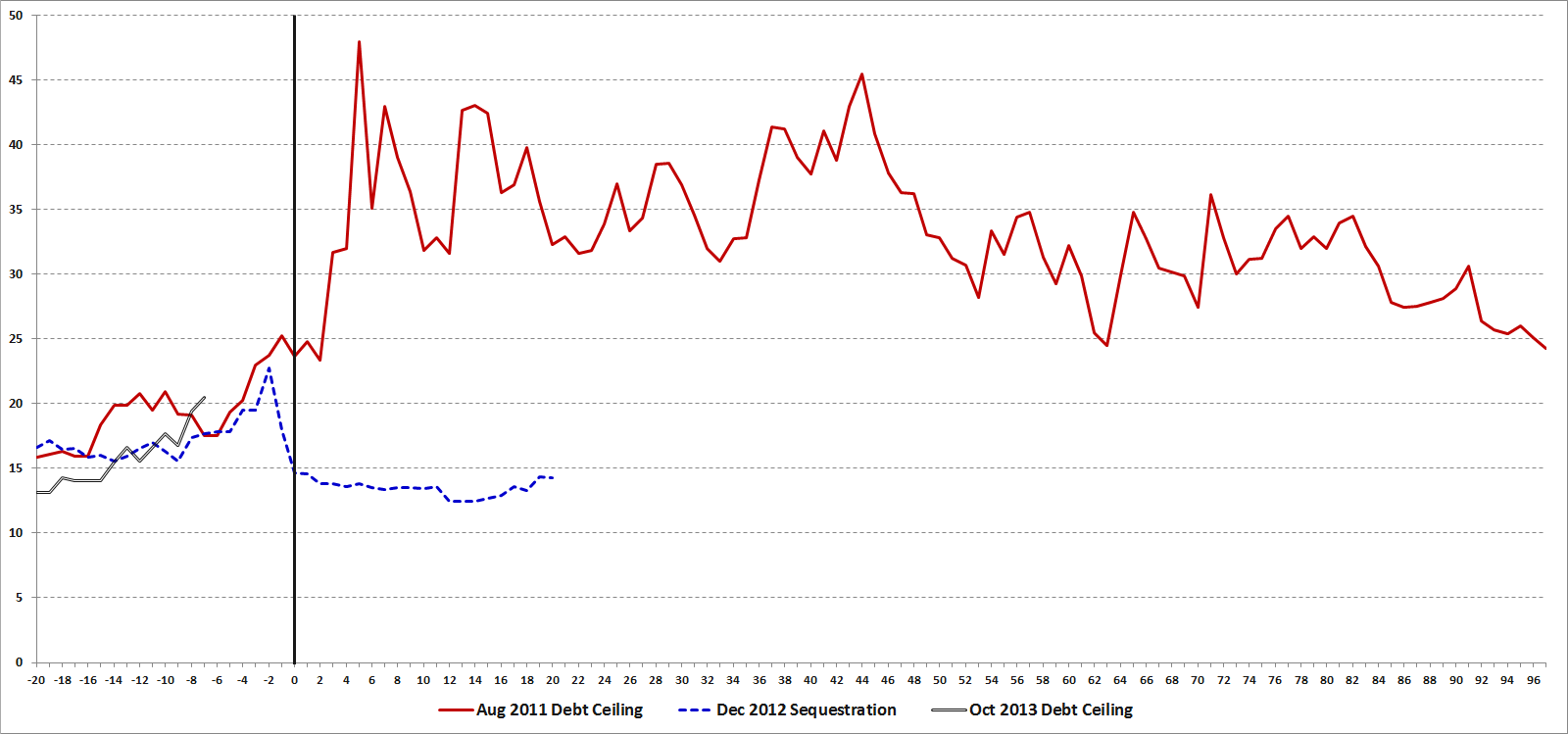
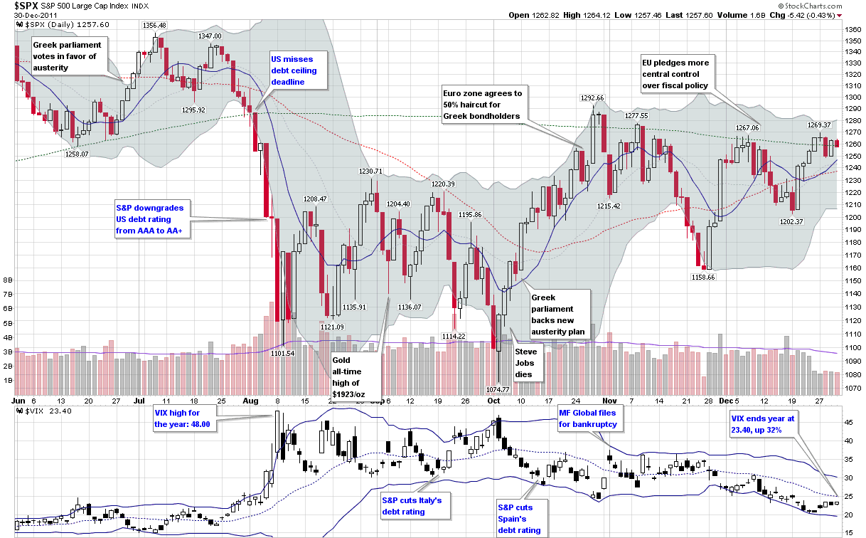
The events of the last three weeks are a reminder that financial crises and stock market volatility can appear almost instantaneously and mushroom out of control before some investors even have a chance to ask what is happening. A case in point: on August 3rd investors were breathing a sigh of relief after the United States had finalized an agreement to raise the debt ceiling; at that time, the VIX stood at 23.38, reflecting a relative sense of calm, yet just three days later, the VIX jumped to 48.00 as two new crises displaced the debt ceiling issue.

Spanning the globe from Northern Africa, Japan, Europe and the United States, 2011 has seen no shortage of crises in the first eight months of the year. Given this pervasive crisis atmosphere, it is reasonable for investors to consider how much volatility they should anticipate during a crisis. In this article I will attempt to put crises and volatility in some historical perspective and address a variety of factors that affect the magnitude and duration of volatility during a crisis, drawing upon fundamental, technical and psychological causes.

Volatility in the Twentieth Century

Every generation likes to think that the issues of their time are more daunting and more complex than those faced by prior generations. No doubt investors fall prey to this kind of thinking as well. With a highly interconnected global economy, a news cycle that races around the globe at the speed of light and high-frequency and algorithmic trading systems that have transferred the task of trading from humans to machines, there is a lot to be said for the current batch of concerns. Looking at just the first half of the twentieth century, however, investors had to cope with the Great Depression, two world wars and the dawn of the nuclear age.

Given that the CBOE Volatility Index (VIX) was not launched until 1993, any evaluation of the volatility component of various crises prior to the VIX must rely on measures of historical volatility (HV) rather than implied volatility. As the S&P 500 index on which the VIX is based only dates back to 1957, I have elected to use historical data for the Dow Jones Industrial Average dating back to before the Great Depression. In Figure 1 below, I have collected peak 20-day historical volatility readings for selected crises from 1929 to the present.

Before studying the table, readers may wish to perform a quick exercise by making a mental list of some of the events of the 20th century that constituted immediate or deferred threats to the United States, then compare the magnitude of that threat with the peak historical volatility observed in the Dow Jones Industrial Average. If you are like most historians and investors, after looking at the data you will probably conclude that the magnitude of the crisis and the magnitude of the stock market volatility have at best a very weak correlation.
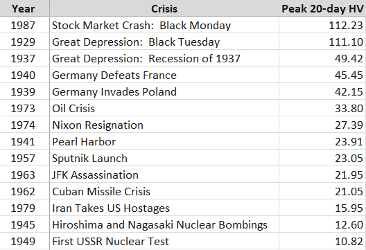
[source(s): Yahoo]

Any ranking of crises in which the Cuban Missile Crisis and the attack on Pearl Harbor rank in the lower half of the list is certain to raise some eyebrows. Frankly I would have been surprised if even one of these events failed to trigger a historical volatility reading of 25, but seeing that was the case for half the crises on this list certainly provides a fair amount of food for thought.

Volatility in the VIX Era

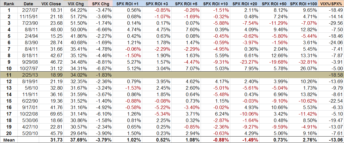
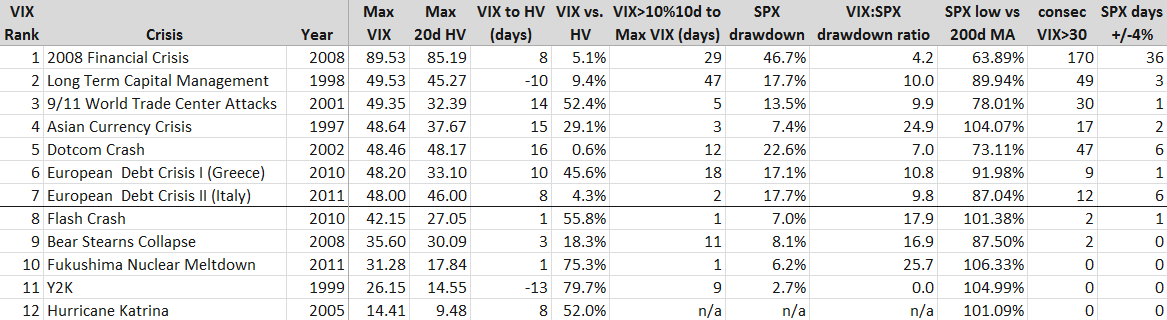
With the launch of the VIX it became possible not only to evaluate historical volatility, but implied volatility as well. With only 18 years of data to draw upon, there is a limited universe of crises to examine, so in the table in Figure 2 below, I have highlighted the seven crises in the VIX era in which intraday volatility has reached at least 48. Additionally, I have included five other crises with smaller VIX spikes for comparison purposes.

[source(s): CBOE, Yahoo]

[Some brief explanatory notes will probably make the data easier to interpret. First, the crises are ranked by maximum VIX value, with the maximum historical volatility in an adjacent column for an easy comparison. The column immediately to the right of the MAX HV data captures the number of days from the peak VIX reading to the maximum 20-day HV reading, with negative numbers (LTCM and Y2K) indicating that HV peaked before the VIX did. The VIX vs. HV column calculates the amount in percentage terms that the peak VIX exceeded the peak HV. The VIX>10%10d… column reflects how many days transpired from the first VIX close above its 10-day moving average to the peak VIX reading. The SPX Drawdown column calculates the maximum peak to trough drawdown in the S&P 500 index during the crisis period, not from any pre-crisis peak. The VIX:SPX drawdown ratio calculates the percentage change in the VIX from the SPX crisis high to the SPX crisis low relative the percentage change in the SPX during the same period (of course these are not necessarily the VIX highs and lows during the period.) The SPX low relative to the 200-day moving average is the maximum amount the SPX fell below its 200-day moving average during the crisis. Finally, the last two columns capture the number of consecutive days the VIX closed at or above 30 during the crisis and the number of days the SPX closed at least 4% above or below the previous day’s close during the crisis.]

Looking at the VIX era numbers, it is not surprising that the financial crisis of 2008 dominates in many of the categories. Reading across the rows, one can get an interesting cross-section of each crisis in terms of various volatility metrics, but I think some of the more interesting analysis comes from examining the columns, where we can learn something not just about the nature of the crises, but also about volatility as well. One important caveat is that the limited number of data points does not allow for this to be a statistically valid sample, but that does not preclude the possibility of drawing some potentially valuable and actionable conclusions.

Looking at the peak VIX reading relative to the peak HV reading I note that in all instances the VIX was ultimately higher than the maximum 20-day historical volatility reading. In the five lesser crises, the VIX was generally 50-80% higher than peak HV. In the seven major crises, not surprisingly HV did approach the VIX in several instances, but in the case of the 9/11 attack and the 2010 European sovereign debt crisis the VIX readings grossly overestimated future realized volatility.

One of my hypotheses about the time between the first VIX close above its 10-day moving average and the ultimate maximum VIX reading was that the longer the period between the initial VIX breakout and the maximum VIX, the higher the VIX spike would be. In this case the Long-Term Capital Management (LTCM) and 2008 crises support the hypothesis, but the data is spotty elsewhere. The current European debt crisis, Asian Currency Crisis of 1997 and 9/11 attack all reflect a very rapid escalation of the VIX to its crisis high. In the case of the May 2010 ‘Flash Crash’ and the Fukushima Nuclear Meltdown, the maximum VIX reading happened just one day after the initial VIX breakout. As many traders use the level of the VIX relative to its 10-day moving averages as a trading trigger, the data in this column could be of assistance to those looking to fine-tune entries or better understand the time component of the risk management equation.

Turing to the SPX drawdown data, the Asian Currency Crisis stands out as one instance where the VIX spike seems in retrospect to be out of proportion to the SPX peak to trough drawdown during the crisis. On the other side of the ledger, the drawdown during the Dotcom Crash appears to be consistent with a much higher VIX reading. Here the fact that it took some 2 ½ years for stocks to find a bottom meant that when the market finally bottomed, investors were somewhat desensitized and some of the fear and panic had already left the market, which is similar to what happened at the time of the March 2009 bottom. Note that the median VIX:SPX drawdown ratio for all twelve crises is 10.0, which is about 2 ½ times the movement in the VIX that one would expect during more normal market conditions.

The data for the SPX Low vs. 200-day Moving Average is similar to that of the SPX drawdown. For the most part, any drawdown of 10% or more is likely to take the index below its 200-day moving average. In the seven major crises profiled above, all but the Asian Currency Crisis dragged the index below its 200-day moving average; on the other hand, in all but one of the lesser crises the SPX never dropped below its 200-day moving average. Based on this data at least, one might be inclined to include the 200-day moving average breach as one aspect which helps to differentiate between major and minor crises.

As I see it, the last two columns – consecutive days of VIX closes over 30 and number of days in which the SPX has a 4% move – are central to the essence of the crisis volatility equation. Since the dawn of the VIX, the SPX has experienced a 2% move in about 80% of its calendar years, the VIX has spiked over 30 about 60% of the years, and the SPX has seen at least one 4% move in about 40% of those years. Those 4% moves are rare enough so that they almost always occur in the context of some sort of major crisis. In fact, one could argue that a 4% move in the SPX is a necessary condition for a financial crisis and/or a significant volatility event.

Fundamental, Technical and Psychological Factors in Crisis Volatility

Crises have many different causes. In the pre-VIX era, we saw a mix of geopolitical crises and stock market crashes, where the driving forces were largely fundamental ones. During the VIX era, I would argue that technical and psychological factors become increasingly important. The rise of quantitative trading has given birth to algorithmic trading, high-frequency trading and related approaches which place more emphasis on technical data than fundamental data. At the same time, retail investing has been revolutionized by a new class of online traders and the concomitant explosion in self-directed traders. This increased activity at the retail level has added a new layer of psychology to the market.

In terms of fundamental factors, one could easily argue that the top nine VIX spikes from the list of VIX era crises all arise from just two meta-crises, whose causes and imperfect resolution has created an interconnectedness in which subsequent crises are to a large extent just downstream manifestations of the ripple effect of the original crisis.

The first example of the meta-crisis effect was the 1997 Asian Currency Crisis, which migrated to Russia in the form of the 1998 Russian Ruble Crisis, which played a major role in the collapse of Long-Term Capital Management.

The second example of meta-crisis ripples begins with the Dotcom Crash and the efforts of Alan Greenspan to stimulate the economy with ultra-low interest rates. From here it is easy to draw a direct line of causation to the housing bubble, the collapse of Bear Stearns, the 2008 Financial Crisis and the recurring European Sovereign Debt Crisis. In each case, the remedial action for one crisis helped to sow the seeds for the next crisis.

In addition to the fundamental interconnectedness of these recent crises, it is also worth noting that the lower volatility crises were largely point or one-time-only events. There was, for instance, only one Hurricane Katrina, one turn of the clock for Y2K and one earthquake plus tsunami in Japan. As a result, the volatility associated with these events was compressed in time and accordingly the contagion potential was limited. By contrast, the major volatility events are more accurately thought of as systemic threats that ebbed and flowed over the course of an extended period, typically with multiple volatility spikes. In the same vein, the attempted resolution of these events generally included a complex government policy cocktail, whose effects were gradual and of largely indeterminate effectiveness.

Apart from the fundamental thread running through these crises, I also believe there is a psychological thread that sometimes spans multiple crises. Specifically, I am referring to the shadow that one crisis casts on future crises that follow it closely in time. I call this phenomenon ‘disaster imprinting’ and psychologists characterize something similar as availability bias. Simply stated, disaster imprinting refers to a phenomenon in which the threats of financial and psychological disaster are so severe that they leave a permanent or semi-permanent scar in one’s psyche. Another way to describe disaster imprinting might be to liken it to a low-level financial post-traumatic stress disorder. Following the 2008 Financial Crisis, most investors were prone to overestimating future risk, which is why the VIX was consistently much higher than realized volatility in 2009 and 2010.

While it is impossible to prove, my sense is that if the events of 2008 were not imprinted in the minds of investors, the current crisis atmosphere might be characterized by a much lower degree of volatility and anxiety.

Conclusion

As this goes to press, the current volatility storm is drawing energy from concerns about the European Sovereign Debt Crisis as well as fears of a slowdown in global economic activity. The rise in volatility has coincided with a swift and violent selloff in stocks that has seen six days in which the S&P 500 index has moved at least 4% either up or down – a rate that is unprecedented outside of the 2008 Financial Crisis.

Ultimately, the severity of a volatility storm is a function of both the magnitude and the duration of the crisis, as well as the risk of contagion to other geographies, sectors and institutions. Act I of the European Sovereign Debt Crisis, in which Greece played the starring role, can trace its origins back to December 2009. In the intervening period, it has spread across Europe and has sent shockwaves across the globe.

By historical standards the volatility aspect of the current crisis is more severe than at any time during World War II, the Cuban Missile Crisis and just about any crisis other than the Great Depression, Black Monday of 1987 and the 2008 Financial Crisis.

In the data and commentary above, I have attempted to establish some historical context for volatility during various crises extending back to 1929 and in the process give investors some metrics for evaluating current and future volatility spikes. In addition, it is my hope that concepts such as meta-crises and disaster imprinting can help to bolster the interpretive framework for investors who are seeking a deeper understanding of volatility storms and the crises from which they arise.

Related posts:

Disclosure(s): none

DISCLAIMER: "VIX®" is a trademark of Chicago Board Options Exchange, Incorporated. Chicago Board Options Exchange, Incorporated is not affiliated with this website or this website's owner's or operators. CBOE assumes no responsibility for the accuracy or completeness or any other aspect of any content posted on this website by its operator or any third party. All content on this site is provided for informational and entertainment purposes only and is not intended as advice to buy or sell any securities. Stocks are difficult to trade; options are even harder. When it comes to VIX derivatives, don't fall into the trap of thinking that just because you can ride a horse, you can ride an alligator. Please do your own homework and accept full responsibility for any investment decisions you make. No content on this site can be used for commercial purposes without the prior written permission of the author. Copyright © 2007-2023 Bill Luby. All rights reserved.
 
Web Analytics