Showing posts with label Italy. Show all posts

Tuesday, March 10, 2020

Looking at Coronavirus Cases per Million, by Country


Further to yesterday’s Coronavirus (COVID-19), post, Tracking the Trajectory and Peak of Coronavirus Cases, I want to make sure we are thinking not just in terms of the absolute number of confirmed cases, but also cases per million. 

The graphic below highlights the countries which have been hit hardest on a per capita basis.  Using this criterion, Iceland is the country where the coronavirus is most prevalent, followed by Italy, South Korea, Iran, China and Switzerland.  These six countries stand out as having passed an inflection point.  Given the data out of Western Europe in the past 48 hours, it appears as if Spain, Sweden, France and Denmark are not far behind.  The U.S. currently ranks 41st in terms of cases per million, with just 1/100th of the penetration in Iceland.

[source(s):  Wikipedia, VIX and More]

Assuming the distribution of new cases continues to trace a parabolic path, being able to reasonably estimate the terminal penetration rate – which will no doubt vary by country – could help to set expectations about the progress and timeline of new cases.

Finally, to follow up on yesterday’s post, I am now dating the first day of 100 new cases in the U.S. at March 7th.  Using the 8-14 day window for 100 new cases to peak new cases means the U.S. could see peak new cases in the March 15th – March 22nd time frame, with an outside shot of the peak extending out to March 29th.  Of course, this projection are merely an extrapolation from the experience in other countries and will be largely dependent upon the rate at which testing is ramped up in the U.S.

Further Reading:

For those who may be interested, you can always follow me on Twitter at @VIXandMore

Disclosure(s):
none

Monday, March 9, 2020

Tracking the Trajectory and Peak of Coronavirus Cases


I have seen a lot written about the Coronavirus, a.k.a. COVID-19, but I have yet to see any informed discussion about the trajectory of cases in various regions, the cycle time to peak new cases or meaningful predictions about the future course of the spread of the virus.

So here are some thoughts on the subject, using historical data from Wikipedia that is more standardized in time and collection methodology than any other data I have been able to find on the Web.  First, I examined the entire history of case data by country and found inflection points that roughly correspond to 10 new cases and 100 new cases per day.  As identification of initial cases is somewhat problematic given the variable protocols for testing, availability of testing kits, timing of nearby positive cases, etc. I elected to use the 100 new cases per day threshold.

It turns out that there have been seven countries so far that have logged 100 new COVID-19 cases in a single day.  In order of reaching that 100 new cases threshold, they are:  China (January 21st), South Korea (February 21st), Italy (February 26th), Iran (February 27th), France (March 5th), Germany (March 6th) and Spain (March 6th).  The U.S. has come close to the 100 new case threshold and may indeed hit that mark today or tomorrow.

The graphic below shows the daily number of new cases in each of the seven 100+ new case countries.  Note that it is reasonable to expect some sort of parabolic pattern for new cases with a steep jump in new cases that eventually flattens out, peaks and declines in a similar fashion.  This pattern probably would have been the case in China, except that on February 10th, China changed the methodology for counting new “confirmed” cases from relying strictly on the basis of a positive result from a lab testing kit to cases that included patients where CT scans for pneumonia allowed for a “confirmed” case clinical diagnosis for likely COVID-19 cases without having to wait for a lab test and results.

[source(s):  Wikipedia, VIX and More]

To summarize the data in the graph, three of the four countries that are at least ten days from the initial 100-case day have seen what appears to be a peak in new cases.  In China, it was 22 days from 100 cases to peak new cases, though it is possible that peak new cases might have been 14 days if China had not expanded the methodology for defining new cases to include a clinical diagnosis.

In South Korea, a concerted effort to ramp up testing as quickly as possible is probably responsible for the fact that South Korea saw a peak in new cases just 9 days after the first 100-case day.

While the peak in new case data in Iran should be considered provisional, the current peak in new cases was only 8 days after the first 100-case day, perhaps aided by the steep trajectory in new cases during the first five days.

Italy is the outlier in that there are no signs of a peak some ten days after the first 100-case day, though it is reasonable to expect that the newly implemented national lockdown and public gathering measures will help to slow the rate of new cases going forward.

The remaining three Western European countries – France, Germany and Spain are only 3-4 days into their post-100 timeline, so it is too early to talk about a peak.

The first quick takeaway is that the time from 100 new cases to peak new cases seems to cluster around 8-14 days or perhaps 8-22 days if you overlook the changes in the methodology for counting new cases in China.

Second, with the U.S. new case count hovering just below 100, it is reasonable to expect that the 8-14 day window for new cases will also apply to the U.S. putting a likely peak count in the March 17th – March 24th time frame, with an outside shot of the peak extending out to April 1st.  This assumes, of course, that the U.S. follows a similar trajectory to the other countries.  Along those lines, it will be interesting to see if Italy’s new cases peak during the next week.

Obviously, there are a number of factors that can affect how successful a country can be in containing the COVID-19 outbreak, conduct an appropriate number of tests and other factors. Japan, for instance, had its first case almost two months ago and has yet to approach 100 new cases in a day.

More to come on the COVID-19 global outbreak, the VIX, volatility and more.

Further Reading:

For those who may be interested, you can always follow me on Twitter at @VIXandMore

Disclosure(s): none

Saturday, December 31, 2016

The Year in VIX and Volatility (2016)

The consensus called for a big uptick in volatility in 2016 and while there was a lot of drama, the VIX spikes were relatively manageable and short-lived.  The VIX opened the year at 22.48 and ended the year at just 14.04.  For the full year, the median VIX was 14.31, while SPX historical volatility for the full year ended up at a mere 13.12.

That being said, there were five distinct VIX spikes in the graphic below, listed according to chronology:
  • Fears related to slowing growth in China (January)
  • A plunge in crude oil prices to $26.05/bbl. for WTIC, as investors grappled with the possibility that Cushing storage facilities would be exhausted (February)
  • The surprise Brexit vote result in favor of the U.K. leaving the E.U. (June)
  • A cocktail of nearly simultaneous shocks from Fed President Rosengren (suddenly sounding hawkish), Jeff Gundlach (interest rates have bottomed) and the European Central Bank (no additional stimulus) puts pressure on stocks (September)
  • Increasing uncertainty leading up to the U.S. election (November) 

In all five instances, the VIX moved up sharply, but in defiance of historical precedent, the volatility index moved down almost as sharply as it moved up.  In fact, some of the biggest extremes for the year came in the form of volatility crushes, where the VIX had an unprecedented series of sharp downward one-day move.  Checking the record books, the only previous year that the VIX posted three top 20 one-day declines was 2007 – and clearly investors were in denial that year.  This year the Trump election caused the sixth largest one-day drop in the history of the VIX, whereas the Thursday before and Tuesday after the Brexit vote triggered the eighteenth and tenth largest one-day VIX declines.

On the other side of the ledger, some of the upward moves in the VIX made the record books as well.  The day following the Brexit vote saw a 49.3% VIX spike – the fifth highest one-day spike on record.  What was even more surprising was the Rosengren/Gundlach/ECB cocktail noted above triggered a 39.9% spike (eleventh highest in history) in what seemed to be a relatively calm market environment in September.  It turns out the VIX was just getting warmed up for greater things, including a record nine consecutive up days leading up to the November election.

Even with these extremes, the highs and lows in the VIX were rather middling, with the VIX peaking at 32.09 on January 20th and hitting an annual low of 10.93 on December 21st.

The graphic below captures these and other highlights from 2016:


[source(s): StockCharts.com, VIX and More]

Included in the non-VIX highlights are a 5000+ year low in interest rates in Europe and Japan (where negative interest rates prevailed) as well as a thirteen-year low in the price of crude oil.  On the geopolitical front, political craziness of one kind or another abounded in Brazil, South Korea, Turkey, Italy, Colombia and South Africa, among other locations.  Terrorism also left its footprint again in 2016 and Zika also created considerable political and social turmoil.  In the financial realm, European banks had a very difficult year and begin 2017 on shaky footing.

While the year ended on a relatively quiet not, I suspect 2017 will have much more in the way of new surprises, including swans of many dark hues.  Next week I will resume the VIX and More fear poll and find out what the consensus is for volatility and its causes in the coming year.

Finally, since 2011, I have been maintaining a proprietary Macro Risk Index that measures volatility and risk across a broad range of asset classes, including U.S. equities, foreign equities, commodities, currencies and bonds.  In 2016, the Macro Risk Index was trending down most of the year, punctuated by significant spikes in February (crude oil) and again in June (European currencies). 

How did 2016 measure up to expectations?  I sum up the year in My Low Volatility Prediction for 2016: Both Idiocy and Genius.  Also worth investigating are a pair of Barron’s articles from one year ago laying out two opposing perspectives on volatility in 2016.  For the case for rising volatility and what to do about it, try Jared Woodard’s Prepare for Rising Volatility in 2016.  I provide the contrarian point of view in The Case Against High Stock-Market Volatility in 2016.

Have a happy, healthy and profitable 2017!

Related posts:


For those who may be interested, you can always follow me on Twitter at @VIXandMore

Disclosure(s): the CBOE is an advertiser on VIX and More

Sunday, November 20, 2016

Post-Election Risk Trending Up in Treasuries and the Euro, Down in U.S. Stocks

You can always tell when the crowd gets long the VIX and ends up on the wrong side of the trade.  “The VIX is broken!” becomes an oft-repeated refrain, as does “The markets are rigged!” and the usual list of exhortations from those who are in denial.  The current line of thinking is that the world must be much more dangerous, risky and uncertain as a result of a Trump victory, yet the VIX is actually down 31.4% since the election – ipso facto the VIX is broken.

While I have more than a small soft spot in my heart for the VIX, I will be the first to point that taking an Americentric, equity-centric view of the investment landscape is dangerous and naïve.  More often than not, the issues that end up having a strong influence on the VIX are born on foreign soil and/or in other asset classes.  Just look at the recent history in China, Greece, Italy, currencies and commodities to name a few.

When it comes to looking at implied volatility indices as a risk proxy, I prefer to survey the landscape across asset classes, geographies and sectors, which is why I have developed tools such as a proprietary Macro Risk Index (more on this shortly) that look at risk across asset classes, geographies and sectors.

In the graphic below, I have isolated a handful of volatility indices that cut across asset classes and geographies to show how these have moved in the eight days following the election.  Note that Treasuries (TYVIX) and the euro (EVZ) have been trending steadily higher since the election as uncertainty related to the future of inflation and interest rates in the U.S. has risen, while the relationship that the Trump Administration will have with our NATO allies and the European Union is also somewhat murkier. 

Gold implied volatility (GVZ) initially moved sharply higher following the election, but has since receded, as gold prices fell swiftly after the election, but have since stabilized.  Meanwhile, emerging markets saw dramatic selling immediately following the election, but have bounced during the course of the past week as fears and implied volatility (VXEEM) have subsided.  Last but not least, the moves in crude oil and crude oil implied volatility (OVX) have been the least remarkable of the group


[source(s):  CBOE, VIX and More]

In aggregate, the picture is a mixed one in terms of implied volatility, risk and uncertainty.  As is often the case, risk has become elevated in certain asset classes, such as Treasuries and the euro.  In other areas, such as U.S. equities – and their VIXian barometer – there are winners and losers, with the result that a net bullish outlook has moved equity implied volatility lower.  This is not to say that a Trump Administration – whose cabinet members and policy priorities are largely unknown at this juncture – will not increase risk in some areas.  More risk is certainly on the horizon and if history is any guide, an Americentric, equity-centric view of the investment world is likely to be slow in identifying those risks.

Related posts:


For those who may be interested, you can always follow me on Twitter at @VIXandMore


Disclosure(s): the CBOE is an advertiser on VIX and More

Sunday, January 26, 2014

The Year in VIX and Volatility (2013)

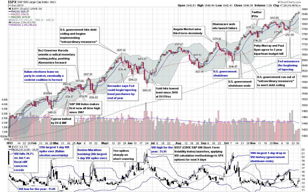
This is the sixth year in a row I have offered a retrospective look at the year in VIX and Volatility, which is my attempt to cram the highlights of the year in volatility onto one graphic with a manageable amount of annotations.

In terms of equity volatility and specifically the VIX, 2013 was the story of a persistent bull market in stocks and very little in the way of implied or realized volatility, at least by historical standards. In fact, the VIX’s high water mark of 21.91 was the second lowest annual high point since 1995, eclipsed only by the Greenspan liquidity flood in 2005. Similarly, the average VIX in 2013 was just 14.23, considerably lower than the long-term average, which is a shade over 20. The year only saw two days in which the SPX was up 2% or more and another two days in which the SPX was down at least 2%, the fewest number of such days since 2006.

Even though the numbers may not be impressive, there were still some significant events during the course of the year that were able to provoke substantial anxiety and fear, at least for the short-term. The year began with the Fiscal Cliff drama coming to an end and saw fear in the euro zone heat up after the Italian elections ended with a parliamentary deadlock and Cypriot banks triggered a joint EU/IMF bailout of Cyprus. The Boston Marathon bombings provided a jolt of terrorist fear in April and fears about Japan the future of Abenomics created huge volatility in the yen, with ripple effects felt across currency markets and in many related financial markets during May and June.

In the U.S., the Fed tapering scenarios dominated the investment landscape during the second half of the year and the debt ceiling crisis, government shutdown and entrenched bipartisan bickering cast many doubts about the potential for some huge self-inflicted wounds.

In the end, the SPX set 44 new all-time closing highs in 2013 and the VIX ended the year almost 24% below where it finished in 2012, though the Fiscal Cliff was responsible for most of that gap.

[source(s): StockCharts.com. VIX and More]

So far 2014 looks more interesting from a volatility perspective, but the year is young and the volatility story is always one of surprises in the form of swans with dark gray plumage.

Related posts:

Disclosure(s): none

Monday, February 25, 2013

All-Time VIX Spike #11 (and a treasure trove of VIX spike data)

Today was one of those days that caught a lot of people off guard. Halfway through today’s trading session stocks we largely unchanged, then some pockets selling began when results of the elections in Italy started trickling in, suggesting the possibility of a deadlock in the Italian parliament and perhaps the need for another round of elections.

The governmental chaos is largely the result of rise of two intriguing political figures. One of these is the phoenix known as Silvio Berlusconi and his People of Freedom (PDL) party, which is anti-austerity and has proposed a policy of massive tax cuts and talked about the possibility of leaving the euro. The bigger electoral surprise is Beppe Grillo and the Five Star Movement (M5S), where Grillo’s populist agenda and anti-corruption message have resonated with voters. Both Berlusconi and Grillo have had a much stronger influence on the elections than most had anticipated and with Italy’s relationship with the euro zone now in question, the euro fell to under 1.31 against the dollar for the first time in six weeks.

U.S. stocks, which had seemed impervious to the sequestration threat, began selling off sharply as a result of the confusion about the future of the Italian government, with selling gathering steam during the second half of today’s session and accelerating sharply during the last hour, when the S&P 500 index fell more than 1% and the VIX spiked 14.4%.

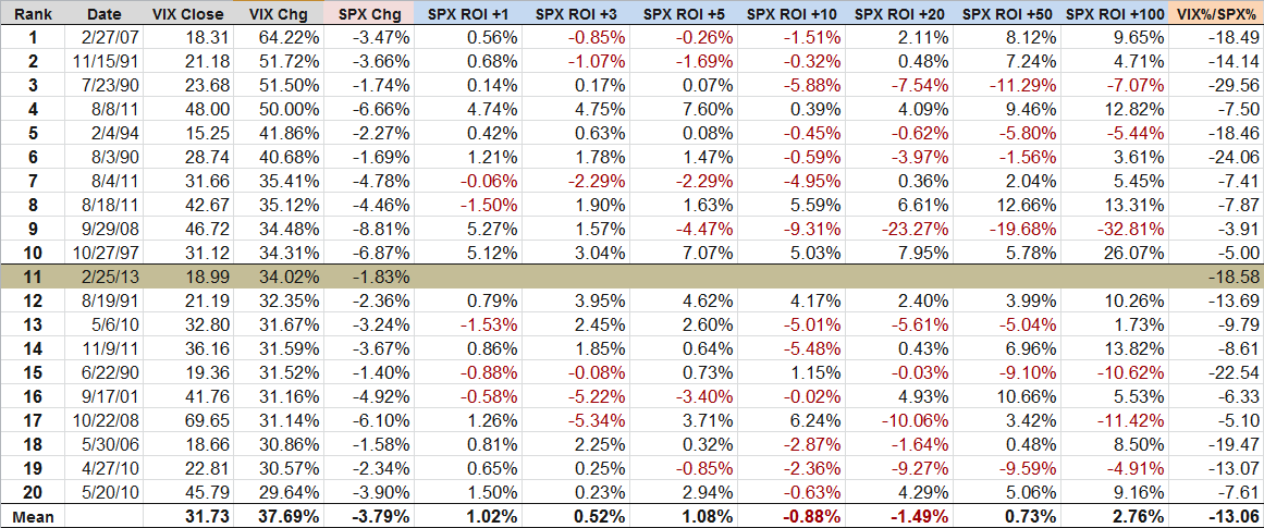
For the full day, the SPX was down 1.83% and the VIX was up 34.02%. The 34% spike in the VIX makes it the eleventh largest one-day spike in the 24 years of VIX historical data going back to 1990.

The first question on everyone’s mind is what the implications of the VIX spike are for stock prices and volatility going forward. The truth is that the historical record following a large one-day VIX spike is somewhat spotty. The table below captures some data from the top 20 one-day VIX spikes. Note that on average (here is where I like to remind everyone that it is possible to drown crossing a stream that is one inch deep ‘on average’) stocks generally outperformed following a big VIX spike for up to one week (SPX ROI +1 to +5 days) and also performed well looking out more than two months. From one week to two months, however, stocks have underperformed following a large VIX spike.

Note that the table below is based on a small data set and if one extracts subsets of this data for the VIX at certain absolute levels or during selected periods or even relative to the magnitude of the change in the SPX, it is possible to draw some very different conclusions. Part of the reason for this may be due to the sample size and part of the answer may be that a clear-cut interpretation of this data is not easy to extract. For these reasons, I have included a fair amount of relevant data and encourage readers to draw their own conclusions.

[source(s): CBOE, Yahoo, VIX and More]

For those who are interested in more conclusive research and analysis on VIX spikes, volatility and other subjects related to today’s events, the links below are an excellent place to start.

Related posts:

Disclosure(s): short VIX at time of writing

Friday, January 4, 2013

VIX ETP Performance in 2012

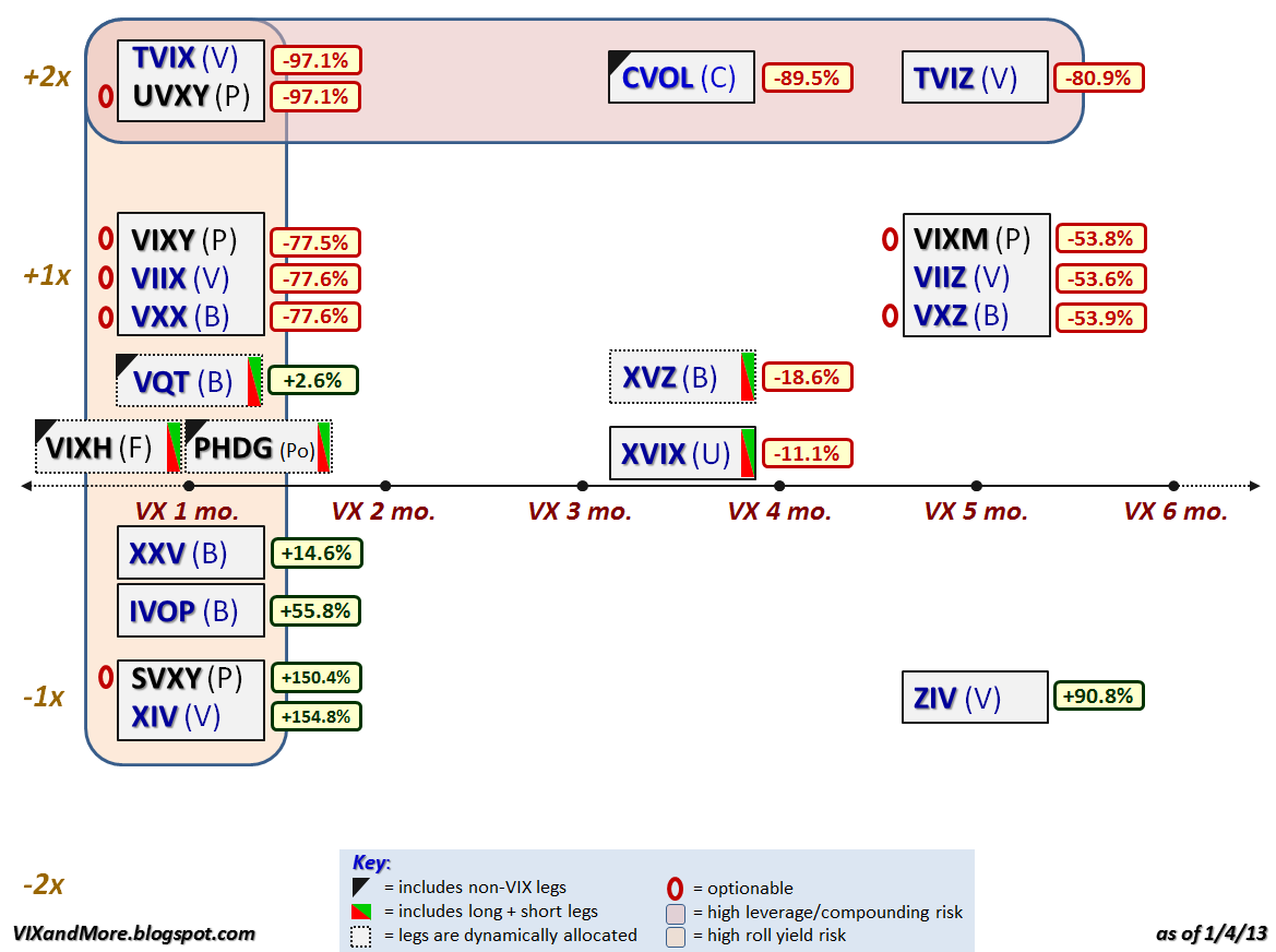
For anyone who pays attention to the VIX exchange-traded products space, 2012 was the year of the inverse (short) VIX futures ETP. The graphic below recaps the performance of the VIX ETPs that were trading as of the end of 2012 and it is easy to see that if you were long the inverse products (XIV, SVXY, ZIV, etc.) and were able to hold on to these positions during volatility storms such as the Greek elections, yield spikes on the sovereign debt of Italy and Spain, the fiscal cliff, etc. (all of which required nerves of steel and a creative risk management approach), then 2012 was a very good year for you. If not, then let the performance ups and downs be a reminder that most of the VIX ETPs are not well-suited for mainstream investors.

Instead of going into too much detail about the performance and reiterating much of what I have already said in the past, I encourage readers to investigate the links below, which include some predictions about future price moves and risk-reward ratios that have been borne out by the events of 2012.

If your new to this product space, perhaps the first place you should begin your research is with posts tagged with labels such as contango, roll yield and term structure – subjects that I have been writing about since the first VIX ETPs were launched, three years ago this month.

[Note that there are no performance numbers for VIXH or PHDG, as these products were launched during the year and have not yet accumulated full-year performance data.]

Related posts:

Disclosure(s): long XIV, SVXY and ZIV at time of writing

Wednesday, January 2, 2013

The Year in VIX and Volatility (2012)

Every year I assemble a chart that is my retrospective look at the year in volatility. While 2012 was the first year since 2006 that the VIX failed to make it out of the 20s, this was not due to an absence of threats to the stock market.

During the first half of the year, the euro zone was the primary concern for most investors, with the events surrounding the two nail-biting elections in Greece haunting the markets from April through June. With Greece off of the front page, focus of the European sovereign debt crisis shifted to unsustainable government debt yields in Spain and Italy, which only began to turn around after Mario Draghi pledged to do “whatever it takes” to save the euro in July.

Meanwhile, markets in the United States were relatively calm due to the repeated intervention of the Fed, which offered up QE 2.5, QE3 and QE4. The global economy also found support in the form of central bank stimulus plans from China, Japan and the euro zone.

The last hurrah for the VIX and volatility in 2012 was the fiscal cliff, which was largely overlooked during the U.S. elections, but dominated the headlines even before the last vote was counted. The fiscal cliff issue remained the #1 source of concern for investors throughout the balance of the year and had the VIX moving counter to its usual direction for most of December.

As 2013 dawns, fears related to the fiscal cliff are plummeting and dragging the VIX down with it, but clearly the issues that have kept the financial markets on edge for the past few years are not yet behind us and unseen risks are always lurking just over the horizon.

[source(s): StockCharts.com]

Related posts:

Disclosure(s): none

Saturday, July 7, 2012

Chart of the Week: As Goes Spain…

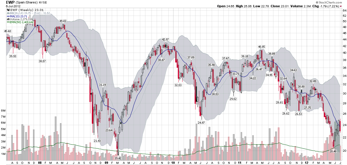
Two years ago today, in Spain rallies, I posted a chart of the Spanish ETF, EWP, that showed EWP had rallied off of a bottom and looked like it was poised for a bullish breakout.

In July 2010, I saw Spain as the keystone in the euro zone puzzle:

“Spain is the tipping point in the European sovereign debt crisis as I see it. In a nutshell, as goes Spain, so goes Europe.”

Two years later, I still believe that Spain is the most important line in the sand that euro zone leaders have to grapple with and the country whose fate is probably most intertwined with the future of the euro.

The chart of the week below shows weekly bars of EWP going back five years. The dominant feature in this chart is the financial crisis of 2008-2009. Various iterations of the euro zone crisis can be identified in the bottoms in June 2010, September 2011, November 2011, etc. EWP was in a gradual downtrend from April 2011 to March 2012, but fell sharply until the beginning of June. The most recent bounce in the Spanish ETF still looks somewhat tentative on the charts and is likely to be tested in the weeks and months ahead.

As concerning as the equity situation looks in Spain, the country’s credit default swaps (just 8% off of their all-time highs at 578) and yields on sovereign debt (yields on the 10-year bond are 5% below their all-time highs at 6.95%) indicate an even greater degree of financial stress.

At one time or another, I would expect Italy, France to find their way back into the crosshairs of traders who are looking to capitalize on euro zone angst, but as far as I am concerned, Spain will continue to the most critical line in the sand.

Related posts:

[source(s): StockCharts.com]

Disclosure(s): none

Thursday, June 28, 2012

The Evolution of European Equity Risk

There are many ways in which investors can evaluate risk related to the euro zone. Credit default swaps for sovereign debt are one way to evaluate the risk of country default. Sovereign bond yields are a good proxy for a country’s access to funding via the credit markets. The euro crosses and related directional moves are a barometer of the strength of the currency and the euro zone countries as a whole, while various Intrade contracts can lend a sense of the probabilities that investors assign to various events, such as to the risk of one or more countries dropping the euro.

On the volatility side, the VSTOXX (EURO STOXX 50 Volatility Index) the EVZ (CBOE EuroCurrency Volatility Index) provide a market assessment of risk and uncertainty in euro zone stocks as well as the currency.

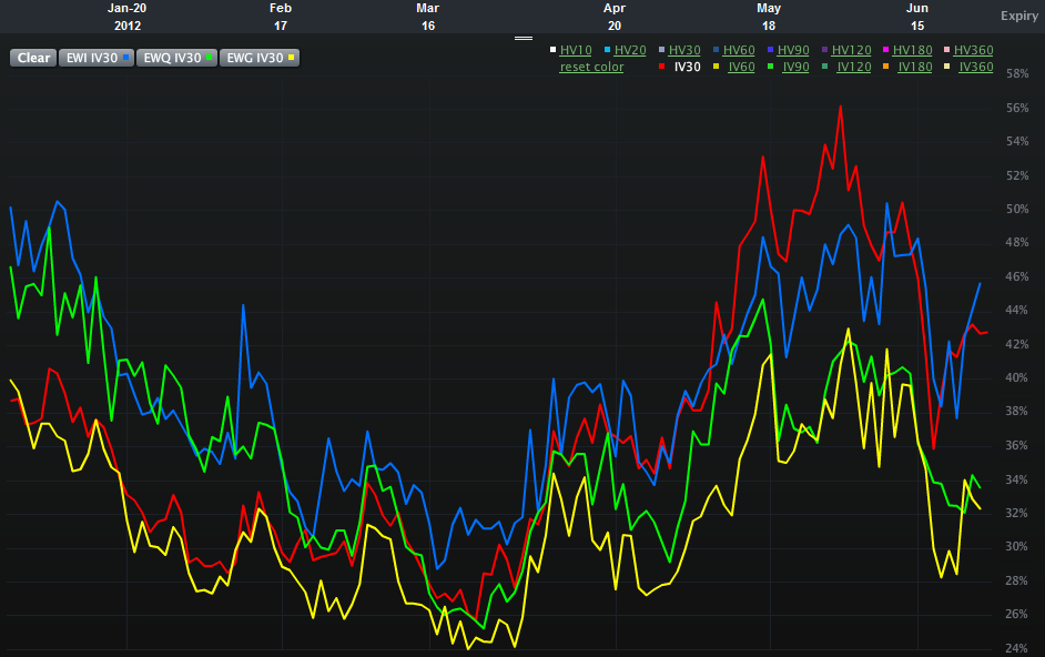
One piece of analysis I have not seen, however, is an assessment of the relative risk and uncertainty for equity markets in some of the more important euro zone nations. Specifically, Spain, Italy, France and Germany. The chart below attempts to offer up that very information, using 30-day implied volatility for the various country ETFs over the course of the past six months:

  • EWP – Spain (red line)
  • EWI – Italy (blue line)
  • EWQ – France (green line)
  • EWG – Germany (yellow line)

Looking at the chart, what initially catches my eye is the recent evolution of the two-tiered risk system. In the first half of the year, the higher risk is clearly associated with Italy and France, whereas Spain and Germany appear to be considerably less risky in terms of implied volatility. By the March the risk appears to have lessened across the board and the distinctions between individual countries is more difficult to discern. Over the course of the last 1 ½ months or so, a new two-tiered system has appeared. This time around it is Italy and Spain where the risk to equities is considered to be the greatest, with France now joining Germany in the lower risk tier.

In essence, Italy has persisted in the high risk tier and Germany has been a constant in the lower risk category. Over the course of the past few months, the interesting development has been the switch between France and Spain, with the former improving from being a peer of Italy to a peer of Germany, while Spain has moved in the opposite direction.

One could certainly argue that all four countries are in the same boat (taking on water, with shoddy life preservers, in shark-infested waters and being one small mutiny away from having no captain…), but clearly investors think there are important distinctions to be made in terms of equity risk and uncertainty. Perhaps of more interest, these fortunes appear to be shifting, with little perceptible difference not just between Spain and Italy, but also between Germany and France.

Related posts:

[source(s): LivevolPro.com]

Disclosure(s): Livevol is an advertiser on VIX and More

Wednesday, June 27, 2012

Euro Volatility and Risk

With the euro zone summit looming, investors are scrambling to find all sorts of measuring sticks to evaluate the risks of a sharp move in the financial markets. Based on some of the emails I have received, many are skeptical of the VIX right now, which is trading in the mid 19s, some 5% below its lifetime mean. At 27.54, the VSTOXX (EURO STOXX 50 Volatility Index) is showing much more uncertainty, but even that number is low relative to the range of the VSTOXX for the past three months.

Whether Spain, Italy or Greece is the fixation du jour, the questions investors really want answers to ultimately all cluster around the future of the euro. I have addressed this question relative to the risk of one or more countries leaving the euro in the context of various Intrade contracts (see links below), but another overlooked manner of measuring risk and uncertainty in the euro is the CBOE EuroCurrency Volatility Index (EVZ). Sometimes referred to as the “euro VIX,” EVZ uses the VIX methodology to measure the market’s expectations of future volatility in the euro. In theory, therefore, EVZ should also be a proxy for risk and uncertainty in the euro. One might even go as far as to consider EVZ as a euro zone fear indicator.

So what is a chart of EVZ telling us on the eve of another euro zone summit?

The chart below shows that at 11.27, EVZ is currently in the lower portion of its range of 9.23 – 20.34 for the past year. Indeed EVZ is only in the 18th percentile of the range of values over the course of the past year. Also of interest, the current 20-day historical volatility of EVZ (60) is lower than the 180-day historical volatility measure (65) – as has been the case for the majority of the last six months. Last but not least, EVZ has been on a notable downtrend since June 18th.

Headlines aside, traders do not see a lot of currency risk in the euro right now, at least relative to the last year or so and as far as the 30-day forward-looking window defined by EVZ is concerned.

So if you think the VIX is depressed and understating market risk, don’t expect the EVZ to be signaling something different. Currency risk and uncertainty seem surprisingly low at current levels. If you think the market has underpriced the potential for a large move in the euro, then consider some long straddles on the euro or its ETF counterpart, FXE.

Related posts:

[source(s): LivevolPro.com]

Disclosure(s): Livevol is an advertiser on VIX and More

Tuesday, June 12, 2012

Greek Elections and the Future of the Euro

While this week’s news cycle has been Spain, Spain, Italy and Spain so far (reminiscent of an old Monty Python skit, but I digress), it is easy to forget for a moment or so that Greece is holding another round of elections on Sunday.

As Greek law prohibits polling or publishing poll results in the 14 days leading up to an election, we do not know how voter sentiment about the bailout and remaining in the euro may be ebbing or flowing. Greek voters have certainly a great deal to think about, some of which may have been complicated by the positioning of Syriza’s leader, Alexis Tsipras, who insists that it is possible to repudiate the bailout agreement, start afresh with a new plan that is based on stimulating economic growth and job creation – yet never have to leave the euro zone in the process.

So just how will the Greek elections influence the future of the euro?

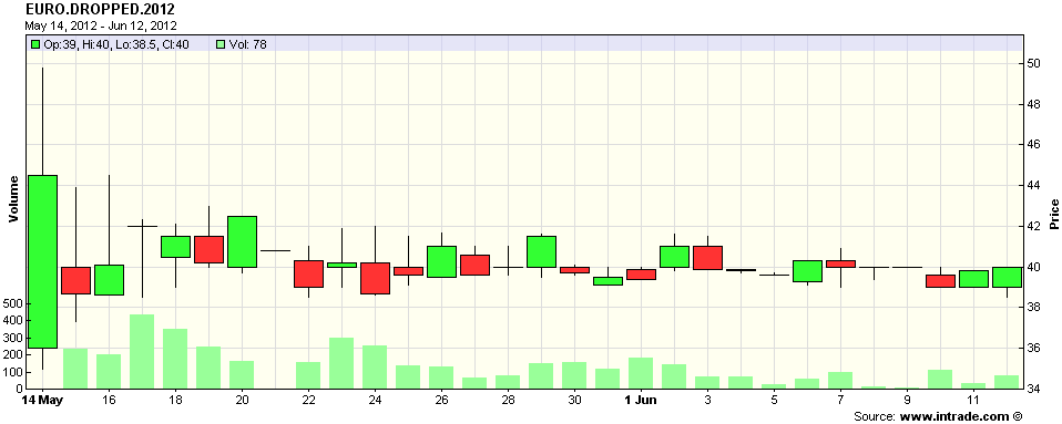
Without polls, the Intrade contract that specifies “Any country currently using the Euro to announce intention to drop it before midnight ET 31 Dec 2012” now becomes an even more valuable informational resource. The problem is that in spite of a fair amount of activity, the price of the contract has remained essentially unchanged for the last month, hugging the 40 level (see chart below), which means that participants continue believe that the chance of a Greek exit (I refuse to say ‘Grexit’) by the end of the year is about 40%.

By Monday we will have a much more information, but once again, the process of forming a coalition government may prove to be troublesome…or worse.

For those looking for hedges against some panic in the financial markets next week, keep in mind that VIX options do not expire this week, but next Wednesday, June 20th. As such, VIX calls may prove to be an appropriate hedge against at least short-term post-election anxiety. For those looking for volatility hedges on a week-to-week rather than monthly basis, it might be helpful to investigate VXX weekly options (A Favorite Trade: VXX Weeklys) as well. Last but not least, a reader favorite is a thought piece on the process of constructing hedges is Cheating with Partial Hedges.

Related posts:

[source(s): Intrade.com]

Disclosure(s): short VXX at time of writing

Sunday, April 15, 2012

Chart of the Week: Don’t Blame China

Last week’s financial headlines were dominated by Spain and China. In the case of Spain, this was largely due to increased borrowing by Spanish banks from the European Central Bank. For China the culprit was Q1 GDP growth of only 8.1%, which was down from 8.9% in Q4 2011 and well short of the 9.0% whisper number that made the rounds in the day leading up to Friday’s announcement. In fact, once could certainly argue that it was China’s GDP whisper number that was the main catalyst for Thursday’s big rally that was essentially reversed on Friday.

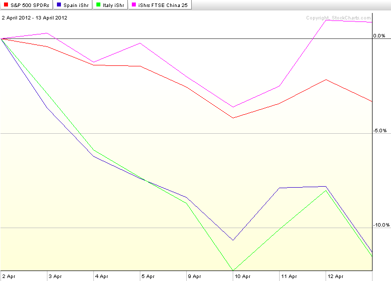
The chart of the week below shows the performance of SPY as well as country ETFs for Spain (EWP), Italy (EWI) and China (FXI) since stocks put in a top two weeks ago tomorrow. The chart shows that while SPY has been declining, country ETFs for Spain and Italy have been falling approximately three times as quickly as their American counterparts. And China? Well, don’t blame China for the woes in the U.S. stock market. While U.S. stocks have been selling off, the performance of the popular iShares FTSE/Xinhua China 25 Index, FXI, has managed to post a 0.9% gain.

[As a side note, about a year ago I discontinued the Chart of the Week, an extremely popular feature in this space since its launch in 2008, as my posting had become sporadic. Going forward I hope to be able to continue my recent regular posting and make this a weekly feature that not only shines a light on key developments of the past week, but also has some archival value as well.]

Related posts:

[source(s): StockCharts.com]

Disclosure(s): none

Monday, January 2, 2012

The Year in VIX and Volatility (2011)

One of the most-loved charts I assemble each year is my retrospective look at the year in volatility. I already touched on some of the highlights of event volatility in text form in Expectations, Surprises and Fear in 2011, but this is one case in which I believe a picture does a better job of telling the story in the context of a timeline for the entire year.

From a volatility perspective, the first half of 2011 was relatively benign, even though the global social and economic fabric was ripped by Arab Spring and the Japanese trio of disasters which came in the form of the earthquake, tsunami and nuclear meltdown.

Things were much more promising during the middle of the year when the Greek parliament voted in favor of austerity and the euro zone agreed to expand the European Financial Stability Facility (EFSF) to €780 million.

For a while, there was considerable angst surrounding the bipartisan politics associated with the U.S. debt ceiling deadline at the beginning of August, but only after the Democrats and Republicans failed to come up with a meaningful debt reduction deal did investor anxiety shift back to Europe. Ironically, the downgrade of the U.S. debt from AAA to AA+ had very little impact on Treasury securities, which actually began to rally sharply after the downgrade. When Europe returned to the center stage, however, the sovereign debt crisis was escalating rapidly and it was now Italy that was in the crosshairs. The VIX shot up to 48 on August 8th and was regularly above 30 through the end of November, setting a new record for persistent backwardation in the VIX futures in the process.

The VIX was a high wire act throughout August and September, with multiple excursions into the 40s. Even after the S&P 500 index bottomed on October 4 at 1074, the VIX remained stubbornly elevated in October and November, before finally falling into the 20s in December. While the SPX was essentially unchanged for the year, the VIX ended 2011 at 23.40, up 31.8% over 2010’s close of 17.75. At the same time, the VIX futures are calling for a VIX of between 29 and 30 by the mid-point of 2012, suggesting that volatility will climb higher once again in the coming months.

In a year where most asset classes struggled mightily, volatility was one of the few great long positions. With a higher starting point going into 2012, it will be difficult for the VIX to repeat its market-beating performance once again, but if the euro zone and some of the geopolitical flash points fail to make progress, 2012 may indeed be the year of the VIX.

Finally, since I had so many requests for a high-resolution version to download last year, I am going to preemptively offer a full resolution PNG screen capture of the graphic below for download here.

Related posts:


[source(s): StockCharts.com]


Disclosure(s): none

Wednesday, December 28, 2011

Italy’s Sovereign Debt Schedule and the VIX

When I think about the risks posed by the European sovereign debt crisis in 2012, the first thing that comes to mind is the huge amount of debt that Italy has to roll over next year. In yesterday’s staff meeting/run with Logan (What My Dog Can Tell Us About Volatility) I even floated the semi-sexy label of “peak refinancing.” He was not particularly impressed…

But I’m sure that somewhere under that calm demeanor, Logan too is worried about Italy and how well that pivotal country will manage the burden of refinancing. Of particular concern is that the refinancing schedule has a three month stretch from February through April in which the debt that is coming due is particularly large – €91.7 billion, just under half of the total redemptions for the entire year.

The table below summarizes the monthly estimates of Italy’s 2012 issuance (per HSBC), as well as the schedule of redemptions and net issuance minus redemptions for each month.

In planning for the timing of elevated anxiety and perhaps a full-blown crisis in Europe in 2012, one would think that Italy’s debt schedule would figure prominently into those calculations. I would also expect to see some of that timetable translated into elevated VIX futures, which I have included at the bottom of the table below. In fact, the 2012 VIX futures term structure is very similar to what it looked like prior to the August selloff, with no hint at all that volatility might peak in February, March or April.

When it comes to pricing options for 2012, keep Italy’s debt schedule in mind, regardless of whether the VIX futures are paying attention to this issue.

Related posts:


[source(s): Italy Department of Treasury, HSBC, Interactive Brokers]

Disclosure(s): none

Tuesday, May 11, 2010

Recent Performance Divergence in European ETFs

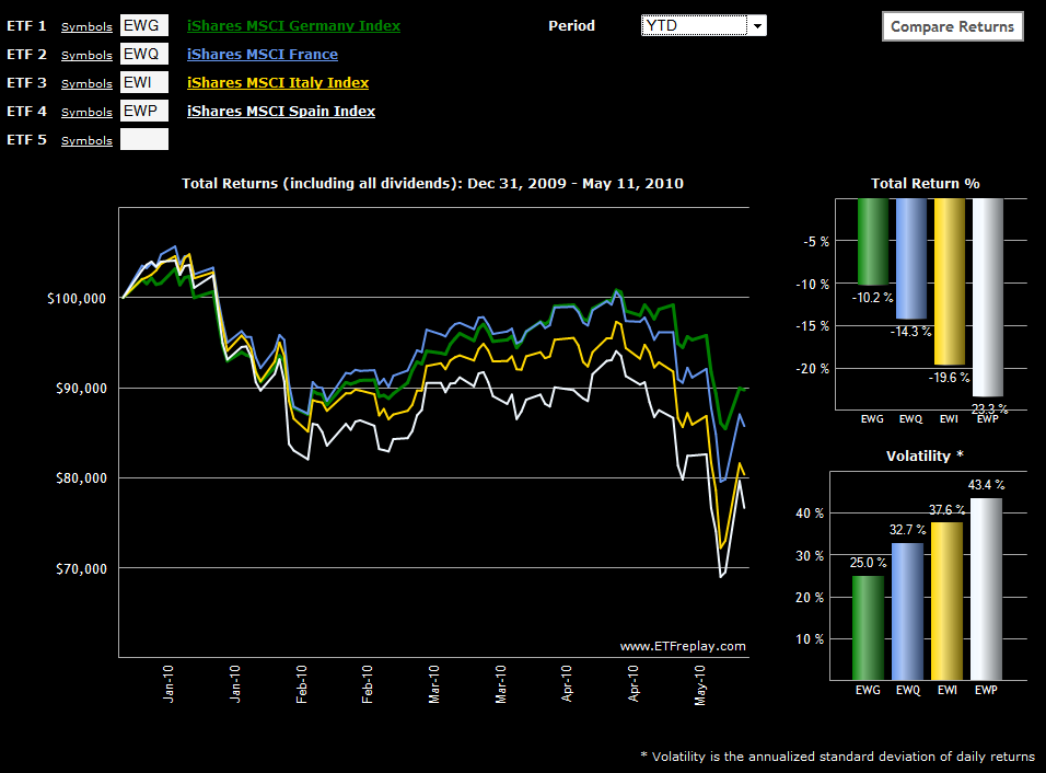
With all the turmoil in Europe, I thought it would be interesting to check on some of the single country ETFs for those nations which have been closest to the sovereign debt crisis. The chart below, courtesy of ETFreplay.com, captures the year-to-date price movements and (historical) volatility for the likes of Germany, France, Italy and Spain.

Not surprisingly, Germany has held up the best and Spain has been the worst performer in 2010. France, which had been tracking fairly close to Germany, has fallen into second as the country’s bank exposure to Greece has saddled France with additional risk. Italy, which has been on the periphery of the contagion concerns, has fared only slightly better than Spain and has actually been the worst performer of the four during the last month and a half as the crisis has deepened.

Also, note that as is often the case, volatility is negatively correlated with performance in these countries, as the largest moves have been negative ones.

For more on related subjects, readers are encouraged to check out:


[source: ETFreplay.com]

Disclosure(s): long EWG at time of writing

Thursday, April 29, 2010

VIX Unspikes as Stocks Rebound

How many days does it take to undo a 30% spike in the VIX? This time around, the VIX retraced 82% of Tuesday’s 30.6% VIX spike in just two days, a bigger reversal than I had anticipated. By comparison, the S&P 500 index reclaimed slightly less ground, recovering 73% of the 38.18 point loss.

The chart below details the most significant pullbacks since stocks bottomed in March 2009, with this week’s 3.1% drop being the 10th largest in 13 months and considerably below the average drop of 5.4% during the period. Note that a 5.4% pullback from a high of SPX 1219 would put that index back at 1153, which is very close to January’s high of 1150.

I have fielded quite a few questions on VIX options, VIX futures and VXX this week, many by readers who wish to know why these securities have been relatively placid compared to the seemingly more dynamic cash/spot VIX. The reason these securities have not retraced as much of Tuesday’s spike as the VIX is because while VIX May futures rose 2.3 points on Tuesday, they have only fallen 1.4 points or 61% in the past two days, largely due to the fact that mean reversion expectations are built into the pricing of VIX futures.

Ultimately the numbers will take back seat to the fundamentals of the European debt crisis, where there has been more evidence of contagion in Portugal, Spain and even Italy where yields on sovereign debt have increased dramatically in the past few days.

The SPX fell 6.5% during the relatively short-lived Dubai debt crisis of October-November 2009. The likelihood that the current European debt crisis will be resolved as quickly and smoothly as the Dubai situation strikes me as remote, which is why I will be looking to take profits on short volatility positions quickly.

For more on related subjects, readers are encouraged to check out:


Disclosure(s): Short VIX and VXX at time of writing

DISCLAIMER: "VIX®" is a trademark of Chicago Board Options Exchange, Incorporated. Chicago Board Options Exchange, Incorporated is not affiliated with this website or this website's owner's or operators. CBOE assumes no responsibility for the accuracy or completeness or any other aspect of any content posted on this website by its operator or any third party. All content on this site is provided for informational and entertainment purposes only and is not intended as advice to buy or sell any securities. Stocks are difficult to trade; options are even harder. When it comes to VIX derivatives, don't fall into the trap of thinking that just because you can ride a horse, you can ride an alligator. Please do your own homework and accept full responsibility for any investment decisions you make. No content on this site can be used for commercial purposes without the prior written permission of the author. Copyright © 2007-2023 Bill Luby. All rights reserved.
 
Web Analytics