Showing posts with label Greece. Show all posts

Tuesday, May 2, 2017

Euro Zone VSTOXX ETNs Land on U.S. Beaches!

Think the market is too complacent about this weekend’s election in France?  Worried that the euro area is going to crumble under the weight of Italy’s struggles?  Convinced that Greece, Portugal or Spain are just one more kicked can away from a disaster?

As of tomorrow, investors in the U.S. will have another way to translate these ideas into actionable trades with tomorrow’s launch of two new exchange-traded notes (ETNs) – EVIX (long euro zone volatility) and EXIV (inverse euro zone volatility) – from VelocityShares and UBS that put a European face on existing U.S. VIX-based products such as VIIX and perennial favorite XIV.

Based on the VSTOXX, the VIX-like volatility index for the EURO STOXX 50 Index of 50 blue-chip stocks from 11 euro zone countries, EVIX and EXIV should be familiar to those who are knowledgeable about VXX and VIIX on the long volatility side as well as XIV and SVXY on the short volatility side.  EVIX and EXIV are based on VSTOXX futures and have a target maturity of 30 days – a maturity that is maintained by rolling a portion of the portfolio each day and therefore subjecting both products to the vagaries of contango and backwardation.  In the event these are terms you are not familiar with, I strongly recommend that you click on the links above and educate yourself.  Believe it or not, this is the ninth year I have been talking about the VIX futures term structure, negative roll yield, contango and backwardation.  (Those who have been paying attention since the early days of VXX and VXZ have no doubt profited mightily from this knowledge.)

The beauty of EVIX and EXIV is that these products create so much flexibility for investors who maintain a global, cross-asset class view of volatility.  In the run-up to the first round of the French election, for example, VSTOXX spiked dramatically and pushed the VSTOXX:VIX ratio below 1.00, creating some interesting arbitrage opportunities and/or pairs trades in the process.  Now investors can trade euro zone volatility against U.S. volatility, use targeted hedges for risk that is specific to the euro zone or speculate more easily about the direction of volatility in the euro zone.

I encourage everyone to study the EVIX and EXIV prospectus closely.

This is a huge development in the volatility space and if options on EVIX and EXIV follow later this week, as expected, the volatility trading landscape will be much richer and more diverse. 

Now if we can only get liquid volatility products for gold volatility (GVZ) and crude oil volatility (OVX), I won’t even have to set out a stocking next to the chimney this Christmas.

While I’m at it, why are there no options on XIV?  This is such a popular high-beta product that it deserves options so traders can express a broader range of opinions on volatility.  Readers, it never hurts to nudge the CBOE on these issues.  An outpouring of popular sentiment can make a difference.

As the risk of charging off into full rant mode, I feel compelled to say that I hope volatility investors know a good thing when they see it.  It is a shame that VXST futures did not attract enough attention to hang around and that VMAX and VMIN are not trading with higher volumes.  One of the best volatility products ever created, ZIV, nearly died of neglect before investors finally paid it some attention.

As I see it, EVIX and EXIV as well as VMAX and VMIN are test cases for the future of the breadth of volatility products.  If you would like a diverse tapestry of volatility products in the future, it would not hurt to “buy local” volatility ETPs rather than sticking to the handful of already successful products.  If you don’t vote with your feet, you had better be happy playing in a small and rather limited sandbox.  I am fond of saying, “In volatility, there is opportunity!” – but that opportunity is a function of the richness of the various volatility product platforms.

Last but not least, I know Eurozone and eurozone are the preferred spellings, but I am sticking to the two-word “euro zone” with as much stubbornness as I can muster.  What can I say, I am short convention…

Further Reading:

For those who may be interested, you can always follow me on Twitter at @VIXandMore

Disclosure(s): net short VXX and VMAX; net long XIV and ZIV at time of writing.  The CBOE is an advertiser on VIX and More.

Sunday, November 20, 2016

Post-Election Risk Trending Up in Treasuries and the Euro, Down in U.S. Stocks

You can always tell when the crowd gets long the VIX and ends up on the wrong side of the trade.  “The VIX is broken!” becomes an oft-repeated refrain, as does “The markets are rigged!” and the usual list of exhortations from those who are in denial.  The current line of thinking is that the world must be much more dangerous, risky and uncertain as a result of a Trump victory, yet the VIX is actually down 31.4% since the election – ipso facto the VIX is broken.

While I have more than a small soft spot in my heart for the VIX, I will be the first to point that taking an Americentric, equity-centric view of the investment landscape is dangerous and naïve.  More often than not, the issues that end up having a strong influence on the VIX are born on foreign soil and/or in other asset classes.  Just look at the recent history in China, Greece, Italy, currencies and commodities to name a few.

When it comes to looking at implied volatility indices as a risk proxy, I prefer to survey the landscape across asset classes, geographies and sectors, which is why I have developed tools such as a proprietary Macro Risk Index (more on this shortly) that look at risk across asset classes, geographies and sectors.

In the graphic below, I have isolated a handful of volatility indices that cut across asset classes and geographies to show how these have moved in the eight days following the election.  Note that Treasuries (TYVIX) and the euro (EVZ) have been trending steadily higher since the election as uncertainty related to the future of inflation and interest rates in the U.S. has risen, while the relationship that the Trump Administration will have with our NATO allies and the European Union is also somewhat murkier. 

Gold implied volatility (GVZ) initially moved sharply higher following the election, but has since receded, as gold prices fell swiftly after the election, but have since stabilized.  Meanwhile, emerging markets saw dramatic selling immediately following the election, but have bounced during the course of the past week as fears and implied volatility (VXEEM) have subsided.  Last but not least, the moves in crude oil and crude oil implied volatility (OVX) have been the least remarkable of the group


[source(s):  CBOE, VIX and More]

In aggregate, the picture is a mixed one in terms of implied volatility, risk and uncertainty.  As is often the case, risk has become elevated in certain asset classes, such as Treasuries and the euro.  In other areas, such as U.S. equities – and their VIXian barometer – there are winners and losers, with the result that a net bullish outlook has moved equity implied volatility lower.  This is not to say that a Trump Administration – whose cabinet members and policy priorities are largely unknown at this juncture – will not increase risk in some areas.  More risk is certainly on the horizon and if history is any guide, an Americentric, equity-centric view of the investment world is likely to be slow in identifying those risks.

Related posts:


For those who may be interested, you can always follow me on Twitter at @VIXandMore


Disclosure(s): the CBOE is an advertiser on VIX and More

Tuesday, November 8, 2016

Top VIX Crushes in History

Yesterday’s sharp downward move in the VIX gave me a reason to tweet that the volatility crush as seen in the SPX and VIX was among the top 25 in history.  Upward pressure on the VIX toward the end of the session dropped the VIX down to the 30th largest VIX decline in history, but along the way the Twitterati raised a number of questions about volatility crushes and the VIX as a measurement tool of broad market volatility crushes.

Since I have never seen any data related to the VIX and volatility crushes before, I thought this might be an opportunity to present some of my data and talk about the findings.  In the chart below, I have captured the 25 largest one-day declines in the VIX since 1990 and have presented data showing the forward performance of the SPX in periods from one to 100 days and I have also added some brief commentary regarding the causes.  In some cases I link the volatility crush to a previous VIX spike and use some explanatory shorthand in the process.  For instance, the top crush day, May 10, 2010, followed 2 days after the 21st largest VIX spike (“2d+ #21”).


[source(s):  CBOE, VIX and More]

Of course, most of these volatility crush days coincided with huge jumps in the SPX, but there are some interesting exceptions, not the least of which was the 0.04% decline in the SPX back on April 11, 1990.  That just happens to be the only day for which I cannot find any obvious explanatory catalyst – to the extent that a 0.04% in stocks can actually have a catalyst – but given the proximity to the upcoming Gulf War, my guess is that some sort of news related to Iraq played into this event.

Note also how many of these volatility crush instances follow other important market-moving high fear events one or two days later, in true mean reversion fashion.  Examples on this list range from the flash crash, Greece, Lehman Brothers and Bear Stearns to several VIX all-time highs, Russian political and economic crises, the Boston marathon bombing, etc.

Things get even more interesting if you compare the top 25 VIX crushes to the top 25 VIX spikes in history (for an identical table recapping the top 25 spikes refer to Last Two Days Are #5 and #6 One-Day VIX Spikes in History.)  For starters, the top 25 VIX spikes all move up at least 31%, while none of the top 25 VIX crushes managed to eclipse the 30% decline level.  Also note the differences in the mean reversion predictive value of spikes versus crushes.  In general, the performance of the SPX following VIX crushes is modestly lower than that of the SPX in general.  On the other hand, the performance of the SPX following VIX spikes is generally better than the SPX in general – much more so if the September 29, 2008 outlier is dropped from the data set.

Another point that I think is worth making speaks to the overall changes in the volatility space.  The critical data point is that 11/25 of the top 25 VIX crushes happened since the beginning 2010, while 14/25 of the top 25 VIX spikes have occurred during the same period.  This means that we have had as much in the way of big volatility moves in the list seven years as in the previous twenty years of VIX data.  In other words, the volatility landscape is changing and the rise of VIX futures and VIX ETPs are no doubt an important part of that change.

For those who may be interested, you can always follow me on Twitter at @VIXandMore

Related posts:


Disclosure(s): the CBOE is an advertiser on VIX and More

Sunday, November 6, 2016

VIX Sets New Record with Nine Up Days in a Row

Over the course of the past few days I have been tracking the slow grind upward in the VIX on Twitter, noting that it had been up seven, eight and eventually nine (as of Friday) days in a row.  As the VIX is a mean reverting animal, I find it interesting that until Friday, the VIX had never risen for nine consecutive days in 27 years of VIX data.  Perhaps even more interesting, during the same period, the VIX had fallen nine days in a row on nine separate instances and even managed to fall ten days in a row on three occasions.  For those who may be wondering, this is yet another data point supporting the idea that VIX mean reversion is more robust following a sharp VIX spike than a sharp VIX decline.

Whenever the VIX makes an unusual move, I am bombarded by variations along the lines of, “That’s nice, but what does it mean for the markets?"  As much as the doomsayers hate to hear this, fear is almost always a great fade, particularly when you have a little patience.  Rather than talking about the matter in theoretical terms, however, I thought I would let some numbers do the talking.  In the table below, I have assembled the fifteen instances in which the VIX has been up at least seven days in a row and have calculated the mean and median performance in the VIX for seven different intervals ranging from one day to 100 days.


[source(s):  CBOE, VIX and More]

Not surprisingly, the mean and median performance of the VIX following these 15 streaks and 1-100 days is uniformly negative.  The data set includes data from Thursday and Friday, which show increases in the VIX and render the one-day performance relatively weak when compared to the rest of the measurement periods.  That being said, mean reversion is evident from the first day all the way through the five-month period that forms the most distant measurement date in this table.

Once again, these findings are consistent with dozens of similar tables presented in these pages over the years that show fading a VIX spike is, on average, an excellent trade opportunity, assuming elevated levels of volatility will persist.

Returning to theoretical territory, if you think about it, what is the type of environment that is likely to cause the VIX to move higher every day for a week and a half or so?  Typically it is event risk in the form of a known event on the calendar that investors obsess about and become increasingly anxious about as it draws ever nearer.  Think of Fed meetings (The VIX and the Pre-FOMC + Post-FOMC Trades), Greece’s elections or key Parliament votes, Congressional votes related to the fiscal cliff, etc.  [See A Conceptual Framework for Volatility Events for more background and context.]

Contrast fretting about the scheduled event risk with something that comes out of nowhere, like the yuan devaluation, Ebola virus, Fukushima, various terrorist incidents and even the Arab Spring.  These dark gray swans blindsided investors and caused a sudden sharp VIX spike – the kind whose steepness cannot be sustained over the course of 1 ½ weeks.

A Twitter reader asked about volatility crushes and their timing.  In a nutshell, a volatility crush is the opposite of a volatility spike and generally happens after a scheduled event is over.  In addition to the macro events listed above, one often sees a volatility crush following an earnings report.  For reasons discussed in A Conceptual Framework for Volatility Events, a volatility crush is much less likely to occur in the context of an unscheduled event with no notice and an uncertain duration.

Today we saw an excellent example of a volatility crush following the announcement by James Comey that the recently discovered batch of emails contained no new evidence in the Hillary Clinton private email server case, reaffirming that there would be no criminal charges against Clinton.  Front month (November) VIX futures are down 12% on this news.

For those who may be interested, you can always follow me on Twitter at @VIXandMore

Related posts:


Disclosure(s): the CBOE is an advertiser on VIX and More

Saturday, July 11, 2015

Seizing Opportunity From Stock Market Volatility (Guest Columnist at Barron’s)

Steve Sears and I have a running joke that whenever I am tapped as a guest columnist for The Striking Price at Barron’s, we should both start buying VIX calls as inevitably something is going to come along and cause a volatility spike just in time to give me something topical to discuss.

This time around I thought China might be the culprit or Greece or Puerto Rico or the Fed or maybe even the NYSE. In fact, it was a cocktail of everything that has turned a relatively quiet Q2 into a much more menacing volatility environment in Q3. In Seizing Opportunity From Stock Market Volatility, which appears today in Barron’s, I turn my attention to small caps (RUT, IWM) and use IWM vs. SPY as a way to think about relative volatility in the context of exposure to China, the euro zone and a strong dollar. Focusing on the Russell 2000 Volatility Index (RVX) and VIX, investors have been attributing roughly the same level of uncertainty and relative risk for small caps as large caps, which I see as questionable when one considers the very different exposure each asset class has to global issues and the dollar.

Given that RVX futures (VU) are thinly traded, it probably does not make sense to be short VU and long VX, the VIX futures. Another way to translate the thinking above into a strict volatility trade would be to short an at-the-money straddle for RUT or IWM, while going long an at-the-money straddle for SPX or SPY. That type of trade is probably a stretch for most Barron’s readers, but I suspect is probably right in the wheelhouse of many readers in this space. For the Barron’s article, I came up with something simpler to execute, an IWM Aug 121/123 bull put spread, which has both volatility and directional components to it and is disengaged from volatility in SPX/SPY.

In the Barron’s article, I talk a little bit about selling volatility in a post-crisis market environment or following a significant volatility event, observing:

“Selling options on the downslope of a volatility spike is often only marginally less profitable than selling options at the top of a volatility spike.”

If any of this sounds a little bit like a corollary to some of my work on “disaster imprinting” then some readers clearly have very good memories.

Related posts:

A full list of my (16) Barron’s contributions:

Disclosure(s): none

Monday, June 29, 2015

Longest SPX Peak to Trough Pullback Since 2012

I have been quiet in this space as of late, but there is nothing like a 34% one-day spike in the VIX to inspire me to dust of the cobwebs and get this place humming again. I will start by updating an old favorite table that invariably is the subject of many requests whenever stocks begin to show signs of a meaningful pullback, as is the case today.

Note that the table below includes only pullbacks from all-time highs and only those that go back to the March 2009 bottom. Here 2.75% seems to be a natural cutoff, but I am more apt to include smaller numbers if it took a relatively large number of days to arrive at the bottom. Seen in this light, today’s 2.09% decline in the S&P 500 Index brings the aggregate peak-to-trough decline to 3.7%, but perhaps the most interesting number is that it took a full 27 trading days to realize that 3.7% drop. In fact, no peak-to-trough decline has taken longer to materialize since a pair of 43-day moves from late 2012 that resulted in 8.9% and 10.9% declines. Of course, there is no reason to believe that today is a bottom, but then again, there have been only four longer-lasting pullbacks since the current bull market started over five years ago.

SPX pullback chart as of 062915

[source(s): CBOE, Yahoo, VIX and More]

Depending upon whether one attributes the current pullback to China, Greece, Puerto Rico or more nebulous factors as valuation, time without a correction, etc. one might draw different conclusions about the path forward. Personally, I see China as the biggest culprit, followed (at least today) by Puerto Rico and then Greece. What concerns me most is that the issues in China and Puerto Rico are no less thorny or difficult to resolve than they are in Greece.

For what it is worth, while I think it is important to understand the age of a bull market as a partial proxy for vulnerability, I do not subscribe to the theory that a healthy market needs a 10% correction every x months or y years. Further, did the 9.8% peak-to-trough decline in the SPX really need another 0.2% to reset some sort of magical market-timing sundial? (Don’t forget that both the NASDAQ-100 [NDX] and Russell 2000 [RUT] did hit that threshold during the same period.)

In technical analysis, the time for a move to unfold is sometimes almost as important as the magnitude of the move. In another week or so, we should know whether the current price action is just a slow-motion, short and shallow dip or perhaps the first signs of a deeper and more painful countertrend – and the best part is that we don’t even need a referendum to decide the matter.

Related posts:

Disclosure(s): none

Sunday, January 25, 2015

The Year in VIX and Volatility (2014)

This is the seventh year in a row I have offered a retrospective look at the year in VIX and Volatility, which is my attempt to cram some of the highlights of the year in volatility onto one eye chart graphic with a (somewhat) manageable number of annotations.

In aggregate, 2014 was a very quiet year for the VIX, with a mean close of just 14.19 for the year, which is the lowest the VIX has been since 2006 and third lowest since 1995. On the other hand, as I recently documented, VIX spikes were common last year, with 2014 registering the third highest number of 20% VIX spikes since the beginning of VIX data, in 1990. In short, the VIX was susceptible to large spikes, but these were typically followed by strong mean-reverting declines. For example, the peak VIX of 31.06 on October 15 was the highest VIX reading since 2011, yet just six weeks later the VIX was back in the 11s.

When asked in October what they perceived as the biggest threat to stocks, respondents to the VIX and More fear poll pointed to the end of quantitative easing and the removal of the Fed safety net as their top concern, with Ebola narrowly edging out the much more nebulous “market technical factors” for the second slot. As best as I am able to determine, it was the panic associated with fears of an Ebola epidemic that took an already elevated VIX and pushed it up into the 30s.

At various times during the year, Ukraine/Russia, crude oil, ISIS/ISIL, Israel/Gaza, the Fed and the European Central Bank all managed to increase anxiety and perceptions of risk among investors. Also, the narrow miss in the vote for Scottish independence created turmoil in the United Kingdom and across the euro zone, but managed to avoid morphing into another nationalist crisis. Early in the year, there was a currency crisis in emerging markets that was triggered by (unfounded, in retrospect) concerns about higher interest rates in the U.S. Throughout the year there were concerns about valuations and excesses momentum trading in the likes of biotechnology, social media, internet and solar stocks. To some extent, these concerns peaked in April (see The Correction as Seen in the ETP Landscape for additional details), only to return periodically throughout the balance of the year.

The Year in VIX and Volatility 2014

[source(s): StockCharts.com, VIX and More]

Last year at this time, the prevailing worries were focused on whether or not Fed Chair Janet Yellen was leaning toward a more hawkish stance, the inevitable march to higher interest rates in the U.S., the weakening of emerging markets currencies and the potential fallout from the Fed’s tapering of bond purchases. In retrospect, investors were largely worrying about the wrong things.

The first few weeks of 2015 have seen Greece, Saudi Arabia and Ukraine back in the spotlight, with the Swiss National Bank and European Central Bank dominating news on the central banking front. If the past is any guide, the big issue for 2015 has yet to rear its ugly head, whether it turns out to be a gray, charcoal or black swan.

Related posts:

Disclosure(s): none

Tuesday, October 8, 2013

A History of the VIX During Recent Debt Ceiling and Sequestration Battles

Democrats and Republicans have been fighting over budgets and related matters since before any of us were born and while the debate has been heated at times, only recently has the credit of U.S. debt been called into question as a result.

During the impasse that led to the government shutdowns of November 14 – 19, 1995 and December 16, 1995 – January 6, 1996, for instance, there was nary a whiff of panic in the air, as the VIX never made it above 15 and spent a good portion of the shutdown in the 10s.

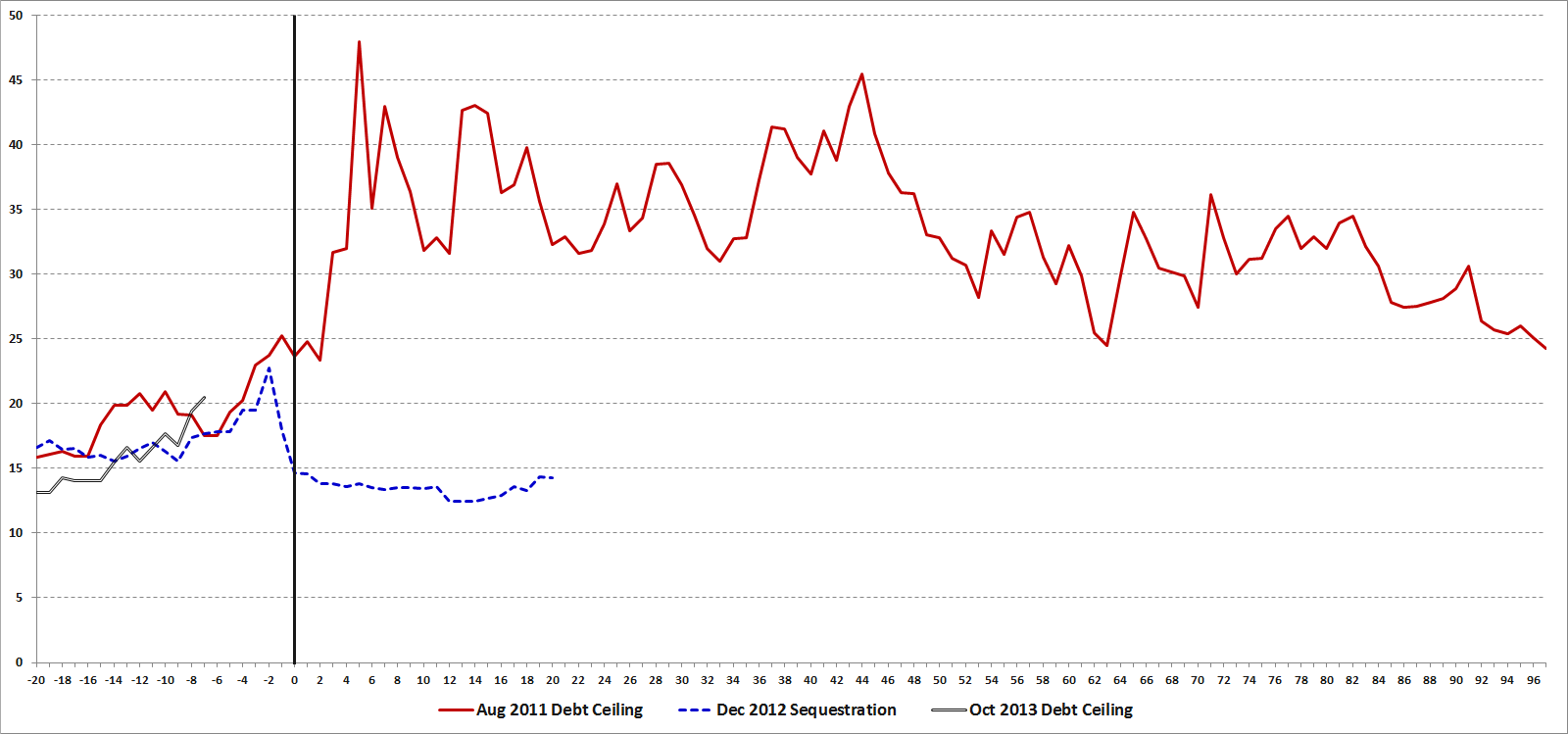
The last three instances of party budget squabbling have been much different than the Clinton-era budgetary battles and one only has to watch the trajectory of the VIX during these battles to get a sense of the uncertainty, anxiety and risk that was priced into SPX options during the period. Granted, none of these budget and debt ceiling battles has unfolded in a vacuum and the August 2011 debt ceiling battle played out against the backdrop of a dramatic worsening of the situation in Greece and euro zone sovereign debt in general, but the relative moves in the VIX during these three crises can still be instructive.

The chart below captures the month leading up to as well as data following the following three budget battles, all of which had specific deadlines, which are identified in the chart by the vertical black line running through day zero:

  • the August 2011 debt ceiling crisis
  • the December 2012 sequestration crisis (fiscal cliff)
  • the current debt ceiling crisis

Note that the August 2011 debt ceiling crisis is a classic example of risks that turned out to be much greater than almost everyone had predicted, whereas the fears related to the December 2012 sequestration crisis quickly disappeared. Historically there have been many more false alarms than crises which have escalated out of control, which is part of the reason why investors tend to underestimate and/or discount the full potential of each threat and why the VIX has a tendency to spike and then mean revert fairly quickly.

With a little over a week before the October 17 debt ceiling deadline hits, the VIX is higher now than it was at a similar stage in July 2011 or December 2012. Certainly the political landscape has changed since the last two budget battles and both the Democrats and Republicans have had an opportunity to refine their strategies and tactics in the interim. How it all plays out this week and next is anyone’s guess. I still find it hard to believe that there will be a default, but that still leaves plenty of room for the type of “resolution” that drags out the current anxieties and leads to additional pitched battles – some of which may be even more costly – down the road.

So by all means root for a replay of December 2012, but prepare for August 2011 just in case…

[source(s): CBOE, VIX and More]

Related posts:

Disclosure(s): none

Friday, January 4, 2013

VIX ETP Performance in 2012

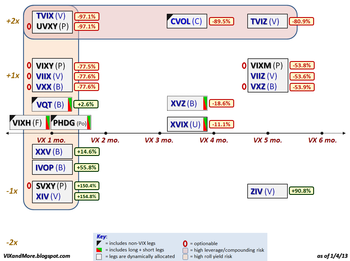
For anyone who pays attention to the VIX exchange-traded products space, 2012 was the year of the inverse (short) VIX futures ETP. The graphic below recaps the performance of the VIX ETPs that were trading as of the end of 2012 and it is easy to see that if you were long the inverse products (XIV, SVXY, ZIV, etc.) and were able to hold on to these positions during volatility storms such as the Greek elections, yield spikes on the sovereign debt of Italy and Spain, the fiscal cliff, etc. (all of which required nerves of steel and a creative risk management approach), then 2012 was a very good year for you. If not, then let the performance ups and downs be a reminder that most of the VIX ETPs are not well-suited for mainstream investors.

Instead of going into too much detail about the performance and reiterating much of what I have already said in the past, I encourage readers to investigate the links below, which include some predictions about future price moves and risk-reward ratios that have been borne out by the events of 2012.

If your new to this product space, perhaps the first place you should begin your research is with posts tagged with labels such as contango, roll yield and term structure – subjects that I have been writing about since the first VIX ETPs were launched, three years ago this month.

[Note that there are no performance numbers for VIXH or PHDG, as these products were launched during the year and have not yet accumulated full-year performance data.]

Related posts:

Disclosure(s): long XIV, SVXY and ZIV at time of writing

Wednesday, January 2, 2013

The Year in VIX and Volatility (2012)

Every year I assemble a chart that is my retrospective look at the year in volatility. While 2012 was the first year since 2006 that the VIX failed to make it out of the 20s, this was not due to an absence of threats to the stock market.

During the first half of the year, the euro zone was the primary concern for most investors, with the events surrounding the two nail-biting elections in Greece haunting the markets from April through June. With Greece off of the front page, focus of the European sovereign debt crisis shifted to unsustainable government debt yields in Spain and Italy, which only began to turn around after Mario Draghi pledged to do “whatever it takes” to save the euro in July.

Meanwhile, markets in the United States were relatively calm due to the repeated intervention of the Fed, which offered up QE 2.5, QE3 and QE4. The global economy also found support in the form of central bank stimulus plans from China, Japan and the euro zone.

The last hurrah for the VIX and volatility in 2012 was the fiscal cliff, which was largely overlooked during the U.S. elections, but dominated the headlines even before the last vote was counted. The fiscal cliff issue remained the #1 source of concern for investors throughout the balance of the year and had the VIX moving counter to its usual direction for most of December.

As 2013 dawns, fears related to the fiscal cliff are plummeting and dragging the VIX down with it, but clearly the issues that have kept the financial markets on edge for the past few years are not yet behind us and unseen risks are always lurking just over the horizon.

[source(s): StockCharts.com]

Related posts:

Disclosure(s): none

Friday, December 21, 2012

Volatility During Crises

[The following first appeared in the August 2011 edition of Expiring Monthly: The Option Traders Journal. I thought I would share it because it might help some readers put the current fiscal cliff crisis in historical context.]

The events of the last three weeks are a reminder that financial crises and stock market volatility can appear almost instantaneously and mushroom out of control before some investors even have a chance to ask what is happening. A case in point: on August 3rd investors were breathing a sigh of relief after the United States had finalized an agreement to raise the debt ceiling; at that time, the VIX stood at 23.38, reflecting a relative sense of calm, yet just three days later, the VIX jumped to 48.00 as two new crises displaced the debt ceiling issue.

Spanning the globe from Northern Africa, Japan, Europe and the United States, 2011 has seen no shortage of crises in the first eight months of the year. Given this pervasive crisis atmosphere, it is reasonable for investors to consider how much volatility they should anticipate during a crisis. In this article I will attempt to put crises and volatility in some historical perspective and address a variety of factors that affect the magnitude and duration of volatility during a crisis, drawing upon fundamental, technical and psychological causes.

Volatility in the Twentieth Century

Every generation likes to think that the issues of their time are more daunting and more complex than those faced by prior generations. No doubt investors fall prey to this kind of thinking as well. With a highly interconnected global economy, a news cycle that races around the globe at the speed of light and high-frequency and algorithmic trading systems that have transferred the task of trading from humans to machines, there is a lot to be said for the current batch of concerns. Looking at just the first half of the twentieth century, however, investors had to cope with the Great Depression, two world wars and the dawn of the nuclear age.

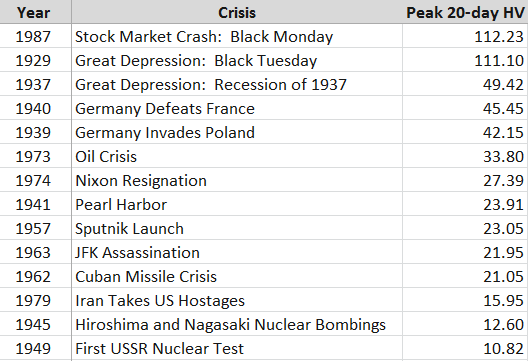
Given that the CBOE Volatility Index (VIX) was not launched until 1993, any evaluation of the volatility component of various crises prior to the VIX must rely on measures of historical volatility (HV) rather than implied volatility. As the S&P 500 index on which the VIX is based only dates back to 1957, I have elected to use historical data for the Dow Jones Industrial Average dating back to before the Great Depression. In Figure 1 below, I have collected peak 20-day historical volatility readings for selected crises from 1929 to the present.

Before studying the table, readers may wish to perform a quick exercise by making a mental list of some of the events of the 20th century that constituted immediate or deferred threats to the United States, then compare the magnitude of that threat with the peak historical volatility observed in the Dow Jones Industrial Average. If you are like most historians and investors, after looking at the data you will probably conclude that the magnitude of the crisis and the magnitude of the stock market volatility have at best a very weak correlation.
[source(s): Yahoo]

Any ranking of crises in which the Cuban Missile Crisis and the attack on Pearl Harbor rank in the lower half of the list is certain to raise some eyebrows. Frankly I would have been surprised if even one of these events failed to trigger a historical volatility reading of 25, but seeing that was the case for half the crises on this list certainly provides a fair amount of food for thought.

Volatility in the VIX Era

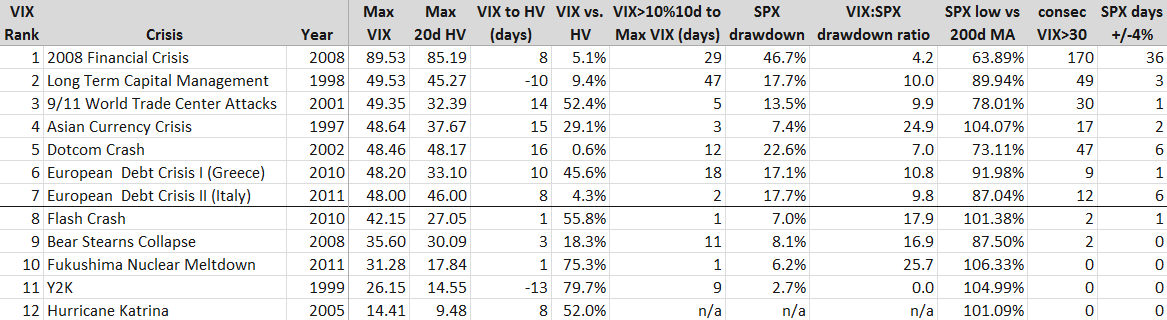
With the launch of the VIX it became possible not only to evaluate historical volatility, but implied volatility as well. With only 18 years of data to draw upon, there is a limited universe of crises to examine, so in the table in Figure 2 below, I have highlighted the seven crises in the VIX era in which intraday volatility has reached at least 48. Additionally, I have included five other crises with smaller VIX spikes for comparison purposes.
[source(s): CBOE, Yahoo]

[Some brief explanatory notes will probably make the data easier to interpret. First, the crises are ranked by maximum VIX value, with the maximum historical volatility in an adjacent column for an easy comparison. The column immediately to the right of the MAX HV data captures the number of days from the peak VIX reading to the maximum 20-day HV reading, with negative numbers (LTCM and Y2K) indicating that HV peaked before the VIX did. The VIX vs. HV column calculates the amount in percentage terms that the peak VIX exceeded the peak HV. The VIX>10%10d… column reflects how many days transpired from the first VIX close above its 10-day moving average to the peak VIX reading. The SPX Drawdown column calculates the maximum peak to trough drawdown in the S&P 500 index during the crisis period, not from any pre-crisis peak. The VIX:SPX drawdown ratio calculates the percentage change in the VIX from the SPX crisis high to the SPX crisis low relative the percentage change in the SPX during the same period (of course these are not necessarily the VIX highs and lows during the period.) The SPX low relative to the 200-day moving average is the maximum amount the SPX fell below its 200-day moving average during the crisis. Finally, the last two columns capture the number of consecutive days the VIX closed at or above 30 during the crisis and the number of days the SPX closed at least 4% above or below the previous day’s close during the crisis.]

Looking at the VIX era numbers, it is not surprising that the financial crisis of 2008 dominates in many of the categories. Reading across the rows, one can get an interesting cross-section of each crisis in terms of various volatility metrics, but I think some of the more interesting analysis comes from examining the columns, where we can learn something not just about the nature of the crises, but also about volatility as well. One important caveat is that the limited number of data points does not allow for this to be a statistically valid sample, but that does not preclude the possibility of drawing some potentially valuable and actionable conclusions.

Looking at the peak VIX reading relative to the peak HV reading I note that in all instances the VIX was ultimately higher than the maximum 20-day historical volatility reading. In the five lesser crises, the VIX was generally 50-80% higher than peak HV. In the seven major crises, not surprisingly HV did approach the VIX in several instances, but in the case of the 9/11 attack and the 2010 European sovereign debt crisis the VIX readings grossly overestimated future realized volatility.

One of my hypotheses about the time between the first VIX close above its 10-day moving average and the ultimate maximum VIX reading was that the longer the period between the initial VIX breakout and the maximum VIX, the higher the VIX spike would be. In this case the Long-Term Capital Management (LTCM) and 2008 crises support the hypothesis, but the data is spotty elsewhere. The current European debt crisis, Asian Currency Crisis of 1997 and 9/11 attack all reflect a very rapid escalation of the VIX to its crisis high. In the case of the May 2010 ‘Flash Crash’ and the Fukushima Nuclear Meltdown, the maximum VIX reading happened just one day after the initial VIX breakout. As many traders use the level of the VIX relative to its 10-day moving averages as a trading trigger, the data in this column could be of assistance to those looking to fine-tune entries or better understand the time component of the risk management equation.

Turing to the SPX drawdown data, the Asian Currency Crisis stands out as one instance where the VIX spike seems in retrospect to be out of proportion to the SPX peak to trough drawdown during the crisis. On the other side of the ledger, the drawdown during the Dotcom Crash appears to be consistent with a much higher VIX reading. Here the fact that it took some 2 ½ years for stocks to find a bottom meant that when the market finally bottomed, investors were somewhat desensitized and some of the fear and panic had already left the market, which is similar to what happened at the time of the March 2009 bottom. Note that the median VIX:SPX drawdown ratio for all twelve crises is 10.0, which is about 2 ½ times the movement in the VIX that one would expect during more normal market conditions.

The data for the SPX Low vs. 200-day Moving Average is similar to that of the SPX drawdown. For the most part, any drawdown of 10% or more is likely to take the index below its 200-day moving average. In the seven major crises profiled above, all but the Asian Currency Crisis dragged the index below its 200-day moving average; on the other hand, in all but one of the lesser crises the SPX never dropped below its 200-day moving average. Based on this data at least, one might be inclined to include the 200-day moving average breach as one aspect which helps to differentiate between major and minor crises.

As I see it, the last two columns – consecutive days of VIX closes over 30 and number of days in which the SPX has a 4% move – are central to the essence of the crisis volatility equation. Since the dawn of the VIX, the SPX has experienced a 2% move in about 80% of its calendar years, the VIX has spiked over 30 about 60% of the years, and the SPX has seen at least one 4% move in about 40% of those years. Those 4% moves are rare enough so that they almost always occur in the context of some sort of major crisis. In fact, one could argue that a 4% move in the SPX is a necessary condition for a financial crisis and/or a significant volatility event.

Fundamental, Technical and Psychological Factors in Crisis Volatility

Crises have many different causes. In the pre-VIX era, we saw a mix of geopolitical crises and stock market crashes, where the driving forces were largely fundamental ones. During the VIX era, I would argue that technical and psychological factors become increasingly important. The rise of quantitative trading has given birth to algorithmic trading, high-frequency trading and related approaches which place more emphasis on technical data than fundamental data. At the same time, retail investing has been revolutionized by a new class of online traders and the concomitant explosion in self-directed traders. This increased activity at the retail level has added a new layer of psychology to the market.

In terms of fundamental factors, one could easily argue that the top nine VIX spikes from the list of VIX era crises all arise from just two meta-crises, whose causes and imperfect resolution has created an interconnectedness in which subsequent crises are to a large extent just downstream manifestations of the ripple effect of the original crisis.

The first example of the meta-crisis effect was the 1997 Asian Currency Crisis, which migrated to Russia in the form of the 1998 Russian Ruble Crisis, which played a major role in the collapse of Long-Term Capital Management.

The second example of meta-crisis ripples begins with the Dotcom Crash and the efforts of Alan Greenspan to stimulate the economy with ultra-low interest rates. From here it is easy to draw a direct line of causation to the housing bubble, the collapse of Bear Stearns, the 2008 Financial Crisis and the recurring European Sovereign Debt Crisis. In each case, the remedial action for one crisis helped to sow the seeds for the next crisis.

In addition to the fundamental interconnectedness of these recent crises, it is also worth noting that the lower volatility crises were largely point or one-time-only events. There was, for instance, only one Hurricane Katrina, one turn of the clock for Y2K and one earthquake plus tsunami in Japan. As a result, the volatility associated with these events was compressed in time and accordingly the contagion potential was limited. By contrast, the major volatility events are more accurately thought of as systemic threats that ebbed and flowed over the course of an extended period, typically with multiple volatility spikes. In the same vein, the attempted resolution of these events generally included a complex government policy cocktail, whose effects were gradual and of largely indeterminate effectiveness.

Apart from the fundamental thread running through these crises, I also believe there is a psychological thread that sometimes spans multiple crises. Specifically, I am referring to the shadow that one crisis casts on future crises that follow it closely in time. I call this phenomenon ‘disaster imprinting’ and psychologists characterize something similar as availability bias. Simply stated, disaster imprinting refers to a phenomenon in which the threats of financial and psychological disaster are so severe that they leave a permanent or semi-permanent scar in one’s psyche. Another way to describe disaster imprinting might be to liken it to a low-level financial post-traumatic stress disorder. Following the 2008 Financial Crisis, most investors were prone to overestimating future risk, which is why the VIX was consistently much higher than realized volatility in 2009 and 2010.

While it is impossible to prove, my sense is that if the events of 2008 were not imprinted in the minds of investors, the current crisis atmosphere might be characterized by a much lower degree of volatility and anxiety.

Conclusion

As this goes to press, the current volatility storm is drawing energy from concerns about the European Sovereign Debt Crisis as well as fears of a slowdown in global economic activity. The rise in volatility has coincided with a swift and violent selloff in stocks that has seen six days in which the S&P 500 index has moved at least 4% either up or down – a rate that is unprecedented outside of the 2008 Financial Crisis.

Ultimately, the severity of a volatility storm is a function of both the magnitude and the duration of the crisis, as well as the risk of contagion to other geographies, sectors and institutions. Act I of the European Sovereign Debt Crisis, in which Greece played the starring role, can trace its origins back to December 2009. In the intervening period, it has spread across Europe and has sent shockwaves across the globe.

By historical standards the volatility aspect of the current crisis is more severe than at any time during World War II, the Cuban Missile Crisis and just about any crisis other than the Great Depression, Black Monday of 1987 and the 2008 Financial Crisis.

In the data and commentary above, I have attempted to establish some historical context for volatility during various crises extending back to 1929 and in the process give investors some metrics for evaluating current and future volatility spikes. In addition, it is my hope that concepts such as meta-crises and disaster imprinting can help to bolster the interpretive framework for investors who are seeking a deeper understanding of volatility storms and the crises from which they arise.

Related posts:

Disclosure(s): none

Wednesday, June 27, 2012

Euro Volatility and Risk

With the euro zone summit looming, investors are scrambling to find all sorts of measuring sticks to evaluate the risks of a sharp move in the financial markets. Based on some of the emails I have received, many are skeptical of the VIX right now, which is trading in the mid 19s, some 5% below its lifetime mean. At 27.54, the VSTOXX (EURO STOXX 50 Volatility Index) is showing much more uncertainty, but even that number is low relative to the range of the VSTOXX for the past three months.

Whether Spain, Italy or Greece is the fixation du jour, the questions investors really want answers to ultimately all cluster around the future of the euro. I have addressed this question relative to the risk of one or more countries leaving the euro in the context of various Intrade contracts (see links below), but another overlooked manner of measuring risk and uncertainty in the euro is the CBOE EuroCurrency Volatility Index (EVZ). Sometimes referred to as the “euro VIX,” EVZ uses the VIX methodology to measure the market’s expectations of future volatility in the euro. In theory, therefore, EVZ should also be a proxy for risk and uncertainty in the euro. One might even go as far as to consider EVZ as a euro zone fear indicator.

So what is a chart of EVZ telling us on the eve of another euro zone summit?

The chart below shows that at 11.27, EVZ is currently in the lower portion of its range of 9.23 – 20.34 for the past year. Indeed EVZ is only in the 18th percentile of the range of values over the course of the past year. Also of interest, the current 20-day historical volatility of EVZ (60) is lower than the 180-day historical volatility measure (65) – as has been the case for the majority of the last six months. Last but not least, EVZ has been on a notable downtrend since June 18th.

Headlines aside, traders do not see a lot of currency risk in the euro right now, at least relative to the last year or so and as far as the 30-day forward-looking window defined by EVZ is concerned.

So if you think the VIX is depressed and understating market risk, don’t expect the EVZ to be signaling something different. Currency risk and uncertainty seem surprisingly low at current levels. If you think the market has underpriced the potential for a large move in the euro, then consider some long straddles on the euro or its ETF counterpart, FXE.

Related posts:

[source(s): LivevolPro.com]

Disclosure(s): Livevol is an advertiser on VIX and More

Tuesday, June 12, 2012

Greek Elections and the Future of the Euro

While this week’s news cycle has been Spain, Spain, Italy and Spain so far (reminiscent of an old Monty Python skit, but I digress), it is easy to forget for a moment or so that Greece is holding another round of elections on Sunday.

As Greek law prohibits polling or publishing poll results in the 14 days leading up to an election, we do not know how voter sentiment about the bailout and remaining in the euro may be ebbing or flowing. Greek voters have certainly a great deal to think about, some of which may have been complicated by the positioning of Syriza’s leader, Alexis Tsipras, who insists that it is possible to repudiate the bailout agreement, start afresh with a new plan that is based on stimulating economic growth and job creation – yet never have to leave the euro zone in the process.

So just how will the Greek elections influence the future of the euro?

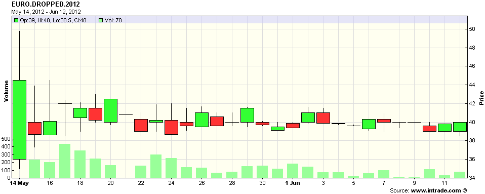
Without polls, the Intrade contract that specifies “Any country currently using the Euro to announce intention to drop it before midnight ET 31 Dec 2012” now becomes an even more valuable informational resource. The problem is that in spite of a fair amount of activity, the price of the contract has remained essentially unchanged for the last month, hugging the 40 level (see chart below), which means that participants continue believe that the chance of a Greek exit (I refuse to say ‘Grexit’) by the end of the year is about 40%.

By Monday we will have a much more information, but once again, the process of forming a coalition government may prove to be troublesome…or worse.

For those looking for hedges against some panic in the financial markets next week, keep in mind that VIX options do not expire this week, but next Wednesday, June 20th. As such, VIX calls may prove to be an appropriate hedge against at least short-term post-election anxiety. For those looking for volatility hedges on a week-to-week rather than monthly basis, it might be helpful to investigate VXX weekly options (A Favorite Trade: VXX Weeklys) as well. Last but not least, a reader favorite is a thought piece on the process of constructing hedges is Cheating with Partial Hedges.

Related posts:

[source(s): Intrade.com]

Disclosure(s): short VXX at time of writing

Friday, May 25, 2012

Investing with a Target Volatility Approach

Since I mentioned one of my favorite ETP sites earlier today [the more I think about it, the more I have come around to the idea that the Best Post of the Year on Exchange-Traded Products may be the best post I have ever seen on the subject] I thought it might be a good idea to include some functionality with that required weekend reading.

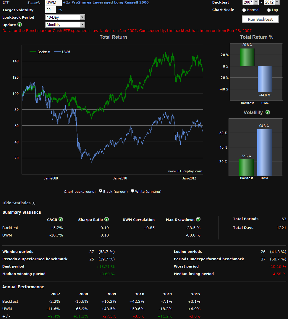
Another superb ETP site, ETFreplay.com, recently launched a Volatility Target Backtest tool. What this tool is designed to do is to demonstrate what historical returns would have looked like if one had taken a high volatility ETP such as a leveraged ETP, a VIX-based ETP, etc. and combined with a dynamic cash allocation and historical volatility data to limit exposure to a target volatility ceiling.

An example may make this easier to visualize. Let’s assume that you are bullish on the Russell 2000 index of small capitalization stocks and want to get some long exposure to these stocks with the +2x leveraged ETP, ProShares Ultra Russell2000 (UWM). Last August, however, the 10-day historical volatility in UWM spiked over 160 and right now it is at 41 – and you decide those levels of volatility are unacceptable, particularly with all the uncertainty in Greece and across the euro zone.

The solution? How about a portfolio that dynamically allocates between UWM and cash, (here using the iShares Barclays 1-3 Year Treasury Bond, SHY), based on 10-day historical volatility data and targets a forward volatility level of 20%.

The graphic below shows the ETFreplay backtest results of such a portfolio, using a monthly rebalancing period and starting in January 2007, when UWM was launched.

Of course past results are no guarantee of how this type of strategy might work in the future (and leveraged ETPs certainly entail a great deal of compounding decay risk for long-term investors), but the graphic is compelling, for both bull and bear markets. Think of this type of approach as a way to fine-tune risky products to a desired volatility level.

Enjoy the long weekend, everyone!

Related posts:

[source(s): ETFreplay.com]

Disclosure(s): none

Thursday, May 17, 2012

A Million SPX Put Contracts Traded Today…a Contrarian Timing Signal

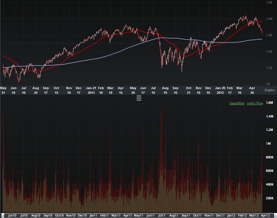
With a half hour to go in today’s trading session, over one million put contracts have already been traded on the S&P 500 index, which is about 2 ½ times the average daily volume. This elevated put volume comes on top of 913,000 SPX put contracts yesterday, which was the second highest for 2012.

The one million level is rarely seen in SPX puts and generally indicates an extreme amount of hedging on the part of institutional investors, as well as increased speculative activity.

Looking at the chart below, which goes back two years, one can see that in those rare instances when put volume (vertical red bars on lower half of chart) reached one million, this typically coincided with a bottom in stocks.  [Edit:  today’s finally tally is 1.28 million SPX puts, the highest total since August 9, 2011]

In addition to puts in the SPX, I also closely follow the ISEE equities only call to put ratio. The indicator I have developed which is based on the ISEE is now showing is greatest contrarian bullish bias (due to a preponderance of put volume) since the end of June 2010, just two days before the SPX put in an key bottom at 1010.

Of course, history is not guaranteed to repeat itself or even rhyme in the face of the current worries about Greece and Spain, but the odds now favor stocks finding at least a short-term bottom very soon.

Related posts:

[source(s): LivevolPro.com]

Disclosure(s): Livevol is an advertiser on VIX and More

DISCLAIMER: "VIX®" is a trademark of Chicago Board Options Exchange, Incorporated. Chicago Board Options Exchange, Incorporated is not affiliated with this website or this website's owner's or operators. CBOE assumes no responsibility for the accuracy or completeness or any other aspect of any content posted on this website by its operator or any third party. All content on this site is provided for informational and entertainment purposes only and is not intended as advice to buy or sell any securities. Stocks are difficult to trade; options are even harder. When it comes to VIX derivatives, don't fall into the trap of thinking that just because you can ride a horse, you can ride an alligator. Please do your own homework and accept full responsibility for any investment decisions you make. No content on this site can be used for commercial purposes without the prior written permission of the author. Copyright © 2007-2023 Bill Luby. All rights reserved.
 
Web Analytics