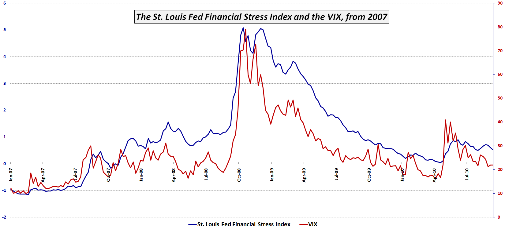
Zooming in on the St. Louis Fed’s Financial Stress Index
Yesterday’s post, St. Louis Fed’s Financial Stress Index, generated a great deal of interest in what I like to call the STLFSI.
Not surprisingly, many of the questions and comments had to do with the performance of the STLFSI and the VIX during the 2008 Financial Crisis and up through the present.
The chart below zooms in on the previous 1993-2010 timeline and highlights the STLFSI and VIX since the beginning of 2007. Keep in mind that the data is weekly (the STLFSI is only updated once per week) so some of the nuances are lost. Still, some conclusions are unavoidable. For instance, the STLFSI appears to have done a better job than the VIX of flagging the deteriorating economic situation from the end of 2007 to September 2008. Additionally, the STLFSI indicates that extreme stress in the system in late 2008 persisted longer than the VIX would have investors believe. Finally – and perhaps most relevant to the current situation – the VIX has almost completely discounted the May 2010 volatility spike some four months later, whereas the STLFSI suggests that the events of May, which were highlighted by the European sovereign debt crisis, still cast a large shadow on the current state of the markets.
As is often the case, here the holistic analytical approach trumps the solo indicator.
Related posts:
- St. Louis Fed’s Financial Stress Index
- VIX Showing Signs of Progressive Desensitization
- Chart of the Week: The Weekly VIX
- Revisiting the Flight-to-Safety Trade
- Chart of the Week: The Flight-to-Safety Trade
- The Credit Default Swap Canary
- A Sentiment Primer (Long)
- Chart of the Week: Record Low Yields for the 2-Year U.S. Treasury Note
- Chart of the Week: 10-Year Treasury Note Yield
- Chart of the Week: Ratio of VIX to Yield on 3 Month T-Bills


