Showing posts with label STLFSI. Show all posts

Tuesday, June 11, 2013

The Currency Carry Trade, DBV and Risk

Anyone who has been active in the financial markets during the past five years knows that there are many types of risk, many ways to think about and measure risk, and invariably some risks lurking around the next corner that many of us have never bothered to contemplate. Most investors tend to focus their attention on equities and therefore have a tendency to think in terms of the CBOE Volatility Index (VIX) and use that number to evaluate the relative level of risk, uncertainty or perhaps fear in the markets. That being said, during the past few years, almost everyone has become conversant in such topics as credit default swaps, the TED spread, the LIBOR-OIS spread, bank capital ratios and a whole host of concepts and statistics which were not on their radar in 2007.

For a more holistic approach to evaluating risk, there is always the St. Louis Fed’s Financial Stress Index, which is one example of an attempt to aggregate a variety of risk factors (18 in all) related to economic and financial matters into a single risk index.

One aspect of market risk that many investors continue to struggle with is the currency carry trade. If the daily movements of the dollar are relatively unimportant for those interested in buying and selling stocks that are primarily based in the U.S., then it is relatively easy for most investors to conclude that the gyrations of the Japanese yen (FXY) or Australian dollar (FXA) can be dismissed as much less important than those of the dollar. Unfortunately, this is not always the case. It turns out that many investors, particularly large institutional ones, have an appetite for the currency carry trade, in which one borrows in a currency where interest rates are low and uses the proceeds to buy assets in a currency where interest rates are higher. With Japan’s central bank targeting interest rates of 0.1% and the Reserve Bank of Australia recently cutting its base rate to 2.75%, the carry trade is structured as an interest rate differential trade in which an investor can borrow in yen and then buy Australian bonds, with profitability determined by the net interest rate differential plus or minus any fluctuation in the exchange rate.

Naturally some more aggressive investors prefer to use the yen as a funding currency for the purchase of assets other than bonds, including U.S. stocks. The problem for investors in U.S. stocks is that when the yen appreciates sharply – as it did on Monday and Thursday of last week, as well as during today’s session – traders with short yen positions who are victimized by a short squeeze will be subject to margin calls and/or forced liquidations, which means that not only are they covering their short yen positions, but they are also selling any long positions in U.S. equities as both legs are unwound. For this reason, when the yen carry trade is in favor, U.S. equities tend to move in the opposite direction of the yen. Traders can monitor the strength of the yen by following the USD/JPY currency cross or the Japanese yen ETF, FXY.

An alternative to focusing entirely on the yen is to monitor the PowerShares DB G10 Currency Harvest Fund (DBV), which, as PowerShares indicates, “is composed of currency futures contracts on certain G10 currencies and is designed to exploit the trend that currencies associated with relatively high interest rates, on average, tend to rise in value relative to currencies associated with relatively low interest rates. The G10 currency universe from which the Index selects currently includes U.S. dollars, euros, Japanese yen, Canadian dollars, Swiss francs, British pounds, Australian dollars, New Zealand dollars, Norwegian krone and Swedish krona.”

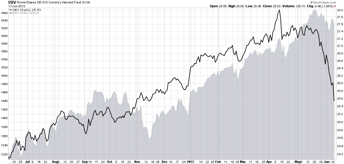
In other words, DBV is a carry trade ETF that is short three currencies and long three currencies at all times, updating these holdings on a quarterly basis. The ETF is currently short the Swiss franc, the euro and the yen, with long positions in the Australian dollar, the Norwegian krone and the New Zealand dollar.

As the chart below shows, DBV has been tracking the S&P 500 index quite closely for most of the past year, but that relationship has recently broken down as DBV has plummeted while the SPX has experienced only a mild pullback. Going forward, investors should strongly consider keeping an eye on the USD/JPY cross, the FXY ETF (which is optionable) and also DBV, which provides a much broader picture of the overall carry trade – and can also serve as a proxy for the risk this trade can pose to stocks.

[In addition to the products referenced above, note that there is a currency carry trade ETF that is similar to DBV, the iPath Optimized Currency Carry ETN (ICI), but this product has considerably less liquidity.]
[source(s): StockCharts.com]

Related posts:

Disclosure(s): none

Sunday, June 10, 2012

Chart of the Week: The St. Louis Fed’s Financial Stress Index and Market Risk

Determining the risk in the financial markets should get easier with more data, more measures and more experience navigating crisis environments, right? Not so fast.

Right now, for instance, the CBOE Volatility Index (yes, the VIX does have a formal name) is just a shade above its lifetime average, yet the yield on the 10-Year U.S. Treasury Note is just a week away from its all-time low. Granted the Fed has been distorting interest rates with Operation Twist and other policy initiatives, but it has only been in the last month or so that yields have dipped below 1.7%.

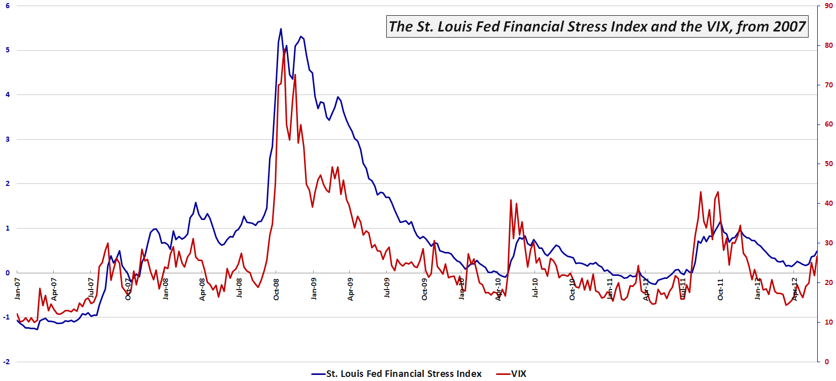
One broad-based tool for measuring risk in the financial markets and related institutions is the St. Louis Fed’s Financial Stress Index (which I refer to as the STLFSI), which has 18 component measures that include a variety of interest rate and yield spread data, as well as the VIX, measures of bond volatility and other data that are correlated with market stress.

This week’s chart of the week below shows the movements in the STLFSI and the VIX since the beginning of 2007. Note that for most of 2012 the VIX has been indicating much less risk and uncertainty than the STLFSI. Only since the middle of May have I observed the VIX rise to a relative level that is consistent with the STLFSI. As of last week, for instance the STLFSI was at the 79th percentile of its lifetime range, while the VIX was in its 82nd percentile. For the record, the divergence was widest in the middle of March, when the STLFSI had a 68th percentile reading, yet the VIX was mired in the 23rd percentile. Financial historians might also be interested to know that the mid-March divergence was the largest since August 2008…

For more information on the components of the STLFSI and the index’s long-term performance, check out an earlier post, St. Louis Fed’s Financial Stress Index, as well as some of the other posts linked below.

Related posts:

[source(s): Federal Reserve Bank of St. Louis]

Disclosure(s): none

Friday, December 16, 2011

VIX and St. Louis Fed’s Financial Stress Index Moving in Concert

Last year I talked about the St. Louis Fed’s Financial Stress Index (which I am calling the STLFSI in order to lower my carpal tunnel risk) as a measure of financial market risk that I consider complementary to the VIX and in some cases perhaps even a superior alternative.

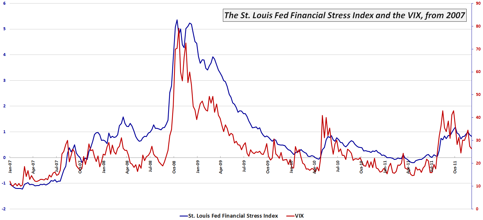
Given the fact that some investors have difficulty coming to terms with the “holiday effect” and the seasonal swoon in the VIX, I thought it might be timely to update a chart I have posted here previously which captures the movements in the more broad-based STLSFI. Note that the chart dates from January 2007 and includes all the data from the financial meltdown of 2008, as well as the various permutations of the European sovereign debt crisis that have plagued the financial markets during the last two years or so. [Data are through the last update to the STLFSI, 12/9/11.]

Looking at some of the spikes in the chart, the first thing that strikes me is just how closely the two measures of risk have moved during the past five years. Also worth noting is the fact that both the VIX and the STLFSI indicate that the degree of risk/stress in the financial markets over the last few months has been slightly higher than what happened in one of the earlier Greek chapters of the euro zone debacle back in May and June of 2010.

More importantly perhaps, both the recent VIX and STLFSI data suggest that the current threats to the global financial markets are at least an order of magnitude lower than what we experienced in late 2008 and early 2009. This is not to say that both the VIX and STLFSI cannot spike much higher in short order, only that according to both measures, we now appear to be on the downhill side of the crisis.

For more information on the components of the STLFSI and the index’s long-term performance, check out St. Louis Fed’s Financial Stress Index.

Related posts:


[source: Federal Reserve Bank of St. Louis]

Disclosure(s):
none

Wednesday, December 8, 2010

Market Psych Offers Language-Based Fear Index

Aside from the VIX, there are quite a few fear indices out there. Just a couple of months ago, for example, I was extolling the virtues of the St. Louis Fed’s Financial Stress Index.

One of the more interesting ones that I have not seen get much in the way of media attention is the Market Psych Fear Index. This index is constructed by using a 10-day exponential moving average of the percentage of “fear” words in the U.S. financial news. In the chart below, the Market Psych Fear Index is the solid blue line and the candlesticks are the NASDAQ-100 index (QQQQ).

As the construction of this fear index is based on language in the financial media, the fear index makes it possible to compare market-based fear measures such as the VIX and other volatility indices with the degree of public concern or perhaps even fear mongering found in the media.

One would expect that the Market Psych Fear Index and stocks to generally move in opposite directions, just as is the case with the VIX and stocks. While this is the case more often than not, the chart below shows that in the last month or so, as stocks have been rising, the movements in stocks and the Market Psych Fear Index have been positively correlated. What does this mean? Perhaps all the talk of the European sovereign debt crisis and North Korean aggression is starting to wear thin. Perhaps the media is not quite able to stir up fear like it has in the past. Of course, perhaps Occam’s razor would say that investors are being naïve.

In any event, VIX futures are predicting that the VIX will rise almost 50% by the middle of 2011.

At a minimum, I think the divergence between market-based and language-based fear indicators bear further watching.

Finally, the Market Psych web site has some interesting content, not the least of which is sentiment-based analysis of stocks and ETFs, but also an excellent collection of free personality tests for traders and investors.

Related posts:


[source: MarketPsych.com]

Disclosure(s): neutral position in VIX via options at time of writing

Wednesday, September 29, 2010

Zooming in on the St. Louis Fed’s Financial Stress Index

Yesterday’s post, St. Louis Fed’s Financial Stress Index, generated a great deal of interest in what I like to call the STLFSI.

Not surprisingly, many of the questions and comments had to do with the performance of the STLFSI and the VIX during the 2008 Financial Crisis and up through the present.

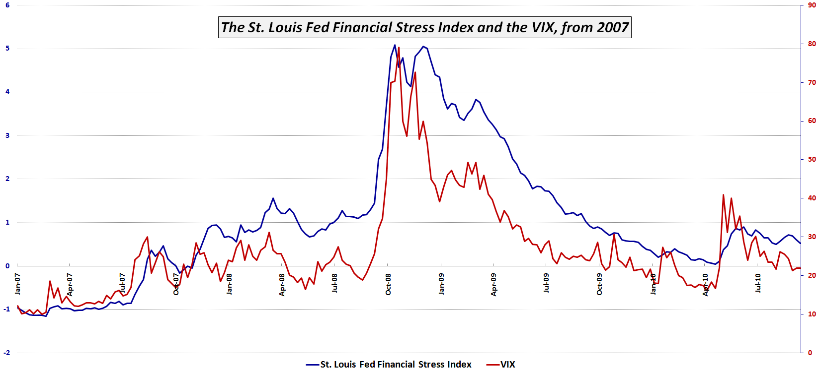
The chart below zooms in on the previous 1993-2010 timeline and highlights the STLFSI and VIX since the beginning of 2007. Keep in mind that the data is weekly (the STLFSI is only updated once per week) so some of the nuances are lost. Still, some conclusions are unavoidable. For instance, the STLFSI appears to have done a better job than the VIX of flagging the deteriorating economic situation from the end of 2007 to September 2008. Additionally, the STLFSI indicates that extreme stress in the system in late 2008 persisted longer than the VIX would have investors believe. Finally – and perhaps most relevant to the current situation – the VIX has almost completely discounted the May 2010 volatility spike some four months later, whereas the STLFSI suggests that the events of May, which were highlighted by the European sovereign debt crisis, still cast a large shadow on the current state of the markets.

As is often the case, here the holistic analytical approach trumps the solo indicator.

Related posts:


[source: Federal Reserve Bank of St. Louis]

Disclosure(s): none

Tuesday, September 28, 2010

St. Louis Fed’s Financial Stress Index

When I started this blog, I added what sounded like a whimsical tagline at the time, “Your one stop VIX-centric view of the universe.” In retrospect, perhaps the joke was on me, as the content here has consistently been VIX-centric, despite my occasional forays into that “and More” netherworld.
I will be the first to admit, however, that the VIX captures only a small slice of investor sentiment and represents only one type of threat to the markets.

Back in March 2007 I addressed a broader range of sentiment indicators when I wrote A Sentiment Primer (Long) and urged investors to take a broad-based view of threats to the market in The Credit Default Swap Canary. Along the way, I have been a strong proponent of using put to call ratios (Put to Call Everest), bond yields, the VIX divided by T- bill yields (VIX:IRX), the TED spread, counterparty risk measures, and other factors.

One excellent index which attempts to capture a broad range of components of financial stress is the St. Louis Fed’s Financial Stress Index, henceforth to be known here as the STLFSI. The index constituents are highlighted below and include an interest rate group, a yield spread group and an third uncategorized group of additional indicators in which the VIX is one of five components.

Interest Rates:
  • Effective federal funds rate
  • 2-year Treasury
  • 10-year Treasury
  • 30-year Treasury
  • Baa-rated corporate
  • Merrill Lynch High-Yield Corporate Master II Index
  • Merrill Lynch Asset-Backed Master BBB-rated
Yield Spreads:
  • Yield curve: 10-year Treasury minus 3-month Treasury
  • Corporate Baa-rated bond minus 10-year Treasury
  • Merrill Lynch High-Yield Corporate Master II Index minus 10-year Treasury
  • 3-month London Interbank Offering Rate–Overnight Index Swap (LIBOR-OIS) spread
  • 3-month Treasury-Eurodollar (TED) spread
  • 3-month commercial paper minus 3-month Treasury bill
Other Indicators:
  • J.P. Morgan Emerging Markets Bond Index Plus
  • Chicago Board Options Exchange Market Volatility Index (VIX)
  • Merrill Lynch Bond Market Volatility Index (1-month)
  • 10-year nominal Treasury yield minus 10-year Treasury Inflation Protected Security yield (breakeven inflation rate)
  • Vanguard Financials Exchange-Traded Fund (VFH)
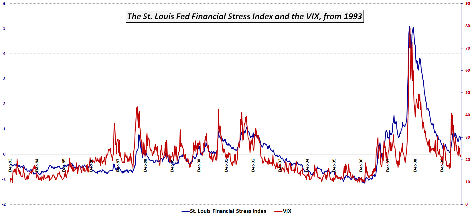
The chart below shows the performance of the STLFSI and the VIX going back to 1993. Not surprisingly, there is a high degree of correlation. If one accepts the STLFSI as a more broad measurement of stress in the financial system, one can make a case that while the VIX is usually directionally correct, at certain times the VIX has underestimated the stress in the system (e.g., May 2008) while at other times the VIX has overestimated the stress in the system (e.g., May 2010). Going forward, I will make an effort to flag important divergences between the VIX and the STLFSI.

Note that the Kansas City Fed has a similar Financial Stress Index, aka the KCSFI, which is more concise and more focused on yield spreads.

The St. Louis Fed has more information on the STLFSI here, while the Kansas City Fed has more information on the KCSFI here.

Related posts:


[source: Federal Reserve Bank of St. Louis]

Disclosure(s): none

DISCLAIMER: "VIX®" is a trademark of Chicago Board Options Exchange, Incorporated. Chicago Board Options Exchange, Incorporated is not affiliated with this website or this website's owner's or operators. CBOE assumes no responsibility for the accuracy or completeness or any other aspect of any content posted on this website by its operator or any third party. All content on this site is provided for informational and entertainment purposes only and is not intended as advice to buy or sell any securities. Stocks are difficult to trade; options are even harder. When it comes to VIX derivatives, don't fall into the trap of thinking that just because you can ride a horse, you can ride an alligator. Please do your own homework and accept full responsibility for any investment decisions you make. No content on this site can be used for commercial purposes without the prior written permission of the author. Copyright © 2007-2023 Bill Luby. All rights reserved.
 
Web Analytics