Monday, August 31, 2009

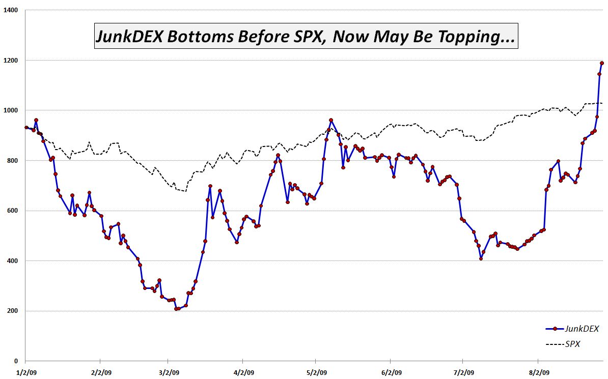
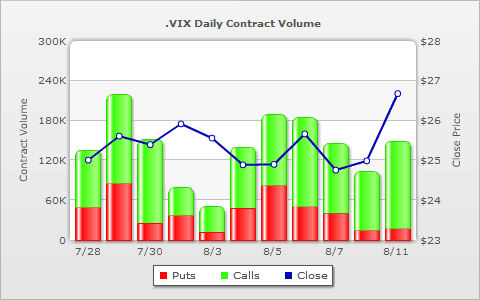
JunkDEX Component Performance

I am delighted to see that JunkDEX Tracks Speculative Frenzy in Financials and the JunkDEX itself appear to have hit a nerve and have generated such positive feedback.

To some extent, one could argue that the selection of the individual components of the JunkDEX was done in a somewhat arbitrary fashion and consequently, the performance of the index is somewhat biased by the hand-picked issues that tell a particular story.

I already mentioned the exclusion of Freddie Mac (FRE), largely because the company’s business, financial history and stock performance is so similar to that of Fannie Mae (FNM). I also looked at Lehman Brothers (LEHMQ), which gave us the LEHVIX, among other memories. LEHMQ was up 200% on Friday and is up another 50% so far today. I even toyed with the idea of General Motors (MTLQQ), but as both of these issues trade on the pink sheets, I did not want to venture into that netherworld.

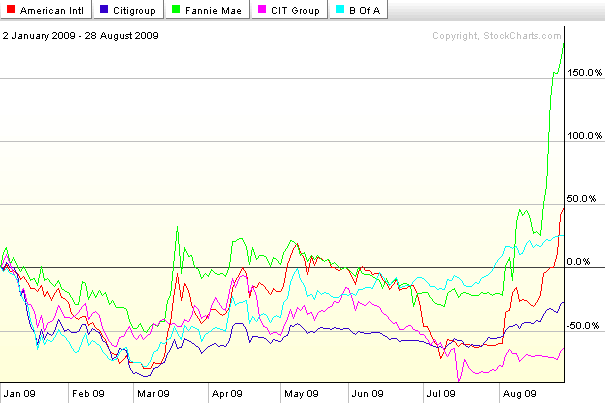
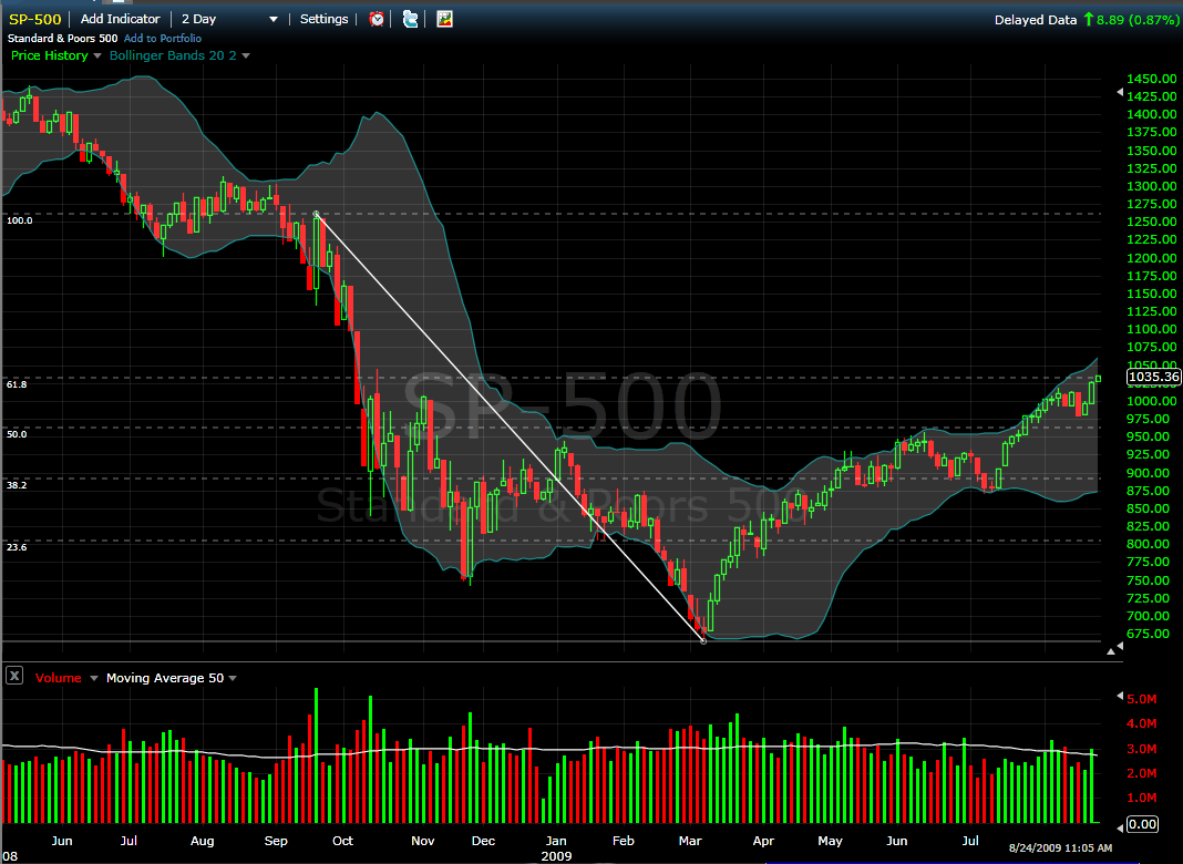
For some historical context, I thought it would be helpful to provide some individual component performance charts for the JunkDEX. The first chart covers the full span of the JunkDEX, dating back to the beginning of 2009. It shows particularly strong performance on the part of Fannie Mae and American International Group (AIG):

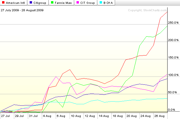
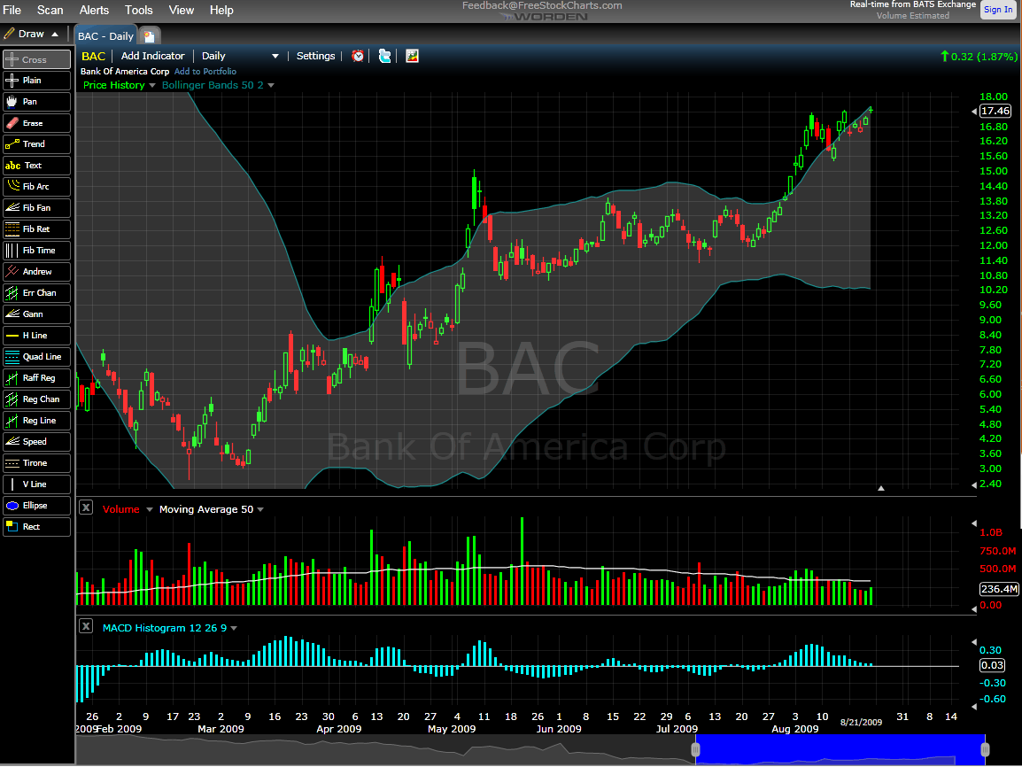
The second chart reflects performance in each of the five components over the course of the last five weeks. Given the relatively short time frame for this data, I find the percentage changes to be even more interesting. While FNM and AIG are still the top performers, both Citigroup (C) and CIT Group (CIT) have doubled during this period. Bank of America (BAC), which is weighted down by a market cap of $153 billion, is considerably less nimble, yet still has a gain of 37% in the past five weeks:

In today’s trading, AIG is down 11.5%, FNM is down 5.4% and only CIT is showing a gain.

[graphics: StockCharts.com]

[Disclosure: short AIG at time of writing]

Sunday, August 30, 2009

Chart of the Week: JunkDEX Tracks Speculative Frenzy in Junk Financials

Back in September 2007, when I thought the markets were a little too frothy, I created a list of Overripe High Fliers. A few weeks later, in From Overripe to Vulnerable? I took the current list of 14 overripe high flier stocks that had been drawing a great deal of speculative attention into something I called the OHFDEX – an index based on those overripe high fliers.

Not only was the timing of the OHFDEX impeccable, but the post became so popular that it spawned a number of follow-up posts, including, OHFDEX One Year Later.

In the spirit of the original OHFDEX, I have been watching closely the recent speculative frenzy in some stocks that have come to be known as “junk financials.” These are financial firms that were the recipients of government bailout funds during the financial crisis and now sell at valuations substantially below 2007 levels. They include American International Group (AIG), Fannie Mae (FNM), Freddie Mac (FRE), Citigroup (C), CIT Group (CIT) and Bank of America (BAC). In the last few weeks, these stocks have routinely accounted for 30% or more of the total volume on the NYSE and on Friday alone the group of six traded 2.53 billion shares.

While I find the transition from risk-averse behavior to risk-tolerant behavior on the part of investors to be an important step in the healing process, the recent headlong rush into risk-seeking behavior has me more than a little concerned. How healthy can the markets be when speculation in six companies that were all but bankrupt a few months ago now accounts for one out of every three shares traded each day?

In order to track the speculative interest in junk financials, I have created what I am calling the JunkDEX, which consists of equally weighted positions (as of 1/2/09) in AIG, FNM, C, CIT and BAC (I elected to omit FRE due to the strong similarities with FNM.) I scaled the JunkDEX so that it had the same value as the SPX at the beginning of the year. As this week's chart of the week below shows, the JunkDEX led the S&P 500 index down from January through March, bottomed two days earlier and rallied impressively through the middle of May. From May through early August, the JunkDEX lagged the SPX significantly, before spiking dramatically during the past 3 ½ weeks.

The JunkDEX looks as if it may be approaching a blow-off top. If this turns out to be the case, I expect it will signal an imminent top in the broader markets, just as the OHFDEX did.

Going forward, I will keep an eye on speculative activity in the junk financials and in the JunkDEX for clues about the sustainability of the recent bull leg. I will update the performance of the JunkDEX, as appropriate and suggest that traders treat these stocks with extra caution, whether long or short.

[graphic: VIXandMore]

[Disclosure: short AIG at time of writing]

Friday, August 28, 2009

The Other Side of Fear and Panic

Joshua Brown at The Reformed Broker has a nice piece out this morning (hat tip, Trader Mike) with the playful title of The Five Stages of Panic Buying. Brown illustrates each of the five stages with quotes from through the investment management world and in so doing has reconstructed something of a psychological history of the current bull market. Both bulls and bears are encouraged to click through to get a chuckle out of what has been going on in the head of investors for the past 5-6 months.

The underlying theme of all five stages is that on Wall Street, where annual bonuses are typically doled out based on performance relative to a benchmark, investment managers loathe the idea of falling behind that benchmark early in the year and having to play catch-up for the balance of the year. Particularly in a year when the market starts down then reverses sharply to the upside, one would expect that a large majority of investment managers would find themselves chasing performance, becoming more aggressive and taking on more risk in order to reel in the benchmark.

Of course, panic buying is not the flip side of panic selling. Panic buying favors the use of more derivatives, more leverage, more beta and less cash. It shows up on charts as aggressive buying on the dip, the failure of stocks to retrace earlier gains, etc. and is part of the reason why the 10 day rate of change (ROC) in the chart below has yet to fall below -5 (%) since the rally began.

What I find particularly interesting is that I believe panic buying is more likely to lead to crowded trades and ultimately to panic selling. There have not been many days in which we have seen big drops in the SPX and there has certainly been no extended weakness in stocks since the March bottom, but I suspect that when the market finally does turn, those same panic buyers will be quick to lock in gains in hopes of keeping pace with or finally overtaking the appropriate benchmark.

So…if we have many panic buyers who have been chasing performance with long positions of questionable underlying value, then the potential for some high volatility trading in the next month or so may be higher than recent stock market activity has led many to believe.

[graphic: StockCharts]

Thursday, August 27, 2009

The Recent Treasury Auction Brouhaha

In yesterday’s An Introduction to Treasury Auctions, my intent was to provide some background information on Treasury auctions that might be appropriate to get an equity-centric investor up to speed on the basics.

I know from personal experience that it is easy to define one’s investment universe as consisting entirely of stocks, but if we have learned anything in the past year, it is that erecting artificial boundaries to one’s investment knowledge dramatically increases the risk of getting blindsided in any asset class.

So with the introduction out of the way and with the considerable encouragement of a number of readers, let me turn to some interesting recent developments that have created quite a stir in the bond circles.

The issue of foreign demand for U.S. debt has loomed large during the course of the financial crisis. One of the early flash points was the deterioration and eventual government bailout of Fannie Mae and Freddie Mac. At that time, approximately 10% of China’s GDP was invested in bonds issued by Fannie Mae and Freddie Mac, which was probably the reason why Treasury Secretary Henry Paulson felt the need to explain:

Fannie Mae and Freddie Mac are so large and so interwoven in our financial system that a failure of either of them would cause great turmoil in our financial markets here at home and around the globe. [emphasis added]”

As noted yesterday, China and Japan each account for about 1/3 of the U.S. Treasury debt held by foreign nations. Since the beginning of the financial crisis, there have been rumblings that interest in U.S. debt may be waning in the Treasury’s two largest customers – an issue that was summarized nicely by Keith Bradsher of the New York Times at the beginning of the year in China Losing Taste for Debt from U.S. The most recent data available show that China, the largest customer of U.S. Treasury securities, reduced its holdings from $801.5 in May to $776.4 in June.

The issue became a little stickier when the Fed decided to change the manner in which it reports data from indirect bidders on June 1st. In Is Foreign Demand as Solid as It Looks? Min Zeng of the Wall Street Journal claimed that the new reporting standards which expanded the definition of indirect bidders made it more difficult to determine the level of foreign demand.

Skipping ahead to the punch line, the most interesting recent claim of note comes from Chris Martenson, whose The Shell Game – How the Federal Reserve Is Monetizing Debt makes the case that the Federal Reserve is using a custody account to enable foreign central banks to swap agency debt for Treasury debt. If this turns out to be the true, it will undoubtedly have some very interesting implications.

For those seeking out additional background and context, the following will likely be of interest:

Wednesday, August 26, 2009

An Introduction to Treasury Auctions

It remains to be seen whether the growing U.S. Department of the Treasury auctions will be a relatively quiet sideshow or eventually take the center stage in the ongoing financial crisis. As the number of potential disaster scenarios continues to shrink, one subject that I see receive surprisingly little play in the blogosphere is one of the few remaining potential disasters: the auction of U.S. debt.

The concern is that as the U.S. debt grows, so does the volume of Treasury debt for each auction. The big fear is that at some point the supply of U.S. debt may begin to outstrip the demand. At the moment, China and Japan account for about 2/3 of all foreign holdings of U.S. Treasuries; any plateau in the demand for U.S. debt from these two nations might necessitate higher interest rates to stimulate demand and could send potentially traumatic shock waves throughout the economy. This is the disaster scenario. So far, I am happy to report, demand for Treasuries has been robust and yields have remained at very low levels.

The U.S. Treasury auctions a mixture of Treasury Bills (with maturities from 4 weeks to 52 weeks), Treasury Notes (from 2 to 10 years) and 30-Year Treasury Bonds. The T-Bills are auctioned on what is largely a weekly cycle, with the typical pattern seeing the 13-week and 26-week T-Bills slotted for Mondays and the 4-week and 52-week T-Bills on Tuesdays. Given the frequency of these T-Bill auctions and the relatively low demand from foreign central banks, the T-Bill auctions are probably the least important auctions in terms of being able to gauge market sentiment and the strength of foreign demand.

The more important auctions are of the Treasury Notes, where the 10-Year Note has become the de-facto benchmark for U.S. long-term debt. Treasury Note auctions are best understood as occurring on a monthly cycle, with the 3-Year and 10-Year Notes typically auctioned on Tuesdays and Wednesdays during the second week of each month and the 2-Year, 5-Year and 7-Year Notes typically auctioned off on Tuesdays, Wednesdays and Thursdays of the last week of each month.

The 30-Year Bond and Treasury Inflation Protected Securities (TIPS) are a much smaller part of the Treasury refunding process and are subjects for another post.

The results of Treasury auctions are announced at 1:00 p.m. ET (see Announcement & Results Press Releases) and contain three particularly important pieces of information:

  1. Yield
  2. Bid-to-cover ratio
  3. Percentage of indirect bidders

In short, the yield determines the cost of the debt refunding and/or the price sensitivity of the bidders. The bid-to-cover ratio is simply the total dollar amount of the bids tendered by the total amount of the securities being auction and reflects demand relative to supply. Finally, the percentage of indirect bidders is used as a proxy for demand from foreign central banks, as indirect bids are bids of significant size that do not go through the primary dealer community.

Going forward, investors should keep an eye on the Treasury auctions, particularly on the demand for U.S. Treasury Notes. Should yields start rising, bid-to-cover ratios start falling and participation by indirect bidders begin to decline, then we may have the beginnings of a new kind of debt crisis on our hands.

For additional information on Treasury auctions, try:

For some VIX and More posts on TIPS, readers may wish to check out:

Tuesday, August 25, 2009

Bloggers on Volatility

In the last day or so I have noticed quite a few excellent posts on volatility and related subjects from various corners of the blogosphere. Some of my favorites, in case anyone missed them:

Monday, August 24, 2009

SPX at Post-Lehman Fib Retracement Target of 1035-1037

There have been several posts (see below) in this space that have addressed the issue of Fibonacci retracements in the S&P 500 index. In the dialogue, I have been a proponent of using a post-Lehman high in conjunction with the March low to arrive at a set of post-Lehman Fibonacci retracement numbers. Depending upon whether one uses just the real bodies of the candlestick (open and close) or includes the shadows (adds intraday highs and lows), the 61.8% retracement of the post-Lehman high falls in the range of 1035 to 1037.

A short while ago, the SPX established a new high for the year of 1035.82, which puts it right at the post-Lehman Fibonacci retracement target price, as shown in the chart below, which uses relatively unusual two-day candles.

I have been waiting patiently for two or more consecutive days of weakness and/or a 5% pullback from the highs to open up some aggressive short positions. With the Fibonacci retracement target hit, I am now more likely to start to scale into some short positions early, assuming we start to see some sort of meaningful weakness in stocks this millennium…

For some related posts on the SPX and Fibonacci retracements, try:

[source: FreeStockCharts.com]

Sunday, August 23, 2009

Chart of the Week: BAC Through the Eyes of FreeStockCharts.com

It has been almost six months since I have mentioned banks in the chart of the week, the so it seems as if the statute of limitations for beating dead horses has probably passed and I can talk about Bank of America (BAC) once again.

In the past few weeks, many traders have taken to using Bank of America as their market weather vane, reasoning that as Bank of America goes, so go the banks and as the banks go, so go stocks in general. For the most part, this rationale has held up and anyone who has used Bank of America to gauge the direction of the markets has likely done quite nicely. Of course, investors who were fortunate to have grabbed some BAC shares when the stock was trading below 4.00 have now seen their original investment turn into a five-bagger in just five months.

The chart below also marks the first time I have used a chart from FreeStocksCharts.com on the blog. This relatively new web site is a Worden Brothers venture – which means that it comes from the same people behind the popular TeleChart charting program. Another Worden Brothers product is StockFinder and if you are familiar with StockFinder, then you already know FreeStockCharts.com, which resembles an online incarnation of the former. In the graphic, I have captured some of the drawing tools (which include some fairly exotic tools), available at FreeStockCharts.com. There are also 52 customizable indicators (again, not just the basics), an alert function and other features of interest. In one of the great investing oxymorons, there is also a premium version of FreeStockCharts.com, with fees that are competitive with StockCharts.com.

As a StockCharts subsciber, it would take a great deal for me to switch to another charting program, but FreeStockCharts.com certainly looks like a compelling alternative at first blush. At the very least, it can provide a different color scheme and set of indicators for the blog…

For some related posts, try:

[source: FreeStockCharts.com]

Friday, August 21, 2009

Options Expiration Weeks and the March to August Bull Market

For a number of reasons, the options expiration cycle can be extremely difficult to trade. One of the problems with options expiration week is that the forces acting on stock prices are often much different this week than during other weeks, often ignoring underlying existing trends, but sometimes magnifying them.

A good rule of thumb is that the week before options expiration is most likely to be bullish and the week after options expiration is most likely to be bearish. On average, options expiration week is less volatile and more directionally neutral than these other two weeks.

In the table below, I looked at data since the March 6th low and found it interesting that the week before options expiration has been the most bullish of the three expiration weeks, with the week after options expiration the second most bullish, by a small margin. Options expiration week itself has been relatively flat, particularly when compared to the other two weeks.

My knee-jerk explanation for this is that stock movements during options expiration week are more likely to be random and out of synch with underlying trends. As a result, during options expiration week, stocks frequently underperform in bull markets and outperform in bear markets.

For some related posts, try:

Say Hello at the San Francisco MoneyShow Tomorrow

Since I started this blogging adventure in early 2007, I have had the pleasure of developing relationships with quite a few people across the globe. So far I have had an opportunity to meet only a few of them in person, but that will start to change in the coming year, as I expect to attend a number of industry functions. Tomorrow I will be at the local San Francisco MoneyShow at the San Francisco Marriott and will be at the greenfaucet booth (#616) from noon until 1:30 p.m. If you are at the event and want to stop by and say hello, I am looking forward to putting some faces behind the names. If you are on the fence about coming, registration is free (register here) and between the speakers and the exhibitors, there is sure to be something in the investment world that is of interest to you.

Of course, if you can’t make it to San Francisco, feel free to drop me a note any time. While not always successful, I do my best to stay current with email and comments on the blog.

[photo of San Francisco from Ring Mountain, Tiburon, CA]

Thursday, August 20, 2009

The Sideways Play

The more dogmatic bulls and bears get about the markets, the more I usually begin to pay attention to the possibility of a sideways market. As is often the case, both bulls and bears can make compelling arguments to support their position – and even back them up with a convincing set of facts.

From a technical perspective, while the SPX has bounced more than 50% off of its bottom, there has been very little in the way of pullbacks during the ride up.

So here we sit at SPX 1004, with the major averages just a little below their recent highs and August SPX options set to expire at the open tomorrow. Still, it has been nine sessions since the SPX made its 2009 high of 1018. Finally, while volatility has been declining, the VIX seems to have found a floor in the 24-25 range.

With these factors, I am looking hard at selling some SPX straddles. The charts below show that a single contract SPX September 1000 short straddle (top chart) has a maximum potential profit of $5000, with a profit zone between 950 and 1050. Traders who might be interested in the SPX October 1000 short straddle (bottom chart) have a maximum potential profit of another 50% or so ($7530) and a 50% wider profit zone (from 925-1075) as well.

Short straddles will perform best when markets move sideways and volatility (vega) declines.

Of course, when short trades go wrong, they can get ugly quickly, so anyone looking to enter in a short straddle should expect monitor this trade closely and have all manner of exit strategies mapped out in advance.

Traders who are more risk averse will certainly be interested in checking out butterfly plays instead of straddles.

For additional posts on these subjects, readers are encouraged to check out:

…and the two part SPX short straddle case study:

  1. Is the SPX Going to Stick Close to 900?
  2. SPX Straddle Case Study Update

[graphics: optionsXpress]

Wednesday, August 19, 2009

The Gap Between the VIX and Realized Volatility

Since making an all-time closing high of 80.86 on November 20th 2008, the CBOE Volatility Index (VIX) has been declining in the direction of its historical mean of 20.22. While the initial drop in the VIX took it rapidly from 80 to the 40-50 range, it took some time before investors began to gain confidence that the March lows in stocks were going to be the bottom. Once the consensus began to build around the likelihood of a bottom and a historic buying opportunity in stocks, the VIX began a steady descent that has taken it all the way down to the mid-20s.

As the chart below demonstrates, as rapidly as the VIX (red line) has been able to fall, it has not managed to keep up with the decline in realized volatility. The chart records the closing VIX value for each day as well as the 21-day realized volatility (dotted green line) that results from calculating 21-day historical volatility 21 trading days into the future. These calculations allow an options buyer or seller to determine the extent to which the VIX (which looks forward 30 calendar days) accurately predicted the realized volatility that occurred during the next 21 trading days or approximately 30 calendar days. The differential (VIX-RV) is plotted as the blue area.

One of the key takeaways from the chart is that at least during the last 2 ½ years, the VIX frequently has been a poor estimator of future volatility. During the October 2008 portion of the financial crisis, the VIX often underestimated future volatility by 30-40 points. Since November, however, the VIX has been consistently overestimating future volatility. In fact, not since February 27th has the VIX expectation of future volatility turned out to be lower than realized volatility 21 days hence.

In other words, if you had been selling SPX options every day since the beginning of March, the dramatic decrease in implied volatility would have almost guaranteed that every day would have been a winning day.

[While I have generally avoided using the term “realized volatility” here, it is synonymous with historical volatility, statistical volatility and actual volatility. All these terms reflect the conventional way of calculating the volatility of a series of changes in price, which is essentially done by taking the natural log of the ratio of daily price changes relative to the mean value for the data series. To the extent that I can avoid confusion, I will try to standardize on using ‘historical volatility’ when looking backward from a specific date and ‘realized volatility’ when looking forward from a date in which there are more recent historical data from which to derive the calculations. For the record, there are actually several ways to calculate historical volatility and one of these days I will finally get around to a series of posts on historical volatility, starting with the calculations…]

For related posts on this subject, readers are encouraged to check out:

Tuesday, August 18, 2009

CWB: A New(ish) Convertible Bond ETF

I have never been a particularly big fan of convertible bonds, but from time to time, these investments can make a good deal of sense.

Launched four months ago (and still qualifying as “new” according to my warped ETF chronograph), the SPDR Barclays Capital Convertible Bond ETF (CWB) is designed to track the price and yield performance of the Barclays Capital U.S. Convertible Bond >$500MM Index.

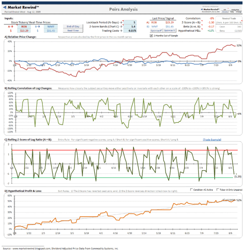
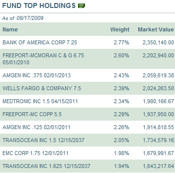
The table to the right shows the ETFs top holdings as of yesterday’s close, which include a top three of Bank of America (BAC), Freeport-McMoRan (FCX) and Amgen (AMGN). This same snapshot of current top ten holdings can be found here.

Since the launch of CWB on April 16th, the bull market performance of this ETF has matched the SPX almost step for step, with lower volatility. In the chart below, CWB is represented by the red line, the SPX is in blue, and the iShares iBoxx $ Investment Grade Corporate Bond ETF (LQD) is shown in green. This chart is an almost perfect illustration of why convertible bond ETFs (or closed-end fund or mutual fund) can be a powerful addition to one’s portfolio. At its best, in bull markets, convertibles have an upside comparable to stocks, with less downside risk. At their worst, which is generally in non-trending markets or bearish markets, the lower yield and expense of owning options that do not appreciate makes convertibles inferior to standard bonds.

Of course, options savvy investors will probably wish to buy their own bond ETF and cherry pick their favorite options plays, but for those who wish to forego a customized approach and stick with an off-the-shelf product, CWB is – for the moment at least – the only ETF which is up to the task.

[graphic: StockCharts]

Monday, August 17, 2009

How to Trade the VIX

Based upon the search terms that are landing visitors on the blog this morning, it seems as if many readers are interested in how to trade the VIX. This question really boils down to two separate issues: strategies and trading vehicles.

Since I have talked about strategies repeatedly in this space in the past, I thought I would offer a quick summary of trading vehicles today.

First off, it is not possible to trade the VIX directly. Formally known as the CBOE Volatility Index, the VIX calculates market expectations of 30 day implied volatility for S&P 500 index options. The VIX (sometimes referred to as the cash or spot VIX) is a statistic that the CBOE calculates and disseminates every 15 seconds during the trading day. While widely disseminated, this statistic is not available for purchase.

Fortunately, there are a number of VIX derivatives that allow traders to take positions on the VIX without owning the underlying. In no particular order, they are:

  1. VIX options – these include standard options as well as VIX binary options

  2. VIX futures – standard VIX futures contracts have a contract size of 1000 times the VIX; the recently added mini-VIX futures have a contract size of 100 times the VIX

  3. VIX ETNs – currently consists of two exchange traded notes: the iPath S&P 500 VIX Short-Term Futures ETN (VXX) and the iPath S&P 500 VIX Mid-Term Futures ETN (VXZ). The former targets one month VIX futures and the latter targets five month VIX futures.

In addition to VIX products, one can always trade options on the SPX (or SPY). A long VIX position is very similar to a long SPX straddle (or strangle); a short VIX position is very similar to a short SPX straddle (or strangle.)

For some additional reading on these subjects, readers are encouraged to check out:

Sunday, August 16, 2009

Chart of the Week: China Through the Eyes of FXI

One of the biggest stories of 2009 is turning out to be the rapid rebound in the China, both for the economy and for Chinese stocks.

Second quarter GDP was up 15% quarter-over-quarter in China and industrial production is up 10.8% year over year through July. A number of other statistics also show strong growth returning to China following the enactment of recent stimulus measures. Additionally, when pressed for areas of current and future revenue growth in their recent earnings conference calls, American companies were quick to point to the strong rebound in China as one of the few or sometimes the only area of growth.

For these reasons, I have made FXI, the iShares FTSE/Xinhua China 25 Index, the subject of this week’s chart of the week. The chart below is a weekly chart of FXI going back to April 2005 and shows the dramatic gains of 2006 and 2007, the subsequent crash from October 2007 to October 2008, and the 129% bounce from the October bottom to the August 3rd top. In the two weeks since topping, FXI has fallen about 6.4%.

In the last year, Chinese stocks bottomed before their U.S. counterparts, had a much more significant bounce off of that bottom, and also topped before U.S. stocks did. Are Chinese stocks pointing to a correction? Can U.S. stocks continue to make new highs without new highs from Chinese equities? Will technical resistance at the 100 week moving average become a significant hurdle for FXI? I expect we will have much better answers to these questions before Labor Day rolls around.

For two excellent resources on Chinese markets, I recommend:

[source: StockCharts]

Friday, August 14, 2009

Pairs Trading with ROB

While I have never written down any sort of mission statement or goals for VIX and More, my aim here has always been to bring fresh ideas, new subject matter and original graphics to an investment landscape that I find all too often overrun by the same warmed over sound bites and clichés.

Ideally, I would like to give readers a steady diet of ideas and concepts they can ruminate about and use to incorporate new thinking into their trading.

I have never been keen on trading blogs, but there are times when I should probably make a better effort to build a bridge from ruminations to trading. Yesterday’s Hermès vs. Wal-Mart is a case in point. The post generated a fair amount of feedback, including some discussion about possible pairs trading approaches for some retailing ETFs and individual stocks.

The chart below is an adaptation of the Claymore/Robb Report Global Luxury Index ETF (ROB) to Wal-Mart (WMT) ratio discussed in yesterday’s post and incorporates some pairs trading tools found in ETF Rewind, a powerful Excel spreadsheet tool and companion blog that is a sister site to Jeff Pietsch’s popular Market Rewind blog.

The chart shows the potential for a market neutral pairs trading approach using ROB and WMT that incorporates a 4 day lookback period and results in a nice smooth hypothetical profit and loss curve. [Click to view full-sized original graphic]

Readers who are interested in learning more about pairs trading or who are interested in a superb Excel spreadsheet for analyzing ETFs are encouraged to check out in ETF Rewind, which is available with a three day free trial.


[source: ETF Rewind]

Disclosure: I use ETF Rewind on a daily basis and have been so happy with it that I now offer a special annual subscription bundle consisting of VIX and More, ETF Rewind and Quantifiable Edges in a ‘Blogger Triple Play

Thursday, August 13, 2009

Hermès vs. Wal-Mart

Hermès vs. Wal-Mart (WMT); upscale vs. downscale. It hardly seems like a fair fight in these trying economic times. The venerable Paris-based fashion house, whose customers range from traditional royalty to Paris Hilton and Madonna pitted against the world’s largest retailer, the Bentonville, Arkansas-based discounting behemoth, whose customers seem as likely to achieve fame on the Jerry Springer Show as anywhere else.

In fact, it is Hermès and the luxury retailers such as Louis Vuitton Moet Hennessy that have been prospering as of late. Last month, Hermès reported a 12% revenue gain for the second quarter. Today, Wal-Mart weighed in with a 1.4% decline in sales, citing “a sales environment more difficult than we expected.”

For a reality check on some of the relevant stocks, I have included the ratio chart below from StockCharts.com. The ratio tracks a ratio of the Claymore/Robb Report Global Luxury Index ETF (ROB) to Wal-Mart. ROB’s top holdings include Porsche, Daimler (DAI), BMW, Louis Vuitton Moet Hennessy, Hermès, Luxottica (LUX), Pernod Ricard, etc. As the graphic shows, the luxury segment has been dramatically outperforming the discount retailer since the March bottom.

ROB has still not exceeded last Friday’s top on an absolute basis or relative to Wal-Mart. While this fact is not yet noteworthy from a technical analysis perspective, it does bear watching going forward.

For a related post, readers may wish to check:

[source: StockCharts]

Wednesday, August 12, 2009

Doug Short and a New Look at the Four Bad Bears

While we are waiting to see what the FOMC has to say, I thought I would use this lull to highlight the work of Doug Short, which can be found at dshort.com.

Yesterday, in The Road to Recovery, Doug looked at the profile of recoveries from four strong bear markets. Given the relative ease with which stocks have recovered from their March lows (see chart below), Doug adopts a skeptical tone (which I share) about the path forward for stocks:

“Our current market is now 47% above the March 9th low. It has significantly outperformed the 1974 and 2002 rebounds over the equivalent period, and it briefly surpassed the 48% rally in the 1929 Dow. Will it continue to show resilience?”

For a related post and graphic that puts the above in a different perspective, readers are encouraged to check out Doug’s The “Real” Mega-Bear Quartet 2000.

[source: dshort.com]

Tuesday, August 11, 2009

VIX Calls Attract Attention

The VIX is up about 7.4% as I type this, to 26.84, as the recent rally is finally beginning to shows signs of running out of steam.

Weakness and stocks and the rise in the VIX has generated some interest in VIX calls, with the September 35s, September 45s and August 37.5 calls attracting most of the action at the ask.

With today’s session not even at the halfway point, VIX call volume is running at a high level and the ratio of VIX calls to puts is considerably higher than the recent trend, as the chart below from WhatsTrading.com reflects. It is difficult to determine whether the VIX options activity reflects new speculation or new hedging activity, but my best guess is that a good deal of the activity is speculative.

Note that VIX options expire one week from tomorrow (see expiration calendar) and have a last trading day of one week from today.

Any close over 26.31 would mark the highest close in the VIX for a month, but it would take a spike all the way to 28.13 to bring the VIX to a level that is 10% over its 10 day moving average.

[source: WhatsTrading.com]

Monday, August 10, 2009

The TAO of Chinese Real Estate

Two places where investors have done extremely well since March are China and real estate. Some investors have undoubtedly been lucky enough to find themselves at the intersection of these two bullish themes by being invested in Chinese real estate.

Historically, gaining significant exposure to Chinese real estate has been at best unwieldy for U.S. investors. In December 2007, however, investors were given a shortcut to Chinese real estate with the launch of the Claymore/AlphaShares China Real Estate ETF, which seeks to match the performance of the AlphaShares China Real Estate Index and sports the slightly-too-cute ticker TAO.

For about a year and a half, TAO received very little attention and struggled to put together an occasional 100,000 share day, but as Chinese stocks rebounded, TAO started gathering a following. For the last two months, volume in TAO has been improving and this formerly niche ETF has started to attract a mainstream following.

Last week, TAO peaked at 20.39, more than 2 ½ times the March low of 8.08. As the chart below shows, since last week’s high, TAO has begun to come under some selling pressure, both on an absolute basis and relative to FXI, the popular Chinese ETF (see top study.) Going forward, TAO is an interesting way to keep an eye on speculative trends in the Chinese real estate market.

Finally, don’t be surprised if Chinese securities start to exhibit more of a bellwether role for global securities.

[Thanks to Market Rewind for bringing TAO to my attention.]

[source: StockCharts]

Sunday, August 9, 2009

Chart of the Week: Putting Nonfarm Payrolls in Context

For the sake of the economy and the national psyche, I was just as happy as the next person to hear that Friday’s nonfarm payrolls were better not as bad as had been expected.

The 247,000 jobs lost in July were the lowest since August 2008 and less than half of the job losses suffered in each month from November through April.

I last highlighted nonfarm payrolls in a chart of the week just over two months ago: Chart of the Week: Nonfarm Payrolls, Unemployment Rates and Time. In that post and accompanying chart, I stressed that following the peak job losses of 325,000 in October 2001, it was 19 months before there was a sustained improvement in the unemployment rate and a full 3 ½ years before the unemployment rate was below the October 2001 rate on a sustained basis.

This week’s chart of the week adds two more months of data to the previous chart and highlights another important point about the monthly job report. In the last recession, it was two full years from peak job losses to three months of consecutive net job gains. Further, while the 247,000 job losses sounds like considerable progress in the context of the recent job situation, July would have been the third worst month for job losses during the 2000-2003 bear market.

So while the July employment numbers are undoubtedly a step in the right direction, we are a long way from the type of data that should be a cause for celebration.

[source: Bureau of Labor Statistics]

Friday, August 7, 2009

Around the Horn: VIX, Volatility and Options

Just a quick note as we head into the last hour of trading to highlight several interesting new posts in the world of the VIX, volatility and options:

Finally, thanks to all who commented and wrote about the Bloomberg TV piece. I appreciate all the kind words and support.

Thursday, August 6, 2009

Bloomberg TV, TiVo and the SPX

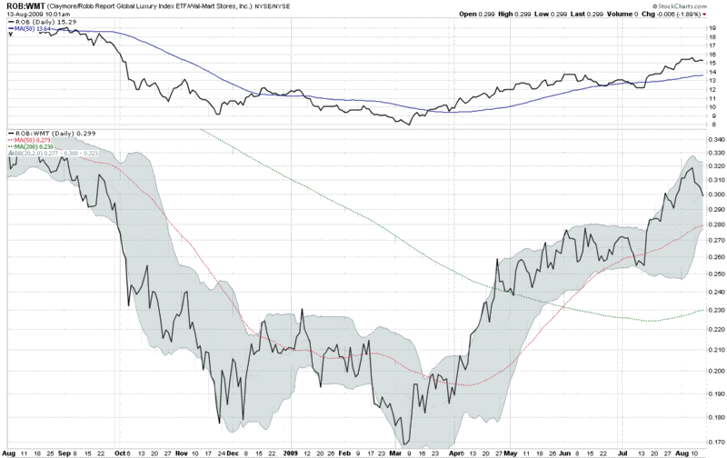
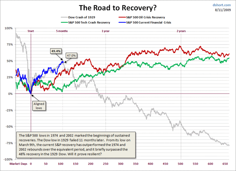
I had an interesting sequence of events happen to me today. I’m not sure they mean anything, but I thought I’d pass them along for posterity and the remote possibility that it may be of service to someone else further on down the line.

While I am decidedly not a chat room person, in the heat of today’s trading boredom, I decided to drop in the Market Rewind chat room, which is hosted daily by Jeff Pietsch of Market Rewind.

I couldn’t have been in the chat room for more than a minute or two when someone blurted out that I was “just on Bloomberg.” I assumed he meant some sort of mention in an article on Bloomberg.com, but it turns out he was referring to Bloomberg TV. Now I know I had not been out of the house all morning and had not even been on the phone, so this made me fairly curious. When I was unable to pull up anything on the Bloomberg TV web site, it occurred to me that the previous night I might have flipped on Bloomberg Asia before going to sleep. While I don’t know all the nuances of TiVo, I do know that even if you turn of the television, the last half hour or so of programming for whatever station you were watching is stored in a buffer. Perhaps my wife had not turned on the TV and changed the channel today…

So, I dashed upstairs and sure enough, found that Brennan Lothery had mentioned VIX and More as well as the newsletter in a short segment about the possibility of a correction in stocks. Specifically, Lothery picked up on the theme of Monday’s post, SPX 15% Over 200 Day Moving Average for First Time in Ten Years and used a recent chart of the SPX and the 200 day simple moving average to highlight the widening gap between the two.

To the best of my knowledge, this is the first time any VIX and More analysis has been referenced on any of the major financial television stations.

Adam at Daily Options Report noted how the multiple attributions and very positive tone of the Bloomberg segment was in sharp contrast to the almost comically confrontational approach CNBC has taken to bloggers.

While I am pleased to receive the recognition, I find it surreal that I would never have happened upon this without the following very unlikely events falling into place:

  1. I decided to wander into a stock chat room for probably the second time in my life
  2. I just happened to have Bloomberg TV as the last station I watched out of the 900+ DirecTV channels
  3. my wife was occupied all morning and unable to change the TV station

Finally, I am left with the thought that it is indeed possible to trap serendipity in today’s electronic fishing net, particularly if you have TiVo and can make a good guess at which channel might snare what you are looking for.

Wednesday, August 5, 2009

CBOE Equity Put to Call Ratio in Bear Territory

Lately I have been dipping my toe in the water on the short side – only to discover that something resembling an alligator seems intent on severing my leg at the ankle. Fortunately, I have managed to keep the stakes low to this point, but during today’s session I took a much more aggressive stance and bought a large quantity of puts.

In the process of reshaping my thinking, I found two indicators in particular to be persuasive. The first is the TRIN, where I am partial to using a 10 day EMA to smooth the data. Today it closed at a level seen only once since the beginning of 2006, just as the market put in a short-term top after a week and a half of bouncing off of the March lows.

Even more persuasive is the CBOE equity put to call ratio (CPCE), where the 10 day EMA hit a low of 0.51 – a level which has not been seen since the October 2007 top. The chart below shows that a low CPCE warned of excessive optimism and the possibility of a top first in July 2007, when the SPX began to form the first half of a double top and again in October 2007, just as the market was topping for the second and final time.

For a different take on today’s CBOE equity put to call ratio, I can highly recommend 08/05/09 Market Recap: CPCE a little too low again, from Cobra’s Market View.

For some related VIX and More posts on the CPCE, try:


[source: StockCharts.com]

Money Center Banks Surge as Regional Banks Lag

While the S&P 500 index is down about 0.8% as I type this, banks are faring considerably better than the index today, continuing a recent trend. Buying interest across the bank universe is splintered, however, with strong demand for money center banks and less interest in regional banks.

The chart below compares the performance of two popular banking ETFs, KBE, which is based on a broad-based bank index, and KRE, which is based on a regional banking index. The contrast is stark. Not only is KBE up 2.2% today while KRE is down a fractional amount, but this has been a recurring theme since the end of April, when regional banks became a laggard. Note that both banking ETFs have trailed the performance of the full financial sector, as represented by seemingly ubiquitous XLF.

During the last two days, sellers have been unable to put a dent in either real estate or financials. Until this pattern reverses, stocks are not going to be able to correct.

[source: StockCharts]

Tuesday, August 4, 2009

Real Estate Breaks Out While the Major Indices Pause

A wave of buying in the last ten minutes pushed the major indices to small gains today, following a day of lackluster trading. Stocks caught a bid early in the session following the announcement of a 3.6% increase in pending home sales for the month of June. While the broad indices bounced around near the unchanged mark all day, real estate was strong throughout the day, with IYR, the popular real estate ETF, gaining 4.8% on the day.

The chart below shows today’s action constituted a breakout for IYR, which is now trading at levels not seen since early November. Today’s volume of on volume of 40 million shares was also the highest in more than two months.

Three subsector real estate ETFs posted even more impressive gains than IYR. The FTSE NAREIT Retail Capped Index Fund (RTL) gained 6.0%, while the FTSE NAREIT Industrial/Office Capped Index Fund (FIO) advanced 5.5% and the FTSE NAREIT Residential Plus Capped Index Fund (REZ) added 4.9%. For more on the holdings of these three ETFs, check out Three Commercial Real Estate Sub-Sectors to Watch.


[source: StockCharts]

Monday, August 3, 2009

SPX 15% Over 200 Day Moving Average for First Time in Ten Years

Since I have not seen it mentioned elsewhere (which is not saying as much as it used to, given the expansion of the blogosphere), I thought it worth noting that in addition to closing over the critical 1000 level for the first time since November, the SPX also closed 15% above its simple moving average for the first time since 1999.

In the chart below, I show the daily closes of the S&P 500 index going back to 1970 (blue) and an overlay of the ratio of the SPX to its 200 day simple moving average (red.) With today’s close (red diamond), the SPX is now entering a level where mean reversion trading often makes the SPX vulnerable to a reversal. That being said, the 200 day moving average will be rising at a rate of about 0.40 per trading day for the next month or so, meaning that sideways action or even small gains will help to work off some of the excess in this ratio and bring it back toward a more typical range.

Frankly, I am beginning to think that if we do not see a significant correction begin between now and Friday’s employment report, that the SPX may make a quick move to 1100. Of course it is going to be awfully difficult to bet against the bulls until there is some evidence of an Achilles heel.

Those looking for a related upside target might be interested to know that the SPX has not closed 20% above its 200 day SMA since 1983.

For a related post, try:

[As an aside, I somehow feel compelled to note that I had no intention of making the chart look like the national flag of some new investor nation…]

Sunday, August 2, 2009

Chart of the Week: Recent Rising Weekly VIX and SPX

With all of the interest being generated by Friday’s Is the VIX Being Gamed? I thought it might be a good time for this week’s chart of the week to build on a tangential subject: the meaning of a simultaneous rise in the VIX and the SPX. Lately I have heard more than a few observers comment that the recent positive correlation between the VIX and the SPX – specifically the simultaneous rise in each index – is a bad omen for stocks.

Frankly, the SPX:VIX correlation is a subject I have been blogging about since the early days of the blog, with some of the more memorable posts on the subject included in the links below. So far I have published very little on weekly correlation data for the VIX and the SPX, but that is about to change, starting with this post.

The chart below shows weekly bars of the SPX and VIX going back to the beginning of 2008. There have been five instances since the beginning of 2008 in which both the VIX and SPX have risen in the same week (a relatively low number by historical standards largely because a large majority of weeks during this period have seen the SPX lose ground.) All five instances have been flagged with a blue arrow on the chart.

While five instances is a long way from being able to draw any meaningful statistical inferences, I think it is interesting to note that there were two consecutive weeks of gains in both the SPX and the VIX just prior to the sharp drop from September through November 2008. On the other hand, both the SPX and VIX in the middle of March, just as the March to July 2009 rally was gathering steam. Finally, the early June 2009 blue arrow seems to fall at a relatively uneventful time in recent stock market history.

The bottom line: don’t read too much about the SPX and VIX moving up in the same week.

For more posts on this subject, readers may wish to check out:

[source: StockCharts]

Disclosure: Long VIX at time of writing.

DISCLAIMER: "VIX®" is a trademark of Chicago Board Options Exchange, Incorporated. Chicago Board Options Exchange, Incorporated is not affiliated with this website or this website's owner's or operators. CBOE assumes no responsibility for the accuracy or completeness or any other aspect of any content posted on this website by its operator or any third party. All content on this site is provided for informational and entertainment purposes only and is not intended as advice to buy or sell any securities. Stocks are difficult to trade; options are even harder. When it comes to VIX derivatives, don't fall into the trap of thinking that just because you can ride a horse, you can ride an alligator. Please do your own homework and accept full responsibility for any investment decisions you make. No content on this site can be used for commercial purposes without the prior written permission of the author. Copyright © 2007-2023 Bill Luby. All rights reserved.
 
Web Analytics