Showing posts with label 10 Year Treasury Note. Show all posts

Tuesday, June 25, 2013

VXTYN Measures Volatility in U.S. Treasuries and Potential Spillover Effect

Recently I have been highlighting some non-traditional measures of volatility and risk in the financial markets, including VXEEM (CBOE Emerging Markets ETF Volatility Index); DXJ (WisdomTree Japan Hedged Equity Fund); and DBV (PowerShares DB G10 Currency Harvest Fund). Part of my intent in focusing some attention on these largely under-the-radar indices and ETPs is to get more investors to think about risk more broadly across geographies and asset classes.

One asset class that should absolutely be watched closely by even those stubbornly equity-centric investors (and I know you are out there in larger numbers than you care to admit) is U.S. Treasuries. Of course U.S. Treasuries come in quite a few flavors, but the most important is probably the U.S. 10-Year Treasury Note. In a display of impeccable timing, last month the CBOE and the CFE teamed up to launch a new volatility index based on this security: CBOE/CBOT 10-year U.S. Treasury Note Volatility Index (VXTYN).

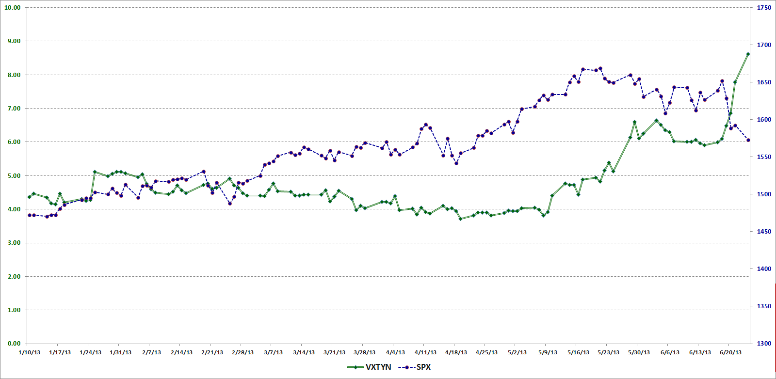
In the chart below, I show the path of VXTYN and the SPX going back to January 10, 2013, which is the beginning of the historical data for VXTYN provided by the CBOE. Note that VXTYN only began rising in May and when hit has made a substantial move up, that has preceded a decline in stocks.
[source(s): CBOE, Yahoo, VIX and More]

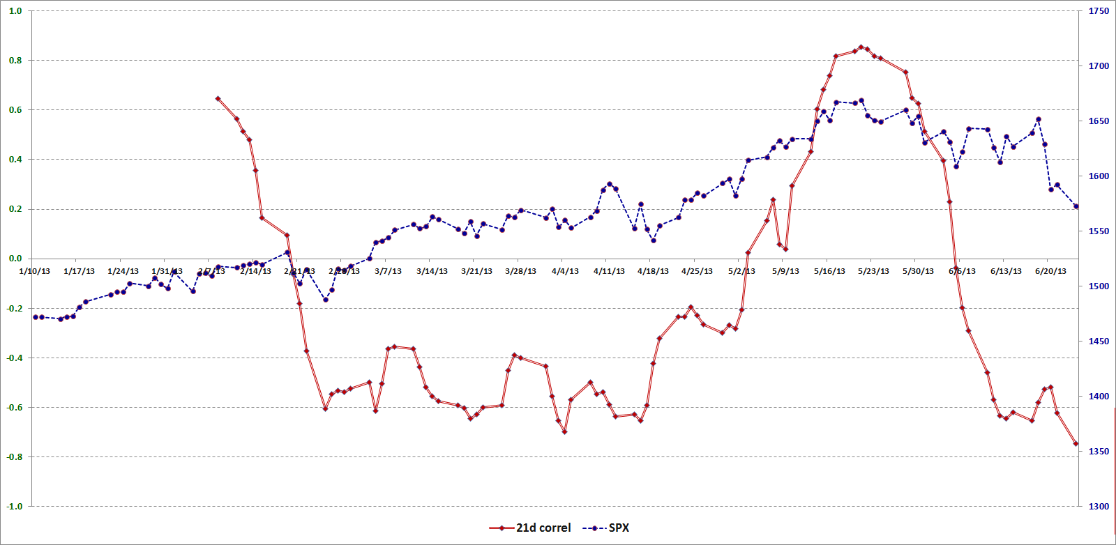
Just for fun, I am also including a chart that shows a 21-day rolling average of the correlation between VXTYN and the SPX. Here the relationship between the swings in correlation and subsequent moves in stocks may be easier to visualize. With less than months of historical data to draw on, I would caution against jumping to conclusions regarding correlation and causation, but at the very least I thought this graphic might provide some food for thought.
[source(s): CBOE, Yahoo, VIX and More]

Last but not least: did you know there are ETPs for placing bets on whether the Treasury yield curve will get steeper or flatter? I highlighted these products back in 2010 in Treasury Yield Curve ETNs and Volatility; they are known formally as the iPath US Treasury Steepener ETN (STPP) and the iPath US Treasury Flattener ETN (FLAT).

Related posts:

Disclosure(s): long DXJ at time of writing; the CBOE is an advertiser on VIX and More

Sunday, August 15, 2010

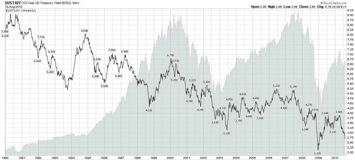
Chart of the Week: 10-Year Treasury Note Yields From 1990

The speed with which the yield on the 10-Year U.S. Treasury Note dropped from just over 4.00% in early April to just 2.68% as of Friday’s close is astonishing – and points to how the bond market is evaluating the prospects for deflation, recession and a prolonged economic malaise, or worse.

This week’s chart of the week captures the history of the yield on the benchmark 10-Year U.S. Treasury Note since 1990, when it was hovering in the vicinity of 9%. For additional context I have also included a gray area chart of the S&P 500 index. More often than not, yields on the long bond are positively correlated with equities, but this relationship can decouple, sometimes for an extended period of time.

Those who are interested in the history of the yield curve and may wish to experiment with an interactive tool with yield curve data going back to 1977 may wish to click through to Fidelity’s Historical Yield Curve page.

Related posts:


[source: StockCharts.com]

Disclosure(s): none

Wednesday, August 26, 2009

An Introduction to Treasury Auctions

It remains to be seen whether the growing U.S. Department of the Treasury auctions will be a relatively quiet sideshow or eventually take the center stage in the ongoing financial crisis. As the number of potential disaster scenarios continues to shrink, one subject that I see receive surprisingly little play in the blogosphere is one of the few remaining potential disasters: the auction of U.S. debt.

The concern is that as the U.S. debt grows, so does the volume of Treasury debt for each auction. The big fear is that at some point the supply of U.S. debt may begin to outstrip the demand. At the moment, China and Japan account for about 2/3 of all foreign holdings of U.S. Treasuries; any plateau in the demand for U.S. debt from these two nations might necessitate higher interest rates to stimulate demand and could send potentially traumatic shock waves throughout the economy. This is the disaster scenario. So far, I am happy to report, demand for Treasuries has been robust and yields have remained at very low levels.

The U.S. Treasury auctions a mixture of Treasury Bills (with maturities from 4 weeks to 52 weeks), Treasury Notes (from 2 to 10 years) and 30-Year Treasury Bonds. The T-Bills are auctioned on what is largely a weekly cycle, with the typical pattern seeing the 13-week and 26-week T-Bills slotted for Mondays and the 4-week and 52-week T-Bills on Tuesdays. Given the frequency of these T-Bill auctions and the relatively low demand from foreign central banks, the T-Bill auctions are probably the least important auctions in terms of being able to gauge market sentiment and the strength of foreign demand.

The more important auctions are of the Treasury Notes, where the 10-Year Note has become the de-facto benchmark for U.S. long-term debt. Treasury Note auctions are best understood as occurring on a monthly cycle, with the 3-Year and 10-Year Notes typically auctioned on Tuesdays and Wednesdays during the second week of each month and the 2-Year, 5-Year and 7-Year Notes typically auctioned off on Tuesdays, Wednesdays and Thursdays of the last week of each month.

The 30-Year Bond and Treasury Inflation Protected Securities (TIPS) are a much smaller part of the Treasury refunding process and are subjects for another post.

The results of Treasury auctions are announced at 1:00 p.m. ET (see Announcement & Results Press Releases) and contain three particularly important pieces of information:

  1. Yield
  2. Bid-to-cover ratio
  3. Percentage of indirect bidders

In short, the yield determines the cost of the debt refunding and/or the price sensitivity of the bidders. The bid-to-cover ratio is simply the total dollar amount of the bids tendered by the total amount of the securities being auction and reflects demand relative to supply. Finally, the percentage of indirect bidders is used as a proxy for demand from foreign central banks, as indirect bids are bids of significant size that do not go through the primary dealer community.

Going forward, investors should keep an eye on the Treasury auctions, particularly on the demand for U.S. Treasury Notes. Should yields start rising, bid-to-cover ratios start falling and participation by indirect bidders begin to decline, then we may have the beginnings of a new kind of debt crisis on our hands.

For additional information on Treasury auctions, try:

For some VIX and More posts on TIPS, readers may wish to check out:

Sunday, March 29, 2009

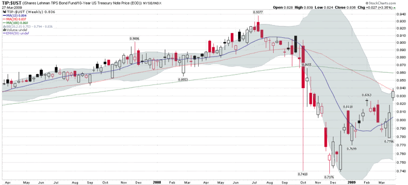
Chart of the Week: TIPS Breaking Out

While there were many important stories that broke this week, the one which found me briefly holding my breath was the failed auction of £1.75 billion in U.K. government 40-year bonds on Wednesday followed by the weak demand for $34 billion of 5-year U.S. Treasury notes later in the day. While Thursday’s successful auction of $24 billion of 7-year U.S. Treasury notes has temporarily put the government debt auction issue on the back burner, the interest rate plot is clearly thickening – and the debate on deflation vs. inflation is starting to heat up.

One excellent way to protect against inflation is through the use of Treasury Inflation-Protected Securities, more commonly known as TIPS. As I noted last September in Treasury Inflation -Protected Securities and Inflationary Expectations, TIPS utilize the CPI as an inflationary benchmark and TIPS coupon payments and the underlying principal are automatically adjusted to account for inflation.

All of this brings us to the chart of the week below, which shows a ratio of the iShares Barclays TIPS Bond Fund ETF (TIP) to the 10-Year U.S. Treasury Note. This ratio has seen several jolts in the last six or so months, but since mid-December, investors have shown a strong preference for TIPS over the standard Treasuries. In fact, as concern about inflation has elevated during the course of the last week or so, TIP, with an average maturity of approximately nine years, has moved up impressively while Treasuries with comparable maturities have fallen. The ratio is now approaching its pre-Lehman levels, so that further moves could help to gauge whether inflationary or deflationary fears are dominating the thinking of investors.

[source: StockCharts]

Saturday, November 29, 2008

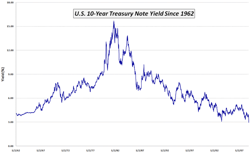
Chart of the Week: Yields on U.S. 10-Year Treasury Notes Below 3%

The chart of the week looks like it will now be a regular feature in this space. This week’s theme, once again, has a bond focus and extends the flight to safety theme from last week. The graphic below captures the full 46 year history of the yield on the 10-Year U.S. Treasury Note. While difficult to discern from the graph, this is the first week the yield on that bond has ever closed below 3.0%. The reason for the low yield is the overwhelming demand cause by investors who are embracing a flight to safety approach to investing and see U.S. government debt as a safe haven for their assets.

The low yields on U.S. government debt have several interesting implications. One implication is that a falling VIX does not reflect the action in the government bond markets. Another implication is that rising yields will indicate when money is starting to flow out of safe haven investments toward higher risk investments such as stocks. Finally, when the bulk of those currently holding government debt decide that it is appropriate to redeploy these assets into stocks, the pent-up demand for equities will be a formidable factor to reckon with.


[source: VIX and More]

Friday, March 14, 2008

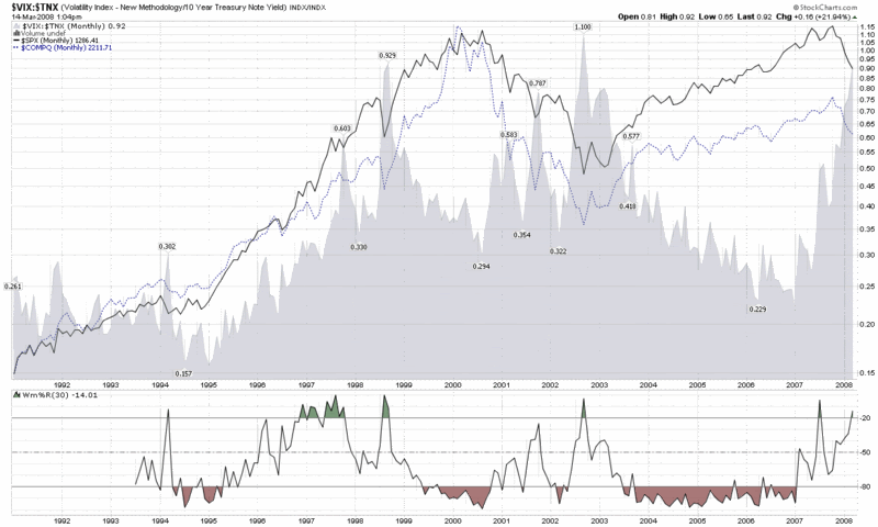
Fear and the Flight to Safety

There are many ways of thinking about the current credit crisis, but today I thought I’d offer a visual depiction of one that I’m fairly certain has never been posted anywhere else. The chart below shows the ratio of the VIX to the yield on the 10-Year Treasury Note. By way of commentary, consider this to be a loose proxy for fear divided by the propensity of investors to flee to the safest investment alternatives. Needless to say, the graphic shows that the ratio is currently at levels seen only during extreme crisis or panic market environments.

DISCLAIMER: "VIX®" is a trademark of Chicago Board Options Exchange, Incorporated. Chicago Board Options Exchange, Incorporated is not affiliated with this website or this website's owner's or operators. CBOE assumes no responsibility for the accuracy or completeness or any other aspect of any content posted on this website by its operator or any third party. All content on this site is provided for informational and entertainment purposes only and is not intended as advice to buy or sell any securities. Stocks are difficult to trade; options are even harder. When it comes to VIX derivatives, don't fall into the trap of thinking that just because you can ride a horse, you can ride an alligator. Please do your own homework and accept full responsibility for any investment decisions you make. No content on this site can be used for commercial purposes without the prior written permission of the author. Copyright © 2007-2023 Bill Luby. All rights reserved.
 
Web Analytics