Showing posts with label yield curve. Show all posts

Tuesday, June 18, 2013

VIX and SPX During the 1994 Interest Rate Hike Cycle

With yesterday’s The VIX and the Pre-FOMC + Post-FOMC Trades post in the books, it occurred to me that my reference to the series of interest rate hikes in 1994 probably stretches back before the memory banks of the current generation of investors. So with all the anxiety about Fed tapering and ultimately ending quantitative easing, I thought this might be a good time to review what happened to stocks and volatility when the Fed embarked upon a series of interest rate hikes that took the financial community by surprise.

To set the context, the 1990s started out with a recession that coincided with the first Gulf War and a corresponding sharp rise in oil prices. The Fed had been gradually lowering interest rates from 1989 – 1992 and this helped to create an environment that favored a recovery, but this recovery took some time to gain traction and did not get going until 1991. The stock market fared better than the economy during this period; after a down year in 1990, stocks rallied to post gains in 1991, 1992 and 1993. After a strong January for stocks, 1994 appeared to be on a similar path to success.

It was at this point that Federal Reserve Chairman Alan Greenspan decided to remove the proverbial punch bowl before the party got out of hand and on February 4, 1994, the Fed surprised the markets by announcing a 0.25% increase in the federal funds rate. By the time 1994 was over, the Fed had raised interest rates on six different occasions. As the chart below shows, the first three raises were 0.25% increases in the federal funds rate, but the incremental size of the raises increased to 0.50% and eventually 0.75% later in the year and were supplemented by increases in the federal discount rate, which also grew from 0.50% to 0.75%. By the time 1994 was in the books, the federal funds rate had jumped from 3.00% to 5.50% and the federal discount rate had risen from 3.00% to 4.75%. (The rate hike cycle finally ended on February 1, 1995, when the Fed raised the federal funds rate to 6.00% and the federal discount rate to 5.25%.)

Keep in mind that Alan Greenspan did not believe in signaling the Fed’s intentions in those days; on the contrary, he was a master of obfuscation and his cryptic and often ambiguous language typically kept investors in the dark about his intentions. For this reason, it was difficult for the markets to anticipate the Fed’s next move and investors we not necessarily prepared for subsequent interest rate hikes.

How did the financial markets respond to what amounted to almost a doubling of the federal funds rate and an increase of more than 50% in the federal discount rate? With a lot less volatility than one might imagine. The average closing value of the VIX was 13.93 in 1994, little different than the 13.90 average for the VIX in 2013. While the VIX did spike all the way up to 28.30 on April 4th, the VIX only closed above 20.00 on two days during the entire year! The S&P 500 index ended the year with a small loss (a small gain if dividends were to be included in the calculations), but roared back with gains of 34%, 20%, 31%, 27% and 20% in the subsequent five years.

[source(s): StockCharts.com, Federal Reserve Bank of New York, VIX and More]

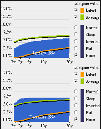
The series of rate hikes did dramatically change the yield curve, as the chart below illustrates. The more dramatic moves were at the front end of the terms structure, with the curve essentially flat from two years through thirty years by the end of 1994.

[source(s): Wall Street Journal / SmartMoney]

So while Robin Harding’s Fed Likely to Signal Tapering Move is Close article in the Financial Times yesterday (and his subsequent tweet, “The Fed does not leak anything to any journalist to steer markets - especially during blackout”) may have given investors an opportunity for a dress rehearsal for the ultimate tapering, the historical record from 1994 suggests that tapering fears may be exaggerating how the QE end game will ultimately play out.

Related posts:

Disclosure(s): none

Tuesday, December 14, 2010

Treasury Yield Curve ETNs and Volatility

The subject of the VIX and Treasury yields is one I have probably not explored in sufficient detail in this space, so with some recent developments, this seems like a good time to dive into that subject.

One big reason for my interest is the recent rapid steepening of the Treasury yield curve. Another is an excellent article on two yield curve ETN plays from Timothy Strauts of Morningstar: How to Take Advantage of a Steep Yield Curve. In the article, Strauts discusses two ETNs from iPath that are designed to take advantage of a yield curve that becomes steeper or flatter. The ETNs are known formally as the iPath US Treasury Steepener ETN (STPP) and the iPath US Treasury Flattener ETN (FLAT). These innovative and exciting ETNs hold 2-year and 10-year Treasury futures and are rebalanced monthly. In many respects they represent the latest generation of what I refer to as strategy-in-a-box ETPs.

Launched in August, STPP and FLAT have started to attract some attention in the last few weeks, as Treasury yields have become more volatile.

There is not yet much of a track record, but I will be interested to see how the movements in STPP and FLAT interact with movements in the VIX. For an initial pass, I have chosen to look at STPP and FLAT in conjunction with SPY and VXZ. (Note that I chose VXZ here in order to sidestep the strong contango in the VIX futures term structure that exacerbated the price decline in VXX as of late.)

The chart below shows the performance of the yield curve ETNs since their August 10th launch. Note that so far – and particularly as of late – it has been FLAT which has been more positively correlated with changes in implied volatility expectations as measured by VXZ. On the flip side, STPP has demonstrated a higher positive correlation with stocks, at least as reflected in SPY.

Going forward, I will provide periodic updates on my observations between changes in the Treasury yield curve in the VIX and also take up the subject of how the Treasury yield curve might be able to predict the future of the VIX.

Related posts:


[source: ETFreplay.com]

Disclosure(s):
short VXX at time of writing

Sunday, August 15, 2010

Chart of the Week: 10-Year Treasury Note Yields From 1990

The speed with which the yield on the 10-Year U.S. Treasury Note dropped from just over 4.00% in early April to just 2.68% as of Friday’s close is astonishing – and points to how the bond market is evaluating the prospects for deflation, recession and a prolonged economic malaise, or worse.

This week’s chart of the week captures the history of the yield on the benchmark 10-Year U.S. Treasury Note since 1990, when it was hovering in the vicinity of 9%. For additional context I have also included a gray area chart of the S&P 500 index. More often than not, yields on the long bond are positively correlated with equities, but this relationship can decouple, sometimes for an extended period of time.

Those who are interested in the history of the yield curve and may wish to experiment with an interactive tool with yield curve data going back to 1977 may wish to click through to Fidelity’s Historical Yield Curve page.

Related posts:


[source: StockCharts.com]

Disclosure(s): none

Tuesday, June 29, 2010

Revisiting the Flight-to-Safety Trade

Once again the S&P 500 index approached the precipice at 1040 and for now at least has backed away and found a little breathing room.

With anxiety running high, investors have embraced the flight-to-safety trade once again. The current preference is for U.S. Treasuries, the dollar (UUP), and to a lesser extent, gold (GLD).

While the most conservative plays are necessarily on the short end of the U.S. Treasury yield curve (represented by ETFs such as SHV and BIL), note that in the chart below I have included the long bond ETF (TLT) to provide a higher volatility bond for comparison purposes. The trend is fairly well established at this stage. Of the flight-to-safety vehicles, U.S. Treasuries are attracting the most interest (perhaps due to deflationary concerns), followed by gold, with the dollar the least enticing alternative, today’s 0.8% rally notwithstanding.

Not shown in the chart below is VXX (iPath S&P 500 VIX Short-Term Futures ETN), which is more of a speculative bear market play or a hedge than a flight-to-safety alternative. During the period from the April 23rd high through yesterday (June 28th) VXX is up 53.4%, with a volatility level of 94.5.

For more on related subjects, readers are encouraged to check out:


[source: ETFreplay.com]

Disclosure(s): short VXX at time of writing

Sunday, April 11, 2010

Chart of the Week: 10-Year Treasury Note Yield

I’ll be the first to admit that I have never considered myself a ‘bond guy’ and I spend much less time than I probably should studying the bond market. That being said, I know I have quite a few equity-centric readers who think the bond market moves too slowly to warrant their attention. The attitude is frequently, “I’ll never be a bond trader, so why should I spend my time watching bonds?”

My quick answer to bond skeptics is that bonds can help to divine the direction of interest rates and bonds frequently make major market turns before stocks do. Additionally, with the advent of bond ETFs such as the highly liquid TLT (and its +3x and -3x counterparts, TMF and TMV), it is now much easier for the retail investor to trade the U.S. Treasury long bond and their volatile triple ETF counterparts, as well as some of the shorter-dated Treasury ETFs, such as IEF, which is comprised of U.S. Treasury Notes with a target maturity of 7-10 years.

The bond world is so large that I have singled out one particular bond in this week’s chart of the week as the bond number for non-bond people to follow. The chart is the yield on the 10-Year U.S. Treasury Note, which is the de facto benchmark for government and sometimes even for corporate bonds as well.

Note that the yield on the 10-Year Treasury Note just hit 4.00 last week, attracting buyers such as BlackRock (BLK), which found the steep yield curve a good reason to buy some of the 10-Year Treasury Notes.

For those who wish to dive further into the subject of intermarket relationships such as the link between bonds and stocks, an excellent place to start is with John Murphy’s Intermarket Analysis.

For more on related subjects, readers are encouraged to check out:


[source: StockCharts.com]

Disclosure(s): short TLT at time of writing

Wednesday, April 30, 2008

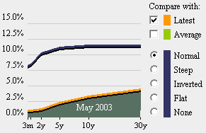
Yield Curve Looks Just Like May 2003

There are several places on the web where you can watch a short time-lapse video that shows the recent history of the yield curve. One of those places is Fidelity’s Historical Yield Curve page.

In reviewing the history of the yield curve on the Fidelity site, I was surprised to see that the current yield curve is almost identical to the yield curve as it stood on May 2003. This may just be a historical coincidence, but May 2003 also represents the beginning of the five year bull market that followed the 2002-2003 bottom. In the graphic below, I have added a blue arrow to mark May 2003, which just happens to be the time that the SPX started making higher highs and confirming that a bullish move was underway.

Recall that the inverted yield curve which began in 2006 and caused considerable consternation among investors, turned out to be an excellent – if somewhat early – predictor of the coming stock market top and subsequent economic malaise. Historically a steep yield curve, such as the one we have at present and saw in May 2003, has generally been a harbinger of better times ahead and is often found at the beginning of economic expansions.

DISCLAIMER: "VIX®" is a trademark of Chicago Board Options Exchange, Incorporated. Chicago Board Options Exchange, Incorporated is not affiliated with this website or this website's owner's or operators. CBOE assumes no responsibility for the accuracy or completeness or any other aspect of any content posted on this website by its operator or any third party. All content on this site is provided for informational and entertainment purposes only and is not intended as advice to buy or sell any securities. Stocks are difficult to trade; options are even harder. When it comes to VIX derivatives, don't fall into the trap of thinking that just because you can ride a horse, you can ride an alligator. Please do your own homework and accept full responsibility for any investment decisions you make. No content on this site can be used for commercial purposes without the prior written permission of the author. Copyright © 2007-2023 Bill Luby. All rights reserved.
 
Web Analytics