Volatility Catastrophe Graphic
Catastrophe may not be exactly the right word here, but I needed a title with which to introduce the graphic below, which is a ratio of the VIX to the 3 month T-bill yield (VIX:IRX ratio).
The chart goes back to beginning of the VIX data in 1990 and even in a log scale demonstrates that the current environment is several orders of magnitude more concerning (at least from a volatility and flight to safety perspective) than any other day in the last 19 years.
For more background on this particular ratio, check out Expanding on the VIX and the 10 Year Treasury Note Yield and Fear and the Flight to Safety.
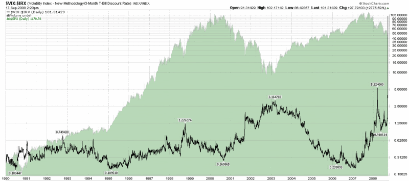
[source: StockCharts]


54 comments:
FWIW, the VIX:IRX ratio is now over 170...
More postings about the VIX:VXW ratio please.
Great work, and thanks for updating more frequently during these interesting times.
Yes, thanks for the great work.
Is there any index like this that goes back before 1990?
It would be interesting to see this during the crash of 1987.
Keep up the good work.
Thanks for the feedback.
Regarding the VIX:IRX ratio, there is VXO data going back to January 1986, but I am not able to do a similar ratio graph for VXO:IRX at StockCharts.com
Perhaps when things calm down a little I can look at some other alternatives for a VXO:IRX ratio chart.
Cheers, good trading, and be sure to have some dry power handy at all times,
-Bill
Bill,
I would be interested in seeing what ever you have, but I was actually referring to the IRX. The level of the IRX is really interesting here (thank you for pointing it out). In fact, the IRX might even deserve to be shown in the bottom panel of your chart. Just a thought.
Cheers.
Bill,
is this the lowest ever on record for the IRX? Like holy cow, it almost 0% interest rate (well actually it's at 0.02%.) looks like we're heading into 1990s Japan-like recession/deflation scenario but much worse.
Jimmy
The VXO:IRX ratio on Oct 19, 1987 was 2.35.
This is why one needs to be cautious when doing analysis on ratios. They show significant changes over time.
typo there, it's 0.2% 3 month treasury bill interest rate.
jimmy
When I look at your charts, I can only see to the end of 2006. Thus, I am not able to visually grasp your point. Is there a setting on ie that I can change, or is it related to the site.
Thanks.
This chart ends at 2007. I can't see what you are referring to.
t-rates at lowest rate since the great depression.
jimmy
Andy and anon,
I'm afraid my graphics are not compatible with all monitors. Sorry for the inconvenience.
The easiest workaround is to right click on the image, highlight "Copy Image Location," and paste the link into a new browser window.
I hope this helps.
Cheers,
-Bill
buy ativan online ativan withdrawal ringing ears - how to order ativan online
buy xanax online 1mg clonazepam vs xanax - xanax on drug test
order valium valium in your system drug test - side effects quitting valium
diazepam generic diazepam side effects uses - diazepam dose elderly
order ativan teva lorazepam 1mg lorazepam 1mg - buy lorazepam online no prescription needed
buy diazepam diazepam drug test - diazepam 5mg street value
ativan for sale ativan and high blood pressure - buy ativan online
order ativan quitting ativan side effects - many milligrams ativan overdose
xanax pills xanax 1 mg time release - small round white pill xanax
ambien without prescription generic ambien 93 74 - ambien and alcohol and death
buy cheap soma soma online buy - buy soma online no rx
buy valium in uk legal buy valium online usa - valium dosage before surgery
soma cheap soma 350 mg dose - generic soma good
buy carisoprodol buy soma online no prescription mastercard - carisoprodol dosage back pain
ambien online purchase 40 mg ambien high - buy cheap ambien online no prescription
Blogger: VIX and More - Post a Comment buy cheap ativan - where can i buy ativan online http://www.ativanonlineoffer.com/#where-can-i-buy-ativan-online
Blogger: VIX and More - Post a Comment cheap acomplia diet pills - acomplia pills http://www.a6soft.com/#acomplia-pills
Blogger: VIX and More - Post a Comment sibutramine online - sibutramine for sale http://www.meridiaordernow.com/#sibutramine-for-sale
Blogger: VIX and More - Post a Comment soma no prescription - order soma online http://www.emprendiendoideas.com/#order-soma-online
Blogger: VIX and More - Post a Comment acomplia uk - buy acomplia rimonabant http://www.a6soft.com/#buy-acomplia-rimonabant
Blogger: VIX and More - Post a Comment prednisone 5mg - prednisone acne http://www.ourdailybreadmarket.net/#prednisone-acne
Hi, MoxoredapeTox ambien without prescription - cheap generic ambien http://topandhra.com/#cheap-generic-ambien
Health Medicine Education Usmle rimonabant online - acomplia 20mg http://www.buydiscountedisotretinoin.net/#acomplia-20mg
Hello, price of generic lipitor - buy lipitor online no prescription http://www.costoflipitoronline.net/#buy-lipitor-online-no-prescription
advitleva seroquel drug - seroquel for sale http://www.seroqueldiscounts.com/
advitleva buy finasteride no prescription - finasteride online no prescription http://www.bestpricefinasteride.com/
Drug Utilizer purchase topamax online - discount topamax http://www.topamaxforless.com/
Meridia Diet Medicine And Success topamax without rx - topamax weight loss http://www.topamaxdiscount.com/
dalsCleax finasteride without prescription - buy propecia online no prescription http://www.propeciaspecialprice.com/#buy-propecia-online-no-prescription
Drug Testing Paretns Stories price of diflucan - diflucan fluconazole 150mg http://www.aftermarketcaddy.com/, cheap diflucan online
Health Care Professional Lubiprostone Medicine buy reductil - buy meridia without prescription http://www.meridiaonlineorder.net/#buy-meridia-without-prescription , [url=http://www.meridiaonlineorder.net/#buy-cheap-meridia ]buy cheap meridia [/url]
tfv buy zoloft without rx - zoloft 50mg http://www.zoloftonlinesales.net/#buy-zoloft, generic zoloft cost
tfv maxalt without prescription - buy maxalt - buy maxalt online http://www.maxaltonlinesale.net/#maxalt-online-no-prescription ,
tni cheap clomiphene - clomid drug http://www.clomidonlinediscount.net/#buy-clomiphene, cheap clomid pills
ooo!!! Generic Topiramate - purchase topamax no prescription http://www.topamaxbestonline.net/#topamax-online, [url=http://www.topamaxbestonline.net/#topamax-online]Generic Topiramate[/url]
2013 buy prednisone online - buy prednisolone http://www.prednisoneonlinerx.net/index.html, [url=http://www.prednisoneonlinerx.net/index.html]buy prednisolone online [/url]
2, furosemide without rx - order lasix without prescription http://www.lasixordernow.net/, generic for lasix
2, order furosemide - cheap lasix without prescription http://www.lasixordernow.net/, furosemide without rx
Hi, buy sumatriptan no prescription - cheap imitrex http://www.zombiedriver.net/, [url=http://www.zombiedriver.net/]buy sumatriptan online no prescription [/url]
2, [url=http://www.zolofthelpsleep.net/]Zoloft Price[/url] - Buy Sertraline - zoloft for anxiety http://www.zolofthelpsleep.net/.
Thanks for sharing this valuable information with us about Buy Ativan 2mg Online.
My brother suggested I might like this blog. He used to be totally right. This submit truly made my day. You cann't believe simply how so much time I had spent for this info! Thanks! Looking foward to สล็อ
Post a Comment