Showing posts with label 3 Month Treasury Bill. Show all posts

Sunday, November 23, 2008

Chart of the Week: Ratio of VIX to Yield on 3 Month T-Bills

I have been mulling over some ideas for new features on the blog (feel free to suggest some possibilities in the comments below) and one of these is a chart of the week that highlights what I think is a particularly salient development from the past week. This week, of course, there are many possibilities to draw upon, given some of the historic market activity. Friday’s Citigroup implied volatility chart is one such example.

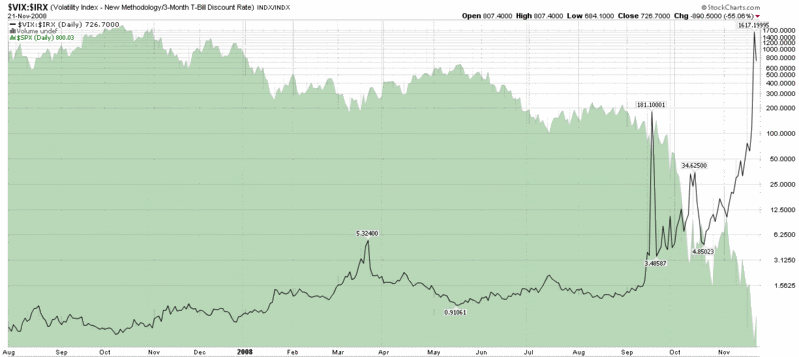
This week, however, I would like to highlight the T-Bill aspect of the recent flight to safety with a ratio of the VIX to the 3 month T-bill yield. A chart of the VIX:IRX ratio is below.

Some readers may recall that following the Lehman Brothers bankruptcy in mid-September I highlighted this same ratio in a chart going all the way back to 1990 in Volatility Catastrophe Graphic. At that time, the VIX:IRX ratio had just exceeded 100, shattering the all-time high set in March when the ratio jumped to 5.3 on the heels of the Bear Stearns failure. This week the ratio took another quantum leap, surpassing 1600 at one point and closing at 726.

When it comes to measuring fear, VIX is only part of the story. The VIX:IRX ratio paints a much broader – and darker – picture of fear and the flight to safety.
[source: StockCharts]

Friday, October 17, 2008

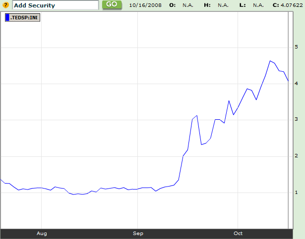
TED Spread and VIX Both Coming Back to Earth?

It remains to be seen whether yesterday’s new high of 81.17 in the VIX turns out to be the top in that index. Personally, I think there is a good possibility that 81.17 holds up for many years, but I also believe that it is even more likely that the TED spread (which measures the difference between LIBOR rates and the yield on the 3 month U.S. T-Bill) high of last Friday will mark the maximum point of atherosclerosis in the credit markets.

In the graphic below, courtesy of Bloomberg, you can see that the TED spread has already pulled back about 14% from the October 10th high.

Even a slow thaw in the credit markets and in equity volatility should be a sign that the global economy is turning the corner. In fear and panic there is opportunity; and as we turn the corner, the opportunities are greatest.

[source: Bloomberg]

Wednesday, September 17, 2008

Volatility Catastrophe Graphic

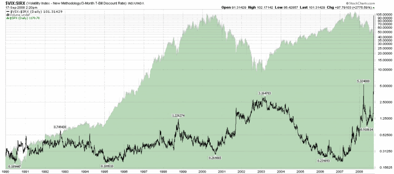
Catastrophe may not be exactly the right word here, but I needed a title with which to introduce the graphic below, which is a ratio of the VIX to the 3 month T-bill yield (VIX:IRX ratio).

The chart goes back to beginning of the VIX data in 1990 and even in a log scale demonstrates that the current environment is several orders of magnitude more concerning (at least from a volatility and flight to safety perspective) than any other day in the last 19 years.

For more background on this particular ratio, check out Expanding on the VIX and the 10 Year Treasury Note Yield and Fear and the Flight to Safety.

[source: StockCharts]

Wednesday, March 19, 2008

What Panic Looks Like

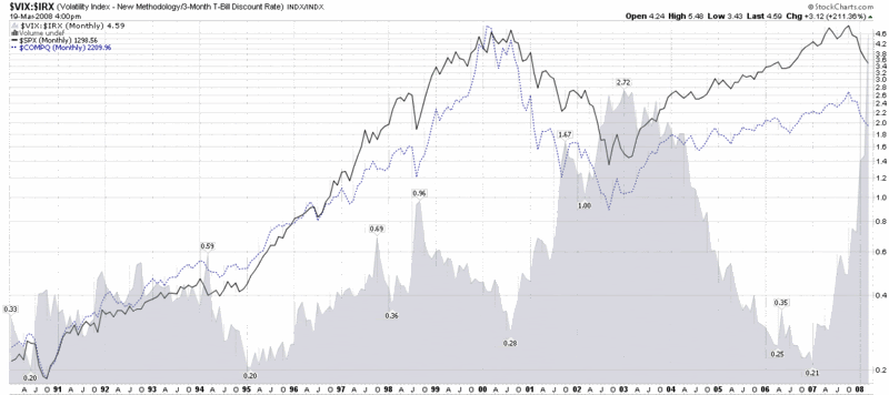
A monthly chart of the VIX to 3 month T-bill yield ratio:

Monday, March 17, 2008

Expanding on the VIX and the 10 Year Treasury Note Yield

On Friday, in Fear and the Flight to Safety, I posted a chart of the ratio of the VIX to the 10 year Treasury Note yield. That post triggered a number of interesting responses, two of which I would like to highlight here.

First, Jason Goepfert of SentimenTrader.com, noted in a Minyanville.com article titled Cashing in on the Panic that past instances in which volatility spiked to extreme levels relative to the 10 Year Treasury Note offered superb buying opportunities. Goepfert examined returns from five days to three months from the spike and found “results going forward were exceptionally positive and consistently so.” See his table of results for additional details.

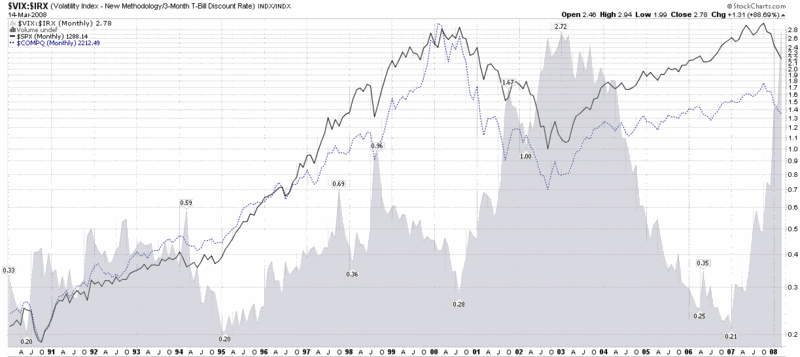
Second, Tom Drake of Putting the Pieces Together suggested an obvious enhancement to the ratio chart: substituting the 3 month Treasury Bill yield for the 10 Year Treasury Note, on the grounds that the flight to safety usually favors short-term government debt. A monthly chart of the VIX to 3 month T-bill yield ratio (VIX:IRX), which is similar in many respects to Friday’s chart, is as follows:

DISCLAIMER: "VIX®" is a trademark of Chicago Board Options Exchange, Incorporated. Chicago Board Options Exchange, Incorporated is not affiliated with this website or this website's owner's or operators. CBOE assumes no responsibility for the accuracy or completeness or any other aspect of any content posted on this website by its operator or any third party. All content on this site is provided for informational and entertainment purposes only and is not intended as advice to buy or sell any securities. Stocks are difficult to trade; options are even harder. When it comes to VIX derivatives, don't fall into the trap of thinking that just because you can ride a horse, you can ride an alligator. Please do your own homework and accept full responsibility for any investment decisions you make. No content on this site can be used for commercial purposes without the prior written permission of the author. Copyright © 2007-2023 Bill Luby. All rights reserved.
 
Web Analytics