Chart of the Week: Ratio of VIX to Yield on 3 Month T-Bills
I have been mulling over some ideas for new features on the blog (feel free to suggest some possibilities in the comments below) and one of these is a chart of the week that highlights what I think is a particularly salient development from the past week. This week, of course, there are many possibilities to draw upon, given some of the historic market activity. Friday’s Citigroup implied volatility chart is one such example.
This week, however, I would like to highlight the T-Bill aspect of the recent flight to safety with a ratio of the VIX to the 3 month T-bill yield. A chart of the VIX:IRX ratio is below.
Some readers may recall that following the Lehman Brothers bankruptcy in mid-September I highlighted this same ratio in a chart going all the way back to 1990 in Volatility Catastrophe Graphic. At that time, the VIX:IRX ratio had just exceeded 100, shattering the all-time high set in March when the ratio jumped to 5.3 on the heels of the Bear Stearns failure. This week the ratio took another quantum leap, surpassing 1600 at one point and closing at 726.
When it comes to measuring fear, VIX is only part of the story. The VIX:IRX ratio paints a much broader – and darker – picture of fear and the flight to safety.
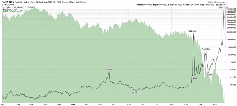
[source: StockCharts]


3 comments:
How about a periodic review (quarterly?) of these original indicators you've developed such as VIX:VXV, VIX:IRX, etc. What's working, what's not, new insights.
Great work.
I wish I could zoom in this and study it more, but I like the direction on this. There is also a constant maturity 3-month as well, I think, but a lot of interesting ratios could be expanded on here, because we are in very weird territory!
[p]The notepads can be applied to maintain [url=http://www.uggsbootssaleinuk.co.uk]cheap ugg boots sale[/url] observe of your prospects . The same as other ugg [url=http://www.uggbaileybuttonbootssale.co.uk]ugg bailey button bomber[/url] boots,Ugg Ultra Boots is made of double-faced grade a sheepskin which provides you amazing feeling to wearing them . Much more than just a slipper, the Tasman seamlessly doubles as [url=http://www.uggslipperssale.co.uk]kids ugg slippers[/url] a shoe . Together with just a little persistence you will get the [url=http://www.cheapuggsbootsonlinesale.co.uk]cheap ugg boots sale[/url] most perfect gown for almost any situation . Be sure to try on the boot with heavy socks to make sure the size is correct . Are your shoes finishing touches or devastating elements to your entire look? To know the answer, make a precise [url=http://www.uggsbootssaleukcheap.co.uk]cheap ugg boots sale[/url] decision on your own personality before hand . [url=http://www.uggsbootssaleukcheap.co.uk]kids ugg boots sale[/url] com/classic-short-boots-black5825-p-3539.[/p]
Post a Comment