Showing posts with label bond ETFs. Show all posts

Tuesday, August 31, 2010

Emerging Markets Bond ETFs Soar

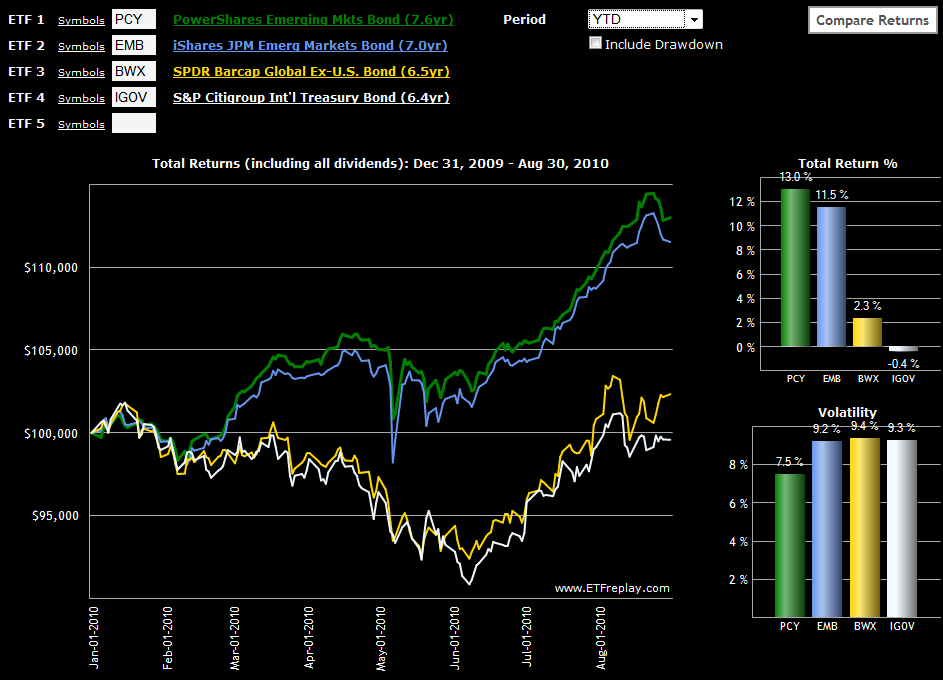
While there have been pockets of strength in emerging markets for equities (see links below), emerging markets bonds have been even stronger performers in 2010, both on an absolute and risk-adjusted basis. In fact, if one compares the chart of emerging markets bonds below, the gap between emerging markets and developed markets looks strikingly similar to what was seen on the equity side in Chart of the Week: Rethinking Geography.

I first wrote about PCY (the PowerShares Emerging Markets Sovereign Debt Portfolio ETF) back in October 2008 in the context of an indicator of the strength of the global economic in general and emerging markets in particular. Since that time, PCY has been an extremely strong performer, gaining 35.6% in 2009 and adding another 13.0% so far in 2010. Along the way, PCY has attracted completion in the form of EMB, the iShares USD Emerging Market Bond ETF, which was up 15.4% in 2009 and is up 11.5% year-to-date in 2010. Of course both PCY and EMB have been able to post these excellent returns with only a fraction of the risk of their equity market counterparts.

For comparison sake, I have also included two international bond ETFs that have a much higher weighting in developed markets than emerging markets. Of these two the more liquid is SPDR Barclays Capital International Treasury Bond ETF (BWX); the S&P/Citigroup International Treasury Bond ETF (IGOV) is a relative newcomer. A shorter duration option in this space is the S&P/Citigroup 1-3 Year International Treasury Bond ETF (ISHG).

It may be a global marketplace, but geography continues to have a strong influence over local and regional risk and reward. Without the sovereign debt problems, zombie banks and housing bubbles, emerging market debt is an attractive place to diversify a portfolio and capture a relatively high yield, such as the 5% or so currently available from PCY.

Related posts:


[source:ETFreplay.com]

Disclosure(s): long PCY at time of writing

Sunday, April 11, 2010

Chart of the Week: 10-Year Treasury Note Yield

I’ll be the first to admit that I have never considered myself a ‘bond guy’ and I spend much less time than I probably should studying the bond market. That being said, I know I have quite a few equity-centric readers who think the bond market moves too slowly to warrant their attention. The attitude is frequently, “I’ll never be a bond trader, so why should I spend my time watching bonds?”

My quick answer to bond skeptics is that bonds can help to divine the direction of interest rates and bonds frequently make major market turns before stocks do. Additionally, with the advent of bond ETFs such as the highly liquid TLT (and its +3x and -3x counterparts, TMF and TMV), it is now much easier for the retail investor to trade the U.S. Treasury long bond and their volatile triple ETF counterparts, as well as some of the shorter-dated Treasury ETFs, such as IEF, which is comprised of U.S. Treasury Notes with a target maturity of 7-10 years.

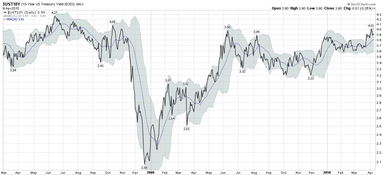
The bond world is so large that I have singled out one particular bond in this week’s chart of the week as the bond number for non-bond people to follow. The chart is the yield on the 10-Year U.S. Treasury Note, which is the de facto benchmark for government and sometimes even for corporate bonds as well.

Note that the yield on the 10-Year Treasury Note just hit 4.00 last week, attracting buyers such as BlackRock (BLK), which found the steep yield curve a good reason to buy some of the 10-Year Treasury Notes.

For those who wish to dive further into the subject of intermarket relationships such as the link between bonds and stocks, an excellent place to start is with John Murphy’s Intermarket Analysis.

For more on related subjects, readers are encouraged to check out:


[source: StockCharts.com]

Disclosure(s): short TLT at time of writing

Sunday, December 27, 2009

Chart of the Week: An Incredible Year for Junk Bonds

It is that time of year where investors look back at 2009 and ahead toward 2010.

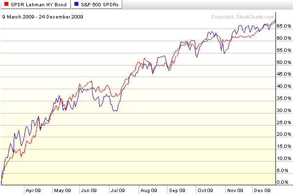
In looking back at 2009, investors who were fortunate enough to time the March bottom have been able to take advantage of most or all of 68% gain in the S&P 500 index since that bottom. While stocks have been on a tear for the past 9 ½ months, I would hazard to guess that quite a few investors do not realize that for the most part, junk bonds have performed as well as equities during this period.

In this week’s chart of the week, below, I show the almost identical performance of SPY (SPDR S&P 500 ETF) and JNK, a junk bond ETF formally known as the SPDR Barclays Capital High Yield Bond ETF (holdings). Amazingly, since the March 9th bottom in stocks, JNK has matched SPY step for step – and with less volatility.

If the U.S. economy continues to rebound in 2010, it is possible that junk bond ETFs such as JNK and HYG will keep pace with stocks going forward. At the very least, these ETFs offer investors some portfolio diversification and less volatility – even though these are an extremely risky asset class.

For more on related subjects, readers are encouraged to check out:

[source: StockCharts]

Disclosure: none

Tuesday, August 18, 2009

CWB: A New(ish) Convertible Bond ETF

I have never been a particularly big fan of convertible bonds, but from time to time, these investments can make a good deal of sense.

Launched four months ago (and still qualifying as “new” according to my warped ETF chronograph), the SPDR Barclays Capital Convertible Bond ETF (CWB) is designed to track the price and yield performance of the Barclays Capital U.S. Convertible Bond >$500MM Index.

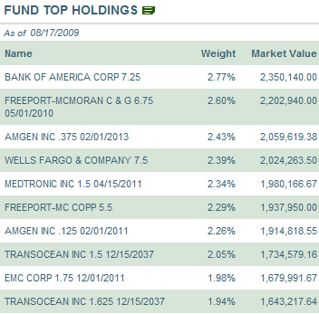
The table to the right shows the ETFs top holdings as of yesterday’s close, which include a top three of Bank of America (BAC), Freeport-McMoRan (FCX) and Amgen (AMGN). This same snapshot of current top ten holdings can be found here.
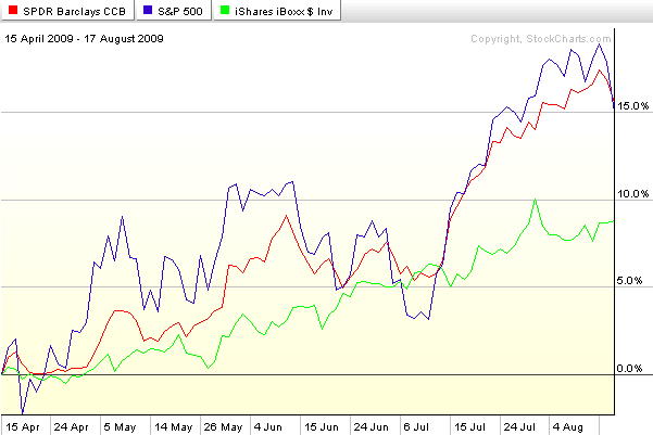
Since the launch of CWB on April 16th, the bull market performance of this ETF has matched the SPX almost step for step, with lower volatility. In the chart below, CWB is represented by the red line, the SPX is in blue, and the iShares iBoxx $ Investment Grade Corporate Bond ETF (LQD) is shown in green. This chart is an almost perfect illustration of why convertible bond ETFs (or closed-end fund or mutual fund) can be a powerful addition to one’s portfolio. At its best, in bull markets, convertibles have an upside comparable to stocks, with less downside risk. At their worst, which is generally in non-trending markets or bearish markets, the lower yield and expense of owning options that do not appreciate makes convertibles inferior to standard bonds.

Of course, options savvy investors will probably wish to buy their own bond ETF and cherry pick their favorite options plays, but for those who wish to forego a customized approach and stick with an off-the-shelf product, CWB is – for the moment at least – the only ETF which is up to the task.

[graphic: StockCharts]

Friday, October 31, 2008

Watch Emerging Markets Bonds

I know a number of equities-only investors who have started following the bond markets for the first time ever over the course of the past year after becoming tired of being blind-sided by inter-market relationships.

Of the many credit market data points, LIBOR, the TED spread, OIS-LIBOR and others have received a fair amount of press as of late as measures of liquidity. More traditional bond market indicators focus more on risk than liquidity and include the spread between corporate and government bonds or between investment grade and high yield corporate bonds.

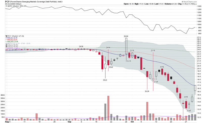
I want to suggest another bond market indicator – one that can provide a reflection on the workings of the global economy. The PowerShares Emerging Markets Sovereign Debt Portfolio is an ETF that carries the ticker PCY. Launched in October 2007, the one year chart shows historical volatility in the 5-10% range prior to the Lehman Brothers collapse last month. Historical volatility is now above 100% after a month and a half of pure chaos. As the chart below shows, PCY lost almost half of its value during the past month and appears to have bottomed last Friday. Note the new buying interest over the course of the last few days, as investors have sought out emerging markets debt as a value play.

In many ways, emerging markets are the focal point of many of the issues facing today’s global economy, from the credit crisis to the demand for commodities to the prospects for renewed global growth down the road. Keep an eye on PCY, not only as an indicator, but also for its investment potential.

[source: StockCharts]

Thursday, September 25, 2008

Recent Volatility in Corporate Bonds

There is a good reason why you rarely hear about high volatility and bonds in the same sentence. It is the same reason why people don’t debate whether the grass is growing faster on Thursday than it was on Wednesday or whether the paint is taking longer to dry than usual. For the most part, bond volatility is nano-volatility.

Until last week, that is.

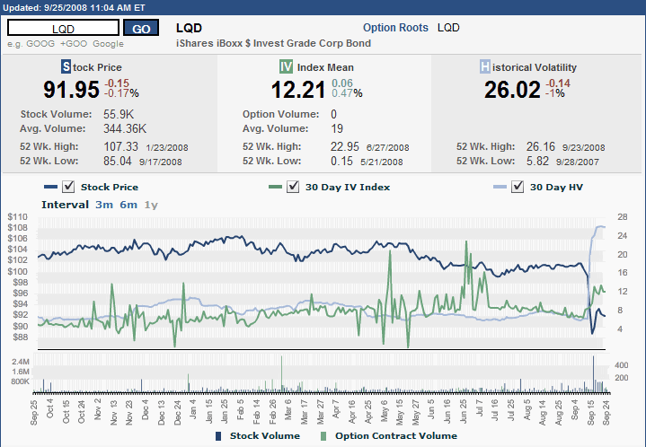
The graphic below (courtesy of the ISE) shows one year of pricing, implied volatility, and historical volatility for the iShares iBoxx $ Investment Grade Corporate Bond ETF (LQD). Looking solely at implied volatility, one would be tempted to conclude that March was relatively uneventful and the real difficulties in the bond market were from early May through early July. The price of the ETF and the historical volatility, however, tell another story. Rarely will you find a chart where historical volatility spiked to such dramatic levels without first seeing a rise in implied volatility that hints at what is coming.

A large part of the reason for the dramatic spike is that in addition to the general freezing of the credit markets, as recently a few months ago half of LQD’s holdings were in the financial sector. One only has to check the list of current holdings to see that LQD continues to own bonds issued by Lehman Brothers and AIG, as well as Wachovia (WB), Goldman Sachs (GS), Morgan Stanley (MS), and other names that have recently come under extreme pressure.

Depending upon your intermediate to long-term view of the U.S. economy, LQD could be an interesting buy and hold investment, if one is interested taking an approach not too different than what is being proposed by Paulson, et al. As always, caveat emptor.

Friday, August 24, 2007

Drilling Down on Sector Performance

Yesterday I talked about sectors in the context of the nine AMEX Select Sector SPDRs. While these are excellent high level buckets for analyzing macro sector performance, when you lift the hood on these SPDRs (click on any one for details), you jump down to the individual stock level, without the benefit of sub-sectors to analyze.

Fortunately, there are many other excellent free resources where one can drill down on sector performance. Four great places to start are:

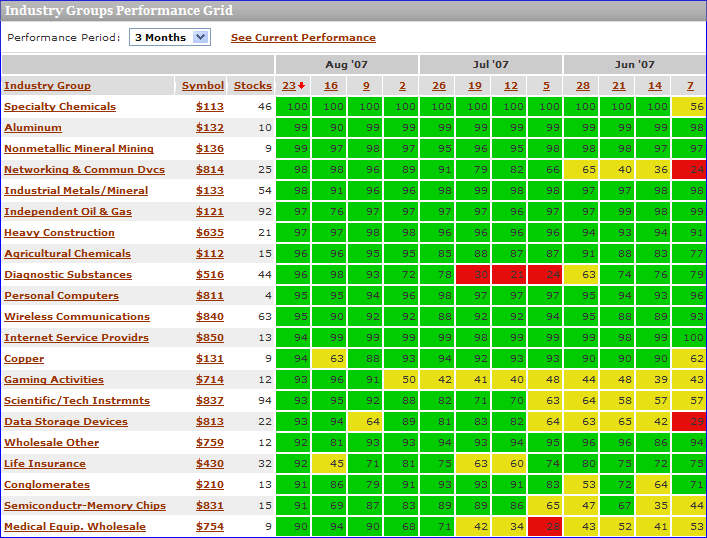
I should probably devote an entire post to Prophet.net, which does many interesting things with sectors. The tools I find of particular value are sortable performance for 214 sectors from 2 days to 5 years; and historical sector ranks from 3 months to 5 years in a helpful graphical format (see below), complete with a drill down capability that pops up the charts for all the individual stocks in a particular sector. Also, from the I-just-couldn’t-help-myself category, while the pull down menu only allows for a minimum historical performance of 3 months, if you manually edit the URL, you can produce some interesting charts for shorter time frames. For example, where the URL for the 3 month graphic ends in “…period=3m” it can be edited to “...period=1m” to generate a particularly interesting one month historical chart. Try it!


MarketGauge.com has an industry group summary that is an excellent graphical tool covering multiple time frames, but also offers four fundamental analysis options for analyzing the top and bottom sectors. I particularly like a feature they have that highlights the stocks driving the strongest/weakest groups higher and a perhaps even more valuable leading stocks in today’s top groups page that includes fundamental data and charts on one handy page.

For a different take on sector performance and momentum, you might want to try ETFInvestmentOutlook.com. Two of their features that I get the most use out of are the McClellan breadth ETF rankings and the high-low breadth ETF rankings.

In addition to the above, there are a number of interesting sector-related heat maps available, including two sites of particular note:

Finally, in the event that you have not been there in awhile, Yahoo has beefed up their Industry Center a little. A good place to start surfing there is in the leaders and laggards section.

Monday, July 16, 2007

A Baker’s Dozen of Favorite Indicators

In my previous life, when I favored the currency of frequent flier miles over the Dow Jones Transportation Average itself, I used to spend a lot of time consulting in the area of business strategy development. During this period, much of my energy was focused on the creation of strategic objectives and a corresponding set of metrics that would help to determine how well those objectives were being met and how likely the were to be achieved in the coming quarters. The work was a roughly even mixture of art and science that attempted to capture the complexity of a business, yet reduce it to about 12-15 metrics. Experience proved that less than a dozen or so metrics invariably meant that important components of the strategic plan would fall through the cracks, while more than 15 metrics usually translated into a management team that was not properly focused and thinking about strategic priorities.

Investing, it turns out, is not much different. To the extent that you can keep things simple and have an uncluttered cockpit that still tells you everything you need to know to make it from point A to point B, you increase your chances of success.

Last week, a reader asked what my favorite market indicators are and it got me to thinking how I should be able to trade with only 12-15 indicators instead of the 25-30 that it seems I am always trying to pay attention to.

So…here is my attempt at spelling out a baker’s dozen of indicators that I would use if I were restricted to just this number:

General Market Overview:

Market Breadth Indicators:

  • McClellan Summation Index – my favorite of the advance-decline indicators
  • New Highs Minus New Lows – I do a lot of work with individual stocks making new highs and like the way the 52 week high-low data complements the daily advance-decline data

Market Sentiment Indicators:

  • ISEE – with a number of SMAs, including the 50 day SMA
  • VIX – particularly the graph with the 10 day SMA combined with the 10% and 20% envelopes
  • VWSI (VIX Weekly Sentiment Indicator) – while there is some overlap with the chart noted above, I include this because an increasing amount of my trading is driven by the VIX

Internal Market Trends / Speculative Behavior:

  • Small Cap vs. Large Cap ratio – I tend to favor the RUT:OEX
  • Emerging Markets vs. Developed Markets – while it hasn’t provided much in the way of exciting information as of late, I use the EEM:EFA

Three “Indicator Species” of Sorts:

  • Oil – I prefer to watch the commodity, West Texas Intermediate Crude, but I also watch some of the ETFs closely
  • Gold – again, I go with the commodity instead of various indices and ETFs
  • The Long Bond – here I prefer TLT, the ETF for the 20 year Treasury, as I find it easiest to trade

And to Make it a Baker’s Dozen:

  • Sector and Regional Strength Indicator – there are many ways to do this, but I like to sort ETFs by strength, as can be done on ETFScreen.com

Since I use Firefox, Flock and IE during the trading day, what I like to do is load all of the above indicators into tabs for my Opera start-up session, so that I can pop them open all at once just by starting Opera.

In the real world, I will likely find it difficult to wean myself away from all the other indicators that I use, but at a very minimum I urge all to prioritize their top dozen or so indicators and come up with some ideas about which ones to lean on most heavily when they are providing conflicting information and/or the markets are most volatile.

Monday, April 16, 2007

The Battle for Bond ETF Supremacy

Over the weekend, there was an interesting MarketWatch.com article, "In come more bond ETFs: Vanguard enters wide-open market as Barclays throws out the 'junk,'" about the battle for bond ETF supremacy between Barclays (BGI) and Vanguard, with BGI landing the first few punches. Two items in particular caught my interest:

  1. BGI's launch of the first high yield ETF, the iShares iBoxx High Yield Corporate Bond Fund (ticker HYG); and
  2. the very low 0.11% expense rates for the Vanguard bond ETFs

Specific to VIX, volatility and risk, I can see future applications involving the use of a high yield ETF with a government long bond ETF like TLT to look at ratio charts (unfortunately, StockCharts.com does not yet have HYG in their database,) price differential charts, etc. This type of analysis might turn out to be a good complement to the Markit Credit Default Swap data.

Looking more at the “…and More” side of the ledger, here are a handful of ETF-related links that I get a lot of value from:

Finally, while the bond ETF field is already getting crowded, I thought I might point out a half dozen ETFs that have consistently high volume and consequently are as appropriate for trading as they are for longer term investing:

  • SHY - iShares Lehman 1-3 Year Treasury Bond Fund
  • IEF - iShares Lehman 7-10 Year Treasury Bond Fund
  • TLT - iShares Lehman 20+ Year Treasury Bond Fund
  • AGG - iShares Lehman Aggregate Bond Fund
  • LQD - iShares iBoxx $ Invest Grade Corp Bond Fund
  • TIP - iShares Lehman TIPS Bond Fund

DISCLAIMER: "VIX®" is a trademark of Chicago Board Options Exchange, Incorporated. Chicago Board Options Exchange, Incorporated is not affiliated with this website or this website's owner's or operators. CBOE assumes no responsibility for the accuracy or completeness or any other aspect of any content posted on this website by its operator or any third party. All content on this site is provided for informational and entertainment purposes only and is not intended as advice to buy or sell any securities. Stocks are difficult to trade; options are even harder. When it comes to VIX derivatives, don't fall into the trap of thinking that just because you can ride a horse, you can ride an alligator. Please do your own homework and accept full responsibility for any investment decisions you make. No content on this site can be used for commercial purposes without the prior written permission of the author. Copyright © 2007-2023 Bill Luby. All rights reserved.
 
Web Analytics