Showing posts with label emerging markets. Show all posts

Sunday, November 20, 2016

Post-Election Risk Trending Up in Treasuries and the Euro, Down in U.S. Stocks

You can always tell when the crowd gets long the VIX and ends up on the wrong side of the trade.  “The VIX is broken!” becomes an oft-repeated refrain, as does “The markets are rigged!” and the usual list of exhortations from those who are in denial.  The current line of thinking is that the world must be much more dangerous, risky and uncertain as a result of a Trump victory, yet the VIX is actually down 31.4% since the election – ipso facto the VIX is broken.

While I have more than a small soft spot in my heart for the VIX, I will be the first to point that taking an Americentric, equity-centric view of the investment landscape is dangerous and naïve.  More often than not, the issues that end up having a strong influence on the VIX are born on foreign soil and/or in other asset classes.  Just look at the recent history in China, Greece, Italy, currencies and commodities to name a few.

When it comes to looking at implied volatility indices as a risk proxy, I prefer to survey the landscape across asset classes, geographies and sectors, which is why I have developed tools such as a proprietary Macro Risk Index (more on this shortly) that look at risk across asset classes, geographies and sectors.

In the graphic below, I have isolated a handful of volatility indices that cut across asset classes and geographies to show how these have moved in the eight days following the election.  Note that Treasuries (TYVIX) and the euro (EVZ) have been trending steadily higher since the election as uncertainty related to the future of inflation and interest rates in the U.S. has risen, while the relationship that the Trump Administration will have with our NATO allies and the European Union is also somewhat murkier. 

Gold implied volatility (GVZ) initially moved sharply higher following the election, but has since receded, as gold prices fell swiftly after the election, but have since stabilized.  Meanwhile, emerging markets saw dramatic selling immediately following the election, but have bounced during the course of the past week as fears and implied volatility (VXEEM) have subsided.  Last but not least, the moves in crude oil and crude oil implied volatility (OVX) have been the least remarkable of the group


[source(s):  CBOE, VIX and More]

In aggregate, the picture is a mixed one in terms of implied volatility, risk and uncertainty.  As is often the case, risk has become elevated in certain asset classes, such as Treasuries and the euro.  In other areas, such as U.S. equities – and their VIXian barometer – there are winners and losers, with the result that a net bullish outlook has moved equity implied volatility lower.  This is not to say that a Trump Administration – whose cabinet members and policy priorities are largely unknown at this juncture – will not increase risk in some areas.  More risk is certainly on the horizon and if history is any guide, an Americentric, equity-centric view of the investment world is likely to be slow in identifying those risks.

Related posts:


For those who may be interested, you can always follow me on Twitter at @VIXandMore


Disclosure(s): the CBOE is an advertiser on VIX and More

Sunday, January 25, 2015

The Year in VIX and Volatility (2014)

This is the seventh year in a row I have offered a retrospective look at the year in VIX and Volatility, which is my attempt to cram some of the highlights of the year in volatility onto one eye chart graphic with a (somewhat) manageable number of annotations.

In aggregate, 2014 was a very quiet year for the VIX, with a mean close of just 14.19 for the year, which is the lowest the VIX has been since 2006 and third lowest since 1995. On the other hand, as I recently documented, VIX spikes were common last year, with 2014 registering the third highest number of 20% VIX spikes since the beginning of VIX data, in 1990. In short, the VIX was susceptible to large spikes, but these were typically followed by strong mean-reverting declines. For example, the peak VIX of 31.06 on October 15 was the highest VIX reading since 2011, yet just six weeks later the VIX was back in the 11s.

When asked in October what they perceived as the biggest threat to stocks, respondents to the VIX and More fear poll pointed to the end of quantitative easing and the removal of the Fed safety net as their top concern, with Ebola narrowly edging out the much more nebulous “market technical factors” for the second slot. As best as I am able to determine, it was the panic associated with fears of an Ebola epidemic that took an already elevated VIX and pushed it up into the 30s.

At various times during the year, Ukraine/Russia, crude oil, ISIS/ISIL, Israel/Gaza, the Fed and the European Central Bank all managed to increase anxiety and perceptions of risk among investors. Also, the narrow miss in the vote for Scottish independence created turmoil in the United Kingdom and across the euro zone, but managed to avoid morphing into another nationalist crisis. Early in the year, there was a currency crisis in emerging markets that was triggered by (unfounded, in retrospect) concerns about higher interest rates in the U.S. Throughout the year there were concerns about valuations and excesses momentum trading in the likes of biotechnology, social media, internet and solar stocks. To some extent, these concerns peaked in April (see The Correction as Seen in the ETP Landscape for additional details), only to return periodically throughout the balance of the year.

The Year in VIX and Volatility 2014

[source(s): StockCharts.com, VIX and More]

Last year at this time, the prevailing worries were focused on whether or not Fed Chair Janet Yellen was leaning toward a more hawkish stance, the inevitable march to higher interest rates in the U.S., the weakening of emerging markets currencies and the potential fallout from the Fed’s tapering of bond purchases. In retrospect, investors were largely worrying about the wrong things.

The first few weeks of 2015 have seen Greece, Saudi Arabia and Ukraine back in the spotlight, with the Swiss National Bank and European Central Bank dominating news on the central banking front. If the past is any guide, the big issue for 2015 has yet to rear its ugly head, whether it turns out to be a gray, charcoal or black swan.

Related posts:

Disclosure(s): none

Tuesday, February 4, 2014

A Very Middling Pullback, So Far

Nary a selloff goes by these days without at least a handful of readers asking for an update of the SPX pullback table I have used to chronicle the pullbacks in the S&P 500 index since stocks bottomed in March 2009.

The table below captures the 24 most significant peak-to-trough declines from new highs during the course of what is now an almost five-year bull move:

[source(s): Yahoo, VIX and More]

Note that the current peak-to-trough decline of 6.0% puts the pullback in the middle (#11 of 24) of those pullbacks in terms of magnitude, though it is slightly lower than the 6.9% average (mean) pullback during the period, due to large selloffs in 2010 and 2011 that skew the average well above the median.

While the recent decline seems sharp, it actually progressed in two stages: a sideways to slightly down move for the latter half of January; and a sharper decline at the end of January and the beginning of February. If one were to plot the magnitude of the current pullback against the duration of the peak-to-trough move, it would like exactly on the trend line which can be found on the plot in All About the Pullback from 1687. In other words, the current pullback, should it stop at SPX 1739, is very middling in almost all respects.

That being said, a mean pullback of 6.9% would take the SPX down to 1723 and a pullback matching the 21.6% decline from 2011 would take the SPX all the way back to 1451 – a level not seen since early January 2013.

Right now the SPX is at 1757 and has about a 1% buffer over yesterday’s low. While emerging markets are bouncing back nicely today, anything can happen following the release of Friday’s nonfarm payroll data.

Related posts:

Disclosure(s): none

Friday, January 31, 2014

VXX and VXZ Now Five Years Old!

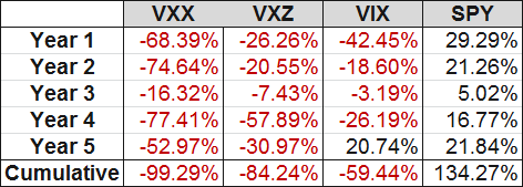
In the midst of all the emerging markets turmoil, I wanted to take a moment to acknowledge the fifth birthday of the two pioneering VIX ETPs : VXX and VXZ. Launched five weeks before stocks hit their 2008-09 financial crisis bottom, both VXX and VXZ have struggled against a tide of falling volatility over the course of the past five years and have also been battered by persistent contango in the VIX futures, which has created additional head winds in the form of negative roll yield.

The table below captures the grim history of these two products, looking at product lifecycle years from January 30th to January 30th:

[source(s): CBOE, Yahoo, VIX and More]

Note that even though each of the five years have been losing years for both products, there have been periods in which these products have been extremely strong performers. One of these periods was from July to October 2011 when VXX nearly tripled (maximum gain of 198%) and VXZ rallied some 66%. I mention this because both have performed well in January, with VXX up 13.0% as I type this and VXZ with gains of 2.2% for the year.

While I am not going out on a limb and predicting a renaissance for these two VIX ETPs, they are two of the most important and liquid VIX ETPs on the market and can be attractive hedges or speculative trades when the markets go through a period of selling and/or there are concerns about a potential crisis.

I have been writing about these even before they were launched and will continue to offer my thoughts on them going forward.

Related posts:

Disclosure(s): short VIX and VXX at time of writing

[source(s): CBOE, Yahoo, VIX and More]

Sunday, January 26, 2014

Top Posts of 2013

Every year I tabulate the most-read posts in this space as a way to monitor the issues that are resonating with readers and also to see how these issues evolve over time. These most-read posts also serve as easily accessible repositories of high-quality material for the benefit of new readers and long-term readers alike.

The top themes from 2013 echo some top themes that resonated with readers from previous years, including continued interest in VIX spikes and SPX pullbacks, as well as the VIX ETPs, low volatility ETPs, the Fed, interest rates and various global flash points, such as emerging markets.

The posts below represent those that have been read by the highest number of unique readers during 2013. Farther down there are links to similar lists going back to 2008, along with several other “best of” type posts that I have flagged for archival purposes.

For the record, each year I also attach the hall of fame label to a handful of posts that I believe have particularly compelling and/or original content, regardless of readership. I find it interesting that ten posts from 2013 made it into the hall of fame – a record for any single year. Part of the reason for this is that while my total number of posts for 2013 was low, I favored quality and more in-depth analysis than pithy commentary, most of which I have migrated to my Twitter handle feed, @VIXandMore

The most-read posts on VIX and More in 2013 were:

Related posts:

Disclosure(s): none

Thursday, August 29, 2013

Watching Two Key Emerging Markets Currencies

With Syria and the Fed grabbing most of the headlines in the last few days, I wonder how many people have emerging markets currencies at the top of their list of concerns. I am guessing few are poring over the likes of India (EPI), Indonesia (EIDO), Brazil (EWZ), Turkey (TUR), South Africa (EZA), Thailand (THD) and the Philippines (EPHE) on a daily basis. As a matter of fact, I would bet that very few people even know that there is an ETF dedicated to the Philippines.

While keeping an eye on country-specific equities is important, it is currency movements that are at the heart of the emerging markets problem right now. Of course, the issue with currencies is really little more than a downstream effect of rising interest rates in the U.S., which is a result of changing expectations about the Fed’s quantitative easing (QE) program. Since December 2008, the Fed has used a variety of policy instruments to keep interest rates as low as possible in the U.S. and has effectively driven capital to emerging markets, where higher-yield investments looked more attractive. As QE begins to unwind, the supply of easy money in emerging markets has suddenly come to a halt and countries with large current account deficits and loans denominated in dollars (which will be repaid in a local currency that is rapidly declining in value) are particularly vulnerable.

Since many equity investors do not have access to a full menu of currency crosses, I think it is important to note that there are ETPs that track two of the most important emerging markets currencies:

  • WisdomTree Indian Rupee ETF (ICN)
  • WisdomTree Brazilian Real ETF (BZF)

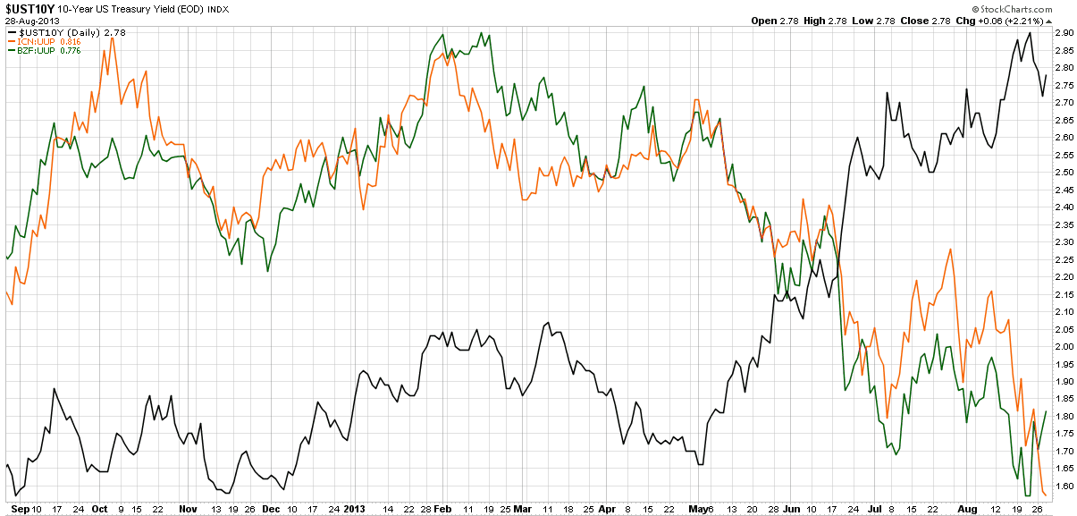
In the chart below I show the yield in the 10-Year U.S. Treasury Note (UST10Y) in the black line, along with a ratio of the Indian Rupee to the U.S. dollar (ICN:UUP) in orange, as well as a ratio of the Brazilian Real to the dollar (BZF:UUP) in green. Now these are a roll-your-own ratio of ETFs to ETFs rather than the exact currency crosses, but the charts are almost identical (and easily constructed at StockCharts.com), while the key takeaways are necessarily the same. Note that until May, ICN and BZF relative to the dollar appeared to be more positively correlated to U.S. interest rates than negatively correlated. As soon as interest rates began to rise at the beginning of May, both ICN and BZF began to rapidly lose ground against the dollar and the negative correlation with U.S. interest rates suddenly became very strong.

One last point worth noting is that the BZF:UUP ratio has seen a bounce during the course of the last week, while the ICN:UUP ratio continues to deteriorate, as there has been little to suggest that the Indian Rupee is stabilizing, even as Brazil improves somewhat.

[source(s): StockCharts.com]

For those who are interested in evaluating the risk and uncertainty in emerging markets in general, the recent VEXXM as a Measure of Emerging Markets Volatility and Risk is recommended reading for some background and information on VXEEM, the CBOE Emerging Markets ETF Volatility Index.

Related posts:

Disclosure(s): long EWZ at time of writing

Tuesday, July 2, 2013

Charting the Recent Decline of the BRIC Components

U.S. stocks are mostly green in today’s session, though there is a good deal of red in global stocks, notably in emerging markets, where the popular EEM emerging markets ETF is down close to 1% as I type this and the Brazil (EWZ) is down more than 2%.

In the chart below, I plot the recent decline of the four large BRIC emerging market country ETFs: Brazil (EWZ); Russia (RSX); India (EPI); China (FXI). While all four country ETFs have declined between 8% and 20% during the past six weeks, the various woes afflicting each country appear to be country-specific to a large extent, though obviously the issues affecting China’s manufacturing base and export market have a significant upstream impact on Brazil.

Emerging markets in general have been struggling as of late, but difficulties in Brazil, India and China have helped to fuel a global selloff.

Going forward, investors will be well-served to keep an eye on all four components of the BRIC block, as well as aggregated BRIC ETFs, such as the most popular issue in this space: the iShares MSCI BRIC Index (BKF).

For those who are interested in evaluating the risk and uncertainty in emerging markets in general, the recent VEXXM as a Measure of Emerging Markets Volatility and Risk is recommended reading for some background and information on VXEEM, the CBOE Emerging Markets ETF Volatility Index.

[source(s): StockCharts.com]

Related posts:

Disclosure(s): long EEM at time of writing

Thursday, June 20, 2013

VXEEM as a Measure of Emerging Markets Volatility and Risk

If you think U.S. stocks have been through a rough patch as of late, then you haven’t been paying attention to emerging markets stocks, where the popular EEM emerging markets ETF as fallen from a high of 42.96 on May 22nd to 37.02 earlier today – a 13.8% drop in less than one month. A large part of the problem has been the performance of the BRIC countries, where Brazil (EWZ), China (FXI) and India (EPI) are all acting as if they have been thrown overboard with anchors tied to their ankles, making Russia (RSX) look like the most stable investment of the group – which is quite a task.

Investors looking to monitor risk and uncertainty in Brazil and China are fortunate enough to have dedicated volatility indices based on the VIX methodology for EWZ and FXI. These volatility indices were created by the CBOE and use the tickers VXEWZ and VXFXI, respectively. For a more holistic view of risk and uncertainty in the emerging markets space, the best choice is probably VXEEM, the CBOE Emerging Markets ETF Volatility Index that is calculated based on options in EEM.

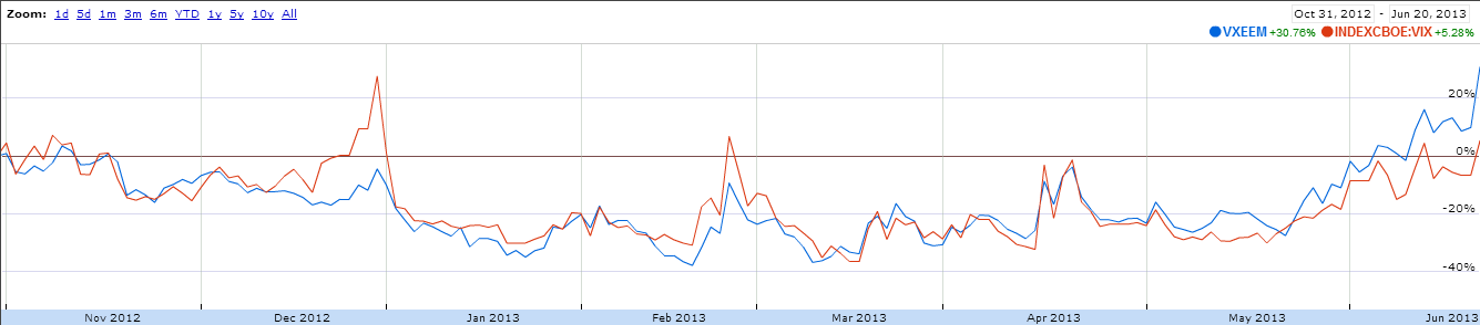
The chart below shows the relative performance of VXEEM and the VIX going back to the end of October 2012. Note that during toward the end of 2012, the debate over sequestration caused the markets to assign much more additional risk and uncertainty to U.S. stocks than to emerging markets stocks. During the course of the last month or two, this relationship has reversed and the risk and uncertainty associated with VXEEM has grown at a much faster rate than that of the VIX. On average, the absolute level of VXEEM is about 40% higher than that of the VIX. This week, however, VXEEM has been about 60% higher than the VIX.

On a related note, I find it interesting that S&P announced the launch of the S&P Emerging Markets Volatility Short-Term Futures Index just ten days ago. With that index in place, it would be relatively easy to create a futures-based emerging markets volatility ETP that would function in the same manner as VXX, but be based on VXEEM rather than the VIX. The biggest obstacle to this type of product is probably the current lack of liquidity in the VXEEM futures market.

[source(s): Google Finance]

Related posts:

Disclosure(s): short VXX at time of writing

Tuesday, March 6, 2012

VXEEM vs. VIX Indices and Futures in Today’s Selloff

Stocks have been eerily quiet for the first ten weeks of 2012, with only four 1% moves in the SPX so far – and all of those coming to the upside.

It just so happens that the CBOE’s launch of futures and options on the CBOE Emerging Markets ETF Volatility Index (VXEEM) coincided with this period of languid volatility, which has made it easier for this index to fly under the radar.

Today is the first time I am able to get data on the VXEEM futures in a market that is down at least 1% and I must admit to being somewhat surprised by the results.

The table below captures SPY and VIX data in the left column along with and EEM and VXEEM data in the right column. Note that approximately one hour into today’s regular trading session, SPY was down about 1.3% and EEM, the popular emerging markets ETF, was down 3.1%. So far, so good. Far more interesting, while EEM was down about 2.4 times as much as SPY, the VIX was up substantially more than the VXEEM index, 16.57% to 12.62%...so while the selloff was disproportionately in emerging markets, the panic was disproportionately in the S&P 500 index.

I also captured simultaneous futures data for March, April and May for both the VIX futures and VXEEM futures. Interestingly enough, the changes in the front three month futures for both the VIX and VXEEM were almost identical.

So what kind of volatility environment do we live in where the emerging markets index falls faster than the SPX (even beta-adjusted, but that discussion is for another day), while the VIX spikes much more than VXEEM, yet the futures for both products seem to move in almost identical fashion?

If you think you have the answer, pairs trading opportunities with VIX products and the VXEEM futures and options (there are no ETPs yet that are based on VXEEM) are certainly there for the taking. While VXEEM futures and options are not particularly liquid or deep yet, they are sufficiently liquid and deep from which to extract some profits.

Related posts:

[source(s): Interactive Brokers]

Disclosure(s): long EEM at time of writing; the CBOE is an advertiser on VIX and More

Tuesday, January 31, 2012

CBOE Adds Options to Emerging Markets Volatility Index (VXEEM)

Earlier this month, the CBOE launched futures on the CBOE Emerging Markets ETF Volatility Index (VXEEM) and barely three weeks later, VXEEM options began trading today.

For more information on VXEEM options, which are based on the popular EEM emerging markets ETF, a good first stop is the CBOE’s VXEEM options product specification page. Of particular note is the fact the options expiration cycle is the same for VXEEM options as it is for the futures products. Additionally, VXEEM futures and options have the same expiration cycle as VIX futures and options, meaning that they will expire on Wednesdays (February 15, March 21, April 18 and May 16), with the options last traded on the Tuesday immediately following the expiration. For more information, check out the CBOE’s VXEEM splash page and information circular.

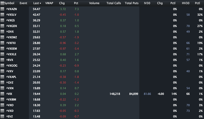
In the graphic below, courtesy of LivevolPro.com, I have collected closing data for some of the primary U.S. volatility indices, including those which are volatility indices for ETPs and single stocks. The indices are sorted from highest to lowest and provide a good sense of the market’s perceptions of relative risk across various stocks, groups of stocks (sectors and geographies) and asset classes.

Partly due to today’s earnings announcement, VXAZN, the volatility index for Amazon (AMZN) tops the list, with volatility indices for silver (VXSLV), Goldman Sachs (VXGS) and gold miners (VXGDX) rounding out the top four. VXEEM ranks eighth of the twenty volatility indices at 27.97 and currently carries a 43.8% premium to the VIX. Is that 43.8% premium too high? Too low? With VXEEM options (and futures) now you can not only express your opinion, but benefit financially if you are correct.

Related posts:

[source(s): LivevolPro.com]

Disclosure(s): Livevol is an advertiser on VIX and More
Friday, December 30, 2011

CBOE To Launch Futures on Emerging Markets Volatility (VXEEM)

One of the predictions I made for 2011 was that the trend toward what I have labeled “atomic volatility” (a lessening of the scope of the underlying for options contracts and/or the duration of those contracts) would accelerate.

Back in March 2011, the CBOE helped to usher in the atomic volatility era when they rolled out volatility indices using the VIX methodology for six sector and geography ETFs:

  • iShares MSCI Emerging Markets Index Fund (VXEEM)
  • iShares Trust FTSE China 25 Index Fund  (VXFXI)
  • iShares MSCI Brazil Index Fund  (VXEWZ)
  • Market Vectors Gold Miners Fund (VXGDX)
  • iShares Silver Trust (VXSLV)
  • Energy Select Sector SPDR (VXXLE)

Later in March, the CBOE rolled out futures based on the gold volatility index (GVZ), which was launched back in August 2008, at the same time as the euro volatility index (EVZ) and several weeks after the launch of the OVX, known affectionately as “the Oil VIX.” [Those who are interested in the sequencing of the launch of various volatility measures should refer to The Evolution of the Volatility Index Family Tree.]

Now the CBOE is taking the next step with VXEEM, the volatility index that is based on the popular emerging markets ETF (EEM), and offering futures on that index. The launch of these futures contracts is set for January 9th and will initially include contracts with expirations in February, March, April and May. Note that the expiration cycles for these contracts are the same as those for the VIX futures and options, meaning that they will expire on Wednesdays (February 15, March 21, April 18 and May 16) and can last be traded on the Tuesday immediately following the expiration. For more information, check out the CBOE’s VXEEM splash page and information circular.

One of the reasons I think products based on EEM and VXEEM have a good chance of being successful is that emerging markets are typically a highly volatile area – much more so than the basket of stocks included in the S&P 500 index on which the VIX is based. Right now, for instance, EEM has a 60-day historical volatility that is more than 50% higher than that of the SPX. All this means that short-term traders should find VXEEM products (futures as well as options and ETPs, assuming they are in the pipeline) to be the types of high-octane trading vehicles that are well-suited to some of their favorite strategies, much like leveraged ETPs and VIX-based products.

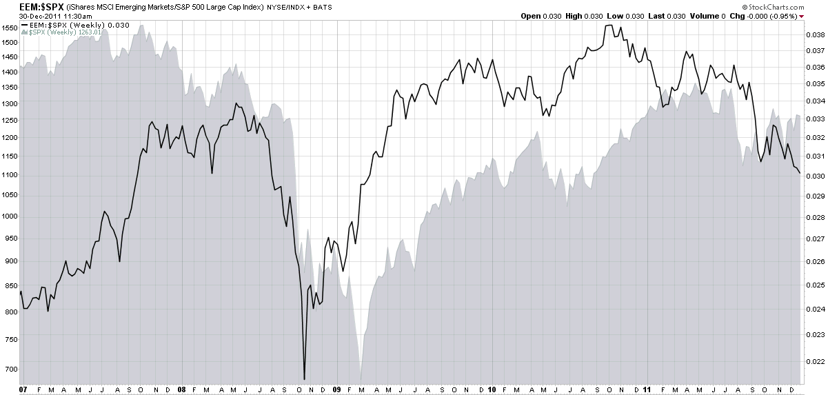
Additionally, as the chart below reminds us, emerging markets sometimes move in cycles that are distinct from U.S. stocks. Note that the ratio of EEM to SPX has varied wildly over the course of the past five years and has had different bottoms and tops than the SPX has. Whether this phenomenon will continue into the future (influenced strongly by China) remains to be seen, but the role of emerging markets relative to developed markets should be watched closely in 2012.

Related posts:

[source(s): StockCharts.com]

Disclosure(s): none

Sunday, January 9, 2011

Chart of the Week: World Food Prices

Talk of rising commodities prices seems to focus primarily on energy and metals, with agricultural commodities often overlooked, at least in the United States.

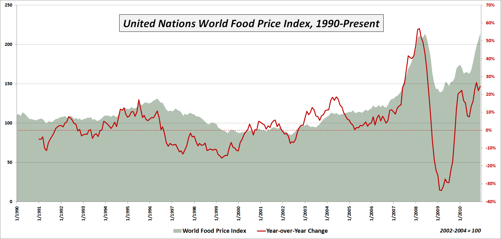
This week’s chart of the week is intended to underscore the inflationary trend in agricultural commodities and ‘softs’ (which generally refer to sugar, coffee and cocoa) as reflected in the United Nations World Food Price Index. As the chart below shows, world food prices hit a new high in December, after jumping more than 54% from a February 2009 low. The new high in the index eclipses the old high from June 2008.

Among the various sub-indices, the most dramatic increase has been seen in sugar, which is up 51% in just four months and is up a staggering 239% over the course of the past two years to a new all-time high. Meat prices are also at new highs, but while the sugar price index currently stands at 398.4, meat has only risen to 142.2. Note that all index values reflect a baseline of 100 that is derived from the 2002-2004 average prices.

Commodities prices have both economic and political implications. The economic implications are particularly severe for emerging markets in which food costs represent a disproportionately high percentage of the typical household budget. Here the incremental increase in food prices can have a disastrous impact on the family cost structure. There are also some countries where the possibility of food riots and related civil unrest has the potential to destabilize those who are in power and in some cases perhaps even thrust the political system into chaos.

So far rising food prices have triggered only a mild backlash here and there, but should prices continue to rise at the current rate of more than 20% per year, it is not possible to rule out catastrophic consequences across the globe.

Related posts:


[source: United Nations]

Disclosure(s):
none

Wednesday, November 24, 2010

More Turkey Anyone?

It is the last week in November, so naturally all our thoughts are turning to the BCS and Turkey (TUR). Here I mean not Barclays and the bird, but the Bowl Championship Series possibilities and the emerging market.

As the chart below shows, anyone who has focused on Turkey not just as a seasonal play but a long-term holding has been nicely rewarded over the course of the past year, as Turkey has outperformed broader emerging markets ETFs like EEM by 5x. As captured in the chart, over the past month or so the performance advantage of TUR has begun to narrow. This could mean it is time to take profits and it could also spur the enterprising investor to go back for a second helping. Either way, I suggest that as 2011 approaches, investors make sure to look at emerging markets at least as a portfolio side dish, if not at a main course.

Related posts:


[source: ETFreplay.com]

Disclosure(s): long TUR at time of writing

Tuesday, August 31, 2010

Emerging Markets Bond ETFs Soar

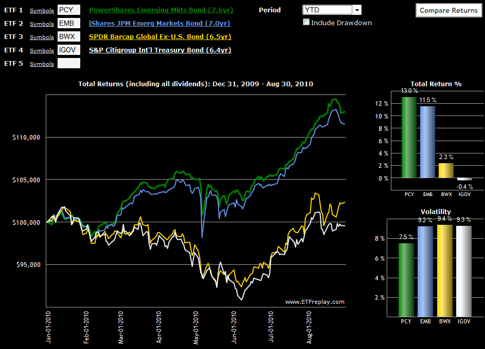
While there have been pockets of strength in emerging markets for equities (see links below), emerging markets bonds have been even stronger performers in 2010, both on an absolute and risk-adjusted basis. In fact, if one compares the chart of emerging markets bonds below, the gap between emerging markets and developed markets looks strikingly similar to what was seen on the equity side in Chart of the Week: Rethinking Geography.

I first wrote about PCY (the PowerShares Emerging Markets Sovereign Debt Portfolio ETF) back in October 2008 in the context of an indicator of the strength of the global economic in general and emerging markets in particular. Since that time, PCY has been an extremely strong performer, gaining 35.6% in 2009 and adding another 13.0% so far in 2010. Along the way, PCY has attracted completion in the form of EMB, the iShares USD Emerging Market Bond ETF, which was up 15.4% in 2009 and is up 11.5% year-to-date in 2010. Of course both PCY and EMB have been able to post these excellent returns with only a fraction of the risk of their equity market counterparts.

For comparison sake, I have also included two international bond ETFs that have a much higher weighting in developed markets than emerging markets. Of these two the more liquid is SPDR Barclays Capital International Treasury Bond ETF (BWX); the S&P/Citigroup International Treasury Bond ETF (IGOV) is a relative newcomer. A shorter duration option in this space is the S&P/Citigroup 1-3 Year International Treasury Bond ETF (ISHG).

It may be a global marketplace, but geography continues to have a strong influence over local and regional risk and reward. Without the sovereign debt problems, zombie banks and housing bubbles, emerging market debt is an attractive place to diversify a portfolio and capture a relatively high yield, such as the 5% or so currently available from PCY.

Related posts:


[source:ETFreplay.com]

Disclosure(s): long PCY at time of writing

Monday, August 30, 2010

More Top Emerging Markets ETFs

Entirely by accident, the theme of the last two charts of the week has been emerging markets. A week ago, in Chart of the Week: Rethinking Geography, I chose to highlight how Asian and European emerging markets ETFs had very similar performance charts, much more so than the relationship between each emerging market and its continent-specific developed market counterpart. Yesterday, in Chart of the Week: Irrepressible Colombia (GXG), I highlighted the 42% returns that the Global X/InterBolsa FTSE Colombia 20 ETF (GXG) has managed to post this year, tops among the geography-based ETFs.

As it turns out, there are four other country ETFs which have posted returns of over 20% this year. In the chart below I have highlighted these single country emerging market ETFs and added a fifth top performer for good measure. Ranked in terms of 2010 performance, these ETFs are for Thailand (THD), Chile (ECH), Malaysia (EWM), Indonesia (IDX) and Turkey (TUR).

On a related note, I had previously made two references to the Claymore/Zacks Country Rotation ETF (CRO) as one option for investors who might be looking for an ETF which took advantage of a third party “strategy-in-a-box” country rotation model. For the record, aftera disappointing run, Claymore Securities is set to close CRO in at the end of next week, with the last day of trading on September 10th.

Even in a flat market, ETFs with 20% annual returns are out there. Sometimes it takes a little creative thinking to find them and get on board in time to capture a large portion of that move.

Related posts:


[source: ETFreplay.com]

Disclosure(s): long GXG, EWM and IDX at time of writing

Sunday, August 29, 2010

Chart of the Week: Irrepressible Colombia (GXG)

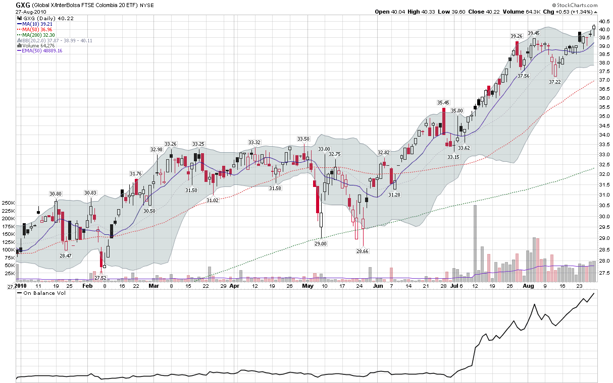
While U.S. investors can be forgiven for thinking that stocks have been stuck in a fairly narrow trading range for the last 3 ½ months, those who are scanning the globe for investment ideas are likely to have seen an entirely different investment climate.

A case in point is the Global X/InterBolsa FTSE Colombia 20 ETF (GXG), which has regularly been showing up as one of the top geography-based ETFs in my weekly newsletter. GXG is up 42% in 2010, handily outdistancing the BRIC ETF, EEB, and the popular broad-based emerging markets ETF, EEM, which are down -4.8% and -1.8% year-to-date, respectively.

Whereas BRIC has been a popular emerging markets investment theme for the past few years due to the popularity of Brazil (EWZ), Russia (RSX), India (EPI) and China (FXI), some have suggested that the current decade may turn out to be the decade of so-called frontier ETFs, with countries like Colombia, Indonesia (IDX), Vietnam (VNM), Egypt (EGPT), Turkey (TUR) and South Africa (EZA) among the top performers. These frontier ETFs already have their own catchy acronym, CIVETS, in order to make them easier to recall.

In terms of economic firepower, don’t expect the CIVETS to displace the BRIC countries, but when it comes to returns, the CIVETS are already off and running. With the best performance of any country ETF so far in 2010, Colombia has been acting like the new lead dog and has earned the spotlight as this week’s chart of the week.

Related posts:


[source: StockCharts.com]

Disclosure(s): long GXG, IDX and VNM at time of writing

Monday, August 23, 2010

Chart of the Week: Rethinking Geography

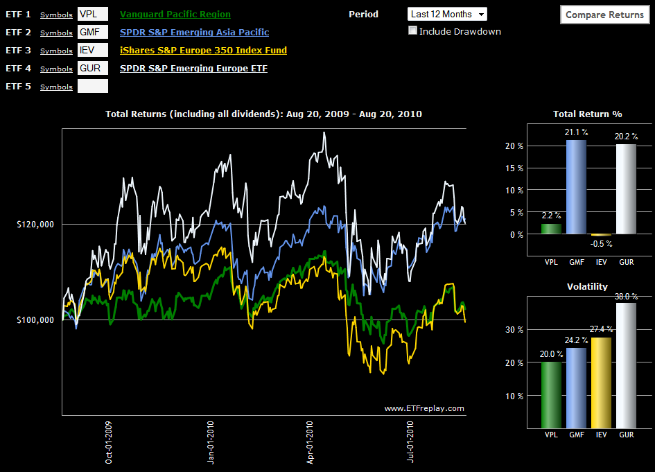
I have a tendency to look at the world through ETFs and when thinking globally, often in terms of country ETFs. I find that regional ETFs too often dilute some of the trends and ideas I am looking to capture. Further compounding the problem is that I have a tendency to think in terms of emerging markets and developed markets more than, say, broad geographic boundaries such as Europe and Asia.

Even with this bias, I was surprised to see in this week's chart of the week that if one looks at the performance of emerging and developed markets ETFs for both Europe and Asia over the course of the past year, the strong correlation is not between the geographies, but across the emerging/developed distinction. In spite of all the sovereign debt problems in Europe, emerging Europe (GUR) has generally been the top performer of the group, but this performance has been closely matched by emerging Asia (GMF). Not surprisingly, developed markets in Europe (IEV) have been more volatile and slight underperformers when compared to their developed market counterparts in Asia (VPL), but the margin has been a relatively slim one.

For me at least, the key takeaway is that emerging Asia looks a lot more like emerging Europe than developed Asia. Perhaps it is time to start rethinking our investing geography…

Related posts:


[source: ETFreplay.com]

Disclosure(s): none

Sunday, May 31, 2009

Chart of the Week: Emerging Markets

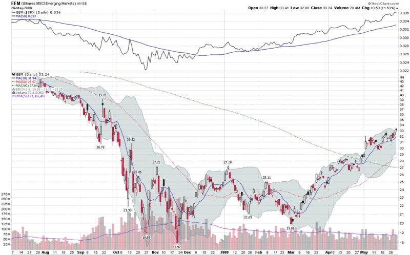
One of my best trades for 2009 has been a long position in EEM, the emerging markets ETF. The chart of the week below shows that emerging markets have been consistently outperforming the S&P 500 index since the beginning or January (see ratio study at top of chart) and was one of the first major equity groups to top its 200 day simple moving average (dotted green line) in late April. While the SPX has been going sideways during May, emerging markets have continued to tack on gains, bolstered by rising prices for commodities.

I would not be surprised to see EEM finding increasing resistance at several stages in the 34-40 range, but for now at least, I see no reason to exit EEM at least until its performance relative to the SPX begins to falter.


Disclosure: Long EEM at time of writing.

Tuesday, December 9, 2008

BRIC Update: China a Leader or Outlier?

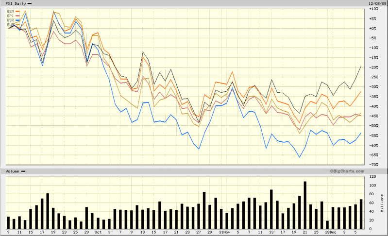
I have commented on resurgent Chinese stocks several times in the past few weeks, most recently in China About to Break Out? Now that Chinese stocks (FXI, black line) appear to be on the rebound, an important question is whether this is an isolated phenomenon or one that will also affect other emerging markets economies.

As the chart below shows, the rally in Chinese stocks has significantly outdistanced the recent bounce in emerging market stocks (EEM, orange line). It is the other three members of the BRIC group, however, that are lagging China and the broad emerging markets group the most. Not surprisingly, commodity-rich Russia (RSX, blue line) is the biggest laggard among the BRIC countries, while India (EPI) and Brazil (EWZ) are trailing the broader emerging markets index, but performing better than Russia.

The question of whether growing domestic demand and a massive government stimulus package will result in a China-specific rebound or help pull other global economies along for the ride is not likely to be answered soon. In the meantime, China looks strong on a relative basis and other emerging economies should be watched closely for clues about the geographical breadth of the rally.

[source: BigCharts]

Friday, October 31, 2008

Watch Emerging Markets Bonds

I know a number of equities-only investors who have started following the bond markets for the first time ever over the course of the past year after becoming tired of being blind-sided by inter-market relationships.

Of the many credit market data points, LIBOR, the TED spread, OIS-LIBOR and others have received a fair amount of press as of late as measures of liquidity. More traditional bond market indicators focus more on risk than liquidity and include the spread between corporate and government bonds or between investment grade and high yield corporate bonds.

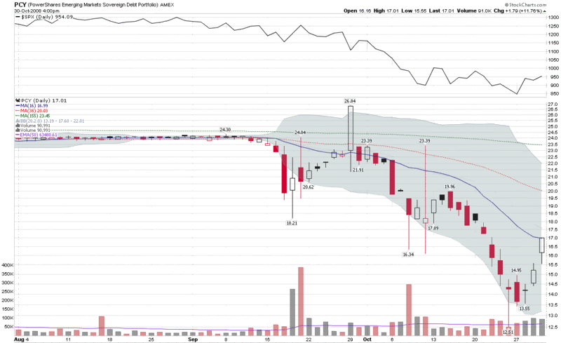
I want to suggest another bond market indicator – one that can provide a reflection on the workings of the global economy. The PowerShares Emerging Markets Sovereign Debt Portfolio is an ETF that carries the ticker PCY. Launched in October 2007, the one year chart shows historical volatility in the 5-10% range prior to the Lehman Brothers collapse last month. Historical volatility is now above 100% after a month and a half of pure chaos. As the chart below shows, PCY lost almost half of its value during the past month and appears to have bottomed last Friday. Note the new buying interest over the course of the last few days, as investors have sought out emerging markets debt as a value play.

In many ways, emerging markets are the focal point of many of the issues facing today’s global economy, from the credit crisis to the demand for commodities to the prospects for renewed global growth down the road. Keep an eye on PCY, not only as an indicator, but also for its investment potential.

[source: StockCharts]

DISCLAIMER: "VIX®" is a trademark of Chicago Board Options Exchange, Incorporated. Chicago Board Options Exchange, Incorporated is not affiliated with this website or this website's owner's or operators. CBOE assumes no responsibility for the accuracy or completeness or any other aspect of any content posted on this website by its operator or any third party. All content on this site is provided for informational and entertainment purposes only and is not intended as advice to buy or sell any securities. Stocks are difficult to trade; options are even harder. When it comes to VIX derivatives, don't fall into the trap of thinking that just because you can ride a horse, you can ride an alligator. Please do your own homework and accept full responsibility for any investment decisions you make. No content on this site can be used for commercial purposes without the prior written permission of the author. Copyright © 2007-2023 Bill Luby. All rights reserved.
 
Web Analytics