Showing posts with label 200 day SMA. Show all posts

Friday, December 18, 2009

200 Days Since March 6th Bottom

Just a quick note to inform those who follow such things that today marks 200 trading days since the March 6th bottom.

Among other things, this means that for those who watch the 200 day moving average, these averages are going to start to accelerate their already rapid upward move, as old lows begin to scroll off of the lookback window. In order to show how quickly the 200 day MA is moving, two months ago the S&P 500 index was just about exactly where it is now. At the time, the index was more than 20% above its 200 day MA of about 909, which I took as a signal that equities were getting overheated. Fast forward two months and with the SPX at the same level, the index is now only 13% above the 200 day MA, which is currently at 969 and is advancing at a rate of more than two points per day.

Bulls will probably interpret a rising 200 day MA as an indication that support levels are rising. Bears will undoubtedly see any sort of convergence with the 200 day MA level as a sign that the distance to a bear market is decreasing. For now I am in the bull camp, but an extended range-bound drift is starting to look increasingly likely.

For more on related subjects, readers are encouraged to check out:

Disclosure: none

Thursday, August 6, 2009

Bloomberg TV, TiVo and the SPX

I had an interesting sequence of events happen to me today. I’m not sure they mean anything, but I thought I’d pass them along for posterity and the remote possibility that it may be of service to someone else further on down the line.

While I am decidedly not a chat room person, in the heat of today’s trading boredom, I decided to drop in the Market Rewind chat room, which is hosted daily by Jeff Pietsch of Market Rewind.

I couldn’t have been in the chat room for more than a minute or two when someone blurted out that I was “just on Bloomberg.” I assumed he meant some sort of mention in an article on Bloomberg.com, but it turns out he was referring to Bloomberg TV. Now I know I had not been out of the house all morning and had not even been on the phone, so this made me fairly curious. When I was unable to pull up anything on the Bloomberg TV web site, it occurred to me that the previous night I might have flipped on Bloomberg Asia before going to sleep. While I don’t know all the nuances of TiVo, I do know that even if you turn of the television, the last half hour or so of programming for whatever station you were watching is stored in a buffer. Perhaps my wife had not turned on the TV and changed the channel today…

So, I dashed upstairs and sure enough, found that Brennan Lothery had mentioned VIX and More as well as the newsletter in a short segment about the possibility of a correction in stocks. Specifically, Lothery picked up on the theme of Monday’s post, SPX 15% Over 200 Day Moving Average for First Time in Ten Years and used a recent chart of the SPX and the 200 day simple moving average to highlight the widening gap between the two.

To the best of my knowledge, this is the first time any VIX and More analysis has been referenced on any of the major financial television stations.

Adam at Daily Options Report noted how the multiple attributions and very positive tone of the Bloomberg segment was in sharp contrast to the almost comically confrontational approach CNBC has taken to bloggers.

While I am pleased to receive the recognition, I find it surreal that I would never have happened upon this without the following very unlikely events falling into place:

  1. I decided to wander into a stock chat room for probably the second time in my life
  2. I just happened to have Bloomberg TV as the last station I watched out of the 900+ DirecTV channels
  3. my wife was occupied all morning and unable to change the TV station

Finally, I am left with the thought that it is indeed possible to trap serendipity in today’s electronic fishing net, particularly if you have TiVo and can make a good guess at which channel might snare what you are looking for.

Monday, August 3, 2009

SPX 15% Over 200 Day Moving Average for First Time in Ten Years

Since I have not seen it mentioned elsewhere (which is not saying as much as it used to, given the expansion of the blogosphere), I thought it worth noting that in addition to closing over the critical 1000 level for the first time since November, the SPX also closed 15% above its simple moving average for the first time since 1999.

In the chart below, I show the daily closes of the S&P 500 index going back to 1970 (blue) and an overlay of the ratio of the SPX to its 200 day simple moving average (red.) With today’s close (red diamond), the SPX is now entering a level where mean reversion trading often makes the SPX vulnerable to a reversal. That being said, the 200 day moving average will be rising at a rate of about 0.40 per trading day for the next month or so, meaning that sideways action or even small gains will help to work off some of the excess in this ratio and bring it back toward a more typical range.

Frankly, I am beginning to think that if we do not see a significant correction begin between now and Friday’s employment report, that the SPX may make a quick move to 1100. Of course it is going to be awfully difficult to bet against the bulls until there is some evidence of an Achilles heel.

Those looking for a related upside target might be interested to know that the SPX has not closed 20% above its 200 day SMA since 1983.

For a related post, try:

[As an aside, I somehow feel compelled to note that I had no intention of making the chart look like the national flag of some new investor nation…]

Thursday, July 16, 2009

200 Trading Days Ago Today

Exactly 200 trading days ago today, on September 24th, the S&P 500 index last traded over 1200. From that point, it only took six more trading days before the SPX closed under 1000. From that point forward, the SPX flirted with the 1000 level for about a month, before plunging to a low close of 752 in November and ultimately a bottom closing low of 676 in March.

I mention this not out of a desire to wax nostalgic, but to point out that the 200 day simple moving average for the SPX is in the process of dropping those last few closing values in the 1000-1200 range over the course of the next week or so. This means, among other things, that the 200 day moving average is going to start forming a rounded bottom next week and should only drop another five points or so to 869.

Don’t expect to see much of an uptick in the 200 day moving average until the beginning of September. At that point, it should start rising at a rate of about two points per week.

Finally, as I type this, the SPX is at its highest level above the 200 day SMA (about 6.6%) since July 2007.

For more on this subject, check out The SPX and the 200 Day Moving Average.

Thursday, June 4, 2009

The SPX and the 200 Day Moving Average

Lately there has been a great deal of talk related to the SPX closing above its 200 day moving average for the first time since the end of 2007.

The first question traders should ask themselves is whether this technical artifact has any relevance to trading. The simple answer is that it depends upon how many people pay attention to the 200 day moving average and incorporate rules related to it in their trading methodologies. For example, there are many traders who prefer – or insist upon – long positions only when the instrument in question is above its 200 day moving average and short positions only when it is below the 200 day moving average. In sum, if enough people pay attention to the 200 day moving average, it becomes a self-fulfilling prophecy of sorts.

But is there an edge in incorporating the 200 day moving average into trading decisions? Condor Options took up this subject earlier today in Exponentially Curb Your Enthusiasm and concluded that since 1965, long only strategies that incorporated the 200 day simple moving average (SMA) and exponential moving average (EMA) for the SPX both beat a simple buy and hold approach. (Interestingly, the EMA approach had a better track record than the SMA approach.)

A quick glance back at a long-term SPX chart show why the 200 day SMA has helped generate excellent timing signals. Note that from 1996-2000 and 2003-2007, the 200 day SMA kept investors in the bull market almost all the time. Investors would have been in cash (or perhaps even short) during the 2000-2003 bear market and from the beginning of 2008 to the present.

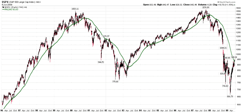
Looking at the SPX since the beginning of 2008, one can see the steady decline in the 200 day SMA, which actually peaked in January 2008.

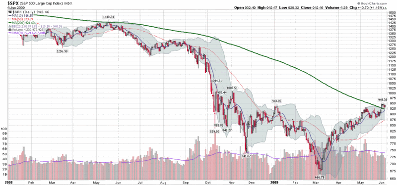
Before getting too excited about the 200 day SMA, it is important to look under the hood at the data that goes into the calculations. Right now, the 200 day window includes data going back to August 19, 2008, when the SPX closed at 1266.69. Tomorrow that number will be dropped from the calculations and replaced with one that is likely to be close to today’s close of 942.46. That is 324 points lost from the index calculations, which means that if the markets drift sideways, the 200 day SMA will be declining at rate of about 1.6 points per day as the higher closes from August scroll off. In fact, since the beginning of 2009, the 200 day SMA has dropped 48, 46, 69, 46 and 37 points in each of the last five months.

Another factor to consider is that the lows of March 6th and 9th are now almost three calendar months behind us. That translates into 61 and 62 trading days. It also means that the March lows will be in the midpoint of the data series in 38-39 trading days, which means that the 200 day SMA is most likely to continue to decline until the last week in July before turning back up.

So, go ahead and consider the 200 day SMA to be a potential support level or long/short inflection point, but going forward, this line on the charts should continue to decline and be less and less relevant, unless, of course, the markets follow the green line down.

[graphics: StockCharts]

Sunday, May 31, 2009

Chart of the Week: Emerging Markets

One of my best trades for 2009 has been a long position in EEM, the emerging markets ETF. The chart of the week below shows that emerging markets have been consistently outperforming the S&P 500 index since the beginning or January (see ratio study at top of chart) and was one of the first major equity groups to top its 200 day simple moving average (dotted green line) in late April. While the SPX has been going sideways during May, emerging markets have continued to tack on gains, bolstered by rising prices for commodities.

I would not be surprised to see EEM finding increasing resistance at several stages in the 34-40 range, but for now at least, I see no reason to exit EEM at least until its performance relative to the SPX begins to falter.


Disclosure: Long EEM at time of writing.

Monday, May 4, 2009

Percentage of NYSE Stocks Above 200 Day SMA

While it is similar in construction to yesterday’s chart of the week (the percentage of NYSE stocks above their 50 day simple moving averages), a chart of the percentage of NYSE stocks above their 200 day moving averages looks much different from the 50 day version and is generally subject to a much different interpretation.

The chart below is a weekly chart of the percentage of stocks trading above their 200 day simple moving averages since 2002. As the graphic demonstrates, the 200 day moving average does an admirable job of capturing the strength of the long-term trend. During the 2003-2007 bull market, for instance, pullbacks to 50 percent represented excellent buying opportunities. Furthermore, when the percentage of NYSE stocks above their 200 day SMA failed to surpass the 60 percent level in October 2007, this should have been taken as a sign that market breadth was weak and the bull market was in danger.

As 200 days encompasses approximately 9 ½ months of trading, large swings in the 200 day percentage data have a tendency to significantly lag the market. For this reason, interpreting the chart below should focus on swings of at least 30 percent that move the aggregate percentages above the 60 level or below the 40 level. Applying this interpretation to the chart below, the current bull move should be considered a bull market when the percentage of NYSE stocks above their 200 day SMA exceeds 60.

[source: StockCharts]

Friday, April 24, 2009

XLY and XHB Move Above 200 Day Moving Averages

Two important ETFs, XLY (consumer discretionary) and XHB (homebuilders) have moved above their 200 day simple moving averages today for the first time since early October.

Among other important indices and ETFs that are closing in on their 200 day SMAs are the NASDAQ-100 index (NDX), semiconductor index (SOX) and emerging markets ETF (EEM).

If the current bullishness holds, we may see widespread moves above the 200 day SMA – and the possibility of renewed buying interest…or an opportunity to take profits.

I am cautious as the SPX approaches 875, but am not interested in a substantial short position until there is some sort of bearish momentum.

Thursday, April 16, 2009

Some VIX Milestones…and a Prediction

It was an interesting trading day not matter how you slice it. When all was said and done the SPX had its highest close since February 9th and moved as close as it has been to its 200 day simple moving average (SMA) since September 26th of last year.

The VIX hit some interesting milestones as well. Today’s close of 35.79 was the lowest close since that same September 26th and the 10 day SMA of the VIX is under 40 (as of yesterday) for the first time since the beginning of October. Elsewhere in the VIX family, the iPath S&P 500 VIX Short-Term Futures ETN, VXX, is now at its lowest level (94.91) since its January 30th launch. Finally, the 10 day historical volatility in the SPX is at a 10 week low (31.18) and 20 day HV just slid below 40 for the first time in 6 weeks.

While the numbers above represent an incremental change in volatility, they also reflect a sea change in investor outlook. Just a few weeks ago it was widely believed that all the banks were insolvent, the economy was not going to turn around until 2010 and if we were lucky, the housing market might bottom before the end of the year.

A flicker of hope here and a flicker of hope there and now suddenly some of the worst case scenarios are being discarded. Perhaps it is just a case of the slowing pace of economic deterioration, but there is always the possibility that things have already started to turn up. After six months of bad news getting worse and worse news morphing into terrifying, even just being able to set aside a couple of the potential disaster scenarios seems to be cause for celebration. But, are the celebrations premature?

Volatility is notoriously difficult to predict, but my personal forecast is for the recent decline in volatility to drop to no lower than the 30-32 level before flattening out, perhaps just in time to meet the 20 month SMA in the (monthly) chart below.

If you have not looked into or traded VXX, next week might be a good time to think about hedging or speculating on an upside move in volatility with this VIX ETN.

[source: StockCharts]

Thursday, May 22, 2008

The Big Question for the VIX

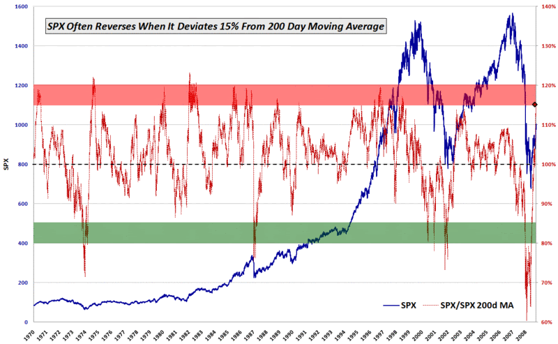
There are a lot of important questions about the markets that are being hotly debated as I write this. These include:

  • Are we in a recession?
  • Will crude oil break 150 soon?
  • How long will it be until the housing market finally hits bottom?
  • Can the indices take out their 200 day SMAs?
  • Why is the VIX still under 20?

OK, so I was kidding about the last one. Judging by the number of visitors this blog gets, there is a fair amount of interest (about five times as much as there was a year ago) in the nanosubject known as the VIX.

Condor Options, a site that is part of my regular reading, wonders if the VIX phenomenon has jumped the shark. Drawing upon the latest from Steven Sears, Don’t Read too Much Into a Rising VIX, my avian friends opine (in Has the VIX Jumped the Shark) that “the VIX has definitely received too much attention of late, and is being asked to perform too many roles - market timer, sentiment indicator, and even trading vehicle.”

The gist of the Condor Options argument comes a little later:

“…it’s getting harder and harder to find a source whose daily market commentary doesn’t feature at least a casual nod to VIX action, and more importantly, those passing references almost always describe it one-dimensionally as ‘the fear index.’”

I was debating whether to weigh in on some of the particulars of the Condor Options article when another prominent blogger who bears more than a passing resemblance to Henry Winkler picked up on the VIX theme and added:

“The VIX is just one tool in the shed, and a very imperfect one. It is an estimate, and as such, there is a boatful of noise in the number any time you look at it. At the end of the day, it tends to confirm something you already knew. Back in January and March the VIX spiked as the market got plowed and peaked on those big down gap days. Guess what, emotions got extreme.”

Adam (of Daily Options Report fame) also offered some good advice to VIX watchers. “Going forward, we should forget about the blips, myself included…[a]nd we should concentrate on looking for divergences.”

Condor Options and Adam certainly make some excellent points. Regarding the larger question of whether or not the VIX has jumped the shark, my answer is that when I started a blog about the VIX with a tongue-in-cheek tagline of “Your One Stop VIX-Centric View of the Universe…” some seventeen months ago, the water skis were already passing over the dorsal fin.

With respect to the ‘fear index’ label, divergence analysis, and several other specific points about the VIX, I will save these subjects for more detailed treatment at a later date.

Sunday, April 6, 2008

VWSI at +3 as VIX Keeps Falling

The VIX fell 3.26 (12.7%) to end the week at 22.45, the lowest end of the week close for 2008 so far. Last week's move brings the drop in the VIX to 8.71 points or 28% over the past three weeks and brings the index to a level about 8.9% the 10 day SMA and 15.3% below the 20 day SMA.

While these may sound like fairly extreme readings, the VWSI has only ticked up from +1 to +3 in the past week (but up from -4 three weeks ago), suggesting a most likely scenario of only a mild increase in volatility over the next week or two.

With all the recent attention being given to the VIX and the 200 day SMA (currently at 22.90), I thought I should weigh in by expanding upon some comments I have made previously. Specifically, it is my opinion that technical analysis does not work well with a derivative in which one cannot trade the underlying. Part of my thinking is that there is no such thing as support for the VIX at the 200d SMA (or any moving average) because one cannot trade the VIX directly when it hits a support (or resistance) point. In a more general sense, many TA techniques are on shaky ground with derivatives in which the underlying is not traded, so I am skeptical about the value of technical analysis of the VIX.

That being said, if enough people use the VIX as a market timing tool, some of the market's response to important TA VIX signals can filter down to the VIX itself and have somewhat of a reinforcing effect. I suspect that the effect, if any, is quite small.

Those who want to eyeball the significance of the 200d SMA are encouraged to look at a chart of the VIX with the 200d SMA going back 5 years or more. The only time that the 200d SMA appears to have served as even minor support or resistance was in July 2006 -- and that looks more like a small coincidence on the long-term chart than solid technical support. For the most part, the 200d SMA has been irrelevant throughout the history of the VIX -- and there is no reason to think that fact should change in the present environment.

Tuesday, March 18, 2008

Ratio of Stocks Above 50 and 200 Day Moving Averages

As part of my ongoing effort to posts charts that you (probably) won’t find anywhere else, I offer up this monthly ratio chart of NYSE stocks above their 50 day and 200 day moving averages.

As the 2002 data show, this chart is capable of flagging extreme readings. Given that I use the 200 day SMA as the numerator and the 50 day SMA as the denominator, the chart tends to show short-term pullbacks as upward spikes in the 4 period EMA of the ratio and longer term extreme bear moves as downward spikes. Not surprisingly, the current 4 period EMA 0.76 is the lowest since late 2002.

Unfortunately, the data only goes back about six years, so I am unable to construct a chart that includes the end of the 1990’s bull market and the first two years of the bear market that followed.

While this chart may give you some things to chew on, the larger point is to consider changes in the percentage of stocks above certain moving averages as good measures of market momentum and ratios covering two different periods as good measures of relative market momentum or acceleration/deceleration.

DISCLAIMER: "VIX®" is a trademark of Chicago Board Options Exchange, Incorporated. Chicago Board Options Exchange, Incorporated is not affiliated with this website or this website's owner's or operators. CBOE assumes no responsibility for the accuracy or completeness or any other aspect of any content posted on this website by its operator or any third party. All content on this site is provided for informational and entertainment purposes only and is not intended as advice to buy or sell any securities. Stocks are difficult to trade; options are even harder. When it comes to VIX derivatives, don't fall into the trap of thinking that just because you can ride a horse, you can ride an alligator. Please do your own homework and accept full responsibility for any investment decisions you make. No content on this site can be used for commercial purposes without the prior written permission of the author. Copyright © 2007-2023 Bill Luby. All rights reserved.
 
Web Analytics