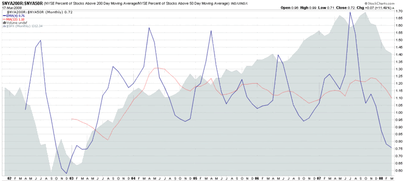
Ratio of Stocks Above 50 and 200 Day Moving Averages
As part of my ongoing effort to posts charts that you (probably) won’t find anywhere else, I offer up this monthly ratio chart of NYSE stocks above their 50 day and 200 day moving averages.
As the 2002 data show, this chart is capable of flagging extreme readings. Given that I use the 200 day SMA as the numerator and the 50 day SMA as the denominator, the chart tends to show short-term pullbacks as upward spikes in the 4 period EMA of the ratio and longer term extreme bear moves as downward spikes. Not surprisingly, the current 4 period EMA 0.76 is the lowest since late 2002.
Unfortunately, the data only goes back about six years, so I am unable to construct a chart that includes the end of the 1990’s bull market and the first two years of the bear market that followed.
While this chart may give you some things to chew on, the larger point is to consider changes in the percentage of stocks above certain moving averages as good measures of market momentum and ratios covering two different periods as good measures of relative market momentum or acceleration/deceleration.