A First Look at the ISEE
I briefly touched upon the ISEE yesterday; and while the ISE web site has a nice little graph of the ISEE going back a year, it is probably not sufficient to answer even the more casual questions about the usefulness of the index. Fortunately, the ISE has data going back to October 2002 available to download so that you can conduct your own analysis…or you can just keep reading.
For now I’m going to skip over the details of the debate about the usefulness of put to call ratios to help call market turns. If you want to do some research on this indicator, a good place to start would be Bill Rempel’s “The Significance of the Equity Put to Call Ratio” commentary at MarketThoughts.com.
Suffice it to say that I believe that it is worth the effort to watch this contrarian sentiment indicator and suggest that a good place to do so is the SchaeffersResearch.com page that graphs the CBOE equity (non-index) put to call ratio. You can create your own CBOE put to call charts at Stockcharts.com using $CPCE as the equity put to call ticker, $CPCI for the index put to call ticker, and $CPC for the total equity + index data.
The ISEE is actually a call to put ratio based entirely on purchases of calls and puts in which a customer is opening a position through the ISE itself. For more details and a testimonial of sorts I recommend a Wall Street Journal article by Mohammed Hadi.
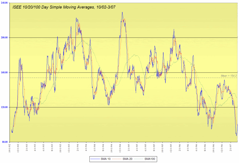
What do the ISEE data look like? I have graphed the 10, 20 and 100 day SMAs going back to 2002. They show a mean of 154, with obvious extreme readings falling conveniently at round numbers: below 100 and above 200. As a contrarian indicator, a reading of 100 or below is a good cutoff for overly bearish sentiment and a high likelihood of a bullish move ahead; 200 signals extreme bullishness and an increased chance of a bearish turn in the markets in the near future. In many respects, a high ISEE number is a lot like a low VIX number and vice-versa.
Turning to the ISEE as a predictor of future market performance, this is a subject that I will come back to regularly in this space, but for now I have posted a graph of the SPX and the 10 day SMA of the ISEE for the period 10/1/02 to 3/19/07. Note that the four largest spikes in the ISEE all preceded significant moves down in the SPX; also, low ISEE readings frequently marked the beginning of bullish moves.
Before wrapping up this subject for today, I will leave the reader with one last thought: the lowest 10 day SMA ever recorded for the ISEE was an 87.00 last Thursday.


3 comments:
Hi Bill,
I downloaded the data file and ran a correllation versus the S&P since 1/3/2005. On the 10 day Average, the r^2 is .14 and on the raw data the R^2 is .02.
There appear to be certain spots with some predictive power but there are just as many not. For example, the data appears to have hit a low in September of 2006 then shot up markedly...all the while an investor should have been in the market.
I'll try to look at it with some time lags, but unless I'm missing something, I'm not sure what the value of this index is.
John
Again, I love this blog. Fascinating stuff and great charts.
John:
Glad to see you are crunching the numbers. Three quick suggestions:
1) focus on extreme values, where the correlation and predictive power is higher;
2) experiment with SMAs that are a lot longer than the 10 day SMA
3) from a time series perspective, look for SPX implications in the 10-50 day range
Of course, it's far from perfect...
Woodshedder:
I always enjoy positive feedback -- and the charts are (I know I shouldn't admit this) even more fun than the contortionists and spikers!
Post a Comment