Showing posts with label CPCE. Show all posts

Thursday, December 16, 2010

VIX and Put to Call Ratio Snapshot

There has been a good deal of discussion about recent high put to call ratios across the blogosphere lately, including in my post yesterday, Rohan Clarke on the VIX and Put to Call Ratios.

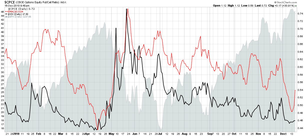
Given all the interest in the subject, I thought it would be an opportune time to share a simple chart of both that I often refer to. The graphic below captures the VIX (solid black line) and a 10-day exponential moving average of the CBOE equity put to call ratio (CPCE), which is show as a dotted red line.

Note that these two indicators are generally highly correlated. They both hit extreme lows in April, just before stocks began to correct – hence the concern about the current situation. The recent levels mark the second lowest readings of the year and may also portend a reversal. It is important to note, however, that the VIX can remain low for an extended period and also indicate nothing more than the fact that investors are comfortable accepting more risk. Also, the 10-day EMA of the CPCE is showing some signs that the recent extreme reading may self-correct before the bears are able to generate any significant traction. Finally, seasonal factors have a tendency to distort both indicators and often point to short-term holiday complacency rather than any sort of conviction that is expected to persist into 2011.

Related posts:


Disclosure(s):
none

[source: StockCharts.com]

Thursday, June 10, 2010

Interesting Chart Utilizing Put to Call Ratios and Volatility

I received quite a few excellent submissions for last week’s chart of the week contest and three subjects seemed to attract the most attention of chartists: put to call ratios; volatility and market breadth.

One chart that did a superb job with put to call ratios and volatility was submitted by Greg Neal. Actually, this was not a single chart, per se, but more of a series of charts which tell a compelling story. Whereas Greg submitted his chart over the weekend, I have used updated data through today and have cut Greg’s chart to two sections to make for easier reading below. In terms of key takeaways, I’ll let the chart and Greg’s annotations speak for themselves.

To find a live version of this chart that is continuously updated at StockCharts.com, click here. The full complement of Greg's public charts at StockCharts.com can be found here.

For more on related subjects, readers are encouraged to check out:


[source: StockCharts.com and Greg Neal]

Disclosure(s): none

Sunday, April 4, 2010

Chart of the Week: CBOE Monthly Equity Put to Call Ratio Nears All-Time Low

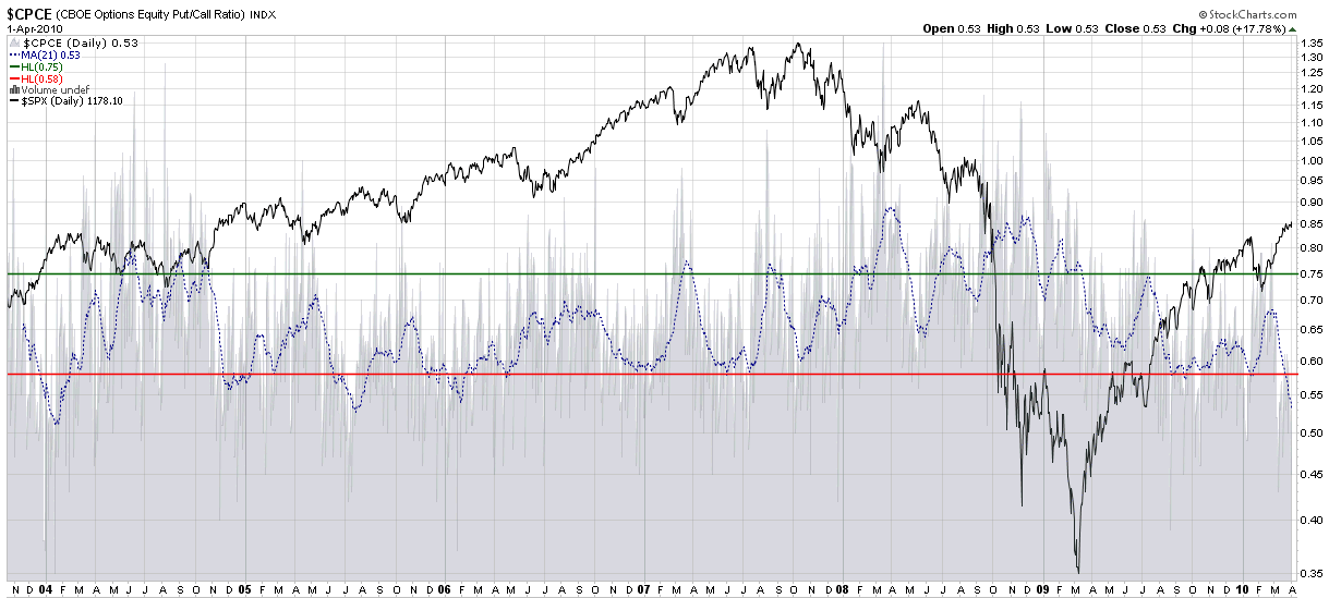
For trading purposes, I adhere fairly faithfully to a 10-day exponential moving average (EMA) of the CBOE equity put to call ratio (CPCE) as an appropriate smoothing factor to flag short to intermediate-term swing trading opportunities. There are occasions, however, when a longer-term moving average, like a 21-day simple moving average, is a better tool for identifying persistent extremes in put and call activity. This week is one of those occasions.

The chart of the week below looks at the full history of the CBOE equity put to call ratio, which dates from October 21, 2003, and applies a 21-day SMA (dotted blue line) to generate what I call the monthly equity put to call ratio. As the chart shows, readings below 0.60 have generally been a good time to take profits on long positions and/or initiate short positions. In fact, the current 0.53 level has only been seen on one prior instance, in January 2004. That period just happened to be exactly 13 months after the S&P 500 index had bottomed and started a strong bull rally. It also marked the beginning of a period in which stocks declined for ten months, before resuming a rally that would ultimately last until October 2007.

Of course there is nothing magical about low equity put to call ratios or rallies stalling after a 13 month rise, but bulls and bears alike should certainly take note of historical precedent.

For more on related subjects, readers are encouraged to check out:


[source: StockCharts.com]

Disclosure(s): none

Friday, March 19, 2010

Bears Emboldened By Low CBOE Equity Put to Call Ratio

Truthfully, I have not surveyed our ursine friends this morning, so I really have no idea if they are emboldened by the low CBOE equity put to call ratio (CPCE), but they should be.

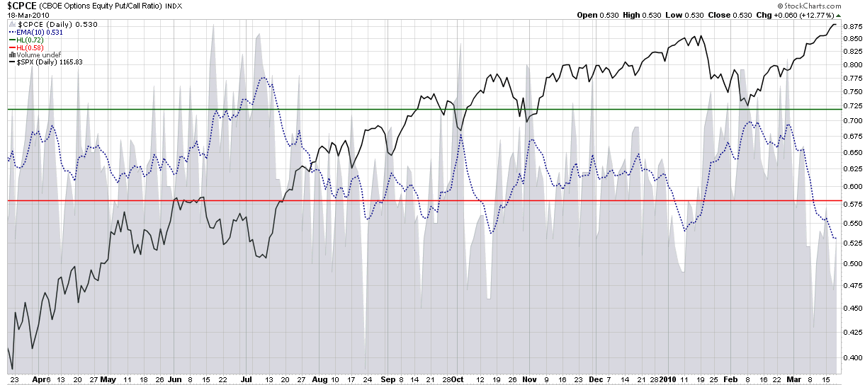
My preferred way of looking at the equity put to call ratio involves using an exponential 10 day moving average (EMA) as a smoothing factor. The 10 day EMA generates the dotted blue line in the chart below, which is now at a one month low, meaning that bullish investors are now likely to be speculating more aggressively with calls and are less concerned about managing risk with put protection. The chart shows that prior lows in August, September, October and January all preceded meaningful pullbacks. The history of put to call extremes suggests that another pullback is now in the offing.

Whether the bears are truly emboldened or even bother watching put to call ratios, this looks like an excellent time for longs to take some profits and go enjoy the vernal equinox.

For more on related subjects, readers are encouraged to check out:


[source: StockCharts]

Disclosure(s): none

Monday, March 1, 2010

Chart of the Week: Total Put to Call Ratio

Thanks to all who submitted charts for the chart of the week contest. After getting off to a slow start, I was somewhat skeptical that my idea of opening up the chart of the week to readers would turn out as I had hoped, but when over two dozen submissions landed in my inbox, I was humbled by the breadth and depth of the body of work they represented.

Alas there can only be one gold medal and this time around (I’m sure I will do this again), the winner is Amir from Las Vegas.

Amir’s chart shows how using the CBOE’s total put to call ratio (CPC) could have been helpful in identifying tops and bottoms in the S&P 500 index during the course of the last year. The areas highlighted in yellow show that the total put to call ratio (which summarizes put and call activity for individual equities plus indices) spiking to extreme levels during the June-July 2009 low and just last month dropping to the lowest level in several years. Clearly last month's signal was an excellent time to trade on the short side, at least for the short-term. Whether the extreme reading turns out to be a harbinger of a much steeper downturn remains to be seen.

My personal bias is to use the ISEE and CPCE (equity only) put to call data, but any one of these indicators is capable of generating excellent short-term to long-term market timing signals.

For his efforts, Amir also wins a one year free subscription to Expiring Monthly: The Option Traders Journal.

Thanks again to all those who submitted a very strong group of charts. As much fun as this was, I will be sure to periodically open up the Chart of the Week competition to readers going forward.

For more on related subjects, readers are encouraged to check out:


[source: StockCharts]

Disclosure(s): I am one of the founders and owners of Expiring Monthly


Thursday, December 10, 2009

Put to Call Ratio and the Probability of a Downturn

In the last day or two I have been fielded several questions about put to call ratios. It seems as if some investors are concerned that there is a stealth movement by sophisticated investors who are making substantial bets on a downward move with large purchases of puts. Invariably, these concerns have led to questions about what I see in the put to call ratios that will confirm or deny this.

To quickly recap, the CBOE publishes three put to call ratios. In my preferred charting site, StockCharts.com, these are known as:

  • $CPCE – the ticker for the equity put to call ratio
  • $CPCI – the ticker for the index put to call ticker
  • $CPC – the ticker for the total equity + index data

For reasons I have discussed in the past, I prefer the CPCE ratio and use this as a contrarian signal. The problem with the CPCI data is that institutional order flow for index options tends to come in large chunks that can create misleading short-term signals.

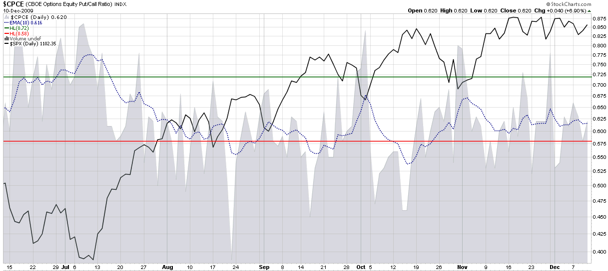
Recently, however, the CPCE, CPCI and CPC have all had very similar looking charts. I have reproduced the six month chart of CPCE below and it shows no unusual spikes in put activity relative to call activity. If anything, the 10 day EMA that I use to smooth the sometimes noisy CPCE data shows an almost eerie flat line for the past month or so, just as was the case when I last wrote about put to call ratios when in Equity Put to Call Ratio Not Pointing to a Correction when the Dubai debt crisis hit.

For more on related subjects, readers are encouraged to check out:

[source: StockCharts]

Disclosure: none

Tuesday, December 1, 2009

Equity Put to Call Ratio Not Pointing to Correction

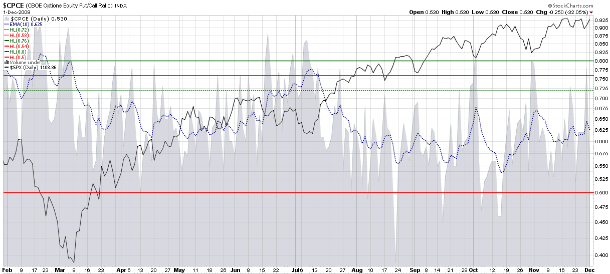
The recent Dubai debt crisis has spurred some investors to take some profits, protect their portfolios and contemplate both the acknowledged and hidden threats to the global economy. From Wednesday’s close to Friday’s intraday low, the S&P 500 index (SPX) only fell 17 points or 2.4%, hardly the type of selloff that typically strikes fear into the hearts of bulls. Fearing that further declines may be in the cards, however, investors snapped up puts aggressively, particularly on Monday, when the put buying pushed the CBOE equity put to call ratio (CPCE) to elevated levels.

In the chart below, I have reproduced the CPCE along with a 10 day exponential moving average (dotted blue line) to smooth the data over a two week period. The chart shows that since the July leg of the current bull market, significant pullbacks in the SPX (solid black line) have been preceded by drops in the 10-day EMA of the CPCE below the 0.58 level. In fact, for the last 5 ½ weeks, the 10-day EMA has never threatened the 0.58 area and at the current 0.625, the CPCE shows no signs of an impending correction.

For related posts on the CPCE, readers are encouraged to check out:

Disclosure: none

Wednesday, August 5, 2009

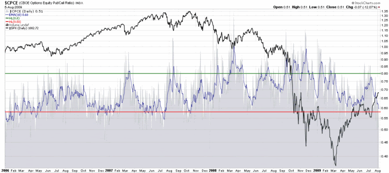
CBOE Equity Put to Call Ratio in Bear Territory

Lately I have been dipping my toe in the water on the short side – only to discover that something resembling an alligator seems intent on severing my leg at the ankle. Fortunately, I have managed to keep the stakes low to this point, but during today’s session I took a much more aggressive stance and bought a large quantity of puts.

In the process of reshaping my thinking, I found two indicators in particular to be persuasive. The first is the TRIN, where I am partial to using a 10 day EMA to smooth the data. Today it closed at a level seen only once since the beginning of 2006, just as the market put in a short-term top after a week and a half of bouncing off of the March lows.

Even more persuasive is the CBOE equity put to call ratio (CPCE), where the 10 day EMA hit a low of 0.51 – a level which has not been seen since the October 2007 top. The chart below shows that a low CPCE warned of excessive optimism and the possibility of a top first in July 2007, when the SPX began to form the first half of a double top and again in October 2007, just as the market was topping for the second and final time.

For a different take on today’s CBOE equity put to call ratio, I can highly recommend 08/05/09 Market Recap: CPCE a little too low again, from Cobra’s Market View.

For some related VIX and More posts on the CPCE, try:


[source: StockCharts.com]

Thursday, March 19, 2009

Equity Put to Call Ratio Hits Ten Month Low

At the moment it is not at all difficult to find an indicator that believes stocks are overbought, at least on a short-term basis.

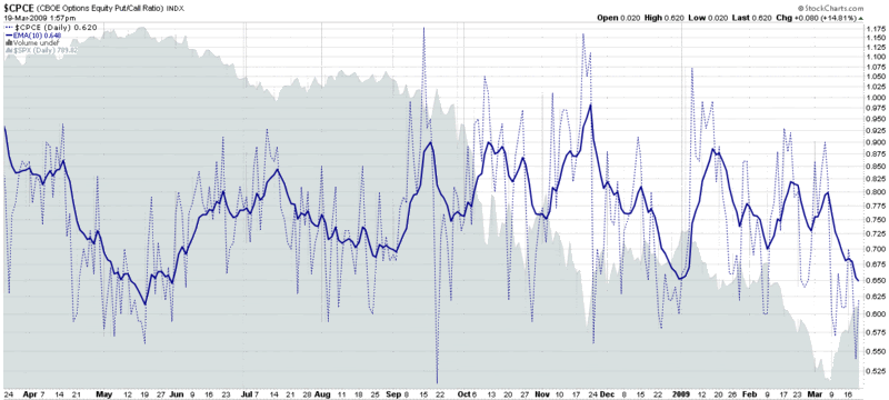
Of the many out there, I choose to highlight the CBOE’s equity ratio (CPCE), which, along with the ISEE, is one of my two favorite put to call ratios.

In the chart below, there is ample evidence of low levels of put activity compared to call activity at the CBOE. The daily data are represented by the dotted blue lines; I also use a 10 day exponential moving average to smooth the data over a two week period. I find that the 10 day EMA gives excellent contrarian signals. The most recent low in the 10 day EMA was at the beginning of the year and was a slightly early sell signal. The last time the 10 day EMA was this low was in May 2008, when it was an even more timely sell signal.

Longs, this looks like a good time to take some profits. Shorts, expiration week can sometimes delay trend reversals by a few days, but by Monday, the trend is likely to be back down.

[Edit: A commenter asked for an explanation of how to read this chart. For those who are interested, my response is in the comments section below.]

[source: StockCharts]

Monday, July 14, 2008

Volatility and Sentiment Tidbits…and Today Doesn’t Matter

Some semi-random thoughts inspired by today’s market action:

  • The VIX:VXV ratio spiked up to 1.12 at 1:12 p.m. EDT (I’m not superstitious, but that’s an interesting bullish signal)

  • The underappreciated VXN (volatility index for the NDX or NASDAQ-100) spiked over 34 on Friday and made it as high as 33.76 earlier today. That’s not enough to satisfy the “VIX must spike over 30!” purists, but it is an interesting data point, particularly because the VXN and NDX excludes financials

  • My VIX algebra says that two medium to large VIX spikes on Friday and today do not equal one large capitulation-friendly VIX spike

  • The CBOE equity put to call ratio – an excellent market timing indicator – is looking bullish

When all is said and done, I don’t think we can have a serious market rally until the tone of the news flow changes, regardless of market technicals and sentiment data. There must be several bullish macroeconomic and/or fundamental data points which collectively give the bulls a reason not to be so skittish. At a minimum, the markets need to navigate the PPI, CPI, industrial production and capacity utilization data due out tomorrow and Wednesday, then weather the flood of earnings reports (with strong representation from some key financial institutions) on Thursday. Even then, there is the Citigroup (C) earnings story on Friday morning.

Whatever happens to the rest of today’s session, the balance of the week will tell the story.

Tuesday, June 3, 2008

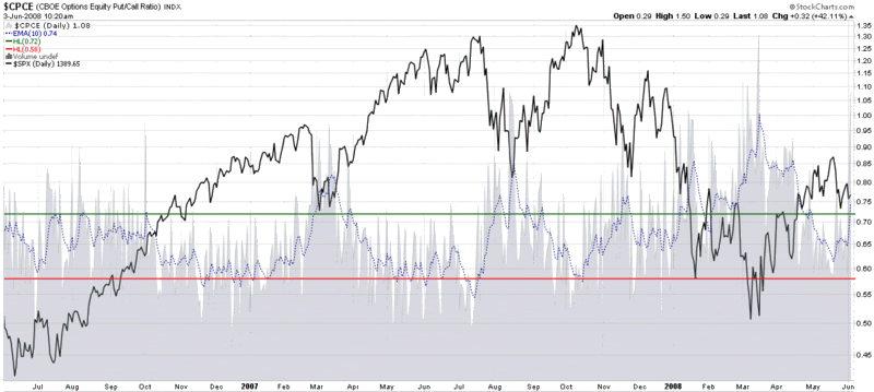
CBOE Equity Put to Call Ratio Looking Bullish

Based on one of the ways I like to apply the CBOE Equity Put to Call Ratio, this ratio has just turned bullish for the first time since late April. Like any indicator, put to call ratios are far from infallible, but looking at historical context, there is a good possibility that the recent surge in put activity will be enough bricks in the wall of worry to provide a base for another bullish move from current levels.

Given that most of the other indicators I follow have a more neutral outlook, it will be interesting to see how this plays out.

Thursday, May 8, 2008

CBOE Equity Put to Call Ratio No Longer Bullish

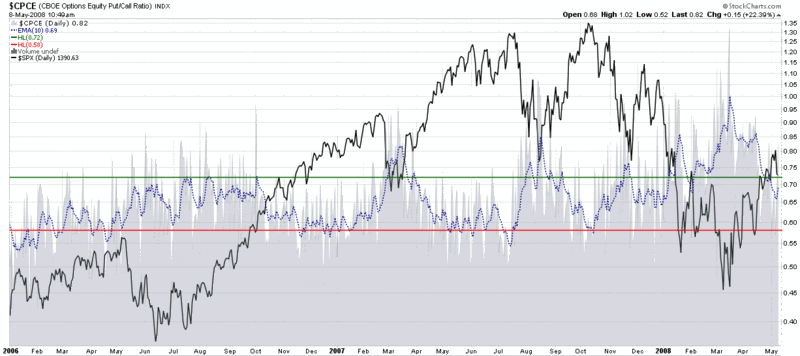
The CBOE equity put to call ratio, which Stockcharts.com and I refer to as CPCE, has been generating consistently bullish readings since the beginning of 2008. Those bullish readings came to an end about a week or so ago, as the chart below reflects. That does not necessarily mean that options sentiment is turning bearish, only that the ‘free lunch’ portion of the bounce off of the March low is over. Now the likelihood of getting whipsawed – either on the long side or the short side – increases considerably. I suspect that a couple more days like yesterday will push options sentiment back into the bullish contrarian camp, but that remains to be seen. Until the market generates a stronger directional signal, priority should be given to conservative strategies.

Thursday, April 10, 2008

Persistent High Put to Call Ratio

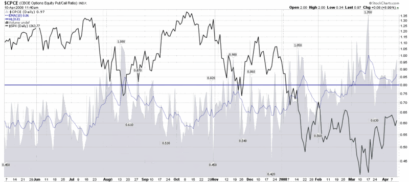
The last time I mentioned the CBOE Equity Put to Call Ratio, one month ago today, it was at such elevated levels that I titled the post Put to Call Everest and limited my commentary to a brief question, “What number comes after infinity?” The extreme put to call data even inspired me to make my first major bottom call since trying to catch the bottom in the NASDAQ in 2002 (I was also a little early then, but close enough.)

Fast forward one month and the put to call data continue to show a preponderance of non-believers, with put buying dominating the options activity. Given the headlines of the past few days, this widespread pessimism is easy to understand. The more important question is how long it will endure.

Critical market bottoms are almost always marked by a spike in put to call ratios. For aggressive investors, the current levels probably offer an attractive risk-reward profile. More conservative investors may wish to wait for a confirmation signal, such as the 10 day exponential moving average of the CBOE Equity Put to Call Ratio dropping below 0.80 (the blue horizontal line in the chart below.) More market shocks certainly lie ahead, but history suggests that the current environment has a high probability of producing above average returns – perhaps even considerably higher than that – over the next month or two.

Monday, March 10, 2008

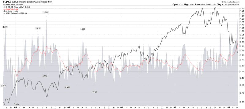
Put to Call Everest

What number comes after infinity?

Monday, March 3, 2008

Put to Call Data at Extreme Levels

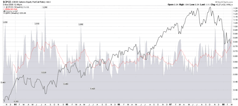
Earlier this morning, I mentioned that the ISEE is setting new records on a daily for the all-time lowest readings in the 20, 50 and 100 simple moving averages and pointed out that the CBOE Equity Put to Call numbers have spiked to record levels as well. I thought a graphic might do a better job of telling the story, so I have attached a weekly chart of the CBOE Equity Put to Call Ratio below.

The chart goes back to the point at which the CBOE started publishing equity only put to call data and uses a 10 week EMA as a smoothing function. As the chart shows, the current EMA of 82 is a new record, eclipsing the old record of August 2004. In retrospect, 2004 was a great buying opportunity for those who had the fortitude to go against the crowd. As for the present, while the jury is still out, the odds are that the current situation is also a good buying opportunity, as difficult as it may be for some to pull the trigger.


[source: StockCharts]

Put to Calls and TRIN More Skittish than VIX, VWSI

A quick programming note: henceforth, I am going to be a little more freeform with my end of week commentary, making it less VIX and VWSI-centric. Lately the VIX has been at best a sub-plot in the market turmoil and the VWSI has not generated any extreme readings, so I will be expanding my weekly scope to include some of my other favorite indicators: put to call ratios, market breadth data, TRIN numbers, etc. going forward – or whatever else looks to be most newsworthy.
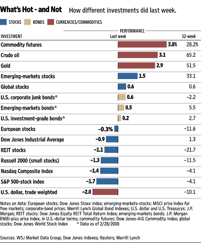
The Wall Street Journal “What’s Hot and Not” graphic shows where the action was last week – and this story is starting to look familiar. Oil, gold and other commodities were the biggest gainers last week, with a weak dollar and a weak US stock market accounting for the biggest losers.

The VIX ended the week up 2.48 (+10.3%) to 26.54, with the VWSI slipping back to zero. More interesting was the action in the put to call data, where the ISEE set all-time records lows for the 20, 50 and 100 day moving averages each day from Tuesday through Friday and the CPCE (CBOE Equity Put to Call Ratio) hit a new high of 1.50. In the wake of Friday’s precipitous drop, the TRIN and NASDAQ TRIN also ended the week with extreme readings of 2.46 and 2.76, respectively.

All this continues to mean one of two things: either the market is extremely oversold and anxious investors are going to create a massive wall of worry for a nice rebound…or we are in the midst of a financial meltdown not seen in the lifetime of most investors. I continue to reside in the former camp, but am watching SPX 1310 and NDX 1725 for signs of additional cracks in the dike.

Friday, February 29, 2008

McClellan Summation Index Turns Positive

It may seem like the height of folly to be talking about an upturn in the market on a day when the DJIA is down 230 points, but I’m not going to let that stop me.

Apart from the recent bump in the markets, I see several factors that lead me to believe that the markets are poised to continue to go up from current levels. The first of these, as highlighted by J.J. McGrath on his MackTheKnife blog, is that money formerly on the sidelines is starting to flow back into mutual funds. It may not be a flood yet, but it is a toe in the water. The second factor is the persistent extreme readings in put to call ratios that are evident in the ISEE and the CBOE equity only numbers. These numbers indicate that while some institutional money is coming back into the market, many retail investors are still sitting on the sidelines or have a short bias.

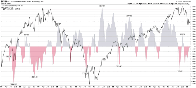
A third way to think about pent-up demand is to look at the McClellan Summation Index, a chart of which I have appended below. As can be seen in the chart, the index just turned positive for the first time since late October. While this is by no means a guarantee that the markets are moving up, this signal has historically been a bullish one. Perhaps more importantly, one way to think about the size of the red areas under the zero line is that these represent bearish periods in which pent-up demand continued to accumulate under the surface, roughly proportionate to the duration and magnitude of the red spike.

To summarize my thinking here, two bullish signals are mutual funds moving cash into the market and advance decline data turning positive, suggesting that the tide has turned. At this stage, only options sentiment data needs to normalize to indicate that the retail investor is once again comfortable going long and helping to push the market out of the recent trading range.


[source:  StockCharts.com]

Monday, February 4, 2008

Divergence Between Put to Call and Volatility Data

Several weeks ago in Checking for Atheists, I talked about how bullish moves can be fueled by a large supply of non-believers who prefer to cling to a wall of worry in times of great uncertainty. These investors often prefer to wait until a bullish move is well established before they cautiously and reluctantly begin to resume long positions.

Volatility indicators, such as the VIX, usually provide an insight into just how worried these investors are, but put to call ratios do us one better: they give us a sense of their numbers. Right now, the numbers are compelling. As I noted in my weekly VIX recap, the ISEE data reflect all-time record lows of new call positions initiated relative to new put positions on the International Securities Exchange (ISE) over the past 20 days – a trend that has carried over to today’s session.

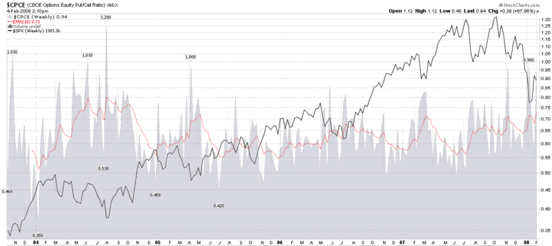
The other important put to call ratio that I follow closely is the CBOE’s equity put to call ratio ($CPCE on StockCharts.com), a chart of which I have included below. Like the ISEE, the CPCE is showing historically high level of puts to calls – in numbers not seen since early 2005. In the chart below, note that P/C readings of 0.70 or higher have consistently been good buying opportunities and today’s 10 day EMA of 0.73 has not been surpassed since May 2005.

Several readers have asked about the significance of a divergence between volatility and put to call readings. As I discussed last May in More Thoughts on the PCVXO, divergences in which volatility readings are much higher than put to call numbers are usually bullish, while the current situation, with put to call numbers much higher than volatility data, tend to resolve in a bearish move going forward.

Wednesday, December 19, 2007

No Fear?

We may be stuck in a holiday time warp, but I find the lack of fear in the VIX to be more than a little surprising, particularly given the spate of gloomy headlines. I talked about this same subject three weeks ago, but the gulf between the VIX action and the news flow has grown wider and wider ever since. Is it possible that this kid has already grown up enough to get a hedge fund job?
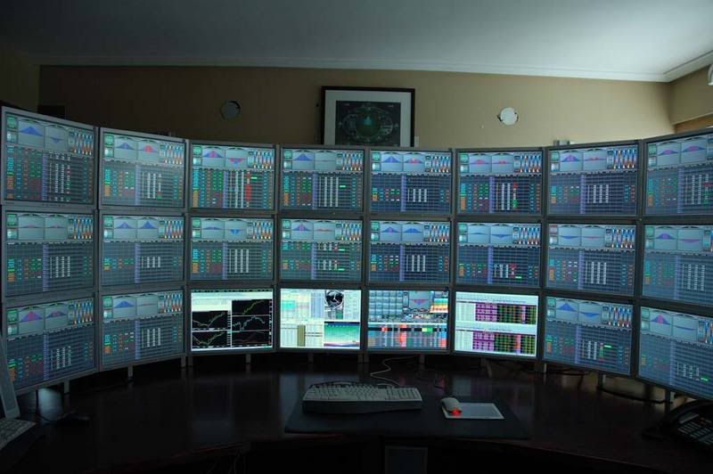
The ISEE (below the long-term mean for the 30th day in a row) and the CBOE equity put to call ratio (spiking once again) both indicate that call buying relative to put buying is considerably below historical norms, which makes the VIX numbers even more surprising.

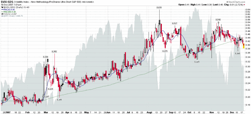
In times like this I turn to the VIX:SDS ratio. As shown below, my proxy for the fear premium component of the VIX is now showing a reading that is substantially below the 10 and 100 day simple moving averages. Is this merely a case of desensitization or is something else going on?

Tuesday, September 11, 2007

ISEE Buy Signal Coming, But Is It Tradeable?

Updating a previous post, it now looks as if the September ISEE buy signal I was anticipating two weeks ago will arrive as soon as Friday.

I’m sure traders across the globe are bursting with excitement, anxiously counting down the minutes until the ISEE tells them to rush headlong into the markets. But really now, is all this faux buildup worth the effort?

Just in time to answer this question, Michael Stokes at MarketSci.com has looked at the total put to call ratio as a timing tool in a three part series, published today. In short, MarketSci concludes that while the total put to call ratio has some predictable patterns, translating that knowledge into a winning trading system is non-trivial. In the end, they find that the put to call data can be successfully be used to enhance at least one SPX crossover system.

A couple of comments are in order.

First, when it comes to put to call ratios, I have a preference for the ISEE over all the other ratios because they only count opening options purchases. My second choice would be the CBOE’s equity put to call ratio. Third and fourth would be the total put to call ratio (this sums the equity and index put to call data and was used in the MarketSci study) and the index put to call ratio. The theory is that individual investors are more likely to trade options on individual equities, while large institutions will have disproportionate involvement in index options. (Note that the ISEE has recently started breaking out an equities only ratio, but since this data does not go back very far, I do not yet use it.)

Second, put to call ratios are a great tool. So are volatility indicators like the VIX. It always makes sense to look at these two indicators in concert, as I have talked about vis-a-vis the PCVXO and my own version of this indicator, which I have dubbed the PCEVXO.

Third, I recently reviewed an analysis by the CXO Group of the ISEE and CBOE total put to call ratio. You can follow the links in the previous sentence to read their original analysis, but the bottom line is that they were not enthusiastic about either tool, particularly the total put to call ratio.

Fourth, there are a number of books that offer an excellent treatment of put to call ratios; I will only mention three here. Bernie Schaeffer lays out some of his thinking about put to call ratios in Rick Bensignor’s New Thinking in Technical Analysis; Larry Connors and Connor Sen offer an excellent statistical analysis in How Markets Really Work; and Gary Smith explains his thinking and recommends some models of his own in How I Trade for a Living.

So…read, analyze and test. The answers are out there. And have your finger on the buy button Friday, just in case.

DISCLAIMER: "VIX®" is a trademark of Chicago Board Options Exchange, Incorporated. Chicago Board Options Exchange, Incorporated is not affiliated with this website or this website's owner's or operators. CBOE assumes no responsibility for the accuracy or completeness or any other aspect of any content posted on this website by its operator or any third party. All content on this site is provided for informational and entertainment purposes only and is not intended as advice to buy or sell any securities. Stocks are difficult to trade; options are even harder. When it comes to VIX derivatives, don't fall into the trap of thinking that just because you can ride a horse, you can ride an alligator. Please do your own homework and accept full responsibility for any investment decisions you make. No content on this site can be used for commercial purposes without the prior written permission of the author. Copyright © 2007-2023 Bill Luby. All rights reserved.
 
Web Analytics