VIX and Put to Call Ratio Snapshot
There has been a good deal of discussion about recent high put to call ratios across the blogosphere lately, including in my post yesterday, Rohan Clarke on the VIX and Put to Call Ratios.
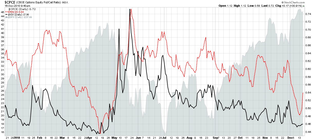
Given all the interest in the subject, I thought it would be an opportune time to share a simple chart of both that I often refer to. The graphic below captures the VIX (solid black line) and a 10-day exponential moving average of the CBOE equity put to call ratio (CPCE), which is show as a dotted red line.
Note that these two indicators are generally highly correlated. They both hit extreme lows in April, just before stocks began to correct – hence the concern about the current situation. The recent levels mark the second lowest readings of the year and may also portend a reversal. It is important to note, however, that the VIX can remain low for an extended period and also indicate nothing more than the fact that investors are comfortable accepting more risk. Also, the 10-day EMA of the CPCE is showing some signs that the recent extreme reading may self-correct before the bears are able to generate any significant traction. Finally, seasonal factors have a tendency to distort both indicators and often point to short-term holiday complacency rather than any sort of conviction that is expected to persist into 2011.
Related posts:
- Rohan Clarke on the VIX and Put to Call Ratios
- Interesting Chart Utilizing Put to Call Ratios and Volatility
- Put to Call Ratio and the Probability of a Downturn
- Chart of the Week: VIX Support

Disclosure(s): none

