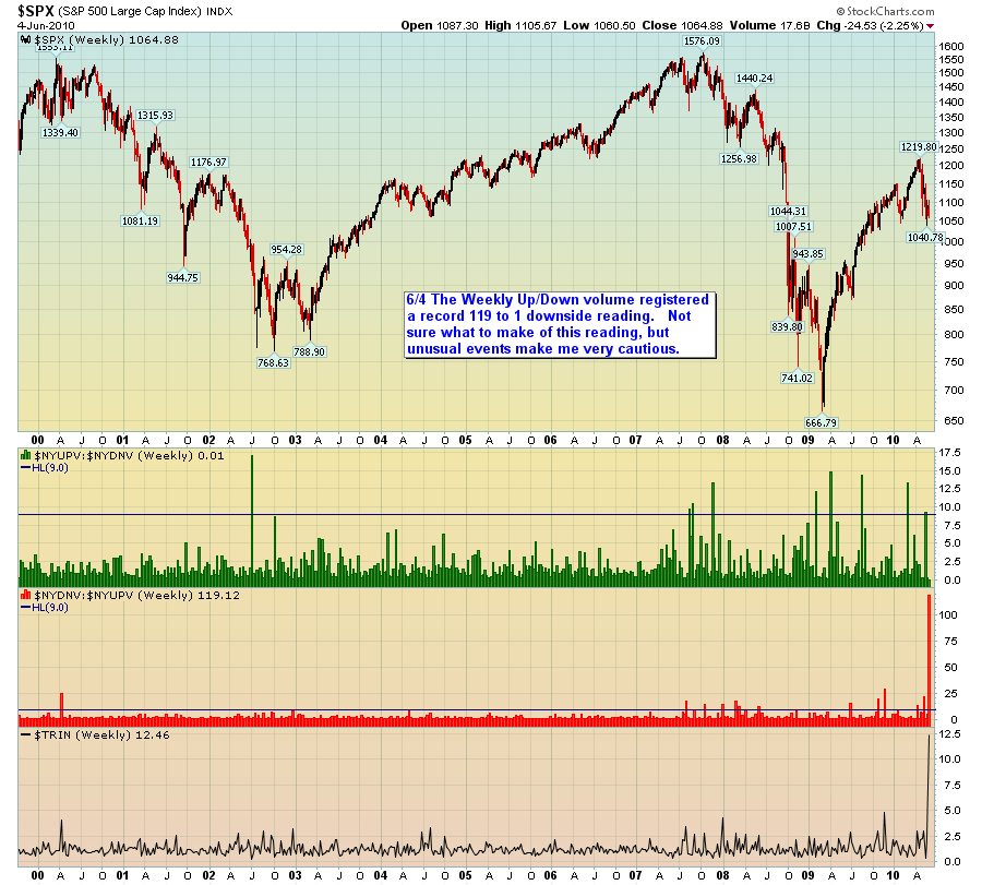
Chart of the Week: Weekly Volume Flow
Thanks to Charlie Thompson for submitting this week’s winning chart of the week entry. Once again there were quite a few very strong entries. Perhaps because I have lately been focusing much of my trading research and development in the area of volume and perhaps because I see so little top notch analysis of volume patterns, I found Charlie’s chart to be particularly compelling. Also, I tend to place most of my emphasis on short and intermediate-term data and analysis in this blog – and given the events of the past month or so, I think the present is an excellent time to step back and view the investment landscape with a wide angle lens.
For the record, $NYUPV is the total volume of all advancing stocks on the NYSE and $NYDNV is the total volume of all declining stocks on the NYSE. The green bars thus represent a ratio of $NYDNV to $NYUPV. The TRIN is also known as the Arms Index. I discuss the how the index is calculated in Bullish TRIN as Year Winds Down.
For his efforts, Charlie also wins a free one year subscription to Expiring Monthly: The Option Traders Journal.
As I did the last time around, I will also highlight some of my other favorite entries in the next few days. For those who may be interested, the March winner and three honorable mention charts can be found in the links below.
- Chart of the Week: Total Put to Call Ratio (March winner)
- Correlation of VIX and “VIX Index” Searches on Google (honorable mention)
- Annotated VIX Downtrend Symmetry Channel (honorable mention)
- VIX Price Channel Chart (honorable mention)
For more on related subjects, readers are encouraged to check out:
- Chart of the Week: Extreme Readings for Up Volume vs. Down Volume
- Chart Porn
- Arms Index [TRIN] Going Back to 1992
- Chart of the Week: NASDAQ TRIN

[source: StockCharts.com and Charlie Thompson]
Disclosures: I am one of the founders and owners of Expiring Monthly

