Showing posts with label up volume and down volume. Show all posts

Sunday, June 6, 2010

Chart of the Week: Weekly Volume Flow

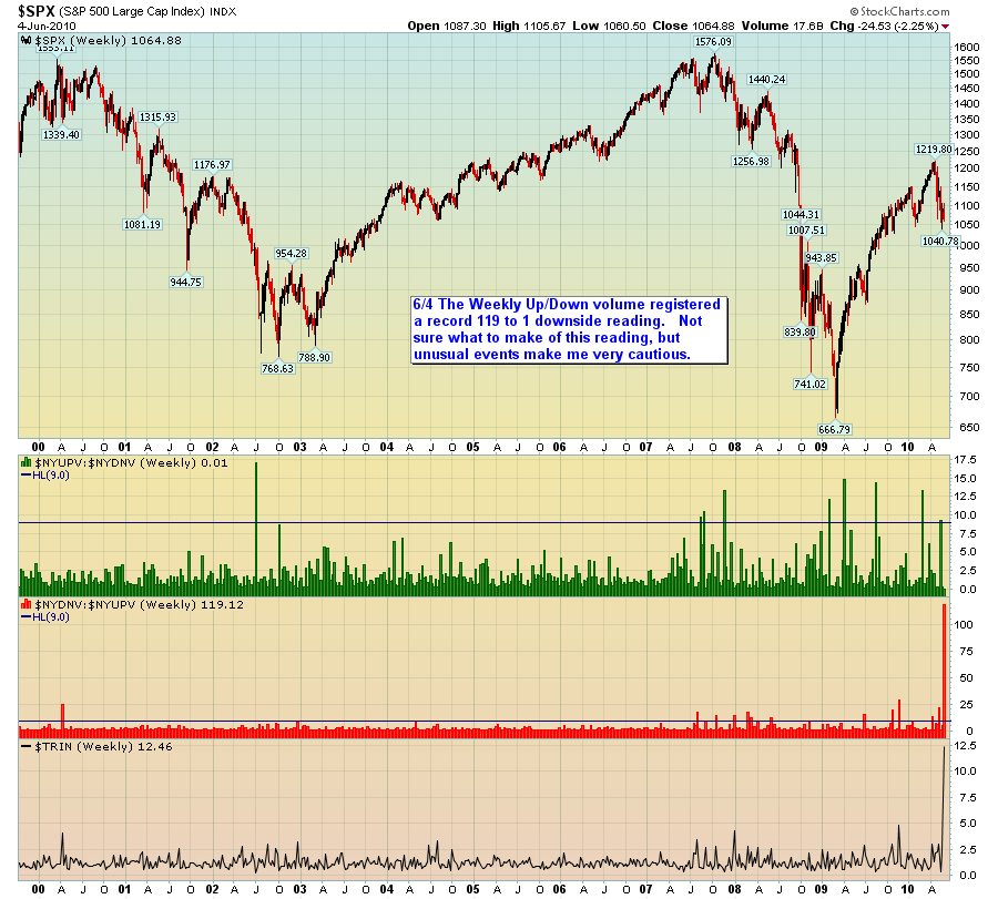
Thanks to Charlie Thompson for submitting this week’s winning chart of the week entry. Once again there were quite a few very strong entries. Perhaps because I have lately been focusing much of my trading research and development in the area of volume and perhaps because I see so little top notch analysis of volume patterns, I found Charlie’s chart to be particularly compelling. Also, I tend to place most of my emphasis on short and intermediate-term data and analysis in this blog – and given the events of the past month or so, I think the present is an excellent time to step back and view the investment landscape with a wide angle lens.

For the record, $NYUPV is the total volume of all advancing stocks on the NYSE and $NYDNV is the total volume of all declining stocks on the NYSE. The green bars thus represent a ratio of $NYDNV to $NYUPV. The TRIN is also known as the Arms Index. I discuss the how the index is calculated in Bullish TRIN as Year Winds Down.

For his efforts, Charlie also wins a free one year subscription to Expiring Monthly: The Option Traders Journal.

As I did the last time around, I will also highlight some of my other favorite entries in the next few days. For those who may be interested, the March winner and three honorable mention charts can be found in the links below.

For more on related subjects, readers are encouraged to check out:


[source: StockCharts.com and Charlie Thompson]

Disclosures: I am one of the founders and owners of Expiring Monthly

Sunday, March 15, 2009

Chart of the Week: Extreme Readings for Up Volume vs. Down Volume

I did the best I could to avoid yet another chart about banks or the financial sector this week’s but even indirectly, it is hard to come up with a chart that isn’t about the banks. So be it.

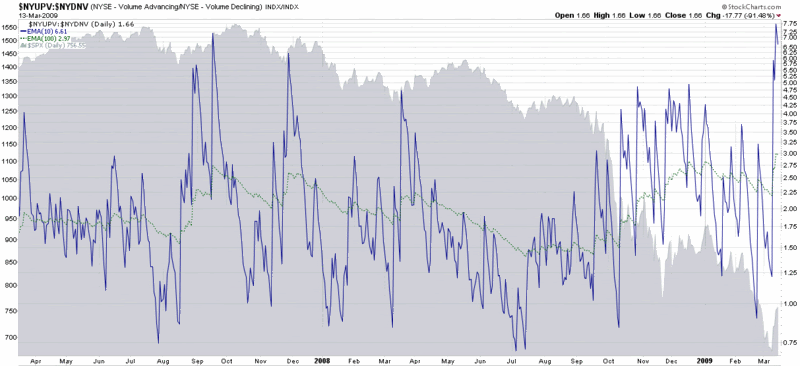
This week the chart of the week is a ratio chart of the volume of advancing issues to declining issues for the New York Stock Exchange. There is a considerable amount of noise in the short-term for this data, so I have used a ten day and 100 day exponential moving average to smooth the data, but retain the important trends. The story in this chart is the massive surge in up volume to down volume during the past four days that has pushed the ratio to levels seen only once before, in 1997, for my 18 years of data. In the past, extreme up volume relative to down volume has usually been a precursor to a bullish move of one to eight months, but in the current market environment, there is no guarantee that historical patterns will hold.

Of course, if the banks continue to move up on large volume, it will be difficult for the broader markets not to follow…

[source: StockCharts]

Thursday, January 10, 2008

Chart Porn

If I had tried a little harder, I’m sure I could have come up with a better title for this post, but something like “Strange and Unusual Charts You are Guaranteed Not to Find Anywhere Else” and their ilk seemed like too much work.

So let me summarize the current market situation, if I can. Essentially, almost all the momentum and support/resistance charts say that a bear curtain has descended upon the markets. On the other hand, Panglossian types are still able to find solace in the fact that some oscillators suggest that the recent moves down have been excessive. Additionally, they can always change the moving averages on their charts from days and weeks to months in order to support their contention that the markets are in the midst of pulling back to support. At this stage, deciding which camp has the most like-minded souls has as much to do with one’s philosophy and outlook as it does the result of rigorous analysis.

In the end, it’s quite possible that none of this matters. As one commenter from yesterday suggested, perhaps the only things that do matter are what the bearded man sings and how mellifluously it falls on our ears (that and perhaps whether he is a baritone or a castrato.) Hint: if it’s Das Lied von der Erde, I’m buying gold.

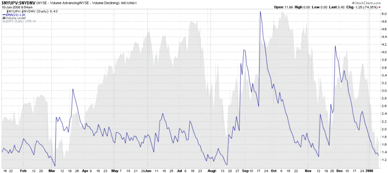
But enough silliness for now. Getting back to some chart porn, I am including the chart below not so much because the conclusions are fresh (“things are bad” or “things are about to turn,” depending upon your perspective), but because I’m fairly sure you cannot find this chart anywhere else. The chart tracks the ratio of up volume to down volume for the NYSE and uses a 21 day EMA to smooth the data. The NASDAQ version of the data looks similar, but this NYSE chart shows the potential for volume data to help call both tops and bottoms in advance. So dial up some Mahler and watch the volume.

DISCLAIMER: "VIX®" is a trademark of Chicago Board Options Exchange, Incorporated. Chicago Board Options Exchange, Incorporated is not affiliated with this website or this website's owner's or operators. CBOE assumes no responsibility for the accuracy or completeness or any other aspect of any content posted on this website by its operator or any third party. All content on this site is provided for informational and entertainment purposes only and is not intended as advice to buy or sell any securities. Stocks are difficult to trade; options are even harder. When it comes to VIX derivatives, don't fall into the trap of thinking that just because you can ride a horse, you can ride an alligator. Please do your own homework and accept full responsibility for any investment decisions you make. No content on this site can be used for commercial purposes without the prior written permission of the author. Copyright © 2007-2023 Bill Luby. All rights reserved.
 
Web Analytics