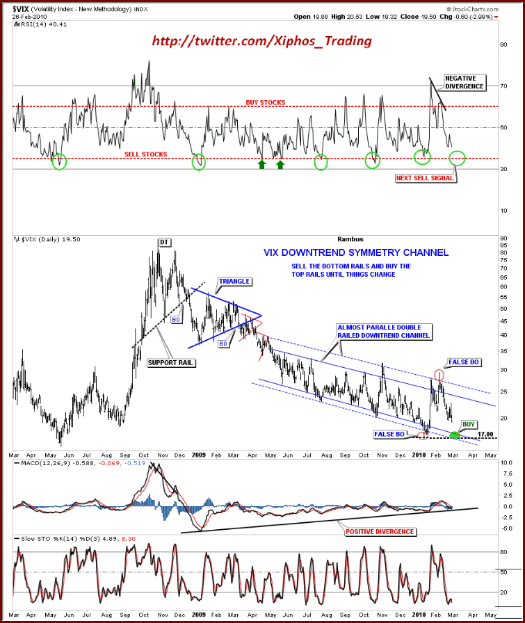
Annotated VIX Downtrend Symmetry Channel
Not surprisingly, I received quite a few VIX charts in last week’s chart of the week contest. After several reader requests, I am taking the liberty of posting some of my favorites that fell just short of the (highly subjective) gold medal, but probably should have been somewhere on the podium.
Included in the runner up list is the chart below from Rick at Xiphos Trading. In my opinion, Rick’s chart is a superb example of using the power of clean lines and annotations to turn a great deal of data into a relatively simple interpretive model with buy and sell signals that are easy to discern. Not only is the look and feel attractive, but the interpretation and conclusions are interesting as well. This chart has quite a few moving parts, but they are integrated well, with an overlay of geometry and commentary that makes the main chart and three supplementary studies easy to digest and act upon.
For more on related subjects, readers are encouraged to check out:

Disclosure(s): none

