Showing posts with label charts. Show all posts

Friday, March 5, 2010

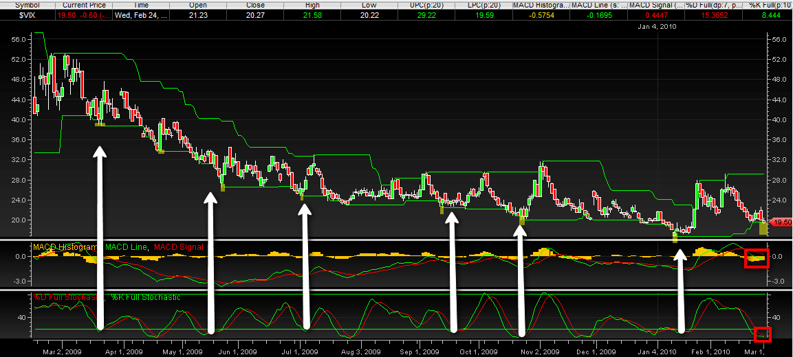
VIX Price Channel Chart

Today I am concluding my presentation of some of the charts I received as entries in last week’s chart of the week contest.

The chart below comes from Dan Glynn, who offered the following commentary:

“This is just a simple one year chart of the VIX in a price channel with MACD and stochastic indicators. Every time the VIX has broken the price channel lower line (highlighted) there has been a reversal, even in this lengthy downtrend. In addition, I have white arrows pointing from where the stochastic lines were crossing. This either coincided with the channel break or was slightly before or after. I also red boxed the most recent MACD bars, which are getting shorter. [Finally,] the distance between the last price line break and the most recent shows the most X-axis (vertical) distance [of] any other consecutive price line breaks throughout the year.”

The original version of the chart, which is larger and easier to read, can be found here.

Thanks again to all who sent in charts. This was a lot of fun for me and I will definitely do it again.

For more on related subjects, readers are encouraged to check out:


[source: Dan Glynn]

Disclosure(s): none

Thursday, March 4, 2010

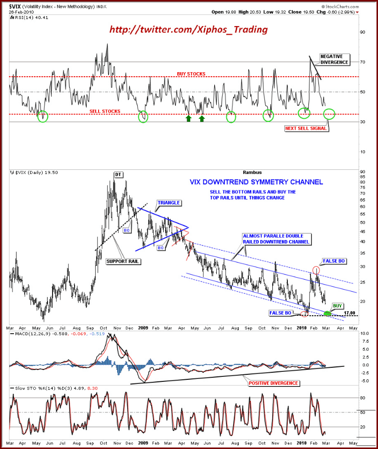
Annotated VIX Downtrend Symmetry Channel

Not surprisingly, I received quite a few VIX charts in last week’s chart of the week contest. After several reader requests, I am taking the liberty of posting some of my favorites that fell just short of the (highly subjective) gold medal, but probably should have been somewhere on the podium.

Included in the runner up list is the chart below from Rick at Xiphos Trading. In my opinion, Rick’s chart is a superb example of using the power of clean lines and annotations to turn a great deal of data into a relatively simple interpretive model with buy and sell signals that are easy to discern. Not only is the look and feel attractive, but the interpretation and conclusions are interesting as well. This chart has quite a few moving parts, but they are integrated well, with an overlay of geometry and commentary that makes the main chart and three supplementary studies easy to digest and act upon.

For more on related subjects, readers are encouraged to check out:


[source: Rick, Xiphos Trading]

Disclosure(s): none

Saturday, February 27, 2010

Charting 101

Given the dismal response to the chart of the week contest, I thought a couple of suggestions and hints might be in order to help get the graphics flowing.

For starters, creating charts is easy. Making charts that tell a compelling story only requires a little bit of insight and effort. Sometimes the best way to make a interesting chart is just to look at a bunch of them until one of them jumps off the page and forces you to take notice.

A good place to start with charting is your favorite broker. For those who like to use a third party specialty chart tool, one of the best free charting sites is at FreeStockCharts.com, where you can create an attractive chart that is as simple or complex as you wish in one or two minutes.

For those wishing to subscribe to a charting service, my personal favorite is StockCharts.com, where you can maintain a stable of charts that are customized to your liking. Non-subscribers can create a fairly comprehensive view of almost any security, ratio, etc. using gallery charts. There are a number of attractive features that are also available for free. These include an extensive group of public chart lists that are the product of some of exceptionally talented technical analysis practitioners, a ticker cloud of the most popular current charts and a sharp charts voyeur that keeps tabs on charts being created by others.

Keep in mind that with the explosion of ETFs, it is possible to slice and dice the investment universe with almost infinite precision and variation. Also, a screen capture tool such as Screen Hunter can make it easy to capture any chart for posterity.

For those who are partial to fundamental data, there is the Federal Reserve Economic Database (FRED), where you are never more than two clicks away from creating your own customized chart of economic data. The Bureau of Economic Analysis, National Bureau of Economic Reserach and U.S. Census Bureau are three of many other excellent sources for government data.

If your interests run more toward concepts and ideas, Google Trends can churn out some fascinating charts in a matter of seconds.

Finally, many providers of specialized data publish their own charts. Two that I like to refer to on a regular basis are the CBOE VIX term structure and the ISEE call to put ratio. [If you intend use a chart created by a non-governmental third party, I always recommend asking for permission in advance.]

So…the one year free subscription to Expiring Monthly: The Option Traders Journal is still up for grabs. Where is the winning chart?

For more on related subjects, readers are encouraged to check out:

Disclosure(s): I am one of the founders and owners of Expiring Monthly

Sunday, August 23, 2009

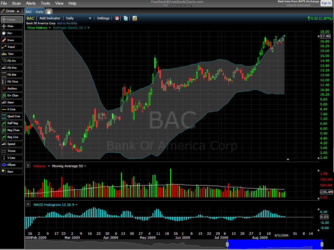
Chart of the Week: BAC Through the Eyes of FreeStockCharts.com

It has been almost six months since I have mentioned banks in the chart of the week, the so it seems as if the statute of limitations for beating dead horses has probably passed and I can talk about Bank of America (BAC) once again.

In the past few weeks, many traders have taken to using Bank of America as their market weather vane, reasoning that as Bank of America goes, so go the banks and as the banks go, so go stocks in general. For the most part, this rationale has held up and anyone who has used Bank of America to gauge the direction of the markets has likely done quite nicely. Of course, investors who were fortunate to have grabbed some BAC shares when the stock was trading below 4.00 have now seen their original investment turn into a five-bagger in just five months.

The chart below also marks the first time I have used a chart from FreeStocksCharts.com on the blog. This relatively new web site is a Worden Brothers venture – which means that it comes from the same people behind the popular TeleChart charting program. Another Worden Brothers product is StockFinder and if you are familiar with StockFinder, then you already know FreeStockCharts.com, which resembles an online incarnation of the former. In the graphic, I have captured some of the drawing tools (which include some fairly exotic tools), available at FreeStockCharts.com. There are also 52 customizable indicators (again, not just the basics), an alert function and other features of interest. In one of the great investing oxymorons, there is also a premium version of FreeStockCharts.com, with fees that are competitive with StockCharts.com.

As a StockCharts subsciber, it would take a great deal for me to switch to another charting program, but FreeStockCharts.com certainly looks like a compelling alternative at first blush. At the very least, it can provide a different color scheme and set of indicators for the blog…

For some related posts, try:

[source: FreeStockCharts.com]

Tuesday, July 21, 2009

StockCharts.com Charts on the Blog

By far, my favorite stock charting site on the web is StockCharts.com, from which quite a few screen shots have been imported into the blog.

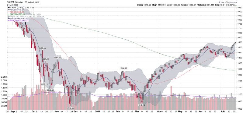
Recently I have fielded a few questions about my StockCharts charts and I wanted to spend a little time talking about the information contained in these charts. For starters, StockCharts offers what they call a “gallery view” for each ticker. This is a group of three free charts consisting of a daily chart with five months of data, a weekly chart with two years of data and a point and figure chart. StockCharts members also have a fourth intraday utilizes ten minute bars for the past four days.

While these gallery charts are an excellent starting point, the true power of StockCharts is in creating custom charts. At the bottom of this post is what I would call my “standard chart” from StockCharts, which uses daily bars over the course of the past eleven months. My standard chart utilizes candlesticks because I prefer the informational content that can be displayed in one candle. I also utilized three simple moving averages: 10 days (solid blue line) for the short-term; 50 days (dotted red line) for the intermediate-term; and 200 days (dotted green line) for the longer-term. These are widely-used moving averages and the selection is somewhat arbitrary. I prefer the 10 day to the more common 20 day because I often have a very short-term time horizon and because the 10 day is utilized heavily by traders who follow the VIX.

The gray cloud around the candlesticks is Bollinger Bands, set to 20 days and two standard deviations. I like to use Bollinger Bands to give a sense of the ebb and flow of historical volatility superimposed on the price data, rather than as a separate study above or below the main price chart. I choose to display these by area instead of the more typical lines because I want to limit the lines cluttering up the chart and give some semblance of visual clarity. According to extensive studies done by John Bollinger, one would expect 88-89% of all future daily price moves to fall within the range defined by the current Bollinger Bands – assuming, of course, the future resembles the past.

The only other graphical data on this chart is the volume data, which includes a 50 day exponential moving average line in purple, making it relatively easy to identify large volume spikes.

Finally, a reader recently asked why the y-axis is not proportional. The short answer is that charts can be plotted with a standard (proportional) y-axis or using a logarithmic axis. The benefit of a standard axis is the ease of measuring absolute changes: ten points up and ten points down are the same height. For longer periods, however, compounding distorts percentage changes, so a logarithmic axis ensures that percentage moves up and down are the same height. Consider a $100 stock. If it goes up 50% three years in a row, it ends up at 337.50 (100*1.5*1.5*1.5) a change of 227.50 points. But if the same stock goes down 50% three years in a row, it will be at 12.50, a change of only 87.50 points. On a standard y-axis, the move up 50% for three years will look 2.6 times (237.50 / 87.50) greater than the move down 50% for three years. A logarithmic axis makes sure that these percentage changes look identical to the eye. In a future post, I will talk more about logarithmic axes and use some examples to illustrate their advantages and disadvantages.

In the meantime, those with an interest in learning more about charts, high quality charts and archiving their ideas in chart form are advised to kick the tires of StockCharts.com. If you want to see some of what others have done with the available tools, check out the public charts section.
[source: StockCharts]
DISCLAIMER: "VIX®" is a trademark of Chicago Board Options Exchange, Incorporated. Chicago Board Options Exchange, Incorporated is not affiliated with this website or this website's owner's or operators. CBOE assumes no responsibility for the accuracy or completeness or any other aspect of any content posted on this website by its operator or any third party. All content on this site is provided for informational and entertainment purposes only and is not intended as advice to buy or sell any securities. Stocks are difficult to trade; options are even harder. When it comes to VIX derivatives, don't fall into the trap of thinking that just because you can ride a horse, you can ride an alligator. Please do your own homework and accept full responsibility for any investment decisions you make. No content on this site can be used for commercial purposes without the prior written permission of the author. Copyright © 2007-2023 Bill Luby. All rights reserved.
 
Web Analytics