Chart of the Week: Four Good (?) Banks
I wish there were something other than the banks to talk about for this week’s chart of the week, but until further notice, the banks are the story and it is inviting trouble to look past this fact for any period of time.
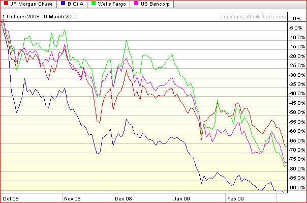
It was not too long ago that JPMorgan Chase (JPM), Bank of America (BAC), Wells Fargo (WFC) and US Bancorp (USB) were being held up as examples of four large relatively strong banks that were likely to emerge from the current financial crisis as the dominant large American banks.
At this stage of the game, it appears as if Bank of America is clearly in trouble, Wells Fargo is coming under increased scrutiny, and even stalwarts JPMorgan Chase and US Bancorp are seeing confidence and share prices eroding rapidly. Dividend cuts and insider purchases have done little to stem the tide of value destruction and comments by the Obama administration to the effect that they are strongly in favor of private ownership of the banks have provided no more than a temporary reprieve.
The chart below shows the performance of these ‘good’ banks in the post-Lehman period. During that period, JPMorgan Chase has been the top performer in the group, losing 2/3 of its value, while losses at Wells Fargo and US Bancorp are now over 75%. Bank of America is down over 90% during the same period.
Since I am on the subject, I thought I might point out that Global Finance has just compiled a list of the World’s 50 Safest Banks. The top U.S. bank on the list is Wells Fargo at #21. US Bancorp is #26, JPMorgan Chase is #47 and the only other U.S. bank on the list is The Bank of New York Mellon (BK), which comes in at #35.
[source: StockCharts]


2 comments:
Superb work
I folow your blog every day.
I ndx it`s the best market to short.
See chart. The NDX is currently the best index to get short. The ratio ndx:spx is good example, is currently testing the top of the upward channel.
http://rounderstrader.blogspot.com/2009/03/ndx-why-ndx-is-best-index-to-enter.html
Hi Carlos,
Thanks for pointing out an interesting chart -- and for the bilingual posts.
I do think the ratio is important and I am wondering two things:
1) is it significant that the NDX:SPX ratio has already begun to exceed the trend line from Nov '07 to Aug '08?
2) does the rate of change in the ratio (extremely steep slope) since the beginning of the year suggest that the current move may be more than a 'normal' oscillation within a range?
This will be interesting to watch going forward. I suspect that the NDX will be a strong participant in any rally, but if it gets dragged down like the SPX has, then the next few months could even be worse than the last few.
Cheers and thank for the comment and kudos,
-Bill
Post a Comment