Showing posts with label JPM. Show all posts

Wednesday, October 31, 2012

EuroCurrency Volatility Index (EVZ) at Lowest Level Since March 2008, Diverges from VIX

Since its launch in August 2008, the CBOE EuroCurrency Volatility Index (ticker EVZ, sometimes known simply as the “euro VIX”), which is based on the FXE ETF, has toiled in relative obscurity compared to some of the more famous volatility indices.

Given all the fears about the European sovereign debt crisis over the past few years, I find the lack of interest in EVZ to be surprising. After all, in thinking about the euro zone one of the most basic questions has been whether or not the euro will survive.  Further, outside of the U.S. at least, the future of the euro zone is still considered to be the biggest risk to the stock market.

With all this in mind, I was looking at EVZ data this evening and discovered that today marks five years since the beginning of the historical EVZ data provided by the CBOE (reconstructed data fills the gap from November 2007 to the August 2008 launch.)

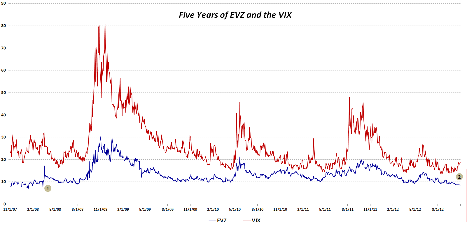
The chart below shows the history of closes in EVZ (blue line), as well as comparative closing prices for the VIX (red line.) I have annotated the chart to highlight two pieces of information:

  1. The last time that EVZ closed lower that it did today (8.55) was in March 2008, just before Bear Stearns collapsed and was sold to JP Morgan (JPM)
  2. The recent divergence between a falling EVZ and a rising VIX, which dates from the middle of September, is unusual, particularly given the length of the divergence

So…is EVZ understating the risk to the euro or is the VIX overstating the risk to stocks? Is it possible that these two measures of risk can be moving in opposite directions and both be right?

Related posts:

[source(s): CBOE]

Disclosure(s): none

Monday, October 12, 2009

Implied Volatility Flat Ahead of Bank Earnings

With some very important earnings in the financial sector coming up this week (JPM on Wednesday; C and GS on Thursday; BAC and GE on Friday), I have been watching implied volatility (IV) in the sector very closely. Much to my surprise, implied volatility has not increased ahead of earnings, as is typically the case.

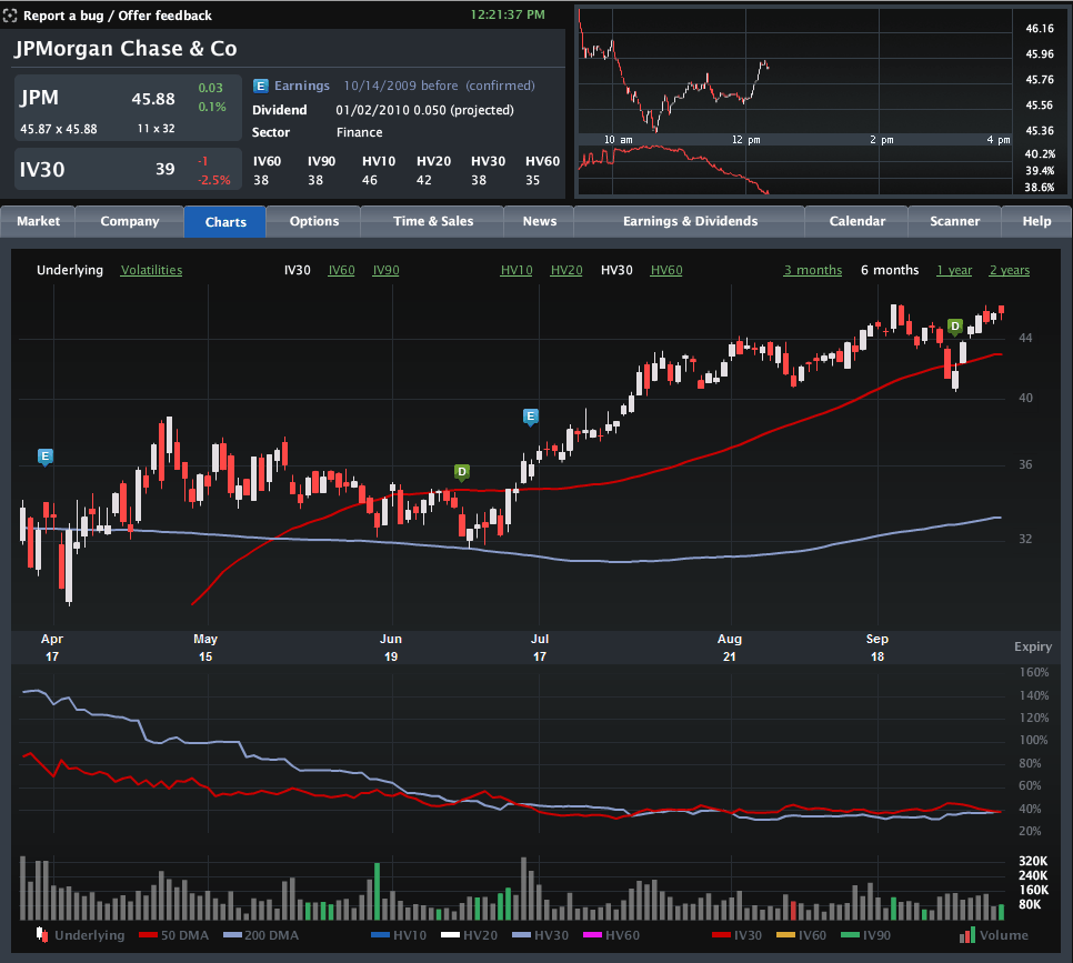
The chart below, courtesy of Livevol, shows six months of price and volatility activity in JPMorgan Chase (JPM), with the upper portion chart highlighting the last two earnings releases with the blue “E” icon. The bottom half of the chart plots 30-day implied volatility (red line) against 30-day historical volatility (light blue line) during the same period.

Note that just prior to the last two earnings reports, implied volatility rose due to the uncertainty and potential for higher volatility associated with an earnings surprise. This time around, however, the lack of movement in implied volatility – as well as the proximity of the IV level to historical volatility – suggests that investors are not expecting any surprises at all. In fact, this situation is not specific to JPMorgan, but is also mirrored at Citigroup, Bank of America, Goldman Sachs and even quasi-financial General Electric. Not surprisingly, the bank ETFs, such as KBE, and the financial sector ETF, XLF, show a similar pattern.

No matter how the current earnings season unfolds, it is difficult to imagine that there will not be any surprises. Investors who think implied volatility is underestimating the surprise potential for the banks may look to initiate long straddles or long strangles to take advantage of a potential increase in implied volatility – and hence options prices.

For some related posts on implied volatility in financials, readers are encouraged to check out:

[source: Livevol Pro]

Saturday, March 7, 2009

Chart of the Week: Four Good (?) Banks

I wish there were something other than the banks to talk about for this week’s chart of the week, but until further notice, the banks are the story and it is inviting trouble to look past this fact for any period of time.

It was not too long ago that JPMorgan Chase (JPM), Bank of America (BAC), Wells Fargo (WFC) and US Bancorp (USB) were being held up as examples of four large relatively strong banks that were likely to emerge from the current financial crisis as the dominant large American banks.

At this stage of the game, it appears as if Bank of America is clearly in trouble, Wells Fargo is coming under increased scrutiny, and even stalwarts JPMorgan Chase and US Bancorp are seeing confidence and share prices eroding rapidly. Dividend cuts and insider purchases have done little to stem the tide of value destruction and comments by the Obama administration to the effect that they are strongly in favor of private ownership of the banks have provided no more than a temporary reprieve.

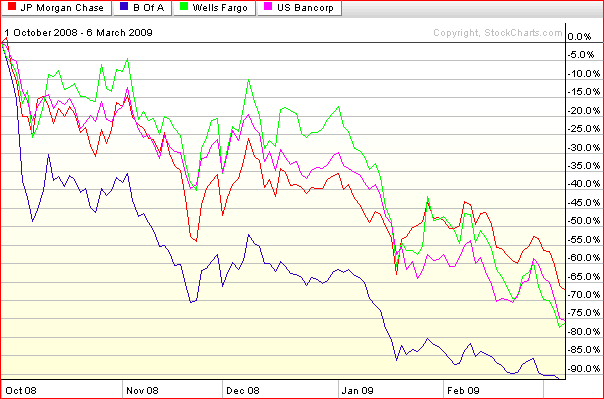
The chart below shows the performance of these ‘good’ banks in the post-Lehman period. During that period, JPMorgan Chase has been the top performer in the group, losing 2/3 of its value, while losses at Wells Fargo and US Bancorp are now over 75%. Bank of America is down over 90% during the same period.

Since I am on the subject, I thought I might point out that Global Finance has just compiled a list of the World’s 50 Safest Banks. The top U.S. bank on the list is Wells Fargo at #21. US Bancorp is #26, JPMorgan Chase is #47 and the only other U.S. bank on the list is The Bank of New York Mellon (BK), which comes in at #35.

[source: StockCharts]

Saturday, February 28, 2009

Chart of the Week: GDP Worse Than Expected

A lot happened in the markets this week: the government took a larger ownership stake in Citigroup (C); blue chip stalwarts JPMorgan Chase (JPM) and General Electric (GE) both slashed their dividends; durable goods and housing data failed to meet already lowered expectations; Q4 GDP was revised down to a 6.2% annualized drop; and the S&P 500 index fell to levels not seen since 1996.

In spite of all these body blows, the markets held up reasonably well, with the exception of the GDP data, which delivered a knockout blow Friday morning. The GDP numbers are notoriously backward-looking and the revisions to advance GDP data lend very little to the existing body of economic knowledge. That being said, Friday’s GDP numbers touched a statistical and psychological nerve for a market that was just not prepared to digest another assessment of how sharp the economic fall has been.

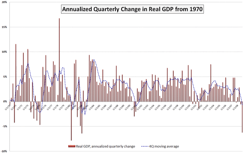
This week’s chart of the week attempts to put the most recent GDP number in historical perspective. While not shown on the chart, the raw GDP for the fourth quarter of 2008 is at approximately the level of economic activity that prevailed in June 2007. Also, while the 6.2% (annualized) drop in Q4 GDP is quite concerning, it is less than what we saw in the first quarter of 1982 (-6.4%) and the second quarter of 1980 (-7.8%). Going back even further (and not shown on the chart), GDP dropped a whopping 10.4% in the first quarter of 1958.

I have added a dashed blue line to show a four quarter moving average of GDP. By this measure, the current situation still has a way to go before it compares to 1991, not to mention the even larger four quarter dips in the 1970s and 1980s referenced above.

A survey of 43 economic forecasters published two weeks ago by the Federal Reserve Bank of Philadelphia showed expectations for a 5.2% drop in Q1 2009 GDP, followed by a 1.8% drop in Q2. Given the most recent revisions to the Q4 data, a 5.2% drop in the current quarter may be on the optimistic side, but the burning question right now is whether Q3 can show any growth at all – or at least a decrease in the rate of economic deterioration.

[source: Bureau of Economic Analysis, VIXandMore]

Monday, November 17, 2008

The Big Four U.S. Banks

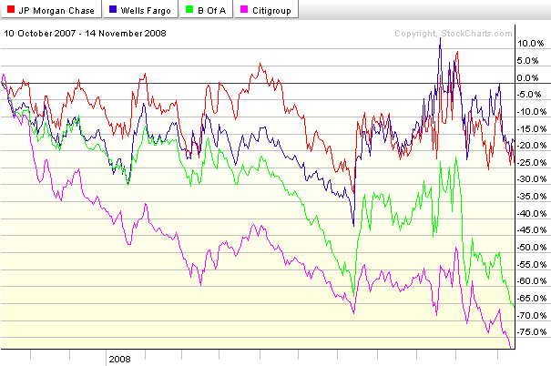
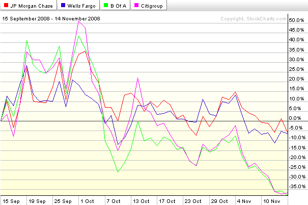
The events of 2008 have completely reshaped the landscape of the U.S. commercial banking industry. At this point it looks as if four major banks will emerge as the dominant players: two relatively strong ones; and two that face a more challenging competitive environment. Here the charts identify the players nicely. From the peak of October 2007, Wells Fargo (WFC) and JPMorgan Chase (JPM) have each fallen about 20%, less than one half of the drop in the financial sector ETF, XLF. At the other end of the spectrum are Bank of America (BAC) and Citigroup (C), each of which has seen their stock drop at least 65% during this period. See the top chart for details. Refocus to the period since the failure of Bear Stearns (bottom chart) and the pattern is even more dramatic, with WFC and JPM each down a little more than 5% while BAC and C are down over 35%.

XLF made a new low of 11.70 on Thursday and is trading at about 12.00 as I type this. If XLF and the large commercial banks are not able to scrape out a bottom, then this market will not be able to sustain any rally. Better yet, add XHB (homebuilders) and XLY (consumer discretionary sector) to that list. A sustainable rally will require the participation of XLF, XHB, and XLY.

[source: StockCharts]

Wednesday, November 12, 2008

People Trading BIDU Also Traded…

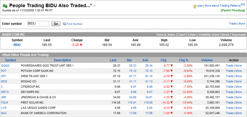
Back in September 2007, I started periodically posting snapshots from the optionsXpress Trading Patterns feature and chose to highlight the highly speculative Chinese internet search firm, Baidu (BIDU), then trading at 299, as my guinea pig. Over the course of seven months, I twice updated what traders who traded BIDU were also trading at optionsXpress when BIDU was at 380 on 10/30/2007 and when it was at 350 on 4/22/2008.

I just captured the most recent Trading Patterns update, which shows traders who are trading BIDU (currently at 185) are still active in the most volatile names in agriculture, financials, shipping, solar, and casinos. The stocks on the top ten list: Potash (POT), Mosaic (MOS), Citigroup (C), JPMorgan Chase (JPM), Bank of America (BAC), DryShips (DRYS), First Solar (FSLR), and Las Vegas Sands (LVS). Also on the list are two ETFs, QQQQ and SPY. Either optionsXpress customers have been cleaning up on the short side or they are a little early to the bull party.

[source: optionsXpress]

Thursday, October 30, 2008

Recent Volatility and VIX Macro Cycles

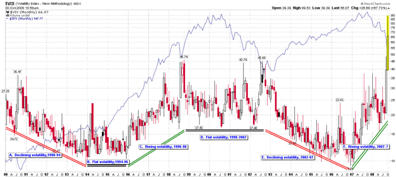
The science art of forecasting volatility more than a couple of weeks out has always struck me as a lot more like astrology than astronomy, so it was with some mild apprehension that I thought I should update my VIX macro cycle chart here and see what previous posts in this area predicted for 2008.

The good news is that in December 2007 in Was 2007 the Beginning of a New Era in Volatility?, I managed at least to nail the persistence of the recent trend by noting, “the current rise in volatility should persist through all of 2008, even if the rate of rise in volatility begins to slow.” In what looked like a much safer prediction, I said, “the rate of change in volatility over the course of 2007 is unsustainable going forward – or at least inconsistent with the slope of volatility macro cycles during previous cycles.” As the monthly chart below shows, the VIX essentially moved sideways to down from July 2007 through August 2008, at which point the recent volatility began in earnest.

My most recent VIX macro cycle update comes from March 19, 2008, just three days after Bear Stearns was sold to JP Morgan (JPM). At that point in time many believed volatility seemed to understate the gravity of the financial turmoil. For historical context, I will repeat my assessment at the time:

I still anticipate that volatility will spend a good portion of 2008 in the neighborhood of 22-26. Looking at the current VIX futures quotes, where the May through December futures are all trading just below 26, it looks as if my prediction is on the low end of the market consensus.

The big question I have is about the duration of current VIX macro cycle – and of course the slope of any continued increase in volatility. If the current slope of the volatility increase holds and the minimum cycle time is two years, that would project to a sustained VIX of about 40 by the end of the year. I don’t expect to see that scenario unfold, but it will be interesting to see how long it takes for the runup in volatility that started about 15 months ago to run out of steam.

So…7 ½ months later I can say that my prediction held up through mid-September, but once Lehman Brothers filed for bankruptcy, the LEHVIX and VIX went through the roof and my predictions went out the window.

From a macro cycle perspective the two questions to ask now are how long the current cycle of increasing volatility should last and what direction the next cycle will take. Using the historical norms of a 2-4 year cycle and considering the steep trajectory of the recent 22 months of increasing volatility, I suspect that the current cycle is nearing an end and either topped out at the beginning of the week or will see one final topping move in the next month or two.

The direction of the next move is the bigger question and the more difficult one to answer. Two of the three previous changes in volatility have ended in a multi-year sideways move. Given some of the structural and fundamental challenges currently facing the economy, the easier prediction to make seems to be several years of elevated volatility.

I am going to go out on a limb, however, and stick to my fear bubble thesis to predict that volatility will be on the wane over the course of the next two years or so. Don’t succumb to anchoring when it comes to a VIX of 70. Just two months ago the VIX was in the teens. While it may be awhile before the VIX returns to the teens, I would not be surprised if the VIX were back in the 20s in another 2-3 months.

Of course, a large part of the path forward will be strongly influenced by the policies and regulations put into place by governments that have yet to take office – all of which substantially increase uncertainty around any prediction.

[source: StockCharts, VIX and More]

Tuesday, April 15, 2008

Financials Testing Critical Support Level

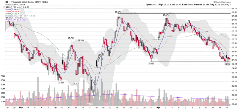
This morning, State Street (STT) reported a $3.2 billion loss on its investment portfolio and an additional $2.5 billion loss on conduits, then was placed on Ratings Watch Negative by Fitch Ratings, signaling that Fitch will review the company’s credit rating for a possible downgrade.

While the State Street news put a damper on financial stocks, XLF, the most widely followed ETF for the financial sector, is trading up as a write this. Earlier in the session, XLF tested an important March 31st low of 24.40 (see chart below) and has since bounced back. The 24.40 level is an important support level for the XLF and one to watch closely, particularly as tomorrow brings additional earnings reports from J.P. Morgan Chase (JPM) and Wells Fargo (WFC), as well as several smaller banks.

Thursday, January 24, 2008

MBI, Bond Insurers, and Volatility

One of the more interesting – and important – subplots to keep an eye on during the current market difficulties is that of the bond insurers. The two most prominent of these bond insurers, MBIA (MBI) and Ambac (ABK), are in the news today with reports that the New York Insurance Superintendent is trying to arrange a capital infusion from the likes of Goldman Sachs (GS), Merrill Lynch (MER), JPMorgan (JPM), Citigroup (C), and Wachovia (WB). Presumably, the Fed is doing some arm twisting and offering some financial incentives behind the scenes, as a failure to resolve the problems with the bond insurers would likely trigger systemic havoc and involve a long and expensive list of dominoes in the process.

Eric Dinallo, the New York Insurance Superintendent, was quoted earlier today as saying that while a rapid resolution is essential, ironing out the details of a bailout may take awhile. “It is important to resolve issues related to the bond insurers as soon as possible,” Dinallo noted, while cautioning “these are complicated issues involving a number of parties and any effective plan will take some time to finalize.”

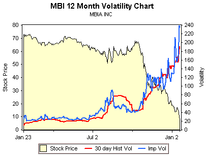
While most investors should be thinking about the bond insurer issue in terms of its impact on the broader markets, there are some interesting plays on bond issuers themselves. As reported in 24/7 Wall Street, Goldman Sachs laid out some potential valuations under three different scenarios, ranging from the bond insurers’ being unable to raise enough capital to mollify the rating agencies to a situation where the capital raised enables the bond insurers to continue to operate as they had in a pre-crisis mode. Looking just at MBI, the valuation spread ranges from $6 to $48.

Investments don’t get much more speculative than this, as the chart from optionsXpress above shows. For the record, all February puts now carry an implied volatility of more than 200. While I am not going to recommend a specific trade here, there are some fascinating options spreads and ratio spreads to look at for those who believe that the Goldman scenarios and numbers are in the ballpark.

DISCLAIMER: "VIX®" is a trademark of Chicago Board Options Exchange, Incorporated. Chicago Board Options Exchange, Incorporated is not affiliated with this website or this website's owner's or operators. CBOE assumes no responsibility for the accuracy or completeness or any other aspect of any content posted on this website by its operator or any third party. All content on this site is provided for informational and entertainment purposes only and is not intended as advice to buy or sell any securities. Stocks are difficult to trade; options are even harder. When it comes to VIX derivatives, don't fall into the trap of thinking that just because you can ride a horse, you can ride an alligator. Please do your own homework and accept full responsibility for any investment decisions you make. No content on this site can be used for commercial purposes without the prior written permission of the author. Copyright © 2007-2023 Bill Luby. All rights reserved.
 
Web Analytics