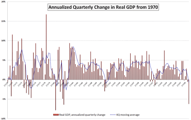
Chart of the Week: GDP Worse Than Expected
A lot happened in the markets this week: the government took a larger ownership stake in Citigroup (C); blue chip stalwarts JPMorgan Chase (JPM) and General Electric (GE) both slashed their dividends; durable goods and housing data failed to meet already lowered expectations; Q4 GDP was revised down to a 6.2% annualized drop; and the S&P 500 index fell to levels not seen since 1996.
In spite of all these body blows, the markets held up reasonably well, with the exception of the GDP data, which delivered a knockout blow Friday morning. The GDP numbers are notoriously backward-looking and the revisions to advance GDP data lend very little to the existing body of economic knowledge. That being said, Friday’s GDP numbers touched a statistical and psychological nerve for a market that was just not prepared to digest another assessment of how sharp the economic fall has been.
This week’s chart of the week attempts to put the most recent GDP number in historical perspective. While not shown on the chart, the raw GDP for the fourth quarter of 2008 is at approximately the level of economic activity that prevailed in June 2007. Also, while the 6.2% (annualized) drop in Q4 GDP is quite concerning, it is less than what we saw in the first quarter of 1982 (-6.4%) and the second quarter of 1980 (-7.8%). Going back even further (and not shown on the chart), GDP dropped a whopping 10.4% in the first quarter of 1958.
I have added a dashed blue line to show a four quarter moving average of GDP. By this measure, the current situation still has a way to go before it compares to 1991, not to mention the even larger four quarter dips in the 1970s and 1980s referenced above.
A survey of 43 economic forecasters published two weeks ago by the Federal Reserve Bank of Philadelphia showed expectations for a 5.2% drop in Q1 2009 GDP, followed by a 1.8% drop in Q2. Given the most recent revisions to the Q4 data, a 5.2% drop in the current quarter may be on the optimistic side, but the burning question right now is whether Q3 can show any growth at all – or at least a decrease in the rate of economic deterioration.
[source: Bureau of Economic Analysis, VIXandMore]


2 comments:
Could you show the chart with a 5yr MA?
President Obama outlined during each of the October 2008 Presidential debates how the U.S. automobile manufacturers would be competitive through the sale of alternative energy vehicles. He also mentioned that new jobs would be created through infrastructure spending and that the education and health care systems would be improved. No new taxes would be incurred by ninety-five percent of Americans. The U.S. and the world is looking forward to his programs achieving these goals.
Post a Comment