Showing posts with label GDP. Show all posts

Friday, May 17, 2013

The Fed, QE, the Economy and Goldilocks 2.0

It was never easy being a central banker and the job has become much more difficult over the course of the last five years or so, but right now the task of guiding monetary policy and juggling the myriad of threats to economic stability is particularly daunting.

Take the Fed, for instance. The current policy statement calls for $85 billion of bond purchases each month, until the unemployment rate is below 6.5%, as long as inflation expectations do not rise above 2.5%.

At some point, however, the Fed will have to taper its bond purchases and ultimately begin selling some of its bond holdings. The big questions surround when to begin reversing course and how dramatic the increments will be in those policy changes.

With the unemployment rate and rate of inflation highlighted as the key data points for determining the timing and magnitude of the policy changes, the task of slowing and ultimately reversing the quantitative easing policy seems reasonably straightforward, at least in theory.

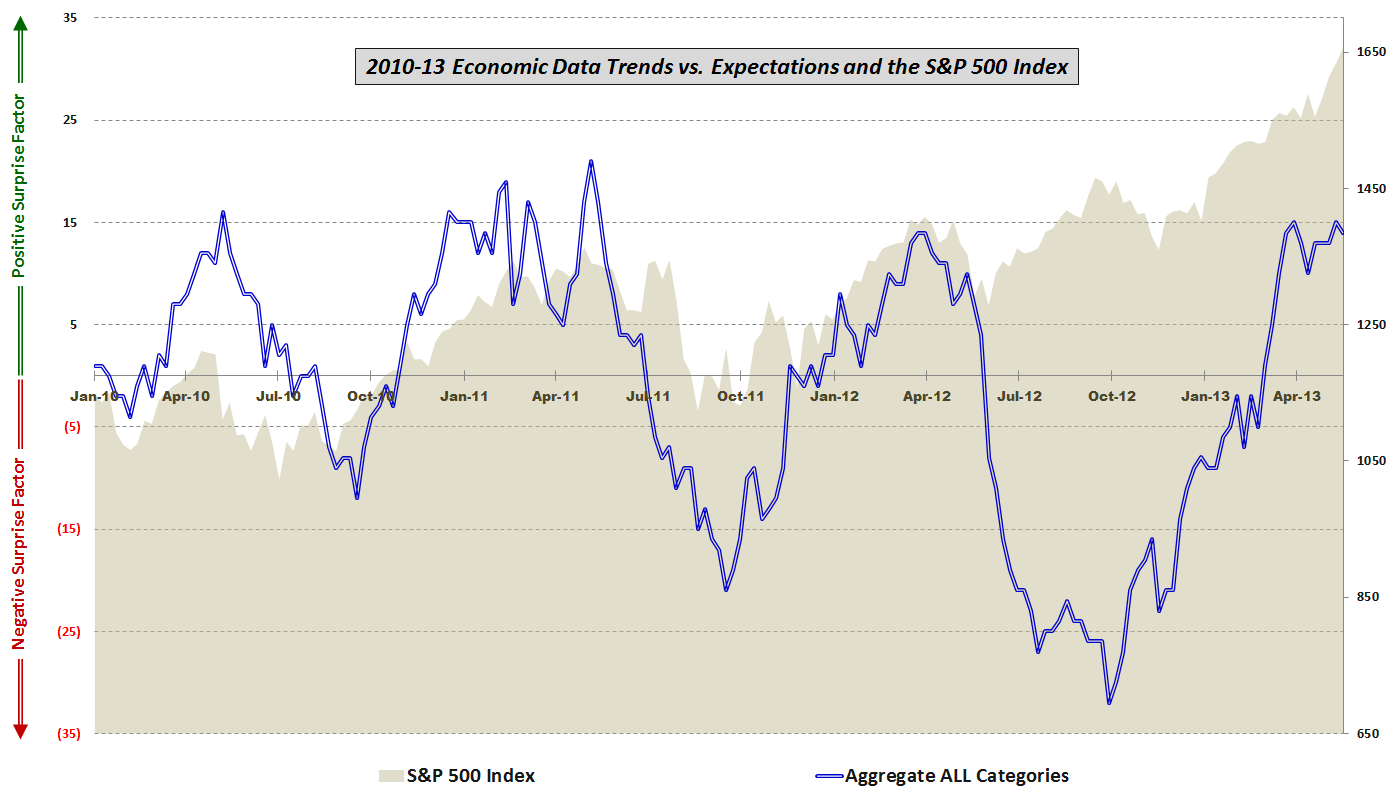
One big problem is that the unemployment rate may not be a very good gauge of the health of the economy. The chart below shows economic data reports relative to expectations over the course of the last 3 ½ years. Note that up until about a year ago, there was a very strong correlation between the performance of the S&P 500 index and whether economic data beat or missed consensus estimates. The correlation resumed when economic data turned up in the end of September, but a new divergence arose when economic data began stalling about two months ago, while stocks have been making new highs.
[source(s): various]

Looking at the five components of the economic data, one can see that for the past eight months or so there has been a favorable trend in housing/construction, employment, the consumer, and prices/inflation. As the graphic below illustrates, the one category that has been consistently missing expectations, particularly over the course of the last five weeks, has been manufacturing and general economic data, a category that includes reports such as GDP, ISM, Industrial Production, Capacity Utilization, Durable Goods, Factory Orders, Regional Fed Indices, Productivity, etc.

[source(s): various]

The problem for the Fed is that even though even though the consumer, housing / construction and aggregate unemployment rates all suggest an improving economy, the manufacturing sector and employment measures such as the labor force participation rate (official BLS graphic) paint a picture of continuing economic weakness.

As an investor, one has to guess how the Fed will handle this evolving conundrum. My general sense is that bulls will be rewarded if the economic data continue to fall slightly short of expectations and help to persuade the Fed that maintaining or perhaps even increasing bond purchases is the best policy approach – all of which should be a positive for stocks. Should economic data, particularly the employment component, begin to top estimates on a regular basis then we are left with the likely conclusion that the Fed will begin to remove the QE safety net relatively quickly. At the other end of the spectrum, if data fall well short of expectations going forward, the more perplexing conclusion is that even with its expanding toolbox, efforts by the Fed to prop up the economy are having at best a temporary effect and are also demonstrating diminishing returns. For investors, the data sweet spot going forward – or Goldilocks zone, if you will – is likely to be a series of near misses that extends the current policy indefinitely.

[Readers who are interested in more information on the component data included in this graphic and the methodology used are encouraged to check out the links below. For those seeking more details on the specific economic data releases which are part of my aggregate data calculations, check out Chart of the Week: The Year in Economic Data (2010).]

Related posts:

Disclosure(s): none

Thursday, April 1, 2010

Some More High Short Interest Stocks

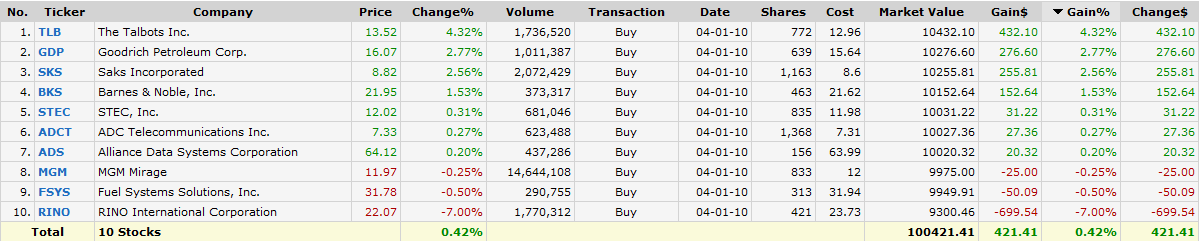
Yesterday’s Short Squeeze Portfolio One Year Later highlighted seven stocks and two ETFs which had extremely high short interest back in early March 2009. Not surprisingly, these stocks have done very well as the market and the economy have turned around.

After having the bulls in chart for some 13 months, is a similarly constructed portfolio using current data a shopping list for bulls or for bears?

Looking at the list below (which includes companies with 30% of the float short, average volumes of at least one million shares per day, as well as additional filters for optionability, minimum market cap, price, etc.), which I assembled after yesterday's close, there is a strong representation of recent high fliers (TLB, SKS) in addition to several stocks that have been underperforming as of late (GDP, STEC, FSYS). Given my bias for shorting weakness rather than strength, I will be looking most closely at the latter group as possible short candidates, while keeping an eye on retailers such as Talbots and Saks as possible buy on the dip candidates until there is better evidence that the consumer – and retail stocks – are suffering from fatigue.

For more on related subjects, readers are encouraged to check out:


[source: FINVIZ.com]

Disclosure(s): none

Saturday, February 28, 2009

Chart of the Week: GDP Worse Than Expected

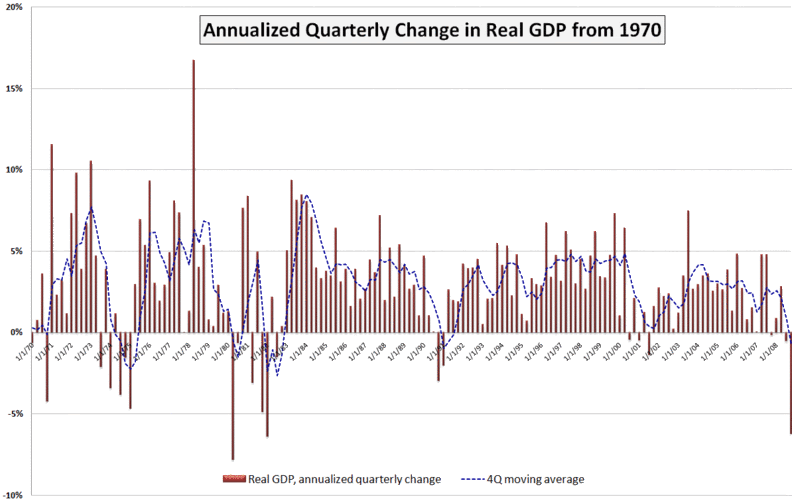
A lot happened in the markets this week: the government took a larger ownership stake in Citigroup (C); blue chip stalwarts JPMorgan Chase (JPM) and General Electric (GE) both slashed their dividends; durable goods and housing data failed to meet already lowered expectations; Q4 GDP was revised down to a 6.2% annualized drop; and the S&P 500 index fell to levels not seen since 1996.

In spite of all these body blows, the markets held up reasonably well, with the exception of the GDP data, which delivered a knockout blow Friday morning. The GDP numbers are notoriously backward-looking and the revisions to advance GDP data lend very little to the existing body of economic knowledge. That being said, Friday’s GDP numbers touched a statistical and psychological nerve for a market that was just not prepared to digest another assessment of how sharp the economic fall has been.

This week’s chart of the week attempts to put the most recent GDP number in historical perspective. While not shown on the chart, the raw GDP for the fourth quarter of 2008 is at approximately the level of economic activity that prevailed in June 2007. Also, while the 6.2% (annualized) drop in Q4 GDP is quite concerning, it is less than what we saw in the first quarter of 1982 (-6.4%) and the second quarter of 1980 (-7.8%). Going back even further (and not shown on the chart), GDP dropped a whopping 10.4% in the first quarter of 1958.

I have added a dashed blue line to show a four quarter moving average of GDP. By this measure, the current situation still has a way to go before it compares to 1991, not to mention the even larger four quarter dips in the 1970s and 1980s referenced above.

A survey of 43 economic forecasters published two weeks ago by the Federal Reserve Bank of Philadelphia showed expectations for a 5.2% drop in Q1 2009 GDP, followed by a 1.8% drop in Q2. Given the most recent revisions to the Q4 data, a 5.2% drop in the current quarter may be on the optimistic side, but the burning question right now is whether Q3 can show any growth at all – or at least a decrease in the rate of economic deterioration.

[source: Bureau of Economic Analysis, VIXandMore]

Saturday, January 31, 2009

Chart of the Week: Industrial Production in Japan

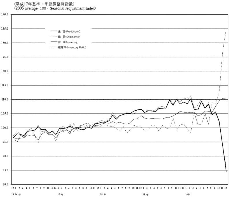
With all the hoopla over a 3.8% drop in Q4 GDP in the United States and a 2.0% decline in industrial production reported two weeks ago, this seems like a good time to remind my largely Americentric audience that things are much worse overseas, particularly in Asia.

During the week Japan reported that December industrial production fell 9.6% and South Korea reported a December decline of 18.6%. These are staggering numbers, whether one chooses to compare them to U.S. data or to historical data sets.

In this week’s chart of the week, I have elected to compare Japanese industrial production data from December 2003 to December 2008, partly because I like the look of the Japanese characters and partly because it illustrates just how dramatically Japan’s export economy declined during the last three months of 2008.

Rapidly declining industrial production may well be Asia’s next major export to the U.S.

[source: Ministry of Economy, Trade and Industry - Japan]

Thursday, November 20, 2008

The VXV and Extreme Structural Volatility Risk

In early October I set forth some of my ideas around how to think about volatility in A Conceptual Framework for Volatility Events. Today I want to briefly touch upon a topic that is tangential to that conceptual framework and closely linked to the VIX:VXV ratio that I talk about on a regular basis.

My thesis is simply this: the VIX looks out 30 days into the future and captures “event volatility” – or the volatility that is associated with events that are expected to occur in the next 30 days. These include Fed meetings, important economic data releases (employment report, consumer prices, retail sales, durable goods orders, GDP, etc.), earnings from bellwether stocks, even hurricanes, geopolitical crises and other events which can expect to cast a shadow over the course of the next 30 days.

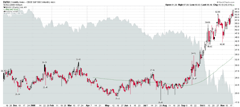
The other half of the thesis is that the VXV (essentially a 93 day version of the VIX) always incorporates a full earnings cycle and a full economic data release cycle – so these events have very little impact on the VXV. As a result, the volatility that is relevant to the VXV is structural or systemic.

If this thesis is correct, it has some interesting implications for interpreting the VIX:VXV ratio and the VXV in isolation. For instance, yesterday’s new highs in the VXV, which occurred without the VIX even coming close to a new record, suggests that traders are currently pricing in record amounts of structural or systemic risk. In the long run, this "structural volatility" is a lot more dangerous than the event risk associated with the VIX.

[source: StockCharts]

Wednesday, October 29, 2008

Is the Fear Bubble Bursting?

There have been quite a few bubbles and mini-bubbles that have burst over the past year or so. A short list would probably include China; housing; oil; fertilizer; solar; dry bulk carriers; etc.

What about a fear bubble?

We have overshot on just about everything else, so maybe it’s time we overshot the whole business of overshooting. Fear and volatility have become so much a part of the everyday existence for those who work in the investment world that it is all too easy to take them for granted.

When I see a contract on Intrade that allows people to bet on the end of western civilization, then I’ll know things have gone too far. I haven’t seen such a contract yet, but I feel obliged to note that there is a contract for The U.S. Economy to go into a Depression in 2009, with a depression defined as “a cumulative decline in GDP of more than 10.0% over four consecutive quarters.”

Looking at previous bubbles, I wonder if the fear bubble is analogous to an oil bubble. You see macroeconomic events moving inexorably in the same direction day after day and you begin to assume the future is a predestined march down what looks like an unavoidable path.

On Monday, in Fear Is on the Decline, I talked about signs I was seeing that fear was already “starting to leave the markets.” The VIX has already fallen more than 15% from Monday’s close and there is a good chance it will be at least another decade before it sees the 80s again.

Roger Ehrenberg is out with another thoughtful piece, Is Volatility Embedded in the System for a Generation? In it, Roger paints a picture of a financial crisis receding only to the point that it exposes gaping fundamental holes in the economy, the substantial risk of a Japan-style deflation, and a Fed so determined to prevent deflation that their easy money policy leads to runaway inflation and ultimately some sort of cruel game of low growth inflation-deflation ping pong.

In such an environment, which I would not consider to be too far-fetched, Roger describes a VIX of 40 as the new 20 and predicts a much higher floor for volatility in the future.

On the other hand, I am reminded of a post I titled The Big Question for the VIX back on May 22nd when the VIX closed at 18.05. The big question back then, with a financial crisis raging, oil approaching 150, and investor anxiety on the increase, was why the VIX was below 20.

Just five months ago, which was the more unlikely scenario: crude oil at 60 or the VIX at 90? It’s hard to say, but suffice it to say that it would have been hard to find the appropriate strikes to even make such a bet back then.

In the last five months, cause and effect has flipped. Not too long ago it was oil prices that were driving estimates of future economic activity and volatility, now the economy is the cause and oil, volatility and the like are the effects.

One day of 900 points gains in the Dow Jones Industrial Average will not fix all the economic woes on the horizon. It just might, however, signal an end to the runaway bull market in fear.

Wednesday, October 8, 2008

A Conceptual Framework for Volatility Events

I developed a framework to aid in thinking about volatility events awhile back and given the recent volatility, I thought it might be helpful to share that framework.

First, there are many different types of events that affect volatility. Some of these events transpire almost instantaneously according to an exact timetable that is known in advance, even if the facts are a surprise. Examples of exact-instantaneous volatility events include government economic data (e.g., tomorrow’s weekly jobless claims), corporate earnings announcements (e.g., Chevron (CVX) reports tomorrow), and yesterday's speech by Ben Bernanke. Other events unfold incrementally on a fuzzy timetable, with any number of twists and turns. Examples of fuzzy-incremental events include hurricanes (Gustav, Hanna, etc.), geopolitical crises (Georgia/South Ossetia, Iran, Iraq, etc.), and of course, the current financial crisis.

Contagion is an important aspect of volatility events. Will the event spread and trigger other related high volatility events? Sector contagion (institutional interconnectedness in the financial sector) and geographical contagion (the Asian financial crisis) are relatively common, but entity-specific problems (e.g., Enron) generally do not spread to encompass an entire sector (though they might hint at a broader previously unrecognized sector problem.)

Without diving into too much detail in this space, I will mention two other related elements of a conceptual framework for volatility events: recurrence and reversibility. Government data reports are recurring and reversible. Productivity and GDP numbers are released quarterly and are subsequently revised. FOMC announcements and same store sales numbers are recurring, but are not revised. Fuzzy-incremental volatility events are not recurring (in identical form) and are not reversible. Legal rulings, however, are not recurring and are reversible.

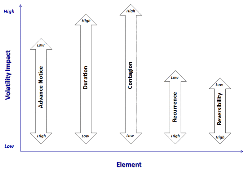
So what does this all mean? It means that most volatility events can be classified along five dimensions and those dimensions can be used to predict the magnitude of the impact that a specific event type will have on volatility.

In the graphic below, I have distilled the above into five dimensions and have provided a framework for thinking about how they impact volatility. A high volatility event would therefore generally have little advance notice (note the “Low” designation at the top of the arrow, meaning that a low level of the element translates into high volatility), have a long duration, involve a high degree of (or potential for) contagion, not be recurring, and not be reversible. Also, the contagion element normally has a greater impact on volatility than advance notice, which tends to be a more important volatility factor than reversibility, etc.

[source: VIX and More]

As always, feedback is encouraged.

DISCLAIMER: "VIX®" is a trademark of Chicago Board Options Exchange, Incorporated. Chicago Board Options Exchange, Incorporated is not affiliated with this website or this website's owner's or operators. CBOE assumes no responsibility for the accuracy or completeness or any other aspect of any content posted on this website by its operator or any third party. All content on this site is provided for informational and entertainment purposes only and is not intended as advice to buy or sell any securities. Stocks are difficult to trade; options are even harder. When it comes to VIX derivatives, don't fall into the trap of thinking that just because you can ride a horse, you can ride an alligator. Please do your own homework and accept full responsibility for any investment decisions you make. No content on this site can be used for commercial purposes without the prior written permission of the author. Copyright © 2007-2023 Bill Luby. All rights reserved.
 
Web Analytics