Showing posts with label jobless claims. Show all posts

Sunday, November 14, 2010

Chart of the Week: Uptick in the Jobs Picture

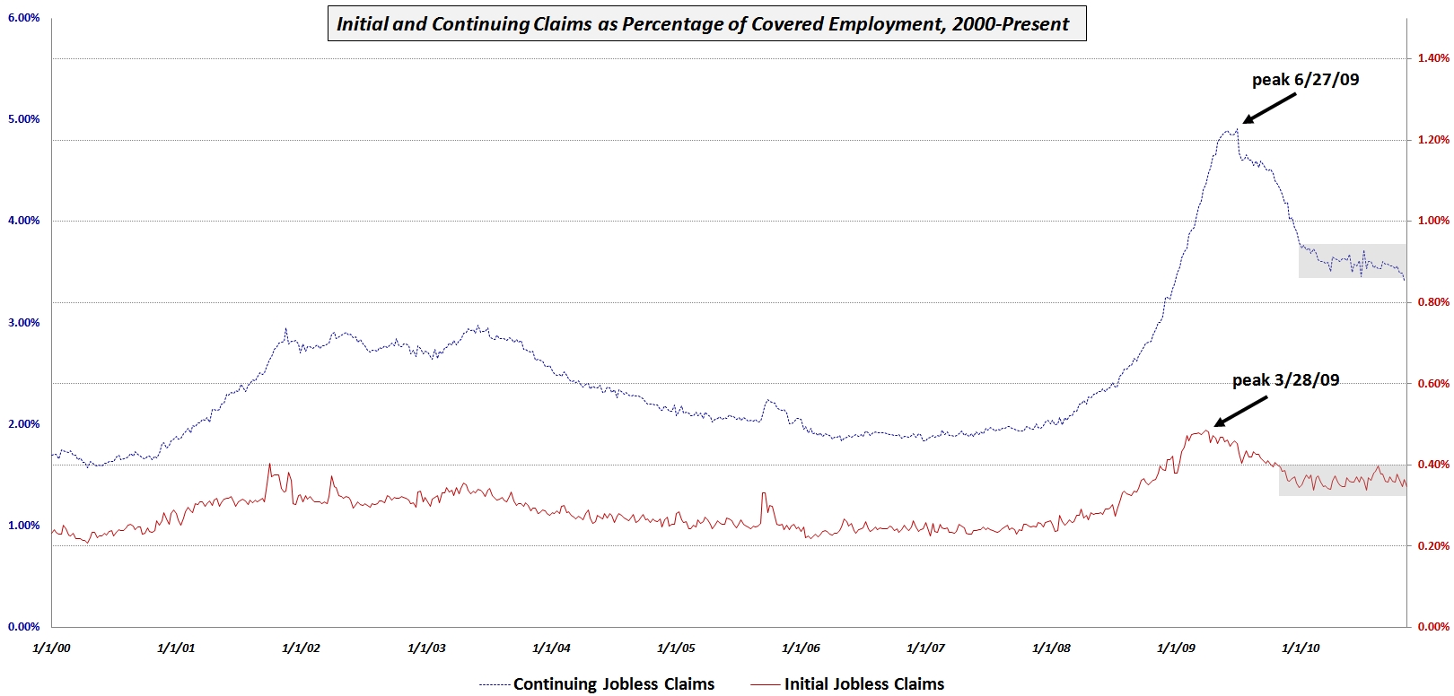
Lost in all of the attention paid to Ireland, China, Cisco (CSCO) and the week’s other headline grabbers was some signs of progress on the jobs front, specifically in the area of the weekly jobless claims data.

This week’s chart of the week shows initial and continuing jobless claims since 2000 as a percentage of total covered employment in order to adjust for the changing size of the workforce. Note that while initial claims (solid red line) peaked first in March 2009, they have been in a holding period for the last year or so. Continuing claims (dotted blue line) peaked three months later and initially showed a sharper decline. While continuing claims began to form a plateau earlier in the year, the last month or so has seen noticeable improvement, with the trend line now dropping below the gray rectangle which marks the recent consolidation area.

This improvement could be a precursor to some downward movement in the unemployment rate, which may show up as early as in this month’s data.

Related posts:


[source: Bureau of Labor Statistics]

Disclosure(s): none

Thursday, July 8, 2010

Charting Jobless Claims

Concern about the employment situation have resulted in considerable churning – both in the financial markets and in the minds of investors – about the various labor market data. The recent nonfarm payrolls report raised more questions than it answered and the weekly jobless claims numbers often suffer from a low signal to noise ratio that makes it dangerous to get too excited about one week of data.

In an effort to put the nonfarm payrolls data into some historical perspective, last week I assembled Chart of the Week: Nonfarm Payrolls and Backsliding to highlight the nonlinear aspect of much of this monthly data. Rather than wait until the end of this week, I thought it might be helpful to do something similar for the initial and continuing jobless claims data.

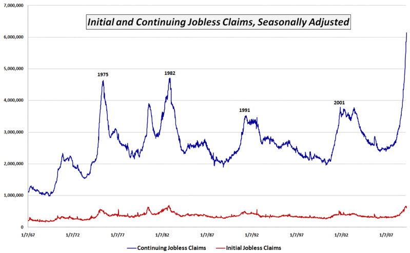
The chart below captures the jobless claims data going back to 1967. Since these are absolute numbers, it is important to note that the current universe of workers covered by unemployment insurance is almost three times as large as it was in 1967. Still, the trends have a great deal of informational value. Note, for instance, that the data are on two axes and the initial jobless claims (solid red line) seems to have settled into a holding pattern that is near the highs from the 1990-91 and 2001-03 recessionary periods.

For more on related subjects, readers are encouraged to check out:


[source: Bureau of Labor Statistics]

Disclosure(s): none

Wednesday, February 24, 2010

Nonfarm Payrolls Before and After Recessions

I was pleased to see that Sunday’s Chart of the Week: A Broader Look at the U.S. Recovery generated a good deal of interest and discussion. While I have always been a card carrying Quadropheniac, truth be told the only slice of the economy anyone is obsessing about these days is jobs. So with the weekly jobless claims numbers due out tomorrow and the February nonfarm payrolls slated for a week from Friday, this seems like an opportune time to revisit the employment situation.

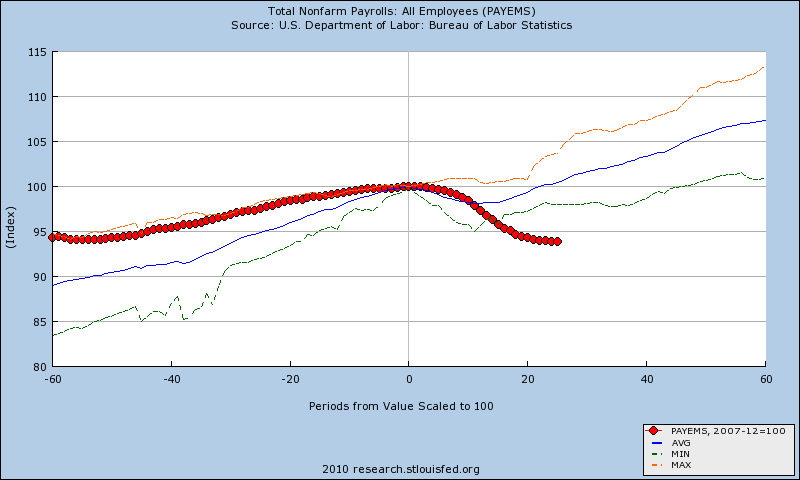
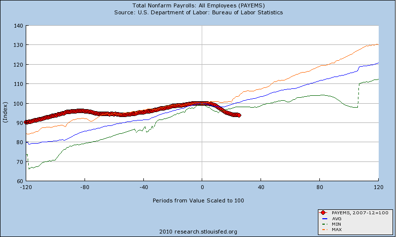
Since last Sunday’s chart measured nonfarm payrolls from 12 months prior to 27 months following the preceding business cycle peak, I have elected to take a much longer view of employment and recessions. The two charts below show employment trend data for five (top) and ten (bottom) years before and after each business cycle since 1948.

Note that in the years leading up to the December 2007 business cycle peak, job growth was relatively flat compared to the historical mean (blue line). More importantly, the performance during the current ‘recovery’ is not only anemic compared to prior post-recession job creation efforts, there is still no concrete evidence of a bottom in employment. The current economic environment is in stark contrast to prior recessions, where there economy has typically replaced all the jobs lost in the downturn at this stage and was already in a net positive job situation relative to the prior business cycle peak.

While I still anticipate that job growth will begin in the next few months, the longer this jobless recovery persists, the harder it will be to get the economy firing on all cylinders.

For more on related subjects, readers are encouraged to check out:


[source: Federal Reserve Bank of St. Louis]

Disclosures:
none

Sunday, April 26, 2009

Chart of the Week: Continuing Jobless Claims
With all the hoopla over some of the green sprouts that are appearing in the economic garden and the knowledge that it has been four weeks since initial jobless claims peaked at a level just below the October 1982 record, I wanted to provide a picture of continuing jobless claims that is very different from the more widely reported initial claims data.

The chart of the week below tracks continuing jobless claims since 1967. Whereas initial jobless claims (red line) are currently just below the 1982 record levels, continuing claims (blue line) have spiked to levels that dwarf 1982 levels by more than 30%.

Initial jobless claims are indeed an important concern, but right now the bigger problem is that existing jobless workers are having an extremely difficult time finding new work. Unfortunately, after setting new records for 12 weeks in a row, the trend in continuing claims shows no sign of letting up at this time.

[source: Department of Labor]

Wednesday, October 8, 2008

A Conceptual Framework for Volatility Events

I developed a framework to aid in thinking about volatility events awhile back and given the recent volatility, I thought it might be helpful to share that framework.

First, there are many different types of events that affect volatility. Some of these events transpire almost instantaneously according to an exact timetable that is known in advance, even if the facts are a surprise. Examples of exact-instantaneous volatility events include government economic data (e.g., tomorrow’s weekly jobless claims), corporate earnings announcements (e.g., Chevron (CVX) reports tomorrow), and yesterday's speech by Ben Bernanke. Other events unfold incrementally on a fuzzy timetable, with any number of twists and turns. Examples of fuzzy-incremental events include hurricanes (Gustav, Hanna, etc.), geopolitical crises (Georgia/South Ossetia, Iran, Iraq, etc.), and of course, the current financial crisis.

Contagion is an important aspect of volatility events. Will the event spread and trigger other related high volatility events? Sector contagion (institutional interconnectedness in the financial sector) and geographical contagion (the Asian financial crisis) are relatively common, but entity-specific problems (e.g., Enron) generally do not spread to encompass an entire sector (though they might hint at a broader previously unrecognized sector problem.)

Without diving into too much detail in this space, I will mention two other related elements of a conceptual framework for volatility events: recurrence and reversibility. Government data reports are recurring and reversible. Productivity and GDP numbers are released quarterly and are subsequently revised. FOMC announcements and same store sales numbers are recurring, but are not revised. Fuzzy-incremental volatility events are not recurring (in identical form) and are not reversible. Legal rulings, however, are not recurring and are reversible.

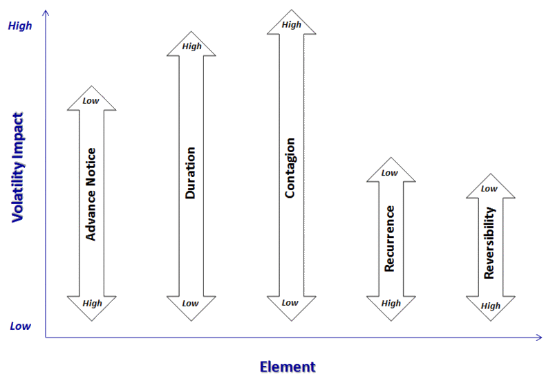
So what does this all mean? It means that most volatility events can be classified along five dimensions and those dimensions can be used to predict the magnitude of the impact that a specific event type will have on volatility.

In the graphic below, I have distilled the above into five dimensions and have provided a framework for thinking about how they impact volatility. A high volatility event would therefore generally have little advance notice (note the “Low” designation at the top of the arrow, meaning that a low level of the element translates into high volatility), have a long duration, involve a high degree of (or potential for) contagion, not be recurring, and not be reversible. Also, the contagion element normally has a greater impact on volatility than advance notice, which tends to be a more important volatility factor than reversibility, etc.

[source: VIX and More]

As always, feedback is encouraged.

DISCLAIMER: "VIX®" is a trademark of Chicago Board Options Exchange, Incorporated. Chicago Board Options Exchange, Incorporated is not affiliated with this website or this website's owner's or operators. CBOE assumes no responsibility for the accuracy or completeness or any other aspect of any content posted on this website by its operator or any third party. All content on this site is provided for informational and entertainment purposes only and is not intended as advice to buy or sell any securities. Stocks are difficult to trade; options are even harder. When it comes to VIX derivatives, don't fall into the trap of thinking that just because you can ride a horse, you can ride an alligator. Please do your own homework and accept full responsibility for any investment decisions you make. No content on this site can be used for commercial purposes without the prior written permission of the author. Copyright © 2007-2023 Bill Luby. All rights reserved.
 
Web Analytics