Chart of the Week: Uptick in the Jobs Picture
Lost in all of the attention paid to Ireland, China, Cisco (CSCO) and the week’s other headline grabbers was some signs of progress on the jobs front, specifically in the area of the weekly jobless claims data.
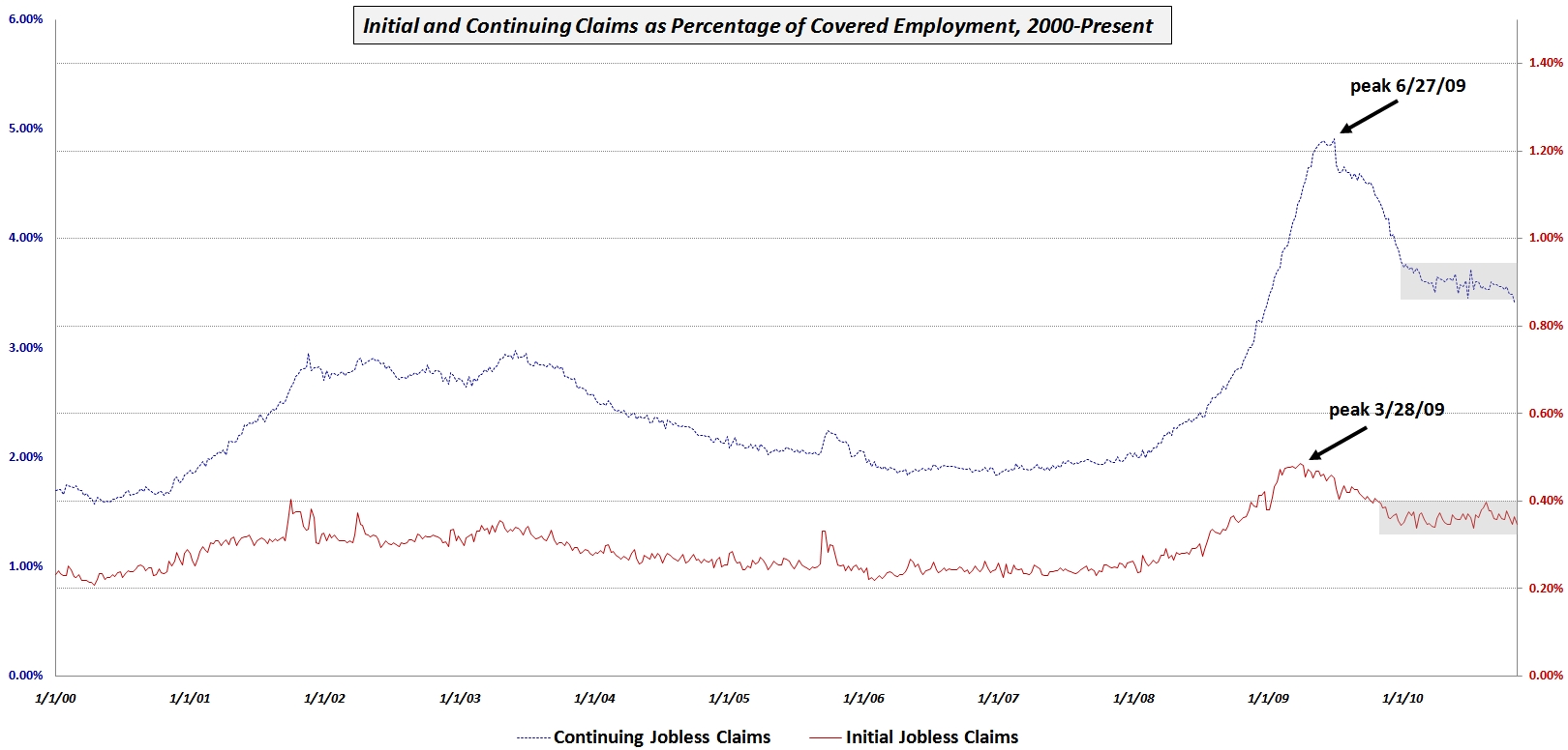
This week’s chart of the week shows initial and continuing jobless claims since 2000 as a percentage of total covered employment in order to adjust for the changing size of the workforce. Note that while initial claims (solid red line) peaked first in March 2009, they have been in a holding period for the last year or so. Continuing claims (dotted blue line) peaked three months later and initially showed a sharper decline. While continuing claims began to form a plateau earlier in the year, the last month or so has seen noticeable improvement, with the trend line now dropping below the gray rectangle which marks the recent consolidation area.
This improvement could be a precursor to some downward movement in the unemployment rate, which may show up as early as in this month’s data.
Related posts:
- Charting Jobless Claims
- Chart of the Week: Nonfarm Payrolls and Backsliding
- Nonfarm Payrolls Before and After Recessions
- Chart of the Week: Updated Nonfarm Payrolls and Unemployment Rate
- Chart of the Week: Nonfarm Payrolls, Unemployment Rates and Time
- Chart of the Week: Putting Nonfarm Payrolls in Context
- Chart of the Week: Continuing Jobless Claims


