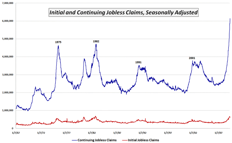
Chart of the Week: Continuing Jobless Claims
With all the hoopla over some of the green sprouts that are appearing in the economic garden and the knowledge that it has been four weeks since initial jobless claims peaked at a level just below the October 1982 record, I wanted to provide a picture of continuing jobless claims that is very different from the more widely reported initial claims data.
The chart of the week below tracks continuing jobless claims since 1967. Whereas initial jobless claims (red line) are currently just below the 1982 record levels, continuing claims (blue line) have spiked to levels that dwarf 1982 levels by more than 30%.
Initial jobless claims are indeed an important concern, but right now the bigger problem is that existing jobless workers are having an extremely difficult time finding new work. Unfortunately, after setting new records for 12 weeks in a row, the trend in continuing claims shows no sign of letting up at this time.

[source: Department of Labor]


6 comments:
The size of the working force is a variable in this chart, is there a chart with normalized or % of workforce submitting jobless claims versus time?
Cheers.. Pankaj
Hi Pankaj,
You are correct that normalized data would be more helpful for comparing different eras. I have the relevant data and will post a revised chart sometime in the future.
Cheers,
-Bill
based on a very crude measuring system - holding my ruler against the screen - it looks like the little red line at the bottom tends to peak before the big red line.
Douglas, that makes sense, continuing claims should always lag initial claims. I don't pay much attention to the overall unemployment rate, initial claims is what I look for. We could stabilize here and still have unemployment go up to 10%.
On another note, I care about the overall unemployment rate when evaluating companies like AXP.
Long AXP Puts
I was not sure whether my comments would be understood because I couldn't remember whether you Americans use the word ruler.
But now more seriously I have question for Bill. The VXO went up quite a lot today compared with both the S&P decline and the VXO rise. Why was that? Was the VIX just moving more into line with where the VXO is now - for a while the VIX has seemed lower than usual compared with the VXO.
(by the way I should have said 'blue line' in my previous comment.)
Well, if the initial jobless claims is such a great indicator then why did everyone miss the crash of 2008-2009?
Post a Comment