Chart of the Week: VXV and Systemic Failure
When it comes to the chart of the week, anything goes. Now it its six month, this regular feature can highlight anything from an important economic data release to interest rates, bonds, index performance, market internals and even my strange and unusual ratios. My intent has been to keep volatility in the loop, but generally cast a wide net each week.
This week I am focusing on volatility, but probably not a measure that many readers pay attention. Specifically, I am speaking of the VXV. This index is essentially a 93 day version of the VIX, but for those who are interested in further digging, a good place to start is with my December 2007 Thinking About the VXV.
One reason I think the VXV is worth following is that I believe it gives a better perspective on structural volatility and systemic risk than its short-term counterpart, the VIX. For more on this subject, I encourage readers to check out my November 20, 2008 post, The VXV and Extreme Structural Volatility Risk.
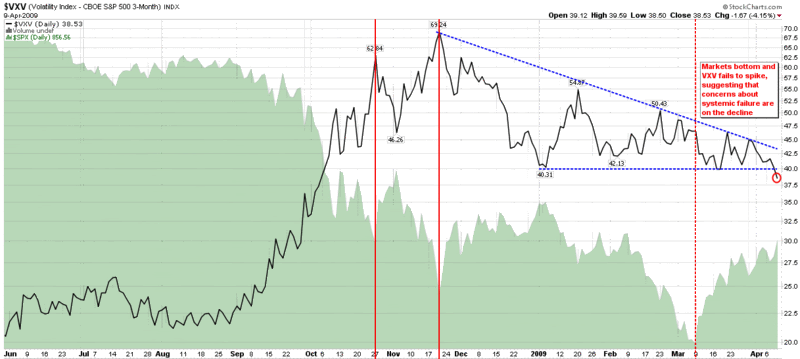
All this brings us to the chart below. The quick takeaway is that according to the VXV, structural volatility and systemic risk peaked on November 29th and has been in a decline ever since, as the dotted blue descending triangle reflects. I have also included three vertical red lines to show significant market bottoms. The first two generated significant VXV spikes and were eventually violated. The most recent bottom, which resulted in the SPX hitting 666, is shown with a dashed vertical red line. An important feature of that bottom is that the VXV did not spike, suggesting that there was no increase in systemic risk – perhaps part of the reason why the 666 bottom has held.
Finally, note that as of Friday (red circle), the VXV has dropped to levels not seen since the first week in October. The key takeaway: systemic healing is continuing and the risk of systemic failure is diminishing. When the VXV is able to make it back below 30, I suspect this will be an indication that systemic risk is once again at a manageable level.

[source: StockCharts]


11 comments:
I enjoy your posts, but your charts are always truncated on the right side of the page, losing about 10% of the chart. Any suggestions on how to fix this? Thanks for all the good work.
Hi Anon,
Unfortunately, it's usually the last 10% of the chart that includes the punch line...
Regarding the chart problem, I'm afraid my graphics are not compatible with all monitors. My apologies for the inconvenience.
The easiest workaround is to right click on the image, highlight "Copy Image Location," and paste the link into a new browser window.
I hope this helps.
Thanks for reading and thanks for the kind words.
Cheers,
-Bill
Hey Bill,
Be careful, dont assume the absence of volatility is the absence of risk. From 03' to 08' vol was low and risk was building like dynamite. Government gurantees can be put to the test.
James
hi bill
i am from india and a great fan of yours. Here in india nifty we dont have such advance parameters like vxv and only have india vix by nse( www.nseindia.com).
can i take 93 day ma of vix and calculate on excel sheet the vxv and which may guide me in furthur decision making?
Kindly guide.....
regards
I think we may be "sanctifying" the VIX when we say it measures fear because when the VIX soars, it means investors bought lots of SPX puts in a hurry. Why did they do so? Because they thought it could make them money. Look: shorting is the best way to make money, right?, and when you short you'll want to buy puts as well so you can make even more money. So when the VIX soars it simply means the short-sellers are making money and there may not actually be that much fear in the market per se. That's why I view the VIX as simply a way that measures how much investors think they can make money by shorting. That's all.
Hello, Greetings for a Happy Easter to you and Family
For seeing the chart: I have no problem if I use internet explorer. If I use firefox, the last 10% of the graph disappeas. My simple fix is to reduce the font size. (ctrl-minus)
hope this help, annoy 4:31pm
Man
i just right click and then click view image
himanshu:
I would suggest you use VIX's formula and use the first three months' options of (the Indian equivalent of) SPX to calculate the Indian equivalent of VXV. Please refer to CBOE's white paper for details. The formula may look complicated but it's actually not that bad and it definitely can be implemented in an Excel spreadsheet. Or Matlab. Or you could even write your own C++ program to calculate it. This is how I would suggest you do it.
That said, I personally don't think VXV will help you that much in trading because in trading you still have to do it one day at a time so it's VIX that counts and not VXV. Besides, SPX options are traded briskly so by the time you reach a day where the 3rd month is the front month you'll find the VIX calculated now is completely different from the VXV you calculated three months ago. That's why VXV may not matter that much in trading.
Thanks for all the comments.
James, I agree that the VIX is at best a single risk proxy and not an all-knowing one at that.
Himanshu,
I will see if I can answer your question in more detail in an upcoming post, but Anon is correct. If you are interested in replicating the VXV in an index such as the Nifty, historical data (such as moving averages) will be of no use. You need to focus on options that are 3-4 months out and look at implied volatility data for those options.
I will publish an example soon.
Cheers,
-Bill
Keep on working, great job!
Also visit my website - Cheap Oakley Sunglasses
Post a Comment