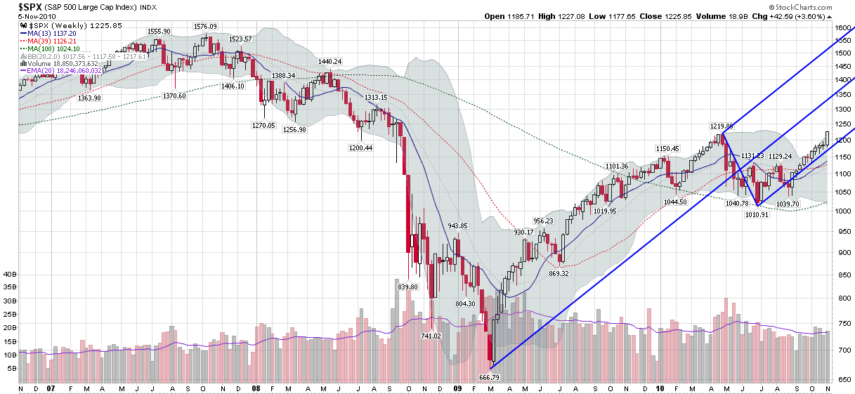
Chart of the Week: Andrews Pitchfork View of SPX
I occasionally feature charts with an Andrews Pitchfork in my subscriber newsletter and I am always surprised by how favorable the reaction is. I am not sure why this is the case, but my hunch is that part of the reason has to do with the relative rarity of Andrews Pitchfork charts.
So…in thinking about the week’s market activity and searching for a fresh approach to evaluating the recent movements in stocks, I elected to take a Neptunian approach with the Andrews Pitchfork below.
This week’s chart of the week incorporates four years of weekly SPX bars in order to capture the full extent of the fall from the 2007 highs to the 2009 lows in order to put the recent rise in perspective.
As the chart shows, the Andrews Pitchfork has captured almost perfectly the slope (at least as shown on the semi-log scale below) of the rally in stocks over the course of the last ten weeks. Note that in order for the Andrews Pitchfork to continue to be relevant, stocks will have to continue to rise at their recent rate in order to stay above the bottom prong, which means that looking forward, this graphic will likely have a short half-life.
In a general sense, pitchforks can be a valuable tool for evaluating the strength and sustainability of continuation moves. The slope of the current strikes me as unsustainable, but it will be interesting to see how long the current trend can last.
Related posts:


