Chart of the Week: Four Key Economic Indicators
For the second week in a row, the chart of the week focuses on economic fundamentals. This week I am featuring a graphic from the Federal Reserve Bank of St. Louis, that attempts to summarize current recession in terms of industrial production, real income, employment and retail sales.
Starting from a business cycle peak of December 2007, the graphic below is an effort to normalize and rescale the economic data by assigning an index value of 100 to December 2007 numbers for each of the four statistics, so that comparative changes are easier to evaluate. Note that for each series, the average, high and low values are plotted for each month following the prior business cycle high. For industrial production, employment, and real retail sales, the average series includes the 10 recessions starting with the November 1948 business cycle peak. For real income, the average starts with the April 1960 peak.
In terms of conclusions, the current recession is establishing new lows for industrial production, employment and retail sales. Curiously, real income, while low, is not even approaching record lows.
Note also that in prior recessions, employment and retail sales have usually started to rebound by now, with real income and industrial production taking longer to bottom.
Going forward, it will be interesting to see how long some of these indicators continue to set record lows and how long before they rebound to the levels of the “average recession’”
[As an aside, for those looking for a top notch repository of raw Federal Reserve economic data and some native charting capabilities, the St. Louis Fed’s Federal Reserve Economic Data (FRED) site should probably be your first stop.]
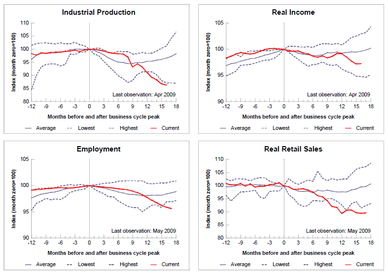
[source: Federal Reserve Bank of St. Louis]


10 comments:
Even though those graph are showing down sloping trend. Still, government number can not be trusted... All numbers are rigged... And our FED is just one big crook! And now Obama wants to give it more power?! WTF...
i wonder if Real Income includes Government Transfer Payments which are at record levels since the Great Depression ( check it out HERE )
Thanks for the link, Celal. Without looking up the details, I suspect that transfer payments are included -- and your graph (which deserves a click) helps to explain how $17,000 in transfer payments per household has helped to cushion the income blow.
Of course, dramatically increasing transfer payments is not sustainable over the long-term...
Cheers,
-Bill
Keep on working, great job!
Also visit my site exercises to improve vertical leap
I always emailed this website post page to all my associates, as if like to read it after that my links will too.
Also visit my page; dunk a basketball
What's up, I want to subscribe for this web site to obtain newest updates, therefore where can i do it please assist.
Here is my webpage: workouts to improve vertical leap
Great beat ! I wish to apprentice while you amend your website, how could i
subscribe for a blog site? The account helped me a acceptable deal.
I had been a little bit acquainted of this your broadcast provided bright clear concept
Check out my blog post http://gujaratayurveda.com/groups/several-workouts-that-will-improve-your-vertical-jump
Hey there! Someone in my Myspace group shared this website with us
so I came to look it over. I'm definitely loving the information. I'm
bookmarking and will be tweeting this to my followers!
Fantastic blog and terrific design and style.
My blog post: workouts for vertical jump
Great post. I was checking continuously this blog and I am impressed!
Extremely helpful information specifically
the last part :) I care for such information much. I
was looking for this particular info for a very long time.
Thank you and good luck.
Feel free to visit my webpage ... http://tintaespana.com/wikka/RubyjtEstesgt
It's really useful and informative, thanks a lot.
Post a Comment