Showing posts with label retail sales. Show all posts

Sunday, November 28, 2010

Chart of the Week: The Resurgent Consumer and Holiday Shopping

During the first half of 2010, a recovery in manufacturing helped to lift stocks. When manufacturing plateaued, stocks gave up their gains. Now it looks like manufacturing may be picking up again, but it has been consumer spending that has been responsible for much of the recent rise in equities.

There are two large ETFs devoted to retailers, XLY and XRT. While neither is a great proxy for the types of stores most likely to compete for our holiday shopping dollars, they will both pick up the major trends. I tend to have a slight preference for XRT over because XRT has more holding and these are more equally distributed. The top holding for XLY, for instance, is McDonalds (MCD).

In this week’s chart of the week below, I show the performance of XRT over the course of 2010. Note that earlier in the month XRT broke above its April high and has continued to maintain a bullish trajectory since then. Of particularly interest is the sector’s performance relative to the S&P 500 index (top study), which has been very strong since stocks began to rally in the beginning of September.

With the holiday shopping season off to a good start, XRT makes an intriguing momentum play and should be a barometer of the strength of U.S. consumer throughout the holiday season.

Related posts:


[source: StockCharts.com]

Disclosure(s): none

Monday, September 13, 2010

Chart of the Week: Updated Economic Data Trends

First unveiled on July 2nd in Trends in Economic Data Relative to Expectations, I was pleasantly surprised by the positive reception to my chart of how various components of economic activity have been tracking against expectations for 2010. As a result, I expect to periodically update a version of this chart for the blog.

This week’s chart of the week is one such update, selected partly because the last several weeks suggest a possible reversal in the negative trend of economic data relative to expectations for employment and the consumer (Retail Sales, Consumer Confidence, Consumer Sentiment, Personal Income, Personal Spending, etc.)

While there is some evidence that the downtrend in economic data may have been broken, there is at best marginal evidence to support the idea of a bullish uptrend in the data. Starting tomorrow with the retail sales numbers, this week should go a long way toward answering some of the questions about what the data say about the state of economic activity in the United States.

Related posts:


Disclosure(s): none

Friday, August 13, 2010

Retail Sales Since 1992

The chart below looks at retail sales (seasonally adjusted, including food services) going back to 1992 and updates a similar chart from February, Chart of the Week: Retail Sales Recovering.

The February headline no longer applies six months later, as retail sales fell on a month-over-month basis in both May and June, though data released today show a 0.4% uptick in July that translates into a year-over-year advance of 5.6%, as shown in the red line in the chart below.

When all is said and done, it will be the consumer who decides whether the economy grows, shrinks or maintains a holding pattern over the course of the next year or so. For now at least, consumers appears to be holding their cards close to the vest. Whether any of those are trump cards remains to be seen…

For more on related subjects, readers are encouraged to check out:


[source: Census Bureau]

Disclosure(s): none

Friday, June 25, 2010

A German Perspective on the Recovery

Yesterday, in Fundamentals and the Recovery, I offered up a snapshot of the recovery in the United States in terms of industrial production, income, employment, and retail sales.

Today, I thought I’d at least temporarily jettison my overly Americentric view of the investment universe and look at the recovery in the same areas through the eyes of Germany. As the graphic below shows, relative to past periods of economic recovery, the current recovery looks more typical than atypical. With a continued weak euro, I would not at all be surprised to see the performance of the German economy to begin to accelerate to the upside, which would bode well for the Germany ETF, EWG.

Of course, the bigger issue may turn out to be the exposure of German banks to Greece and some of the other troubled euro zone economies, per a recent Wall Street Journal, Data Show Big Exposure for Banks in Euro Zone.

For more on related subjects, readers are encouraged to check out:


[source: Federal Reserve Bank of St. Louis]

Disclosure(s): none

Thursday, June 24, 2010

Fundamentals and the Recovery

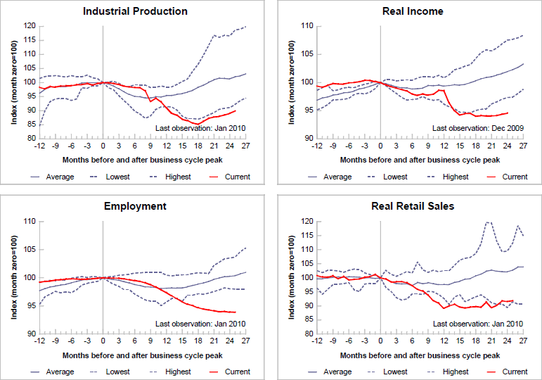
On several occasions in the past, I have leaned on the Federal Reserve Bank of St. Louis for a graphical representation of the current state of the economic recovery. The last time around, about four months ago in Chart of the Week: A Broader Look at the U.S. Economic Recovery, I observed:

“Relative to previous recoveries, which typically follow a bottom that comes some 8-12 months after the top, the current recovery is by far the weakest in the 62 years of data for employment and real income. Industrial production has shown the sharpest rebound, but is still the weakest bounce in 62 years. The only one of the four indicators that is above the historical low is retail sales – yet even here the margin is a narrow one.”

Looking at an updated version of industrial production, income, employment, and retail sales, I am surprised by the signs progress. Now both industrial production and retail sales are near the historical averages for all a recoveries [prior graphs showed performance following a prior business cycle peak] and both employment and income have started to move above historical lows.

The data in the graphic below do not yet reflect the changes in the economy following the expiration of the federal housing tax credit, nor the recent developments in the European sovereign debt crisis. This is undoubtedly a weak recovery, but so far at least, not as bad as many feared it would be.

For more on related subjects, readers are encouraged to check out:


[source: Federal Reserve Bank of St. Louis]

Disclosure(s): none

Sunday, February 21, 2010

Chart of the Week: A Broader Look at the U.S. Economic Recovery

Last week, in Chart of the Week: Retail Sales Recovering, I attempted to demonstrate that the much beleaguered U.S. consumer has actually been a relative source of strength during the economic recovery.

In this week’s chart of the week, my goal is to expand that relatively narrow view of economic activity to encompass four key recession indicators that cut across a broad scope of economic activity: industrial production; income; employment; and retail sales.

Note that relative to previous recoveries, which typically follow a bottom that comes some 8-12 months after the top, the current recovery is by far the weakest in the 62 years of data for employment and real income. Industrial production has shown the sharpest rebound, but is still the weakest bounce in 62 years. The only one of the four indicators that is above the historical low is retail sales – yet even here the margin is a narrow one.

The rather simplified question suggested by this data puzzle is whether retail sales and industrial production will pull incomes and employment up or whether weak employment and income trends will drag down retail sales and industrial production.

For comparison purposes, it may be interesting to look at a chart of the same data as of eight months ago.

For more on related subjects, readers are encouraged to check out:


[source: Federal Reserve Bank of St. Louis]

Disclosures: none

Monday, February 15, 2010

Chart of the Week: Retail Sales Recovering

With all eyes seemingly focused on Europe last week, it seems as if investors largely ignored the new economic data coming out of the United States.

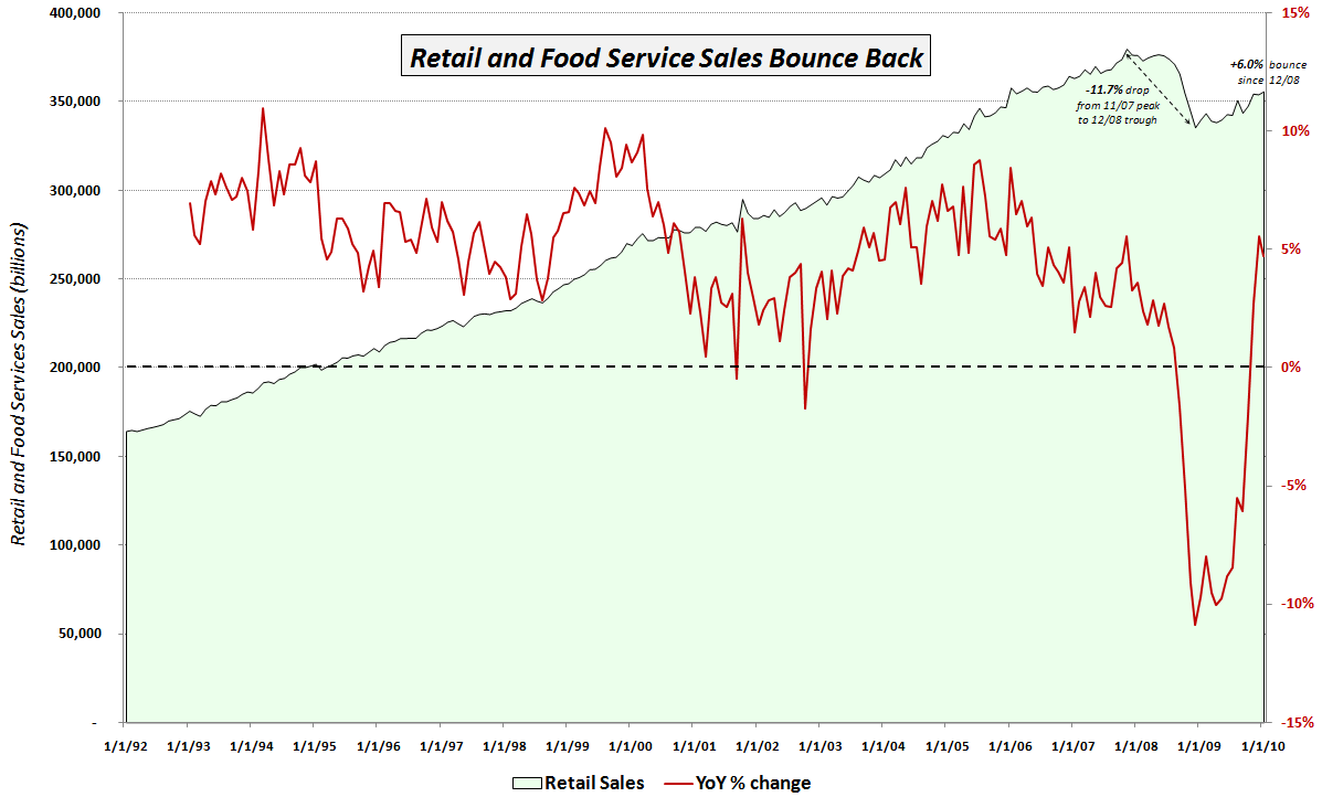
I consider the most important of the new pieces of economic data to be the January retail sales report, which showed retail sales increasing 0.5% on a month-over-month basis (consensus estimate +0.3%) and 4.7% on a year-over-year basis.

The chart of the week below attempts to put the recent retail sales numbers into a meaningful historical context. Since the media generally only reports the month-over-month change from the Census Bureau press release, I thought I would add a couple of my own twists. First, the green area data series below captures the aggregate retail and food service sales in green going back to 1992. Note that until the beginning of 2009, there was never a sustained dip in retail sales. The red line overlays the year-over-year percentage change in retail sales. Given the relatively shallow historical dips, this number was never only negative twice prior to 2008: once in 2001; and a second time in 2002.

Starting in September 2008, the year-over-year change in retail sales was negative for 14 consecutive months. That streak was finally broken in November 2009, but when retail sales slipped during December, there were rumblings about the sustainability of the bounce in retail sales. January’s positive surprise has at least temporarily shelved some of those concerns and brought new buyers into the retail sector, where the two 800 lb. gorilla ETFs (XRT and XLY) have seen renewed interest.

The chart also annotates the 11.7% drop in retail sales from the October 2007 peak to the December 2008 cycle low. Since the low, retail sales have bounced 6.0% or 2.7% in real terms. It will likely be another year or two before retail sales return to their October 2007 highs, but to this point, the consumer has been much more resilient than many pundits had expected.

For more on related subjects, readers are encouraged to check out:


[source: Federal Reserve Bank of St. Louis]

Disclosures:
none

Sunday, June 14, 2009

Chart of the Week: Four Key Economic Indicators

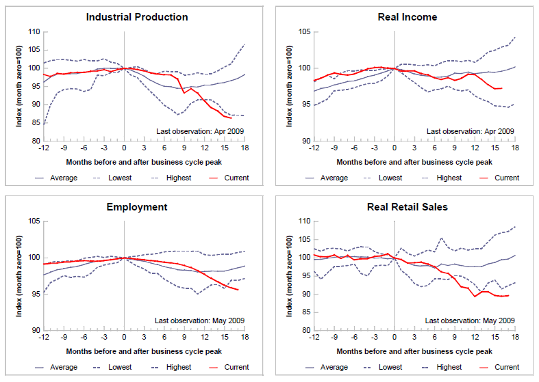
For the second week in a row, the chart of the week focuses on economic fundamentals. This week I am featuring a graphic from the Federal Reserve Bank of St. Louis, that attempts to summarize current recession in terms of industrial production, real income, employment and retail sales.

Starting from a business cycle peak of December 2007, the graphic below is an effort to normalize and rescale the economic data by assigning an index value of 100 to December 2007 numbers for each of the four statistics, so that comparative changes are easier to evaluate. Note that for each series, the average, high and low values are plotted for each month following the prior business cycle high. For industrial production, employment, and real retail sales, the average series includes the 10 recessions starting with the November 1948 business cycle peak. For real income, the average starts with the April 1960 peak.

In terms of conclusions, the current recession is establishing new lows for industrial production, employment and retail sales. Curiously, real income, while low, is not even approaching record lows.

Note also that in prior recessions, employment and retail sales have usually started to rebound by now, with real income and industrial production taking longer to bottom.

Going forward, it will be interesting to see how long some of these indicators continue to set record lows and how long before they rebound to the levels of the “average recession’”

[As an aside, for those looking for a top notch repository of raw Federal Reserve economic data and some native charting capabilities, the St. Louis Fed’s Federal Reserve Economic Data (FRED) site should probably be your first stop.]

[source: Federal Reserve Bank of St. Louis]

Wednesday, June 10, 2009

Historical Volatility Continues to Plummet

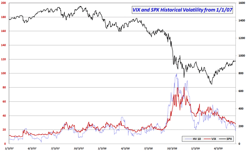
Further to this morning's pre-market post, Volatility in Context with VIX at Pose-Lehman Low, today’s 0.35% drop in the SPX means that it has now been four days since the S&P 500 index has moved more than 0.35%.

The range-bound trading is taking a heavy toll on historical volatility (HV), with today’s action pushing the 10 day HV in the SPX down from 21.54 to 18.10 – the lowest reading since September 3, 2008.

The graphic below attempts to put the current historical volatility levels into the context of the past 2 ½ years. Note that the current 10 day HV of 18.10 fits right in the middle of the range for this measure during 2007 (a year of very low volatility) and the pre-Lehman portion of 2008. In fact, given the recent historical record, I would be quite surprised to see 10 day HV fall any farther than the current level for at least another month or two.

Of course the VIX can continue to decline in the absence of falling volatility, but at some point historical volatility begins to provide some semblance of a floor below which the VIX is unlikely to remain.

On the other side of the coin, investors should also be aware that it has now been 26 sessions since the VIX was above the 35 level. If there is a catalyst (such retail sales numbers, housing data, industrial production statistics, Treasury auction results, the FOMC meeting in two weeks, etc.) that will change the volatility equation, then it is reasonable to look to 35 – not 40 or 50 – as the target for a VIX spike.

Finally, with volatility expectations shrinking almost on a daily basis, those who may be interested in speculative buying VIX out-of-the-money calls might find them a lot cheaper than anticipated – and perhaps a lot cheaper than they will be in another week or two.

[graphic: VIXandMore]

Sunday, May 17, 2009

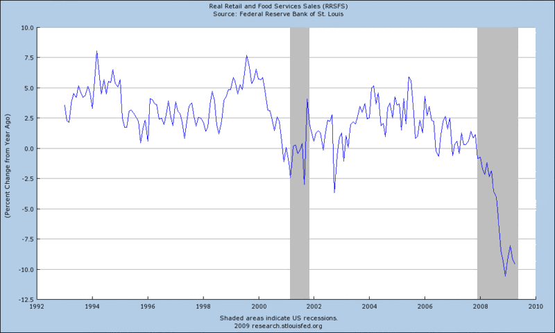
Chart of the Week: Retail Sales

I usually try to make sure that the chart of the week is a chart that tackles a subject I have not seen discussed to the extent I believe it deserves or presents some new material to shine a different light on the subject.

Since I have been out of pocket for the last five days or so, it is possible that others have beaten the subject of retail sales to death during this period. Even if this is the case, I have no problem with a chart of retail sales pinch hitting for this week’s chart of the week, as I believe that the April retail sales data are a microcosm of the larger economic picture. In a nutshell, the retail sales data serve as a reminder that while things may have improved somewhat from March, for the most part, the economy is still as weak as it has been in at least three decades, probably a lot longer.

The graphic below shows the percentage change in retail sales from the year ago period. Are things improving significantly or are we just starting to scrape along the bottom? It looks as if it will take at least another 2-3 months of data before we can begin to answer this question properly.

[source: Federal Reserve Bank of St. Louis]

DISCLAIMER: "VIX®" is a trademark of Chicago Board Options Exchange, Incorporated. Chicago Board Options Exchange, Incorporated is not affiliated with this website or this website's owner's or operators. CBOE assumes no responsibility for the accuracy or completeness or any other aspect of any content posted on this website by its operator or any third party. All content on this site is provided for informational and entertainment purposes only and is not intended as advice to buy or sell any securities. Stocks are difficult to trade; options are even harder. When it comes to VIX derivatives, don't fall into the trap of thinking that just because you can ride a horse, you can ride an alligator. Please do your own homework and accept full responsibility for any investment decisions you make. No content on this site can be used for commercial purposes without the prior written permission of the author. Copyright © 2007-2023 Bill Luby. All rights reserved.
 
Web Analytics