Showing posts with label euro. Show all posts

Monday, February 25, 2013

All-Time VIX Spike #11 (and a treasure trove of VIX spike data)

Today was one of those days that caught a lot of people off guard. Halfway through today’s trading session stocks we largely unchanged, then some pockets selling began when results of the elections in Italy started trickling in, suggesting the possibility of a deadlock in the Italian parliament and perhaps the need for another round of elections.

The governmental chaos is largely the result of rise of two intriguing political figures. One of these is the phoenix known as Silvio Berlusconi and his People of Freedom (PDL) party, which is anti-austerity and has proposed a policy of massive tax cuts and talked about the possibility of leaving the euro. The bigger electoral surprise is Beppe Grillo and the Five Star Movement (M5S), where Grillo’s populist agenda and anti-corruption message have resonated with voters. Both Berlusconi and Grillo have had a much stronger influence on the elections than most had anticipated and with Italy’s relationship with the euro zone now in question, the euro fell to under 1.31 against the dollar for the first time in six weeks.

U.S. stocks, which had seemed impervious to the sequestration threat, began selling off sharply as a result of the confusion about the future of the Italian government, with selling gathering steam during the second half of today’s session and accelerating sharply during the last hour, when the S&P 500 index fell more than 1% and the VIX spiked 14.4%.

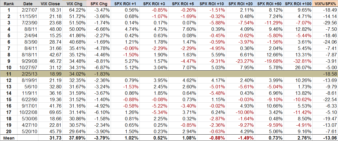
For the full day, the SPX was down 1.83% and the VIX was up 34.02%. The 34% spike in the VIX makes it the eleventh largest one-day spike in the 24 years of VIX historical data going back to 1990.

The first question on everyone’s mind is what the implications of the VIX spike are for stock prices and volatility going forward. The truth is that the historical record following a large one-day VIX spike is somewhat spotty. The table below captures some data from the top 20 one-day VIX spikes. Note that on average (here is where I like to remind everyone that it is possible to drown crossing a stream that is one inch deep ‘on average’) stocks generally outperformed following a big VIX spike for up to one week (SPX ROI +1 to +5 days) and also performed well looking out more than two months. From one week to two months, however, stocks have underperformed following a large VIX spike.

Note that the table below is based on a small data set and if one extracts subsets of this data for the VIX at certain absolute levels or during selected periods or even relative to the magnitude of the change in the SPX, it is possible to draw some very different conclusions. Part of the reason for this may be due to the sample size and part of the answer may be that a clear-cut interpretation of this data is not easy to extract. For these reasons, I have included a fair amount of relevant data and encourage readers to draw their own conclusions.
[source(s): CBOE, Yahoo, VIX and More]

For those who are interested in more conclusive research and analysis on VIX spikes, volatility and other subjects related to today’s events, the links below are an excellent place to start.

Related posts:

Disclosure(s): short VIX at time of writing

Wednesday, January 2, 2013

The Year in VIX and Volatility (2012)

Every year I assemble a chart that is my retrospective look at the year in volatility. While 2012 was the first year since 2006 that the VIX failed to make it out of the 20s, this was not due to an absence of threats to the stock market.

During the first half of the year, the euro zone was the primary concern for most investors, with the events surrounding the two nail-biting elections in Greece haunting the markets from April through June. With Greece off of the front page, focus of the European sovereign debt crisis shifted to unsustainable government debt yields in Spain and Italy, which only began to turn around after Mario Draghi pledged to do “whatever it takes” to save the euro in July.

Meanwhile, markets in the United States were relatively calm due to the repeated intervention of the Fed, which offered up QE 2.5, QE3 and QE4. The global economy also found support in the form of central bank stimulus plans from China, Japan and the euro zone.

The last hurrah for the VIX and volatility in 2012 was the fiscal cliff, which was largely overlooked during the U.S. elections, but dominated the headlines even before the last vote was counted. The fiscal cliff issue remained the #1 source of concern for investors throughout the balance of the year and had the VIX moving counter to its usual direction for most of December.

As 2013 dawns, fears related to the fiscal cliff are plummeting and dragging the VIX down with it, but clearly the issues that have kept the financial markets on edge for the past few years are not yet behind us and unseen risks are always lurking just over the horizon.

[source(s): StockCharts.com]

Related posts:

Disclosure(s): none

Wednesday, October 31, 2012

EuroCurrency Volatility Index (EVZ) at Lowest Level Since March 2008, Diverges from VIX

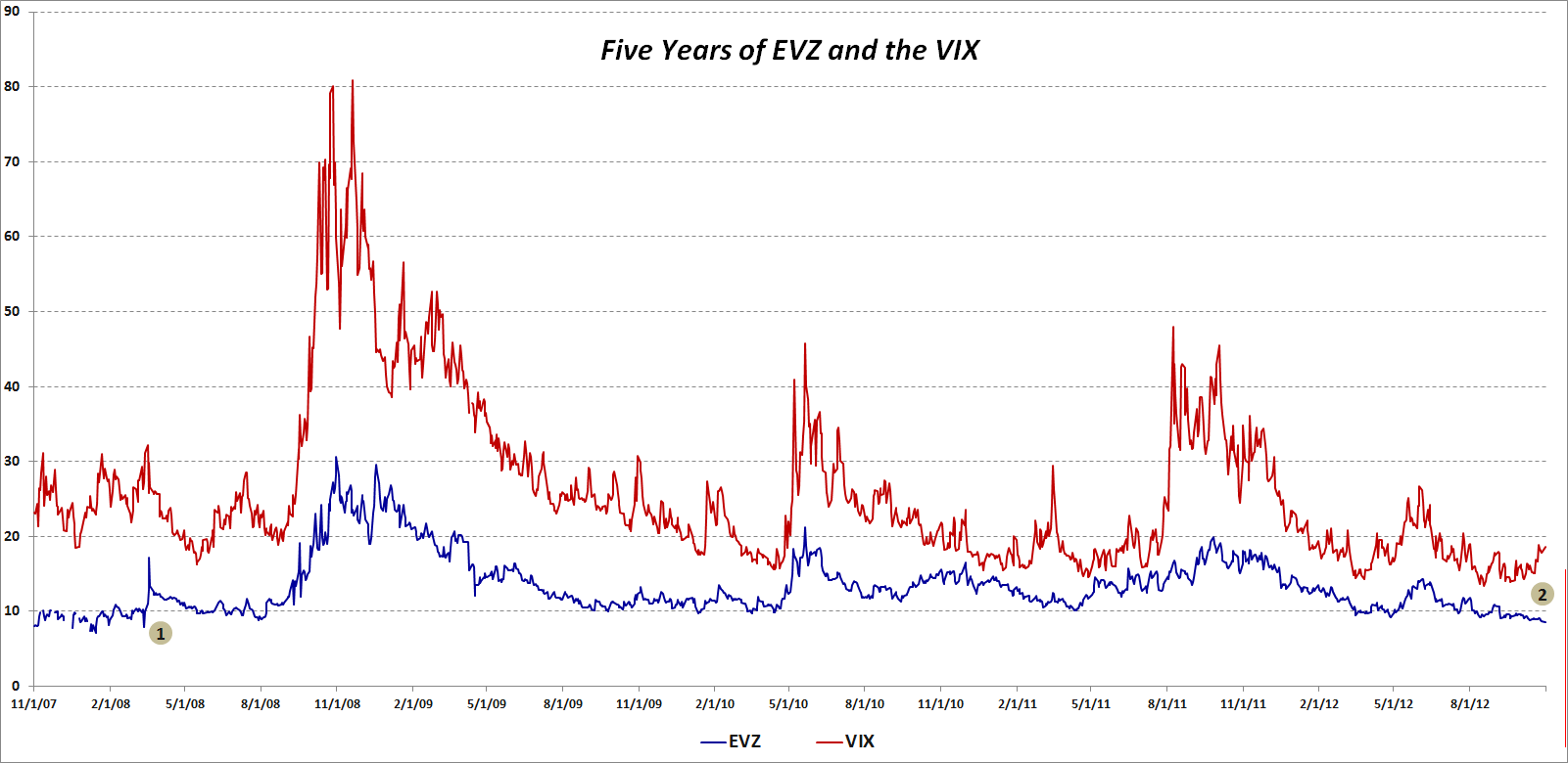
Since its launch in August 2008, the CBOE EuroCurrency Volatility Index (ticker EVZ, sometimes known simply as the “euro VIX”), which is based on the FXE ETF, has toiled in relative obscurity compared to some of the more famous volatility indices.

Given all the fears about the European sovereign debt crisis over the past few years, I find the lack of interest in EVZ to be surprising. After all, in thinking about the euro zone one of the most basic questions has been whether or not the euro will survive.  Further, outside of the U.S. at least, the future of the euro zone is still considered to be the biggest risk to the stock market.

With all this in mind, I was looking at EVZ data this evening and discovered that today marks five years since the beginning of the historical EVZ data provided by the CBOE (reconstructed data fills the gap from November 2007 to the August 2008 launch.)

The chart below shows the history of closes in EVZ (blue line), as well as comparative closing prices for the VIX (red line.) I have annotated the chart to highlight two pieces of information:

  1. The last time that EVZ closed lower that it did today (8.55) was in March 2008, just before Bear Stearns collapsed and was sold to JP Morgan (JPM)
  2. The recent divergence between a falling EVZ and a rising VIX, which dates from the middle of September, is unusual, particularly given the length of the divergence

So…is EVZ understating the risk to the euro or is the VIX overstating the risk to stocks? Is it possible that these two measures of risk can be moving in opposite directions and both be right?

Related posts:

[source(s): CBOE]

Disclosure(s): none

Tuesday, August 7, 2012

Another Way to Play Short EUR/USD: Travel!

There are many ways to translate an opinion about the financial markets into a particular trade. Recently, I decided to act upon my belief that the euro would weaken against the dollar by booking a couple of weeks in Europe. The trader/VIXologist itinerary would have probably run something like Ireland > Portugal > Greece > Spain > Italy, but instead I elected to steer to the north, vising the Netherlands, Belgium, Luxembourg, Germany and the Czech Republic.

For the first time in many moons, parliamentary votes, etc., the markets were reasonably well behaved during my vacation and the VIX didn’t even make it into the 30s.

As someone who spends a great deal of time nine time zones away from the events behind the European headlines, I was somewhat surprised to see the relative calmness and lack of concern in the people I spoke with about the European sovereign debt crisis. This is not to say that the consensus was that the most difficult phases of the crisis were in the rear-view mirror, only that in due time, all would be sorted out and life would go on in a manner similar to the way it was prior to 2008.

That being said, I was surprised to see that in the sculptures above the Gate of Giants, which forms the entrance to Prague Castle, one forward-thinking artist had captured the essence of the discussions between the Troika and the Greek government…

Related posts:

[photo: Gate of Giants, Prague Castle]

Disclosure(s): long VIX at time of writing
Saturday, July 7, 2012

Chart of the Week: As Goes Spain…

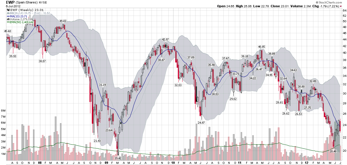
Two years ago today, in Spain rallies, I posted a chart of the Spanish ETF, EWP, that showed EWP had rallied off of a bottom and looked like it was poised for a bullish breakout.

In July 2010, I saw Spain as the keystone in the euro zone puzzle:

“Spain is the tipping point in the European sovereign debt crisis as I see it. In a nutshell, as goes Spain, so goes Europe.”

Two years later, I still believe that Spain is the most important line in the sand that euro zone leaders have to grapple with and the country whose fate is probably most intertwined with the future of the euro.

The chart of the week below shows weekly bars of EWP going back five years. The dominant feature in this chart is the financial crisis of 2008-2009. Various iterations of the euro zone crisis can be identified in the bottoms in June 2010, September 2011, November 2011, etc. EWP was in a gradual downtrend from April 2011 to March 2012, but fell sharply until the beginning of June. The most recent bounce in the Spanish ETF still looks somewhat tentative on the charts and is likely to be tested in the weeks and months ahead.

As concerning as the equity situation looks in Spain, the country’s credit default swaps (just 8% off of their all-time highs at 578) and yields on sovereign debt (yields on the 10-year bond are 5% below their all-time highs at 6.95%) indicate an even greater degree of financial stress.

At one time or another, I would expect Italy, France to find their way back into the crosshairs of traders who are looking to capitalize on euro zone angst, but as far as I am concerned, Spain will continue to the most critical line in the sand.

Related posts:

[source(s): StockCharts.com]

Disclosure(s): none

Thursday, June 28, 2012

The Evolution of European Equity Risk

There are many ways in which investors can evaluate risk related to the euro zone. Credit default swaps for sovereign debt are one way to evaluate the risk of country default. Sovereign bond yields are a good proxy for a country’s access to funding via the credit markets. The euro crosses and related directional moves are a barometer of the strength of the currency and the euro zone countries as a whole, while various Intrade contracts can lend a sense of the probabilities that investors assign to various events, such as to the risk of one or more countries dropping the euro.

On the volatility side, the VSTOXX (EURO STOXX 50 Volatility Index) the EVZ (CBOE EuroCurrency Volatility Index) provide a market assessment of risk and uncertainty in euro zone stocks as well as the currency.

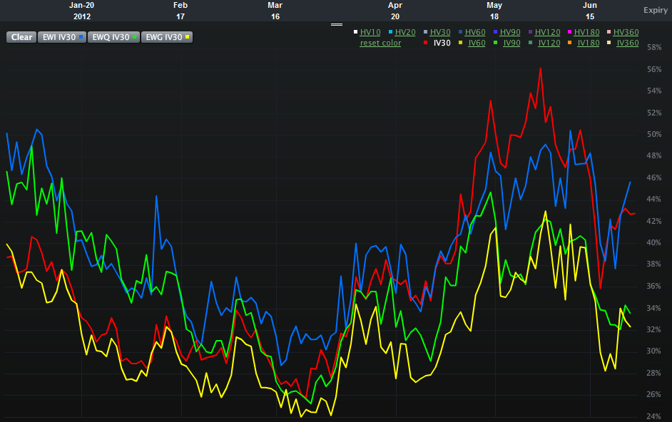
One piece of analysis I have not seen, however, is an assessment of the relative risk and uncertainty for equity markets in some of the more important euro zone nations. Specifically, Spain, Italy, France and Germany. The chart below attempts to offer up that very information, using 30-day implied volatility for the various country ETFs over the course of the past six months:

  • EWP – Spain (red line)
  • EWI – Italy (blue line)
  • EWQ – France (green line)
  • EWG – Germany (yellow line)

Looking at the chart, what initially catches my eye is the recent evolution of the two-tiered risk system. In the first half of the year, the higher risk is clearly associated with Italy and France, whereas Spain and Germany appear to be considerably less risky in terms of implied volatility. By the March the risk appears to have lessened across the board and the distinctions between individual countries is more difficult to discern. Over the course of the last 1 ½ months or so, a new two-tiered system has appeared. This time around it is Italy and Spain where the risk to equities is considered to be the greatest, with France now joining Germany in the lower risk tier.

In essence, Italy has persisted in the high risk tier and Germany has been a constant in the lower risk category. Over the course of the past few months, the interesting development has been the switch between France and Spain, with the former improving from being a peer of Italy to a peer of Germany, while Spain has moved in the opposite direction.

One could certainly argue that all four countries are in the same boat (taking on water, with shoddy life preservers, in shark-infested waters and being one small mutiny away from having no captain…), but clearly investors think there are important distinctions to be made in terms of equity risk and uncertainty. Perhaps of more interest, these fortunes appear to be shifting, with little perceptible difference not just between Spain and Italy, but also between Germany and France.

Related posts:

[source(s): LivevolPro.com]

Disclosure(s): Livevol is an advertiser on VIX and More

Wednesday, June 27, 2012

Euro Volatility and Risk

With the euro zone summit looming, investors are scrambling to find all sorts of measuring sticks to evaluate the risks of a sharp move in the financial markets. Based on some of the emails I have received, many are skeptical of the VIX right now, which is trading in the mid 19s, some 5% below its lifetime mean. At 27.54, the VSTOXX (EURO STOXX 50 Volatility Index) is showing much more uncertainty, but even that number is low relative to the range of the VSTOXX for the past three months.

Whether Spain, Italy or Greece is the fixation du jour, the questions investors really want answers to ultimately all cluster around the future of the euro. I have addressed this question relative to the risk of one or more countries leaving the euro in the context of various Intrade contracts (see links below), but another overlooked manner of measuring risk and uncertainty in the euro is the CBOE EuroCurrency Volatility Index (EVZ). Sometimes referred to as the “euro VIX,” EVZ uses the VIX methodology to measure the market’s expectations of future volatility in the euro. In theory, therefore, EVZ should also be a proxy for risk and uncertainty in the euro. One might even go as far as to consider EVZ as a euro zone fear indicator.

So what is a chart of EVZ telling us on the eve of another euro zone summit?

The chart below shows that at 11.27, EVZ is currently in the lower portion of its range of 9.23 – 20.34 for the past year. Indeed EVZ is only in the 18th percentile of the range of values over the course of the past year. Also of interest, the current 20-day historical volatility of EVZ (60) is lower than the 180-day historical volatility measure (65) – as has been the case for the majority of the last six months. Last but not least, EVZ has been on a notable downtrend since June 18th.

Headlines aside, traders do not see a lot of currency risk in the euro right now, at least relative to the last year or so and as far as the 30-day forward-looking window defined by EVZ is concerned.

So if you think the VIX is depressed and understating market risk, don’t expect the EVZ to be signaling something different. Currency risk and uncertainty seem surprisingly low at current levels. If you think the market has underpriced the potential for a large move in the euro, then consider some long straddles on the euro or its ETF counterpart, FXE.

Related posts:

[source(s): LivevolPro.com]

Disclosure(s): Livevol is an advertiser on VIX and More

Tuesday, June 12, 2012

Greek Elections and the Future of the Euro

While this week’s news cycle has been Spain, Spain, Italy and Spain so far (reminiscent of an old Monty Python skit, but I digress), it is easy to forget for a moment or so that Greece is holding another round of elections on Sunday.

As Greek law prohibits polling or publishing poll results in the 14 days leading up to an election, we do not know how voter sentiment about the bailout and remaining in the euro may be ebbing or flowing. Greek voters have certainly a great deal to think about, some of which may have been complicated by the positioning of Syriza’s leader, Alexis Tsipras, who insists that it is possible to repudiate the bailout agreement, start afresh with a new plan that is based on stimulating economic growth and job creation – yet never have to leave the euro zone in the process.

So just how will the Greek elections influence the future of the euro?

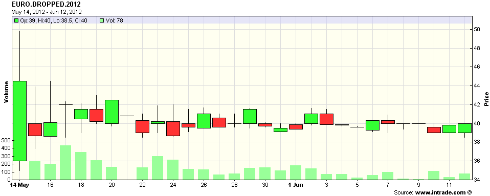
Without polls, the Intrade contract that specifies “Any country currently using the Euro to announce intention to drop it before midnight ET 31 Dec 2012” now becomes an even more valuable informational resource. The problem is that in spite of a fair amount of activity, the price of the contract has remained essentially unchanged for the last month, hugging the 40 level (see chart below), which means that participants continue believe that the chance of a Greek exit (I refuse to say ‘Grexit’) by the end of the year is about 40%.

By Monday we will have a much more information, but once again, the process of forming a coalition government may prove to be troublesome…or worse.

For those looking for hedges against some panic in the financial markets next week, keep in mind that VIX options do not expire this week, but next Wednesday, June 20th. As such, VIX calls may prove to be an appropriate hedge against at least short-term post-election anxiety. For those looking for volatility hedges on a week-to-week rather than monthly basis, it might be helpful to investigate VXX weekly options (A Favorite Trade: VXX Weeklys) as well. Last but not least, a reader favorite is a thought piece on the process of constructing hedges is Cheating with Partial Hedges.

Related posts:

[source(s): Intrade.com]

Disclosure(s): short VXX at time of writing

Monday, May 14, 2012

Handicapping the Chances of Greece Dropping the Euro

Understanding all the moving parts in the European sovereign debt crisis can be a Herculean task, even for the most determined analyst. Heck, even hazarding a guess at what tomorrow’s crisis du jour will be is more than enough for most investors to grapple with.

In the case of Greece, with an ever-changing political party landscape and fickle voters who intend to distort that landscape even more, trying to assign probabilities to various scenarios and then divine the implications for Greece’s relationship with the euro is sufficiently daunting as to cause many an investor just to park their money in cash until the future begins to look a little less murky.

For some aspects of the euro zone fiasco, there are financial instruments and measures that can serve as a barometer of how bad things are now and are likely to become in the future. Credit default swaps are an excellent example, as is the VSTOXX equity volatility index, the euro volatility index (EVZ), sovereign debt yields, etc.

As far as the euro is concerned, the EVZ is relatively subdued at the moment. Over the course of its life (which began in November 2007), EVZ has typically traded at just a shade over half of the VIX, which is where it closed today. Still, while the VIX posted its highest close since January, EVZ was substantially higher during January, February and the beginning of March.

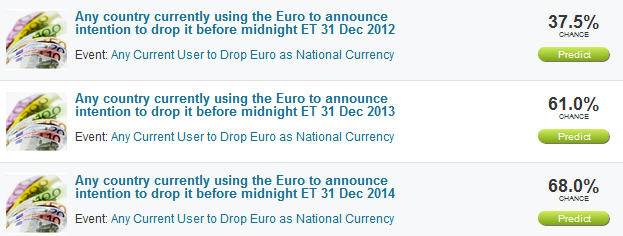
It is at times like this when I find myself paying more attention to the various Intrade prediction markets contracts. In the case of the euro, Intrade has three separate contracts based on the possibility that a euro zone member announces it will stop using the euro as its national currency. The three contracts have expiration dates of the end of 2012, 2013 and 2014 and currently indicate (see top graphic below) that the probability of any euro zone country announcing it will drop the euro is 37.5% by the end of 2012, 61% for the end of 2013 and 68% for the end of 2014.

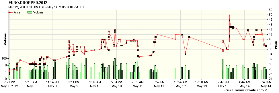
In addition to the probabilities derived from the price of these prediction market contracts, the trend also bears watching. The bottom graphic shows trades in the 2012 contract. Much to my surprise, sentiment that Greece (or any other country) will exit the euro this year apparently peaked (for now, at least) yesterday afternoon, and pulled back somewhat today, in choppy trading. For those who wish to watch this contract on a tick by tick basis, try the Advanced Charts option and click the Time and Sales radio button. Note that it is also possible to set alerts for this contract.

This seems like a good place to reiterate that I believe Intrade contracts, while helpful, are far from perfect. Still, if your talents do not include four dimensional euro zone dominoes in Greek, these prediction contracts can be a great shorthand for determining how certain events are likely to play out.

Related posts:

[source(s): Intrade.com]

Disclosure(s): none

Wednesday, November 30, 2011

VIX Reflecting Skepticism About Rally

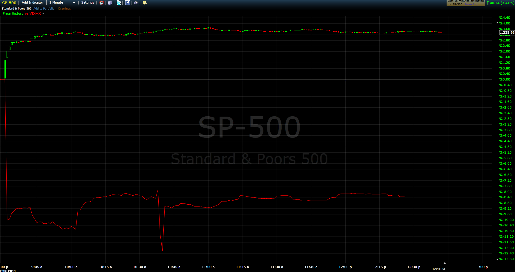
With the S&P 500 index up 3.4% as I type this and the VIX down 7.8%, it is clear that there is a fairly substantial disconnect at the moment between those who are buying stocks and those who are trading options on the SPX.  The picture is even more dramatic if you look at the upward trend in both the SPX and the VIX since the open.  The graphic below is not ideal for deciphering the relative movements, but the unusually high correlation between stocks and implied volatility is unmistakable when looking at today’s intraday price action.

With the VIX typically moving about 4x as rapidly in the opposite direction of the SPX under ‘normal’ market conditions, it appears as if many investors are skeptical about stocks continuing to rally in the face of ongoing uncertainty about the Europe-driven news cycle.  Following an initial pop, the euro is selling off and after it dropped into the 27s, the VIX now looks content to remain above 28 for the balance of the day, the bullish action in stocks notwithstanding.  One simple explanation:  investors are snapping up options, including put protection, at what look like bargain basement prices.

Related posts:


[source: FreeStockCharts.com]

Disclosure(s): none

Friday, June 25, 2010

A German Perspective on the Recovery

Yesterday, in Fundamentals and the Recovery, I offered up a snapshot of the recovery in the United States in terms of industrial production, income, employment, and retail sales.

Today, I thought I’d at least temporarily jettison my overly Americentric view of the investment universe and look at the recovery in the same areas through the eyes of Germany. As the graphic below shows, relative to past periods of economic recovery, the current recovery looks more typical than atypical. With a continued weak euro, I would not at all be surprised to see the performance of the German economy to begin to accelerate to the upside, which would bode well for the Germany ETF, EWG.

Of course, the bigger issue may turn out to be the exposure of German banks to Greece and some of the other troubled euro zone economies, per a recent Wall Street Journal, Data Show Big Exposure for Banks in Euro Zone.

For more on related subjects, readers are encouraged to check out:


[source: Federal Reserve Bank of St. Louis]

Disclosure(s): none

Sunday, June 20, 2010

Chart of the Week: U.S. Open Scorecards

I was pulled in quite a few different directions when considering this week’s chart of the week. There was the rally in the euro, some positive debt offerings in Spain, new highs in gold, BP’s $20 billion escrow fund, etc. On the volatility front, the last week was the first time ever that the VIX fell more than 15% in consecutive weeks.

Of all the things that stuck in my mind this week, however, the one I found the most compelling was the course the United States Golfing Association assembled this week at Pebble Beach to test the world’s best golfers in the world for the U.S. Open championship.

While this was a relatively short course, the challenges posed by natural obstacles, difficult greens and the U.S. Open’s notoriously long and unforgiving rough were such that not one of the 156 golfers was able to break par. In keeping with tradition, the U.S. Open course was set up to extract the maximum penalty for any missed shot.

In fact, as I see it, the championship was decided not by how many birdies a golfer was able to make, but by how well he was able to avoid trouble. The scorecards of the top three finishers tell the story and together comprise this week’s chart of the week. In the end, the winner, Graeme McDowell, persevered by not allowing the course to bully him into anything worse than a bogey. Runner-up Gregory Havret had only one double bogey on his scorecard, but it was just enough to keep him one stroke back from McDowell. Third place finisher Ernie Els, who plays with the demeanor of someone who is always unflappable, ended up with two double bogeys and finished two strokes back. In the end, it was the disastrous double bogeys – and one’s ability to avoid them – that spelled the difference.

The reason the Pebble Beach odyssey stuck in my mind is that it reminded me that traders should approach trading the way they would approach a golf course like Pebble Beach. The goal should be to play for pars and look to capitalize on any birdie opportunities that arise. To the extent possible, this means keeping the ball away from hazards and obstacles, as well as avoiding low percentage plays. It also means not compounding small mistakes by pressing and trying to make up lost shots in a hurry. Impulsive play is almost always penalized; patience and discipline are the only way to survive.

In golf and in trading, it is better to be able to drive the ball into the fairway than to hit it 300 yards and not control where it is going. Consistency, precision, patience and opportunistic aggression. That is the recipe for winning golf and winning trading – at Pebble Beach or in your own back yard.

For more on related subjects, readers are encouraged to check out:


[source: U.S. Open]

Disclosure(s): none

Sunday, March 28, 2010

Chart of the Week: Impact of Falling Euro on Stocks and Commodities

Given all the general economic problems facing Europe and the sovereign debt issues related to Greece and the PIIGS (Portugal, Italy, Ireland, Greece and Spain), it is not surprising that the euro has come under so much selling pressure as of late.

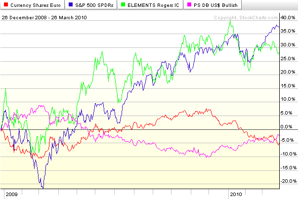
Considering that the dollar index is comprised of a weighted basket of foreign currencies of which the euro comprises 57.6%, it is not too much of a stretch to think of the dollar as an inverse euro – as their almost mirror image in the chart below suggests. So given that recent weakness in the euro is accounting for most of the dollar’s resurgence and the dollar has a strong influence on the prices of commodities and stocks, it is meaningful to consider how the fluctuations in the euro have translated into changes in stocks and commodities.

This week’s chart of the week looks at ETFs for the euro (FXE), dollar (UUP), stocks (SPY) and commodities (RJI) for the last 15 months. Following the bottom of the stock market in March 2009, the euro (red line) rallied in concert with the S&P 500 index (blue line) and commodities (green line) through December 2009. As the euro began to weaken, however, both stocks and commodities initially continued their bullish climb, before selling off in January and the beginning of February. Since the early February lows, stocks (SPY) have managed to rally in spite of a weakening euro and firming dollar (purple line). Commodities, which tend to react more strongly to currency fluctuations, have struggled much more with euro weakness and dollar strength. Should the euro continue to fall, it is reasonable to expect stocks to continue to outperform commodities and of course euro weakness to directly lift the dollar to new heights.

For more on related subjects, readers are encouraged to check out:


[source: StockCharts.com]

Disclosure(s): none

Tuesday, February 9, 2010

Are You Watching Greece?

Retail investors in the United States sometimes have difficulty staying on top of events and markets in Europe.

In the last week, I have suggested several ways to monitor the status of various pockets of interest in Europe, including Spain (via the iShares MSCI Spain Index ETF, EWP) and the euro. I certainly also could have included the VSTOXX, the volatility index tied to the Dow Jones STOXX 50 index of European companies.

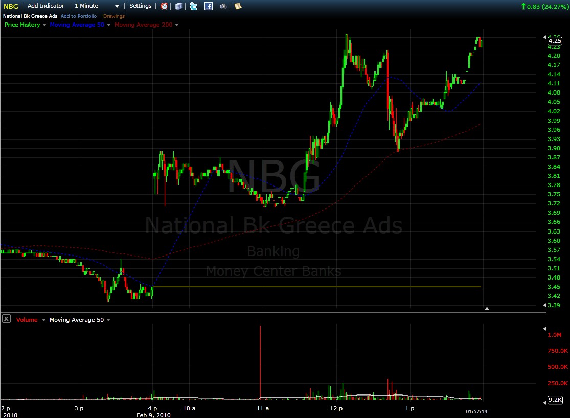
While I love proxies, ground zero for the European financial crisis is Greece, where ongoing discussions with European Union leaders, particularly those from Germany, are wrestling with the best way to balance national and regional interests.

There is not currently a Greek ETF, but as proxies for Greece go, the National Bank of Greece (NBG) is an excellent one. This bank trades millions of shares per day and has a market cap of $12.5 billion. So whether you just wish to take the temperature of the Greek financial situation or want to speculate on a particular outcome, NBG is a worthy addition to any watch list.

For related posts on these subjects, readers are encouraged to check out:


Disclosures: long NBG and EWP at time or writing

[source: FreeStockCharts.com]

Sunday, February 7, 2010

Chart of the Week: Where and When Will the Euro Bottom?

Last week was the type of trading week that raised a lot more questions than it answered – at least for me.

The epicenter of many of those questions seems to be southern Europe, where Greece, Portugal, Spain and to a lesser extent the remainder of the so-called PIIGS (Portugal, Italy, Ireland, Greece and Spain) have flamed investor concerns that burgeoning public debt may significantly weaken investor demand for sovereign debt and exacerbate an already trouble budgetary crisis.

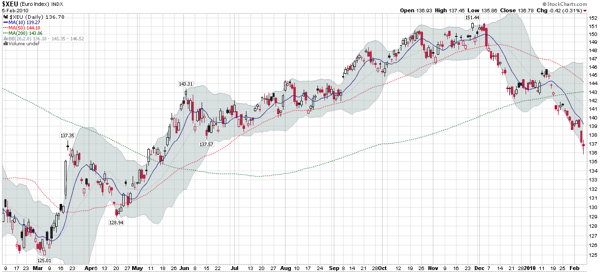
Many investors have taken to selling the euro is as a means by which to reduce exposure to these problem areas and/or speculate on one or more of these crises spiraling out of control. This week’s chart of the week looks at one year of the euro, including a strong rally through most of 2009 and more recently and two-stage selloff, starting in the first half of December and picking up steam over the course of the past 3 ½ weeks as traders looked to capitalize on weakness stemming from the problems in Greece, Portugal and Spain.

Going forward, that ability of the euro to hold support at 136 will be one of the market tells that I watch closely.

For related posts on these subjects, readers are encouraged to check out:


[source: StockCharts]

Disclosures: none

Sunday, December 20, 2009

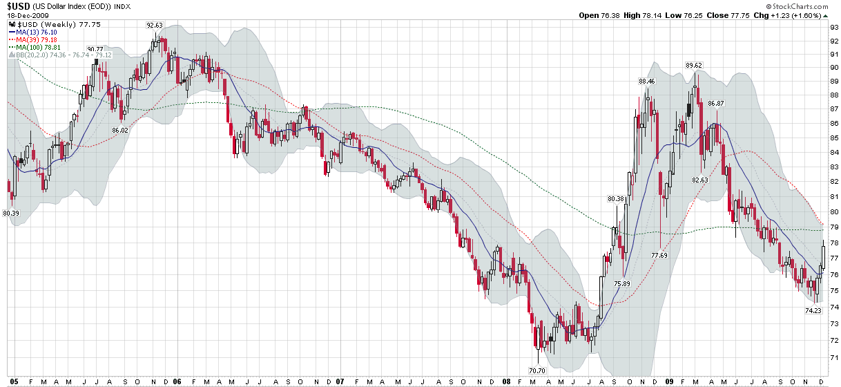
Chart of the Week: Dollar Approaching Resistance on Weekly Chart?

Try as I may to find something other than the dollar to highlight in chart of the week, I find the dollar’s story to be too compelling to overlook. Also, to the extent that this weekly chart is supposed to reflect an issue that I have been contemplating at some length as of late, I see the dollar as one of the key elements of the 2010 investment puzzle.

In order to get a better sense of the dollar, this week’s chart of the week looks at five years of weekly bars in the dollar index, which compares the dollar to a weighted average of a basket of foreign currencies that includes the euro, Japanese yen, British pound, Canadian dollar, Swedish krona and Swiss franc. Of these currencies, the euro has by far the largest weighting in the basket at approximately 57.6%. For this reason, concerns about Dubai, Greece and Spain have not only significantly weakened the euro, but because of the euro’s weighting, have had a strong bullish effect on the dollar index.

The chart below shows that the 79 level in the dollar index represents resistance in the form of converging 39 and 100 week moving averages. On startling feature in the chart is the 100 week moving average, which has held steadfast in the high 78s for 16 straight months, even as the dollar index has fluctuated wildly during the financial crisis. Should the dollar close above 79 and take out both moving averages, I would have to consider it back on a bullish trajectory. For now, however, I am content to count the recent move as a technical bounce that has resulted from a series of threats to the European economy and its currency.

For more on related subjects, readers are encouraged to check out:

[source: StockCharts]

Disclosure: none

Friday, August 15, 2008

The Dollar Is UUP

I know there are many stock pickers out there who never thought they would put on commodity positions until a spate of commodity-related ETFs began appearing. Perhaps the next frontier for these former “equities only” investors is currencies.

Clearly currencies aren’t for everyone and in some respects they are the ultimate zero-sum game, but if anyone doubted their importance, just look how the markets have changed since the dollar reversed its course and started moving up a month ago.

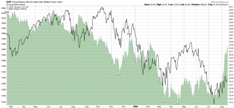
The chart below shows the UUP ETF, the dollar ETF whose formal name is the PowerShares DB US Dollar Bullish Fund. This ETF is based on the Deutsche Bank Long US Dollar Index Futures Index, where futures contracts are designed to replicate the performance of being long or short the US Dollar against the euro, Japanese yen, British pound, Canadian dollar, Swedish krona and Swiss franc. For more details, a good place to start is the UUP fact sheet.

It is important to note that while the dollar has made a substantial move over the course of the past month and is now breaking out of a three year downward channel, the dollar’s move is more the result of increasing concerns about foreign economies than it is about strength in the U.S. economy. The bottom line: the U.S. economic outlook has not improved over the past month; instead, things have taken on an even gloomier tone overseas.

Finally, I would be remiss in not pointing out that on balance, U.S. equities tend to react favorably to a rising dollar. The chart of the UUP shows the dollar’s rally off of the July low buffeting the S&P 500 index.

DISCLAIMER: "VIX®" is a trademark of Chicago Board Options Exchange, Incorporated. Chicago Board Options Exchange, Incorporated is not affiliated with this website or this website's owner's or operators. CBOE assumes no responsibility for the accuracy or completeness or any other aspect of any content posted on this website by its operator or any third party. All content on this site is provided for informational and entertainment purposes only and is not intended as advice to buy or sell any securities. Stocks are difficult to trade; options are even harder. When it comes to VIX derivatives, don't fall into the trap of thinking that just because you can ride a horse, you can ride an alligator. Please do your own homework and accept full responsibility for any investment decisions you make. No content on this site can be used for commercial purposes without the prior written permission of the author. Copyright © 2007-2023 Bill Luby. All rights reserved.
 
Web Analytics