Showing posts with label credit default swaps. Show all posts

Tuesday, June 11, 2013

The Currency Carry Trade, DBV and Risk

Anyone who has been active in the financial markets during the past five years knows that there are many types of risk, many ways to think about and measure risk, and invariably some risks lurking around the next corner that many of us have never bothered to contemplate. Most investors tend to focus their attention on equities and therefore have a tendency to think in terms of the CBOE Volatility Index (VIX) and use that number to evaluate the relative level of risk, uncertainty or perhaps fear in the markets. That being said, during the past few years, almost everyone has become conversant in such topics as credit default swaps, the TED spread, the LIBOR-OIS spread, bank capital ratios and a whole host of concepts and statistics which were not on their radar in 2007.

For a more holistic approach to evaluating risk, there is always the St. Louis Fed’s Financial Stress Index, which is one example of an attempt to aggregate a variety of risk factors (18 in all) related to economic and financial matters into a single risk index.

One aspect of market risk that many investors continue to struggle with is the currency carry trade. If the daily movements of the dollar are relatively unimportant for those interested in buying and selling stocks that are primarily based in the U.S., then it is relatively easy for most investors to conclude that the gyrations of the Japanese yen (FXY) or Australian dollar (FXA) can be dismissed as much less important than those of the dollar. Unfortunately, this is not always the case. It turns out that many investors, particularly large institutional ones, have an appetite for the currency carry trade, in which one borrows in a currency where interest rates are low and uses the proceeds to buy assets in a currency where interest rates are higher. With Japan’s central bank targeting interest rates of 0.1% and the Reserve Bank of Australia recently cutting its base rate to 2.75%, the carry trade is structured as an interest rate differential trade in which an investor can borrow in yen and then buy Australian bonds, with profitability determined by the net interest rate differential plus or minus any fluctuation in the exchange rate.

Naturally some more aggressive investors prefer to use the yen as a funding currency for the purchase of assets other than bonds, including U.S. stocks. The problem for investors in U.S. stocks is that when the yen appreciates sharply – as it did on Monday and Thursday of last week, as well as during today’s session – traders with short yen positions who are victimized by a short squeeze will be subject to margin calls and/or forced liquidations, which means that not only are they covering their short yen positions, but they are also selling any long positions in U.S. equities as both legs are unwound. For this reason, when the yen carry trade is in favor, U.S. equities tend to move in the opposite direction of the yen. Traders can monitor the strength of the yen by following the USD/JPY currency cross or the Japanese yen ETF, FXY.

An alternative to focusing entirely on the yen is to monitor the PowerShares DB G10 Currency Harvest Fund (DBV), which, as PowerShares indicates, “is composed of currency futures contracts on certain G10 currencies and is designed to exploit the trend that currencies associated with relatively high interest rates, on average, tend to rise in value relative to currencies associated with relatively low interest rates. The G10 currency universe from which the Index selects currently includes U.S. dollars, euros, Japanese yen, Canadian dollars, Swiss francs, British pounds, Australian dollars, New Zealand dollars, Norwegian krone and Swedish krona.”

In other words, DBV is a carry trade ETF that is short three currencies and long three currencies at all times, updating these holdings on a quarterly basis. The ETF is currently short the Swiss franc, the euro and the yen, with long positions in the Australian dollar, the Norwegian krone and the New Zealand dollar.

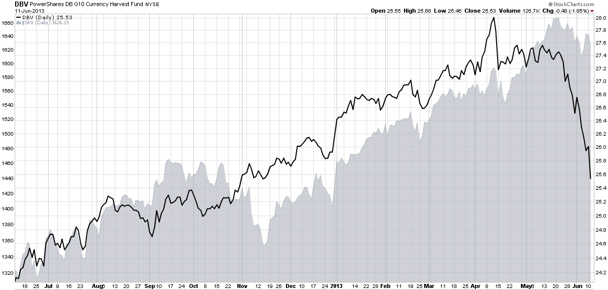
As the chart below shows, DBV has been tracking the S&P 500 index quite closely for most of the past year, but that relationship has recently broken down as DBV has plummeted while the SPX has experienced only a mild pullback. Going forward, investors should strongly consider keeping an eye on the USD/JPY cross, the FXY ETF (which is optionable) and also DBV, which provides a much broader picture of the overall carry trade – and can also serve as a proxy for the risk this trade can pose to stocks.

[In addition to the products referenced above, note that there is a currency carry trade ETF that is similar to DBV, the iPath Optimized Currency Carry ETN (ICI), but this product has considerably less liquidity.]
[source(s): StockCharts.com]

Related posts:

Disclosure(s): none

Saturday, July 7, 2012

Chart of the Week: As Goes Spain…

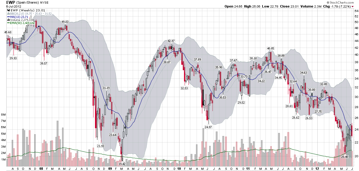
Two years ago today, in Spain rallies, I posted a chart of the Spanish ETF, EWP, that showed EWP had rallied off of a bottom and looked like it was poised for a bullish breakout.

In July 2010, I saw Spain as the keystone in the euro zone puzzle:

“Spain is the tipping point in the European sovereign debt crisis as I see it. In a nutshell, as goes Spain, so goes Europe.”

Two years later, I still believe that Spain is the most important line in the sand that euro zone leaders have to grapple with and the country whose fate is probably most intertwined with the future of the euro.

The chart of the week below shows weekly bars of EWP going back five years. The dominant feature in this chart is the financial crisis of 2008-2009. Various iterations of the euro zone crisis can be identified in the bottoms in June 2010, September 2011, November 2011, etc. EWP was in a gradual downtrend from April 2011 to March 2012, but fell sharply until the beginning of June. The most recent bounce in the Spanish ETF still looks somewhat tentative on the charts and is likely to be tested in the weeks and months ahead.

As concerning as the equity situation looks in Spain, the country’s credit default swaps (just 8% off of their all-time highs at 578) and yields on sovereign debt (yields on the 10-year bond are 5% below their all-time highs at 6.95%) indicate an even greater degree of financial stress.

At one time or another, I would expect Italy, France to find their way back into the crosshairs of traders who are looking to capitalize on euro zone angst, but as far as I am concerned, Spain will continue to the most critical line in the sand.

Related posts:

[source(s): StockCharts.com]

Disclosure(s): none

Thursday, June 28, 2012

The Evolution of European Equity Risk

There are many ways in which investors can evaluate risk related to the euro zone. Credit default swaps for sovereign debt are one way to evaluate the risk of country default. Sovereign bond yields are a good proxy for a country’s access to funding via the credit markets. The euro crosses and related directional moves are a barometer of the strength of the currency and the euro zone countries as a whole, while various Intrade contracts can lend a sense of the probabilities that investors assign to various events, such as to the risk of one or more countries dropping the euro.

On the volatility side, the VSTOXX (EURO STOXX 50 Volatility Index) the EVZ (CBOE EuroCurrency Volatility Index) provide a market assessment of risk and uncertainty in euro zone stocks as well as the currency.

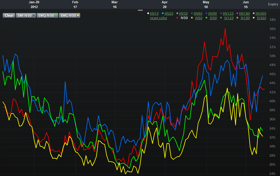
One piece of analysis I have not seen, however, is an assessment of the relative risk and uncertainty for equity markets in some of the more important euro zone nations. Specifically, Spain, Italy, France and Germany. The chart below attempts to offer up that very information, using 30-day implied volatility for the various country ETFs over the course of the past six months:

  • EWP – Spain (red line)
  • EWI – Italy (blue line)
  • EWQ – France (green line)
  • EWG – Germany (yellow line)

Looking at the chart, what initially catches my eye is the recent evolution of the two-tiered risk system. In the first half of the year, the higher risk is clearly associated with Italy and France, whereas Spain and Germany appear to be considerably less risky in terms of implied volatility. By the March the risk appears to have lessened across the board and the distinctions between individual countries is more difficult to discern. Over the course of the last 1 ½ months or so, a new two-tiered system has appeared. This time around it is Italy and Spain where the risk to equities is considered to be the greatest, with France now joining Germany in the lower risk tier.

In essence, Italy has persisted in the high risk tier and Germany has been a constant in the lower risk category. Over the course of the past few months, the interesting development has been the switch between France and Spain, with the former improving from being a peer of Italy to a peer of Germany, while Spain has moved in the opposite direction.

One could certainly argue that all four countries are in the same boat (taking on water, with shoddy life preservers, in shark-infested waters and being one small mutiny away from having no captain…), but clearly investors think there are important distinctions to be made in terms of equity risk and uncertainty. Perhaps of more interest, these fortunes appear to be shifting, with little perceptible difference not just between Spain and Italy, but also between Germany and France.

Related posts:

[source(s): LivevolPro.com]

Disclosure(s): Livevol is an advertiser on VIX and More

Monday, May 14, 2012

Handicapping the Chances of Greece Dropping the Euro

Understanding all the moving parts in the European sovereign debt crisis can be a Herculean task, even for the most determined analyst. Heck, even hazarding a guess at what tomorrow’s crisis du jour will be is more than enough for most investors to grapple with.

In the case of Greece, with an ever-changing political party landscape and fickle voters who intend to distort that landscape even more, trying to assign probabilities to various scenarios and then divine the implications for Greece’s relationship with the euro is sufficiently daunting as to cause many an investor just to park their money in cash until the future begins to look a little less murky.

For some aspects of the euro zone fiasco, there are financial instruments and measures that can serve as a barometer of how bad things are now and are likely to become in the future. Credit default swaps are an excellent example, as is the VSTOXX equity volatility index, the euro volatility index (EVZ), sovereign debt yields, etc.

As far as the euro is concerned, the EVZ is relatively subdued at the moment. Over the course of its life (which began in November 2007), EVZ has typically traded at just a shade over half of the VIX, which is where it closed today. Still, while the VIX posted its highest close since January, EVZ was substantially higher during January, February and the beginning of March.

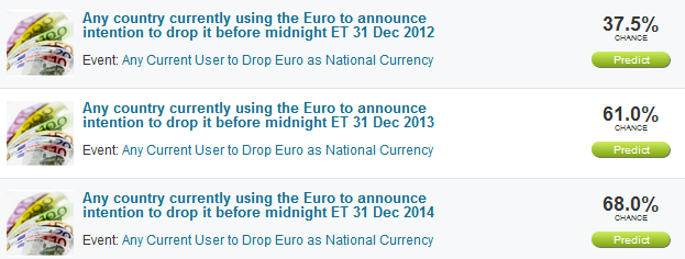
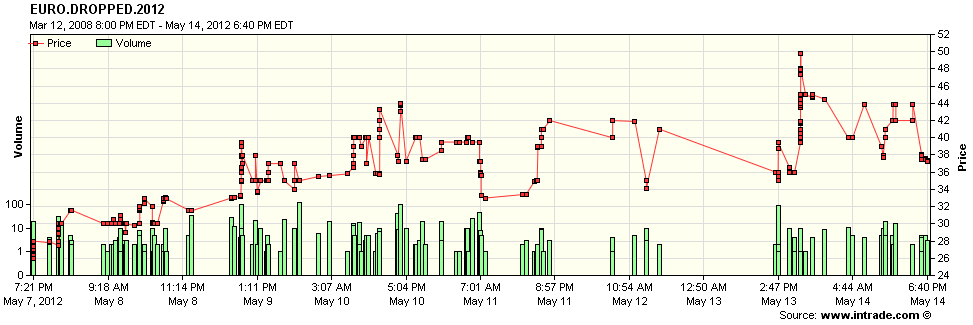
It is at times like this when I find myself paying more attention to the various Intrade prediction markets contracts. In the case of the euro, Intrade has three separate contracts based on the possibility that a euro zone member announces it will stop using the euro as its national currency. The three contracts have expiration dates of the end of 2012, 2013 and 2014 and currently indicate (see top graphic below) that the probability of any euro zone country announcing it will drop the euro is 37.5% by the end of 2012, 61% for the end of 2013 and 68% for the end of 2014.

In addition to the probabilities derived from the price of these prediction market contracts, the trend also bears watching. The bottom graphic shows trades in the 2012 contract. Much to my surprise, sentiment that Greece (or any other country) will exit the euro this year apparently peaked (for now, at least) yesterday afternoon, and pulled back somewhat today, in choppy trading. For those who wish to watch this contract on a tick by tick basis, try the Advanced Charts option and click the Time and Sales radio button. Note that it is also possible to set alerts for this contract.

This seems like a good place to reiterate that I believe Intrade contracts, while helpful, are far from perfect. Still, if your talents do not include four dimensional euro zone dominoes in Greek, these prediction contracts can be a great shorthand for determining how certain events are likely to play out.

Related posts:

[source(s): Intrade.com]

Disclosure(s): none

Tuesday, September 28, 2010

St. Louis Fed’s Financial Stress Index

When I started this blog, I added what sounded like a whimsical tagline at the time, “Your one stop VIX-centric view of the universe.” In retrospect, perhaps the joke was on me, as the content here has consistently been VIX-centric, despite my occasional forays into that “and More” netherworld.
I will be the first to admit, however, that the VIX captures only a small slice of investor sentiment and represents only one type of threat to the markets.

Back in March 2007 I addressed a broader range of sentiment indicators when I wrote A Sentiment Primer (Long) and urged investors to take a broad-based view of threats to the market in The Credit Default Swap Canary. Along the way, I have been a strong proponent of using put to call ratios (Put to Call Everest), bond yields, the VIX divided by T- bill yields (VIX:IRX), the TED spread, counterparty risk measures, and other factors.

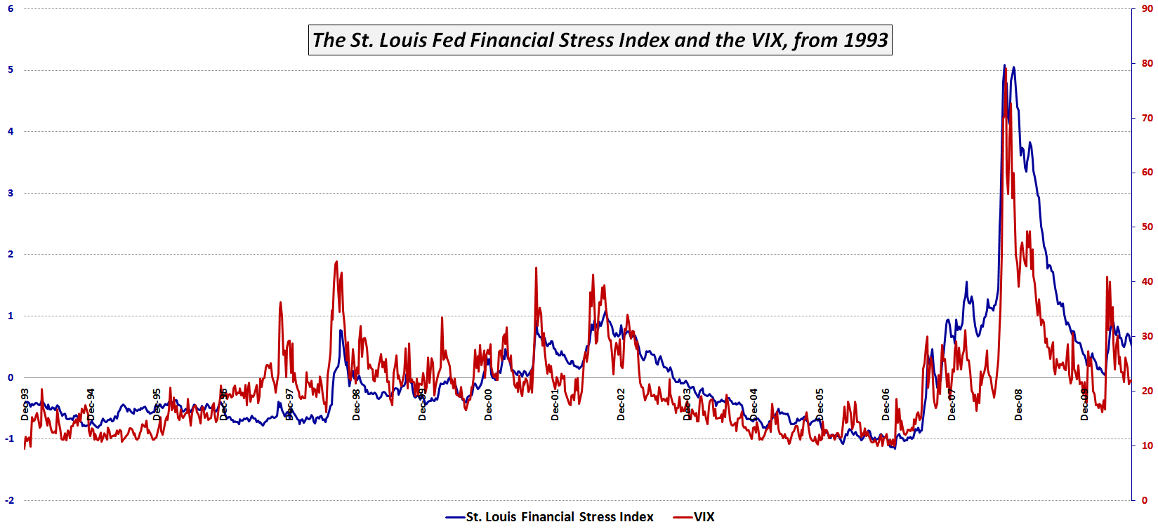
One excellent index which attempts to capture a broad range of components of financial stress is the St. Louis Fed’s Financial Stress Index, henceforth to be known here as the STLFSI. The index constituents are highlighted below and include an interest rate group, a yield spread group and an third uncategorized group of additional indicators in which the VIX is one of five components.

Interest Rates:
  • Effective federal funds rate
  • 2-year Treasury
  • 10-year Treasury
  • 30-year Treasury
  • Baa-rated corporate
  • Merrill Lynch High-Yield Corporate Master II Index
  • Merrill Lynch Asset-Backed Master BBB-rated
Yield Spreads:
  • Yield curve: 10-year Treasury minus 3-month Treasury
  • Corporate Baa-rated bond minus 10-year Treasury
  • Merrill Lynch High-Yield Corporate Master II Index minus 10-year Treasury
  • 3-month London Interbank Offering Rate–Overnight Index Swap (LIBOR-OIS) spread
  • 3-month Treasury-Eurodollar (TED) spread
  • 3-month commercial paper minus 3-month Treasury bill
Other Indicators:
  • J.P. Morgan Emerging Markets Bond Index Plus
  • Chicago Board Options Exchange Market Volatility Index (VIX)
  • Merrill Lynch Bond Market Volatility Index (1-month)
  • 10-year nominal Treasury yield minus 10-year Treasury Inflation Protected Security yield (breakeven inflation rate)
  • Vanguard Financials Exchange-Traded Fund (VFH)
The chart below shows the performance of the STLFSI and the VIX going back to 1993. Not surprisingly, there is a high degree of correlation. If one accepts the STLFSI as a more broad measurement of stress in the financial system, one can make a case that while the VIX is usually directionally correct, at certain times the VIX has underestimated the stress in the system (e.g., May 2008) while at other times the VIX has overestimated the stress in the system (e.g., May 2010). Going forward, I will make an effort to flag important divergences between the VIX and the STLFSI.

Note that the Kansas City Fed has a similar Financial Stress Index, aka the KCSFI, which is more concise and more focused on yield spreads.

The St. Louis Fed has more information on the STLFSI here, while the Kansas City Fed has more information on the KCSFI here.

Related posts:


[source: Federal Reserve Bank of St. Louis]

Disclosure(s): none

Sunday, May 16, 2010

Chart of the Week: VSTOXX, VIX and the Risk of Global Contagion

Several weeks ago, The New York Time ran an excellent graphic showing the interconnectedness of European debt in Europe’s Web of Debt. Other sources periodically trot out various charts of credit default swaps (CDS), but I have yet to see a graphic which attempts to measure the risk of global contagion.

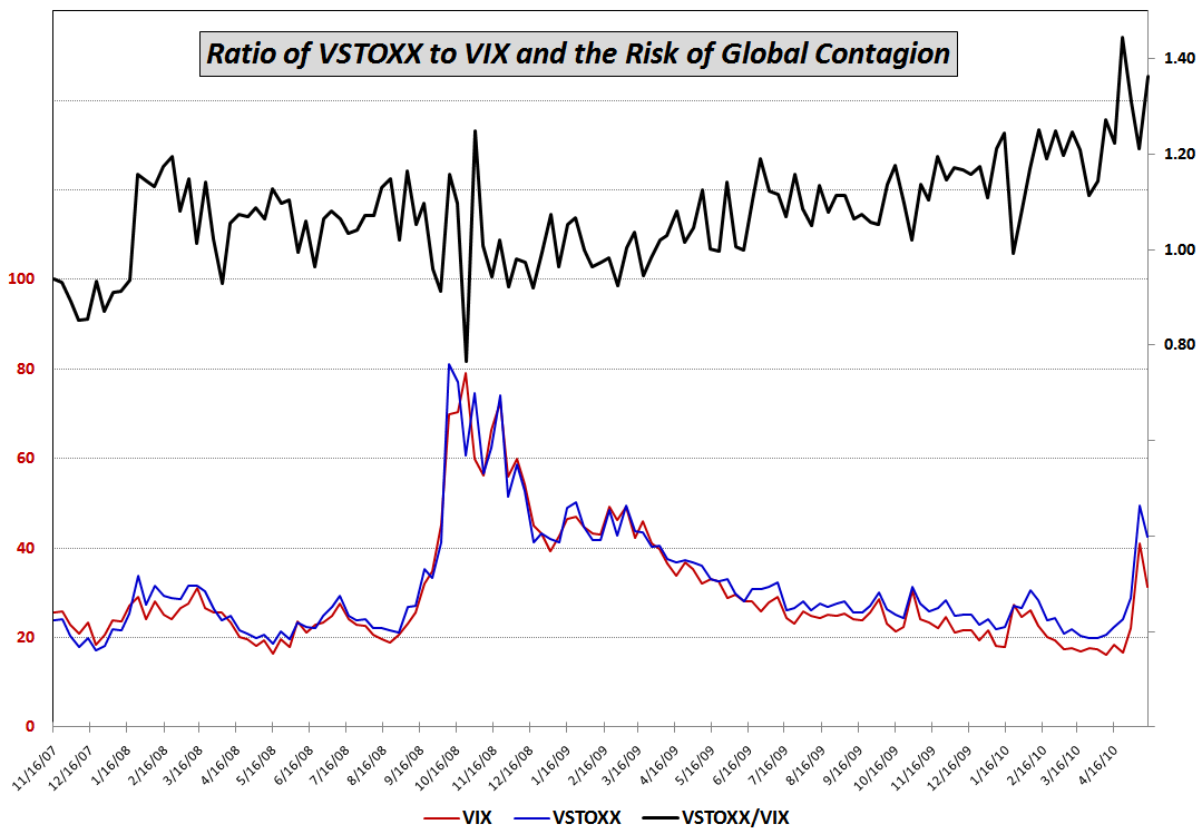
This week’s chart of the week is an attempt to reduce a hypothesis about global contagion to a simple ratio chart. The hypothesis is that whereas the VIX is the best measure of uncertainty in the U.S. stock market and the VSTOXX (which is based on the EURO STOXX 50) is the best measure of uncertainty for euro zone stocks, the ratio of the VSTOXX to the VIX should capture the relative uncertainty for euro zone stocks vs. U.S. stocks. One would expect, therefore, that if VSTOXX is rising faster than the VIX, that options traders are expecting much higher uncertainty (and downside risk) in the euro zone than in the United States. This type of action would support a decoupling theory in which stock markets in the euro zone and the U.S. would begin to move independently of each other. On the other hand, should the VIX be rising at the same rate as VSTOXX, this would suggest that uncertainty and risk are roughly the same in the euro zone and the U.S. and that the risk of global contagion is relatively high.

The chart below is a weekly chart of VSTOXX and the VIX going back to November 2007, just after stocks peaked. Looking at the ratio during the past 2 ½ years, it shows that VSTOXX peaked relative to the VIX three weeks ago, pulled back dramatically up to last week, then surged up through Friday, where the ratio had its second highest weekly close. The verdict from the ratio seems to be that the risk of global contagion is high, slightly below the all-time high, but on the rise.

I will have more about the VSTOXX:VIX ratio going forward.

For more on related subjects, readers are encouraged to check out:


[source: STOXX, CBOE]

Disclosure(s): short VIX at time of writing

Thursday, February 4, 2010

Greece, Spain and the Pulse of European Anxiety

Investors who are attempting to get a sense of the magnitude of anxiety about the economic problems in Greece have a multitude of ways in which to measure how markets are evaluating the situation. Perhaps the most direct approach is with Greece credit default swaps, but the sovereign credit information available to retail investors through firms such as Markit is neither timely or comprehensive.

The euro is another excellent proxy for sentiment about Greece and the rest of the so-called PIIGS (Portugal, Italy, Ireland, Greece and Spain), though once again many U.S. retail investors do not have much in the way of background and experience when it comes to foreign currency.

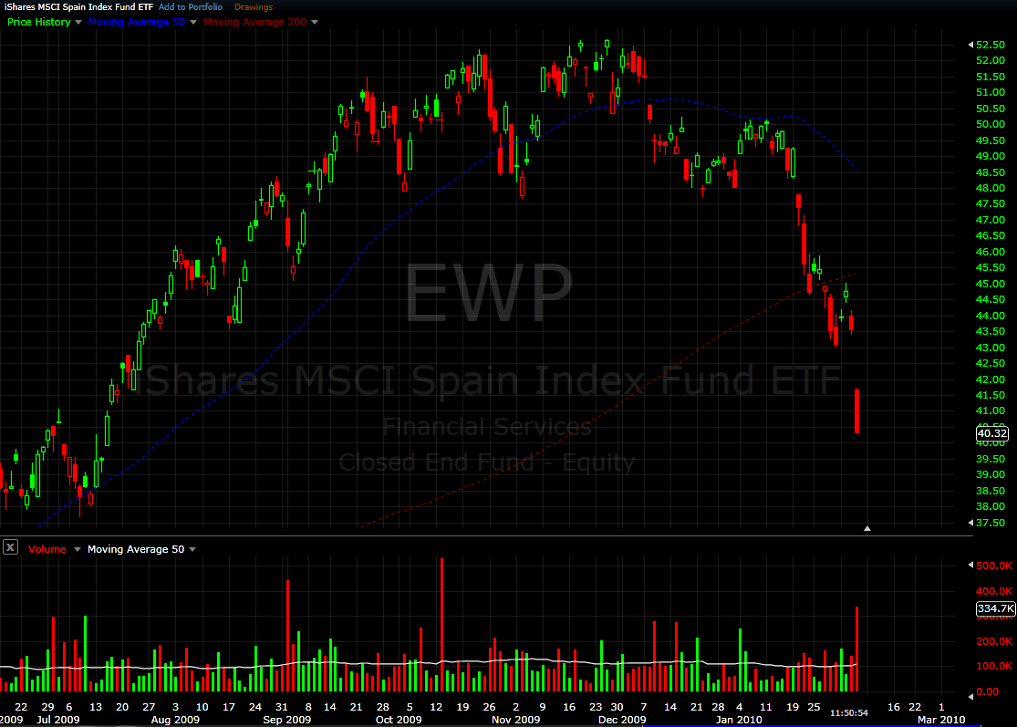
My recommendation is to watch the iShares MSCI Spain Index ETF, EWP. This is a reasonably liquid ETF that is appropriate as a market barometer and/or trading vehicle. The chart below shows the performance of EWP going back to June 2009. After breaking recent technical support at 47.50, this ETF has been subject to intense selling pressure and after a large gap down this morning is currently trading down about 7% on the day.

Watch the euro, watch Spain, watch the large European banks, and if you can get your hands on some good credit default swap data, use a healthy dose of that to take the temperature of the European markets. The situation in Greece is very different than that in Dubai. Whether that is a good or a bad thing remains to be seen.

For related posts on these subjects, readers are encouraged to check out:


[source: FreeStockCharts.com]


Disclosures:
short EWP at time of writing

Saturday, April 11, 2009

Russia Leading the BRIC Rally

The last time I checked in with the BRIC countries, four months ago, the issue de jour was BRIC Update: China a Leader or an Outlier? At that time, China was starting to move impressively off of an October bottom and Russia was a notable laggard.

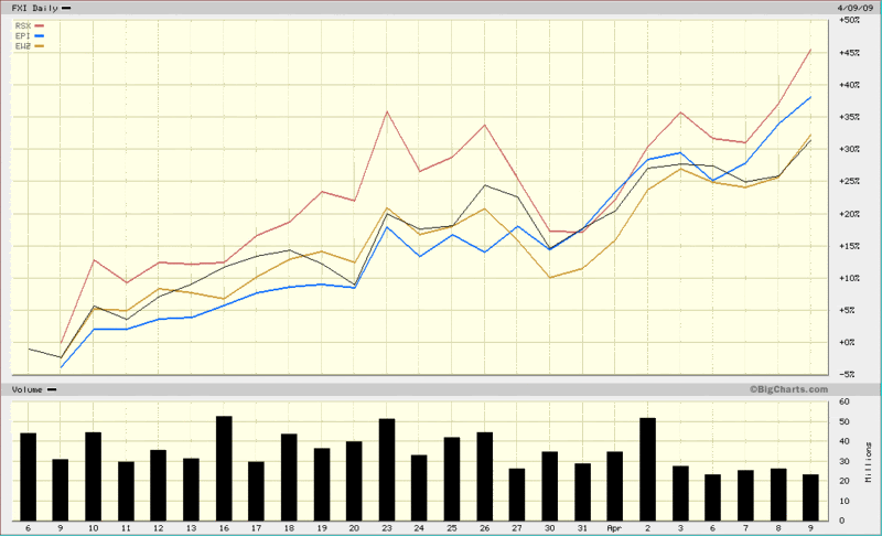
As the chart below shows, in the five weeks since the U.S. stock indices have bottomed, it is Russia (RSX, red line) that has been the strongest performer, followed by India (EPI, blue line), with Brazil (EWZ, gold line) and China (FXI, black line) bringing up the rear.

I watch these relationships closely for a number of reasons, not the least of which is to determine how well the group as a whole is performing, if any particular country is separating itself from the pack, whether commodity producers or consumers are in favor, etc.

Part of the reason Russia has bounced more than its BRIC counterparts is that Russia suffered disproportionately in the recent bear market. In the nine months from June 2008 to February 2009, the RSX Russian ETF lost more than 82% of its value. The last month, however, has seen some notable improvements. Russia’s credit default swaps, for instance, which reflect to the cost to insure the country’s debt, have improved from 694 to 412 in the last four weeks as the outlook for that country’s sovereign debt has improved dramatically.

Going forward, country-specific trends may continue to dominate, but I suspect the relative performance of Russia and Brazil will say more about improvements in the commodities market as a whole than about the plight of a particular national economy.

[source: BigCharts]

Wednesday, April 8, 2009

Waiting for the Next Shoe to Drop?

There has been a lot of speculation about which corner of the economy is likely to implode next and start to write the next chapter in the current financial crisis. Credit card debt and commercial real estate are two of the most frequently cited potential culprits, but lately Eastern European banks have been under great stress, while credit default swaps for Romania, Bulgaria and Hungary have been on the rise.

I did not realize how strong the undercurrent of fear was until I ran Today’s Jump in the VIX on Monday evening. From the various public and private comments, it is clear that there is a strong contingent of veteran investors who anticipate not only that the next shoe will drop soon, but that the fallout will be at least as bad as what we experienced during the October-November peak of the crisis.

While I am not ruling out anything at this stage, I do not see the VIX spiking above 60 in the near future, nor do I even see a VIX above 50 as a likely scenario.

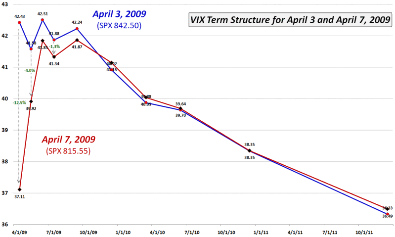
Last Friday, the SPX had its highest close since the 666.79 “devil’s bottom” low of March 6th. From Friday’s 842.50 close to Tuesday’s close of 815.55, the SPX fell 3.2%. During this same period, the cash VIX gained just 1.7%, moving up from 39.70 to 40.39. In the chart below, however, one can see that even thought the cash VIX rose, the volatility index for SPX options in April, May, June, July and September actually fell, with volatility for the April expiration showing a 12.5% drop in the VIX, May volatility dropping 4% and the June through September strikes show a volatility decrease on the order of 0.9%-1.6%. In other words, expectations for volatility – and presumably fear and uncertainty – for the balance of the year continue to point to improvement.

Of course, there is always a group of traders who get fearful when the VIX fails to measure what they believe is an appropriate level of fear. This group, whose concern I can sympathize with from time to time, will undoubtedly see an indifferent VIX as a reason to be even more concerned about the future.

For now at least, the VIX term structure points to increasing investor confidence in the markets and a decreasing concern about the possibility of gravity commingling ominously with oversized footwear.

[source: CBOE, VIXandMore]

Friday, November 28, 2008

Recent Highlights in Volatility

I am moving closer and closer to a regular feature along the lines of “The Week in Volatility.” I’m not quite there yet, so today I am going to turn the keyboard over to others around the blogosphere who have posted some interesting articles of note about volatility from the past week:

Tuesday, November 25, 2008

Citigroup Rescue Triggers Improvement in Credit Default Swaps

Yesterday’s announcement of a $306 billion toxic asset safety net for Citigroup (C) was warmly received in the equity markets and has the potential for helping triggering the first three day rally in stocks since what seems like the Eisenhower administration.

Perhaps even better than the news in the equity markets is the impact that the Citigroup rescue has had in the pricing of credit default swaps (CDS) of financial institutions. Yesterday, for instance, the cost of credit default insurance at Citigroup was essentially cut in half, which is not surprising, given the nature of the agreement. The domino effect at other troubled financial institutions was notable, with CDS prices improving as follows:

  • Goldman Sachs (GS): 68 basis points (18%)
  • Berkshire Hathaway (BRK-A): 86 basis points (19%)
  • Morgan Stanley (MS): 74 basis points (14%)
  • Hartford Insurance Group (HIG): 214 basis points (10%)

For those not versed in the details of credit default swap pricing, each basis point translates into $1000 per year for 5 years to insure $10 million worth of debt, so a 5 year $10 million CDS for Goldman Sachs became $68,000 cheaper in the wake of the Citigroup deal.

The market likes the deal. I think the approach makes sense. Better yet, the Citigroup rescue may provide a workable template for how to best deal with troubled financial institutions in a manner than the government, firm, and market all find acceptable.

Tuesday, September 16, 2008

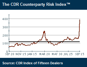
CDR Counterparty Risk Index Swamps March High

Credit Derivatives Research has a Counterparty Risk Index (and a number of related sub-indices) which calculates the average credit spread of the 15 largest credit derivative dealers. Following the recent turmoil in the credit markets, the index now stands more than 50% higher than the previous March 2008 high.

Not surprisingly, the Markit CDX (credit default swap) indices are seeing similar spikes.

[graphic courtesy of Credit Derivatives Research]

Wednesday, April 16, 2008

Measuring Stress in the System

Historically, the VIX has been an excellent proxy for measuring the level of anxiety and stress in the financial markets…but not always the best one.

Back in early March 2007, I suggested credit default swaps – and particularly the Markit indices – as a way to monitor how the markets are pricing in the risk of defaults. Another common way to monitor default risk is to look at the yield spread between corporate bonds of various rating categories versus the (presumably) riskless US Treasury debt of comparable maturity.

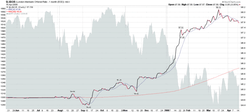
Let me nominate a third alternative: LIBOR rates. LIBOR (formally the London Interbank Offered Rate) is essentially the established rate at which banks lend to each other. Normally LIBOR rates track the Fed Funds rates fairly closely, but lately the LIBOR rates have remained elevated even as the Fed has acted to cut rates and attempted to inject liquidity into the system. If you want to get a sense of how effective the Fed has been in easing tight credit, LIBOR rates (and the "TED spread," which is the difference between LIBOR and the Fed Funds rate) are a good place to start. As the chart below shows, even though LIBOR rates may have topped a month ago, they remain quite elevated when compared to the August-December period.

For more detailed discussion of LIBOR, the Fed, and the current credit crisis, a good place to start is Michael Shedlock’s Failures of the Term Auction Facility – which is decidedly not for the faint of heart.

Monday, April 16, 2007

The Battle for Bond ETF Supremacy

Over the weekend, there was an interesting MarketWatch.com article, "In come more bond ETFs: Vanguard enters wide-open market as Barclays throws out the 'junk,'" about the battle for bond ETF supremacy between Barclays (BGI) and Vanguard, with BGI landing the first few punches. Two items in particular caught my interest:

  1. BGI's launch of the first high yield ETF, the iShares iBoxx High Yield Corporate Bond Fund (ticker HYG); and
  2. the very low 0.11% expense rates for the Vanguard bond ETFs

Specific to VIX, volatility and risk, I can see future applications involving the use of a high yield ETF with a government long bond ETF like TLT to look at ratio charts (unfortunately, StockCharts.com does not yet have HYG in their database,) price differential charts, etc. This type of analysis might turn out to be a good complement to the Markit Credit Default Swap data.

Looking more at the “…and More” side of the ledger, here are a handful of ETF-related links that I get a lot of value from:

Finally, while the bond ETF field is already getting crowded, I thought I might point out a half dozen ETFs that have consistently high volume and consequently are as appropriate for trading as they are for longer term investing:

  • SHY - iShares Lehman 1-3 Year Treasury Bond Fund
  • IEF - iShares Lehman 7-10 Year Treasury Bond Fund
  • TLT - iShares Lehman 20+ Year Treasury Bond Fund
  • AGG - iShares Lehman Aggregate Bond Fund
  • LQD - iShares iBoxx $ Invest Grade Corp Bond Fund
  • TIP - iShares Lehman TIPS Bond Fund

Thursday, March 8, 2007

The Credit Default Swap Canary

Raise your hand if you were following were watching the Bombay Sensex for clues about the future of the Chinese market or were wise to the unwinding of the Yen carry trade before it happened. Maybe you were tipped off to the subprime mortgage debacle. If so, you did a better job than most investors.

I won’t say that keeping a weather eye on the VIX would have guaranteed that you found yourself on the right side of the markets on 2/27, but it would have helped. Careful study of the equity put to call ratio would also probably have helped.

Let me nominate another canary to add to the investment coal mine: credit default swaps. I know, I’m not a bond guy either, but keeping an eye on how the markets are pricing default risk (the spread versus the US Treasury yield curve) is somewhat of a bond analog for how equity risk is priced in with the VIX.

I highly recommend watching the credit default swap index for high yield corporate bonds. A snapshot of this index is available at Yahoo, but much more information is available through Markit (click on the Dow Jones CDX.NA.HY link to pull up the graph below). Note that in the high yield graph, the market discounted 1/3 of the risk premium from September to Feburary and is now going through wild gyrations in an effort to re-price the risk premium to better match current expectations.

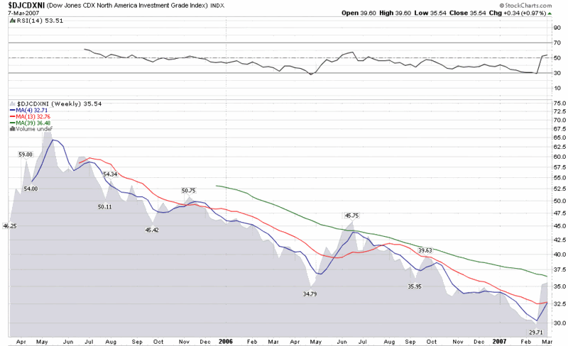
I should also note that while StockCharts.com does not provide charts for the high yield credit default index, they do offer charts for a sister index, the investment grade credit default index, whose weekly chart I have included below. The IG index chart suggests that the recent turmoil in the bond markets is less than what transpired during the May-July sell-off of last year and does little to reverse the 20 month trend of increasingly narrowing credit default spreads.

The bottom line is that it is always good to have a canary that you watch closely to help call market tops and bottoms. It can’t hurt to have several canaries, each with their own unique sensitivities.

DISCLAIMER: "VIX®" is a trademark of Chicago Board Options Exchange, Incorporated. Chicago Board Options Exchange, Incorporated is not affiliated with this website or this website's owner's or operators. CBOE assumes no responsibility for the accuracy or completeness or any other aspect of any content posted on this website by its operator or any third party. All content on this site is provided for informational and entertainment purposes only and is not intended as advice to buy or sell any securities. Stocks are difficult to trade; options are even harder. When it comes to VIX derivatives, don't fall into the trap of thinking that just because you can ride a horse, you can ride an alligator. Please do your own homework and accept full responsibility for any investment decisions you make. No content on this site can be used for commercial purposes without the prior written permission of the author. Copyright © 2007-2023 Bill Luby. All rights reserved.
 
Web Analytics