The Shape of Capitulation in the VIX?
The VIX is a strange animal; and since I just started playing zoologist in this space, I don’t have answers to many of the very basic questions about this beast. Not the least of these questions is whether a chartist approach to the VIX is a valid one. I use charts for everything else, but I have yet to develop a set of charts that I feel has much in the way of predictive value for the volatility indices. I will not, however, let that small detail stop me…
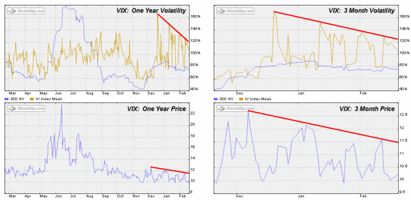
In watching the VIX charts, I have been particularly curious about the mid-December lows and the spike in implied volatility to over 160 that soon followed. As the graphic below shows, when the VIX has dropped and spiked IV, the successive IV spikes have been weaker and weaker.
In fact, both the VIX and the VIX IV seem to have succumbed to some invisible down sloping ceiling over the past two months. If this is true, then the chart wants us to believe that the VIX won’t be going up and it won’t be going down either. For all practical purposes, volatility looks ready to settle in the 10-11 range and it is time for me to change the name of this blog. Of course, at least one VIX watcher was saying essentially the same thing three years ago.
 My take is that what we are seeing is likely the shape of capitulation in the VIX. Of course, the VIX is not just a contrary indicator, it is a contrary animal, so much so that capitulation in this case does not print wild swings and large volumes like it does in so many other indicators. No, the capitulation in the VIX is like a glassy pond where this wind has ceased to blow. For now, at least. I wouldn’t furl those sails just yet.


0 comments:
Post a Comment