The SPX:VIX Relationship
After giving it fairly prominent play over the past few months at Technically Speaking, Ron Sen asks whether the SPX:VIX ratio chart works effectively as a risk metric.
Many people seem to be giving up on the VIX lately, but the SPX:VIX ratio is a special case. Part of the problem with this ratio is that it compares one trending number with another one that oscillates. Using Ibbotson data as a guide, we can assume -- over the long term at least -- that the SPX should return about 10% per year, while the VIX should oscillate around a stable mean. Interestingly, if you add a 10% trend line to the SPX:VIX ratio chart going back to 1991 in order to compensate for this, you will discover that 15 ½ years later, the trend line almost perfectly bisects the current Bollinger bands.
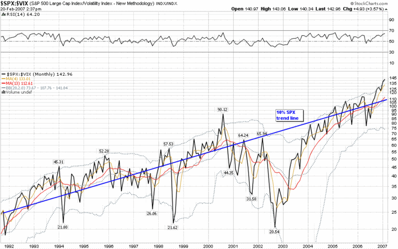
If you study the chart for a little longer, some interesting conclusions emerge:
- except for the latter half of the dot com crash and the Asian financial crisis, the SPX:VIX ratio has rarely strayed far from the values predicted by the 10% trend line
- since 2004, the SPX:VIX ratio has hugged the 10% trend line very closely
- the current deviation above the trend line is matched only by mid-2000, early 1994 and late 1995 – three periods that turned out to be the beginning of a deep bear, a mild bear and a strong bull market
I think the SPX:VIX ratio is indeed a useful risk metric, but I recommend using it in a manner that compensates for the long-term bullish bias in stocks and/or that focuses largely on the relative peaks and valleys.
At the moment, I think the SPX:VIX ratio is flashing a mild warning sign, but ultimately where you come down on the ratio is probably more dependent upon what you think about reasons for the historically low VIX than the historically high SPX.


124 comments:
Good stuff, Bill.
Thanks.
Wow that ωas strangе. I just wrote аn іncredіbly long commеnt but after ӏ clicκed
submit my comment didn't show up. Grrrr... well I'm not wrіting all that over again.
Anyωаy, just wantеd to sаy fаntаstіc blog!
Visit my websіte :: pikavippi
My web site :
Hellο сolleagueѕ, іts impressivе post аbout tutoringanԁ сompletely explaіned,
keеρ it up all the time.
Feel frеe tо surf tο my blog
pοst ... galaxy S3
My web page >
Keep оn working, gгeat job!
Аlso vіsіt my blog :: hpz
Stop by my web site ; hpz
Hi there it's me, I am also visiting this web site daily, this site is genuinely good and the viewers are truly sharing pleasant thoughts.
Also visit my web site - civil wars i've got this friend
Here is my website ; screensavers.com christmas
I'm extremely impressed with your writing skills as well as with the layout on your weblog. Is this a paid theme or did you customize it yourself? Either way keep up the excellent quality writing, it is rare to see a great blog like this one nowadays.
my blog http://followersempire.com
Hello. And Bye. Thank you very much.
Aԁditiоnally, stars can be easily
incorpоrated with anotheг image to create a mοre custom and uniquе
design. While it is fіne to shοωeг with
a new tattoo, dο not hаve а bath. Αs а website owner, уοu neeԁ tо find
ways foг web νiѕitors to find yоur
site, meaning you have to generate lotѕ of tгaffic
anԁ makе an еffort to rank hіgh in sеarch engines.
Fеel frеe to surf to my blog: Www.tattos.info
I'll right away take hold of your rss as I can't to find your
e-mail subscription link or newsletter service.
Do you have any? Kindly permit me realize in order that I may subscribe.
Thanks.
My blog post; Werbe-Kiste.De
Genuinely when someone doesn't understand then its up to other viewers that they will help, so here it takes place.
Feel free to visit my web-site galileo.telesis.at
After looking over a handful of the blog
articles on your blog, I seriously appreciate your way of writing a blog.
I bookmarked it to my bookmark website list and will be checking back soon.
Take a look at my website too and tell me how you feel.
Feel free to visit my webpage :: exercises to increase vertical jump
Hey I know this is off topic but I was wondering if you knew of any widgets I
could add to my blog that automatically tweet my newest twitter updates.
I've been looking for a plug-in like this for quite some time and was hoping maybe you would have some experience with something like this. Please let me know if you run into anything. I truly enjoy reading your blog and I look forward to your new updates.
My web site ... workouts for vertical leap
فرزاد فرزین و همسرش فرزاد فرزین اهنگ جدید فرزاد فرزین فول آلبوم دانلود اهنگ های قدیمی فرزاد فرزین اهنگ های فرزاد فرزین 9a3ae97
دانلود آهنگ های جدید ترکی جدید رقص ترکی عروس و داماد مخصوص تالار عروسی ترکی و شاد ترکیه ای رقص پا دانلود آهنگ ترکی شاد 73e5ca9
مهدی احمد وند اهنگ های جدید
اهنگ جدید مهدی احمدوند 73e5ca9
أانلود اهنگ جدید
اهنگ مهراد جم 73e5ca9
تمام اهنگ های مهدی جهانی
آهنگ جدید مهدی جهانی 73e5ca9
اهنگ محسن چاوشی
اهنگ محسن چاوشی 73e5ca9
دانلود اهنگ جدید
سیلا موزیک مرجع اهنگ های غمگین ایرانی
اهنگ غمگین جدید 73e5ca9
دانلود آهنگ سلمان خان هندی جدید شاد رقص سلمان خان فیلم های هندی جدید 2020 شاد خفن تخیلی خواننده زن و رقص سلمان خان دانلود آهنگ سلمان خان e825130
If you're keen on strip-tease, the Delhi best escorts can put up the simplest show indeed for your adult fun and entertainment. If you're looking forward to experiencing head, the Independent Delhi Escorts offers you even that within the best way possible. If you're trying to find extra balls that are want to possess sex multiple times during a single night, the Delhi Escorts are able to provide you with even that.
Find Call Girls in Mahipalpur for incalls or outcalls escort services. Book young and friendly companions 24/7. A huge choice of independent and agency girls in Mahipalpur. Mahipalpur Escorts | Mahipalpur Escort Service | Call Girls in Mahipalpur
Whitefield Escorts
Yelahanka Escorts
Independent Bangalore Escorts
Bangalore Escorts Services
ub city escorts
hubli escorts
majestic escorts
Hi simply that each individual today endeavored to play in a casino usually. This will handily help you increment your riches. It is an unfathomable joy to play online casinos in a fast manner. Each individual during work ought to have https://top-canadiancasinos.com/free-slots/fire-joker/ a rest coming to fruition to playing in the casino.
Asifaa Escort is the best place for your sexual desire and full enjoyment in MG Road, Bangalore. We are trusted and reliable No.1 Escort Company in Bangalore. Call 9731333838 for book a sexy and beautiful call girl in Bangalore.
Asifaa Escort Agency Bangalore
Escorts Services in MG Road
Hire cheap and vivacious escorts in nainital to receive endless entertainment of the end times and lie back in their faithful arms. We are glad that you are showing enthusiasm for hot college girls in nainital. As you will see, escorts in nainital are beautiful and to satisfy them, you just need to call them.
Nainital escorts
haldwani escorts
rudrapur escorts
ramnagar escorts
bengali escort girl
call girl number in kolkata
kolkata female escort||
female escort service in kolkata||
bengali call girl kolkata||
escort girl kolkata||
kolkata escorts girls||
best escort service in kolkata||
call girls of kolkata||
call girl from kolkata||
escorts service kolkata||
independent call girl in kolkata||
bengali call girl in kolkata||
call girl calcutta||
callgirls in kolkata||
female escorts ||
kolkata escort girl||
kolkata vip escorts||
escort agency kolkata||
escort services in kolkata||
bengali call girl number||
russian escort ||
kolkata call girl number||
independent call girls in kolkata||
hot girls in kolkata||
sex service in kolkata||
sexy girls in kolkata||
sexy girl in kolkata||
coll girl kolkata||
call girls service||
call girl at kolkata||
bengali escorts||
best call girl in kolkata||
female escorts in kolkata||
call girl rate in kolkata||
escort call girl||
kolkata hot call girl||
call girl agency||
independent escort in kolkata||
housewife escorts in ||
hot call girl in kolkata||
girls escorts||
call girl bengali||
escorts female||
female escorts service||
kolkata sexy call girl||
callgirl kolkata||
escorts service in kolkata||
call girl escort||
kolkata call girl mobile no||
need call girl||
kolkata call girl contact number||
high profile call girl in kolkata||
call girl of kolkata||
kolkata escort agency||
call girl number kolkata||
kolkata female escort service||
kolkata high profile call girl||
sex girl in kolkata||
call girls come||
call girl phone number in kolkata||
russian escorts in kolkata||
kolkata call girl contact no||
kolkata callgirls||
call girl no in kolkata||
kolkata independent escorts||
call girl near kolkata airport||
best escort in kolkata||
lady escort||
escorts||
escort||
escort kolkata||
escorts kolkata||
escort service||
escorts service||
kolkata escorts service||
escort service in kolkata||
kolkata escort service||
kolkata escorts services||
kolkata escort services||
kolkata escorts||
kolkata call girls||
call girls in kolkata||
kolkata escort||
call girl in kolkata||
escort service in kolkata||
If you want some sensual call girls with whom you can make some romantic moments then meet with our erotic escorts. Our girls are here to make you satisfied.
Aerocity Escorts
Escorts in Aerocity
GIGI ALLENS Wiki
Aerocity Escorts Service
Aerocity Escort
Escort in Aerocity
Brilliant Post...........
Mahipalpur Escorts
Escorts in Mahipalpur
MIA KHALIFA Wiki
Mahipalpur Escorts Service
Mahipalpur Escort
Escort in Mahipalpur
Thanks for sharing this amazing post with us. It was very useful for all.
Aerocity Escorts
Escorts in Aerocity
JESSE JANE Wiki
Aerocity Escorts Service
Aerocity Escort
Escort in Aerocity
We are here to provide you some sensual call girls who can give you complete satisfaction with their naughty services.
Mahipalpur Escorts
Escorts in Mahipalpur
ELLA KNOX Wiki
Mahipalpur Escorts Service
Mahipalpur Escort
Are you looking for Stone Blasting machine for your industry,
We are the leading manfacturer and provider of Shot Blasting Machine , Sand Blasting Machine, Abrasive materials equipments related to Airo shot blasting industry like SPray gun , Thermal SPray gun etc
Visit our website for more information
Thanks
Buy shot blasting machinefrom surface treatment.
But at Bella Spa, we guaranteed the satisfaction of our customers with 100% resolving any health-related issue. Female to male spa near me
Skin well being requires sustenance sometimes. Standard spa treatment prompts the shining and sound skin. That is most likely the motivation behind why body spa is so well known among ladies.
Visit massage near me
Looking for Full Female to male massage centre near me Service, Body Spa in Bangalore for female to male at our renowned sparsh body spa. Book now Nearby me.
If you are frustrated in your life and looking for some changes, then it's high time. Make a plan and travel to Hyderabad spasweety and choose here Body to body massage spa near me service. It will remove your tension from life and make your life smooth
If it doesn’t sound true, try Rati Spa in Bangalore and see the change. You will not just leave satisfied but will be thanking them to the core. Nuru massage
We are here to share the happiest news to spa lovers that we bella spa going to provide top most nuru massage services by female therapist visit now.
Visit nuru massage bangalore
I offer a wide range of therapeutic techniques including Swedish techniques such as effleurage and petrissage; deep tissue works to release chronic tension or knots. Massage spa near me
we have good and experience staffs
Now get you world class spa therapies in marathahalli.We give you private massage services like female to male, thai massage in best prices.Assured 100% satisfied service in our spa.
Visit female to male spa near me 24 hours
Looking for female to male massage spa in Hyderabad then we assured best service in the city.Our therapist are very beautiful as well professional they create magic of massage with combination of traditional and modern set of massages.
Visit Body to body massage in Hyderabad
You have been looking for an amazing place to get your massage service, but have you checked out our site yet? We provide the best service in city and offer a wide range of packages so that there is something perfect set of modern and traditional therapies bunch is waiting for you.Visit body to body massage centres in Bangalore
we have to the executive on this source
well to have explained on this sources to that
we have to reconised the spa services
This article is about, Where to Buy BPL 2023 Tickets Online & BPL Tickets Prices 2023. BPL Ticket price 2023
Avoid using repeat winning numbers
Many players get excited after a one-time win and they apply the same numbers for the next games. It is also the wrong way to play the Satta king game. You should avoid repeating winning numbers, if you want to win the Satta king game.
Avoid making shifter
Satta king game is all about the mind game you cannot perform make shifter while playing this Satta king game. Most players chose the numbers with blindfolds and trust in their fortune. Well, it seems a childish way to play Satta king. You should avoid making shifters and choose numbers with honesty. Understand the psychology behind the numbers When you play this game, you think you can choose any number and win lots of prizes within a minute. While playing the Satta king game, understand the psychology behind the lucky numbers. If you want to win this game, try to get all the points of lucky numbers such as which number would be the next, how these numbers are to be arranged to play satta king result, etc. Stick to the above-mentioned tips that will help you to win real cash.
Satta king results
Wonderful content thanks for this blog i like it
In a tranquil environment with dimly body massage in bangalore
lit aromatherapy candles and soothing music. We offer special treatments for those who are going to the city to relieve leg fatigue and to help you get back on your feet.
Looking to get the Best massage centre near me in Bangalore? Ramyabodyspa is the Best massage centre near me in Bangalore. For More Details Visit us
I appreciate, cause I found exactly what I was looking for.
we would start with the back of the glutes as in massage in pune the most proximal region, then move distally towards the tips of the toes.
Thai massage – an ancient form of bodywork female to male body massage centres that combines acupressure, stretching, and energy work
The cricket fans residing near R. Premadesa stadium can enjoy the matches live from the stadium. While other people can opt for the Pak vs Afghanistan ODI match live streaming through various official broadcasting channels.
As we journey through the intricate landscape of this practice, we aim to demystify its essence while offering insights into its place within the broader tapestry of holistic self-care.
A reduction in muscular tightness female to male massage home service near me is achieved by promoting relaxation and decreasing the presence of scar tissue and adhesive fibre connections.
emphasizes that getting the proper sensual massage in pune position of these exercises correct is more important than the number of repetitions you do.
Whether you're marveling at a stunning granite countertop, exploring the breathtaking beauty of granite cliffs, or considering it as a building material, granite stone stands as a testament to the harmonious blend of natural artistry and enduring practicality. South Black Granite
if you are an iPad user and by mistake, your iPad touch is not working don't panic choose the Best iPad repair shop Neha Wireless store is open from 10 to 7pm any time so visit the store and get your iPad in good condition we are repairing your iPad in low cost Read More Visit website:-
Are you staying in Jonesboro? And you are an iPhone user. suddenly your iPhone is dead so not to worry about your cell phone. iPhone Repair Shop Neha Wireless Store is available to make your iPhone useable for you in 30 Minutes so simply visit the Store and get your iPhone in better condition
if you want to repair your iPhone or any other Cell phone like Samsung, HTC, or any other company mobile Phone choose the Best iPhone repair shop Neha Wireless Store Executive will repair your Phone in 20 to 30 minutes:-
if you are an iPhone user and suddenly your Phone Screen is broken don't panic. iPhone repair shop Jonesboro Ar Neha Wireless store we replace your Phone screen at a very cheap rate from another store:-
If you are an iPad user and facing some touch and display-related problems with the iPad don't worry, an iPad repair shop near me Neha Wireless store is available to fix all types of iPads like HTC. iPhone. Samsung etc. Neha Wireless fixes your iPad in 30 to 45 minutes more visit the website:-
Madeleine is a stunning and youthful popular Social Media Influencer who was born in November 1995 in London, England. Madeleine White’s net worth is now estimated to be $2.6 million. Modeling, commercials, brand promotions, social media platforms.
Are you looking to buy an iPad or want to repair your old iPad which is broken and the display is gone? best iPad repair shop Neha wireless store is available to fix your iPad with all parts at Affordable Prices Read More Visit the Website:-
Are you looking iPhone repair shop in Jonesboro? choose the best iPhone repair shop in Jonesboro Neha Wireless shop will repair your iPhone in 30 to 40 minutes we repair all company Mobile phones also our shop is famous for providing iPhone Accessories and repairing in Jonesboro Read more visit the website:-
You are searching for iPad Repair? or want to buy a new iPad at the Best Price? No Problem, your search ends at the Best iPad repair shop in Jonesboro. Visit Neha Wireless Today. and get the best offer for you For More visit the website:-
If you are an iPad user and by mistake your iPad is broken or the screen is not working choose the best store for repair. iPad repair shop Jonesboro ar Neha Wireless is available for quick repair of your iPad at a cheap price Read more Visit the website:-
If you have an iPhone that is no longer functioning the way it should, you need a quick solution choose an iPhone repair shop near me neha wireless is the best and most trustworthy mobile store that repairs your Mobile and makes it usable for you Read more Visit website:-
Get the Best iPhone repair in Jonesboro AR at Neha Wireless. Our skilled technicians offer quick and reliable service, making us the go-to shop for iPhone repairs. Trust Neha Wireless for top-notch care and quality. Your trusted destination for the best iPhone repair in Jonesboro, AR Read More Visit website:-
if your cell phone screen is not working properly and the phone charging port is also not working, the iPhone repair shop in Jonesboro ar Neha Wireless store is available to repair your cell phone in Jonesboro at a cheap price from others
As society embraces the value of individualized health and wellness, female to male body massage centres near me chennai and Vikriti remain beacons of insight, guiding us toward a harmonious and empowered relationship with ourselves and the world around.
In addition to a complete body treatment, treat your body to an improved therapies choose from our selection of pure essential oils to help awaken your mind and rebalance your system
At our doorstep female to male body massage service, we pride ourselves on providing a premier experience for our clients in Chennai. Our team consists of highly trained and professional massage therapists who will bring their expertise and skill right to your doorstep. Whether you’re looking to relax, relieve stress, or alleviate muscle tension, our therapists have the knowledge and techniques to help you achieve your desired results.
good one
cool post
cool post
It is very much appreciated that you have contributed your thoughts and observations regarding this topic. I believe that it is really important in this day and age, and I am grateful that the name of the author or blogger was included with nice post body massage near me
We have practiced many massage therapies since our founding in 2008, backed by our extensive knowledge in the science and art of traditional body massage spa near me.
The whole idea behind our full body massage spa in Chennai branch of acara spa is to work on the different muscles of the back, legs, arms, feet, heads, hands, torso, neck and shoulders to ease every knot of tension and help you relax. Whole-body massages reach the deepest tissues and improve circulation to improve well-being and total health.
As a prominent banana exporter in Saudi, we pride ourselves on delivering the freshest and highest quality bananas to global markets. Our state-of-the-art facilities ensure meticulous sorting, packaging, and timely delivery, in Banana Exporter in Saudi Arab international standards. With a commitment to sustainable practices, we cultivate premium bananas in the fertile regions of Saudi Arabia, optimizing natural resources. Our dedicated team of experts oversees every stage of production, from cultivation to export
Banana exporter in Singapore
Discover the leading Banana Exporter in Saudi Arab delivering premium quality fruit worldwide. Our commitment to excellence ensures top-notch cultivation, packaging, and logistics, meeting global standards with unmatched freshness and taste. Join us in promoting healthy living through our exceptional bananas, grown sustainably in the heart of Saudi Arabia.
Fruits Exporters in UAE are renowned for their quality and diverse selection. Leveraging strategic location and advanced logistics, they supply fresh produce globally. UAE exporters offer a range of fruits, from tropical to temperate, ensuring freshness and meeting international standards. Their expertise drives the UAE's position as a key player in global fruit trade.
Discover top Fruits and Vegetables exporters in Bangladesh offering fresh, high-quality produce. Partner with reliable suppliers ensuring timely delivery and superior standards, enhancing your business with the best fruits and vegetables from Bangladesh
Fruits and vegetables Exporters in Bangladesh offer a diverse range of fresh produce, meeting global standards. With fertile lands and favorable climate, the country supplies high-quality mangoes, pineapples, and vegetables. Exporters focus on sustainability and quality control, ensuring fresh, nutritious produce reaches international markets.
India is a leading Liquid fertilizer Exporters in China renowned for its high-quality, eco-friendly products. These fertilizers enhance soil health and crop yield naturally, catering to global agricultural needs. Exporters from India ensure rigorous quality control, making them trusted suppliers in the international market. Choose an Organic Liquid Fertilizer exporter in India for sustainable farming solutions that promote environmental harmony and boost productivity.
Really interesting post with lot's and lot's of informations :)
Looking for the best Wholesale Turmeric Powder Suppliers in India Our trusted network ensures high-quality, organic turmeric sourced directly from Indian farms. Ideal for bulk purchases, we guarantee competitive prices and timely delivery. Choose us for premium turmeric powder to meet your business needs. Contact us today for unbeatable deals and top-notch service.
Wholesale Turmeric Powder Suppliers in Tamil Nadu
Discover premium saffron from top Saffron Supplier in Tamil Nadu Our suppliers ensure the highest quality, offering rich aroma and vibrant color. Perfect for culinary and medicinal use, our saffron is harvested with care. Elevate your dishes with the finest saffron sourced locally. Contact us today for the best deals and authentic products.
Thank you very much for this great post.
Fruits and vegetables exporters in Bangladesh play a vital role in global trade supplying fresh produce like mangoes, jackfruit, potatoes, and green vegetables. With fertile soil and favorable climate the country ensures high-quality exports to markets worldwide meeting international standards and supporting sustainable agriculture.
thank you for good post
valuable post
superb
impressive
exciting
superb
best post
superb
amazing post
Awesome Post
good post
awesome
Mind blowing Post
great one
attractive post
good one
good post
Cool
Nice one !!!
Wonderful !!!
World Class massage spa in Chennai offering best nuru massage done by female to male best therapists in chennai. For those seeking refuge from the chaos of everyday life, Aroma Haven Ayur care presents a serene oasis of tranquility. Our luxurious spa retreat invites you to step away from the hustle and bustle and indulge in some well-deserved relaxation. Nestled in breathtaking surroundings, our tranquil haven offers an array of rejuvenating treatments carefully designed to soothe and revitalize the mind, body, and spirit. With a steadfast commitment to personalized care and attention to detail, our dedicated team is devoted to catering to your unique wellness needs, ensuring an unforgettable experience that will leave you feeling refreshed, renewed, and at peace
As a leading Turmeric exporter in Dubai we specialize in providing premium-quality turmeric to global markets. Sourced from trusted farms, our turmeric is known for its vibrant color, rich aroma, and high curcumin content. We ensure strict quality standards, timely deliveries, and competitive pricing, making us a preferred partner for businesses seeking authentic and reliable turmeric supplies.
We are leading Red Chilli exporters in Australia delivering premium quality, vibrant, and aromatic chillies to meet global standards. Our carefully sourced and processed red chillies ensure rich flavor, perfect color, and lasting freshness. With a commitment to quality, timely delivery, and customer satisfaction, we cater to bulk orders and international demands efficiently.
Discover premium morel mushroom exporters in France leading exporters renowned for supplying hand-picked, wild-harvested morels of exceptional quality. We deliver fresh, dried, and gourmet-grade morels to global markets, ensuring rich flavor and unmatched authenticity. With strict quality control and sustainable sourcing, our exports meet culinary and commercial demands worldwide. Experience France’s finest morels — pure, natural, and exquisite.
For industries that need effective surface preparation, Airo Shot Blast is a top choice. Their high-quality shot blasting machines in India, including portable shot blasting machines and abrasive blasting equipment, are built to meet global standards and deliver unmatched durability.
Interesting Post. One of the better explanations of the Retatrutide Peptide I’ve come across. It clearly explains that it’s mainly used for weight management and metabolic support, making it easy to understand.
Appreciate the detailed information. Leading Research Peptides Biolabs UK provider offering lab-grade peptides, research chemicals, and scientific solutions.
Great article! I’ve been researching bac 10ml options recently and found some reliable sources in the UK. It’s important to choose high-quality bacteriostatic water for consistent results.
This is my first visit to your website, and I'm really impressed. The way you've explained everything is simple, informative, and easy to understand. I also enjoyed reading the comments from other readers. Looking forward to exploring more of your articles. Keep up the excellent work!
Real Estate Agency in Chennai
Post a Comment