Showing posts with label SPX:VIX. Show all posts

Wednesday, September 17, 2008

SPX:VIX Ratio Sets Record for Distance Below Trend Line

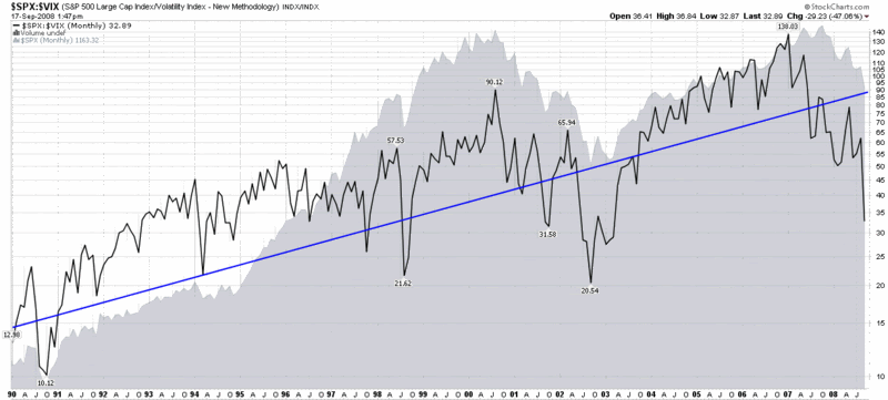
There are many extreme numbers being generated by the current panic in the markets. Since this blog emphasizes volatility, I wanted to share one that takes a long-term view of volatility: the SPX:VIX ratio.

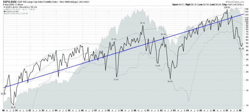
In the chart below, I have created a graphic which tracks the ratio back to the first VIX data from 1990. In addition to the ratio (black line) and SPX (gray area chart), I have also included a blue line that represents a 10% long-term trend line for the SPX (for additional information, try The SPX:VIX Relationship). The key takeaway is that the SPX:VIX ratio is now farther below the trend line than it ever has been during the 19 years of VIX data.

Incidentally, the SPX:VIX ratio has been declining steadily since January 2007, some 21 months ago. As long as the 2000-2002 bear marked seemed, the SPX:VIX ratio trended down only three months more (24 months) during that bear stretch.

The SPX:VIX ratio tends to be mean-reverting around the long-term trend line, but as the graphic shows, the path back to the mean can be a long and difficult one.

[source: StockCharts]

Wednesday, March 5, 2008

SPX to VIX Ratio Turns Up

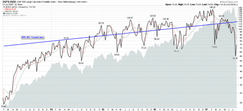
Given my ongoing infatuation with the VIX:VXV ratio and the VIX:SDS ratio, one could easily assume that I have pushed aside an old standby, the SPX:VIX ratio. In fact, I have not posted a chart of the SPX:VIX ratio since the end of July 2007, at which point the ratio had just bounced from 60 to 75.

Fast forward eight months and the weekly chart of the SPX:VIX ratio shows a new low of 50 and a current reading of just under 55. It turns out that the bounce from last July was a temporary one and the ratio has since turned down to levels not seen since September 2003.

One of the factors I watch in this ratio is the distance between the current level and the (blue) 10% trend line [for an explanation of the 10% trend line, try “The SPX:VIX Relationship], which is now greater than any time it has been in the history of the VIX, with the sole exception of the 2002-03 bear market bottom.

Given that the SPX:VIX ratio appears to be turning up again (and ABK was just halted as I type this, so there is the potential for significant momentum flowing back into financials and the SPX if this turns out to be good news), there is a good chance that the bottom in this ratio will hold and the relationship between the SPX and the VIX will move back toward historical norms. I realize that the markets need to work through a considerable amount of credit and other financial turmoil before the SPX:VIX ratio returns to anything resembling a ‘normal’ number, but my gut – and the chart below – suggests there is a good chance the tide is turning right now.

Sunday, November 11, 2007

VWSI Hits -9 as VIX Spikes

In a week where technology stocks were hit harder than financials for the first time in a long time, the VXN rose 30.1% while the VIX rose 23.9% or 5.49 points. Coming on the heels of last week’s 17.6% jump in the VIX, this marks only the third time this decade that the VIX has risen 15% or more in two consecutive weeks, with the two previous instances being two weeks in the middle of May 2006 and the two weeks spanning 9/11.

Even with the VIX printing a rare -9 reading (the third -9 in four months, but only the fifth in the past six years) and the NASDAQ registering the biggest weekly drop in five years, the selloff had a relatively orderly feel to it – at least so far. The fact that the VIX is still ten points below its mid-August high suggests a lack of panic, as does the below average fearogram readings for the SPX:VIX ratio on both Thursday and Friday.

In addition to the extra spice of options expiration, next week’s government data includes a hearty broth of October retail sales data (Wednesday), October consumer prices (Thursday), and October’s industrial production and capacity utilization figures. Earnings season continues, with a healthy does of retail and technology earnings on tap as well.

For a comprehensive look back on last week and a glance at what the coming week may have to offer, I recommend the following links from Barry Ritholtz at The Big Picture:

While the -9 VWSI reading suggests a likely bounce in the coming week, my Where’s Waldo analysis tells me that long red candles in the NASDAQ rarely trigger bounces in the following week. Given that history, the relative lack of fear in the SPX:VIX ratio, the failure of the ISEE to drop below 100 last week, and several other factors, I enter the week by carrying over my bearish bias. I will be watching closely to see what sort of enthusiasm the bulls put into efforts to establish a bottom and threaten yet another quick retracement. This time around I expect it to be at least as difficult as it was in the summer of 2006 for the bulls to push the markets back to new highs, but…this selloff is still early.

(Note that in the above temperature gauge, the "bullish" and "bearish" labels apply to the VIX, not to the broader markets, which are usually negatively correlated with the VIX.)

Wine pairing: For a VWSI of -9, I continue to recommend carmenere as an ideal pairing. The last time around, I sugested a Concha y Toro 2003 Terrunyo Carmenere, some favorite carmeneres listed at Cellar Tracker, and an American effort at Dover Canyon. For ideas about varietals I do not have a lot of experience with, I often check out what is selling at one of San Francisco’s best wine stores, K&L Wine Merchants. A quick search on their site yields a good number of carmenere blends, as well as several selections where carmenere is the dominant varietal.

Thursday, November 8, 2007

The Week in Fear

Since I’m going to have to give a name to this concoction, I’m going to call it my weekly fearogram. Why not? "Fear plot" sounds a little too Halloween for my taste.

In any event, in the chart below, just like its October 22nd and October 3rd predecessors, I attempt to show how the daily SPX:VIX ratio compares to the median ratio for 18 years of data. Interestingly, the chart shows a surprising amount of fear on Monday, followed by middling sentiment on Tuesday, before an atypical amount of fear kicked in yesterday. Perhaps because the market opened in a relatively benign fashion today compared to some early futures projections, fear is actually below normal for the trading day so far.

In between bouts of intensive trading, I am back-testing this fearogram data and hoping to provide an appropriate interpretive framework soon. My initial hypothesis is that the absence of fear will make it easier for the current pullback to continue.

Monday, October 22, 2007

How Fearful Were We Last Week?

Wild weeks sometimes call for wild graphs. By the same token, what fun would it be to have a bunch of VIX data lying around if you didn’t have an opportunity to force it to play Twister at gunpoint from time to time?

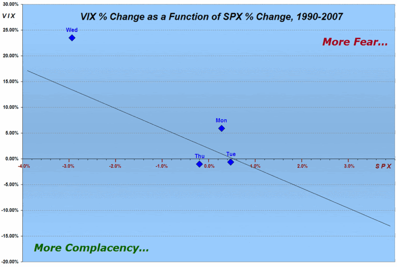
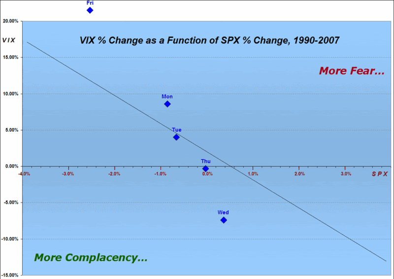
So…with those two thoughts placed firmly tongue in cheek, I set out to find yet another way to show just how fearful the markets were – or were not – this past week. This time around I have plotted a diagonal black line that represents a best fit of all VIX and SPX daily changes since 1990. Above and to the right of that line represents more fear per unit move in the SPX; below and to the left of that line represents more complacency per unit move in the SPX. The blue diamonds are the end of day plots for the changes in the VIX and SPX for last week

A look at the graph shows a notable lack of fear from Monday through Thursday, with Friday’s market selloff generating a spike in the VIX that was out of proportion to a typical VIX move for a -2.56% drop in the SPX. Going forward, I will keep track of how much time the SPX-VIX relationship spends on the fear side of the best fit line and the magnitude of that divergence. Today, for instance, we are back on the complacency side of the line with the Dow down 91 points and the SPX off 8.5 points.

For more information on the relationship between daily changes in the VIX and SPX, see my previous post, “SPX-VIX Daily Correlation.”

Wednesday, October 3, 2007

SPX-VIX Daily Correlation

Yesterday I offered up some numbers to help describe the relationship between daily moves in the SPX and the VIX. I hear quite a few observers comment along the lines of “the SPX was up(down) X% and yet the VIX was only down(up) Y%.” Typically, the next action is to wonder aloud whether the corresponding VIX movement is ‘normal’ and whether any divergences might provide clues about the future direction of the markets.

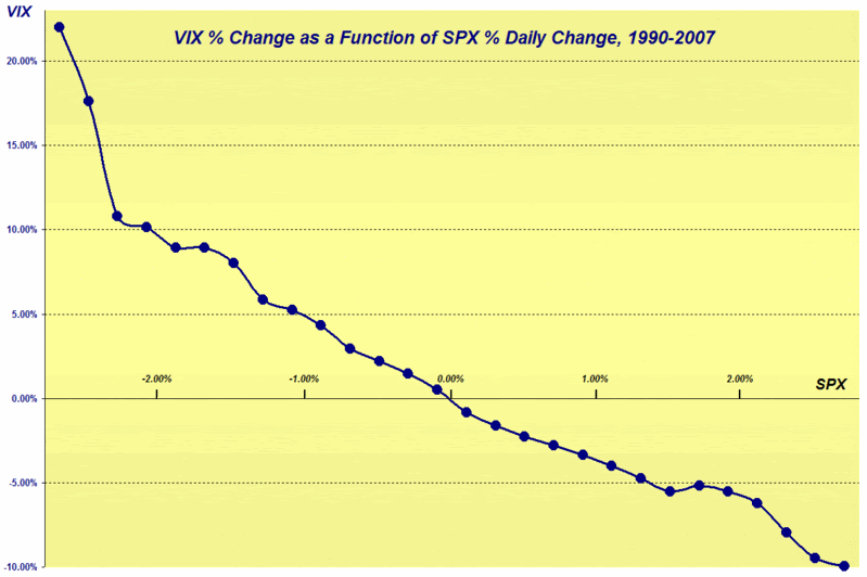
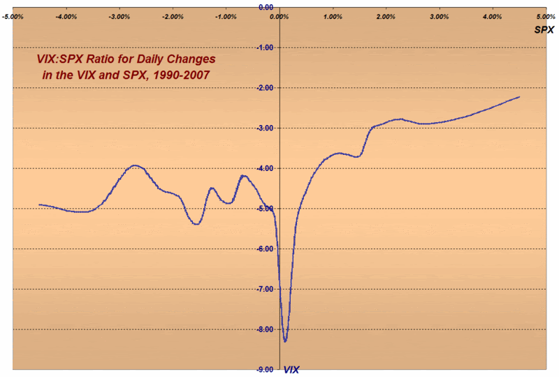
Naturally, I’ll take the easy part of that equation first and offer the reader two ways to look at this. The graph below plots daily percentage changes in the VIX against daily percentage changes in the SPX. From the graphic, you can see that the relationship between the two is fairly linear for a SPX moving +/- 1.5% in a day. Once the SPX moves outside of those bounds, however, the equations get a little messier. Part of this, of course, is the accelerating fear factor that comes with extreme market moves.


The next graph ignores the absolute numbers and focuses on the magnitude of the typical VIX movement versus the SPX movement. Readers are encouraged to ignore the valley around the zero (where strange things happen when you try to divide by zero) and focus instead on the fairly predictable ratio of the VIX to SPX that varies from about -2.5x to about -5.0x, depending upon the daily change in the SPX.


As for the remaining question about whether divergences from the normal relationship provide reliable clues about the future direction of the market, I am going to address this more difficult question over the course of the lifetime of this blog. I will offer this though: if I think I can simplify the answer in one concise post, I will do the best I can to communicate my thinking here.

Tuesday, October 2, 2007

More Thoughts and Numbers on the SPX-VIX Correlation

I have used this space to talk about the correlation between the VIX and SPX, the SPX:VIX ratio and an bunch of other related subjects. Some may be ready to scream “Enough already!” but now it’s time we really got serious about the subject.

Let’s start with yesterday. There was a lot of talk (if you travel in certain blogging circles, at least) about how unusual it was for the SPX to jump 1.33% while the VIX moved down only 0.89%. The contention that the move on the part of the VIX was rather tepid seems to make sense in theory, because it is ‘common knowledge’ that the VIX typically moves in the opposite direction of the SPX and at a much faster rate. Where are the numbers to support this belief? Well, I’m going to start trotting them out in this space, but not all at once, so that I everyone has a chance to move to higher ground before the flood hits.

Some numbers to contemplate, using data from 1990:

  • The VIX and the SPX move in the opposite direction on 76% of all trading days
  • On those days the VIX and SPX move in the same direction, the move is more likely to be up than down
  • In percentage terms, the median daily move in the VIX is -4.2x the daily move in the SPX

Getting back to yesterday, the SPX has risen 1.33% on seven previous instances. On all seven occasions when the SPX has risen 1.33%, the VIX has dropped, with a mean drop of 6.3%, a maximum of 10.1% and a minimum of 1.4%. Of those seven previous instances, the SPX recorded the largest subsequent gains (10, 20 and 50 days out) when the VIX dropped the farthest (10.1%); the SPX had the worst subsequent performance (10, 20 and 50 days out) when the VIX dropped the least (1.4%.) I know this is just seven data points, but history is not looking favorably on yesterday’s VIX performance.

I’ll have a lot more to say about this subject, with a lot more statistical significance, in the near future.

Tuesday, July 31, 2007

The SPX:VIX Ratio, the Mean Reversion Magnet, and Fun With Numbers

During all the excitement of the past week, quite a few indicators printed extreme readings. One that was all over the press was the surge in new lows. Babak, Dr. Brett and Headline Charts did such an excellent job of covering this one that it hardly seems worth noting again here.

Another indicator to print extreme readings that I’m sure I follow much more closely than others is the ratio of the SPX to the VIX. I’ve written a fair amount about the SPX:VIX ratio in the past and am of the opinion that the 10% trend line (for an explanation of the 10% trend line, try “The SPX:VIX Relationship”) acts as an intermediate to long-term mean reversion magnet.

One interesting aspect of the ratio is that it does not specify which of the variables will mostly likely be responsible for moving the ratio back toward the historical trend line. Given that the VIX is much more volatile than the SPX, it is natural to assume that the VIX will make the sharper move, so with an SPX of approximately 1500 and a SPX:VIX ratio of 115 or so, this implies a VIX of 13.04. One interpretation of this calculation is that the VIX is approximately 50% ‘too high’ for the current level of the SPX. Of course, another possible interpretation is that the VIX has been ‘too low’ for much of the baseline period.

Another way of looking at the ratio is to fix both the ratio and the VIX and solve for the SPX. Assuming a VIX in the neighborhood of the current 20 value and a SPX:VIX ratio of 115, this projects to an SPX of 2300, which stretches the limits of credibility a little too far for my taste.

So…if you believe in a relatively constant long-term relationship between the VIX and a trending SPX and all the assumptions that go along with it, which of the two scenarios is more likely to bring the SPX and VIX back toward an equilibrium: an SPX of 2300 or a VIX of 13?

For the record, I do believe in the trend line magnet properties of the SPX:VIX ratio, but I am quick to note that the mean reversion magnet sometimes exerts a sufficiently weak influence that the ratio can stay out of balance for several months to at least two years, as was the case during 2002-03. As unlikely as it may seem in the context of continued volatility in today’s session, the odds favor the SPX:VIX ratio being back in the 100-120 range in the next two months – and this sets up a number of potentially interesting trades.

Tuesday, June 26, 2007

The Language of the SPX:VIX Ratio

A fellow blogger at The dk Report inquired about the analytical value of the SPX:VIX ratio and what it may be telling us at present.

The simple answer is that I don’t know…but I’ll see if I can articulate my uncertainty a little more eloquently in the space below.

Taking a step back, the reason I first even bothered to mention the SPX:VIX ratio on this blog was to address some comments by Ron Sen at Technically Speaking, who blogs about the SPX:VIX ratio on a regular basis and asked rhetorically back on February 19th if this ratio was an effective risk metric. My rejoinder was that it does not make sense to compare a trending number like the SPX with an oscillating number like the VIX. Given that the long-term gains in the SPX approximate 10% per year, I somewhat flippantly suggested that a 10% trend line might be added to this ratio. Having tossed this idea out, I proceeded to look for some insight using the distance between the ratio and the trend line in the wake of February 27th and again when the markets seem to have settled down a month later.

Regarding the 10% trend line, however, I would be remiss in pointing out that my choice of the 10% value was relatively arbitrary (though supported by Ibbotson data) as was my selection of a starting point for the trend line, which turned out to be the default setting for a StockCharts.com monthly chart I created at that time. I used September/October 1991 as a starting point; if you use a different starting month, you can come up with a substantially different trend line.

While keeping one eye on the SPX:VIX ratio, in the last several months, I have spent more of my time and energy researching various correlations between the SPX and the VIX – and will present some findings and interpretations on this subject in the near future. I have already posted about one finding: that when the SPX and VIX are highly positively correlated for short periods of time, this does not augur well for the markets.

High on the priority list for my one man R&D department is to develop a model for long-term volatility forecasts. The VWSI and mean reversion analysis that I have relied heavily upon to this point is best suited for a 5-10 trading day time horizon, though they are sufficiently robust to be applied out to about 20 trading days. It is possible that an analysis similar to that of the SPX:VIX plus a 10% trend line might be appropriate for long-term volatility forecasting, but this remains to be seen. I will also look to tweak the VWSI in order to enhance its predictive power going out 1-3 months. I consider the VWSI and mean reversion to be excellent tools for trading during the current options cycle, but in terms of volatility, I think the Holy Grail lies in being able to look out a quarter or two. This will certainly be an area I look at closely going forward. As always, I encourage reader input.

Friday, April 20, 2007

The SPX and the VIX Revisited

Several readers have inquired about whether the markets can continue to make new highs if the VIX is well above its all-time low. My answer is a resounding “Absolutely!” Frankly, I would expect new highs in the broad market indices to only rarely correspond to new lows in the VIX.

I present my thinking below, but before I get into the details, let me pose a question. Assume I tell you that I have had a glimpse of the future and can guarantee that in 2050 the SPX will be trading at 100,000. Now I ask you to guess what the VIX will be when the SPX hits that milestone. What did you guess? 10? 11? My guess would probably be 18 or 19, as the mean daily close of the VIX since 1990 currently stands at 18.95. For the record, that 100,000 number is not all that outrageous either, as it represents 'only' a 10.1% CAGR, which is consistent with historical rates of return.

The big problem here, as I discussed in some detail in “The SPX:VIX Relationship” is that we are attempting to compare one number that trends about 10% a year over the long-term with another value that oscillates around a mean of about 19.

Let me pull up a monthly chart of the SPX and the VIX going back to 1990 to illustrate my point (click for a larger image; also feel free to disable the Snap preview function with a click on the upper right hand corner of any previewed image if you so desire):
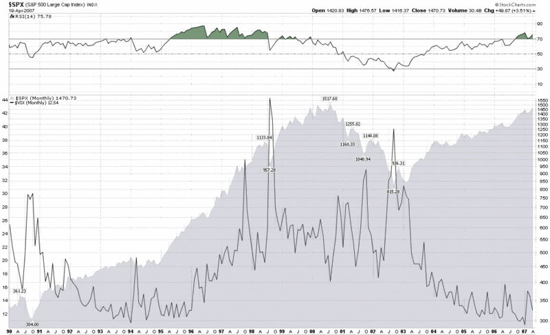

Look closely at the period from October 1994 through March 2000, which, of course, was a raging bull market in which the SPX increased by a multiple of about 4.5x and made hundreds of new all-time highs. What many may not realize is that the VIX was moving up steadily during this period as well, going from the 12-14 range to the mid-20s. In fact, one should expect that given the oscillating nature of the VIX, there will be many bullish periods where the VIX actually goes sideways or rises. Only during extreme bullish complacency should we expect to see VIX readings in the 11-12 range and sub-10 may turn out to be a once a decade phenomenon. Said another way: there is a fairly strong possibility we will not see a sub-8 VIX this century, yet by the end of the century there is a good chance that the SPX will have something like 39 digits in it.

One other factor to consider about the current state of the VIX and market indices is echo volatility, which I have spoken about at length here in the past. While some who may be buying stocks may feel like the big volatility spike is behind us, others, like my dog, are firm believers in volatility clusters – and with good reason.

In summary, time horizons are important, but it is even more important to know when you are comparing trending numbers with oscillating ones. For one potential resolution to the SPX-VIX conundrum, you might wish to take a look at my previous posts on the SPX:VIX ratio.
Tuesday, March 27, 2007

SPX:VIX Back to Predicted Level

A week before the February 27th VIX spike, I talked about the ratio of the SPX to the VIX and posited that the best way to think about that relationship would be to look at the oscillating VIX number in the context of a SPX that is trending approximately 10% over the long term.

The day after the February 27th spike, I revisited the SPX:VIX ratio, which had dropped precipitously from 138 to 76 (on the monthly chart) and commented that I considered a ‘neutral range’ for this ratio to be in the area of 105-115.

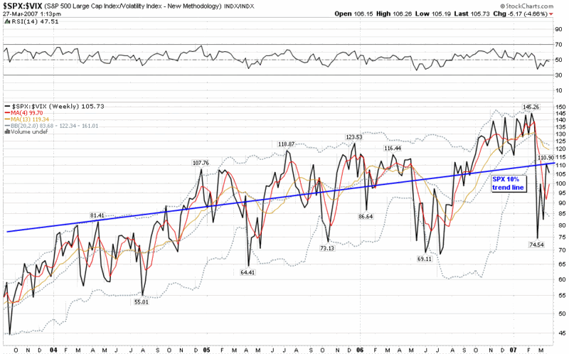
This seems like as good a time as any to update the SPX:VIX ratio, which rebounded all the way to 111 on the weekly chart (below) and now sits at 106. In other words, the SPX:VIX ratio is now just about exactly at the midpoint between the extremes of pre-2/27 complacency and post-2/27 panic – and also very close to the long-term SPX trend line that reflects a 10% annual increase.

If it feels like the forces of bullishness and bearishness are at a standstill at the moment, then it is perhaps because at the current levels, the battle is a draw.

Wednesday, February 28, 2007

Relative Movements of the SPX and VIX

Last week, while some were sounding the death knell of the VIX, I posted an earlier version of the chart below that showed the SPX:VIX ratio had wandered well away from the context of historical norms and above the upper Bollinger band – something that usually happens only once or twice each decade.

Not surprisingly, yesterday’s action turned that relationship upside down, so that the SPX:VIX ratio now sits at the bottom Bollinger band and at a level relative to the SPX:VIX trend line (see that previous post for an explanation) that has not been seen since the latter stages of the dot com bust.

In the last two hours (which are not shown in the end of day chart below) the SPX:VIX ratio has bounced around in the 90-97 range, a move that brings it almost exactly halfway back to the 10% trend line and in close proximity to what I would consider a neutral range of 105-115. My guess is that it will be more of a falling VIX than a rising SPX that will bring these ratios back toward neutral over the next week or two.

I will periodically update this chart going forward and provide some commentary about what the ratio suggests about future market movements. Right now it suggests that the SPX still has a fair amount of firming to do relative to the VIX before it gets to an area where I would be concerned about the SPX taking another dive.


Tuesday, February 20, 2007

The SPX:VIX Relationship

After giving it fairly prominent play over the past few months at Technically Speaking, Ron Sen asks whether the SPX:VIX ratio chart works effectively as a risk metric.

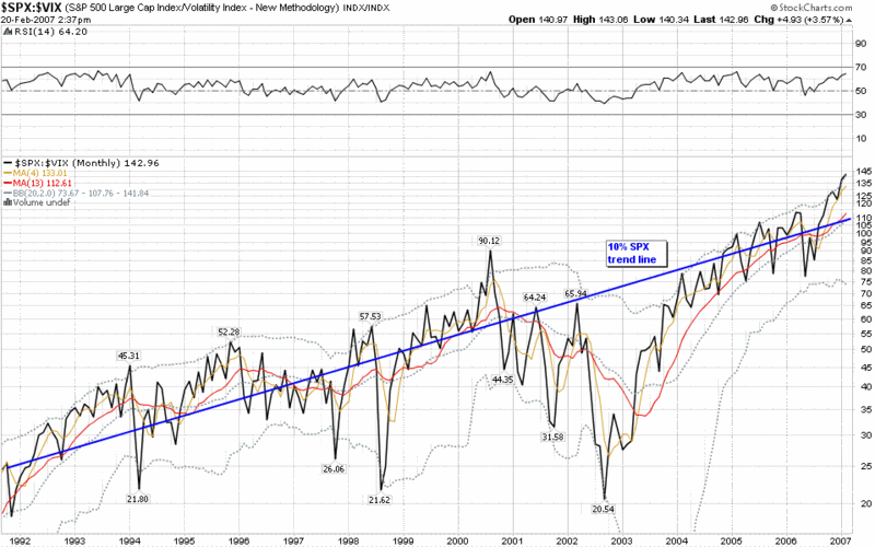
Many people seem to be giving up on the VIX lately, but the SPX:VIX ratio is a special case. Part of the problem with this ratio is that it compares one trending number with another one that oscillates. Using Ibbotson data as a guide, we can assume -- over the long term at least -- that the SPX should return about 10% per year, while the VIX should oscillate around a stable mean. Interestingly, if you add a 10% trend line to the SPX:VIX ratio chart going back to 1991 in order to compensate for this, you will discover that 15 ½ years later, the trend line almost perfectly bisects the current Bollinger bands.

If you study the chart for a little longer, some interesting conclusions emerge:

  • except for the latter half of the dot com crash and the Asian financial crisis, the SPX:VIX ratio has rarely strayed far from the values predicted by the 10% trend line
  • since 2004, the SPX:VIX ratio has hugged the 10% trend line very closely
  • the current deviation above the trend line is matched only by mid-2000, early 1994 and late 1995 – three periods that turned out to be the beginning of a deep bear, a mild bear and a strong bull market

I think the SPX:VIX ratio is indeed a useful risk metric, but I recommend using it in a manner that compensates for the long-term bullish bias in stocks and/or that focuses largely on the relative peaks and valleys.

At the moment, I think the SPX:VIX ratio is flashing a mild warning sign, but ultimately where you come down on the ratio is probably more dependent upon what you think about reasons for the historically low VIX than the historically high SPX.

Friday, February 16, 2007

Around the Horn

Martin Goldberg has a comprehensive review of the VIX on Financial Sense in which he uses a variety of charts to support his claim that the VIX looks like a coiled spring that is ready to jump. He argues that the markets will have difficulty going higher if the VIX does not continue lower, suggests that volatility is bottoming, and reminds us that “fear cannot go bankrupt.”

Brett Steenbarger at TraderFeed has an interesting look at absolute and relative option volatility, with links back to much of his previous VIX research. He also concludes that a market pullback is likely and bases this assessment on the current lows in both absolute and relative option volatility.

Ron Sen at Technically Speaking points to the high SPX/VIX ratio as a warning sign of “enhanced risk” in the markets.

Glenn at the Wednesday Update blog suggests buying VIX calls in the current environment.

Of course, this may just be more linking of arms and minds in that human wall of worry. So says Zen’s Market Insights, Mark Hulbert and many others.

DISCLAIMER: "VIX®" is a trademark of Chicago Board Options Exchange, Incorporated. Chicago Board Options Exchange, Incorporated is not affiliated with this website or this website's owner's or operators. CBOE assumes no responsibility for the accuracy or completeness or any other aspect of any content posted on this website by its operator or any third party. All content on this site is provided for informational and entertainment purposes only and is not intended as advice to buy or sell any securities. Stocks are difficult to trade; options are even harder. When it comes to VIX derivatives, don't fall into the trap of thinking that just because you can ride a horse, you can ride an alligator. Please do your own homework and accept full responsibility for any investment decisions you make. No content on this site can be used for commercial purposes without the prior written permission of the author. Copyright © 2007-2023 Bill Luby. All rights reserved.
 
Web Analytics