Showing posts with label echo volatility. Show all posts

Sunday, February 26, 2017

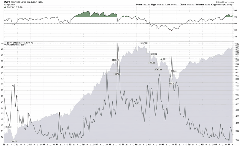
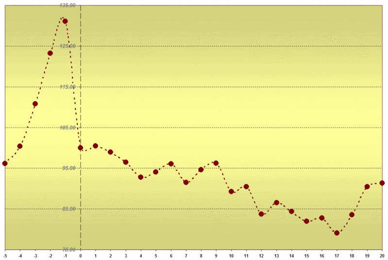
Clustering of Volatility Spikes

Last week, my Putting Low Stock Volatility to Good Use (Guest Columnist at Barron’s) triggered a bunch of emails related to the clustering of low volatility.  Most readers expressed an interest in the phenomenon of volatility clusters occurring in both high and low volatility environments and were curious about the differences between high and low volatility clusters.

When it comes to measuring volatility clusters I am of the opinion that realized or historical volatility is a more important measurement than implied volatility measurements, such as is provided by the VIX.  When I think in terms of VIX spikes, I generally focus on two single-day realized volatility thresholds:  a 2% decline in the S&P 500 Index and a 4% decline.

The graphic below is in many respects the inverse of the graphic in Putting Low Stock Volatility to Good Use (Guest Columnist at Barron’s) – and this should come as no surprise.  Simply stated:  while both high volatility and low volatility cluster in the short-term, volatility regimes tend to persist for several years, so it is very rare to see a clustering of high and low volatility in the same years.  This is exactly the principle I laid out more than ten years ago regarding echo volatility in What My Dog Can Tell Us About Volatility.

[source(s):  CBOE, Yahoo, VIX and More]

Note also that in spite of all the talk in the past few years of the potential implosion of the euro zone, a hard landing in China, central banks across the globe creating the seeds of our destruction, increasingly bipartisan politics creating deep divides across the nation, etc., etc. – volatility has been relatively mild during the past 5-6 years.

The interesting thing about volatility regimes is that they eventually transition from low volatility environments to high volatility environments and vice versa and create what I call VIX macro cycles in the process.  The volatility transition phases are some of the most interesting times in the market and can certainly be some of the most profitable.  These inflection points are sure to be a target of some of my future writing on volatility.

So, as VIX and More sails off into its second decade of publication, I vow to flesh out some of my evolving thinking on subjects I have touched upon above (some of which have lain dormant in this space for several years) at the same time I charge off into new areas.  While I will continue to have a laser focus on volatility (particularly its global, multi-asset class aspects), it is time to pay more attention to the “and More” portion of this title of this blog and make a push into new frontiers.  Said another way:  my thinking likes to cluster, but it likes to spike as well.

Finally, most posts tend to touch on one or two key ideas, so I typically put a half dozen or so links below that I refer to as “Related posts.”  Today, it seems as if I have touched briefly on so many subjects that more links (I’m sure today’s is a new record) seem appropriate and instead of referring to these as related posts, they are now officially Further Reading going forward.  Enjoy!

Further Reading:
For those who may be interested, you can always follow me on Twitter at @VIXandMore

Disclosure(s): none

Thursday, August 18, 2011

Echo Volatility and Another VIX Double Top

Back in 2007, I wrote extensively about the phenomenon I dubbed echo volatility, in which large VIX spikes are frequently accompanied by a second spike of similar size in the month or so following the initial spike. Following the twin VIX spikes over 80 in 2008, I reprised this them in a post I titled The Significance of Double Tops in the VIX.

Lo and behold, here we are in another volatility storm and we have what looks like it was a VIX top of 48.00 on August 8th followed by a spike to 45.28 today – a nine day span between VIX spikes.
Of prior instances of VIX double tops, certainly the most dramatic comes from 2008, when the VIX hit an all-time high of 89.53, pulled back more than 45 points, then spiked all the way back up to 81.48 some 20 trading days later. The timing of these VIX spikes was eerily reminiscent of the 1998 Long-Term Capital Management fiasco, when the VIX hit 48.06 on September 11th, then exactly 20 days later hit a crisis high of 49.53.

In addition to those 20-day periods between VIX spikes, there is also precedent for a 9-day twin top going back to 2002, coinciding with the WorldCom bankruptcy filing. Here we saw a top of 48.46 on July 24th and a secondary spike to 45.21 nine days later.

In sum, of the top seven highest VIX spikes recorded to date, four of these have seen two separate spikes in which the VIX exceeded 45, with those spikes falling from 9 to 20 days apart.

Clearly there are fundamental factors that can trigger another VIX spike above the 45 level before the current volatility storm has passed, but if history is any guide, two is likely to be the lucky number.

Related posts:


[graphic: StockCharts.com]
Disclosure(s): short VIX at time of writing

Monday, August 30, 2010

More Top Emerging Markets ETFs

Entirely by accident, the theme of the last two charts of the week has been emerging markets. A week ago, in Chart of the Week: Rethinking Geography, I chose to highlight how Asian and European emerging markets ETFs had very similar performance charts, much more so than the relationship between each emerging market and its continent-specific developed market counterpart. Yesterday, in Chart of the Week: Irrepressible Colombia (GXG), I highlighted the 42% returns that the Global X/InterBolsa FTSE Colombia 20 ETF (GXG) has managed to post this year, tops among the geography-based ETFs.

As it turns out, there are four other country ETFs which have posted returns of over 20% this year. In the chart below I have highlighted these single country emerging market ETFs and added a fifth top performer for good measure. Ranked in terms of 2010 performance, these ETFs are for Thailand (THD), Chile (ECH), Malaysia (EWM), Indonesia (IDX) and Turkey (TUR).

On a related note, I had previously made two references to the Claymore/Zacks Country Rotation ETF (CRO) as one option for investors who might be looking for an ETF which took advantage of a third party “strategy-in-a-box” country rotation model. For the record, aftera disappointing run, Claymore Securities is set to close CRO in at the end of next week, with the last day of trading on September 10th.

Even in a flat market, ETFs with 20% annual returns are out there. Sometimes it takes a little creative thinking to find them and get on board in time to capture a large portion of that move.

Related posts:


[source: ETFreplay.com]

Disclosure(s): long GXG, EWM and IDX at time of writing

Tuesday, May 19, 2009

Where Will the VIX Bottom?

As I write this, the VIX is at 28.80, after making an intraday low of 28.51 earlier in the session. Since this is the first time the VIX has traded below 30.00 since the middle of September, I am finding there is a great deal of interest in and speculation surrounding where the VIX will ultimately bottom – and what the implications are for equities.

In both How Low Can the VIX Go? and The New VIX Macro Cycle Picture, I predicted that the VIX is not likely to drop below the 25-26 level – and I am standing by that prediction. Actually, in my newsletter I have been a little more precise, saying during the past few weeks that I do not anticipate the VIX falling below 28.00 “for this leg of the bull market.” Frankly, this leg looks a little long in the tooth to me at the moment, but based on the recent price action, the current phase has more of the appearance of consolidation than reversal or impending reversal.

I have weighed in on several occasions about the perils of using the full technical analysis toolbox on the VIX, largely because there is no underlying one can buy and sell, given that the VIX is really just a calculated value. For these reasons – and given the VIX’s tendency toward mean reversion – I tend to shy away from momentum indicators and oscillators when evaluating the VIX and treat moving averages and support and resistance with several grains of salt.

Let me take a minute and put a VIX of 25 into some historical context. First, the historical average of the VIX for 20 years of data extending back to 1990 is 20.12 (dotted black line in the chart below.) The mean VIX for all of 2008, which includes a relatively calm April through August, is 32.68. Looking back at the five year period of 1998-2002, which included the Long-Term Capital Management debacle and the end of the 1990s bull market, the average VIX during this period was 25.27. Current data show S&P 500 historical volatility for the 10, 20 and 30 day lookback periods at 30.88, 27.24 and 30.53, respectively.

The bottom line: 25.00 is a low number for a volatile period.

The VIX may be better analyzed in a macroeconomic and geopolitical context than in terms of technical analysis. Ultimately, the VIX is only rarely a fear index. Most of the time, the volatility index is more accurately a measure of uncertainty or investor anxiety. With the bank stress test results behind us, concerns about structural volatility and systemic risk are now receding and being supplanted by lower anxiety concerns that I like to refer to as event volatility. Sure, the economy may have another significant misstep ahead, but talk of wholesale bank nationalization and the prospect of 15% unemployment have been replaced by discussions of green shoots, bottoming and recovery.

[As an aside, for awhile now I have been thinking about constructing something akin to a Beaufort scale for volatility so we can put absolute measures of volatility into a broader context.]

Regarding the current volatility environment, while confidence and liquidity are returning to the markets, keep in mind that for many investors, the financial and psychological scars are still in the healing process. As long as events and markets continue to improve, that healing process will continue. Should events take a sudden turn for the worse, however, I would expect to see volatility spike dramatically in a case of echo volatility, much like what I described in What My Dog Can Tell Us About Volatility.

In the absence of another spike in volatility, I would also expect to see a dramatic decline in the rate that volatility is decreasing, as we begin to approach a floor in volatility. Even as fears dissipate, there is still uncertainty about the strength of the recovery in addition to the normal uncertainty about the direction of the economy and the markets that would be associated with a period of relative market calm.

Historical volatility, therefore, should provide a volatility floor and with historical volatility currently unable to drop below the low to mid-20s, we should begin to see evidence of that volatility floor shortly. I have seen some investors call for the flood of liquidity to push the VIX under 20. I just don’t see it, at least for now. There is the possibility that stocks enter into an extended period of range-bound trading that brings volatility down to the low 20s, but I would be surprised to see a sub-20 VIX by the end of the year.

In 2007, the VIX ended the year at 22.50. While my crystal ball generally does not extend more than a month or two, my best guess is that we see the VIX in the 22.50 to 25.00 range at the end of 2009.

[source: StockCharts]

Thursday, August 30, 2007

Echo Volatility, Day 10

Following the 2/27 VIX spike, I had a lot to say about echo volatility in this space.

My dog explains the concept best, but a good working definition of echo volatility is along the lines of “the tendency for markets to be more susceptible to volatility spikes in the wake of an initial volatility spike.” Some historical context is available at “VIX Spikes and Echo Volatility” and I looked back at post-2/27 echo volatility in “Lessons from the Post-2/27 VIX Price Action.”

Finally, in response to a reader question, I presented an important element of my thinking regarding echo volatility in “When Is Echo Volatility Safely Behind Us? Here I offered two key takeaways:

  1. The first ten days tell you very little about future VIX prices that you don’t already know by just applying ‘normal’ VIX mean reversion tools to the close on the day of the spike. By day 15, it is possible to predict future VIX price levels [30-60 trading days out] with considerably more accuracy and by day 20 I would say that I am ‘as comfortable as possible’ about making predictions about future VIX levels and the possibility of more echo volatility.

  2. One of the golden rules of VIX mean reversion is that if mean reversion does not play out over the course of 10-20 days, then we are likely headed for a period of extended volatility.

So, here we are on the tenth trading day after the August 16th 37.50 VIX spike top, with a very small echo volatility bounce that took the VIX from 20.44 to as high 26.67 in two days, still almost 30% below the VIX spike top. It is too early to discount the possibility of an another echo volatility VIX spike in the next week or two, but by the end of next week and particularly by the end of the 20 day window on September 14th, the window of opportunity should be closed and we should be able to put the 37.50 spike and any subsequent volatility spikes to bed.

Monday, June 11, 2007

On Short-Term VIX Mean Reversion and Echo Volatility

A reader asked a question about the relationship between the magnitude of short-term VIX mean reversion and the implications for long-term mean reversion and echo volatility.

After doing some research, it turns out that this is a very important question. Specifically, there is a strong inverse relationship between the magnitude of short-term VIX reversion and the continued strength of the longer-term mean reversion trend. Said another way: if the VIX snaps back dramatically in a couple of days, it is more likely that echo volatility (VIX aftershocks, if you prefer) will be an important factor in the next few weeks.

On the one hand, this should not come as a surprise: if most of the mean reversion happens in a couple of days, then less of that same mean-reverting move remains for later. On the other hand, my research suggests that you can use the magnitude of the short-term mean reversion move to measure the magnitude of the long-term mean reversion with surprising accuracy – at least with the benefit of 20-20 hindsight. Whether the future will mirror the past remains to be seen.

Of course, the larger question involves expanding the implications of this finding from the VIX world to the world of the SPX and the broader markets. In this arena, the data look to be encouraging as well.

Arrow up on the predictive value of the VIX for the broader markets.

Friday, April 20, 2007

The SPX and the VIX Revisited

Several readers have inquired about whether the markets can continue to make new highs if the VIX is well above its all-time low. My answer is a resounding “Absolutely!” Frankly, I would expect new highs in the broad market indices to only rarely correspond to new lows in the VIX.

I present my thinking below, but before I get into the details, let me pose a question. Assume I tell you that I have had a glimpse of the future and can guarantee that in 2050 the SPX will be trading at 100,000. Now I ask you to guess what the VIX will be when the SPX hits that milestone. What did you guess? 10? 11? My guess would probably be 18 or 19, as the mean daily close of the VIX since 1990 currently stands at 18.95. For the record, that 100,000 number is not all that outrageous either, as it represents 'only' a 10.1% CAGR, which is consistent with historical rates of return.

The big problem here, as I discussed in some detail in “The SPX:VIX Relationship” is that we are attempting to compare one number that trends about 10% a year over the long-term with another value that oscillates around a mean of about 19.

Let me pull up a monthly chart of the SPX and the VIX going back to 1990 to illustrate my point (click for a larger image; also feel free to disable the Snap preview function with a click on the upper right hand corner of any previewed image if you so desire):


Look closely at the period from October 1994 through March 2000, which, of course, was a raging bull market in which the SPX increased by a multiple of about 4.5x and made hundreds of new all-time highs. What many may not realize is that the VIX was moving up steadily during this period as well, going from the 12-14 range to the mid-20s. In fact, one should expect that given the oscillating nature of the VIX, there will be many bullish periods where the VIX actually goes sideways or rises. Only during extreme bullish complacency should we expect to see VIX readings in the 11-12 range and sub-10 may turn out to be a once a decade phenomenon. Said another way: there is a fairly strong possibility we will not see a sub-8 VIX this century, yet by the end of the century there is a good chance that the SPX will have something like 39 digits in it.

One other factor to consider about the current state of the VIX and market indices is echo volatility, which I have spoken about at length here in the past. While some who may be buying stocks may feel like the big volatility spike is behind us, others, like my dog, are firm believers in volatility clusters – and with good reason.

In summary, time horizons are important, but it is even more important to know when you are comparing trending numbers with oscillating ones. For one potential resolution to the SPX-VIX conundrum, you might wish to take a look at my previous posts on the SPX:VIX ratio.

Monday, April 9, 2007

When Is Echo Volatility Safely Behind Us?

Over the weekend, a reader asked an interesting question, “What day following 2/27 would you have been as comfortable as possible that the volatility index could not or would not sustain its pace?”

My knee jerk answer was that 20 trading days is the magic number for determining whether echo volatility has run its course or if the VIX is entering a period of sustained volatility. A simple test is whether the close on day 20 is below the close on the day of the VIX spike or even below the 10 day SMA.

As March 27th marked the 20th day since the 2/27 spike, the fact that the VIX had dropped 26% from the 2/27 close should certainly provide considerable comfort for those wondering whether the VIX is likely to spike back into the 20s soon.

A look at the chart I posted last Thursday confirms that following the 2/27 spike, the price action in the VIX has been the weakest yet by historical standards. In looking at that same graphic, however, the conclusions about the previous eight VIX spikes are not so obvious.

In this morning’s research project, I examined all nine VIX one day spikes of over 30% (which includes available data for the 2/27 spike) and looked at the close on the day of the spike, 5 days out, 10 days out, 15 days out and 20 days out. I then compared these to the VIX closes on days 30, 40, 50 and 60 in order to determine if any of the five day increments added meaningfully to the ability to predict VIX levels down the road. One conclusion surprised me a bit: the first ten days tell you very little about future VIX prices that you don’t already know by just applying ‘normal’ VIX mean reversion tools to the close on the day of the spike. By day 15, it is possible to predict future VIX price levels with considerably more accuracy and by day 20 I would say that I am “as comfortable as possible” about making predictions about future VIX levels and the possibility of more echo volatility. Of course, your comfort may vary...

Keep in mind that one of the golden rules of VIX mean reversion is that if mean reversion does not play out over the course of 10-20 days, then we are likely headed for a period of extended volatility. Given the events and numbers that have fallen out of the post-2/27 spike, history says that we are more likely to see the VIX back below 11 before we see it in the 20s again.

Thursday, April 5, 2007

Lessons From the Post-2/27 VIX Price Action

Following the 64% spike in the VIX on 2/27, there were many voices insisting that volatility was returning to the markets. For a week or two, they were occasionally correct, but I do not believe you can put a VIX spike in historical context until at least 20 trading days have passed since the spike. The 20th trading day, it turns out, was last Tuesday, so let’s do a post-mortem.

First, as I type this the VIX stands at 13.10, down almost 30% from the February 27th close of 18.31. While we did see some ‘echo volatility’ that briefly pushed the VIX into the 20s on the 4th and 11th day following the spike, for the last 14 trading days the VIX has only closed above 15 once, on March 29th, and even then it just barely managed to do so.

With an eye to historical context, I have been solidly in the mean-reversion camp since the 2/27 spike. On March 1, I posted some graphs showing what had happened to the VIX over the course of the subsequent 20 trading days in the eight previous instances following a 30% spike. In short, the conclusion was to expect considerable mean reversion in the first 10 days or so, with a couple of echo volatility spikes. The high probability trade was to expect mean reversion to win out over any subsequent volatility spikes and if you followed any of my suggested mean reversion VIX options trades, you undoubtedly did very well.

All of which brings us back to the present. How has the VIX price action following 2/27 compared to the VIX price action in previous 30% VIX spikes? The answer to this question, which can be discerned from the graph below of normalized closing prices, is that the two echo volatility spikes on day 4 and day 11 look eerily similar to the historical record. For the most part, the 2/27 VIX spike has been followed by very little volatility. In fact on only two days out of the 20 days subsequent to the spike did the VIX close at a level above the historical mean. I find it even more interesting that from days 14 through 20 (March 19–27), the VIX closed below the historical low on each day, down an aggregate 20-33%.

The next time you see a VIX spike, look for the high probability “fade the spike” play on the mean reversion side and be prepared to bet against the likely one or two instances of echo volatility. History is on your side.

Monday, April 2, 2007

Did We Dive Deep Enough?

After five weeks of increased volatility and a pullback in the S&P 500 that topped out at 6.7%, the question everyone is asking is whether the 6.7% drop was enough to wring out the excesses of the bull market and provide a wall of worry for further advances…or whether a nastier bear ambush lies just around the corner.

In a Sentiment Primer (Long), I did not spell out which scenario the sentiment indicators are pointing to, but if you read my comments on the ISEE the previous day, you know that the case for a resumption of the bull market is strong.

One group of indicators that I purposely left out of my sentiment primer is variously know as market internals, momentum, strength, etc. These include market breadth (advance-decline lines) data, the number of new highs and lows, and the percentage of a group of stocks trading above certain moving averages, among others. I will talk about these indicators in more detail in a future post, but for today I merely wish to update a chart I first posted and discussed here two weeks ago: a ratio chart of the new highs in the NYSE to the VIX.

The current version of the chart, appended below, shows the full extent of the effect on the ratio during the market pullback, in which a small “W” formed in the SPX. By the standards of the past four years, the drop in the ratio was relatively mild compared to other drops, including the May-July 2006 correction. This is partly due to the dramatic spike in the VIX, as we have discussed here ad nauseum, but also a function of the persistence of new highs in the NYSE, as recently noted by Headline Charts.

For the last three years, the 52 week average (not plotted) for the NYSE new high to VIX ratio has held steady in the 10-14 range. As current readings approach this range, the likelihood of the markets running into another bear ambush and bout of echo volatility is slowly receding.


(click to enlarge)

Thursday, March 15, 2007

More Unprecedented Elasticity in the VIX

Clearly, the markets and the VIX took some interesting twists and turns yesterday, but how unusual were those movements?

One interesting statistic is that yesterday’s VIX trading range was 24.8% of the prior day’s close. This has only happened nine times in the last decade and fully 5 of these 9 instances have occurred in the last three weeks!

Another interesting statistic is that the VIX, which is known more for spiking up than spiking down, finished yesterday 18.7% below the intra-day high. This has happened just six times since 1990 and twice (last June and two weeks ago today) in the past eight years. For those who may have some interest in these matters, each of these six occasions happened to fall during a bull market.

I put together my faithful composite historical graph of those six instances. It shows evidence of some additional echo volatility in the subsequent 20 trading days and the lack of a dramatic reversion to the mean which most spikes tend to demonstrate over this period. (An important heuristic is at work here: intra-day spikes tend to have much less subsidence than end of day and multi-day spikes, partly because the nature of intra-day spikes is that much of the subsidence happens before the close.)

If you look at the individual data points, however, (which include the first nine trading days following the 3/1/07 turmoil) some echo volatility is present, but, for the most part, volatility lessens substantially after the first ten trading days.

Tuesday, March 13, 2007

Fade the Echo Volatility Spike

VIX currently at 18.06, +29% for the day.

Looks like some echo volatility and another opportunity to fade the spike.

Wednesday, March 7, 2007

Elast-o-VIX

The events of last week gave us an opportunity to examine what happens when the VIX spikes 30% or more in one day. For the most part, the conclusion was that spikes of this magnitude generally represent a near-term VIX top; save some echo volatility spikes, they also indicate that the VIX should trend down from a large spike.

We are in uncharted territory once again this week, this time with the mean-reversion engine working overtime to snap the VIX back down from the low 20s to 15. In an unprecedented move, the VIX fell over 15% twice within five trading days, dropping 16% on 2/28 and 19% yesterday. Interestingly, the last time two 15% drops fell in reasonably close proximity was in June 2006, when they were ten days apart. Prior to that, there were only nine 15% drops in the previous 17 years and only two of those occurred in the decade leading up to the events of last June.

At one point yesterday, the VIX was down 20%. While it edged away from that number by the end of the trading day, I thought it might be instructive to look at the only three times in VIX history that it has fallen 20% in one day: 9/22/93; 4/15/94; and 6/15/06.

For those who are not familiar with the composite historical graphs I have included here in the past, the chart below takes the three data points above and normalizes the aggregate end of day values at 100 for the day in which the VIX fell 20% (also indicated with a “0” on the X axis and a vertical dashed line through it.) Here I have included the aggregate pricing data for the five days leading up to the 20% VIX drop (-5 to -1) and the twenty days immediately following the drop (1 to 20.)

The graph itself should tell the rest of the story. Personally, I found it most interesting that the 20% VIX drop was – at least in this historical context – a mean-reverting reaction that reversed three days of increasing volatility rather than striking out in a new direction. Interesting perhaps, but not surprising, as it is consistent with one of the recurring themes in this blog.

Thursday, March 1, 2007

Dogs and Earthquakes: Dueling Metaphors?

While talking about my dog as a volatility laboratory has probably been the most fun I have had writing on this blog to date, there is another volatility metaphor that should be kept top of mind as well: earthquakes.

Living in the San Francisco Bay Area, earthquakes are something I am forced to think about from time to time, whether I like it or not. A little known fact is that approximately a half dozen small earthquakes are recorded here every day. Something on the order of 99% of these are not felt by humans and are picked up only by seismographs.

On those rare occasions when I feel an earthquake, my second thought (the first one being whether I should start hedging my real estate investments with CME real estate futures) is one of relief that an earthquake has reduced some of the stress along a nearby fault. Without getting too deeply into the relevant seismology, it is generally accepted that stress builds up along faults as a result of plate tectonics, which describe the movements of the earth’s crust. Since that stress can only be relieved through the forces released by an earthquake, if earthquakes are too few and far between, the pressure on the fault builds up and scientists start worrying about an increased likelihood of The Big One.

In much the same way scientists worry about large earthquakes in the absence of smaller ones, many investors should worry about the increased likelihood of a large VIX spike in the absence of smaller ones. This same line of thinking, which I happen to agree with, would dictate that we should have been particularly concerned because the Dow had gone a record 949 straight sessions (almost four years) without a single day drop of 2% or more. More stress on the investment fault had clearly been building up below the surface, increasing the likelihood of not just a 2% drop, but also of a 3% or 4% one day drop – which is part of the reason that Tuesday’s selloff was so sharp.

Those who are paying attention may wonder if we can have it both ways: can my dog and plate tectonics both explain volatility? My dog would suggest that volatility clusters and trends. Plate tectonics suggests that volatility oscillates.

In fact, volatility clusters and trends in the short term in the same manner that large earthquakes sometimes trigger secondary earthquakes (aka “aftershocks” – akin to echo volatility) and are preceded by smaller earthquakes that are helpful in predicting large earthquakes. Over the longer term, however, my dog goes back to sleep, stress on the fault is relieved and volatility reverts to the mean – until the pressure on the fault starts to build up again and the cycle is repeated.

VIX Spikes and Echo Volatility

The action in the futures this morning might be giving us our first glimpse of echo volatility – something I talked about at length in “What My Dog Can Tell Us About Volatility.” Essentially, echo volatility is a term I use to describe the tendency for markets to be more susceptible to volatility spikes in the wake of an initial volatility spike.

Some of this phenomenon can be seen in the behavior of the VIX in the 20 days following the eight instances in which the VIX spiked at least 30% in one day. In the graph below, day 0 is the VIX close on the day of the 30% spike. In the 20 days that follow, you can see evidence of echo volatility twice looking three days out, another two times on days 9 and 10, once more on day 14, and again on day 20. In sum, six of the eight 30% spikes showed evidence of at least one additional echo spike in the next 20 trading days.

With only eight data points, I am a long way from being able to say anything about statistical significance, but if all market-related talking heads were to bite their tongue until they had something to say with a 95% confidence interval, let’s just say CNBC wouldn’t exist, nor would this blog or any of the blogs over to the right in the “Blogs I Read” section.

With that disclaimer out of the way, I decided to draw a composite picture of the 20 days following the eight instances of a 30% VIX spike. The resulting graph, below, gives values normalized at 100% of the aggregate close on the day of the 30% spike and suggests that those who are long the market should expect to contend with at least one substantial echo volatility spike in the next month and possibly one that looks and feels as dramatic as the one on February 27th.

In the meantime, use stops and always have a plan for how to handle the next spike in your back pocket. Don't forget to pet your dog once in awhile too...

Tuesday, January 30, 2007

What My Dog Can Tell Us About Volatility

I am fortunate that my dog, Logan, is a well-adjusted, happy-go-lucky, 1 ½-year-old canine. To put things in perspective, his idea of a bad day in the market is any time we come home from the grocery store without cheese.

It turns out, however, that he is a walking (or running) volatility laboratory. A typical example of this is the occasional distant noise that just barely penetrates his perceptual radar, particularly on those quiet evenings when he is napping contentedly with the family. Upon hearing the noise, Logan’s altertness instantly spikes, he lets out an involuntary woof, then carefully tunes his ears to their most sensitive setting, seeking any information that will help identify the source of the noise. Usually there are no other disturbances to follow and the noise is catalogued and soon forgotten. His alertness level slowly subsides over the next 10-15 minutes or so and he goes back to napping, a little more fitfully this time and just a little bit on edge.

Things get a little more interesting when another noise surfaces shortly after the first one. What could once be dismissed as the wind, the house settling or some such insignificant event now must be treated as a threat – and just to be safe, a threat of the highest order. Now the appropriate response is a series of barks, nervous glances in the direction of the other members of the pack, brief pacing around, and a rushing off in the direction of the noise to investigate, with a flurry of barks meant to sound more menacing than the source of the noise. Who or what is it? How much harm can they cause? How grave is the threat?

It is the second noise – and any subsequent noises – that creates the equivalent of the Homeland Security red alert and triggers a response similar to what I call “echo volatility” in the markets. Once the elevated level of alertness has been established, it takes a long period of relative serenity for it to subside. On the other hand, when on red alert, any additional noises – big or small – will be magnified and regarded with the utmost caution.

In some respects, my dog is a lot like your typical investor and once he hears two or three threatening noises in a short time frame, it is a good bet that the second leg of a volatility spike is just around the corner.

DISCLAIMER: "VIX®" is a trademark of Chicago Board Options Exchange, Incorporated. Chicago Board Options Exchange, Incorporated is not affiliated with this website or this website's owner's or operators. CBOE assumes no responsibility for the accuracy or completeness or any other aspect of any content posted on this website by its operator or any third party. All content on this site is provided for informational and entertainment purposes only and is not intended as advice to buy or sell any securities. Stocks are difficult to trade; options are even harder. When it comes to VIX derivatives, don't fall into the trap of thinking that just because you can ride a horse, you can ride an alligator. Please do your own homework and accept full responsibility for any investment decisions you make. No content on this site can be used for commercial purposes without the prior written permission of the author. Copyright © 2007-2023 Bill Luby. All rights reserved.
 
Web Analytics