Did We Dive Deep Enough?
 After five weeks of increased volatility and a pullback in the S&P 500 that topped out at 6.7%, the question everyone is asking is whether the 6.7% drop was enough to wring out the excesses of the bull market and provide a wall of worry for further advances…or whether a nastier bear ambush lies just around the corner.
In a Sentiment Primer (Long), I did not spell out which scenario the sentiment indicators are pointing to, but if you read my comments on the ISEE the previous day, you know that the case for a resumption of the bull market is strong.
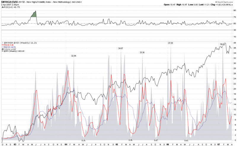
One group of indicators that I purposely left out of my sentiment primer is variously know as market internals, momentum, strength, etc. These include market breadth (advance-decline lines) data, the number of new highs and lows, and the percentage of a group of stocks trading above certain moving averages, among others. I will talk about these indicators in more detail in a future post, but for today I merely wish to update a chart I first posted and discussed here two weeks ago: a ratio chart of the new highs in the NYSE to the VIX.
The current version of the chart, appended below, shows the full extent of the effect on the ratio during the market pullback, in which a small “W” formed in the SPX. By the standards of the past four years, the drop in the ratio was relatively mild compared to other drops, including the May-July 2006 correction. This is partly due to the dramatic spike in the VIX, as we have discussed here ad nauseum, but also a function of the persistence of new highs in the NYSE, as recently noted by Headline Charts.
For the last three years, the 52 week average (not plotted) for the NYSE new high to VIX ratio has held steady in the 10-14 range. As current readings approach this range, the likelihood of the markets running into another bear ambush and bout of echo volatility is slowly receding.


0 comments:
Post a Comment