Showing posts with label time horizon. Show all posts

Monday, September 6, 2010

Chart of the Week: The Monthly SPX

Most of my trades have a tendency to last from a couple of days to a couple of weeks, so as a result I tend to spend almost all of my time looking at charts with daily bars or intraday bars. As a consequence, I find that I run the risk of not focusing on long-term trends.

One of the ways I try to overcome trading with short-term blinders on is to force myself to study some weekly and monthly charts. I find that particularly when markets seem to be at potential inflection points it pays to take out that wide-angle lens and step back for some additional perspective.

This week’s chart of the week is an attempt to do just that with the SPX, using monthly bars going back to 1998 to put the last few months into historical context. What I see is a classic bullish bounce off of a cycle low that has now advanced just shy of the 50% retracement level. Stocks have been consolidating for the past 4-12 months, depending upon one’s perspective, and are likely going to soon be choosing whether to continue upward above the 1220 level and establish some new bullish momentum or fall back below 1010 and make a run in the direction of 666.

The longer time horizon does not necessarily make it any easier to discern the direction of the next big move, but it does a better job of laying out the battlefield and where both bulls and bears should be able to declare victory.

Keep in mind, of course, that it is the victors who get to write history…

Related posts:


[source: StockCharts.com]

Disclosure(s): none

Monday, June 14, 2010

Bernard Lagat and Trading Strategy

Over the weekend I had an opportunity to watch on television as Bernard Lagat ran the 1500 meters in the adidas Grand Prix track and field meet in New York. Just one week after establishing a new American record at the 5000 meters distance in Oslo, Lagat ran a tactically strong race, but was outkicked at the end and finished in fifth place.

A world champion at both the 1500 and 5000 meter distances in 2007, Lagat’s 35-year-old body is now probably better suited to longer distances than 1500 meters, where he was once the second fastest man in history. The graphic below show’s Lagat’s progression over the course of the past dozen years or so. Note that Lagat peaked in 2001 in the 1500 meter distance and his times have gradually slowed since then. On the other hand, while Lagat's speed may be on the decline, his endurance is improving, with the proof that he is now 36 seconds faster in the 5000 meters than he was in 2001.

After watching the race, it occurred to me that something similar has happened to my trading – and at least anecdotally to a large number of other traders. Back in 2001, the majority of my trades were day trades, but as my opponents have become younger, faster and more technologically sophisticated, I find myself, like Lagat, refocusing my efforts on longer time horizons, where my skills and experience match up better than they do against the high-frequency trading crowd.

Whereas Carlos Lopes won the Olympic marathon at the age of 37, I can almost guarantee that Usain Bolt will not win the 100 meters at the 2024 Olympics. Similarly, it makes little sense for me to return to day trading when my skills are a better match for the longer distance events.

As traders, we each need to know our optimal time horizons. Of course, it is important to continue to experiment with strategies across a broad range of time frames, but ultimately we need to be specialists in a specific time frame that best suits our skills and personality, yet preparing for the possibility that our optimal time horizon may be a moving target as we accumulate new knowledge and expertise.

[As an aside, I intend to stray more frequently into the realm of metaphor and analogy in the future in order to provide a broader context in which to discuss trading in general and volatility in particular. With this in mind, I have decided to tag these posts (as well as today’s post and some previous efforts) with the label of “farther afield.” Let the journey begin.]

For more on related subjects, readers are encouraged to check out:


[source: DiamondLeague.com]


Disclosure(s): none

Monday, December 7, 2009

What Is Historical Volatility?

The volatility universe splits fairly neatly into two halves: historical volatility (HV) and implied volatility (IV). I tend to place slightly more emphasis on implied volatility because implied volatility looks to the future, is derived from options prices, and can provide some clues about the current sentiment of options investors. Of course, the CBOE Volatility Index, commonly known as the VIX, is an index that measures implied volatility in S&P 500 index options, so that may persuade me to favor IV over HV a little as well.

Compared to implied volatility, historical volatility seems like a relatively simple concept. It looks backward at price action and measures the degree of change in the price of a security. Things get a little more complicated, however, when one asks two seemingly innocuous questions:

  1. How long of a period?

  2. What method of measurement is used?

The issue of a lookback period is really not much of a complication, but it does lead to a proliferation of historical volatility numbers. As historical volatility looks only at trading days, it is important to note that the historical volatility calendar differs from the implied volatility calendar. As a result, the standard implied volatility time horizon of 30 (calendar) days (such as is used by the VIX) translates to about 21 trading days, assuming the usual NYSE nine holidays per year. Even with the different calendars, the most frequently used historical volatility measurement is HV 30, which translates to about 43 calendar days.

The appropriate lookback period to use for historical volatility calculations is ultimately a matter of personal taste. As noted above, most providers of HV data tend to standardize on HV 30, but I generally prefer HV 20 or HV 21, as this is a better approximation of a trading month. One can use shorter time frames, but investors should be wary of the amount of noise in calculations that look back less than 20 days. Still, I like to look at HV 10 to get a sense of the most recent volatility trend. Looking farther out, HV 50 or HV 60 are popular ways to capture almost an entire earnings cycle, while HV 90, HV 100, HV 180 and HV 200 are all excellent ways to capture the long-term volatility trend. In order to incorporate a full year of historical volatility, HV 250 is recommended. Some options traders like to look at two full years of historical volatility data with the likes of HV 500, but I rarely find much value looking back a second year unless – as is the case right now – the most recent year is filled with quite a few statistical outliers.

Any good options broker will have one of more historical volatility calculations built in, but HV data is also available from various options service providers such as Livevol or iVolatility.

Note that standard historical volatility data are the result of a calculation involving close-to-close prices, specifically end of day prices. As such, historical volatility does not capture the magnitude of any intraday price movements, which are better served by calculations such as an average true range.

Finally, while there are many ways to calculate historical volatility, by convention historical volatility is calculated by taking the standard deviation of the difference between the natural log of the daily changes in the price of the underlying and the mean value during the lookback period. This sounds a lot uglier than it turns out to be in Excel. Since this is the holiday season, however, tomorrow I will provide a recipe for the traditional historical volatility calculation as well as a modification that I find simpler and more useful.

For more on historical volatility, readers are encouraged to check out:

Disclosure: Livevol is an advertiser on VIX and More

Friday, December 4, 2009

New Dr. Brett Series on Lessons for Developing Traders

If there is one blog on the web where I never seem to find the appropriate amount of time required to digest all the nuggets of wisdom it contains, that site is undoubtedly Brett Steenbarger’s TraderFeed. Filled with insights that range from quantitative analysis and system development to what is arguably the best collection of content on the web in the realm of trader psychology, TraderFeed continues to be – at least in my opinion – the top all-purpose investment blog on the web.

For this reason, when Brett mentioned in Lessons for Developing Traders: What Moves Markets that he is “going to write about topics that no one told me about when I was learning the ropes,” I thought that instead of waiting until the series is finished to highlight it I would flag it now for anyone who is not already on the Steenbarger bandwagon.

This new series also got me thinking to about the three things I wish I had been told (assuming I was smart enough to follow that advice) at the beginning of my trading career. The answers are personal ones, but I believe they capture insights that led to quantum advances in my trading:

  1. Standardize on one time horizon…and make it consistent with your trading approach and personality

  2. Make research and analysis of risk management at least as important as R&D on stocks, indicators and strategies

  3. Focus more time on developing expertise in managing (and exiting) existing positions than on discovering new high potential entries

For the record, a close fourth in this exercise was understanding the tenets of behavioral finance and the associated decision-making pitfalls that investors should learn to avoid. Those who wish to get a better sense of how I see the learning process for developing traders may wish to investigate my trader development stage model.

Readers, feel free to use the comments section to spell out the 3-4 things you wished someone had told you when you first started trading.

For more on these subjects, readers are encouraged to check out:

Disclosure: none

Wednesday, March 18, 2009

XLF Bias Depends on Time Frame

Lately it seems as if the financial sector is the market. For this reason, I now watch the financial sector SPDR (XLF) and the KBW Bank Index (BKX) tick by tick, in addition to a handful of financial stocks that seem to be in the most peril on a particular day.

In my opinion, however, XLF is the best way to capture the full extent of goings on in the financial sector, from banks and brokerage houses to insurers and consumer finance companies, XLF pretty much covers the waterfront.

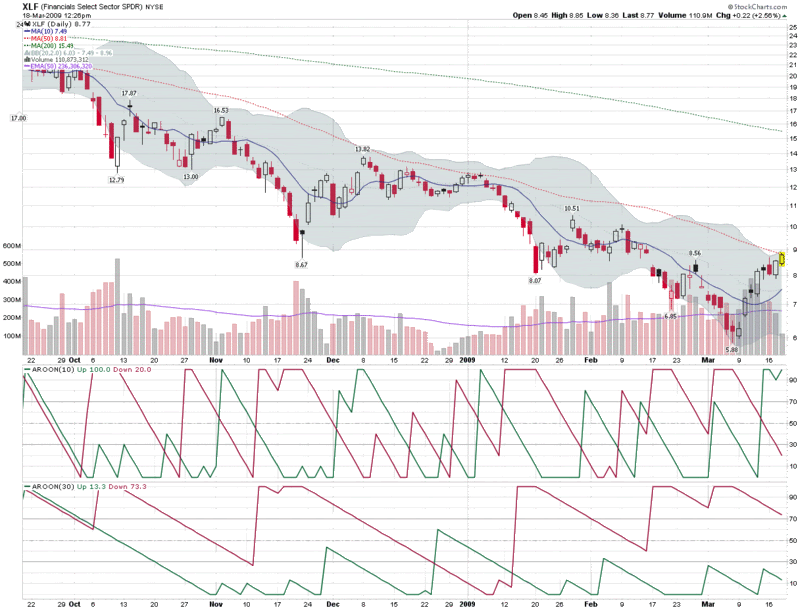
The chart below captures the last six months of action in XLF and highlights the problem facing XLF and the broader markets at the moment. Stocks are overbought in the short-term and oversold in the long-term.

Rather than use oscillators to show how overbought and oversold stocks are, I generally prefer to rely on a combination of moving averages and trend strength indicators, with volatility as an important secondary indicator. Looking at the moving averages, XLF is now well above the 10 day MA and running up against resistance in the form of the 50 day MA. In terms of trend, utilizing the Aroon indicator to measure trend and breakout strength, XLF is bullish in the 10 day calculations, but bearish from a 30 day perspective. In this chart there is not much to see in terms of volatility, but by tracking in the upper half of the Bollinger Bands, XLF generally has positive short-term momentum, while proximity to the upper band suggests a reversal is likely soon.

So there you have it: bullish momentum triggering buying on the part of the trend following crowd, while overbought indicators have the swing trading crowd ready to get short. Such is the current state of the market. The direction in which you lean is more likely to be a function of the time horizon of your analysis than any other technical factor.

[source: StockCharts]

Disclosure: Short XLF at time of writing.

Monday, December 22, 2008

The VIX, Lehman Brothers, and Forecasting

Jeff Kearns and Michael Tsang of Bloomberg have an article out today (VIX Fails to Forecast S&P 500 Drop, Loses Followers) in which the authors contend that largely because the VIX failed to predict the October losses in the S&P 500 index (SPX), the VIX is no longer considered to be an accurate gauge of future market activity.

One of the central claims made by Kearns and Tsang regarding the lack of effectiveness of the VIX is stated as follows:

“On Sept. 11, less than a week before New York-based Lehman Brothers Holdings Inc. went bankrupt and four days after the government takeovers of Washington-based Fannie Mae and McLean, Virginia-based Freddie Mac, the VIX closed at 24.39. That meant traders bet the S&P 500 wouldn’t fluctuate more than 24.39 percent on an annualized basis, or about 7 percent in the next 30 days, and implied a range for the index of 1,161.11 to 1,336.99.

One month later, on Oct. 10, the S&P 500 closed at 899.22, or a record 23 percent lower than what the VIX predicted.”

As fellow blogger Don Fishback was quick to point out, the VIX calculation actually estimates one standard deviation of annualized 30 day volatility expectations in SPX options. That standard deviation, of course, is meant to capture 68.3% of the Gaussian or normal distribution of prices. In fact, the distribution of VIX prices does not follow a normal distribution, but even if it did, the movements from September 11th to October 10th would not be that statistically improbable.

Some quick comments on the math involved here. Using a VIX of 24.39, the conversion of an annualized volatility of 24.39% to 30 day volatility yields a 30 day volatility of 7.04%. Two standard deviations translate into a 30 day volatility of +/- 14.08% and should cover about 95.5% of the normal distribution (I am assuming a normal distribution for the sake of mathematical simplicity). Three standard deviations increase the range of expected volatility to +/- 21.12% and should capture about 99.7% of the normal distribution. In fact, the 99.9% boundary for the normal distribution is 3.29 standard deviations and translates into expectations of an SPX move of 23.16%, about on par with what transpired. So, given that an event which falls outside of 99.9% probability distribution happens once every 1000 instances. Rare indeed, but not unfathomable.

Of course there are many ways in which to utilize the VIX to aid in market timing. Consider that the nature of the VIX calculation is such that the VIX acts as an unbounded oscillator whose values are derived from prices paid for options on the SPX. Like most oscillators, traders tend to use extreme values as opportunities to bet on a reversion to the mean.

A good deal of the difficulty in understanding the movements of the VIX is that some of the dominant patterns are different over the course of different time horizons. For instance, in the short-term, the VIX commonly spikes and mean reverts. Looking at the intermediate term, the VIX frequently establishes strong trends; and in the long term, the VIX has a tendency to move in cycles of 2-4 years. For the month of September and most of the month of October, the VIX was in an uncharacteristically strong sustained uptrend.

Part of the reason for the sharp move in the VIX during September and October is that it is highly dependent upon macroeconomic and fundamental events that help to shape investor perceptions of uncertainty, risk and fear. In the week leading up to the Lehman Brothers bankruptcy, for instance, very few investors believed that the government was prepared to let Lehman fail. Additionally, in retrospect is seems as if those who did believe failure was an option did not comprehend the nature of the systemic reverberations that a Lehman bankruptcy would trigger.

The bottom line is that during the second week in September, the VIX was pricing in a very low probability of a Lehman Brothers bankruptcy. Perhaps more important, investors were also assigning a significantly lower systemic threat potential as a result of the dominoes associated with a Lehman bankruptcy.

Ultimately, it took a full six weeks of a steadily trending VIX for the market to fully price in the global systemic risks associated with the sequence of events that began with the Lehman Brothers bankruptcy.

Consider that the prices and implied volatilities of SPX options have to account not just for the probabilities associated with various future scenarios, but also the magnitude of the impact of those scenarios on the stock market. For this reason, even while some of the probabilities may not have varied significantly from day to day during September and October, as the magnitude of the financial crisis was slowly revealed, the VIX continued to ratchet higher – and investors reacted to a rising VIX with increasing alarm.

Getting back to the question posed by Kearns and Tsang, yes the VIX underestimated future volatility back on September 11th. At that time, the prediction of a four year flood was consistent with mainstream thinking. Very few observers anticipated the SPX falling below 800 by Thanksgiving.

As the year winds down, I will have more about what we learned about volatility in 2008 and what some of the implications are for 2009 and beyond.

Monday, August 4, 2008

The Evolution of the Volatility Index Family Tree

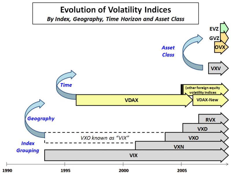
In the beginning, there was the VIX. Eventually, the reach of the VIX was deemed too narrow and the volatility index universe was expanded to include the VXN, VXO, and a host of other volatility indices based on various U.S. equity indices. First an American phenomenon, volatility indices soon began sprouting up overseas, notably in the form of the German VDAX, but more recently reaching Asian shores with the April launch of the India VIX.

Having expanded geographically, volatility indices also recently began to expand the time horizon in which they evaluated volatility with the launch of the VXV, the 93 day version of the VIX.

In the last three weeks, the CBOE has started moving past equity-based volatility indices into commodity and currency volatility indices. The OVX (“Oil VIX”) was the first such effort. Last Friday the CBOE launched two new volatility indices:

  • GVZ – CBOE Gold Volatility Index (“Gold VIX”), based on the GLD ETF

  • EVZ – CBOE EuroCurrency Volatility Index (“Euro VIX”), based on the FXE ETF

The graphic below summarizes some of the highlights across the volatility index evolutionary timeline.

It remains to be seen whether the VIX branding and labeling will stick to oil, gold and the euro. Five years ago, the VIX label was transported from the S&P 100 (OEX) to the S&P 500 (SPX), but until the past few months there has been only one VIX. With the recent arrival of the India VIX, Oil VIX, Gold VIX, and Euro VIX, there is ample room for confusion about what exactly “VIX” means. On the other hand, “VIX” is really just shorthand for a generic “volatility index.” If this potential confusion can be overcome, the CBOE may have found a way to enhance and extend the most successful product and brand they have ever launched – and in the process dramatically change the volatility landscape.


Wednesday, June 25, 2008

The Three-Legged Stool

The issue of whether to rely primarily on fundamental or technical analysis is one that each investor has to struggle with, usually a number of times over the course of his or her investing lifetime.

While the relative merits of the two approaches will appeal to different types of investors, I find it hard to believe that the high court of investment strategy will ever rule in favor of one approach at the expense of the other.

None of this stopped Felix Salmon of Portfolio.com from launching an attack on technical analysis in Monday’s Adventures in Technical Analysis, Jim Cramer Edition. After giving Cramer a well-deserved lambasting, Salmon makes the jump from the particular to the general case:

“…Stock traders don't know anything.

It's not just Cramer, is the point. They all do it: even much smarter and much more analytical traders like Barry Ritholtz do it too. Do what? Resort to ‘technical analysis’, which is the art of drawing lines on charts and extrapolating from them what the market is going to do next.

Whenever you hear words like ‘overbought’ or ‘oversold’ or ‘momentum’ or ‘support’ or ‘resistance’, it means that whatever you're hearing is garbage. But it also means that the person you're listening to has no idea what's about to happen, and is therefore resorting to the financial equivalent of astrology.”

For starters, I would consider Cramer to be more of a fundamental guy than a technical analyst, but that is not the important point. Interestingly, to my thinking, Barry Ritholtz spends as much time as anyone writing about macroeconomic and fundamental issues, but this apparently escaped Salmon’s notice as well.

Ritholtz’s succinct response, which can be found in its entirety in Let’s Get Technical, includes a reframing of the question and a quick summary of some of the merits of technical analysis:

A better question to ask is "What information do charts and related data provide, and how can this be used by investors and traders?"

I posit that, when used appropriately, charts and data can provide tremendous insight:

- Provides a statistical approach to investing, one that describes the probabilities of various outcomes (versus making predictions)
- Charts show you if we are in a bull or bear market, allowing you to manage risk appropriately;
- Trends can keep you away from the wrong sectors (Housing, Autos, and Finance are obvious examples) or keep you in the right sectors (eg., Energy and Ag)

- Developing good risk/reward analyses;
- Tracking what the institutions are doing;
- Identifying specific stocks that might be appealing;

The bottom line is that TA is merely a tool, albeit one used more skillfully by some than others.

Finally, consider this question: If you could look at one and only one source before buying your next stock or fund, which would you choose: a fundamental analyst's report (with no charts in it), or any chart of your choosing? While I like having access to both, I cannot ever imagine buying something without first looking at the chart …”

There are many examples of investors who have been very successful investing exclusively with a fundamental approach – and I’m sure there are at least as many investors who have prospered mightily using only technical analysis. Part of the reason investors gravitate to one approach or the other is that it fits their personality and provides a certain level of comfort.

To my thinking, the most important determinant of whether to focus on fundamentals or technical analysis is one’s investment time horizon. In a nutshell, the shorter the time horizon, the more important technical analysis becomes. Find me a day trader, for instance, that invests primarily based on fundamental factors. One the flip side, find me a chartist who is looking at monthly charts covering more than a decade who does not think it is important to be educated on some of the relevant fundamentals that are driving the long-term price action.

Personally, I like to think of my trading style as marrying roughly equal parts of technical analysis and analysis of market sentiment (which I consider to be tangential to TA), informed by a broad view of stock and industry fundamentals, in the context of a larger macroeconomic environment and interrelated global markets. Ultimately, it’s a three-legged stool, with TA, market sentiment, and fundamental analysis providing a balanced perspective.

Finally, I have received a number of comments in which readers have expressed surprise that my subscriber newsletter covers a much broader range of topics than is generally touched upon in the blog. The reasons for this are simple. All the talking heads talk about macroeconomics and fundamentals all day long. There are also a number of blogs and other web sites that spend a lot of time analyzing charts and other TA data. I choose to focus on market sentiment on the blog because I don’t believe this subject gets nearly the attention it deserves. Those who understand volatility, put to call ratios, market breadth data, and other related subjects and who can combine that information with a fundamental + technical approach have a much greater chance of success than those who ignore market sentiment.

In the subscriber newsletter, I utilize a holistic approach to the markets and incorporate a broad range of themes, because I believe it is important to see the whole playing field and not to have any investing blind spots. The approach seems to be working, as I have a 98% renewal rate and am in the process of writing a book on the subject, slated to be published by Wiley Trading in the first half of 2009.

Monday, June 16, 2008

Bollinger Bands and the Standard Deviation Setting

On Friday, I used Bollinger Bands: Why 20 Days? as an excuse to begin my “evangelical crusade against rampant defaultism.” I did this mostly so I could make up a word (or so I thought, apparently others beat me to it), but also to warn against the tendency to favor the default settings in charting software in lieu of rigorously exploring the alternatives.

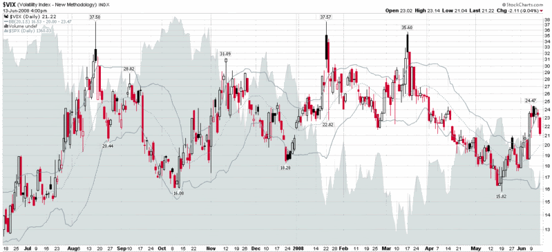
Using Bollinger Bands as my guinea pig indicator, on Friday I explored what happens when you tweak the default setting of 20 days. The other important setting in Bollinger Bands, of course, is the standard deviation setting. In Bollinger on Bollinger Bands, John Bollinger cites tests he conducted on various stocks, indices, currency pairs, and commodities, the results of which led him to conclude that a 2.0 standard deviation setting was quite robust across a variety of asset classes and time frames. Bollinger went on to recommend that the standard deviation setting should be decreased to 1.9 for a time window of 10 days and increased to 2.1 standard deviations when the time frame is extended to 50 days. In other words, modifying the number of days is more likely to provide additional insight than adjusting the standard deviation setting.

Undeterred, I have had a lot of fun experimenting with the standard deviation setting for VIX charts and a number of other charts. My takeaway: even if you do not discover any particularly revealing new information, it is important to experiment with the default settings to get a better understanding of how the indicator works in default mode and why the bands act the way they do.

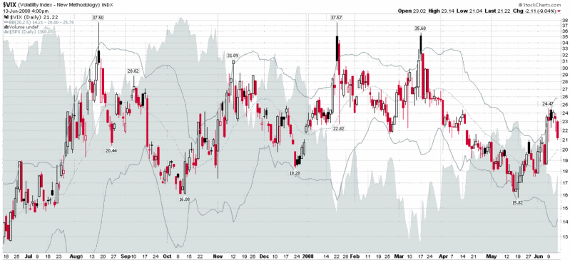
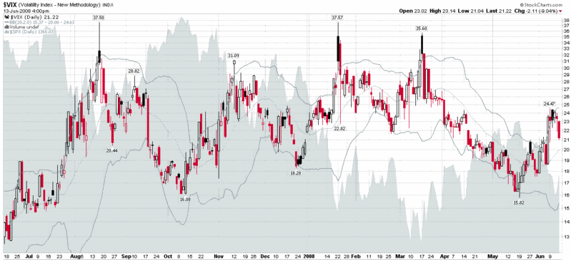
In the VIX charts below, I have included the 2.5 standard deviation setting on the top, with the default 2.0 standard deviation setting in the middle, and the 1.5 standard deviation setting on the bottom. As the graphics show, the standard deviation settings can be fine tuned to adjust the frequency of signals generated by the indicator in a given time period. The exact settings should be largely a function of one’s preferred trading time horizon.

Thursday, October 25, 2007

Two Thoughts on the McClellan Summation Index

For the most part, my trading time horizon is one of hours and days, yet I do have a long-term portfolio that helps motivate me to periodically check out trends and themes that may take months or years to play out.

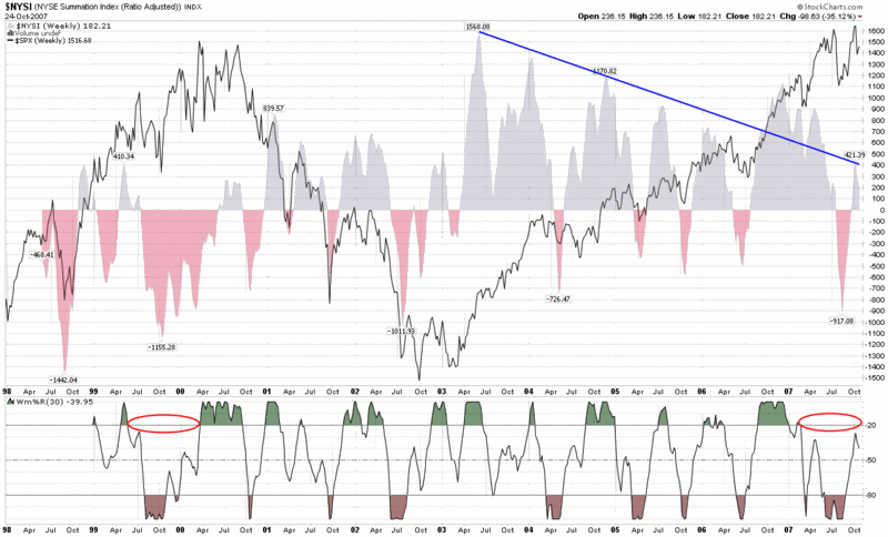
One of my favorite indicators to assist in looking at intermediate and long-term trends is the McClellan Summation Index, which I have talked about here on several occasions in the past. Lately I have been looking at a weekly version of the chart that goes back to 1998 (the farthest StockCharts.com has to offer) and two things have been gnawing at me.

(Of course I should probably preface my remarks by noting I have some concern that once my gut starts to go bearish – which it does not do very often, but has done lately – I wonder whether my chart reading starts to suffer from confirmation bias.)

The first concern I have is the possibility that the trend of lower highs in chart (represented by the blue line that conveniently ignores the data from late 2006 through early 2007) may turn out to be significant, particularly if the relatively low peak of 421 earlier this month cannot be surpassed in the near future.

The second concern I have is the amount of time that the Williams %R indicator has spent below the -20 line. Looking back at the chart, the only other time I can see that the Williams %R failed to generate these high values for at least nine months or so was in the last nine months of the 1999-2000 bull market top.

It seems like a long shot, but each of these two observations continues to bother me.

Friday, April 20, 2007

The SPX and the VIX Revisited

Several readers have inquired about whether the markets can continue to make new highs if the VIX is well above its all-time low. My answer is a resounding “Absolutely!” Frankly, I would expect new highs in the broad market indices to only rarely correspond to new lows in the VIX.

I present my thinking below, but before I get into the details, let me pose a question. Assume I tell you that I have had a glimpse of the future and can guarantee that in 2050 the SPX will be trading at 100,000. Now I ask you to guess what the VIX will be when the SPX hits that milestone. What did you guess? 10? 11? My guess would probably be 18 or 19, as the mean daily close of the VIX since 1990 currently stands at 18.95. For the record, that 100,000 number is not all that outrageous either, as it represents 'only' a 10.1% CAGR, which is consistent with historical rates of return.

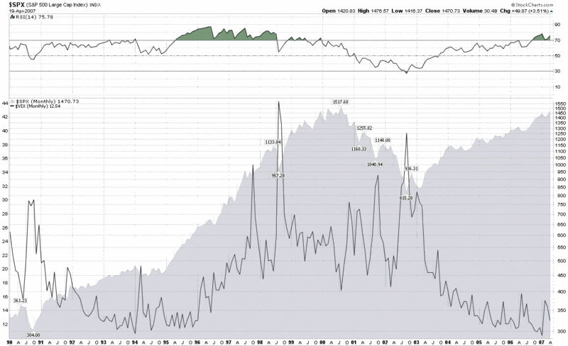
The big problem here, as I discussed in some detail in “The SPX:VIX Relationship” is that we are attempting to compare one number that trends about 10% a year over the long-term with another value that oscillates around a mean of about 19.

Let me pull up a monthly chart of the SPX and the VIX going back to 1990 to illustrate my point (click for a larger image; also feel free to disable the Snap preview function with a click on the upper right hand corner of any previewed image if you so desire):


Look closely at the period from October 1994 through March 2000, which, of course, was a raging bull market in which the SPX increased by a multiple of about 4.5x and made hundreds of new all-time highs. What many may not realize is that the VIX was moving up steadily during this period as well, going from the 12-14 range to the mid-20s. In fact, one should expect that given the oscillating nature of the VIX, there will be many bullish periods where the VIX actually goes sideways or rises. Only during extreme bullish complacency should we expect to see VIX readings in the 11-12 range and sub-10 may turn out to be a once a decade phenomenon. Said another way: there is a fairly strong possibility we will not see a sub-8 VIX this century, yet by the end of the century there is a good chance that the SPX will have something like 39 digits in it.

One other factor to consider about the current state of the VIX and market indices is echo volatility, which I have spoken about at length here in the past. While some who may be buying stocks may feel like the big volatility spike is behind us, others, like my dog, are firm believers in volatility clusters – and with good reason.

In summary, time horizons are important, but it is even more important to know when you are comparing trending numbers with oscillating ones. For one potential resolution to the SPX-VIX conundrum, you might wish to take a look at my previous posts on the SPX:VIX ratio.

Thursday, April 19, 2007

The Importance of Time Horizons

Tim Price at The price of everything has an excellent post up today with the title, “It’s About Time...” In it, he quotes Jim Leitner of Falcon Management as saying (in Inside the House of Money: Top Hedge Fund Managers on Profiting in the Global Markets) that “If all investors allocate money to a one-month time frame, by definition there are going to be fewer opportunities there...There’s just too much competition over short-term trading, which is a timing-driven business. With timing, sometimes you’re going to be right and sometimes you’re going to be wrong, but it’s not going to be consistent over time. Meanwhile, the longer-term opportunities still exist because there hasn’t been that much money allocated with multi-year lockups. That’s not happening yet and probably won’t because investors are way too nervous and shortsighted.”

I talked a little about time horizons in A Sentiment Primer, and will have more to say on the subject at a later date, but I today want to note that I don’t believe Leitner picked the one month time frame for his hypothetical out of thin air. Given that the SPX is a real-time pricing measure, the VIX looks out 30 days, and VIX options extend all the way out to the middle of 2008, this presents an interesting context in which to think about risk and reward.

Later in the same article, Prices cites Nicholas Nassim Taleb (whose Fooled by Randomness is required reading for all VIXophiles) as the source for the statistic that the day trader’s portfolio has a 50.17% chance of improving for each minute that the frenetic trader checks the balance, while the long-term investor who checks his or her portfolio once a month is likely to see a gain in the period 67% of the time.

What is your time horizon? Do you always trade in the same time horizon? How good are you at matching your research, thinking, setups, entries and management of existing positions to your target time horizon? Do you know the time horizon of your favorite indicators? Do they suit your trading style and typical holding periods?

I'm not sure about the answers to all these questions, but I wanted to pose them as a thought experiment. I will kick them around a little more and weigh in again at some time in the future.

Thursday, March 29, 2007

A Sentiment Primer (Long)

A reader asked about how to get up and running with sentiment indicators, where to get data, what time frames to use, etc. Since this is not a subject I have broached here, let me use this opportunity to provide an initial overview of some of my thoughts on sentiment indicators.

In terms of context, I consider fundamental analysis, technical analysis and market sentiment analysis to be the three primary legs of the investment stool. I believe it is a common pattern for relative newcomers to the investing world to begin with a fundamental analysis perspective, start wondering why individual stock don’t move ‘like they should,’ then add some technical analysis tools. Often it takes awhile to get the hang of TA; once they do, most investors get blindsided when thee entire forest moves abruptly while they are focusing on an individual tree or two. This is often the catalyst that leads to a more in-depth examination of market sentiment indicators.

Sentiment as a Contrarian Indicator

With that out of the way, where should you start with investor sentiment? First, keep in mind that much of market sentiment is a contrarian tool. One of my favorite quotes comes from John Bender in Jack Schwager’s Stock Market Wizards, “It’s not the current opinion on the stock that matters, but rather the potential change in the opinion that matters.” When your great aunt, housekeeper and taxi driver all start telling you how much money they are making in the stock market, who is left to buy and drive prices up further? On the other hand, if most of the people you know confess to having recently lost over half of their money in the market and swear about “never investing in stocks again,” then the markets have probably just about run out of sellers.

By all means, keep tabs of anecdotal evidence from novice investors you know and consider how much easy money you could make by taking the other side of every trade that a novice investor makes.

Types of Sentiment Indicators

In a nutshell, sentiment indicators attempt to discern what unsophisticated investors are thinking, feeling and doing, then encourage you to take the opposite position when their fear or greed reaches extreme levels.

Some sentiment indicators are compiled based on a direct survey of investors to determine if they are bullish or bearish. Three of the more famous of these are Investors Intelligence, the American Association of Individual Investors (AAII) and Market Vane. Newer additions to the fold are Birinyi’s Blogger Sentiment Poll and LowRisk.com’s Investor Sentiment Indicator. Since we know that what some people say and actually do are often two very different things, much of sentiment analysis looks at the activity of supposedly unsophisticated investors in order to get a better sense of which direction they are leaning. The ISEE (call to put ratio) is one such measure of investor activity; the CBOE Equity put to call ratio is another; and the Public Short Sales data is another good data point. To the extent you are able to, use ratios and other tools to compare and contrast the actions of the ‘little guy’ with that of institutions.

Sentiment Data Sources

In terms of sources, StockCharts.com has a great (and free) Market Summary page that is an excellent snapshot of what is going on in the 100+ most important markets, sectors, countries, etc. Scroll down to the bottom two groups and you'll find many sentiment indicators I follow in the "Market Breadth" section. You may or may not already be familiar with the "Bullish Percent Indices" – if you aren't, these are something you should take some time to educate yourself on in the future. Each indicator has links to three kinds of charts – and if you click directly on the name of the indicator, you will pull up the default gallery view.

Another excellent free site with a different set of indicators can be found at Market Gauge - Today's Indicators. I keep an eye on the “Contrary Opinion” data, in particular. Note that each line has a chart link in the far right hand side of the page. You may want to also bookmark Market Gauge's Market Summary page. Finally, I only recently discovered InvestmentTools.com, which has some superb “Weekly Sentiment Indicators” as well as some valuable “Short Sales” data.

Two other recommended sources for market sentiment are Market Harmonics (consider the "Volume" and "Momentum" data at some point in the future too) and the "Power Tools" at SchaeffersResearch.com. Once again, start with the “Sentiment Data” section, but eventually look at the others as well. In terms of blog sources, HeadlineCharts probably does more with market sentiment than any of the others I read and TheSentimentals.com has as comprehensive a list of links to market sentiment data as I have seen. For a weekly recap of sentiment data and a commentary on what is happening in the world of sentiment and market internals, check out Fred Ruffy's "Sentiment Journal" column at Optionetics.com.

Whenever possible, I suggest you get data directly from the exchanges, such as ISEE data from the ISE and CBOE VIX data and CBOE Put/Call ratio data from the CBOE. You can download historical data from Yahoo in spreadsheet format for the likes of the VIX and many other indices. As a rule, you should try to get this same data from an exchange or web site dedicated to this index first and use Yahoo only as a last resort.

Sentiment and Time Frames

Regarding time frames, your typical holding period should dictate the time frames you look at. Are most of your trades day trades? swing trades of 2-10 days? have holding periods of 1-3 months? Maybe you trade in multiple time frames (dangerous and confusing at times, but ultimately not necessarily a bad thing to do.)

I have never seen anyone articulate this, but my personal experience is that the charting time horizon for support, resistance, moving averages, recognition of common patterns, etc. ought to be something on the order of 20-50x your typical holding period. Most of my trades are of the 2-10 day variety, so most of the charts I look at are in the 20 day to 1 year range. I like to look at charts of 2 years or more for historical perspective on candidates I have already screened and I sometimes to go down as low as 1 minute bars for intra-day charts to fine tune entries and exits, but for the most part, I live in the 1-6 month charting world. Typically the longer term charts identify the opportunity and the shorter term charts trigger the timing of the entry.

I rarely care much about intra-day sentiment and look at a lot of moving averages in the 5, 10 and 20 day range, sometimes up to 200 days/40 weeks. Your sentiment time horizon should probably match your overall charting time horizon, but I haven't found much bang for my energy/attention buck focusing on intra-day or even day to day sentiment movement. Look for some smoothing factor, such as simple or exponential moving averages, to help minimize the noise.

On-Line Resources and Books

Regarding books and other educational sources, I can't say I have any great ones up my sleeve.

As noted earlier, for an on-line source, StockCharts.com does as good a job as anyone in terms of education. I would definitely start with their Introduction to Market Indicators and go from there, perhaps backing up to their entire Chart School series. You should probably bookmark their Glossary for future reference too.

For a broad brush perspective on sentiment indicators, I highly recommend that you check out an excellent post by Barry Ritholtz of The Big Picture, "Contrary Indicators 2000 - 2003 Bear." You should also download the full PDF or Word document that he links to and study the analysis of various internal and external indicators, then look at some of these and how they performed in and around May-July 2006 as well as around February 2007 – or any other period you are interested in.

If you want a treasure trove of ideas on sentiment, I heartily recommend a visit to TraderFeed.com, where a keyword search on "sentiment" will provide you with many hours of reading from the archives of Brett Steenbarger. If this is news to you, then you just aren't paying attention...

I am embarrassed to admit that I have not yet bothered with the free trial of Jason Goepfert's SentimenTrader.com, but from what I have seen of his work, I would recommend you test drive his site with a free trial. At a minimum, follow the link above to see what sort of indicators he thinks are worth following.

The last time I did a summary of recommended investment books was about 9 months ago. I need to update that list and put it on the blog, but I can tell you that there is not a great book on investor sentiment in there. Gary Smith’s How I Trade for a Living is probably my favorite treatment of market sentiment. Though it is not on the above list, I thought Toni Turner did an excellent job with sentiment and many other topics in Short-Term Trading in the New Stock Market. For my money, Turner’s book is one of the better ones for a relative newbie, albeit with a definite short-term bias. Two other books worth checking out for their discussion of sentiment issues are Martin Pring's encyclopedic Technical Analysis Explained: The Successful Investor's Guide to Spotting Investment Trends and Turning Points and New Thinking in Technical Analysis: Trading Models from the Masters, a patchwork of ideas from many respected thinkers, edited by Rick Bensignor, which includes a chapter on sentiment by Bernie Schaeffer, "Enhancing Technical Analysis by Incorporating Sentiment."

DISCLAIMER: "VIX®" is a trademark of Chicago Board Options Exchange, Incorporated. Chicago Board Options Exchange, Incorporated is not affiliated with this website or this website's owner's or operators. CBOE assumes no responsibility for the accuracy or completeness or any other aspect of any content posted on this website by its operator or any third party. All content on this site is provided for informational and entertainment purposes only and is not intended as advice to buy or sell any securities. Stocks are difficult to trade; options are even harder. When it comes to VIX derivatives, don't fall into the trap of thinking that just because you can ride a horse, you can ride an alligator. Please do your own homework and accept full responsibility for any investment decisions you make. No content on this site can be used for commercial purposes without the prior written permission of the author. Copyright © 2007-2023 Bill Luby. All rights reserved.
 
Web Analytics