Showing posts with label average true range. Show all posts

Tuesday, May 18, 2010

Volatility and Wide-Range Days with Neutral Closes

A reader notes:

The VIX tends to move inversely with the market on a day-to-day basis. Market up = VIX down and market down = VIX up. That’s all fine and dandy MOST of the time (I’m stating the obvious here) because of expectations about the asymmetry of volatility during bull versus bear moves. But how do we square moves like Monday (05/17) when, even though the close-to-close change in the market was very small, the intraday move was very large (with implications re: continued high volatility), yet the VIX still fell? Does the VIX (from a statistical correlation perspective) only care about close-to-close changes? Isn’t that a bit shallow?
This is an excellent comment and set of questions.
In terms of background, consider that measures of volatility based on actual changes in the price of the underlying break out into two camps:
  1. those that focus on close-to-close price changes and ignore/understate intraday price movements (e.g., historical volatility)

  2. those that include intraday price variations in their calculations (e.g., average true range)
Here is where an example might help to clarify things. Take the recent ‘flash crash’ of May 6th. Even though the close-to-close change in the S&P 500 index (SPX) was a very large 3.24%, the intraday range was a whopping 8.73%. So which was the better measure of volatility on that day? My guess is that anyone who was watching the markets as they crashed would vote for the 8.73% move, as things certainly felt more like the panic of October 2008 than the relative calm of October 2007.

Given that implied volatility values such as the VIX are calculated directly from options prices, in theory the VIX does not strictly account for intraday prices. Also, technically the VIX is the market's forward estimate of close-to-close volatility in the SPX. So from a pure statistical perspective, the VIX does indeed have a narrow close-to-close time horizon and is blind to intraday fluctuations in prices.

In practice, however, a wide range day with a relatively benign close-to-close number will typically reinforce the idea that the market is ripe for large volatility moves, even if these moves may cancel each other out on intraday basis. In my opinion, mapping these changes in price to changes in volatility is where fundamental factors and path dependency come into play. If stocks go up 3% intraday, for example, then fall back to even due to news that, say, the government had to prop up a U.K. bank, Spain has announced it will not implement austerity measures, a Fed member makes a speech in which he or she suggests interest rate hikes are coming soon, there is a terrorist attack in Israel, etc., you would expect to see the VIX price in more volatility in the next 30 days. On the other hand, if stocks start the day down 3%, but closed even following news that lots of jobs were created, housing prices are increasing, the euro rallied to 1.30, etc., then I would expect the VIX to price in less volatility in the next 30 days.

In brief, on a wide range day, I would look hard at the fundamentals or what I call the Forces Acting on the VIX, as well as perhaps the elements of volatility I summarized in A Conceptual Framework for Volatility Events. If news suggests that an obvious threat to the market has been eliminated or diminished significantly, then I would expect the VIX to fall, depending upon the applicability of the dragon metaphor. If a new threat crops up or an old one suddenly seems more robust, then I would expect to see a rising VIX.

Even when stocks seem to turn the corner and put a threat behind it, there is often some sort of psychological hangover that behavioral economists would probably call “availability bias” and I have termed “disaster imprinting.” This is the type of thing that happens on a wide range day that ends with a neutral close. So while the VIX is really estimating what historical close-to-close volatility will be 30 days hence, the presence of wide intraday moves almost necessarily forces options traders to consider increasing their estimates of the probability and/or magnitude of large market moves going forward.
Finally, getting back to your question about last weekend, part of what happened was that on Friday skittish investors bought so much portfolio insurance that the VIX priced in the possibility of a very large volatility event. When Monday's reality fell short of Friday's worst fears, the VIX began to fall.

For more on related subjects, readers are encouraged to check out:
Disclosure(s): short VIX at time of writing

Sunday, January 3, 2010

Chart of the Week: The VIX and Volatility in 2009

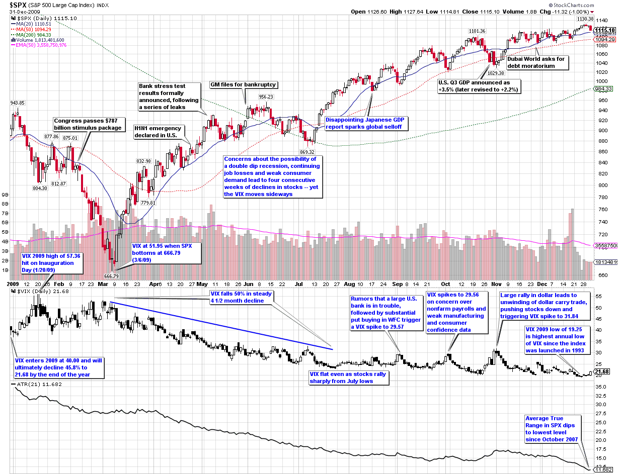
In this week’s chart of the week, I take a look back at the entire year as seen through the eyes of the VIX and volatility. The first thing you see in this heavily annotated chart is that while the graph of the S&P 500 index for the year looks like a checkmark (a dip down to the March lows followed by a rally), volatility as measured by both the VIX and the average true range of the SPX declined in almost a straight line over the course of the year. In other words, volatility was much less sensitive to market declines in 2009 than it had been in prior years.

Similarly, whereas the VIX peaked at 89.53 in October 2008, it was five months later before the SPX finally found a bottom. Part of the explanation for mean reversion in the VIX leading mean reversion in the SPX is likely due to behavioral finance factors such as those I described in Availability Bias and Disaster Imprinting.

Even with the less responsive VIX in 2009, the full year ended up with the second highest mean VIX for the year (31.48, behind 2008’s record of 32.68) and the highest annual low for the VIX (19.25) since the VIX was launched in 1993.

The chart shows some of the major events on the volatility landscape over the course of the year, as well as other events (black text) that had a limited impact on volatility. Notably absent from the second half of the year is any sort of sustained rise in volatility. Instead, volatility events were short-lived and with one exception, not able to push the VIX over 30. I find it interesting that while rumors of a large U.S. bank in trouble or even the Dubai debt crisis failed to elevate the VIX above 30, the one event that did push the VIX above 30 was more of a trading event (a reversal in the dollar carry trade) than an economic or geopolitical threat to stocks.

For a similar recap of the year in volatility from 2008, readers are encouraged to check out:

[source: StockCharts]

Disclosure: none

Monday, December 7, 2009

What Is Historical Volatility?

The volatility universe splits fairly neatly into two halves: historical volatility (HV) and implied volatility (IV). I tend to place slightly more emphasis on implied volatility because implied volatility looks to the future, is derived from options prices, and can provide some clues about the current sentiment of options investors. Of course, the CBOE Volatility Index, commonly known as the VIX, is an index that measures implied volatility in S&P 500 index options, so that may persuade me to favor IV over HV a little as well.

Compared to implied volatility, historical volatility seems like a relatively simple concept. It looks backward at price action and measures the degree of change in the price of a security. Things get a little more complicated, however, when one asks two seemingly innocuous questions:

  1. How long of a period?

  2. What method of measurement is used?

The issue of a lookback period is really not much of a complication, but it does lead to a proliferation of historical volatility numbers. As historical volatility looks only at trading days, it is important to note that the historical volatility calendar differs from the implied volatility calendar. As a result, the standard implied volatility time horizon of 30 (calendar) days (such as is used by the VIX) translates to about 21 trading days, assuming the usual NYSE nine holidays per year. Even with the different calendars, the most frequently used historical volatility measurement is HV 30, which translates to about 43 calendar days.

The appropriate lookback period to use for historical volatility calculations is ultimately a matter of personal taste. As noted above, most providers of HV data tend to standardize on HV 30, but I generally prefer HV 20 or HV 21, as this is a better approximation of a trading month. One can use shorter time frames, but investors should be wary of the amount of noise in calculations that look back less than 20 days. Still, I like to look at HV 10 to get a sense of the most recent volatility trend. Looking farther out, HV 50 or HV 60 are popular ways to capture almost an entire earnings cycle, while HV 90, HV 100, HV 180 and HV 200 are all excellent ways to capture the long-term volatility trend. In order to incorporate a full year of historical volatility, HV 250 is recommended. Some options traders like to look at two full years of historical volatility data with the likes of HV 500, but I rarely find much value looking back a second year unless – as is the case right now – the most recent year is filled with quite a few statistical outliers.

Any good options broker will have one of more historical volatility calculations built in, but HV data is also available from various options service providers such as Livevol or iVolatility.

Note that standard historical volatility data are the result of a calculation involving close-to-close prices, specifically end of day prices. As such, historical volatility does not capture the magnitude of any intraday price movements, which are better served by calculations such as an average true range.

Finally, while there are many ways to calculate historical volatility, by convention historical volatility is calculated by taking the standard deviation of the difference between the natural log of the daily changes in the price of the underlying and the mean value during the lookback period. This sounds a lot uglier than it turns out to be in Excel. Since this is the holiday season, however, tomorrow I will provide a recipe for the traditional historical volatility calculation as well as a modification that I find simpler and more useful.

For more on historical volatility, readers are encouraged to check out:

Disclosure: Livevol is an advertiser on VIX and More

Tuesday, March 31, 2009

Introducing the Parabolic Stop and Reverse (SAR)

Yesterday, a reader asked about the usefulness of the parabolic stop and reverse indicator, sometimes called the PSAR or SAR. Since this is one of my favorite not-quite-mainstream indicators, I thought I would take a moment and mention some of the reasons why I am a fan of the SAR. One thing led to another and before I knew it, my simple response had grown to Tolstoyan proportions. For that reason, I am going to address the SAR over the course of several posts.

The SAR was unveiled by Welles Wilder as part of the groundbreaking 1978 classic, New Concepts in Technical Trading Systems. Even after more than three decades, the achievements in this book still boggle the mind. In one fell swoop, Wilder launched the RSI (relative strength index), ATR (average true range), ADX (average directional indicator) and SAR, along with several lesser known indicators (e.g., commodity selection index, swing index, etc.) that probably deserve much more attention.

When it comes to adding more indicators to one’s TA toolbox, I am always a little hesitant to do so, as I prefer to keep things simple rather than make them too complex. This bias for “less is more” when it comes to indicators is partly due to the fact that so many of the indicators share some computational ancestry that the value added is often a lot less than meets the eye.

With those caveats in mind, I consider the SAR to be an exception. Specifically, the SAR is a unique combination of price and time. It works particularly well in trending markets and perhaps best suited to being implemented as a trailing stop mechanism.

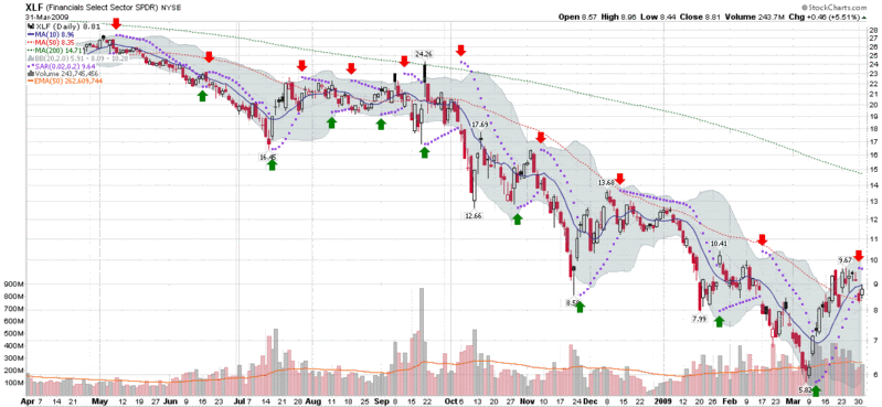
This time around, I will not delve into the details of the calculations of the SAR; instead, I will provide a quick overview of how the SAR works. In the chart below, I have captured data in XLF, the financial ETF, going back one year. The SAR values are represented by the purple dots that are overlays on the price chart. When the purple dots are below the candlesticks, this indicates rising prices; when the purple dots are above the candlesticks, this indicates falling prices. Each time a change in trend is signaled, the purple dots flip from the bottom to the top or the top to the bottom. To make these reversal signals easier to identify, I have added green and red arrows to indicate trend reversals.

The SAR assumes traders are always in the market. Very simply, when the trend reverses, the SAR signals a new position should be initiated. To get a sense of how the SAR values move, review the new short signal from the second week in December. Note that the SAR is a good distance above the initial short entry signal, but as time passes, the SAR continues in the direction of the original signal, regardless of whether the market follows the trend or not. This brings the SAR close to the price at the beginning of the year. Take note also that as XLF begins to move sharply down in the beginning of January, the SAR accelerates down with it and stays close to the price action. When XLF finally reverses in the last week in January, the trailing stop is so tight that one bullish gap up day triggers an exit. This is the essence of the SAR: it gives gradual trends some time to gather momentum, hugs sharp trends closely, and acts as a tight stop should the trend begin to change direction.

Now study the balance of the chart. Notice that when XLF was in a persistent trend (May, June, October, etc.), the SAR performed quite well. When XLF traded sideways, however, as it did in August, the SAR was responsible for quite a few whipsaws.

In the next article in this series, I will delve deeper into the calculations behind the SAR and discuss some of the preferred approaches for applying this indicator.

[source: StockCharts]

Wednesday, February 11, 2009

Thinking About Volatility (First in a Series)

Lately I have been fielding a large number of questions about historical volatility, implied volatility and a variety of related subjects. For this reason, it seems like a good time to kick off what I envision as a series of educational posts on the subject.

First I would like to start out with my own definition of volatility and then throw out some thought starters.

Definition: Volatility is a measure of the degree of change in the price of a security

There are a number of ways to think about changes in the price of a security. For instance, changes in price may be described in terms of:

  • magnitude (amplitude) – how far?
  • frequency – how often?
  • duration – how long?
  • trend – unidirectional or choppy?
  • direction – up or down?

In terms of measurement, common ways to measure price changes include:

  • close to close
  • open to close (intra-bar; excludes gaps)
  • bar to bar maximum (e.g. Average True Range)

Of course each investor has their preferred unit of time, with each bar representing a minute, five minutes, one day or whatever.

By convention, most investors think of volatility in terms of changes in price, but I submit that volatility be measured in the following units:

  • points
  • percentage (of price)
  • standard deviations

Looking back at the definition, I sometimes like to think of volatility more broadly than I have formally defined it. Consider that volatility can be defined in terms of:

  • price
  • volume
  • trend (degree of trending vs. choppiness)

Finally, consider that once measured, volatility can be compared to a number of possible benchmarks. These include:

  • external aggregate (broad index)
  • relative to peers (sector index, sector ETF, other representative ETF)
  • relative to self (including historical volatility and prior implied volatility levels)

I will touch upon all these subjects and more in the coming days and weeks.

Saturday, January 10, 2009

Chart of the Week: Volatility Drifts Lower

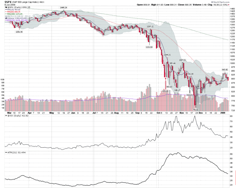
While stocks gave back some gains this week and any sense of inevitability was stricken from the consciousness of the bulls, volatility only grudgingly began to reappear on the charts.

In fact, if you look at the chart of the week below, you see more concern about future volatility in the form of the VIX than there are indications of rising current volatility, as reflected in the average true range (ATR) of the S&P 500 index. I elected to use the 21 day setting for the ATR, as it is based on trading days and approximates the 30 calendar day time horizon used by the VIX. For the record, shortening the ATR window to 10 days shows the same pattern of declining volatility. The SPX historical volatility picture is similarly calm, with 20 day historical volatility hovering around 31 at the moment.

Even with the markets selling off this week, volatility remains relatively low, at least as measured by post-Lehman standards.

[source: StockCharts]

Friday, October 24, 2008

Should You Go Long at Volatility Extremes? A Look at the Nikkei 225

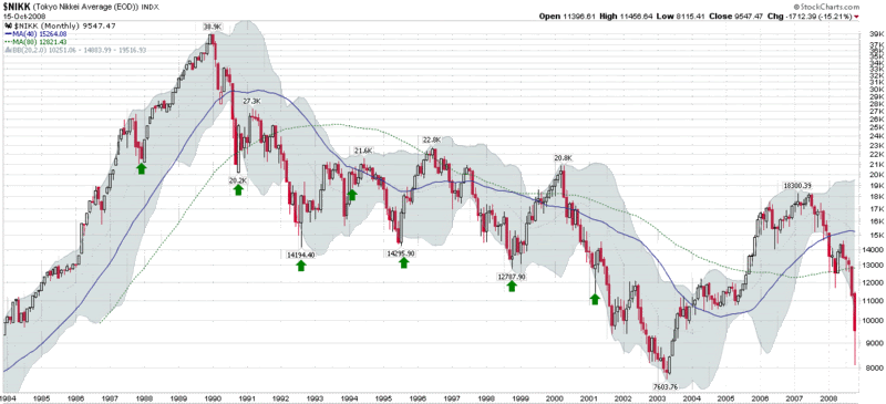
Japan’s Nikkei 225 stock index is the primary index used to track the Tokyo Stock Exchange. It was also the index that captured the fall of the Japanese stock market from 38,959 on the last day of 1989 to 7,603 in April 2003, a drop of 81% over the course of more than 13 years.

The Nikkei, therefore, provides an opportunity to test the idea of whether it is profitable to initiate new long positions in times of extreme volatility, even in prolonged bear markets.

In order to test this hypothesis, I reviewed the data for the Nikkei 225 from 1984 to the present and singled out the ten most volatile days during this period, using various volatility measures such as historical volatility and average true range. The result, which includes a number of overlapping days and clusters of similar volatility extremes, is displayed graphically in the chart below, courtesy of Stockcharts.com. In the chart, the seven instances with the highest volatility levels are highlighted by green arrows. Note that in each case a rally of at least two months followed these volatility extremes. In the one bull market example, the new bullish trend lasted for two years; in all the other bear market examples, the new bullish trend lasted from two months to 1 ½ years.

For the record, the action in the last two weeks in the Nikkei would make the current environment the most volatile of all instances, just as is the case for the S&P 500 at the moment.

While all bear markets are not created equally, Japan's "lost decade" does bear some resemblance to the problems in the U.S. Looking at the historical record with a global perspective, it is tempting to conclude that the current situation ripe for another volatility bounce of at least two months.

[source: StockCharts]

Thursday, October 2, 2008

S&P 500 Index Sets New Volatility Record for Fourth Consecutive Day

When measuring volatility, there is a tendency to focus on historical volatility and implied volatility as the appropriate yardsticks. One looks backward and is a statistical calculation; the other looks forward and lets market participants estimate future volatility.

The VIX gets the bulk of the press, but as a measure of implied volatility, it tells you nothing about what has just happened.

Don Fishback and Adam Warner (Daily Options Report) have opined that historical volatility can be as useful in measuring volatility as implied volatility.

Depending on one’s purpose, I am inclined to agree. In fact, in addition to implied volatility and historical volatility (which is simply the standard deviation of the log of returns of a period of X days), I am a big fan of Average True Range, which is also known simply as ATR.

Developed by J. Welles Wilder and first made public in the classic New Concepts in Technical Trading Systems, ATR first calculates true range as the maximum of:

  1. the difference between today’s high and low;
  2. the difference between today’s high and the previous close;
  3. the difference between today’s low and the previous close.

Average true range is simply the true range averaged over a standard lookback period (most often 14 days), traditionally using an exponential moving average, but sometimes using a simple moving average.

Now for the punch line, which is probably a couple of paragraphs too late: in each of the past four days, the S&P 500 index (SPX) has set new all-time highs in its 30 day historical volatility reading, as well as the simple moving average version of ATR. Further, if you normalize ATR by dividing it by the daily close of the SPX, the past four days have also seen new all-time highs in the normalized ATR.

So…the VIX may be pulling back a little, but backward looking measures of volatility such as historical volatility and ATR are continuing to establish new all-time highs.

Further reading:

Thursday, July 3, 2008

On Measuring Volatility

Mike at HEDGEfolios.com has a good post up today with the title of Measuring Volatility. He touches a lot of bases, but it all starts with the following statement:

“When it comes to measuring or sensing stock market volatility, I do not follow the VIX.”

Now I may have invented that silly tagline, “Your one stop VIX-centric view of the universe,” but I am the first to argue that a defaultist mind set is the wrong way to approach the investment landscape. If you follow the same indicators with the same default settings as everyone else, you are setting yourself up not just to follow the crowd, but to be a half step behind it. In order beat the crowd, what is needed is a variant perception.

Back to HEDGEfolios for a moment:

“The key element of volatility using traditional methods like the VIX rests on the reversal at extremes in a contrarian indication such as buying when the VIX exceeds 30. This is a very dangerous concept and I do not advocate for its use… I never liked that approach so I do my own thing and look at each stock, the turnover in each and how the composite of all signal changes indicates the market volatility.”

Volatility is a wide-ranging concept. It can be defined, measured and applied to over 10,000 stocks and ETFs in many different ways. To think that best way to harness information about volatility is to buy when the VIX hits X is ludicrous.

Consider that the concept of volatility can be applied not just to price, but to volume, options prices, market breadth data, etc. Volatility is a characteristic of every slice of the almost infinite flow of data that is associated with the markets.


It’s not just what you measure, it’s how you measure it. Volatility can look forward when it is in the form of a forecast or a derivation, such as implied volatility. When volatility looks backward, the opportunities to get creative are even richer. There is historical volatility, average true range, Bollinger bands, Chaikin volatility, relative volatility, and a variety of ways in which to index volatility.

Go ahead and watch the VIX, but don’t think for a moment that you are going to have an advantage over the thousands of other people who are watching the same indicator. Sure, you might come up with the next great VIX permutation, but you are far more likely to get a leg up on the competition by revisiting some basic questions:
  • Is volatility worth following?
  • How can more knowledge about volatility make me a better investor?
  • Which aspects of volatility should I pay attention to?
  • How should I measure that type of volatility?
  • How do I interpret those measurements for maximum ROI?
One of my favorite measures of volatility is the number of buy and sell signals my various systems generate each evening. It’s simple, but effective. And I can be sure that nobody is not going to show up on CNBC tomorrow touting the same approach.

Tuesday, August 28, 2007

The Relationship Between Volatility and Market Returns

Hans Wagner (not pictured) has an article with the title “Volatility as a Stock Market Indicator” up on Financial Sense. Posted yesterday, the Wagner article examines the relationship between volatility and market performance from a monthly and yearly perspective. In his analysis, Wagner leans heavily on the research of Ed Easterling of Crestmont Research, whose relevant book, Unexpected Returns: Understanding Secular Stock Market Cycles, I confess not to have read.

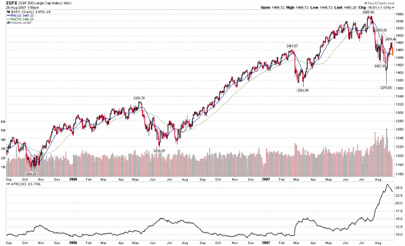
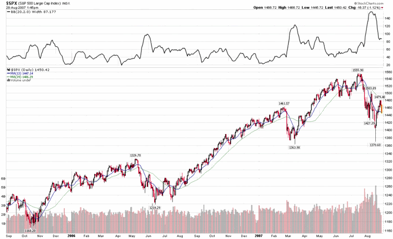
Using S&P 500 index data going back to 1962, Easterling notes that when the average daily range (in percentage terms) of the S&P 500 is lowest, it corresponds to a higher likelihood of monthly gains in the index. So…calmer waters make for easier sailing.

A quick and dirty way to monitor these types of opportunities is with a 20 day Average True Range or 20 day Bollinger Band width indicator. As you can see from the charts below, both ATR and BB width provide an excellent means by which to evaluate market volatility graphically, with fairly reliable and easily measurable signals of volatility extremes, not unlike the information provided by the VIX.


DISCLAIMER: "VIX®" is a trademark of Chicago Board Options Exchange, Incorporated. Chicago Board Options Exchange, Incorporated is not affiliated with this website or this website's owner's or operators. CBOE assumes no responsibility for the accuracy or completeness or any other aspect of any content posted on this website by its operator or any third party. All content on this site is provided for informational and entertainment purposes only and is not intended as advice to buy or sell any securities. Stocks are difficult to trade; options are even harder. When it comes to VIX derivatives, don't fall into the trap of thinking that just because you can ride a horse, you can ride an alligator. Please do your own homework and accept full responsibility for any investment decisions you make. No content on this site can be used for commercial purposes without the prior written permission of the author. Copyright © 2007-2023 Bill Luby. All rights reserved.
 
Web Analytics