Showing posts with label availability bias. Show all posts

Friday, December 21, 2012

Volatility During Crises

[The following first appeared in the August 2011 edition of Expiring Monthly: The Option Traders Journal. I thought I would share it because it might help some readers put the current fiscal cliff crisis in historical context.]

The events of the last three weeks are a reminder that financial crises and stock market volatility can appear almost instantaneously and mushroom out of control before some investors even have a chance to ask what is happening. A case in point: on August 3rd investors were breathing a sigh of relief after the United States had finalized an agreement to raise the debt ceiling; at that time, the VIX stood at 23.38, reflecting a relative sense of calm, yet just three days later, the VIX jumped to 48.00 as two new crises displaced the debt ceiling issue.

Spanning the globe from Northern Africa, Japan, Europe and the United States, 2011 has seen no shortage of crises in the first eight months of the year. Given this pervasive crisis atmosphere, it is reasonable for investors to consider how much volatility they should anticipate during a crisis. In this article I will attempt to put crises and volatility in some historical perspective and address a variety of factors that affect the magnitude and duration of volatility during a crisis, drawing upon fundamental, technical and psychological causes.

Volatility in the Twentieth Century

Every generation likes to think that the issues of their time are more daunting and more complex than those faced by prior generations. No doubt investors fall prey to this kind of thinking as well. With a highly interconnected global economy, a news cycle that races around the globe at the speed of light and high-frequency and algorithmic trading systems that have transferred the task of trading from humans to machines, there is a lot to be said for the current batch of concerns. Looking at just the first half of the twentieth century, however, investors had to cope with the Great Depression, two world wars and the dawn of the nuclear age.

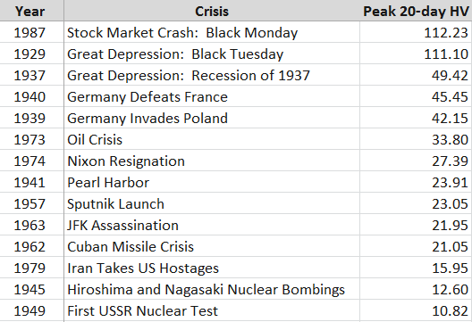
Given that the CBOE Volatility Index (VIX) was not launched until 1993, any evaluation of the volatility component of various crises prior to the VIX must rely on measures of historical volatility (HV) rather than implied volatility. As the S&P 500 index on which the VIX is based only dates back to 1957, I have elected to use historical data for the Dow Jones Industrial Average dating back to before the Great Depression. In Figure 1 below, I have collected peak 20-day historical volatility readings for selected crises from 1929 to the present.

Before studying the table, readers may wish to perform a quick exercise by making a mental list of some of the events of the 20th century that constituted immediate or deferred threats to the United States, then compare the magnitude of that threat with the peak historical volatility observed in the Dow Jones Industrial Average. If you are like most historians and investors, after looking at the data you will probably conclude that the magnitude of the crisis and the magnitude of the stock market volatility have at best a very weak correlation.
[source(s): Yahoo]

Any ranking of crises in which the Cuban Missile Crisis and the attack on Pearl Harbor rank in the lower half of the list is certain to raise some eyebrows. Frankly I would have been surprised if even one of these events failed to trigger a historical volatility reading of 25, but seeing that was the case for half the crises on this list certainly provides a fair amount of food for thought.

Volatility in the VIX Era

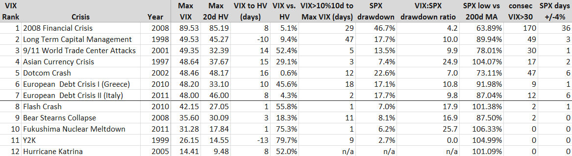
With the launch of the VIX it became possible not only to evaluate historical volatility, but implied volatility as well. With only 18 years of data to draw upon, there is a limited universe of crises to examine, so in the table in Figure 2 below, I have highlighted the seven crises in the VIX era in which intraday volatility has reached at least 48. Additionally, I have included five other crises with smaller VIX spikes for comparison purposes.
[source(s): CBOE, Yahoo]

[Some brief explanatory notes will probably make the data easier to interpret. First, the crises are ranked by maximum VIX value, with the maximum historical volatility in an adjacent column for an easy comparison. The column immediately to the right of the MAX HV data captures the number of days from the peak VIX reading to the maximum 20-day HV reading, with negative numbers (LTCM and Y2K) indicating that HV peaked before the VIX did. The VIX vs. HV column calculates the amount in percentage terms that the peak VIX exceeded the peak HV. The VIX>10%10d… column reflects how many days transpired from the first VIX close above its 10-day moving average to the peak VIX reading. The SPX Drawdown column calculates the maximum peak to trough drawdown in the S&P 500 index during the crisis period, not from any pre-crisis peak. The VIX:SPX drawdown ratio calculates the percentage change in the VIX from the SPX crisis high to the SPX crisis low relative the percentage change in the SPX during the same period (of course these are not necessarily the VIX highs and lows during the period.) The SPX low relative to the 200-day moving average is the maximum amount the SPX fell below its 200-day moving average during the crisis. Finally, the last two columns capture the number of consecutive days the VIX closed at or above 30 during the crisis and the number of days the SPX closed at least 4% above or below the previous day’s close during the crisis.]

Looking at the VIX era numbers, it is not surprising that the financial crisis of 2008 dominates in many of the categories. Reading across the rows, one can get an interesting cross-section of each crisis in terms of various volatility metrics, but I think some of the more interesting analysis comes from examining the columns, where we can learn something not just about the nature of the crises, but also about volatility as well. One important caveat is that the limited number of data points does not allow for this to be a statistically valid sample, but that does not preclude the possibility of drawing some potentially valuable and actionable conclusions.

Looking at the peak VIX reading relative to the peak HV reading I note that in all instances the VIX was ultimately higher than the maximum 20-day historical volatility reading. In the five lesser crises, the VIX was generally 50-80% higher than peak HV. In the seven major crises, not surprisingly HV did approach the VIX in several instances, but in the case of the 9/11 attack and the 2010 European sovereign debt crisis the VIX readings grossly overestimated future realized volatility.

One of my hypotheses about the time between the first VIX close above its 10-day moving average and the ultimate maximum VIX reading was that the longer the period between the initial VIX breakout and the maximum VIX, the higher the VIX spike would be. In this case the Long-Term Capital Management (LTCM) and 2008 crises support the hypothesis, but the data is spotty elsewhere. The current European debt crisis, Asian Currency Crisis of 1997 and 9/11 attack all reflect a very rapid escalation of the VIX to its crisis high. In the case of the May 2010 ‘Flash Crash’ and the Fukushima Nuclear Meltdown, the maximum VIX reading happened just one day after the initial VIX breakout. As many traders use the level of the VIX relative to its 10-day moving averages as a trading trigger, the data in this column could be of assistance to those looking to fine-tune entries or better understand the time component of the risk management equation.

Turing to the SPX drawdown data, the Asian Currency Crisis stands out as one instance where the VIX spike seems in retrospect to be out of proportion to the SPX peak to trough drawdown during the crisis. On the other side of the ledger, the drawdown during the Dotcom Crash appears to be consistent with a much higher VIX reading. Here the fact that it took some 2 ½ years for stocks to find a bottom meant that when the market finally bottomed, investors were somewhat desensitized and some of the fear and panic had already left the market, which is similar to what happened at the time of the March 2009 bottom. Note that the median VIX:SPX drawdown ratio for all twelve crises is 10.0, which is about 2 ½ times the movement in the VIX that one would expect during more normal market conditions.

The data for the SPX Low vs. 200-day Moving Average is similar to that of the SPX drawdown. For the most part, any drawdown of 10% or more is likely to take the index below its 200-day moving average. In the seven major crises profiled above, all but the Asian Currency Crisis dragged the index below its 200-day moving average; on the other hand, in all but one of the lesser crises the SPX never dropped below its 200-day moving average. Based on this data at least, one might be inclined to include the 200-day moving average breach as one aspect which helps to differentiate between major and minor crises.

As I see it, the last two columns – consecutive days of VIX closes over 30 and number of days in which the SPX has a 4% move – are central to the essence of the crisis volatility equation. Since the dawn of the VIX, the SPX has experienced a 2% move in about 80% of its calendar years, the VIX has spiked over 30 about 60% of the years, and the SPX has seen at least one 4% move in about 40% of those years. Those 4% moves are rare enough so that they almost always occur in the context of some sort of major crisis. In fact, one could argue that a 4% move in the SPX is a necessary condition for a financial crisis and/or a significant volatility event.

Fundamental, Technical and Psychological Factors in Crisis Volatility

Crises have many different causes. In the pre-VIX era, we saw a mix of geopolitical crises and stock market crashes, where the driving forces were largely fundamental ones. During the VIX era, I would argue that technical and psychological factors become increasingly important. The rise of quantitative trading has given birth to algorithmic trading, high-frequency trading and related approaches which place more emphasis on technical data than fundamental data. At the same time, retail investing has been revolutionized by a new class of online traders and the concomitant explosion in self-directed traders. This increased activity at the retail level has added a new layer of psychology to the market.

In terms of fundamental factors, one could easily argue that the top nine VIX spikes from the list of VIX era crises all arise from just two meta-crises, whose causes and imperfect resolution has created an interconnectedness in which subsequent crises are to a large extent just downstream manifestations of the ripple effect of the original crisis.

The first example of the meta-crisis effect was the 1997 Asian Currency Crisis, which migrated to Russia in the form of the 1998 Russian Ruble Crisis, which played a major role in the collapse of Long-Term Capital Management.

The second example of meta-crisis ripples begins with the Dotcom Crash and the efforts of Alan Greenspan to stimulate the economy with ultra-low interest rates. From here it is easy to draw a direct line of causation to the housing bubble, the collapse of Bear Stearns, the 2008 Financial Crisis and the recurring European Sovereign Debt Crisis. In each case, the remedial action for one crisis helped to sow the seeds for the next crisis.

In addition to the fundamental interconnectedness of these recent crises, it is also worth noting that the lower volatility crises were largely point or one-time-only events. There was, for instance, only one Hurricane Katrina, one turn of the clock for Y2K and one earthquake plus tsunami in Japan. As a result, the volatility associated with these events was compressed in time and accordingly the contagion potential was limited. By contrast, the major volatility events are more accurately thought of as systemic threats that ebbed and flowed over the course of an extended period, typically with multiple volatility spikes. In the same vein, the attempted resolution of these events generally included a complex government policy cocktail, whose effects were gradual and of largely indeterminate effectiveness.

Apart from the fundamental thread running through these crises, I also believe there is a psychological thread that sometimes spans multiple crises. Specifically, I am referring to the shadow that one crisis casts on future crises that follow it closely in time. I call this phenomenon ‘disaster imprinting’ and psychologists characterize something similar as availability bias. Simply stated, disaster imprinting refers to a phenomenon in which the threats of financial and psychological disaster are so severe that they leave a permanent or semi-permanent scar in one’s psyche. Another way to describe disaster imprinting might be to liken it to a low-level financial post-traumatic stress disorder. Following the 2008 Financial Crisis, most investors were prone to overestimating future risk, which is why the VIX was consistently much higher than realized volatility in 2009 and 2010.

While it is impossible to prove, my sense is that if the events of 2008 were not imprinted in the minds of investors, the current crisis atmosphere might be characterized by a much lower degree of volatility and anxiety.

Conclusion

As this goes to press, the current volatility storm is drawing energy from concerns about the European Sovereign Debt Crisis as well as fears of a slowdown in global economic activity. The rise in volatility has coincided with a swift and violent selloff in stocks that has seen six days in which the S&P 500 index has moved at least 4% either up or down – a rate that is unprecedented outside of the 2008 Financial Crisis.

Ultimately, the severity of a volatility storm is a function of both the magnitude and the duration of the crisis, as well as the risk of contagion to other geographies, sectors and institutions. Act I of the European Sovereign Debt Crisis, in which Greece played the starring role, can trace its origins back to December 2009. In the intervening period, it has spread across Europe and has sent shockwaves across the globe.

By historical standards the volatility aspect of the current crisis is more severe than at any time during World War II, the Cuban Missile Crisis and just about any crisis other than the Great Depression, Black Monday of 1987 and the 2008 Financial Crisis.

In the data and commentary above, I have attempted to establish some historical context for volatility during various crises extending back to 1929 and in the process give investors some metrics for evaluating current and future volatility spikes. In addition, it is my hope that concepts such as meta-crises and disaster imprinting can help to bolster the interpretive framework for investors who are seeking a deeper understanding of volatility storms and the crises from which they arise.

Related posts:

Disclosure(s): none

Tuesday, October 16, 2012

Ratio of VIX to Realized Volatility Higher Than Any Year Since 1996

Before I dive into a series of posts about the VIX futures, I think it is important to add some context in the form of several observations about the relationship between the VIX and the historical volatility (HV) of the S&P 500 index. In the absence of any information about the future, it turns out that historical volatility (a.k.a. realized volatility or statistical volatility) can provide a reasonably accurate measure of future volatility. In fact, it is more difficult than one might imagine to incorporate information about the future to come up with a better estimate of future volatility than what can be gleaned just by extrapolating from recent realized volatility.

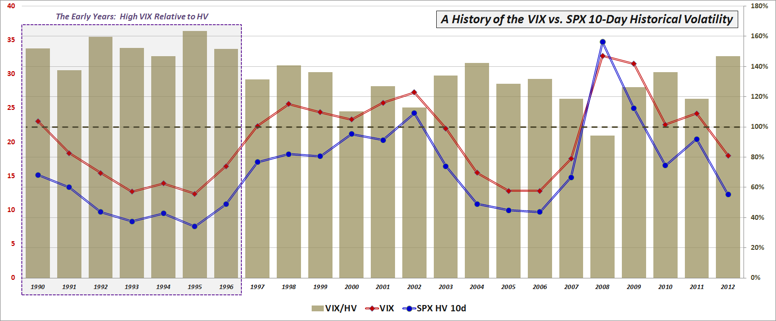
Looking at historical data, the VIX has an established history of overestimating future realized volatility. In fact, in the 23 years of VIX historical data, there was only one year – 2008 – in which realized volatility turned out to be higher than that which was predicted by the VIX.

As the chart below shows, early traders made a habit of dramatically overestimating future volatility. From 1990-1996, for instance, the VIX overshot realized volatility by an average of 49%. Since 1997, the magnitude of that overshoot has dropped dramatically, to about 24%, as investors apparently began to realize that they had been overpaying for portfolio protection in particular and for options in general.

[source(s): CBOE, Yahoo]

That being said, 2012 has been an unusual instance in which the VIX has overestimated 10-day historical volatility in the SPX by 47% – the biggest cushion since 1996. Not surprisingly, low realized volatility tends to depress the VIX and the front end of the VIX futures term structure in general. For that reason, the unusually low average 10-day historical volatility of 12.25 experienced so far in 2012 can serve as a partial explanation for the steepness of the VIX futures term structure (extreme contango) yet given the history of even lower volatility numbers during 2004-2007, the low historical volatility for 2012 is at best a very small portion of the full explanation. Two better potential explanations for the steep VIX futures term structure are the psychology of the 2008 financial crisis and its aftermath (i.e., disaster imprinting, availability bias, the recency effect, etc.) and expectations of future higher volatility due to a geopolitical and macroeconomic overhang that has generated a much higher level of anxiety about future prospects than in more uneventful economic times. Then, of course, there is the issue of the role of mushrooming growth in VIX exchange-traded products as an influence on the VIX futures term structure.

Before I address those issues in more detail, however, the next installment in this series is a discussion of the evolution of the VIX futures term structure.

Related posts:

Disclosure(s): none

Tuesday, March 13, 2012

A VIX of 15!?! Meet the New Reality

When the VIX recently slid below 20.00 for an extended period, I sensed a noticeable unease about the state of the market in many traders and investors. Clearly a sub-20 VIX was underestimating the risks in the current and future market environment, they thought. When the VIX dipped below 18.00 that unease intensified and now with the VIX hovering around the 15.00 range and I can sense that quite a few are ready to grab the nearest pitchfork and riot about the inhumanity of the wayward VIX.

I will be the first to admit that there are a number of perplexing geopolitical, macroeconomic and other factors that pose real threats to the economy and to stocks, but I also believe that investors have become so fixated on some of the past problems that availability bias and disaster imprinting has clouded their judgment to the extent that they cannot separate the current market environment from the ghosts of markets past.

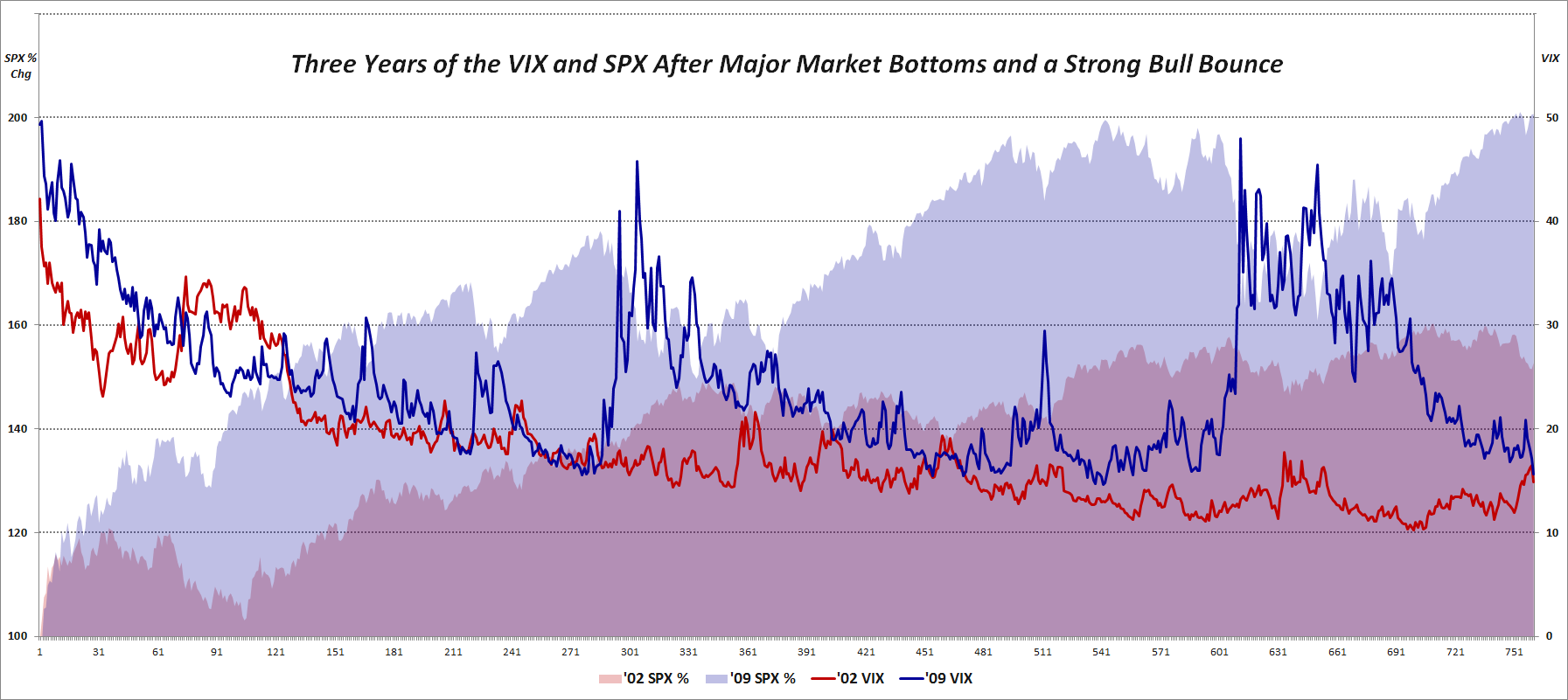
With this in mind, I created a chart to show what happened the last time we had a sharp market selloff and a subsequent bounce that lasted three years. The graphic below shows the percentage change in the SPX as well as the absolute VIX level in the three years following the October 2002 lows in the SPX as well as the three years following the March 2009 lows. Note that from 2002-2005, the SPX rallied about 53%; the current rally in the SPX from the March 2009 close is over 100%.

Turning to the VIX, it starts the sequence in the 42s in 2002 and in the 49s in 2009. Note that in both instances, the VIX had made it into the teens within one year of the beginning of the bull move. As the 2002 bull bounce continued, however, the VIX plummeted, spending a great deal of time in the 10-13 range, with a median value of 15.30 in the first three years of that bull market. The rally off of the 2009 bottom has been a different animal altogether, however, with forays down to the 15s being extremely rare (though it did happen on occasion in 2010 and 2011) and a median VIX of 22.84 during that same initial three years of the bull market.

Of course not all bull markets are the same (and there are many that will not concede that the current rally is a bone fide bull market) and every wall of worry is made of different types of stones, but at some point investors need to come to terms with the reality of a VIX of 15, particularly when we are looking at realized volatility that has been sub-10 for the last two months.

Related posts:

Disclosure(s): none

[sources: CBOE, Yahoo]

Tuesday, May 18, 2010

Volatility and Wide-Range Days with Neutral Closes

A reader notes:

The VIX tends to move inversely with the market on a day-to-day basis. Market up = VIX down and market down = VIX up. That’s all fine and dandy MOST of the time (I’m stating the obvious here) because of expectations about the asymmetry of volatility during bull versus bear moves. But how do we square moves like Monday (05/17) when, even though the close-to-close change in the market was very small, the intraday move was very large (with implications re: continued high volatility), yet the VIX still fell? Does the VIX (from a statistical correlation perspective) only care about close-to-close changes? Isn’t that a bit shallow?
This is an excellent comment and set of questions.
In terms of background, consider that measures of volatility based on actual changes in the price of the underlying break out into two camps:
  1. those that focus on close-to-close price changes and ignore/understate intraday price movements (e.g., historical volatility)

  2. those that include intraday price variations in their calculations (e.g., average true range)
Here is where an example might help to clarify things. Take the recent ‘flash crash’ of May 6th. Even though the close-to-close change in the S&P 500 index (SPX) was a very large 3.24%, the intraday range was a whopping 8.73%. So which was the better measure of volatility on that day? My guess is that anyone who was watching the markets as they crashed would vote for the 8.73% move, as things certainly felt more like the panic of October 2008 than the relative calm of October 2007.

Given that implied volatility values such as the VIX are calculated directly from options prices, in theory the VIX does not strictly account for intraday prices. Also, technically the VIX is the market's forward estimate of close-to-close volatility in the SPX. So from a pure statistical perspective, the VIX does indeed have a narrow close-to-close time horizon and is blind to intraday fluctuations in prices.

In practice, however, a wide range day with a relatively benign close-to-close number will typically reinforce the idea that the market is ripe for large volatility moves, even if these moves may cancel each other out on intraday basis. In my opinion, mapping these changes in price to changes in volatility is where fundamental factors and path dependency come into play. If stocks go up 3% intraday, for example, then fall back to even due to news that, say, the government had to prop up a U.K. bank, Spain has announced it will not implement austerity measures, a Fed member makes a speech in which he or she suggests interest rate hikes are coming soon, there is a terrorist attack in Israel, etc., you would expect to see the VIX price in more volatility in the next 30 days. On the other hand, if stocks start the day down 3%, but closed even following news that lots of jobs were created, housing prices are increasing, the euro rallied to 1.30, etc., then I would expect the VIX to price in less volatility in the next 30 days.

In brief, on a wide range day, I would look hard at the fundamentals or what I call the Forces Acting on the VIX, as well as perhaps the elements of volatility I summarized in A Conceptual Framework for Volatility Events. If news suggests that an obvious threat to the market has been eliminated or diminished significantly, then I would expect the VIX to fall, depending upon the applicability of the dragon metaphor. If a new threat crops up or an old one suddenly seems more robust, then I would expect to see a rising VIX.

Even when stocks seem to turn the corner and put a threat behind it, there is often some sort of psychological hangover that behavioral economists would probably call “availability bias” and I have termed “disaster imprinting.” This is the type of thing that happens on a wide range day that ends with a neutral close. So while the VIX is really estimating what historical close-to-close volatility will be 30 days hence, the presence of wide intraday moves almost necessarily forces options traders to consider increasing their estimates of the probability and/or magnitude of large market moves going forward.
Finally, getting back to your question about last weekend, part of what happened was that on Friday skittish investors bought so much portfolio insurance that the VIX priced in the possibility of a very large volatility event. When Monday's reality fell short of Friday's worst fears, the VIX began to fall.

For more on related subjects, readers are encouraged to check out:
Disclosure(s): short VIX at time of writing

Wednesday, March 3, 2010

Correlation of VIX and “VIX Index” Searches on Google

In retrospect, recognizing only one winner for the chart of the week contest was probably a little short sighted on my part, particularly given the very high quality of the entries.

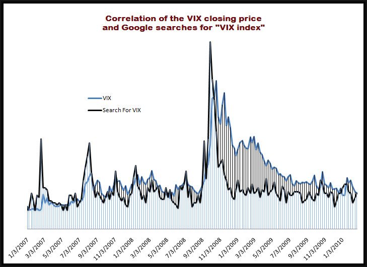
Several readers have asked to see some of the other entries and I am happy to oblige. One of the contenders for the mythical silver or bronze medal certainly would have been a submission from Darren Miller of Attitrade. In the chart below, Darren has compared the level of the VIX with the relative frequency of Google searches for “VIX index” from the beginning of 2007 to the present.

Note that prior to the October 2008 VIX spike, there were more significant spikes in searches for information about the VIX than in the VIX itself. Following the VIX peaks in October and November 2008, the demand for information about the VIX subsided much more rapidly than the VIX index. In fact, according to the graphic, the “VIX index” search activity was back to pre-crisis levels by December 2008, whereas it took the actual index another year to make a comparable drop.

What does this mean? I’m sure Darren and others have their own interpretation, but the chart does bump up against some of the ideas I outlines in my availability bias and disaster imprinting series from last year:

In a nutshell:

“Disaster imprinting refers to a phenomenon in which the threats of financial and psychological disaster were so severe that they continue to leave a permanent or semi-permanent scar in one’s psyche. Another way to describe disaster imprinting might be to liken it to a low level financial post-traumatic stress disorder.”

In reviewing the chart of the VIX against corresponding Google searches, it is possible to conclude that availability bias and disaster imprinting are present in that searches for information about the VIX rapidly reverted to historical norms, while the level of the VIX itself was only gradually reduced over a period of months and months, creating a significant gap between the index and the search activity for almost all of 2009.

For more on related subjects, readers are encouraged to check out:

[source: Darren Miller, Attitrade]

Disclosure(s): none

Monday, January 18, 2010

Chart of the Week: VXX Volume Surges

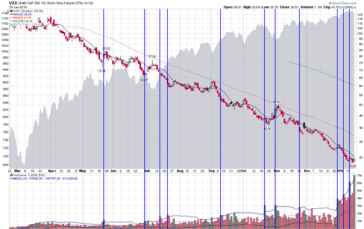
I decided to take a couple of weeks off at the beginning of the year and was amazed to learn retrospectively that as soon as I dialed back my posting, the popularity of the iPath S&P 500 VIX Short-Term Futures ETN (VXX) surged and volume – which had never hit 4 million shares in 2009 – topped the 4 million mark in 7 of the last 8 sessions.

While I am sure the volume surge in VXX is just a coincidence and I can understand why people might think the VIX seems a little low at 17.91 (and at 16.86 a week ago), it is important to note that VIX January futures are now under 20.00 and in the context of historical volatility the VIX is actually somewhat elevated at current levels.

Still, there are obviously quite a few investors for whom the current VIX level does seen warranted given the macroeconomic risks. While some of this gut feeling may be the result of Availability Bias and Disaster Imprinting, there are obviously other factors at work as well.

In this week’s chart of the week, I attempt to capture the price and volume history of VXX, with some of the prior major volatility surges highlighted with the blue vertical bars. The bottom line is that while previous VXX volume spikes did in some instances capture a trough just prior to an uptick in volatility, these were generally small moves of only 3-5 days. Further, while VXX did tend to outperform for a week or more following a volume spike, on balance VXX long positions still lost money from one month to one day following a VXX volume spike. So, while there may be a small ‘smart money’ effect when VXX volume surges, the ‘smart money’ is essentially just losing money at a slower pace with VXX long positions.

I have talked about the problems associated with VXX at length in my subscriber newsletter, but readers should get the gist of my concerns in some of the blog posts linked below.

Specifically, for more on VXX, readers are encouraged to check out:

[source: StockCharts]

Disclosure: none

Sunday, January 3, 2010

Chart of the Week: The VIX and Volatility in 2009

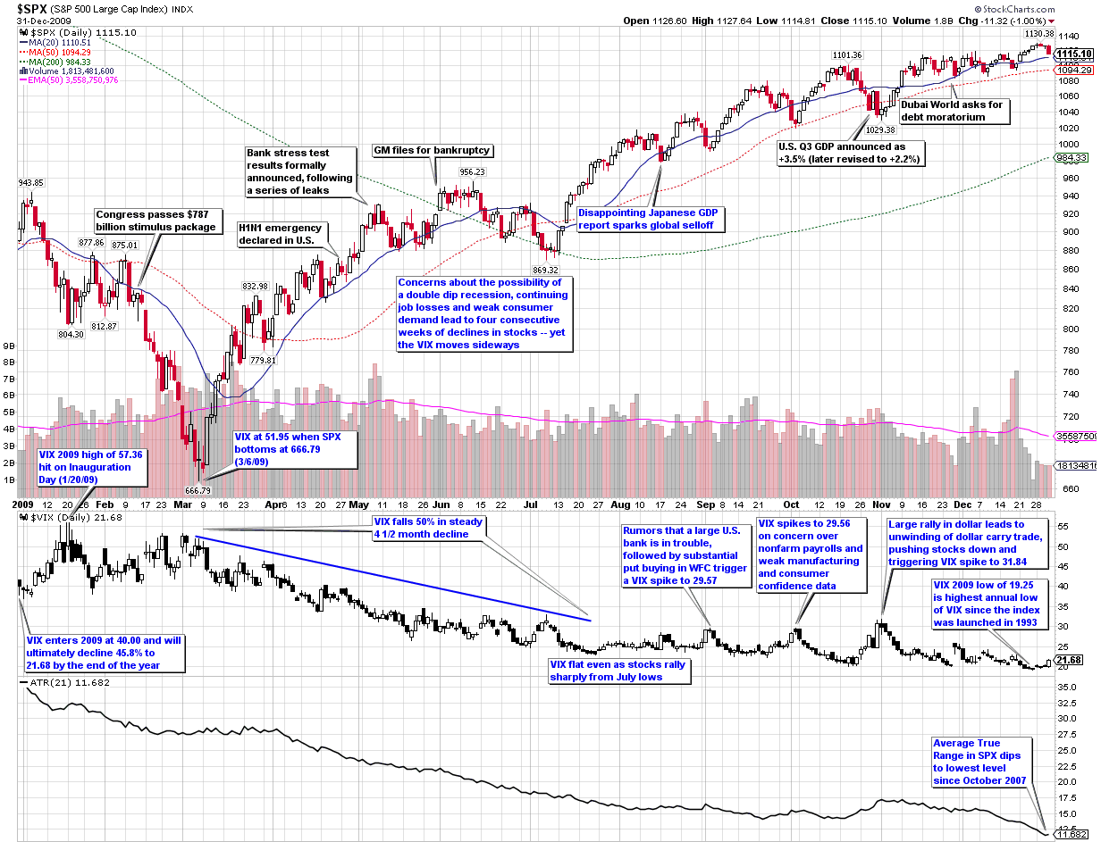
In this week’s chart of the week, I take a look back at the entire year as seen through the eyes of the VIX and volatility. The first thing you see in this heavily annotated chart is that while the graph of the S&P 500 index for the year looks like a checkmark (a dip down to the March lows followed by a rally), volatility as measured by both the VIX and the average true range of the SPX declined in almost a straight line over the course of the year. In other words, volatility was much less sensitive to market declines in 2009 than it had been in prior years.

Similarly, whereas the VIX peaked at 89.53 in October 2008, it was five months later before the SPX finally found a bottom. Part of the explanation for mean reversion in the VIX leading mean reversion in the SPX is likely due to behavioral finance factors such as those I described in Availability Bias and Disaster Imprinting.

Even with the less responsive VIX in 2009, the full year ended up with the second highest mean VIX for the year (31.48, behind 2008’s record of 32.68) and the highest annual low for the VIX (19.25) since the VIX was launched in 1993.

The chart shows some of the major events on the volatility landscape over the course of the year, as well as other events (black text) that had a limited impact on volatility. Notably absent from the second half of the year is any sort of sustained rise in volatility. Instead, volatility events were short-lived and with one exception, not able to push the VIX over 30. I find it interesting that while rumors of a large U.S. bank in trouble or even the Dubai debt crisis failed to elevate the VIX above 30, the one event that did push the VIX above 30 was more of a trading event (a reversal in the dollar carry trade) than an economic or geopolitical threat to stocks.

For a similar recap of the year in volatility from 2008, readers are encouraged to check out:

[source: StockCharts]

Disclosure: none

Thursday, December 3, 2009

VIX of 20 Spurring Market Correction?

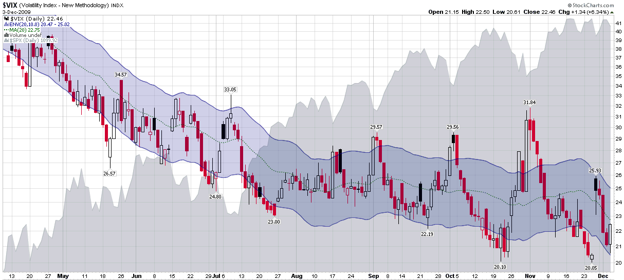
As the chart below shows, the last two times the VIX has taken a run at 20 (late October and late November), stocks have responded by selling off and spiking volatility. It is possible that a VIX of 20 may still be something that investors are not yet ready to accept (availability bias), but with historical volatility hovering around 16 and the long-term trend in the VIX still moving downward, it is likely just a matter of time before we see a VIX in the 19s.

In addition to the absolute levels of the VIX, one must always watch relative VIX levels, which is where the moving average envelopes come in. Displayed as a blue zone in the middle of the trading range on the chart, the 10 day simple moving average envelopes make it easy to identify when the VIX is extended to the high side or the low side. While the 20 level has been well out of the moving average envelopes for the last two drops in the VIX, that is not likely to be the case going forward. This sets the possibility of a battle between the absolute VIX (support at 20) vs. the relative VIX (support at the bottom of the envelope) in the near future, with an increased likelihood that the 20 level does not hold the next time around.

Finally, it is that time of year where I feel compelled to remind everyone that seasonal factors also indicate that volatility should be moving lower. I have discussed the holiday effect several times in the past in this space and essentially the historical pattern calls for the VIX to hold relatively steady for the first two weeks of December, then drop sharply (probably about 1.5 points at current levels) as Christmas approaches.

For more on these subjects, readers are encouraged to check out:

[source: StockCharts]

Disclosure: none

Thursday, November 26, 2009

Dubai Debt Concerns Trigger Spikes in Foreign Volatility Indices

With the S&P 500 and NASDAQ futures both down approximately 3% as I type this on concerns about the ability of Dubai World to repay some $59 billion in debt, tomorrow’s half day session is likely to be ugly and volatile. In a vacuum, this type of event would be concerning, but not likely to cause panic. With the emotional scars of the financial crisis still looming large in the memories of investors (i.e., Availability Bias and Disaster Imprinting), I would not be surprised to see an overreaction in the markets tomorrow.

On average, a 3% drop in the SPX yields a spike of about 12.6% in the VIX. Yesterday the Dow Jones STOXX 50 index of European companies fell 3.36%, yet the VSTOXX, (the corresponding volatility index, which is similar to a pan-European VIX) spiked 28.16%.

For the record, a 28.16% increase in the VIX would put it at 26.25.

With the shortened trading session tomorrow providing below average liquidity and investors having an entire weekend to fret about possible contagion or additional cockroaches suddenly appearing, I am predicting a wild ride.

My general approach to events like this one is to try to fade the VIX spike as it shows signs of having topped, but there are frequently multiple spikes to contend with in these types of scenarios.

I will do the best I can to provide some commentary and analysis as the events of the Dubai World debt problems unfold.

In the interim, readers who are interested in previous posts on related subjects, readers are encouraged to check out:

Wednesday, November 11, 2009

VIX Data to Support Availability Bias and Disaster Imprinting Hypothesis

At the risk of beating to death last week’s theme of availability bias and disaster imprinting as part of the explanation for some of the “realized volatility gap, persistent VIX futures contango and off-center VIX:VXV ratio,” I thought it might be informative to present a simple piece of research which supports the idea that the 2009 volatility picture has been an extremely abnormal one.

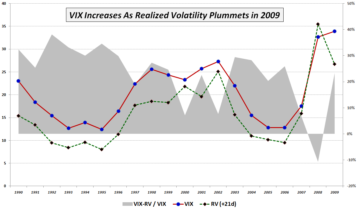
In the 20 years of VIX historical data, the VIX has typically overestimated the realized volatility 21 trading days hence, which is reflected in the chart below by the dotted green RV (+21d) line. In fact, the gray area portion of the graphic, which represents the difference between the VIX and realized volatility 21 trading days later, was close to 30% in the first half of the 1990s; more recently it has been averaging closer to 20%. The VIX actually fell below realized volatility for 2008, which is not surprising, given the volatility extremes of October and November. What is particularly noteworthy about this chart, however, is that during 2009 the VIX is actually 3.8% higher than it was in 2008, which realized volatility has actually fallen 24.7%. It is almost as if the VIX refuses to believe that realized volatility is declining and insists that the gravitational forces of mean reversion be suspended until further notice. This is a large part of the reason why 2009 has been a boon to options sellers.

For additional posts in this series, which I have listed in reverse chronological order, readers are encouraged to check out:

Wednesday, November 4, 2009

The VIX:VXV Ratio, Availability Bias and Disaster Imprinting

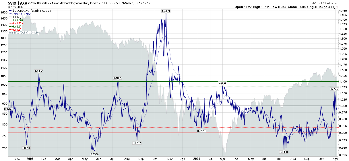
Once a popular subject in this space, the VIX:VXV ratio appeared to be a casualty of the financial turmoil and record volatility spikes in October 2008, when the ratio spiked to record levels an generated a buy signal that turned out to be nothing short of a disaster.

I was not yet ready to give up on the VIX:VXV ratio, so I was pleased to see that from November to January it generated some helpful long and short signals. In a promising development, on March 2nd the ratio generated a buy signal just before the markets bottomed. When the VIX:VXV ratio urged caution in June, I had even more reason to be hopeful. Then, once again, the ratio had another big miss, issuing a sell signal in mid-July just after the markets started rallying. To compound matters, instead of moving back toward the neutral zone (between 0.92 and 1.08), the ratio persisted with a bearish recommendation all the way to the October top.

I was just about to consign the VIX:VXV ratio to the “Sometimes Useful But Not Always Consistent” bin, but decided to reconsider when I started thinking about volatility levels in the context of availability bias and disaster imprinting, as well as The Gap Between the VIX and Realized Volatility and VIX Spike and VIX Futures Contango Means… As I see it, all these subjects are related. The realized volatility gap, persistent VIX futures contango and off-center VIX:VXV ratio (see chart below) are all symptoms of a market that is not functioning as it normally does, while availability bias and disaster imprinting are the main causes of this situation.

Further, the fact that the VIX futures term structure is now flat and the VIX:VXV ratio hit a new post-March 6th high of 1.056 last Friday suggests that the volatility picture may be starting to assume some of its pre-Lehman characteristics – if not exactly returning to a ‘normal’ state of affairs.

Personally, I still think the VIX is a little higher now than realized volatility will be a month from now, but a high VIX relative to realized volatility may turn out to be one of the more persistent effects of the global financial crisis, as each investor has their own personal half-life for how long availability bias and disaster imprinting will cast a shadow on their view of the investment landscape.

For additional posts on some of the above subjects, readers are encouraged to check out:

[source: StockCharts]

Disclosure: Short VIX at time of writing.

Tuesday, November 3, 2009

Availability Bias and Disaster Imprinting

After I dashed off The VIX Spike Conundrum, it occurred to me that there might be some aspects of behavioral finance that have contributed to what is now a full year of continued overestimating of future volatility. I detailed this phenomenon in The Gap Between the VIX and Realized Volatility and is also being reflected in up in a VIX:VXV ratio that has been stuck at unusually low levels from mid-July until last week.

In thinking about the various elements of behavioral finance that impair ‘rational’ decision-making and could contribute to excess implied volatility, one factor that immediately comes to mind is availability bias (nicely summarized in Wikipedia.) The global financial crisis and VIX spikes into the 80s were so vivid and memorable – and so thoroughly discussed in the media – that they are all too easy to recall one year later, even though arguably most of the risks associated with a VIX of 80 have since passed.

I do not think that availability bias is the only explanation for recent excess implied volatility. My working hypothesis – which I do not believe has been addressed by the behavioral finance crowd – is that another factor is as work. I call it “disaster imprinting” for lack of a better name. Disaster imprinting refers to a phenomenon in which the threats of financial and psychological disaster were so severe that they continue to leave a permanent or semi-permanent scar in one’s psyche. Another way to describe disaster imprinting might be to liken it to a low level financial post-traumatic stress disorder.

I will do some additional research to test the disaster imprinting theory, but for now I wanted to throw the idea out and see what others think. Has going to the brink of a global financial meltdown impaired our collective ability to assess future probabilities? If so, how long will this impairment last? As always, all comments are appreciated.

For additional posts on related subjects, readers are encouraged to check out:

Disclosure: Short VIX at time of writing.

DISCLAIMER: "VIX®" is a trademark of Chicago Board Options Exchange, Incorporated. Chicago Board Options Exchange, Incorporated is not affiliated with this website or this website's owner's or operators. CBOE assumes no responsibility for the accuracy or completeness or any other aspect of any content posted on this website by its operator or any third party. All content on this site is provided for informational and entertainment purposes only and is not intended as advice to buy or sell any securities. Stocks are difficult to trade; options are even harder. When it comes to VIX derivatives, don't fall into the trap of thinking that just because you can ride a horse, you can ride an alligator. Please do your own homework and accept full responsibility for any investment decisions you make. No content on this site can be used for commercial purposes without the prior written permission of the author. Copyright © 2007-2023 Bill Luby. All rights reserved.
 
Web Analytics