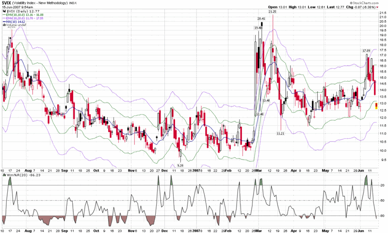
Charting the VIX with 10 Day SMA Envelopes
While the VIX is currently in the process of what looks like a mini-implosion, I thought this might be a good time to offer up what may be the best single chart for keeping track of the VIX.
To understand where I am coming from, I should say up front that I consider the 10 and 20 day simple moving average to be two of the most important pieces of VIX data to watch – and the keystone for short-term mean reversion analysis. Of these two SMAs, I favor the 10 day SMA slightly over its older sibling.
Of course you can easily put the 10 day SMA and the 20 day SMA on the same chart, but what is often more useful is to know just how far the VIX has strayed from these moving averages. For a quick visual check of this, I recommend using moving average envelopes, such as the ones shown in the chart below. You can follow the link in the previous sentence to see how StockCharts describes these envelopes or just consider that they work in a similar fashion to Bollinger Bands, except that instead of using standard deviations as a measuring device for the width of the bands above and below a mean, the moving average envelopes used a fixed percentage of the simple moving average.
An example helps tell the story. In the chart below, the 10 day SMA (mean) is represented by a solid blue line, with a current value of 14.62. The 10% upper band (currently 16.08) is represented by green dotted line while the upper 20% band (currently 17.55) is shown with a purple dotted line. A similar pattern is evident in the lower bands.
There are a couple of important things to remember about moving average envelopes. First, unlike Bollinger Bands or any other standard deviation-based calculation, they do not reflect any sort of volatility. Instead, their width is entirely a function of the value of the underlying SMA, regardless of volatility. Second, the 20% bands are rarely violated and usually represent excellent mean reversion setups; the 10% bands are violated more frequently, yet also offer many good mean reversion setups.
While there are many ways to watch and analyze the VIX, in my opinion moving average envelopes are among the best tools out there for the chartist trader.


1 comments:
Very nice post. I'm also enjoying your tennis match with Adam. In part this is because it feels gentlemanly -- a refreshing twist in the wooly world of bruising financial dialog. Best of luck, especially with finding more good tennis photos - lol.
Post a Comment