Tight VIX Range Keeps Overbought Signals at Bay
Yesterday’s little dose of VIX trivia (VIX Has Smallest Intraday Range Ever!) was just the kind of post that I suspected would raise quite a few eyebrows, until everyone concluded that the headline was out of proportion to the actual data point. Ironically, that was a large part of the intent of the post: to poke fun at statistical outliers and extreme readings that have dubious predictive value.
The more I thought about the tight intraday VIX range, the more I believe it is a good segue to a more important related point: that a narrow trading range for the VIX – and also for stocks in general (10-day historical volatility in the SPX is down into the 12s) is allowing for stocks to rise without triggering any overbought signals.
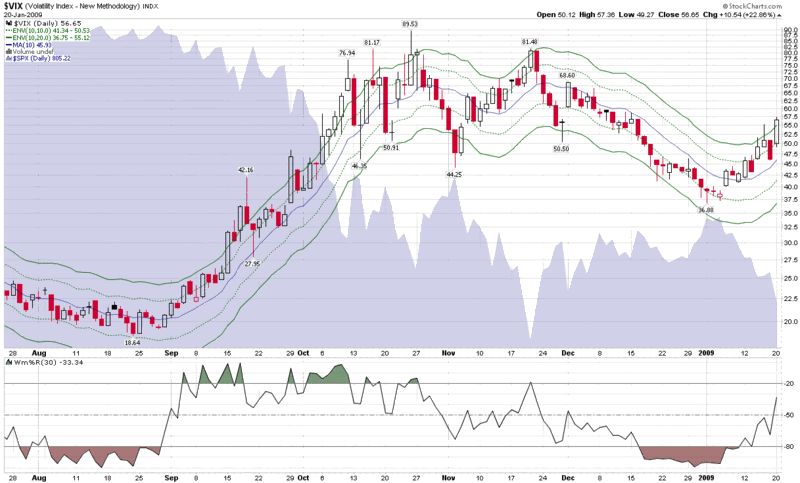
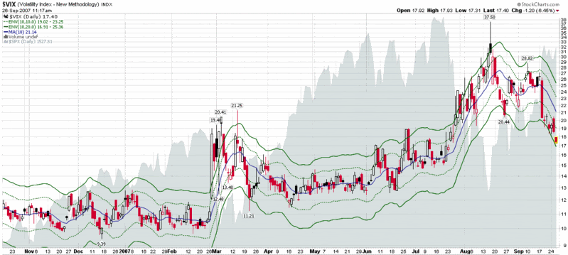
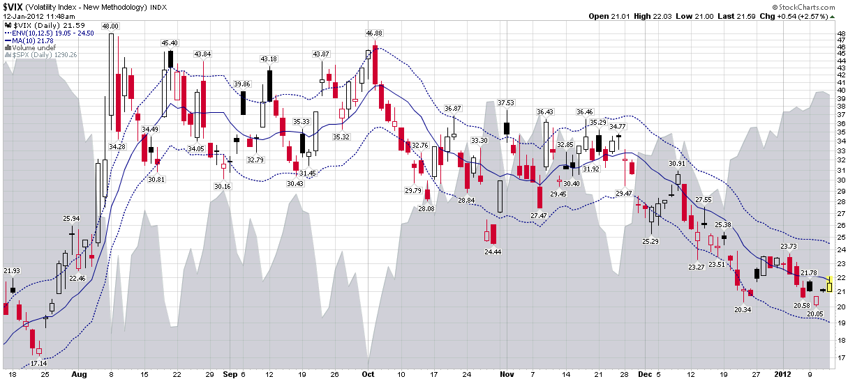
One way I track whether the VIX is signaling an overbought or oversold condition is to use a ratio of the VIX to its 10-day moving average. To make this easy on the eyes, I am partial to using moving average envelopes (MAEs) which quickly flag when the VIX (or any other underlying) has strayed a large distance from its moving average, similar to the manner in which Bollinger bands measure outliers.
My personal preference is to use the VIX 10-day moving average as the baseline and set the MAEs to 10%, 12.5% or 15%, depending upon the underlying volatility in the market. In the chart below, I have set the MAEs to 10 days and 12.5%. The result is a VIX that has hugged the center line (the 10-day moving average) for the past 2 ½ weeks, never threatening the dotted blue MAE lines.
In many respects, the recent activity in the VIX is a microcosm of the action in general in the markets: stocks continue to rise, but not rapidly enough to trigger many of the favored overbought alarms.
Related posts:
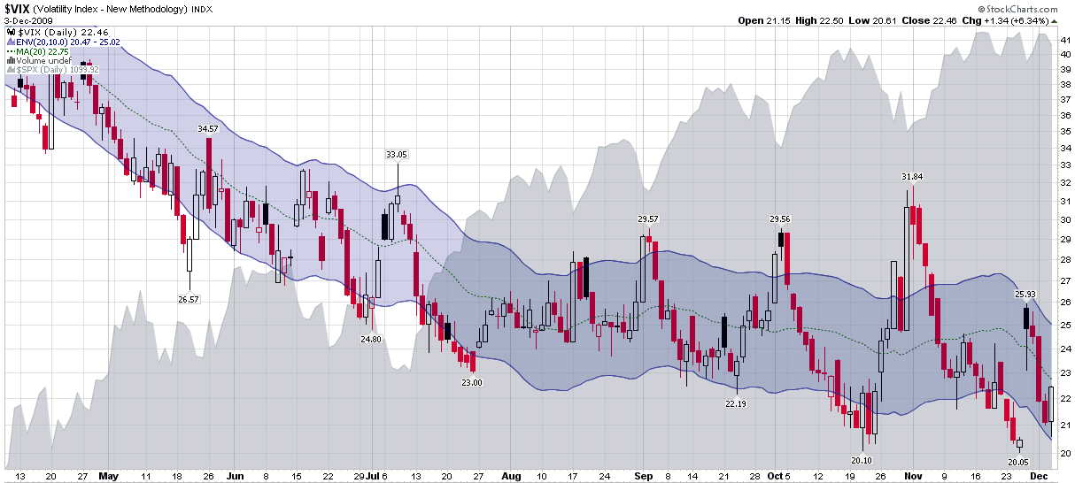
- Charting the VIX with 10 Day SMA Envelopes
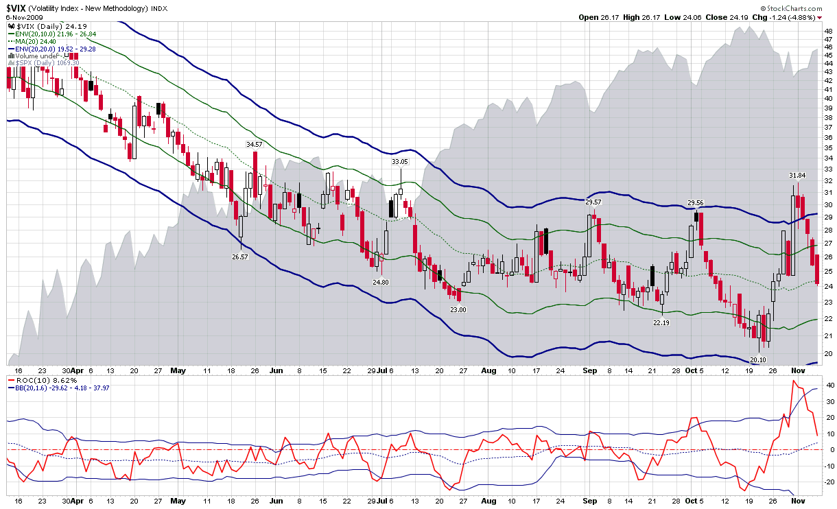
- Recent VIX Activity in the Context of Moving Average Envelopes
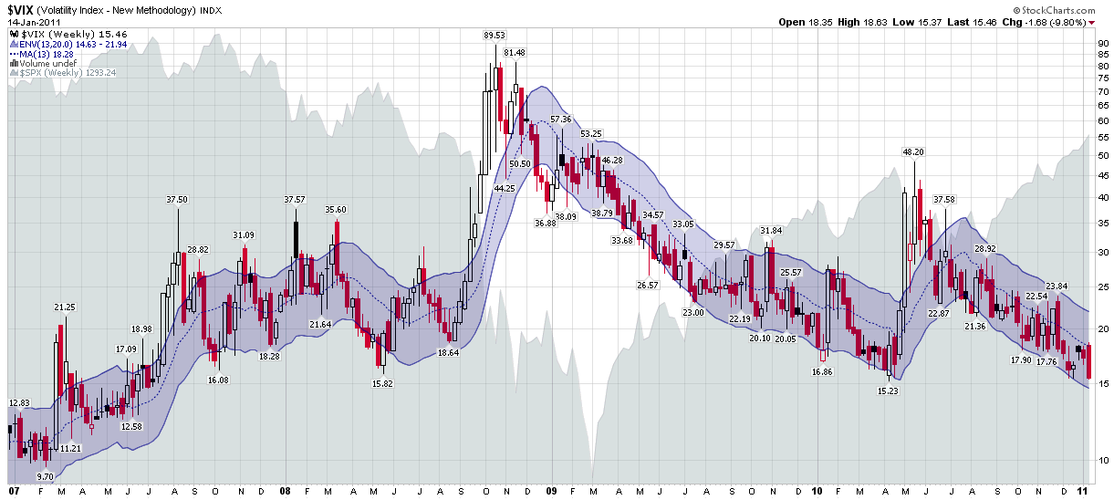
- Chart of the Week: The VIX Since 2007
- VIX of 20 Spurring Market Correction?
- Combining Bollinger Bands and Rates of Change in the VIX
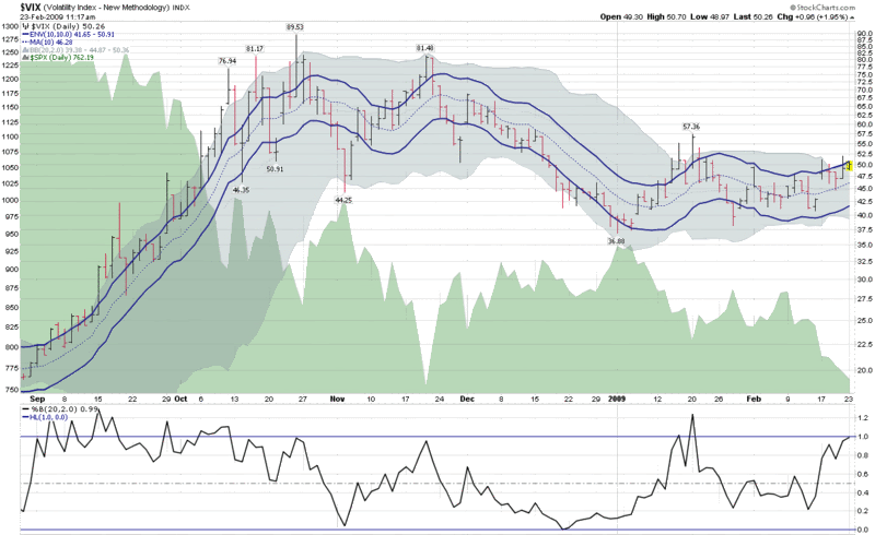
- VIX Kitchen Sink Chart
- VIX Surfing Down the Moving Average Channel
- Volatility Spikes Above 10 Day Moving Average
- VIX Oversold
[source(s): StockCharts.com]
Disclosure(s): none